The Omni Group Launches OmniPresence For Automatic Document Syncing

Announced in December 2012, The Omni Group has today started the public rollout of OmniPresence, their new free automatic document syncing solution for OS X and iOS. OmniPresence, based on open web technologies, is available inside OmniGraffle, OmniGraphSketcher, and OmniOutliner for iPad, and it also comes with a companion Mac app that runs in the menubar.

“The way we are doing it is not to hook it up into some backend proprietary service”, The Omni Group CEO Ken Case told us in an interview during Macworld|iWorld earlier this year. As a long-time user of Omni products such as OmniOutliner for the iPad and Mac, I was eager to see whether Case’s promises of a fast, reliable automatic syncing technology would grow into a stable product capable of fitting seamlessly into my daily workflow. After nearly two months of testing, I’m glad to say that, in some ways, The Omni Group has even exceeded my (already high) expectations. Read more


Share To Flipboard Magazines From Drafts

Flipboard

Flipboard

I’m a big fan of Flipboard’s magazine feature, which was introduced earlier this year with version 2.0 of the app. By leveraging Flipboard’s existing presentation style – capable of re-formatting web articles, videos, and photos with a beautiful print-like layout – magazines allow anyone to put together a collection of interesting links that others can subscribe to, read, and share. I am subscribed to dozens of Flipboard magazines and I send links to my Games one on a daily basis.

Most of my automation tips stem from minor annoyances with default solutions, so yesterday I decided to create a simple, yet effective Drafts URL action to easily open Flipboard’s share interface without having to read a webpage in the browser. Read more


Latest Chrome Release Includes Voice Search Support

Jerry Hildenbrand:

Google Now style voice search has just went live in the latest Chrome stable version for the desktop (Version 27.0.1453.93). As far as we can tell from playing around testing things, the full contextual search isn’t running like we saw in the demo during the Google I/O keynote, but the basic voice search and response is ready to go.

Announced and demoed at I/O last week, Voice Search for the desktop mimics the experience launched on Google’s Search app for iOS last year. Voice Search for the desktop lets you dictate search queries to Google, which will transcribe them in (almost) real-time and take you directly to results, powered by the Knowledge Graph. Like on iOS, certain queries will trigger a voice response by Google itself, whereas others will display cards of information or regular results.

It appears Google is rolling out the feature this morning, as the new voice interface is available in Chrome but leading to frequent “No Internet connection” dialogs; I was able to try Voice Search twice, and it worked as expected.

You can watch a demo of Google’s Voice Search for the desktop from I/O 2013 here; an announcent will likely be posted on the official Google Chrome blog.

Permalink

Apple Rolls Out Online Store Design Changes

Apple rolled out a series of design changes to its online Store overnight, bringing a cleaner, more subdued style for graphical elements and larger, image-centric spots for products and accessories.

The most notable change is the front page of the Store, which now eschews a sidebar to present a full-size view of products with varying sizes. The old design featured evenly-spaced thumbnails for Apple products and third-party accessories with two sidebars with additional navigation options and information; the new one employs larger images, retaining navigation for the main “Shop” sections at the top and in the footer. Interestingly, in the refreshed homepage launched today, the only image showing a Mac is the “Shop Mac” link at the top.

Design tweaks have also been rolled out in several other areas of the Store, such as the Accessories page. The old design relied on a main product list with small thumbnails and a sidebar containing clickable links on the left side; the new one takes a more visual approach with a landing page featuring larger tiles of products, a new sidebar on the right, and a larger grid for accessories in each category.

The Apple Store follows a series of recent design tweaks Apple brought to some of its products and services – notably, the company sent new iTunes promotional emails with a cleaner look and more focus on content yesterday.

For comparison purposes, we have captured screenshots of the old online Store design using the Internet Archive. You can view the full-size images by clicking the links below.

  • Online Store homepage: old/new

  • iPad Accessories page: old/new


Infinitesimal Bits of Time

Adam C. Engst, in his overview of Keyboard Maestro 6:

In fact, many of my macros are utterly simple and obvious — I could type “cheers… -Adam” at the end of every email message I send, or I could press Control-period. Just because I’m saving only a few seconds doesn’t mean that it’s not worthwhile, when added up over tens of thousands of messages. Similarly, much as I love LaunchBar and use it heavily for many things, because I set F1 to open BBEdit via Keyboard Maestro, switching to BBEdit via F1 is a third of the work of LaunchBar’s Command-Space, B, Return. Those infinitesimal bits of time are like the energy drain from glowing lights on otherwise inactive electronics — meaningless in the individual instance, but vast in their overall impact.

According to Keyboard Maestro, I have saved 420 hours since I started using it 635 days ago.

Permalink

Behind the Scenes of Paper’s Zoom

FiftyThree gives us a closer look at Zoom, explaining why they chose to use a loupe instead of expanding the entire drawing.

Our team spent many hours with the accessibility zoom, and looked at the best implementations of zoom across a range of apps. One thing that became clear in our testing and observation was that the time spent in zoom while drawing is typically pretty short. You go in and add the eyelashes or write something funny on your character’s t-shirt, and you’re out. In the vast majority of cases, zoom is task specific and tasks are region specific. This discovery supported our idea that zoom is a tool that’s activated on a particular region instead of globally on the canvas.

It seems to me that they also wanted to remain mindful of the idea that there is no infinite canvas and that the pages you’re drawing on have this real finite space. Paper is an app that is carefully restrained, making the point of realizing what the available tools can actually do. Their implementation of Zoom allots just enough freedom to clarify a drawing, but not enough to obsess over the perfect stroke or modify a drawing beyond disbelief. Paper provides an interface that naturally transfers what’s possible with physical tools onto a touchscreen.

Permalink


Scanner Pro Gets Real-Time Border Detection

Readdle’s Scanner Pro has been my favorite iOS scanner app for over a year now:

…for the professional who runs a small business, or individuals who do scan documents, just not so many every day, I’d seriously suggest considering Scanner Pro on the new iPad. The device’s camera will give you decent images — especially with good lightning and background — and the app works with the services many are already using for document storage and archival.

I have been experimenting with different paperless systems (I still haven’t settled on a specific one), but Scanner Pro was and will remain at the core of my mobile scanning workflow. Every day when I get home, I fire up Readdle’s app on my iPhone/iPad, take the receipts and paper documents I’ve collected during the day, scan them using Scanner Pro, and send them to one of the services built into the app (such as personal favorites Evernote and Dropbox). With today’s 4.5 update, which I have been testing, Scanner Pro gets even faster and more intuitive thanks to real-time border detection.

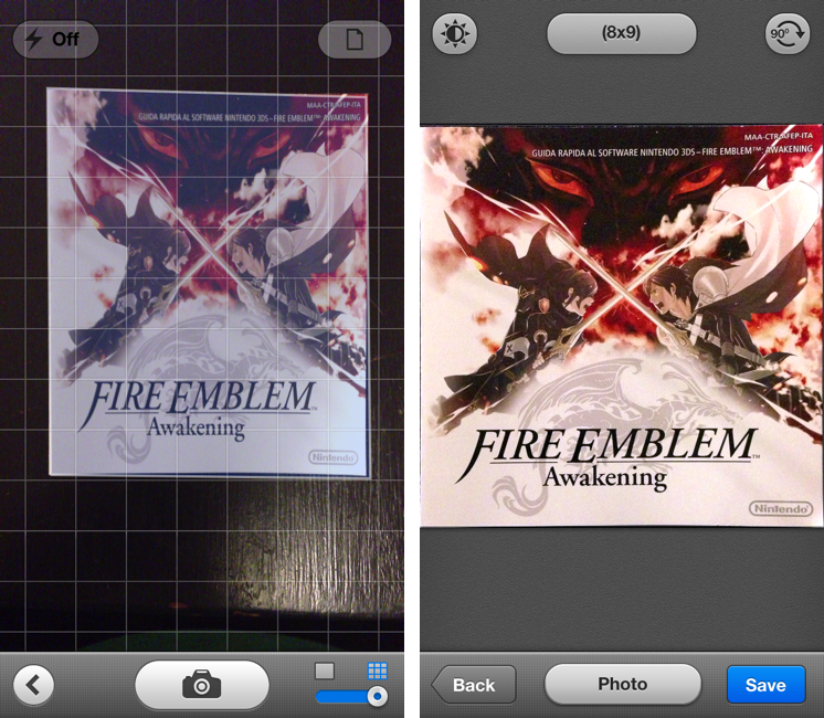
It used to be that Scanner Pro let you take a photo and adjust borders for cropping a document by manually moving a series of controls around the area you wanted to scan. Scanner Pro did a decent job at guessing where it should place the borders, but they still needed tweaking most of the time. In version 4.5, the Readdle team has completely reworked the algorithm behind border detection to make it smarter and bringing it into the camera view as well.

When taking a picture of a document, Scanner Pro 4.5 will overlay borders directly on top of the object, with impressive results. In my tests (a screenshot of which you can see above) Scanner Pro capably recognized borders of paper documents against dark and light backgrounds, in both normal and low-light conditions. Because borders are detected in real time, you can move objects or place other items in the shot and view borders update within a fraction of a second without leaving the camera view. It’s incredibly cool – but, fortunately considering the app’s utilitarian goal, also efficient.

While Scanner Pro tries to automatically detect borders and offer its best take in the Save screen, you can still tap Back to adjust borders manually. This is a welcome option – the app now defaults to the Save screen after a picture has been taken and processed, but you still want to retain manual control in case the new border detection algorithm doesn’t work properly.

It’s not a replacement for full-featured hardware such as Fujitsu’s ScanSnap, but for people who, like me, don’t have exorbitant amounts of paper to digitize every day, Readdle’s Scanner Pro remains a reliable, powerful iOS scanner app with tons of useful options. The new automatic border detection is a simple feature – but a handy one that’s uniquely suited for the iOS camera.

Scanner Pro 4.5 is available on the App Store.