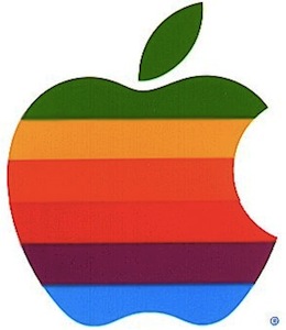
An Interview With The Designer Of The Apple Logo
Craig Grannel posted a transcript of his interview with the designer of the original Apple logo, Rob Janoff. Sorry to destroy all the theories about the logo:
What was the thinking behind the colour order of the stripes, and the ‘bite’?
There wasn’t a whole lot of hidden meaning behind the colours. The logo predates the gay-pride flag by about a year, so that wasn’t it—and there also goes the whole Alan Turing myth! The religious myths are just that too—there’s no ‘Eve and Garden of Eden’ and ‘bite from the fruit of knowledge’ symbolism!
I didn’t have much of a formal brief on the logo assignment, other than “don’t make it cute”. But I did know the selling points of the Apple Computer, and one of the biggest was colour capability. To me, that looked like colour bars on a monitor, which became the stripes in the logo. The order of the stripes, I’m sorry to say, had no particular grand plan other than I liked them that way. And, of course, the green stripe would be at the top where the leaf is.
The bite is really about scale and the common experience of biting into an apple. It was a happy accident that ‘byte’ is a computer term.
It’s just an Apple. [via The Brooks Review]


