Chance Miller, writing for 9to5Mac:
Twitter is rolling out an update to the official Twitter for iPad app that brings a much-needed interface redesign. With today’s update, Twitter for iPad now better takes advantage of the added screen real estate available on the iPad.
As first noted by _Applesfera_, Twitter for iPad now features a multi-column view that allows you to see quite a bit more information. Up until now, Twitter for iPad featured a single timeline of content, surrounded by white space on either side. This led to a lot of wasted space, particularly in landscape mode.
With this redesign, Twitter for iPad now looks and behaves more like the Twitter web app. The menu bar has moved from the bottom to the side of your timeline. On the other side of the timeline, you’ll now find trending topics and other dynamic content.
I’m intrigued by this redesign because, for the past several years, the Twitter app for iPad has offered one of the worst designs on the platform, with an oversized iPhone layout that took no advantage of the extra screen real estate provided by the iPad Pro.
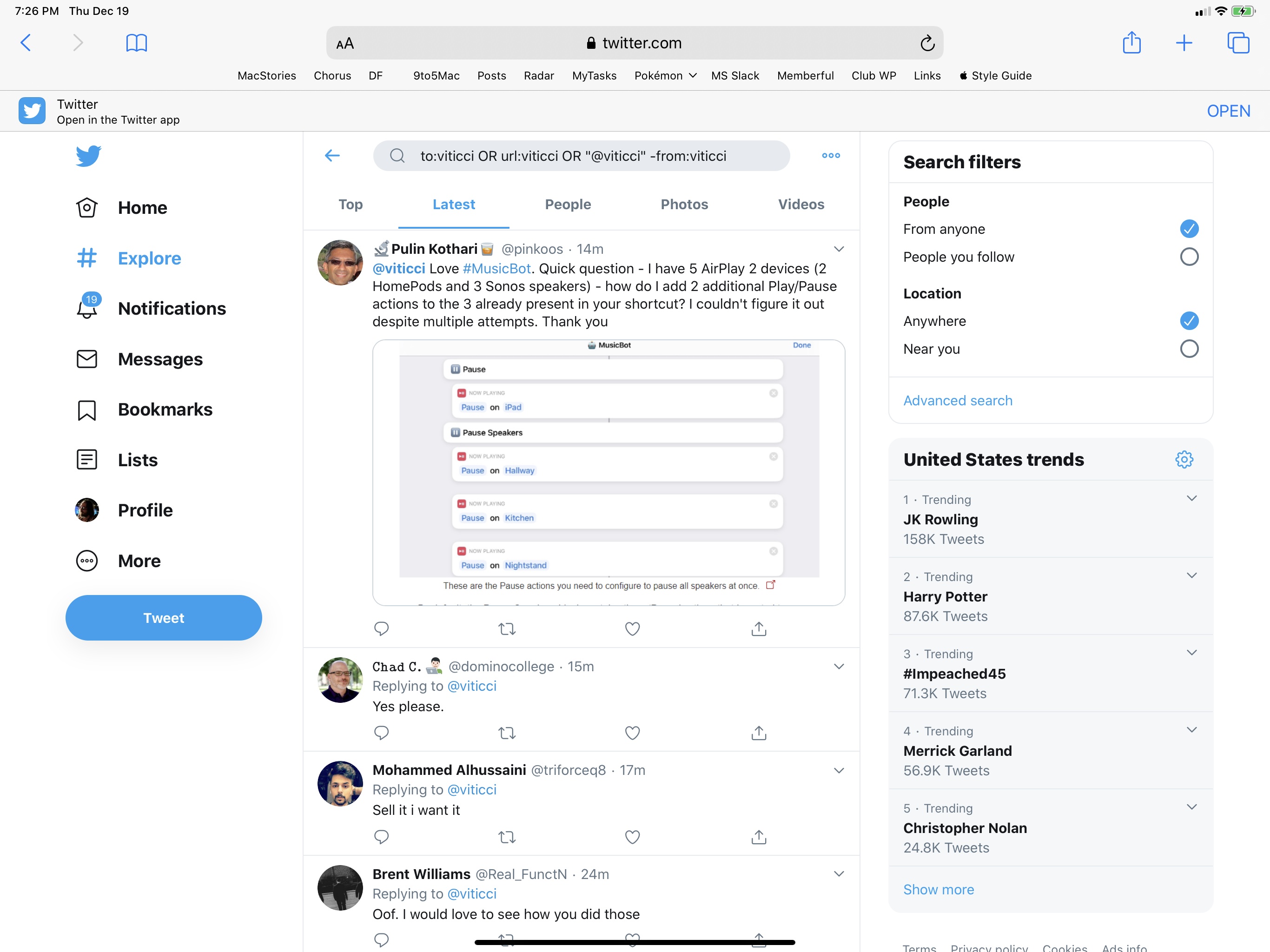
Looking at these early screenshots, I don’t love that Twitter is using the additional column for trends and search options – I’d rather have a customizable column (à la Tweetdeck) to display any kind of Twitter content. It would be great if the extra column could also show tweets from search results: for the past several months, I’ve been using a saved search to check out a complete timeline of my mentions; in theory, I should be be able to view my timeline and mentions at the same time by virtue of having two columns on iPad. Unfortunately, I think Twitter is just going to replicate the web app’s layout and use the additional column for search filters and trends (example) – tweets will always be displayed in the main timeline. If you compare the current Twitter web app running in Safari for iPadOS to the screenshots of the iPad app’s redesign, you’ll notice that they’re essentially using the same layout.
It looks like Twitter is A/B testing this redesign for now, and I don’t have it yet. I’m going to reserve judgement until I can actually play around with it, but if my interpretation is correct, this won’t bring true multi-column support to Twitter for iPad. Sadly, the original, groundbreaking, Loren Brichter-designed Twitter for iPad is still a distant memory.