More Club Gift Options Than Ever Before
The holiday season is upon us, and as you shop for gifts for friends and family, we wanted to remind everyone that Club MacStories memberships can be given as gifts all year long. Every tier of the Club extends what we publish at MacStories, which makes it the perfect gift for someone who wants more of the kind of in-depth app, automation, and other coverage you find on the site every day.
With Club MacStories, Club MacStories+, and Club Premier, we’ve got gift options for every budget this holiday season.
Pick a Plan
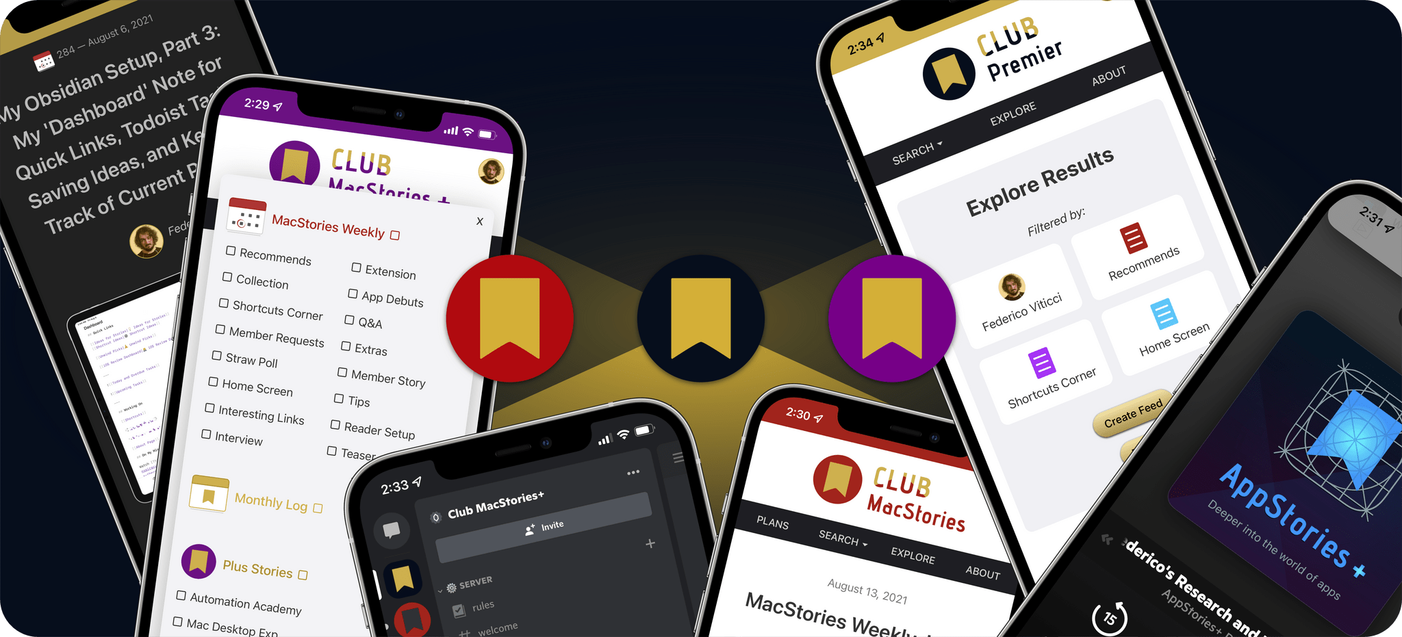
As always, Club MacStories delivers weekly and monthly newsletters by email and on the web, packed with our favorite apps, themed collections, tips, Shortcuts automations, and more. Club members also receive MacStories Unplugged, our monthly Club-only podcast, plus periodic giveaways, and downloadable exclusives like our annual iOS and iPadOS and macOS reviews.
Club MacStories+ adds to Club MacStories, with bonus content, a brand new, powerful web app to read Club articles on the web with advanced search and filtering, advanced RSS features, exclusive discounts, and our Discord community.
Club Premier is the ultimate plan that includes all of Club MacStories, Club MacStories+, and the new extended, ad-free AppStories+ podcast in a single package. It is the best value and the easiest way to get access to everything we do. It’s the MacStories all-access pass.
To learn more about each tier, visit plus.club.
Gift an Annual Plan Through November 30th, and Extend Your Own Membership by 3 Months
Gift accounts are available all year long. However, through November 30th, if you’re already a Club member at any tier and purchase an annual membership for someone as a gift, we’ll extend your membership three months.
The process is simple:
- Purchase an annual Club membership for someone
- Send us an email at [email protected] to let us know you gifted a membership and include the email address you use to log into the Club.
That’s it. We’ll confirm your gift purchase based on your Club email address and extend your membership for three months as a thank you from the MacStories team for helping spread the word about Club MacStories.
So, if you have a MacStories reader on your holiday shopping list this season, consider a Club MacStories membership that they can enjoy all year long.
Gift Memberships Are Available at All Tiers
Annual gift memberships can be purchased using the links below:
We also offer monthly gift memberships too, although they aren’t eligible for the special offer above, which can be purchased here:
Finally, thanks to all our loyal Club members who have joined since the Club’s debut in 2015. You’re an essential part of what we do here at MacStories, and we hope you’ve enjoyed the Club as much as we enjoy creating its special content for you all year long.
Happy Holidays!
– The MacStories Team