Posts in Linked

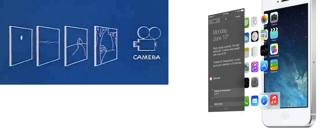
The Multiplane Camera

Manton Reece:

It’s a return to basics. Simple things can remain simple, readable. When clarity is needed, everything goes flat. But it’s a framework that allows for subtle motion and depth without changing what works about the new, content-first flat design. iOS 7’s control center blurs the layer below. The home screen background sits deeper too, as if only the app icons are touching the screen. Photos scroll under the navigation bar.

This is a smart take. Right now, it’s easy to dismiss the new physics and depth of iOS as gimmicks that won’t alter and benefit our daily experience in meaningful ways. But I really do believe that, with APIs for developers, we’ll start seeing interesting new ideas after the summer.

I’d also like to thank Marco Arment for linking to Disney’s explanation of the multiplane camera. The similarities, both in Disney’s description and blueprints, are curious:

Permalink


“Why You Got a New Phone?”

A great piece by Matt Drance.

This is a thought I wish I had in my article on iOS 7:

The emphasis on text is also striking. More than just content, text has replaced iconography in many cases. Look at Camera: the modes — VIDEO, PHOTO, SQUARE, PANO — are represented by text for the first time ever on iOS. This to me is proof that “clarity” has taken top priority. iOS is available in a number of countries and languages, which means every piece of text has to be localized (translated) many times over. This isn’t only time consuming, it’s disruptive to UI design: a short word in English is not necessarily short in German, and suddenly things don’t fit on screen anymore. I attended many meetings at Apple where people cringed at changing a word shortly before release, because it meant a whole new round of localize-then-build-then-test.

Apple still hasn’t seeded a developer beta of iOS 7 for iPad. Looking at one of the official screenshots posted online (the Music app, mirrored here), I wonder if more Apple apps for iPad will also prefer text over icons in tab bars.

Permalink

Skype Launches Video Messaging

Today, Skype has officially introduced a new feature called Video Messaging, which allows users to send video files to other contacts. Video Messaging, rolling out today to every platform (including iOS and OS X),  is aimed at letting users “record and share a personal video message, even when your friends and loved ones are not available”. Video Messaging is free for all Skype users.

Skype Video Messaging adds another great way to keep in touch with friends and family during life’s most meaningful moments. Send a video message to your friends and family today—it’s easy. You can capture a fleeting memory, create a heartfelt reminder or simply tell a friend or family member “wish you were here” even when they aren’t online.

Skype videos can be up to three minutes long, and they can be recorded directly from Skype’s apps. In a promotional video, Skype shows how users can record and re-record videos on the iPhone, previewing them before sending them to someone. Videos will be played inline on Skype for desktop computers, and users can also reply to a video message.

Updates to Skype for iOS and OS X will be released today to support video messaging. In the meantime, Skype has posted an official announcement and FAQ here.

Permalink

Apple Posts Letter On “Commitment to Customer Privacy”

Apple has today posted a lengthy public statement on how they handle customer data following allegations of involvement in the NSA-operated PRISM surveillance program. In the letter, Apple reiterates that they don’t provide any government agency with direct access to their servers, and that only the “narrowest possible set of information” is provided to the authorities after a court order and an evaluation of Apple’s Legal team.

Apple writes:

From December 1, 2012 to May 31, 2013, Apple received between 4,000 and 5,000 requests from U.S. law enforcement for customer data. Between 9,000 and 10,000 accounts or devices were specified in those requests, which came from federal, state and local authorities and included both criminal investigations and national security matters. The most common form of request comes from police investigating robberies and other crimes, searching for missing children, trying to locate a patient with Alzheimer’s disease, or hoping to prevent a suicide.

Apple also explains that they don’t mantain a “mountain of personal details about our customers in the first place”.

For example, conversations which take place over iMessage and FaceTime are protected by end-to-end encryption so no one but the sender and receiver can see or read them. Apple cannot decrypt that data. Similarly, we do not store data related to customers’ location, Map searches or Siri requests in any identifiable form.

Apple’s letter is available here, and it’s linked directly on Apple.com’s front page as well.

Permalink

I Wouldn’t Mod the New AirPort Extreme

9to5Mac ran a quick piece this morning about hacking the new AirPort Extreme. Apparently Apple kept the hard drive caddy in place for the new AirPort Time Capsule, but left out any internal connectors.

In the worst ‘case’ scenario, DIYers could use the USB port and wire a bus-powered 2.5 inch hard drive (up to 2TB currently) or SSD around inside the case.

Don’t do this. You don’t really save a lot of money (if any by the time you paid shipping for a new 2TB HDD and USB compatible cable), and then you’d be using up an available USB slot that could be used for other things, like even more storage or a USB printer. If you want a hard drive, just pay more upfront for the AirPort Time Capsule.

Permalink

Flatness and the Dimensionality of iOS 7

David Cole, product designer at Quora, writes:

The big, obvious change to the look in iOS 7 is the flatness. This change is being characterized as a stripping away of dimensionality. I’ll propose something else is going on here: the move to flat screens actually affords a ramp up in dimensionality. When an individual screen gets flattened together, you can treat it as a single object that you can then manipulate and relate to other screens. This concept is at the heart of the biggest changes to the iOS 7 interaction paradigms.

Permalink

Matt Gemmell Compares iOS 7 To iOS 6

The smear of murky tones across the lower-right half of the iOS 6 grid is replaced with whites and a few light blues on iOS 7. Similarly, iOS 6’s handful of different visual styles (and several eccentric outliers) have become essentially two main themes on iOS 7: the paper-like, bright style in about 75% of apps, and the dark utility style for the remainder.

A great piece by Matt, especially in his thoughts on “flatness” and “brightening”. The pixelated screenshot comparison shows just how striking the difference between iOS 6 and iOS 7 is.

Permalink

The iOS 7 App Store Opportunity

Marco Arment has a good take on what iOS 7 represents for developers: a huge opportunity to differentiate apps that will inevitably remain stuck on iOS 6 from those that will embrace iOS 7’s new modern approach later this year.

As I wrote today, it’ll be interesting to see how developers of existing apps will adapt to iOS 7’s dramatic reimagination of the OS. I do believe that many will try an in-between approach to a) keep their identity in the jump to iOS 7 or b) target both iOS 6 and iOS 7 with separate interfaces. I either case, I don’t think that’s a great solution. And, I am curious to see how long it’ll take designers and developers to exclusively target iOS 7 with different, custom interfaces – as many have done in the past five years.

I’m also thinking about how the App Store team will handle the transition from iOS 6 to iOS 7, which should coincide with Apple reaching the 1 million apps milestone (I was off by < 100,000 apps). Aside from App Store improvements that I mentioned in the past, I believe Apple should find a way to clearly promote and organize apps that have been built exclusively for iOS 7. The new OS isn’t just tweaking functionalities or refining some UI elements; I find it hard to envision an App Store that doesn’t make any distinction between “classic” and “modern” apps.

In the past, Apple launched App Store sections for apps taking advantage of new OSes or hardware features, and I’m wondering if, with 1 million iOS apps, differentiation between iOS 6 and iOS 7 should deserve another simple section or something more advanced like search filters, “made for iOS 7” badges, or new editorial efforts from the App Store team.

Properly promoting and organizing iOS 7 apps on the Store can benefit Apple, its users, and third-party developers. The App Store’s back catalog isn’t a new topic of discussion, but with iOS 7 and six zeros getting closer, it’s worth reconsidering it.

Permalink