As we discussed in our OS X Lion review, Apple’s latest operating system is an evolutionary step forward, a milestone in the company’s desktop software history that innovates old concepts and user interactions by bringing some of the features and design schemes seen on iOS devices to the Mac’s bigger screen. There is a subtle difference though: whereas most people would think Apple is “stealing” from iOS, building on the success of the iPhone and iPad (now a bigger business than desktop computers) to sell more Macs, Lion does in fact prove that the roots of OS X are still strong, but looking for a cohesive integration with the seeds planted on mobile. As Cody wrote in his review “Apple weaved our working knowledge of gestures and interfaces into the Mac to capitalize on our intuition” – Lion isn’t a glamorous iOS. Lion is an evolution of the OS X we know and use, and the changes made to the operating system are immediately visible in the interface.
Lion doesn’t look like iOS. If anything, Apple has tweaked the Aqua interface to achieve the same elegance, minimalism and focus on content first conceptualized on the iPhone, but it’s far from being an iOS clone. With Lion, Apple hasn’t ported iOS’ design principles to the Mac – they took the best parts of a mobile interface that they thought would also make sense on the desktop, and managed to make it work. The changes in Lion – both design-wise and feature-wise – never feel like forced additions that are weird to use and be familiar with. Rather, they’re subtle improvements that will make you wonder why they weren’t implemented before.
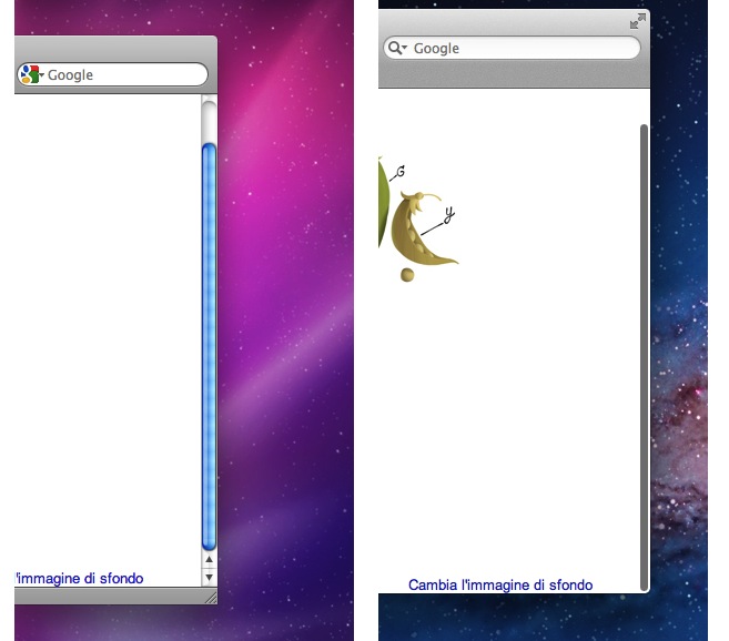
Take the scrolling system for example. As we reported last year, Apple’s intention was to eliminate the scrolling system of Snow Leopard (and all versions of OS X before that) to completely rewrite the engine with the same approach they took on iOS: natural scrolling, no visible scrollbars, rubber-banding, and no scrollbar alleys. As our Macs are increasingly becoming touch-enabled with built-in or external trackpads and multi-touch mice, the engineers at Apple likely asked themselves “Why do we have to keep using this?”. And so they removed the classic Aqua-blue scrollbar. Instead, they implemented the same scrolling method that made reading and interacting with the iPhone a real pleasure: the scrollbar is now a narrow, almost invisible and translucent bar that only appears when you actually scroll. It’s not always there. When you’re done scrolling – because you’re reading, or doing something else entirely that doesn’t require your finger’s movement – the scrollbar disappears.
By focusing on the content, rather than the graphical interface around it, Apple wants to convey a simple yet important message: it’s not the window that matters, it’s what’s inside that window. Whilst previous versions of OS X put huge emphasis on your position inside a document, or a webpage, Lion takes an interesting spin in that your position inside a document doesn’t really matter until you act on that position. Meaning, you only need to know where you are when you move from where you currently are. It didn’t make sense to put a scrollbar on the iPhone’s small screen, but it turns out the same concept might live on just fine on the desktop, too. We could obviously argue for hours on the benefits and disadvantages of such a practice, but I digress. As far as the interface design goes, Lion’s scrollbars are just what they are: translucent bars that show up on screen when you initiate a scroll.
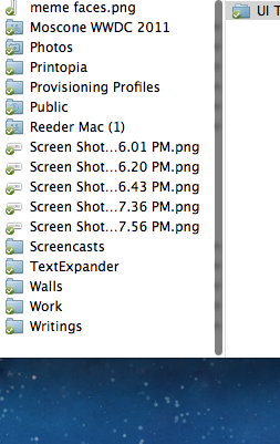
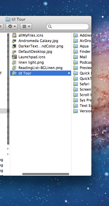
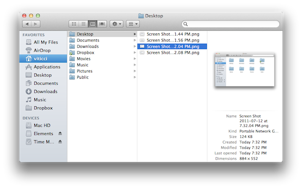
Some apps already work well with them, others will need to be updated to fully support them, but overall, the big graphical changes end at the fact that the scrollbar simply stays on top of content, and this can be particularly annoying (or simply “different”) in some areas like the Finder’s column view, when you’re scrolling and navigating between folders. The scrollbar will appear on top of a folder’s navigation icon.
Lion on the right.
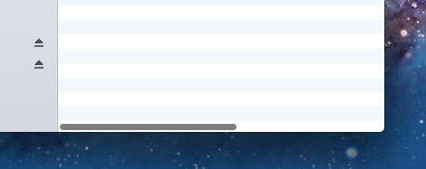
Horizontal scrollbars, too.
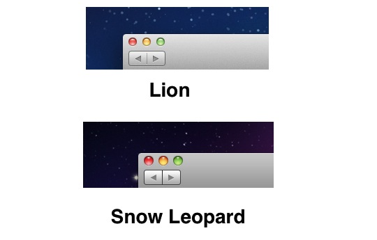
The most visible change in OS X Lion isn’t the scrollbar per sè, it’s the refined Aqua interface that, among other things, incorporates a new minimal scrolling look. On Leopard and Snow Leopard, Aqua tried to get away from Tiger’s heavily rounded, glossy and hyper-fashioned (at least back then) buttons and menus with a more subtle implementation of said menus, checkboxes, radio buttons, and rounded corners. Similarly, Apple killed Tiger’s shadowed “traffic light” red/yellow/green buttons in favor of a more flat (but still glossy) look that played well with the OS’ matte gray toolbar. On Lion, everything becomes even more subtle and flat, with less glossy and more white instead of blue, less prominent toolbar buttons and an overall feeling of “softness” that follows the aesthetic principle of an operating system made to focus on the content rather than the chrome.
From Cody’s review:
Rounded buttons have been replaced with rectangular buttons that no longer feel antiquated. The Launchpad blankets the desktop with frosted glass that purposely highlights your installed applications with tremendous detail. From the login screen to Mission Control, linen patterns line Lion as windows fade in and out of view.
Lion is gratuitously decorated with comfortable pillows on top of beautiful linen covers.
Lion doesn’t feel antiquated at all – thanks to the faster computers we have now – with Flash memory and more RAM, not to mention 64-bit support – the interface feels modern, easy to use, responsive, lightweight, and snappy. The Launchpad and Mission Control are heavy on fancy effects such as transparencies and live-updating thumbnails, but there hasn’t been a single time in Lion I wished Apple did less with interface design choices to make room for a simpler but likely faster OS. We don’t have these problems anymore. The user interface doesn’t get in the way and doesn’t interfere with the OS – at this point, it’s just a matter of taste and user experience. [Here’s a great read: an interview with John Gruber from 2005 in which he discusses some of the aforementioned issues with a heavy interface and the OS]
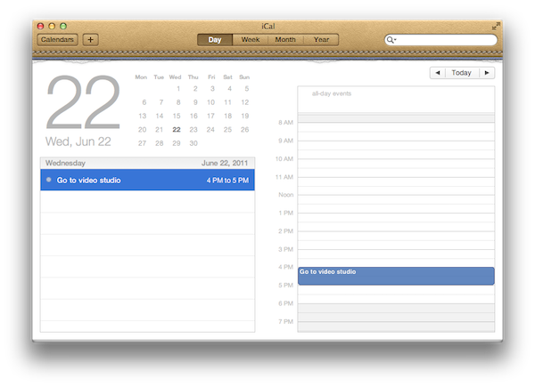
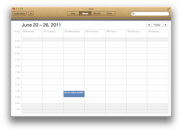
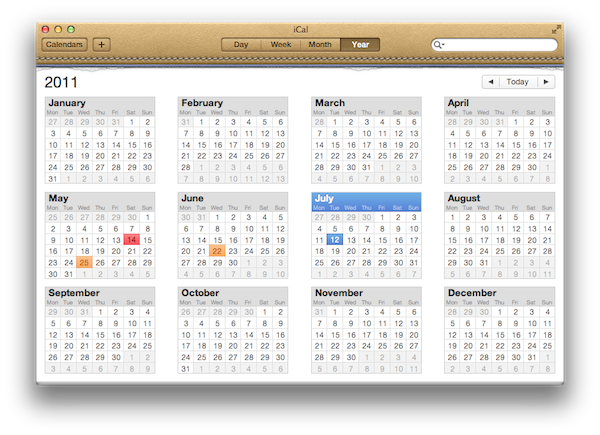
So what’s not to like about Lion? Those who preferred Apple’s simpler approach at digital interfaces could raise an eyebrow at the new texture applied on Aqua’s default window, which makes buttons look more “touchable” in my opinion, but may as well look like an extra step towards the recent skeuomorphic trend in UI design aimed at making things look “real” or familiar with real-life objects; on the other hand, the new iCal will simply end up unused by many because of its “trying too hard” issue with replicating bits of torn paper, leather material, stitches, and day planners we don’t really use much nowadays. The design is excellent (so is the new Address Book), with the only downside being that geeks will grow tired of it. The average iOS user coming to the Mac for the first time will probably love the new iCal and Address Book – those who have been on OS X for years and care about simplicity more than a striking resemblance with real leather, not so much.
In this article, I’ve collected a series of screenshots showing Aqua’s old and updated controls and graphical elements, such as buttons, menus, windows, sidebar icons, and tabs. I’ve also inserted other screenshots highlighting some of the most important changes in system apps like Finder, Safari, and iCal.
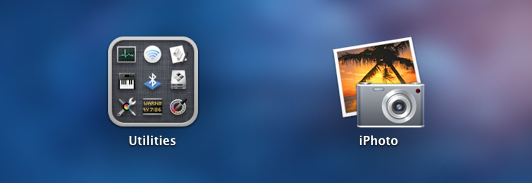
Monochromatic icons in action on Lion. This is one of Apple’s recent standards for Mac apps- it was first experimented with iTunes, and recently applied system-wide and to apps like iPhoto.
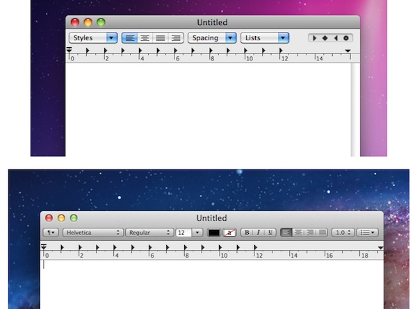
Above: the old Vs. new TextEdit.
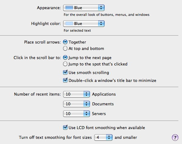
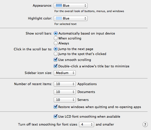
Lion on the right. Notice how Aqua’s blue is gone from the slider, or the dropdown menu’s arrows. There are less drop-shadows, too.
Snow Leopard’s Aqua controls.
Lion’s Aqua controls.
The new tab controls in Lion have a “pressed” state for the selected tab.
The bottom corner of a Finder window with no toolbar.
Lion’s inactive window state.
Snow Leopard’s inactive window state.
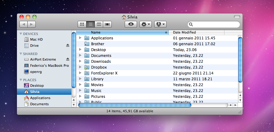
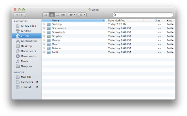
The Finder has been much improved as we saw in our review, but design-wise it looks pretty much the same, only with Lion’s new skin applied to the main window. Here’s an “old” Finder in Snow Leopard, with multiple scrollbars displayed on screen:
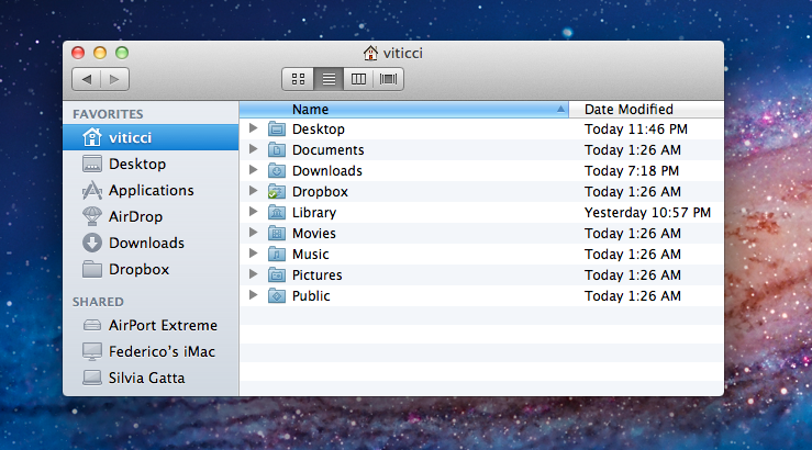
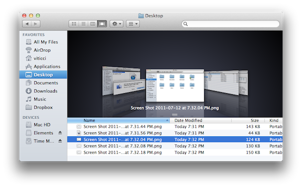
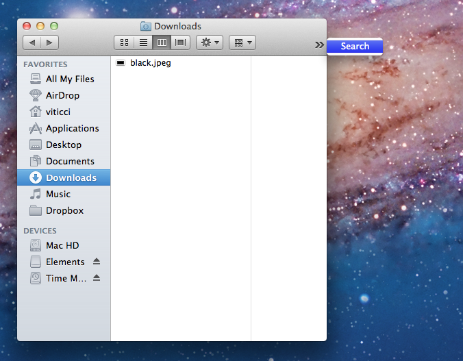
And below is a similar view on Lion. New window style, new traffic light and toolbar buttons, no status bar (it can be enabled), subtle stripes, lighter blue on the window headers, monochromatic icons.
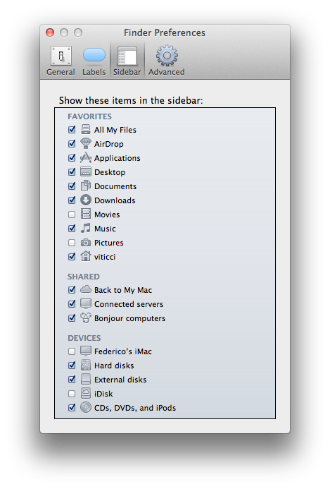
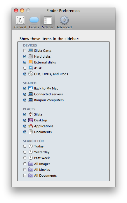
Monochromatic icons can be configured from the Finder’s Preferences.
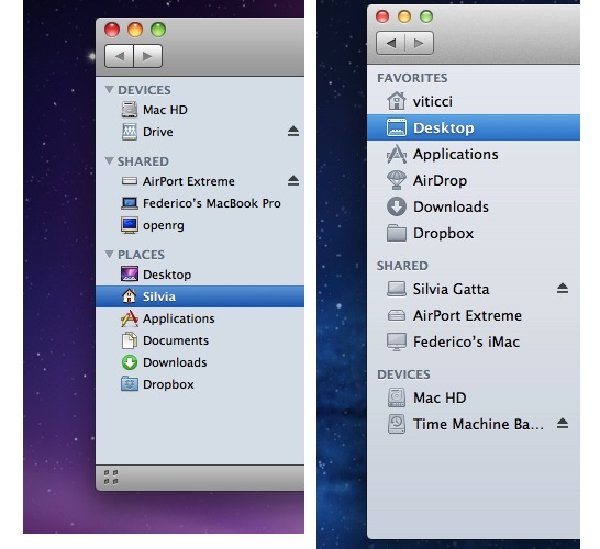
On the other hand, Snow Leopard came with colored sidebar icons.
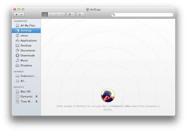
AirDrop, a new file sharing functionality in Lion, features a light gray background with rounded profile avatars – these same profile pictures are used consistently in the OS, for example in the new login screen (which combines dark linen, rounded avatars and white menubar icons on top of linen).
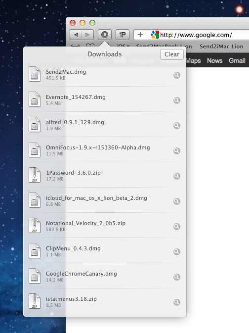
Safari has gained a new Downloads popover that uses Quick Look’s new white design to display downloaded files (with associated file icons) against a semi-transparent background. The shape of the popover is inspired by the iPad’s iOS.
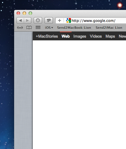
Safari on Lion has a different linen pattern than Mission Control or the system’s login screen. It’s lighter and more subtle, and it can be appreciated when navigating between webpages with the new gestures.
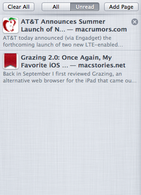
It’s also the same linen background used for the Reading List, also in Safari. For some reason, Apple decided to fetch a scaled-up version of websites’ favicons in the Reading List, thus making them pixelated and awful to look at. You can also notice another implementation of Lion’s new tab controls in the screenshots below.
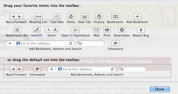
Safari’s toolbar can be customized with buttons that are consistent with the system in their flat and “touchable” look.
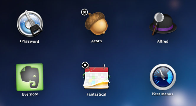
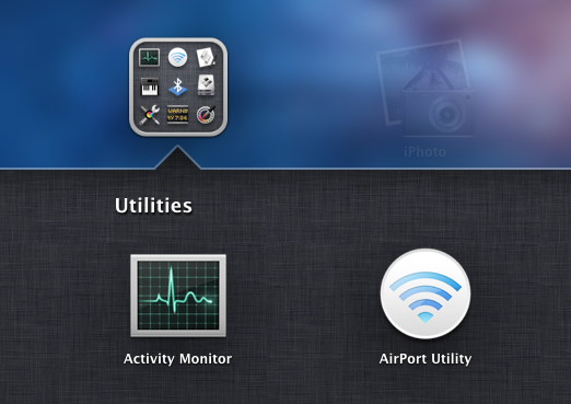
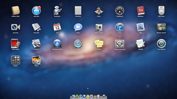
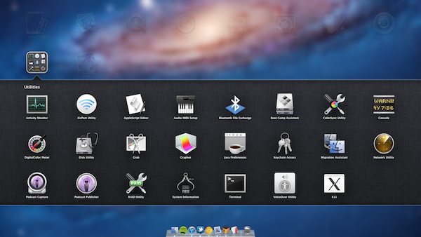
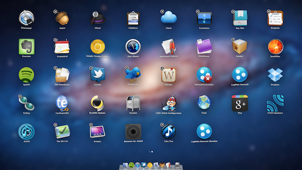
The Launchpad is heavily inspired by iOS, so here’s a series of screenshots that show the similarities in greater detail, from the folders to delete icon in “wiggle mode”. You can read more about Launchpad in our OS X Lion review.
iCal went some through big interface changes in Lion, and many won’t like them – not because of the inefficiencies of the app, I think it’s more of a problem with the fact that whereas Lion’s general focus is on content, iCal (and Address Book with it) seem to care more about the looks. To begin, here’s the top section of iCal on Snow Leopard:
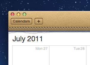
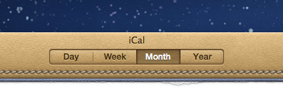
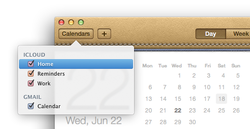
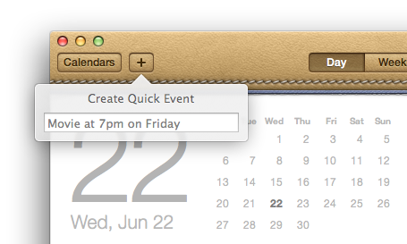
And here’s the same top section on Lion. A Year view has been added to the tab bar controller, calendars are now listed inside a popover accessible from a button in the toolbar, new events can be created using “natural language input” from another popover. Gone is the simple gray window, and welcome our new leather overlord.
Popovers in iCal.
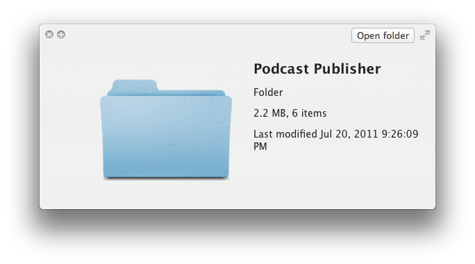
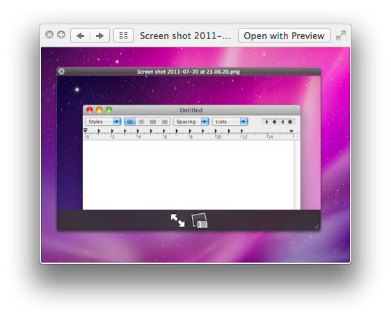
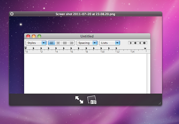
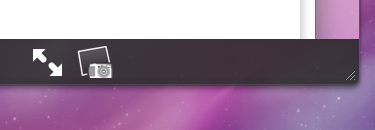
Quick Look went under a complete rewrite on Lion. Functionality aside, the new quick previewing system gains a white look that greatly contributes to enhancing the content you’re previewing, and the new system button to enter full-screen mode.
For comparison, here’s the old translucent black Quick Look from Snow Leopard.
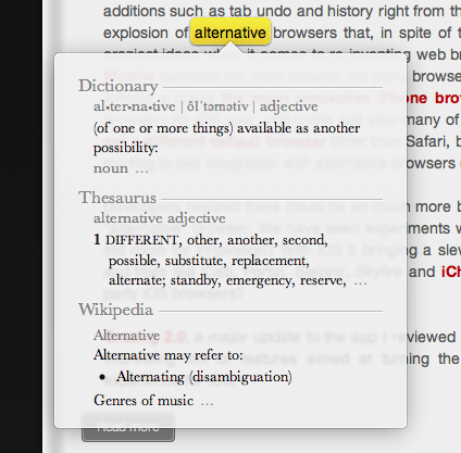
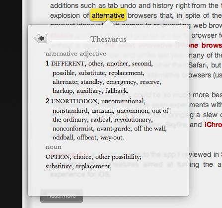
Last, one of my new favorite features in Lion is the system-wide Dictionary plugin. It can be activated with a three-finger double tap on any word, and it retains the new Quick Look style with a light appearance and semi-transparent window. The back button in the second screenshot seems to be inspired by iOS, only smaller.


