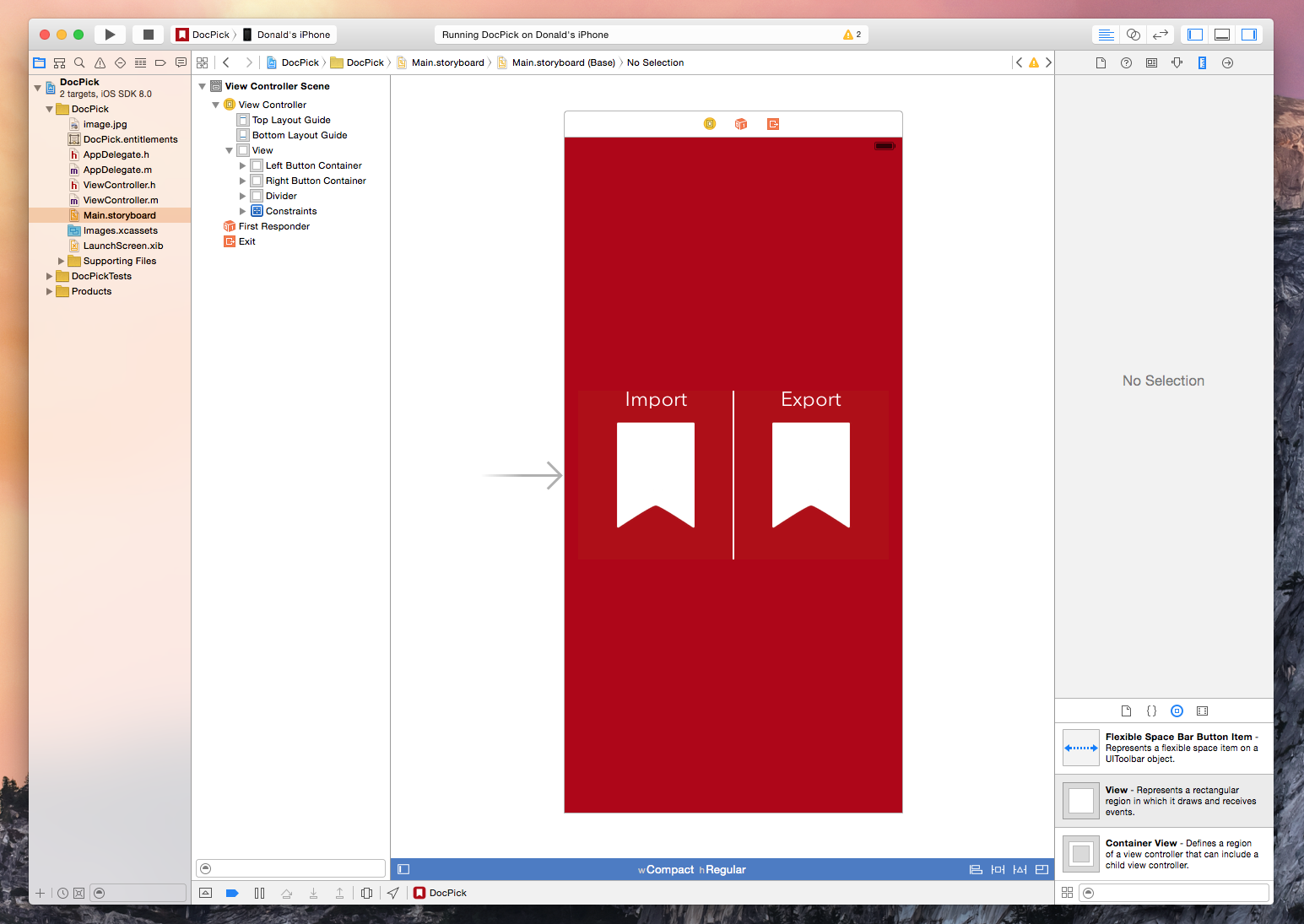
The new document picker and provider functionality in iOS 8 is exciting technology because it expands on the possibilities of what we are capable of doing with our devices. We are already seeing a flood of great apps integrating document pickers and extensions from developers like Dropbox, Panic, and Readdle. I recently had the need for the new UIDocumentPicker functionality so I decided to dive in and see what it takes to implement the feature. As it turns out, getting a basic implementation is extremely easy and only requires a few lines of code. Of course, this is well documented by Apple and seasoned developers will have no problems implementing a picker but for us noobs it helps to see the process laid out – so here is a brief walkthrough.
Xcode 6: Live Rendering, Visual View Debugging, and Swift
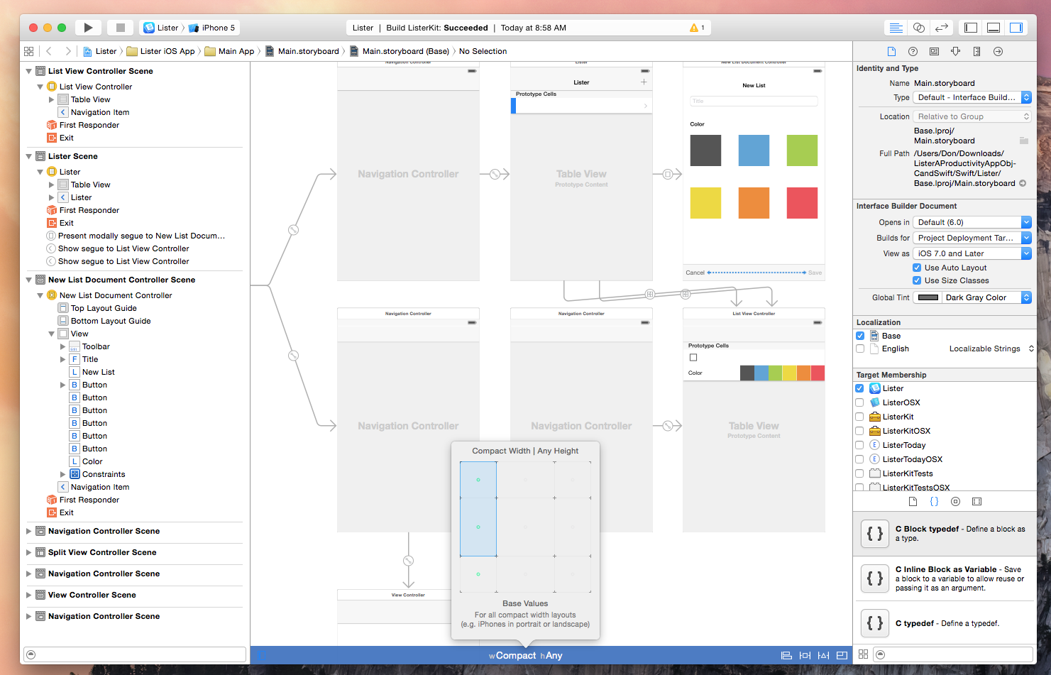
Xcode is the development environment that Apple supplies to the community for creating Mac and iOS apps. Those familiar with the tool will likely agree that working with previous versions have been nothing short of a love/hate relationship. After any update, Xcode’s quirks and crashes are never far behind, however it is one utility that Mac and iOS developers simply could not live without.
Xcode 6 brings exciting new features and enhancements including support for an entirely new programming language, improved view debugging, live view rendering, extensions, playgrounds, and more.
OmniFocus 2 for iPad: Redesigned, Extensions, and Background Sync
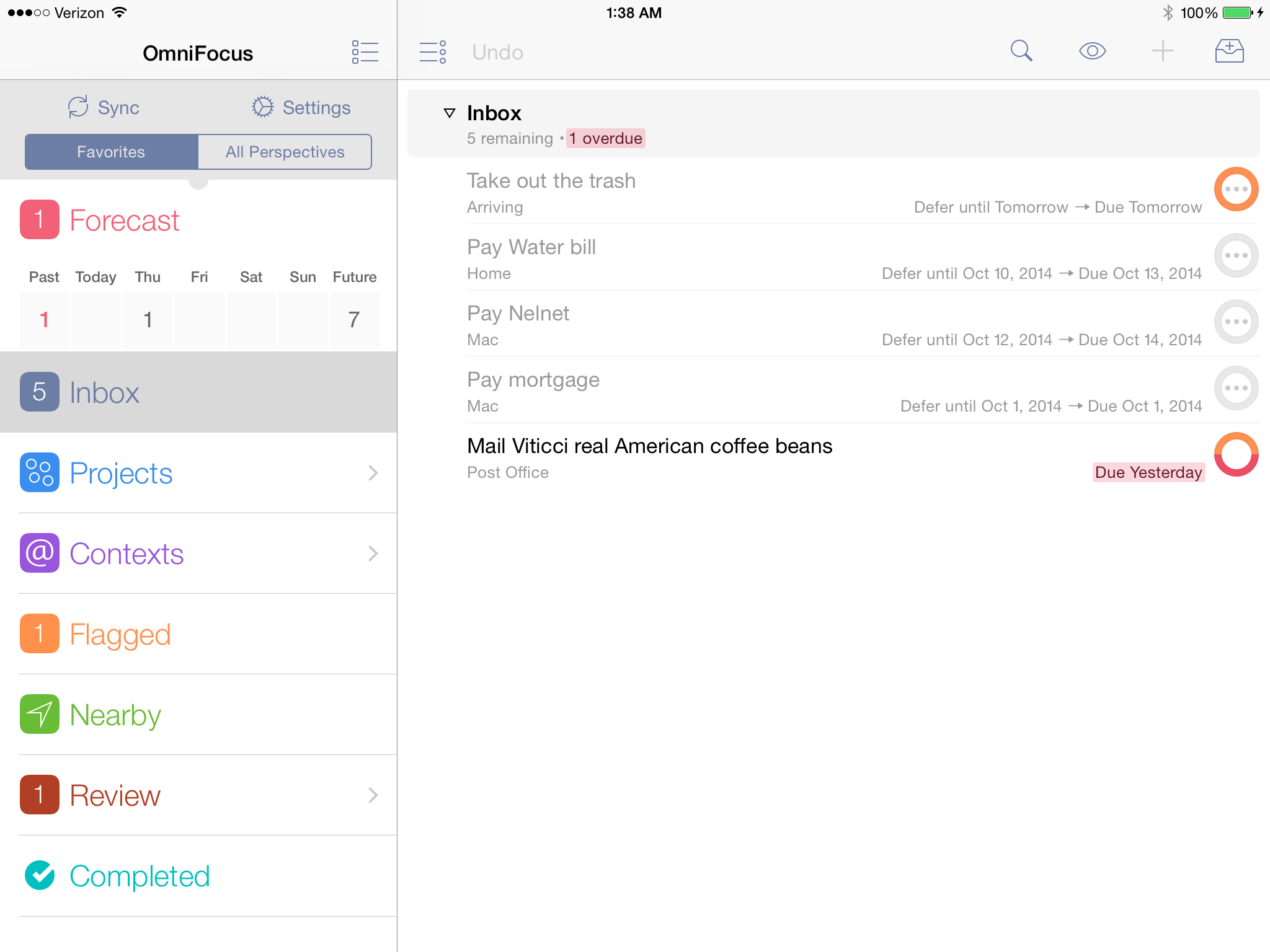
Today the Omni Group released the third and final installment of OmniFocus – OmniFocus 2 for iPad. I call it an installment because although OmniFocus is a standalone product for both Mac and iOS, it truly excels when used as a cross-platform task management solution. Current OmniFocus users like myself have been paitently waiting to replace our overly textured iOS 6-reminiscent iPad versions with something more suitable for the ecosystem of iOS 7 and beyond.
Apple Introduces More Competitive iCloud Pricing

As noted by 512 Pixels, Apple confirmed new iCloud pricing in the official iOS 8 press release today. These new pricing tiers are a substantial drop from Apple’s previous annual storage upgrade pricing model.
The new pricing is as follows:
- 5GB for free
- 20GB at $0.99/month
- 200GB at $3.99/month
- 500GB at $9.99/month
- 1TB at $19.99/month
As interesting as these slashed price tags are, Apple is still competing with companies like Dropbox, who are currently giving away a terabyte of space for only $10 a month. Apple’s edge in this market is definitely going to be their deep integration with the many upcoming features in iOS 8 that rely so heavily on cloud storage, such as the upcoming iCloud Drive.
You can read more about iCloud’s new plans on Apple.com.
For more coverage, check out our September 9 news hub and follow @macstoriesnet on Twitter.
Apple Aims to Revolutionize Payments with Apple Pay
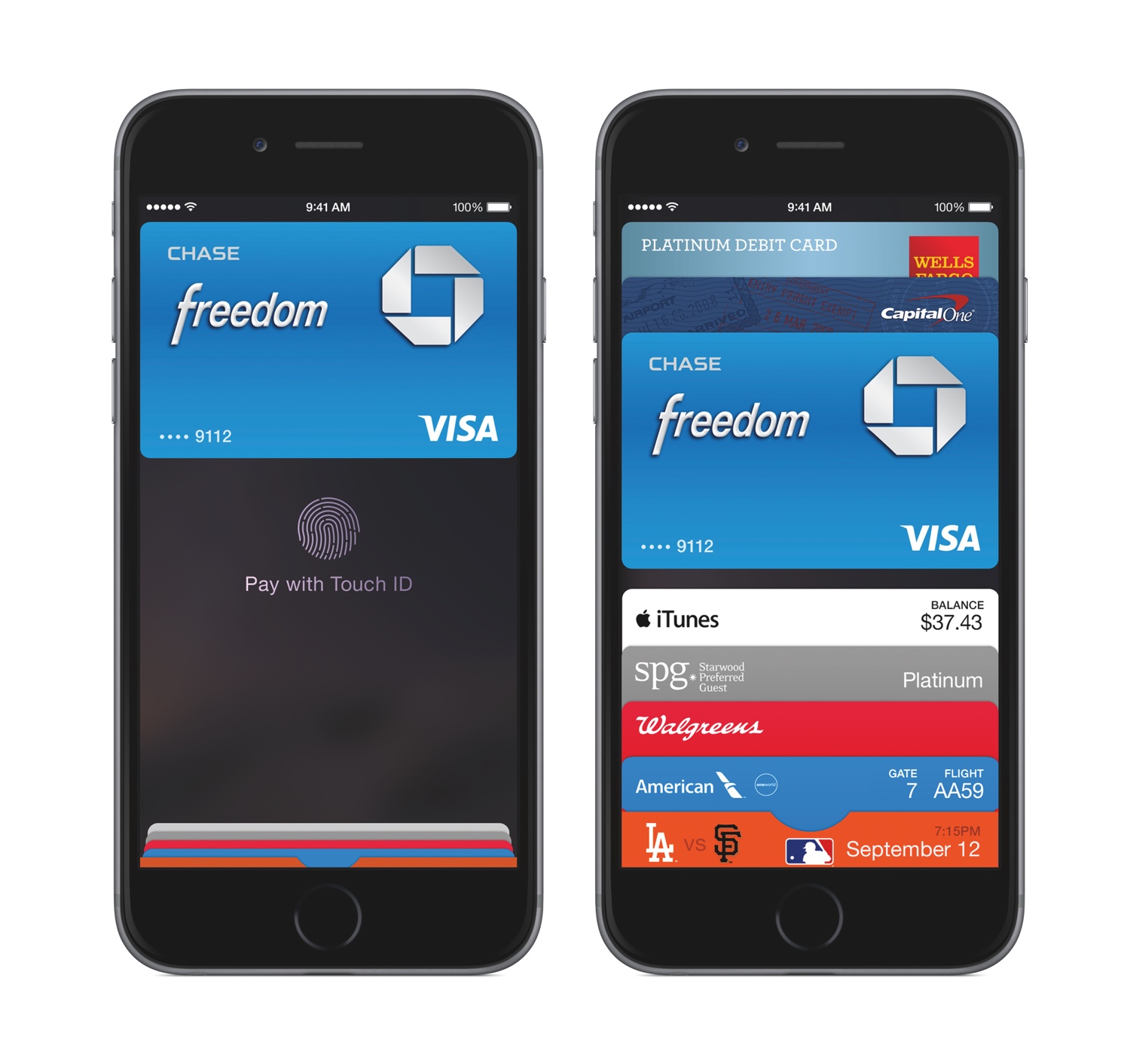
Apple announced an entirely new category of service at today’s event called Apple Pay, which the company is hoping will make reaching for your wallet a gesture of the past.
iPhone 6 and iPhone 6 Plus: Our Complete Overview
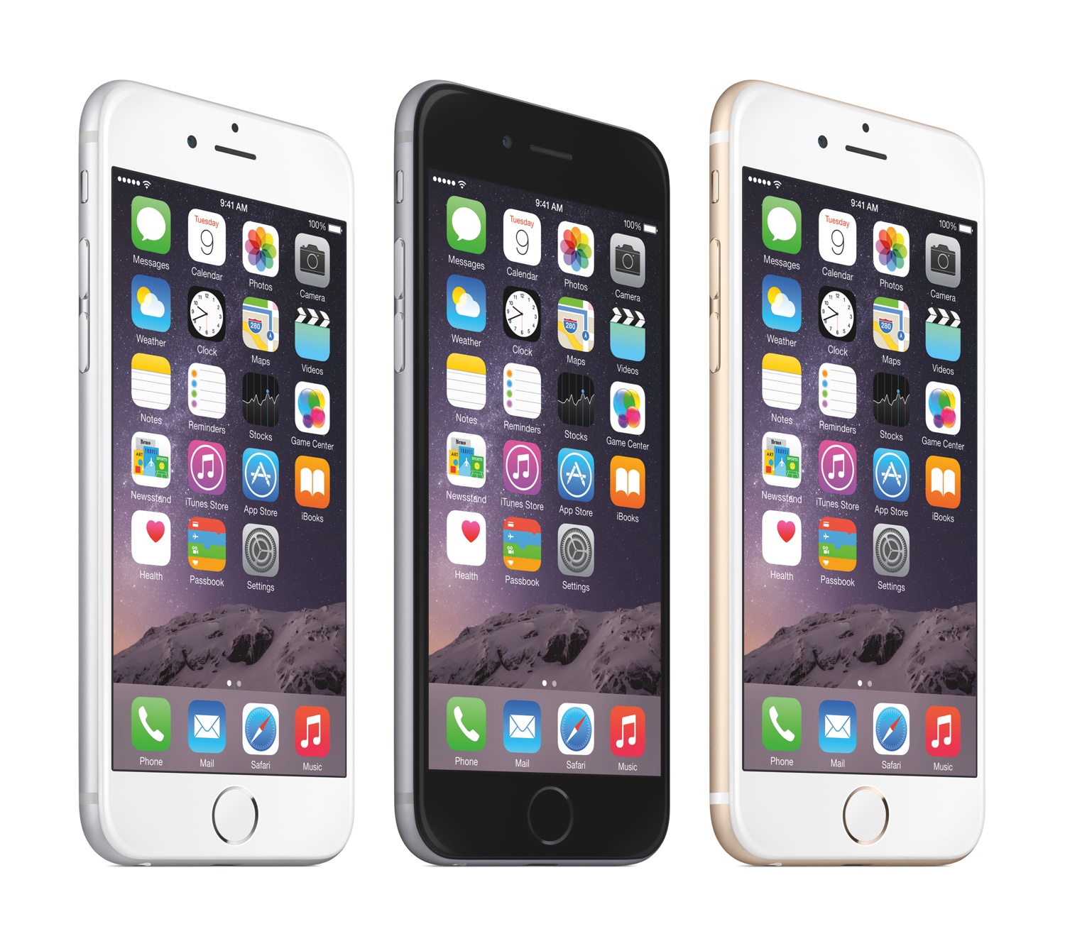
Today’s Apple event at the Flint Center in Cupertino was a whirlwind of powerful announcements surrounding the company’s line of iPhone products. After walking up on stage, Apple’s CEO Tim Cook announced the brand new iPhone 6 and iPhone 6 Plus.
“iPhone 6 and iPhone 6 Plus are the biggest advancements in iPhone history,” said Tim Cook, Apple’s CEO. “The iPhone is the most loved smartphone in the world with the highest customer satisfaction in the industry and we are making it much better in every way. Only Apple can combine the best hardware, software and services at this unprecedented level and we think customers are going to love it.”
Senior Vice President Phil Schiller then took the stage to run through the iPhone 6 enhancements at a swift pace. For the first time, Apple is simultaneously releasing multiple screen sizes – the iPhone will be available in a 4.7” and a 5.5” version. These phones will be technologically similar, varying only in screen resolution and slight camera model differences. They will sport a more powerful A8 64bit processor, larger Retina HD screen, and NFC technology for using the brand new Apple Pay service.
Read more
PaintCode: Vector Drawing to Code
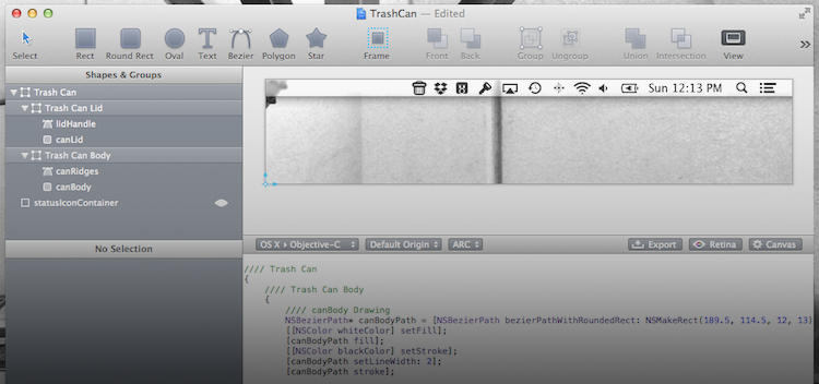
If you are active in the Apple developer community, you are probably already familiar with PaintCode. It is a unique Mac app capable of turning your vector graphic design into pure Objective-C code. PaintCode is a professional quality app and the price tag is a reflection of that fact. The normal selling price of $99.99 (currently $19.99 via MacHeist) is a big pill to swallow for the average user but for a professional iOS/OS X developer it is merely a business investment. However, it is up to you to get your money’s worth out of the app.
PaintCode is full of tools that blend together the look and feel of traditional vector drawing apps while including customizable fields you would more commonly see in Apple’s Interface Builder. It supports numerous object shapes and custom bezier paths, as well as detailed color options including linear and radial gradients. The app is versatile and the uses are limited only by your imagination.
I thought the best way to give you an overview of PaintCode would be to come up with a sample project that I could walk you through. So I decided to make a menubar icon for a non-existent app. This app lets you drag files to the menubar icon to delete them, thus the icon needs to be a little trash can. Read more
AppleScript, Automator, and Automation Improvements in Mavericks
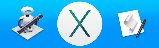
I have been using Mavericks for a little while now and I have to admit that I was a little slow to get excited about this release of OS X. Once I started to sink my teeth into some of the power-user features, though, it didn’t take long for me to really get sucked into trying out every new geeky addition, specifically all of the new AppleScript features.
I will be the first to admit that AppleScript is not my favorite language and I only ever use it when I absolutely have to, but, with the release of Mavericks, Apple has added some very compelling reasons to give it another chance. I was recently discussing AppleScript with a developer friend of mine, and we agreed that since Apple had begun stripping out some script-related functionality of core apps like iTunes, it would not be surprising if the language was slowly phased out of any upcoming OS releases. However, I was wrong. In a surprising turn of events, Apple decided to breath new life into AppleScript and make it easier than ever to write clean and reusable scripts. Read more
OmniFocus 2 for iPhone: Background Sync and a Bold Redesign
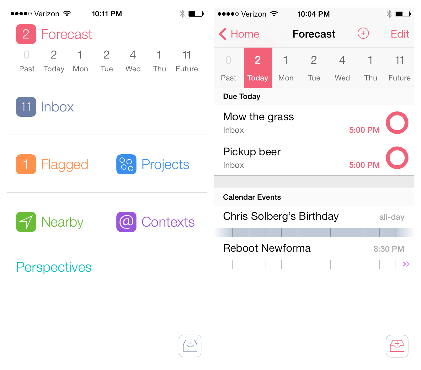
When I pictured what OmniFocus 2 for the iPhone would look like on iOS 7, I pictured simplified monotone icons in a table-view structure that the app has had since it was first released. The reason is probably because when I think of OmniFocus I think of powerful and quality software, however a bold interface is not a characteristic that would ever come to mind. When I opened OmniFocus 2 for the first time, I was shocked. Not to sound dramatic – I did not fall out of my chair – but it honestly took me a few seconds to absorb what I was looking at. Read more