This Week's Sponsor:

Kolide

Ensures that if a device isn’t secure it can’t access your apps.  It’s Device Trust for Okta.


Posts tagged with "iPadOS"

Faking ‘Clamshell Mode’ with External Displays in iPadOS 17

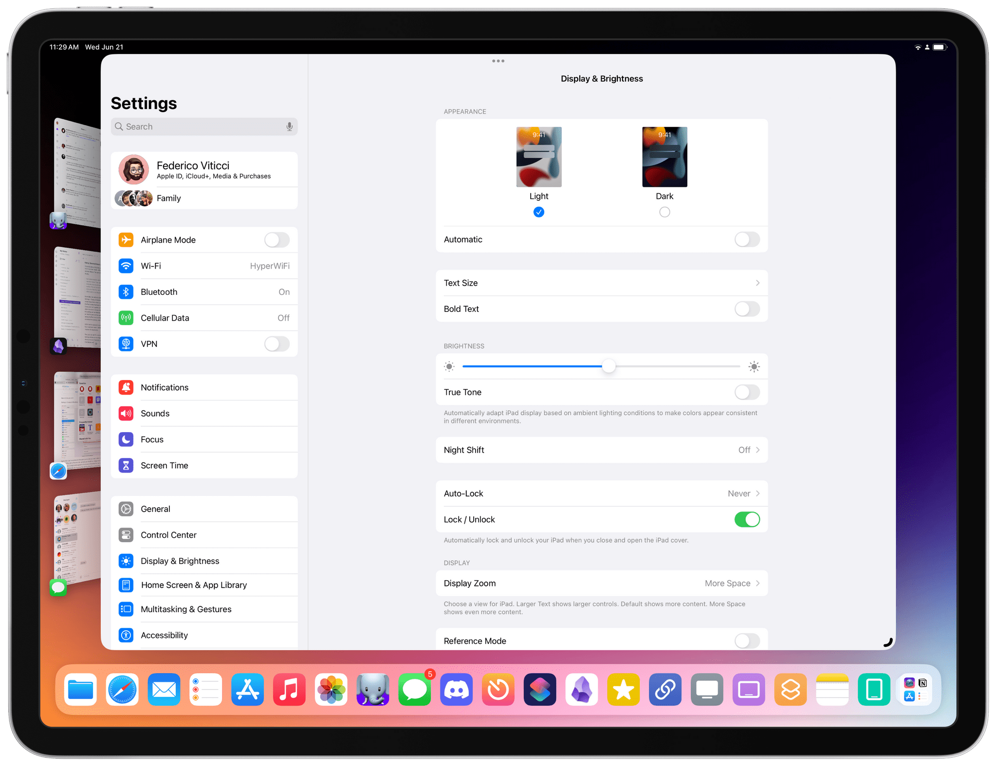
A simple setting can be used as a workaround for clamshell mode in iPadOS 17.

A simple setting can be used as a workaround for clamshell mode in iPadOS 17.

Fernando Silva of 9to5Mac came up with a clever workaround to have ‘clamshell mode’ in iPadOS 17 when an iPad is connected to an external display. The catch: it doesn’t really turn off the iPad’s built-in display.

Now before readers start spamming the comments, this is not true clamshell mode. True clamshell mode kills the screen of the host computer and moves everything from that display to the external monitor. This will not do that. But this workaround will allow you to close your iPad Pro, connect a Bluetooth keyboard and mouse, and still be able to use Stage Manager on an external display.

Essentially, the method involves disabling the ‘Lock / Unlock’ toggle in Settings ⇾ Display & Brightness that controls whether the iPad’s screen should lock when a cover is closed on top of it. This has been the iPad’s default behavior since the iPad 2 and the debut of the Smart Cover, and it still applies to the latest iPad Pro and Magic Keyboard: when the cover is closed, the iPad gets automatically locked. However, this setting can be disabled, and if you do, then sure: you could close an iPad Pro and continue using iPadOS on the external display without seeing the iPad’s built-in display. Except the iPad’s display is always on behind the scenes, which is not ideal.1

Still: if we’re supposed to accept this workaround as the only way to fake ‘clamshell mode’ in iPadOS 17, I would suggest some additions to improve the experience.

Read more


WWDC 2023: Notes and Reminders to Gain Significant Productivity Features This Fall

Source: Apple.

Source: Apple.

Every WWDC, I look forward to what Apple’s Notes and Reminders teams have in store for the next version of the company’s OSes. Notes debuted with the iPhone itself, and Reminders wasn’t too far behind. All these years later, both apps remain actively developed, and in recent years have significantly extended their capabilities, adding new features that remain approachable for all users but also extend further to meet the needs of people who want something more.

Let’s take a look at the highlights of what both apps have in store for users in the fall.

Notes

Notes will add several new features this fall, including PDF tools, linking, new formatting, and Pages integration.

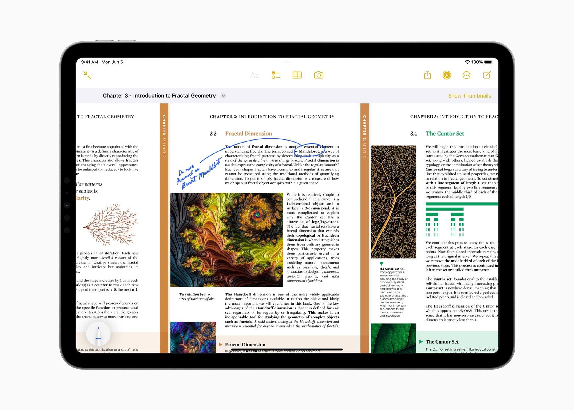
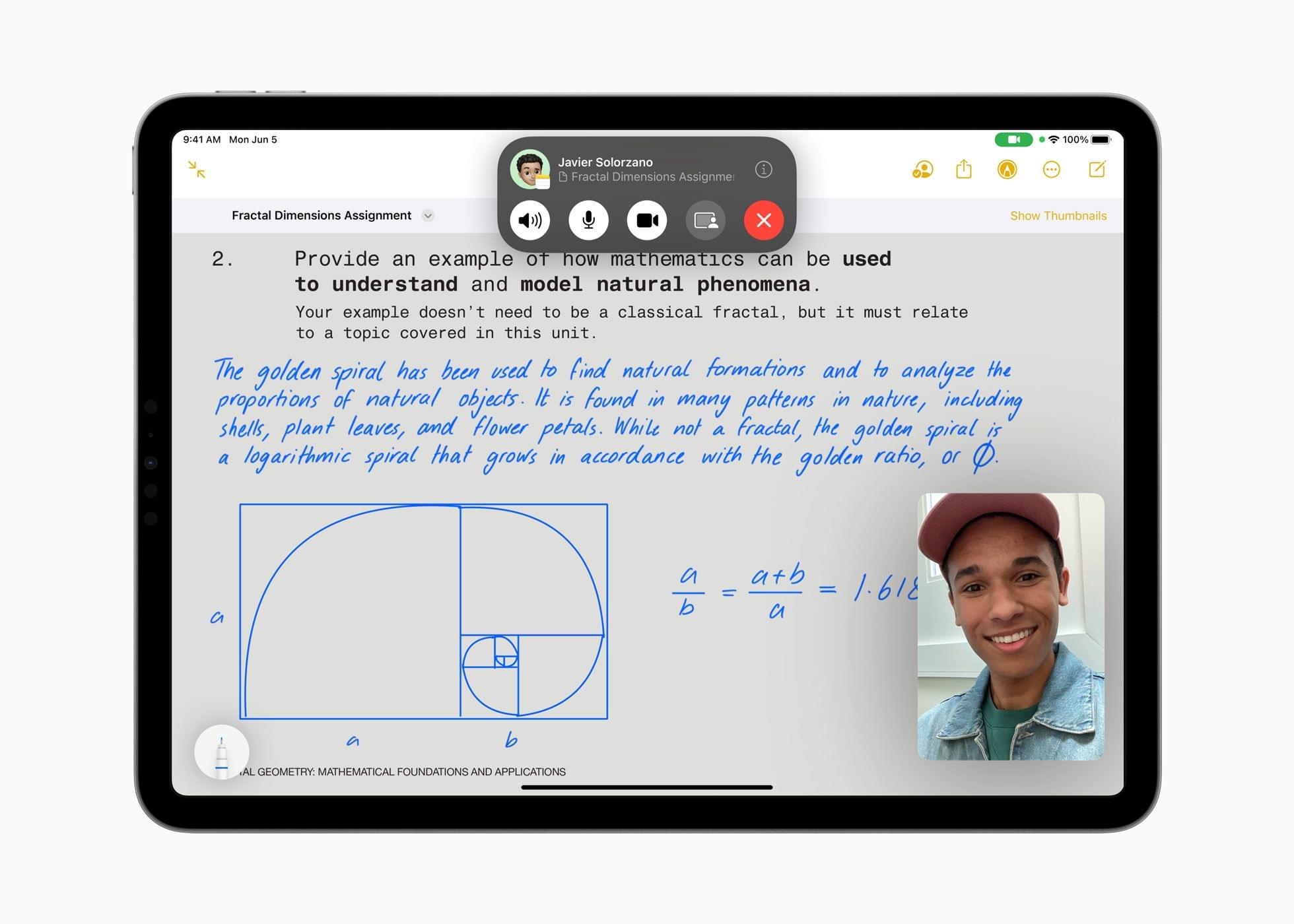
Probably the most extensive set of new features coming to Notes is related to PDF documents. With the update, you’ll be able to read and annotate PDFs and collaborate on documents with others. When you drop a PDF into Notes, it can be navigated by swiping from page to page or by displaying a strip of thumbnails above the current page. All of the markup tools available in Notes can be used to draw and type on a PDF, add shapes to it, or sign it. Notes will be able to detect fields in a PDF, so you can fill out forms with an enhanced version of AutoFill using data from the Contacts app too.

Users will also be able to collaborate in real-time when editing PDFs by sharing a note with others. As you draw, annotate, type on, or add stickers to a shared PDF, Apple says the changes will appear immediately on your collaborator’s device.

Source: Apple.

Source: Apple.

Also coming to Notes are a couple of new ways to add links. You can select text and add a hyperlink to a website, but you can also link to existing notes. I love this feature. It doesn’t automatically add backlinks to the source note the way an app like Obsidian does, but you can do that manually if you’d like, and I expect one-way linking is plenty for most users. With the new internal linking, users will be able to create tables of contents for related notes and split what might otherwise be a long note into linked sections, making the content easier to navigate and read.

Finally, Notes will add Pages compatibility in the fall. If you begin a document in Notes, you’ll be able to open it in Pages to take advantage of Pages’ more extensive set of styling tools. That will allow you to do things like use more fonts, resize graphics incorporate video, and more.

I’m excited about the updates coming to Notes. PDFs are at the heart of a lot of workflows. I don’t use them as frequently as I used to, but students, teachers, lawyers, and many others who depend on PDFs as a core part of their work, should get a much more robust solution for adding them to their note-taking setup with Notes this fall.

I’m also impressed by Notes’ addition of internal linking to other notes. The update should allow for vastly better organization of information in Notes. I’m envisioning it as a solution for our internal documentation needs at MacStories, along with project management and a lot more. I’ve used Notes for that sort of thing before, but once a note reached a certain length, it became hard to manage, especially on smaller devices. With internal linking, I expect that will be a thing of the past.

Read more


With iPadOS 17, Stage Manager Is (Finally) Moving in the Right Direction

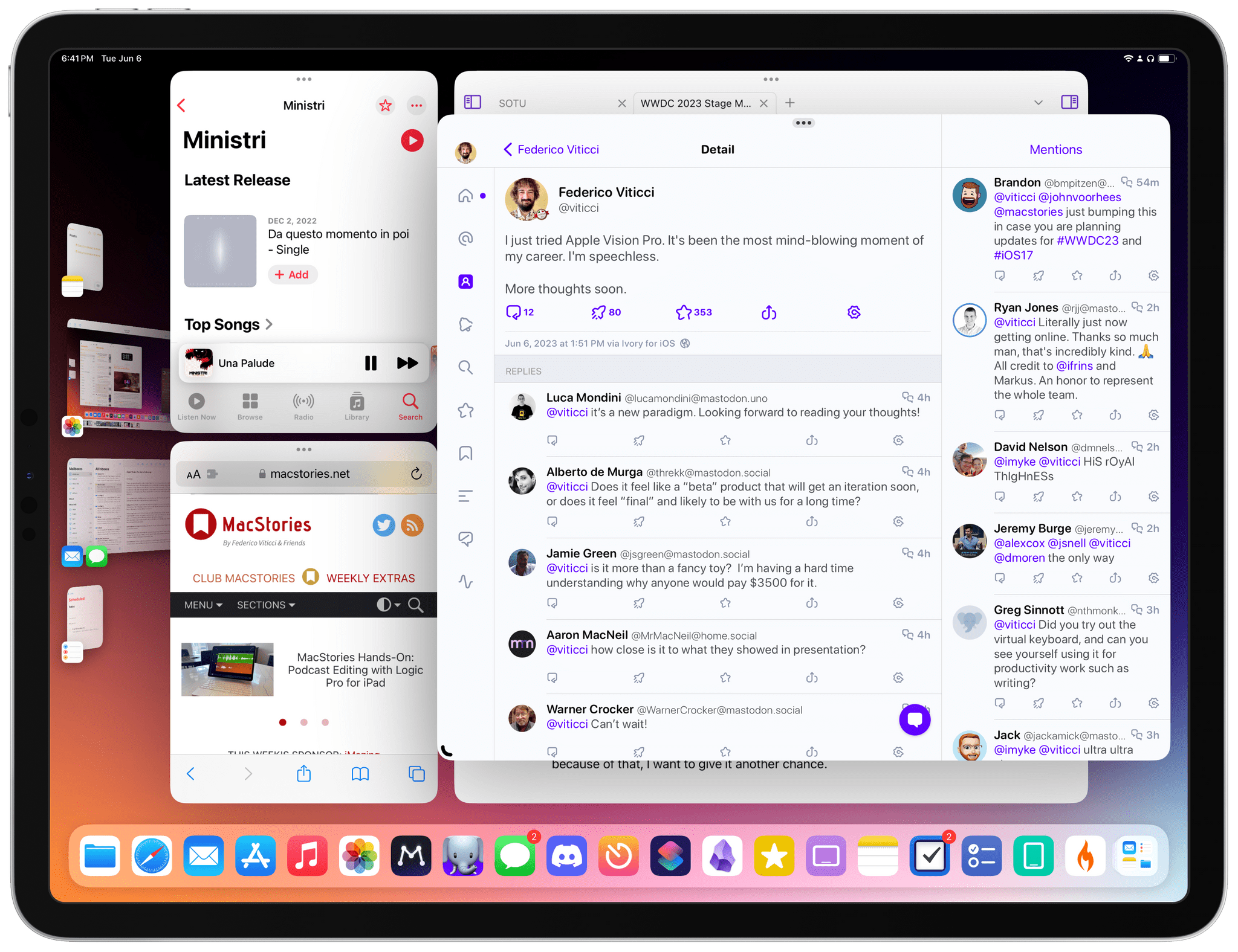
Stage Manager on iPadOS 17 beta 1.

Stage Manager on iPadOS 17 beta 1.

I’m in Cupertino for WWDC this week, and after yesterday’s whirlwind of announcements and surprises, I had some time to sit down with my 12.9” iPad Pro, install iPadOS 17 beta 1 on it, and try the improved version of Stage Manager. As you know, I have a…complicated history with the iPad’s latest multitasking system. Before coming here, I was worried Stage Manager would be left untouched without any updates for at least another year.

I’ll cut to the chase: Apple listened to feedback about Stage Manager and – at least so far – implemented the key improvements I wanted to see. I’ve been using Stage Manager on my iPad Pro since yesterday afternoon, and I even tested it on a portable external display that I brought with me for this trip. If this early, limited experience is of any indication, I think I’m going to be happy with Apple’s revised version of Stage Manager for iPad by the end of the summer. But then again, caution is necessary given how last year’s beta evolved over time.

Read more


Apple Marks Global Accessibility Awareness Day with Features Coming to iOS, iPadOS, and macOS Later This Year

Thursday is Global Accessibility Awareness Day, and as in years past, Apple has previewed several new accessibility features coming later this year. This year, Apple is focusing on a wide range of accessibility features covering cognitive, vision, hearing, mobility, and speech, which were designed with feedback from disability communities. The company hasn’t said when these features will debut in its operating systems, but if past years are any indication, most should be released in the fall as part of the annual OS release cycle.

Assistive Access

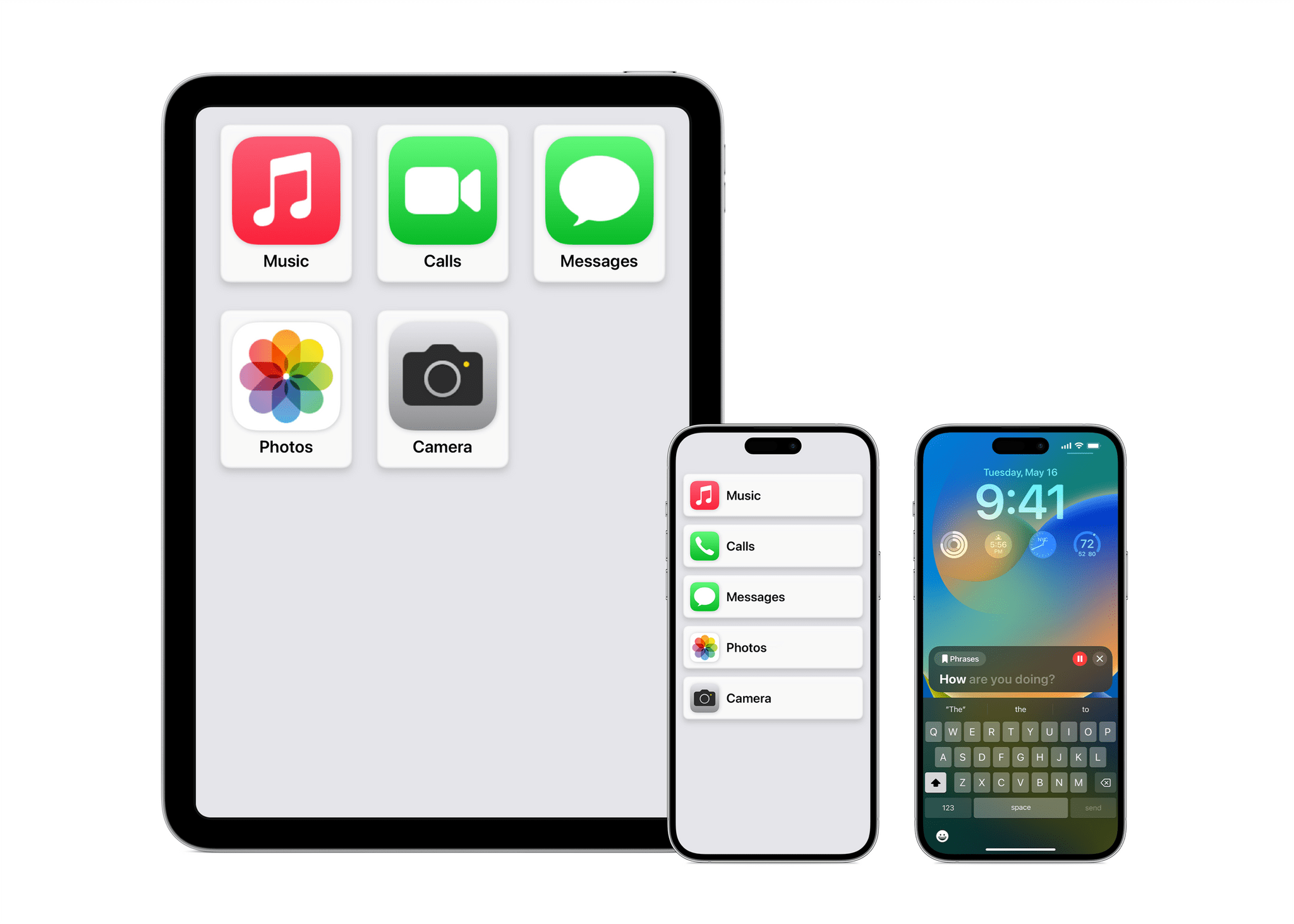
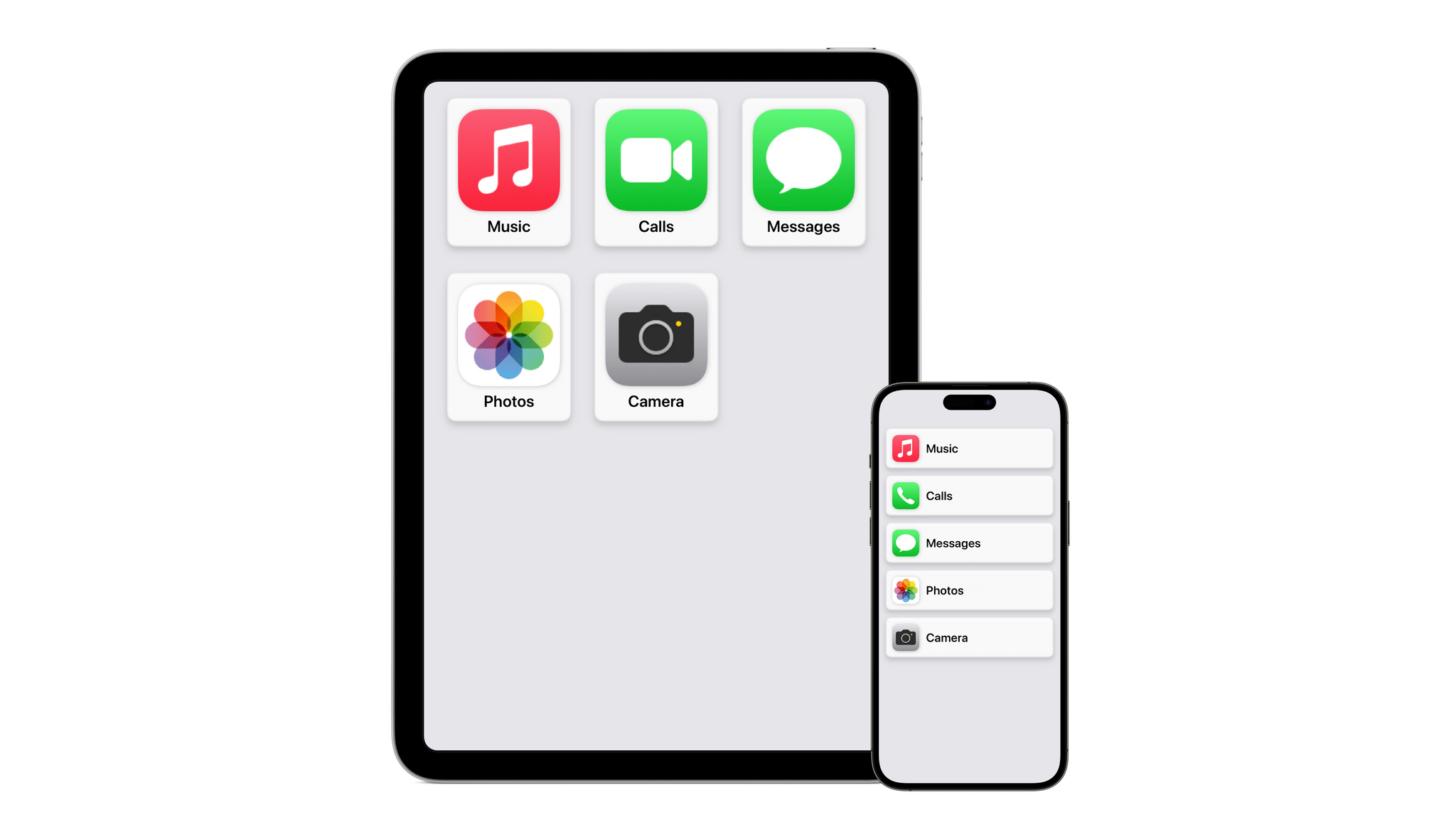
Assistive Access. Source: Apple.

Assistive Access. Source: Apple.

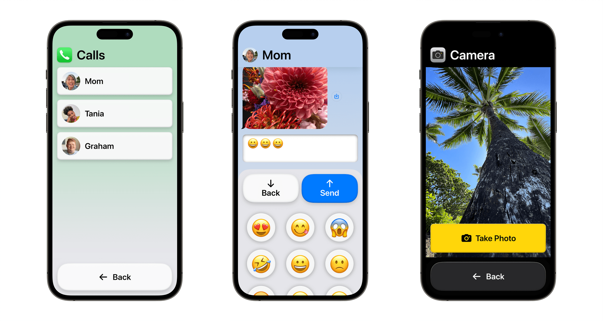
Assistive Access is a new customizable iPhone and iPad mode created for users with cognitive disabilities to lighten the cognitive load of using their favorite apps. Apple worked with users as well as their trusted supports to focus on the activities they use most, like communicating with friends and family, taking and viewing photos, and listening to music. The result is a distillation of the experiences of the related apps. For instance, Phone and FaceTime have been combined into a single Calls app that handles both audio and video calls.

Calls, Messages, Camera in Assistive Access mode. Source: Apple.

Calls, Messages, Camera in Assistive Access mode. Source: Apple.

The UI for Assistive Access is highly customizable, allowing users and their trusted supporters to adapt it to their individual needs. For example, an iPhone’s Home Screen can be streamlined to show just a handful of apps with large, high-contrast buttons with big text labels. Alternatively, Assistive Access can be set up with a row-based UI for people who prefer text.

Read more


FitnessView Teams: A Team-Based Fitness Tracker for Coaches and Trainers

Today, Funn Media released FitnessView Teams, a fitness-tracking app that allows coaches or personal trainers to track multiple team members or clients at once. I’m not a coach or a trainer, but I’ve been trying the app with demo data and like what I’ve seen a lot.

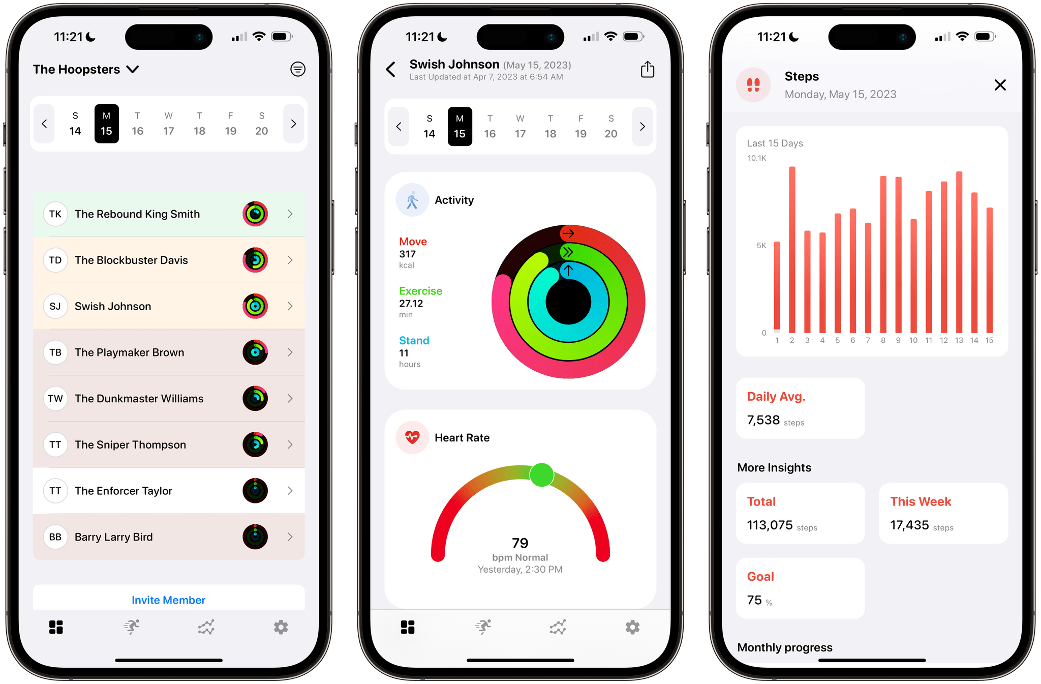
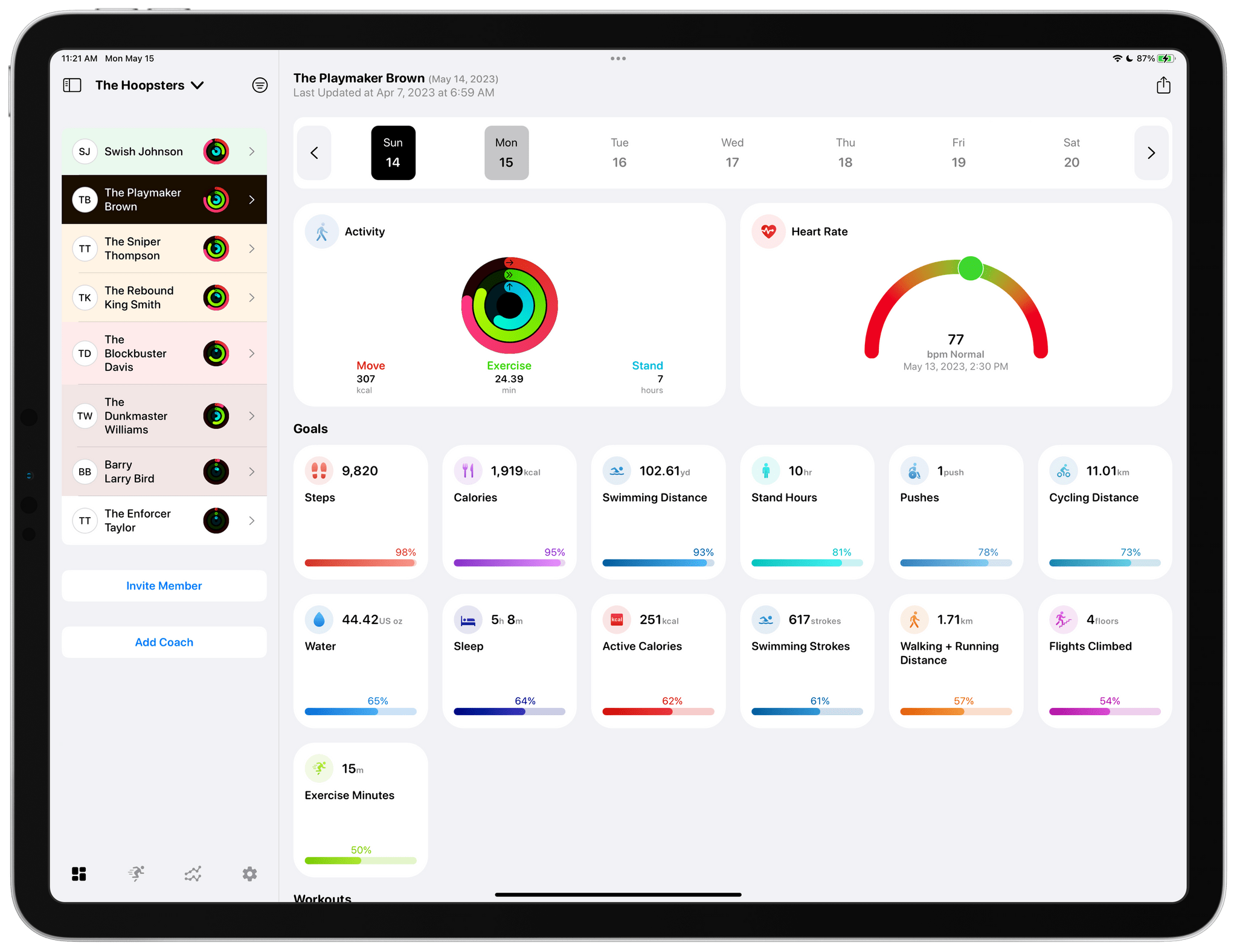
FitnessView Teams provides a home base for tracking the performance of multiple athletes.

FitnessView Teams provides a home base for tracking the performance of multiple athletes.

FitnessView Teams, which builds on Funn Media’s FitnessView app for individuals, works on the iPhone and iPad, but it’s best on the iPad where you can see more data at once. From the main view, you can switch among multiple teams, browse data by team member, invite new team members, and invite other coaches to your team. Coaches and team members can both be added via a QR code or an invitation link that allows FitnessView Teams to access the data collected by a team member’s Apple Watch. You can also browse team member data by date using a calendar strip along the top of the iPad’s screen.

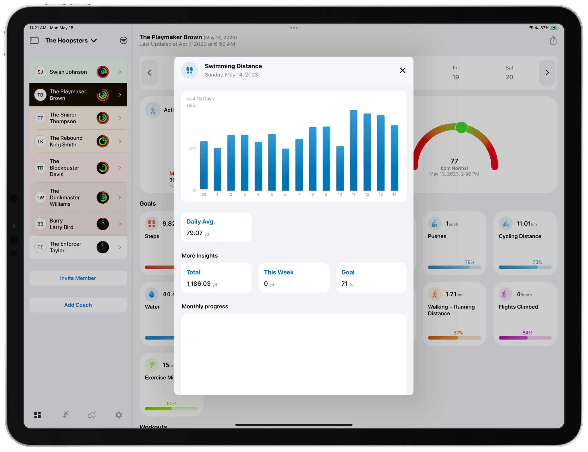
Tapping any of the home view's tiles drills deeper into the details of each.

Tapping any of the home view’s tiles drills deeper into the details of each.

Most of the app’s main view is dedicated to health metric tiles that are fully customizable in the app’s settings. Tapping on any health metric brings up additional details, including a graph for that data over time, as well as daily averages and monthly progress. Reports for each athlete can be exported as a customizable PDF-formatted report too.

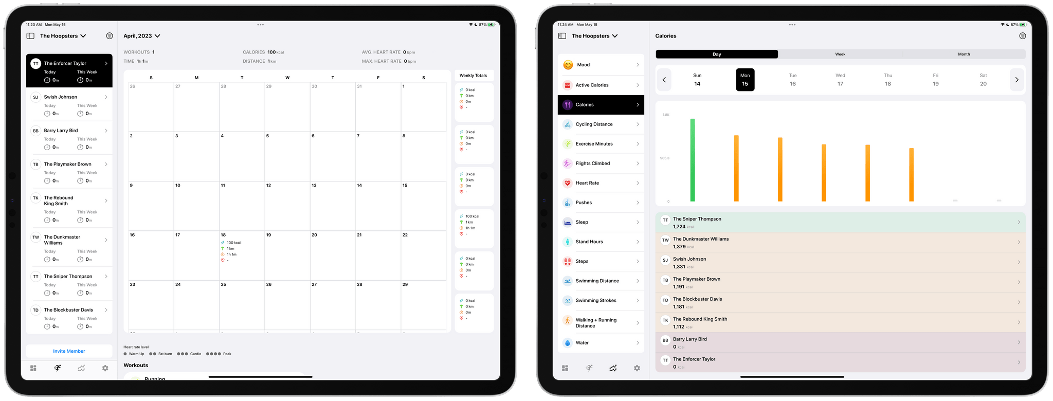
The app includes calendar and metric-based views of team data too.

The app includes calendar and metric-based views of team data too.

Other data visualizations include a tab dedicated to a full month overview per athlete. There’s also a tab that breaks down a team’s progress by fitness metric, which allows coaches to easily compare the stats of one athlete compared to another on a daily, weekly, or monthly basis. All of the same data is available on the iPhone, too, but the limited screen space requires more navigating between views and scrolling of data.

I’ve always been a fan of FitnessView for individuals. The app’s simple, clean design provides an excellent overview of core health metrics, with the ability to dive into each for more detail. FitnessView Teams takes the same approach and succeeds in organizing an even bigger set of health data for multiple people at once, which is an impressive accomplishment. If you’re a coach or trainer, FitnessView Teams is worth checking out.

FitnessView Teams is available to download for free. However, a subscription is required to add multiple team members or clients to the app, which starts at $59.99/month to track ten users.


Mona: A Unique Mix of Customization Options and Features You Won’t Find in Any Other Mastodon App

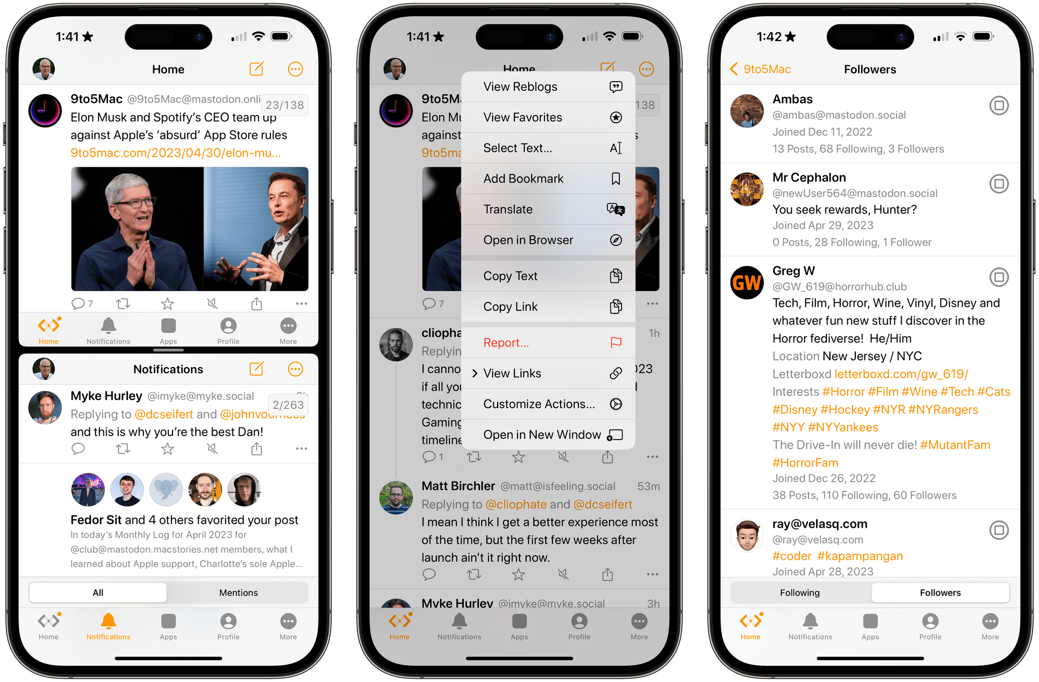
Mona is a brand new, highly customizable Mastodon client from Junyu Kuang, the developer of Spring, which is one of the few remaining third-party Twitter clients that still works and pioneered many of the features found in Mona. Mona, which is available on the iPhone, iPad, and Mac, is a power-user app through and through. The app has a dizzying array of settings for customizing the entire Mastodon experience. If, like me, you enjoy the sort of tinkering that Mona enables, you’ll absolutely love this app.

Read more


Automation April: Hyperduck Leverages the Power of URL Schemes to Control Your Mac from an iPhone or iPad

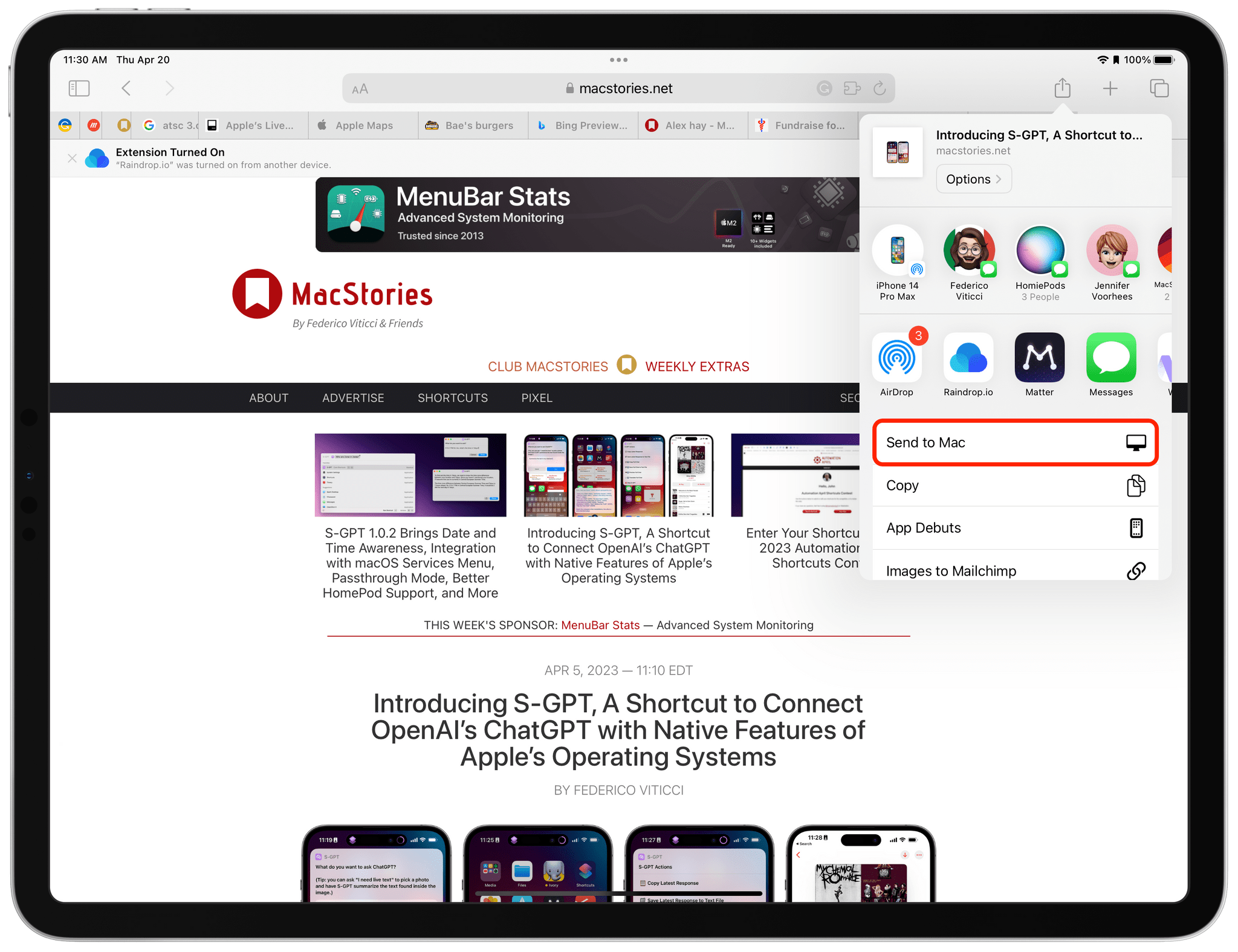
Hyperduck is a recent utility from Sindre Sorhus for sending URLs from an iPhone or iPad to your Mac that has some very interesting applications. Hyperduck hasn’t replaced my use of AirDrop, Handoff, and other Apple technologies that move data between devices, but it has extended those features in meaningful ways and has quickly worked its way into my everyday computing life.

Hyperduck does just one thing very well. It sends URLs from an iPhone or iPad to a Mac using iCloud. That’s different than how AirDrop works, which has some advantages.

Read more


Dark Noise 3.0 Has a New Business Model and A Few Other Updates

Today, Charlie Chapman released Dark Noise 3.0, his iOS, iPadOS, and macOS ambient noise app, with a new business model, some remastered sounds, and other updates.

The biggest change to Dark Noise 3.0 is its new business model. Historically, Dark Noise has been a paid-up-front app, but with 3.0, the app is now free with an optional subscription that unlocks certain features.

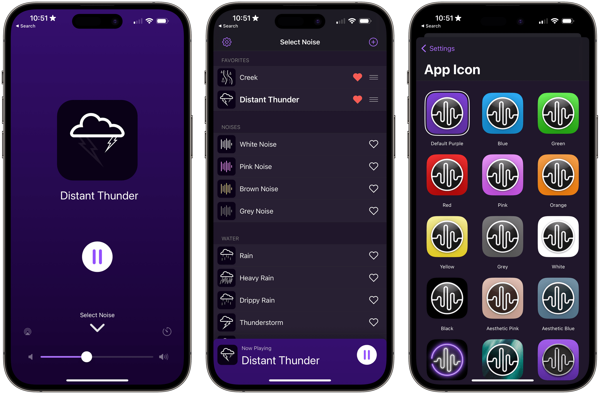
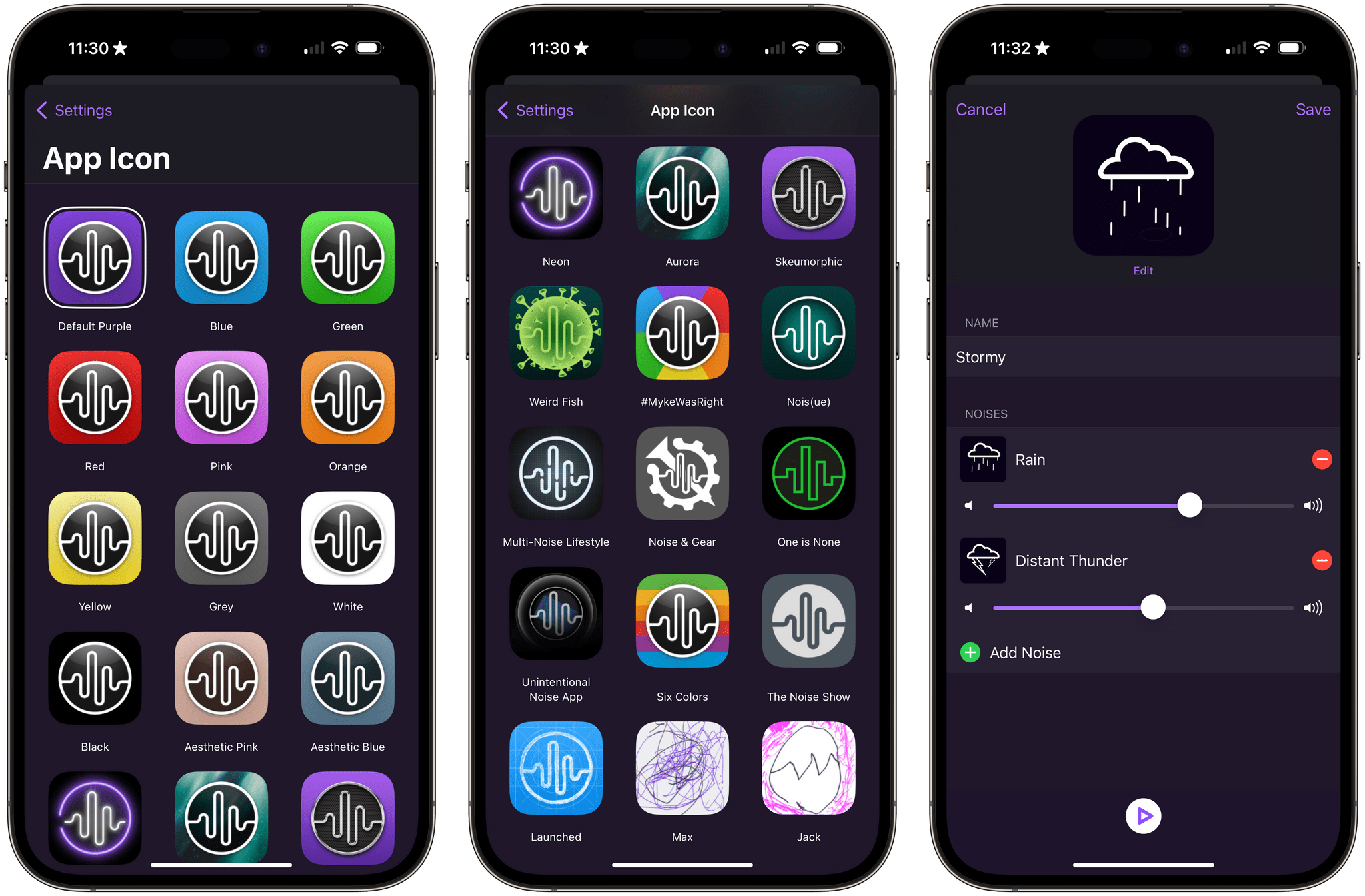
The free version of Dark Noise includes eight sounds, continuous sound looping, Shortcuts support, Siri integration, and a timer. The Pro subscription increases the number of sounds to over 50 and adds custom sound mixes, alternate app icons, themes, and Family Sharing. The Pro features are also available as a one-time purchase.

Alternative icons and sound mixing are two of the features available to Dark Noise Pro subscribers.

Alternative icons and sound mixing are two of the features available to Dark Noise Pro subscribers.

If you previously purchased Dark Noise, which included many of the features that are now part of a Pro subscription, you’re covered. Anyone who bought Dark Noise prior to the release of version 3.0 gets all of the features included in the Pro subscription. Pro subscribers may get new features in the future, but as of the release of version 3.0, existing users and subscribers have access to the same features, which I think is a fair way to transition to a subscription model.

I’m also glad to see that the core features of Dark Noise will be available for free for the first time. There are a lot of ambient sound apps on the App Store, but a lot aren’t very good. Dark Noise is excellent, and I expect having a free tier to show off what the app can do to new users will result in more paid users in the long run. I’m also a fan of the one-time payment option, which is a nice option for fans of the app who just don’t like paying subscriptions.

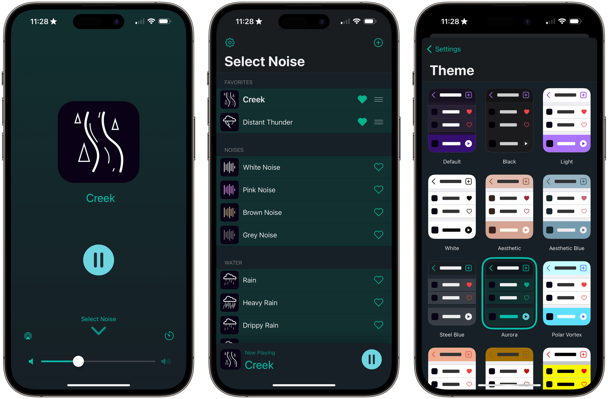
Dark Noise has a new green theme called Aurora.

Dark Noise has a new green theme called Aurora.

Version 3.0 also introduces remastered Rain, Beach, Airplane Interior, and Thunderstorm sounds that sound better when used with stereo speakers. The app’s icons have been tweaked a little, and there’s a new theme that uses shades of green called Aurora.

For more on everything Dark Noise can do, be sure to check out our reviews of version 1.0 and 2.0.

Dark Noise 3.0 is available as a free download on the App Store. The Pro subscription unlocks the features described above, for $2.99/month or $19.99/year with a three-day trial. Dark Noise 3.0 is also available as a one-time purchase for $49.99.


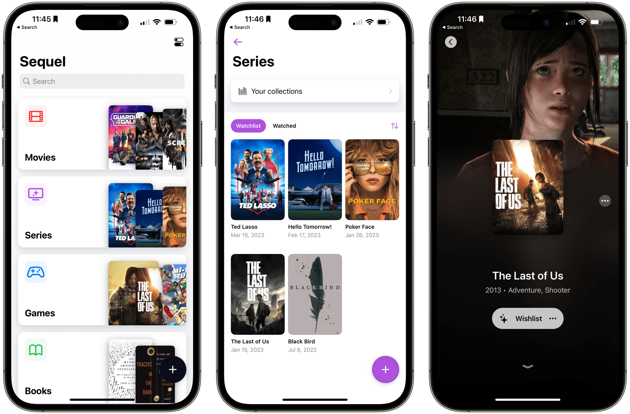
Sequel 2.0: An iPhone and iPad Media Tracker That Strikes an Elegant Balance Between Form and Function

Too often, media tracking apps feel like work. There’s too much effort involved in adding and browsing items, which makes them feel more like task managers than an inviting place that helps you decide how you want to spend your precious free time.

Apps in this category seem to take one of a couple of different approaches. Some apps specialize in one type of media, which can be great if you’re a huge book or videogame fan, for instance. As much as I like the media-specific approach of some apps, I’ve found that lately, I just want an app that’s easy to use, so ‘past me’ can recommend ‘tired and lazy me’ something to watch, play, read, or listen to. And, for the past couple of months, the app that has fit my needs the best has been Sequel 2.0 by Romain Lefebvre.

Read more