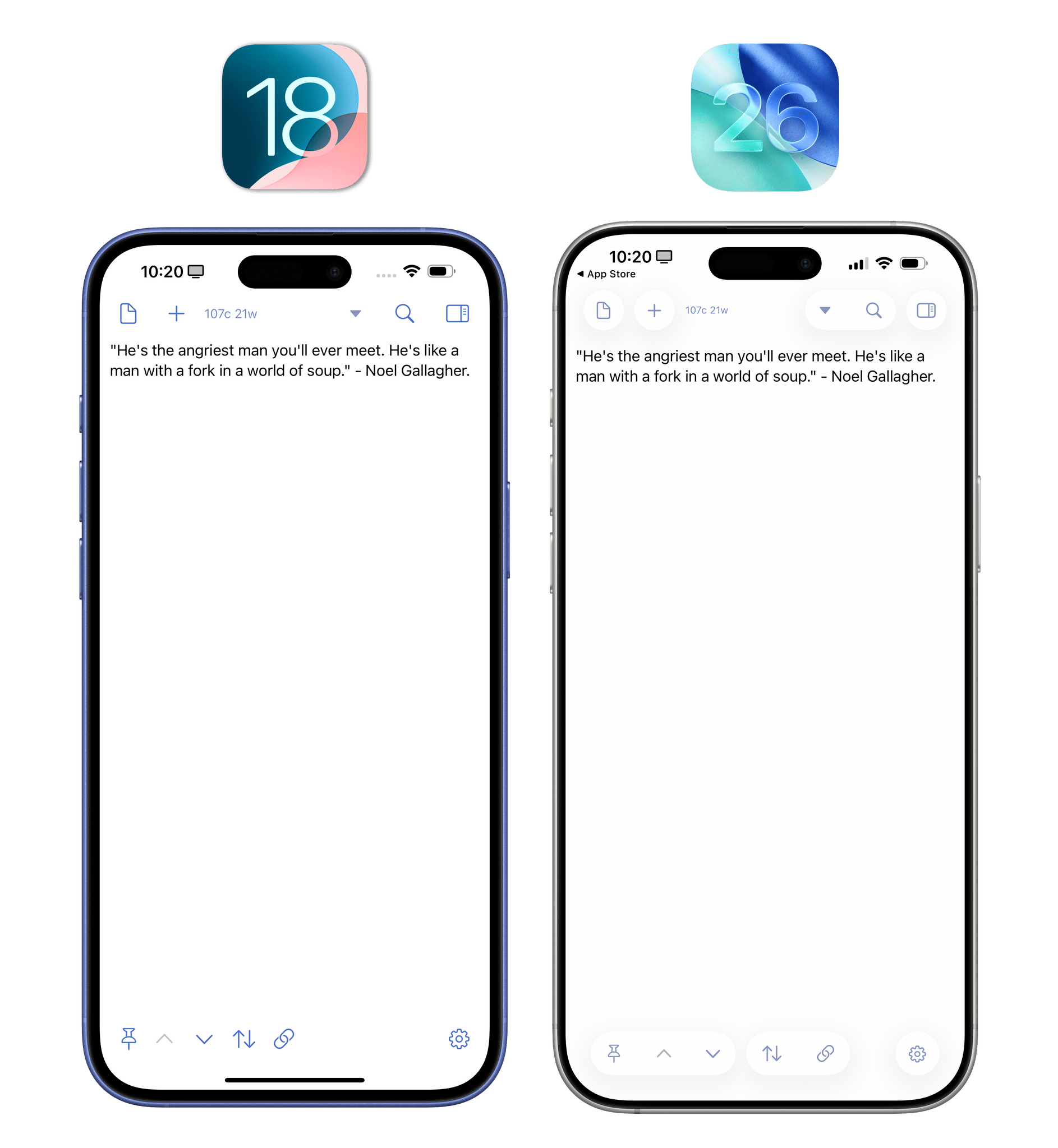
Buttons, Toolbars, and Tab Bars
Remember how shocked we all were when, in 2013, Apple decided this was going to be what “buttons” looked like?
Remember how…that lasted 12 years?
Finally, with Liquid Glass, we’re going back to buttons that actually look like buttons: circular or pill-shaped elements that you can intuitively press to, well, do stuff. Aside from the fact that buttons are no longer mere colored text labels, there are other qualities of Liquid Glass’ buttons worth appreciating that I think make them superior (that is, easier to use and more accessible) to how things used to be.
For one, they’re larger and easier to see. Their rounded shape makes them more inviting to the touch.
Speaking of which, when you press (or click) a button in Liquid Glass, it animates with a highlighted and “elevated” state that visually communicates the action you just performed.
Liquid Glass button animations.Replay
But there’s more. With iOS 26 and Liquid Glass, Apple is replacing the ‘Done’ button (usually displayed in the top-right corner of a view) with a larger, circular checkmark button, and they’re swapping the equivalent ‘Close’ button with an ‘X’ one. Broadly speaking, in different areas of the OS, you’ll find the maligned “Jony Ive text buttons” replaced with glyphs from the SF Symbols collection. There are still instances of text-based buttons in iOS 26 (see Mail’s ‘Select’ action), but even when an icon isn’t used for a button, the word is always enclosed within a tappable shape. Over the years, Apple has been progressively moving away from text-only buttons in iOS (see the button shapes in Photos or Music), and it’s great to see the company universally and consistently embrace the idea that buttons are supposed to look like buttons instead of words. Good riddance.
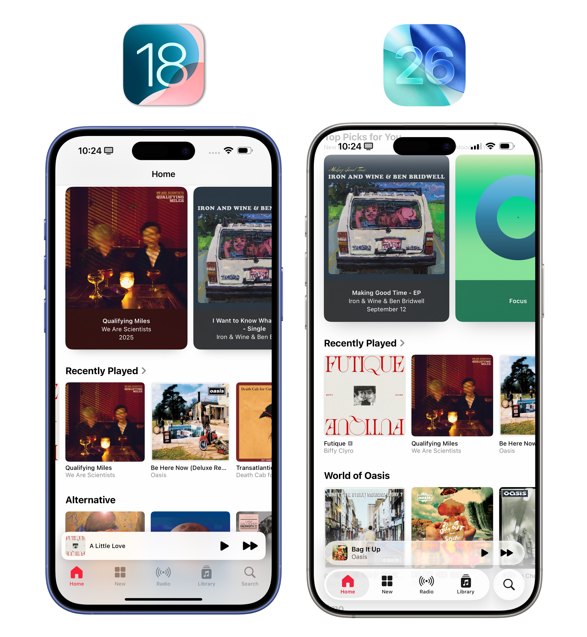
Toolbars are also changing in iOS 26, and they share many of the same properties as buttons in Liquid Glass: they’re rounded, they float, and they’re always contained within a shape. It used to be that a “toolbar” could be a row of thin glyphs laid out horizontally and embedded within a title bar or a bottom toolbar that was anchored on-screen. Now, toolbars are literal floating bars with rounded corners that contain multiple controls, float above content, and can group related controls together.
Glass effect aside (you either like it or don’t), I’m a big fan of Apple’s new approach here with making any UI element a physically separate “object” floating above an app’s content. The grouping is effective at laying out an app’s command hierarchy; I personally find the “self-contained” appearance with toolbar commands inside a Liquid Glass capsule more accessible than iOS 18’s commands that bled into an app’s content view (such as the ones in Notes).
My favorite third-party app example here is Drafts. In iOS 18, toolbar items at the bottom of the screen were essentially a row of glyphs; in iOS 26, toolbars are more visually distinct from the main body of a note, and related items are grouped together.
In case it’s not evident yet, I think Liquid Glass does a vastly better job at visual affordances than any of Apple’s iterations on the iOS 7 design language from the past decade.
Which brings me to tab bars. When you think about it, all the UI elements I covered in this section are technically buttons in that you press or click them to do something, which means that, at a high level, tab bars are also made of buttons that you press. What’s unique about tab bars is that they provide a sense of space in an app’s UI. You can press an item in a tab bar to switch sections of an app, but you can also look at a tab bar to instantly get a sense of where you are. Or, at least, that’s how tab bars were originally conceived in iPhone OS in 2007.
.](https://cdn.macstories.net/img_9518-1757719634611.jpeg)
The tab bar of iPhone OS 1.0 on an original iPhone. Photo courtesy of my friend Noah Herman.
iOS 26 brings a series of notable changes to tab bars: they’re floating “pills” rather than fixed bars anchored at the bottom of the screen, they can be collapsed and expanded, and they support “accessories” that can float above them or be nested next to them when a tab bar is minimized.
Making tab bars floating elements is a good idea. The rounded and floating look is consistent with the rest of Liquid Glass, but also, functionally speaking, the fact that a tab bar can be as long or short as needed based on the number of items inside it is great.
In older versions of iOS, tab bars with two or three elements looked kind of silly; there was a lot of empty space around those items, which incentivized developers to either fill the tab bar with useless options or, worse, eschew tab bars altogether and make navigation in their apps a chore.
Thanks to iOS 26’s tab bars, if a developer wants to make one with two items because their app has two sections, they can do so without the risk of the bar looking like wasted space. It’s just going to be a small capsule at the bottom of the screen that makes navigating an app’s UI faster and more comfortable. Apps like Sequel and Activas are great examples of this. They only have two items in their tab bars, but they don’t look out of place because the bar itself is a small element. In fact, thanks to iOS 26’s scroll edge effect, Activas can even show you a preview of the content around the tab bar when scrolling the app’s main page.
I believe the new look of tab bars will make it less awkward for developers to simplify navigation in their apps even if they don’t want to use four or five tab bar items. And I also personally find the rounded, translucent look more visually pleasing than before.
I’m less certain about the idea of collapsing tab bars into the currently active tab when scrolling. Apple’s own Music app does this. When scrolling down, the tab bar collapses and only the current tab item remains visible as a small circular button; the tab accessory (more on this below – it’s the mini player) slides down next to it, while the search button always remains visible as a separate entity from the tab bar.
I’m not sold on this idea, but we need to have a conversation about how tab selections work in iOS 26 since that may help us understand Apple’s approach.
Regardless of their state, tab bars in iOS 26 showcase the active tab with a colored glyph (like in iOS 18) plus a highlighted shape. At any moment, you can long-press on an iOS 26 tab bar to turn the highlight shape into a “selection bubble”, a Liquid Glass element sporting the familiar lensing and chromatic aberration effects. When holding down, you can then slide your finger across the tab bar and see what happens “inside” the bubble. It’s pretty cool, it’s pretty useless, and only Apple can render this sort of pretty thing in real time without skipping a frame.
Switching between tabs.Replay
I have to mention the long-press behavior as I believe it relates to the (optional) mode of collapsing a tab bar. When a tab bar is collapsed, it frees up even more space for content, and we know that has long been one of Apple’s priorities on iOS (see iOS 14 and compact UI). The tab bar gets expanded by default if you reach the top of a page again, or if you tap the selected item, but what if you need to quickly switch between sections of an app while the tab bar is minimized? You can long-press the minimized tab and swipe to instantly move to other tabs.
Swiping on a minimized tab.Replay
I’m not sold on this idea because I’m afraid that what I just described may be challenging for most people to discover. Who’s going to guess that you can long-press on a minimized tab bar in the Music app to switch from Home to Library? But perhaps I’m overthinking this, and people will be okay with tapping the active tab to re-invoke the full tab bar to switch sections. Even then, that adds one extra tap to what used to be an instant interaction. Such is the tradeoff, however, when you want to minimize UI as much as possible: some interactions will take longer or be hidden from view.
Will that tradeoff be worth it? I’m not sure, but it’s quite telling that, of the dozens of third-party iOS 26 apps I’ve tested, I’ve only run into one that implements the same tab bar behavior as the Music app: Focus. This app uses the new tab bar accessory API to display the equivalent of Music’s mini player above the tab bar, only in this case, it’s a timer for the currently active productivity session. When you scroll down in the app, the tab bar is minimized, and the timer gets “docked” next to it, sliding in between the current tab and the search button.
An example of a third-party app (Focus) implementing the new tab bar with related accessory item in iOS 26.
While I may be unsure about the long-term impact of collapsing a tab bar into the active tab by default, I also have to admit that the combination of iOS 26’s tab bar and tab accessory feels great in a third-party app like Focus. With these new elements, the currently active timer is always accessible when browsing different sections of the app thanks to a safe area at the bottom of the screen that requires less space than iOS 18’s old tab bar alone.
On balance, I do think these tab bars are an improvement over iOS 18; even in their expanded state, they take up less space on-screen, and their design lends itself better to apps that want to use fewer items in the tab bar. The Music-like implementation with a tab bar accessory carries some intrinsic discoverability issues, but the transition from expanded to minimized state with a docked accessory is fantastic. I’ll be curious to see how users and more third-party developers will react to this change.
Sliders and Loupes
Let’s keep going with more specific design components of Liquid Glass. Apple left no stone unturned with this design refresh; for the sake of posterity (mine and yours), I need to go through them all.
Sliders have been modernized for Liquid Glass with a few visual and “tactile” updates. The slider knob is now pill-shaped. It almost looks like it’s been squished and elongated; on/off toggles received a similar treatment this year. More importantly, though, when you grab a slider knob in iOS 26, it transforms into a Liquid Glass “bubble” that grows larger under your finger and refracts content underneath it. It looks great, and even though it’s mostly an aesthetic change, I like how this larger element is easier to see under your fingertip when grabbing it.
Sliders also have momentum with Liquid Glass. If you grab the slider bubble and flick it in either direction, it will accelerate and stop depending on how fast your throw is. In hindsight, it feels obvious that sliders should support momentum-based adjustment just like scrolling does throughout the rest of the OS.
Interacting with sliders in Liquid Glass.Replay
Speaking of bubbles, the text magnification loupe has been redesigned once again as a result of Liquid Glass. After being unceremoniously removed in iOS 13, restored in iOS 15, and improved for developers in iOS 17, the text loupe – you guessed it – is now a Liquid Glass bubble in iOS 26.
Like other Liquid Glass elements, the loupe swiftly bounces on-screen when invoked, and the text within gets magnified and distorted across the edges with the aforementioned lensing effect of Liquid Glass. It works well, looks great, and is fun to use.
Views, Effects, and Search Bars
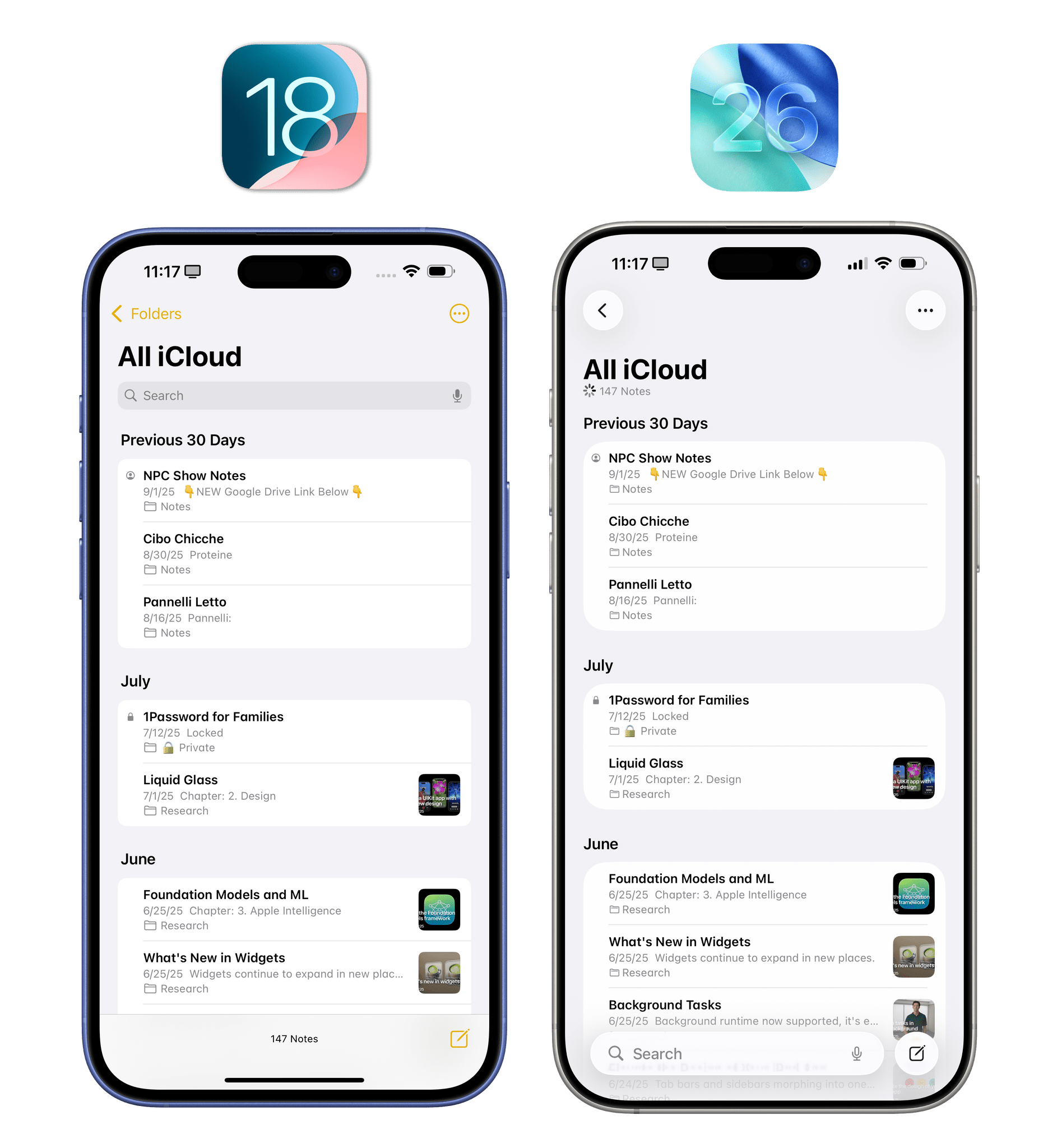
The most common element of an iOS or iPadOS app – the table view – is getting a subtle design refresh in iOS 26 that’s in line with the overall Liquid Glass ethos. Individual cells have rounder corners, and groups are slightly more spaced out and inset than before, with slightly larger glyphs as well.
The result is a friendlier look that gives everything a rounder appearance. I’ll be curious to find out if some folks see this as a “Fisher Price look”; I could see that argument. Personally, I find iOS 18’s old look too rigid and angular now, but that’s recency bias for you.
Also in iOS 26, most table views in Apple’s default apps (and optionally in third-party apps) no longer pin the title bar when scrolling down; instead, they implement a new scroll edge effect that blurs the area between the main content and the top toolbar. You can see this effect at play in apps like Safari, Messages, and Settings. Look at the top of the screen, and you’ll notice that content will be variably blurred as it traverses the toolbar area, with Liquid Glass toolbar items remaining visible and elevated per the system’s layer-based architecture.
Without a fixed title bar, iOS 26’s scroll edge effect helps making apps feel more spacious, showing more content at once.
Once again, the result is a more spacious UI that feels like the culmination of Apple’s work with compact UI that started all the way back in iOS 14. Without sacrificing the visibility of any toolbar items (just look at the Messages app), the iPhone’s screen almost feels bigger thanks to the removal of the solid toolbar and the addition of the scroll edge effect. Developers can choose between two different styles for the edge effect (soft and hard), and they can also opt not to use it. Widgetsmith – the sponsor of this review, and an app I’ve been using for several years – implements this effect with great results in the app’s updated ‘Widgets’ and ‘Wallpapers’ views.
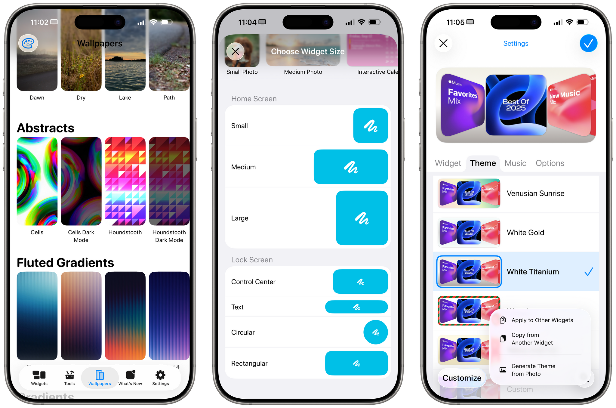
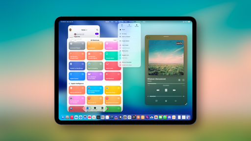
Widgetsmith is a great example of a third-party app that implements several Liquid Glass UI paradigms at once. In this image alone, you can see a new tab bar, redesigned buttons, scroll edge effect, lensing effect, and rounder table views.
Scroll edge effects are used profusely in the new updated Widgetsmith (right). I should also note that I personally enjoy this new ability to apply styles from one widget to others a lot.
I should also mention the background extension effect, a new visual trick for sidebars and inspectors available on iPadOS 26. With this effect, Liquid Glass sidebars on iPad can mirror and blur adjacent content, giving you the illusion that content from the main area of an app is “extending” under the sidebar. It’s a clever trick: the system is effectively creating mirrored copies of background content, blurring them, and placing them under Liquid Glass to give iPad UIs a sense of “expansion” that is not based on any additional data. To see this in action, open the TV app on iPad and take a look at the sidebar when watching a trailer on auto-play.
The background extension effect. It looks better with a trailer playing, but I can’t capture that due to DRM.
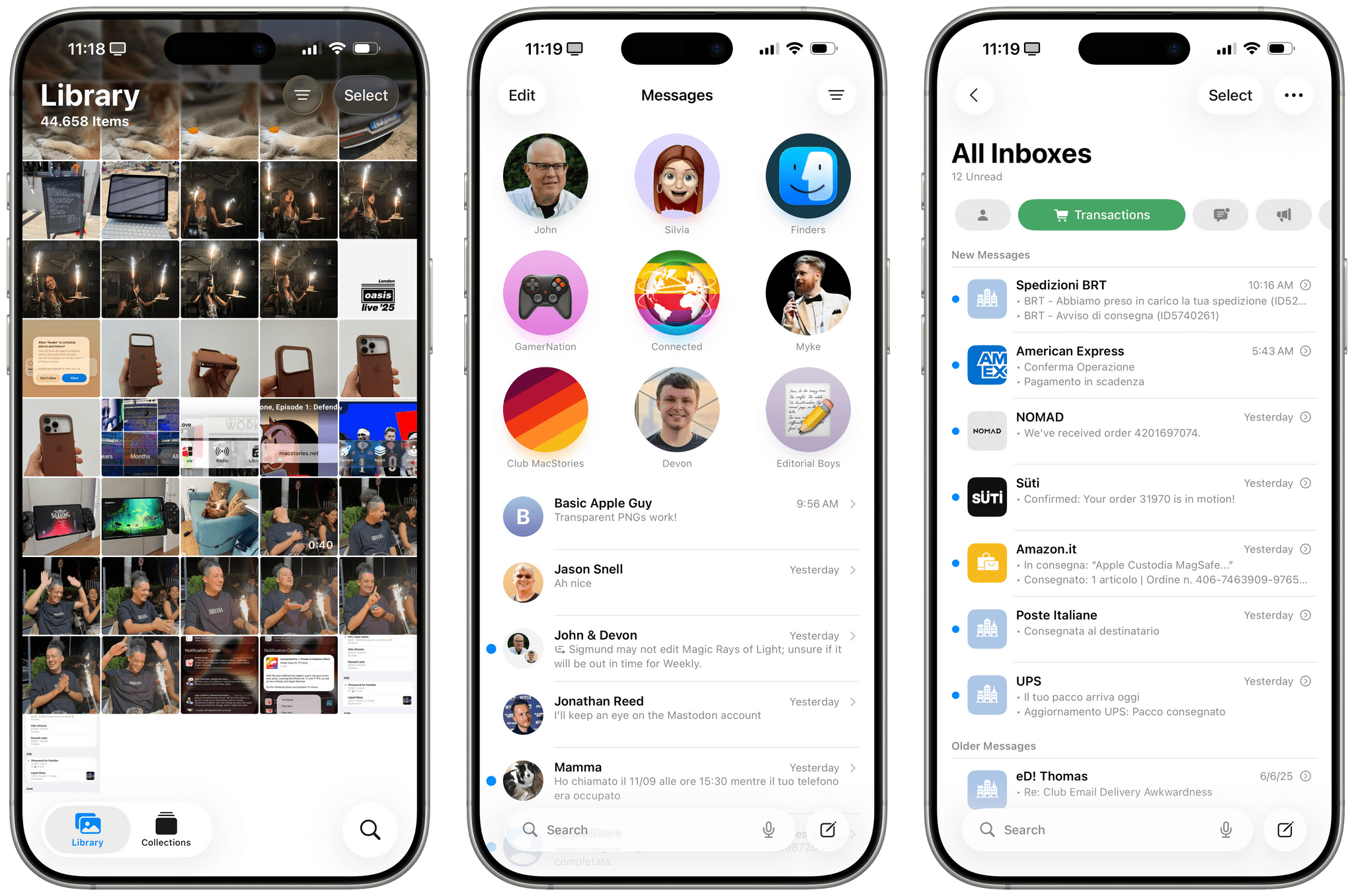
Back to iOS views. With iOS 26, Apple is formalizing work they pioneered with Maps in iOS 10 and refined with the (initially maligned, then beloved) Safari redesign in iOS 15: search bars are moving to the bottom of the screen on iPhone, and they’re either visible by default or can be invoked with a dedicated search button on the trailing edge of a tab bar. Open non-tab-based apps like Messages and Notes, and you’ll see what I mean. The search bar is always docked at the bottom of the screen, readily available for your thumb to comfortably tap into, with a scroll edge effect to boot.
I love this change, and I hope it gets consistently implemented by third-party developers too. I’ve long been a proponent of bottom-oriented UI on Apple platforms; it’s more ergonomic and makes interactions faster. In a funny twist for Alan Dye’s reputation in the Apple community, this change is actually the opposite of hiding UI elements, something that Dye gets frequently accused of. Search bars at the bottom of the screen are more visible than ever in iOS 26: you don’t need to swipe to reveal them, and they transition nicely above the keyboard when tapped. Big thumbs up from me.
The Video Player
The system video player is receiving a Liquid Glass treatment in iOS 26 that doesn’t meaningfully alter any functionality of the video playback controls. Does it make them look cool or get in the way of content more? Yes.
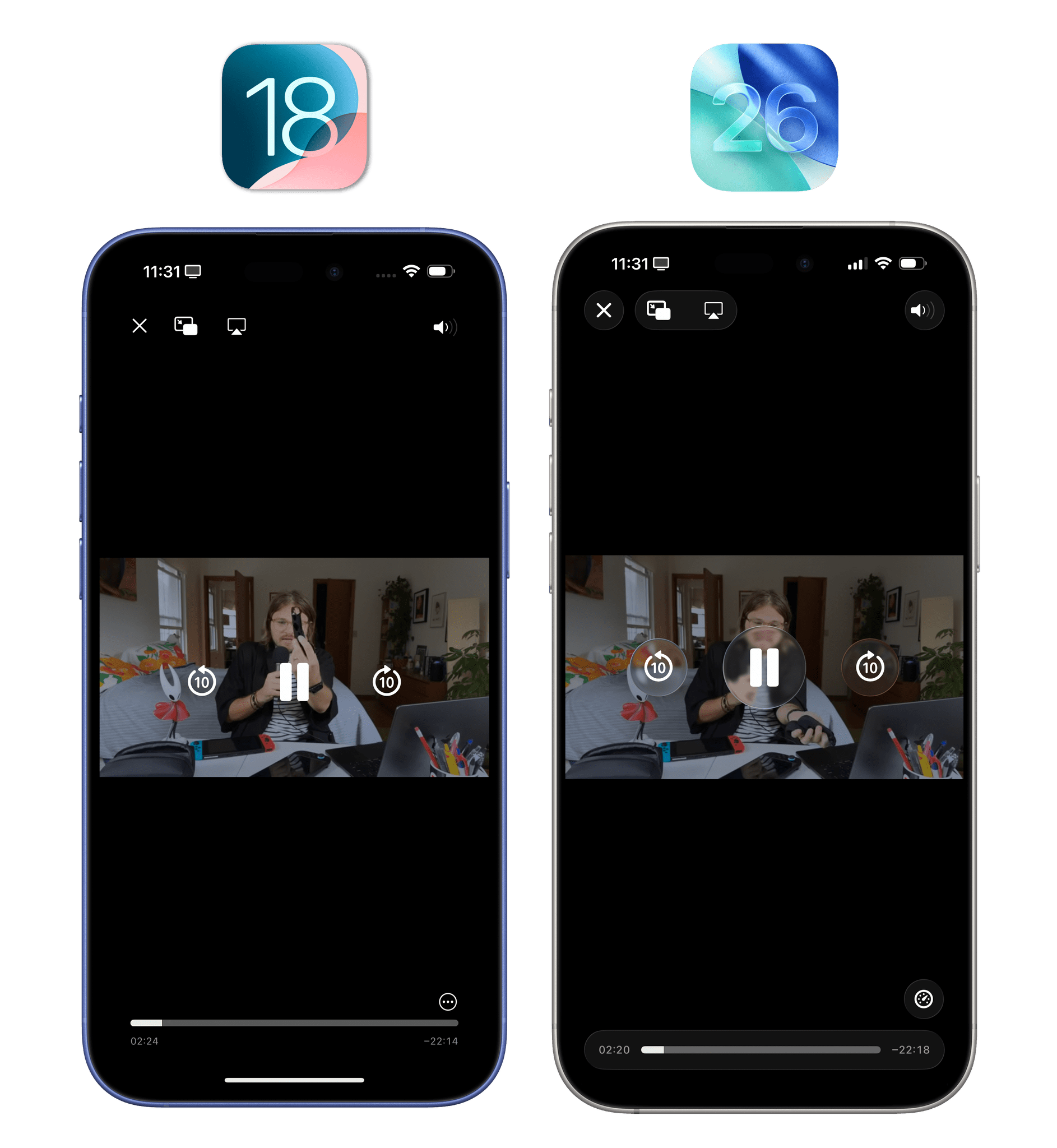
Visually speaking, the change is kind of obvious: existing controls are now slightly larger and contained inside Liquid Glass buttons that aggressively refract content underneath whenever they’re invoked on top of a video. Here, Apple’s work on Liquid Glass’ real-time rendering can be truly appreciated. As you tap play and pause, video gets warped, blurred, and distorted under the Liquid Glass buttons. It’s another graphical pipeline flex on Apple’s part.
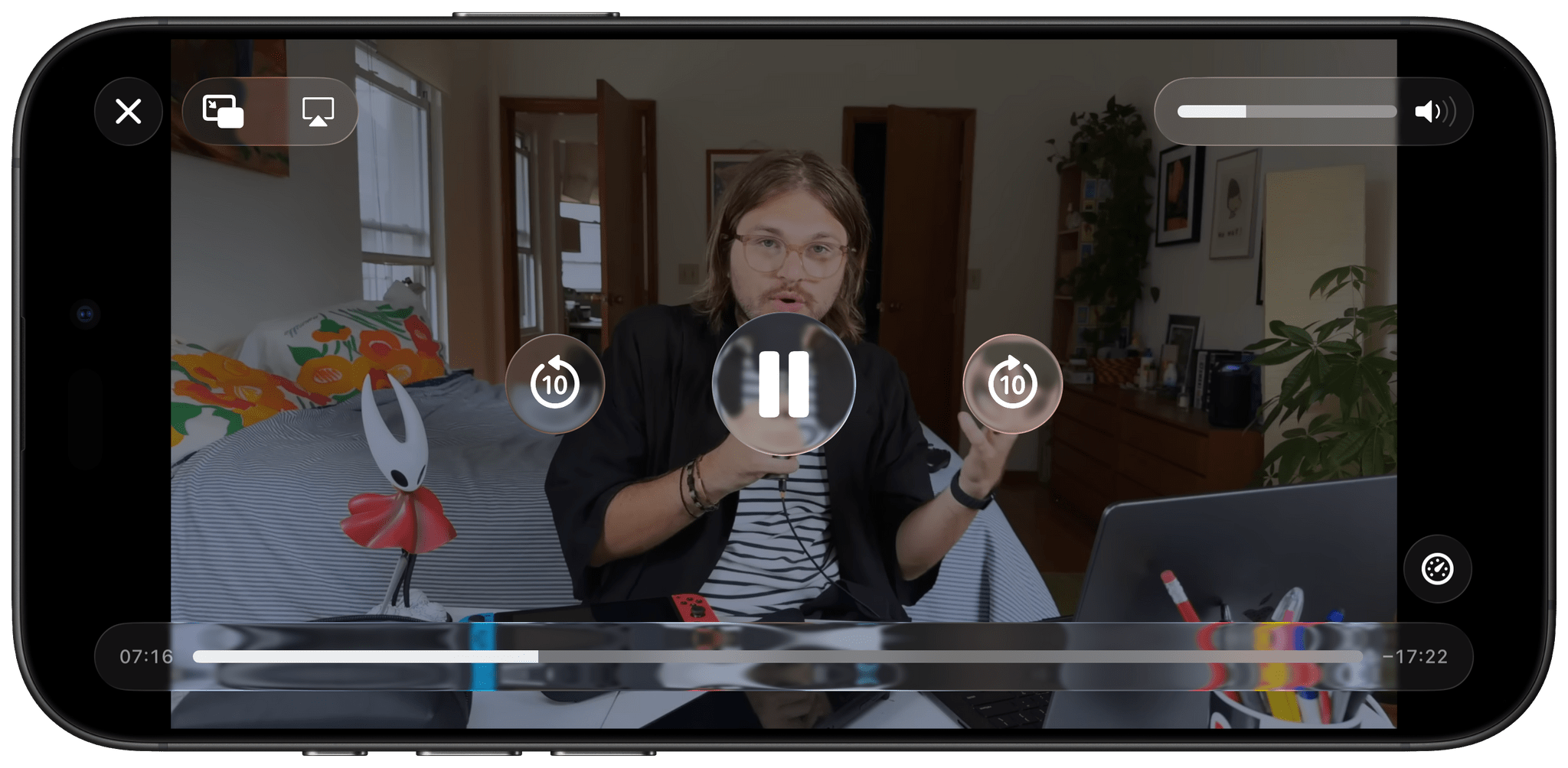
At the same time, when you’re watching a video, you probably don’t want playback controls to get in the way of content too much…? In this case, I think iOS 18’s more discreet, subtle controls were superior. They obfuscated less content and weren’t as in-your-face as the Liquid Glass ones are.
My problem here is that I continue to dislike Apple’s video player design with floating buttons in the middle of the video. The company should follow YouTube’s approach by moving more controls to the bottom of the video player; that’s the way to retain access to controls without covering video content.
Menus and Share Sheet
The most important change for all kinds of menus in iOS 26, beyond the Liquid Glass appearance, is that Apple finally conceded to the idea of left-aligning glyphs on the leading edge of each menu item.
I’ve long maintained that glyphs on the trailing edge of menu items were a terrible UX choice. In left-to-right languages, your eyes naturally scan lines, well, left to right, and symbols are easier to visually parse than text labels. In the previous design, the easy visual elements were placed at the end of the line rather than where they could be the first items your eyes would see. This has been rectified in iOS 26; in addition to being more rounded and spaced out (of course), menus now always place the glyph for each item before its text label.
Tap and hold to invoke any kind of context menu on the iPhone, however, and you’ll notice something else, too: the background around the context menu is no longer blurred.
I’m guessing Apple’s rationale here is that the combination of bigger menus and the Liquid Glass material is enough to make them visually stand out more against any background content. I’m fine with this decision, but I can see why some people may prefer the old design that drew more of your attention away from the background content and onto the menu and associated items.
I’ll expand on this in the next section, but the edit menu (formerly known as the copy and paste menu) has also been updated with an interaction change in iOS 26. Previously, if you wanted to access the overflow actions in the edit menu, you’d have to either scroll the tiny menu horizontally or press the arrow buttons to move between menu pages. In iOS 26, there are usually five top-level items: Cut/Copy/Paste, Replace, and Writing Tools (as an Apple Intelligence symbol), with AutoFill appearing if Paste is not available. If you want to access the overflow actions, you need to press the right-facing icon, which will open a full-blown secondary menu instead.
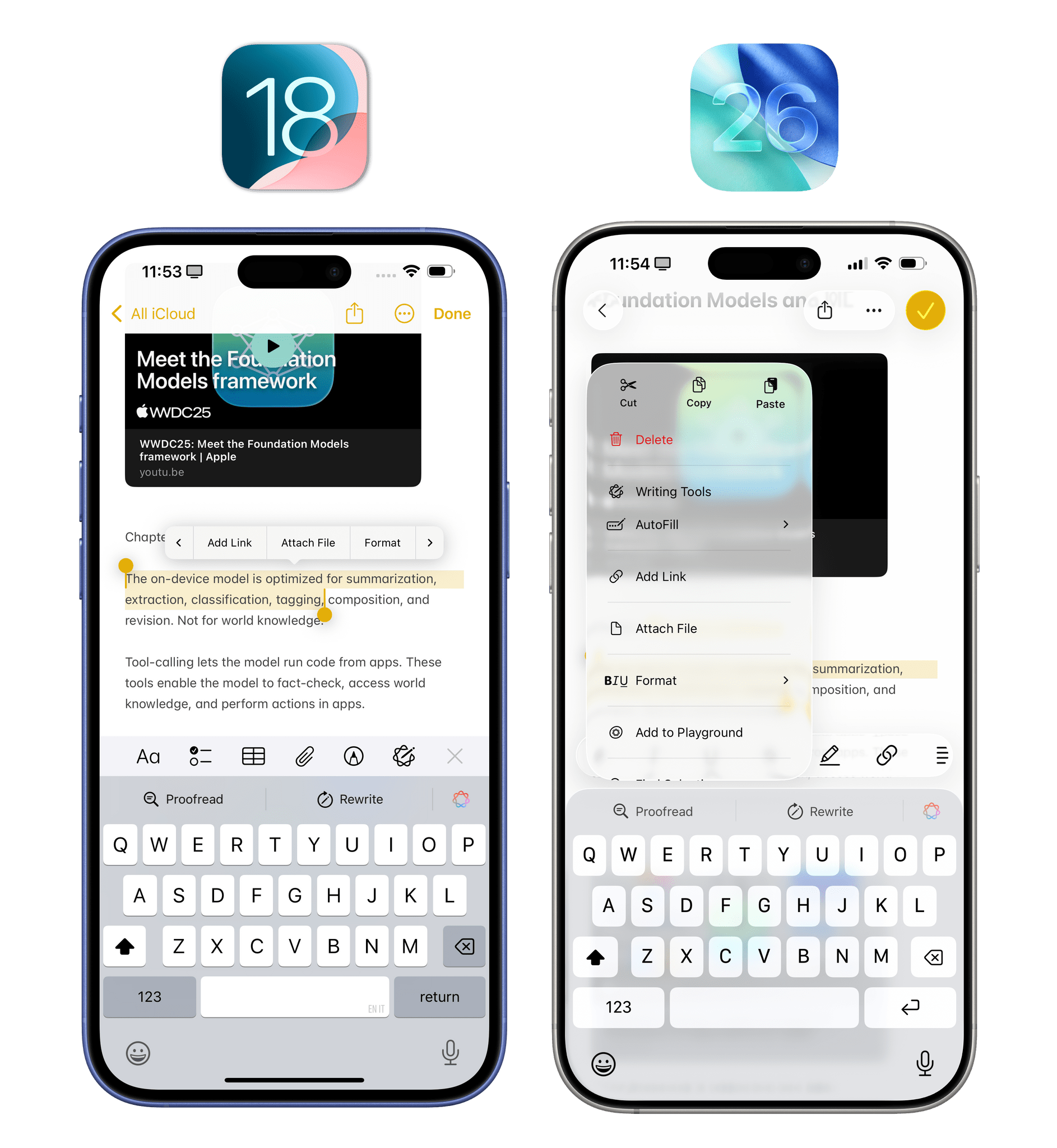
When you press a button to view more options in the edit menu, it expands into a bigger context menu in iOS 26.
I like this change! At this point, though, given the breadth of options available in the edit menu system-wide, I wish I could customize the order of the options, including which ones I want to demote to the sub-menu. Also, with this menu, is Apple accidentally rebuilding the classic macOS Services menu?
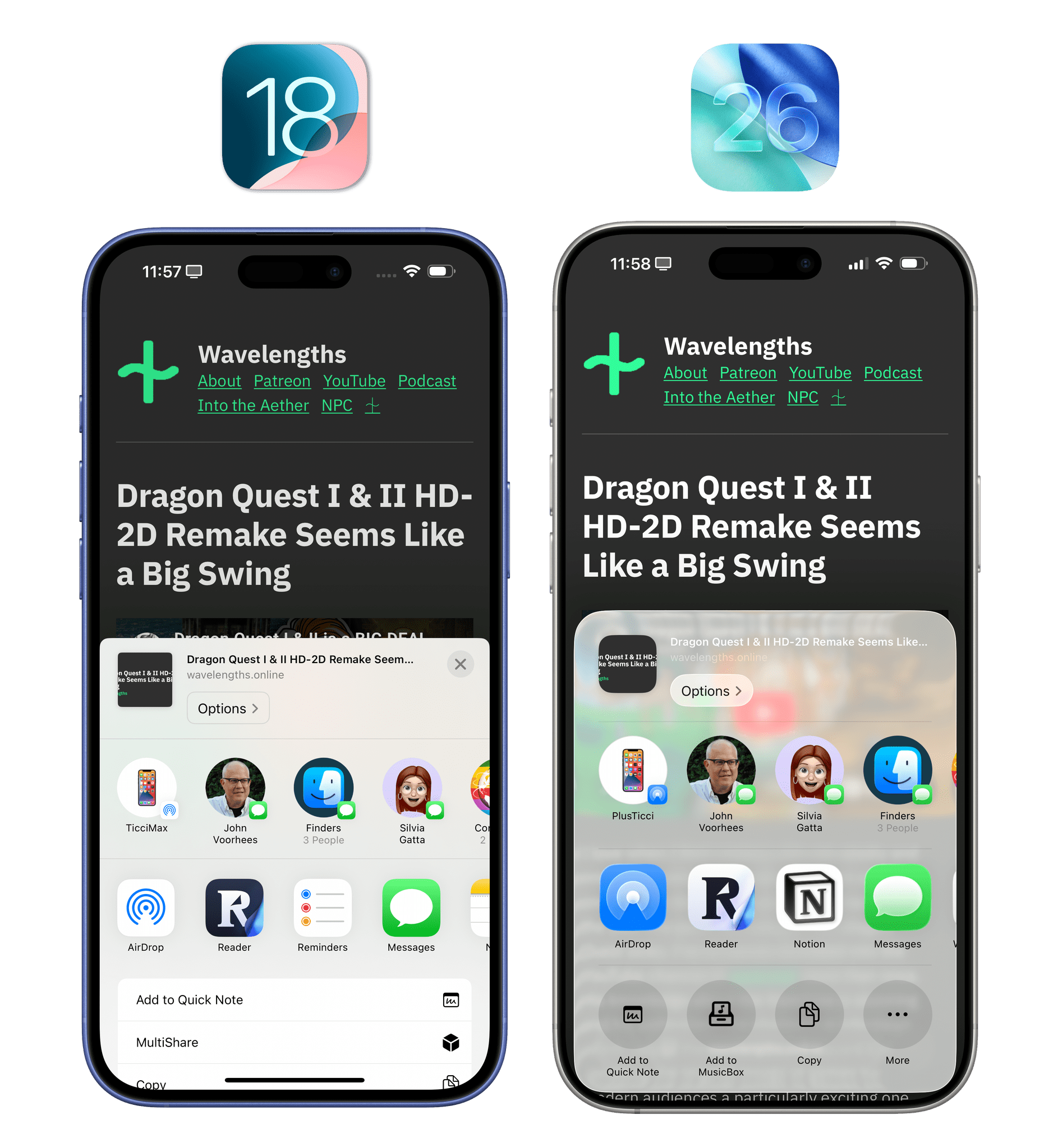
Conversely, I am not so sure about what’s happening with the share sheet in iOS 26. From a material perspective, you know the drill by now: it’s made of Liquid Glass, it’s larger and more rounded, and – like other half sheets in iOS 26 – it is now inset from the edges of the display.
That’s all good stuff. The share sheet is also a nice demo of one of Liquid Glass’ built-in behaviors: when transitioning from half sheet to fully expanded sheet, the material becomes opaque instead of translucent.
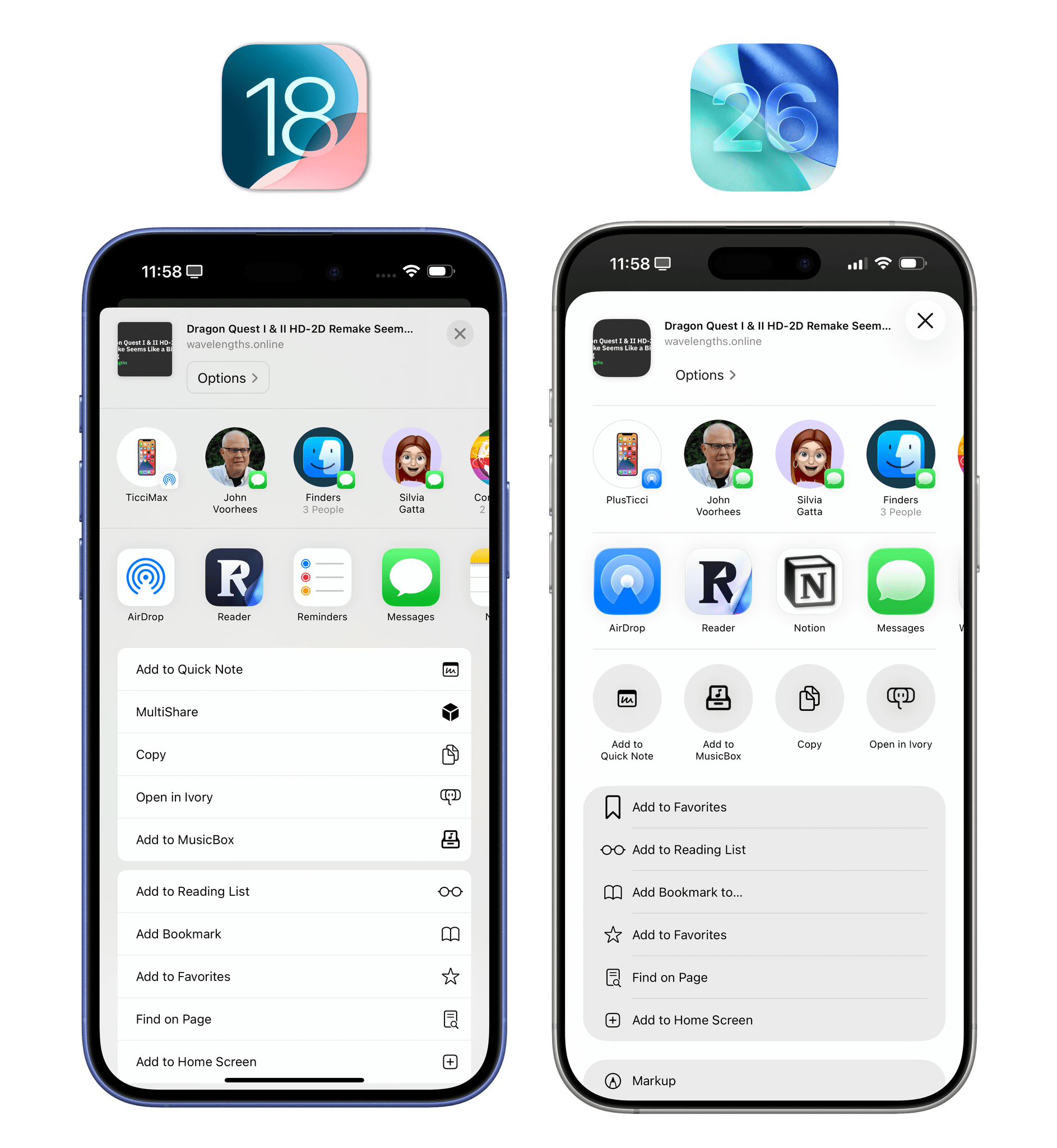
When the share sheet is expanded, the material is more similar to iOS 18’s. However, everything is more rounded, and glyphs are left-aligned.
I’m not fully sold on the implementation of the half-size share sheet. In iOS 26, action extensions (the monochromatic ones) come in two layout modes. Your favorite actions are displayed in a row of icons under share extensions; when you expand the share sheet vertically, all other actions are displayed in a list, just like in iOS 18, now with glyphs on the left side.
While I do appreciate splitting actions between favorites and everything else, I’m concerned about the discoverability of all this and the placement of a specific button in the half-sheet layout.
To reveal the full share sheet, you can either swipe vertically on the share sheet (I found out by accident; the system never tells you), or you can press a ‘More’ button that is placed by default as the fourth “favorite” in the row of circular action extensions. The problem is that this button gets swapped with the actual fourth favorite when the full share sheet is revealed! If you’re relying on muscle memory to reach for the fourth favorite action in the new share sheet, you should know that the first tap opens the full sheet and a second one – via a button that is now higher on-screen than before – performs the action.
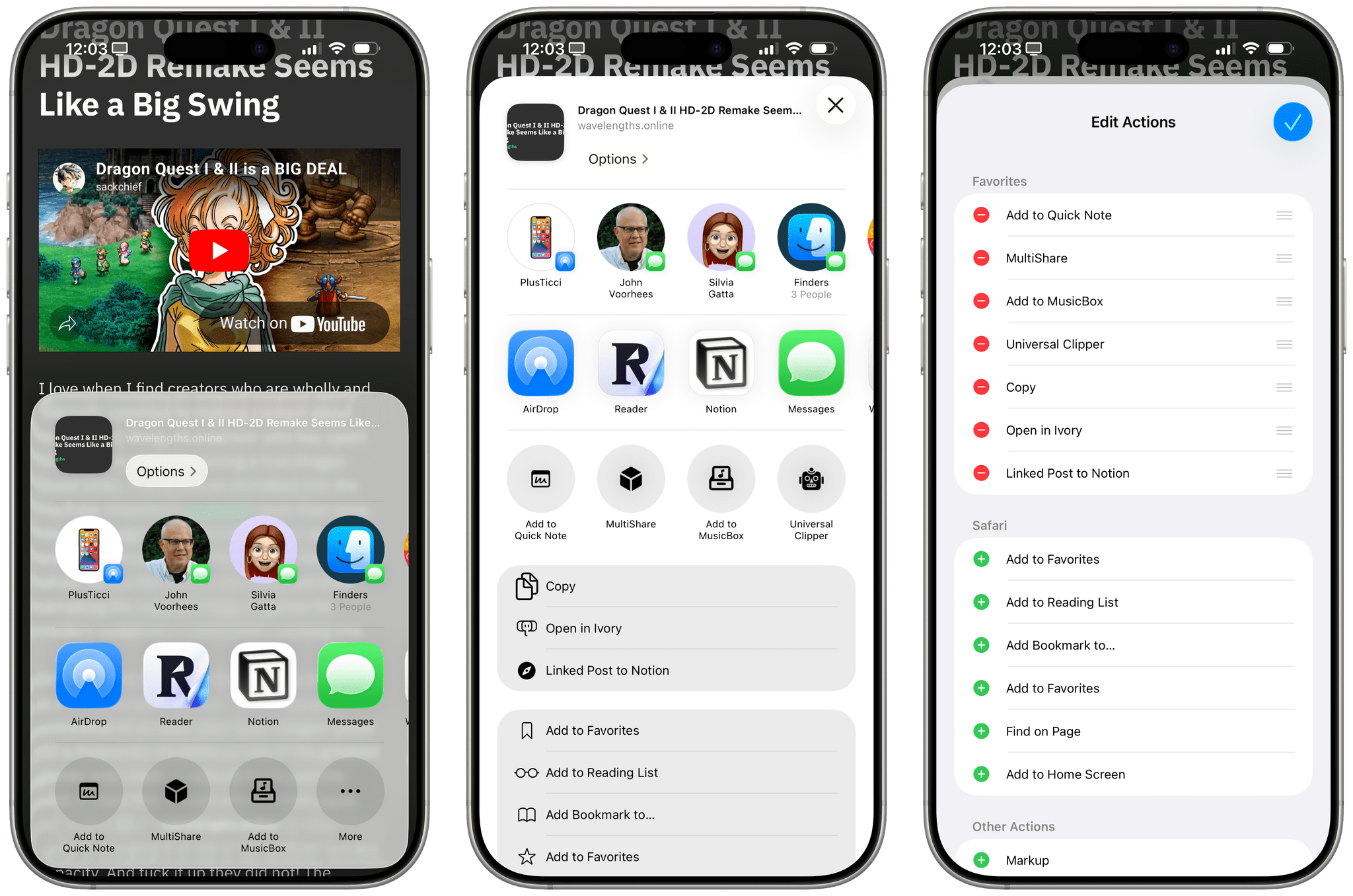
Managing your favorite extensions in iOS 26. Watch what happens to that ‘More’ button (left) when the share sheet is expanded.
I don’t think this design and tap-to-expand flow is good enough. I’d rather see Apple place separate buttons in the share sheet to let you expand it and customize it, keeping the fourth favorite action consistently in place.