Day One, the well-known journaling app by Bloom Built, was an unmistakable success. On both iOS and Mac, it amassed multiple awards for both its design and quality of the experience. Through positive reviews and loyal users, Day One rose to the top of the charts and received recognition from Apple’s App Store team.
Although one might think that Bloom Built would be content to sit back and let the success continue, Day One 2 shows that this assumption is far from the truth. Through some added features and fresh coat of paint, Day One 2, launching today, is definitely an improvement – but with today’s App Store littered with text editors, can Day One still hold its place and purpose?
Day One 2 is a new app on iOS and OS X, both in the features/design and the download itself. If you’ve paid for Day One in the past, you will have to pick up a new copy on both platforms. While this could be remedied in the future by upgrade pricing in the App Store, running that narrative into the ground isn’t something you came here to read.
Visual Changes
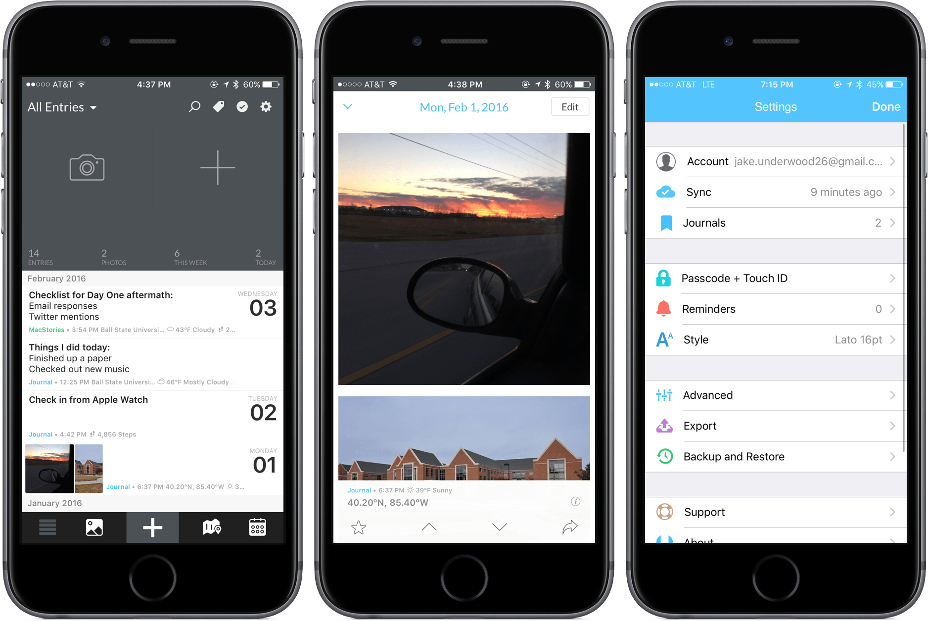
On the visual side, Day One 2 has made a lot of changes for the better. Whereas the main screen on the old app was one page, 2.0 divides different features into various menus that can be navigated using a toolbar at the bottom (Note: I’ll be discussing the context of the app on iOS. I’ll get to the Mac later.).
The new default screen may feel similar, though, with the inclusion of a couple of quick-add options at the top, followed immediately below by some statistics. Users of Day One will remember this from version 1.0, and its inclusion is a nice carryover. Also included is access to the most recent journal entries to preview.
Functional Changes

In version 2.0, syncing has gotten a radical change: instead of syncing with Dropbox or iCloud, Day One syncs between devices using its own platform. After creating an account in settings, Day One will ask you to log in on your various devices. From my testing, syncing worked well and stayed up-to-date.

Day One 2 introduces a new map screen on iOS that shows where you’ve logged journal entries. It’s a nice way to visualize your story – if you’ve gone on a trip or tend to write in different coffee shops, you can see those locations with entries on a map. There’s also an option to “View Visible Region in Timeline,” which means that you can get a summary of all entries written within the area you can see on the map.
Built in is a photo viewer, which allows you to see what photos you’ve uploaded in one large collection. This is new to Mac and its inclusion in a dedicated tab is definitely useful. Additionally, a calendar displaying days you’ve journaled can be found in the last section of the toolbar.
Although journal entries haven’t gotten as much attention as other features, there’s one big change that will cause rejoicing from long-time Day One fans: multiple images per entry. Instead of picking out the best image and hoping it is a good representation of the day, you can now select up to ten and insert them into your journal entry.
Day One 2’s entries can still be as robust as you desire to make them. If you’d like to add in weather information or your step count, it’s done automatically after granting the app permission. There’s a great selection of customization to choose from and it creates a more comprehensive logging experience.
Organizational Changes

In previous versions of Day One, users were stuck with only one journal. It was a limiting restriction, of course, because it could only be organized with tags – it was as if everything was being dumped into a single bucket. Luckily, 2.0 solves this problem by including multiple journals that can be switched to and from at any time. Each journal has a different color that displays throughout the app when selected.
What’s so smart about this, however, is how it’s implemented throughout the app. While some apps may only allow users to switch between journals on certain screens, Bloom Built has built in the possibility to do it in almost every context. For example, you can filter out journals you’re not interested in seeing, including in the map or photo viewer. This may seem like a minor change but it’s one that, to me, makes the app worth its price alone.

Another new inclusion is a sorting functionality that is built to handle any characteristics of a day. By tapping the tag icon at the top of the screen, you can sort by starred entries, as well as by tags, years, activity, and music. This option is tucked away nicely, so it’s self-imposed by the user only; when it’s needed, it comes in handy in helping you find what you need.
Bulk editing also makes an appearance, providing a better way to manage your entries. Whether you’d like to delete, tag, or move what you’ve written, tapping the check mark in the top right is a solid way to organize.
Miscellaneous Changes
There’s three other changes of varying importance: 3D Touch support, custom reminders, and timezone support. From my perspective, those above are in the order of usefulness. While peeking and popping into an entry is certainly useful and can save some time, a feature like timezone support is unlikely to be used unless a person travels frequently. Custom reminders are decent, too, as they allow you to customize how you’d like to remind yourself to write your journal.
Notable Returning Features
My enjoyable usage of Day One 2 and its new features was also illuminating on what made the first version so brilliant in the first place.
Features like Markdown support within entries or exporting to PDF are immensely important in creating an overall experience that users will fall in love with. With the return of a passcode lock and Touch ID integration, there is an added security that works as well as any other app I’ve used. Starring and tagging entries, although not as interesting as activity or music filters, are both useful.
Apple Watch and Mac Apps

Included with the purchase of the iOS app is the Apple Watch app, a simplified version of Day One that brings location check-ins or quick entry to the wrist. By using the Digital Crown to navigate between different journals, you’re able to speak (or use pre-set entries turned off by default in the Apple Watch iPhone app) or mark a location to make a note of something important.

The Mac version of Day One 2 is a bit puzzling. Besides a few design changes, the app is virtually the same on the Mac as it is on iOS. This wouldn’t seem like much of an issue until you compare the price tags: $4.99 for iOS and $19.99 for Mac for a week. After the promotional period, both raise in price to $9.99 and $39.99. That difference is steep, and although I believe it’s a fair price for the app on the Mac, it’s hard to swallow when there’s not much difference between the two platforms.
The Potential Effects of Day One 2’s Changes
With everything mentioned above, it’s easy to see the improvements and additions that make Day One 2 a great update. With that being said, Day One 2 has to compel users to not only upgrade to the new app but also develop new habits.
The two features I consider to be the most impactful, multiple photos per entry and multiple journals, have the potential to draw users into the platform, making it a one-stop location for logging life’s daily moments. Though it doesn’t offer storage solutions like Dropbox or Google Drive, 10 images in an entry can be enough to bring a user to Day One first in order to gain a better idea of a day, week, or year. With multiple journals, Day One doesn’t limit itself to be focused around one subject – it’s capable of covering many aspects of daily life.
Smaller features, like map view and entry management, add on to the overall experience of Day One. In some instances, apps simply try to do too much; Day One 2 battles that by offering features that make sense when integrated with each other.
Because of the potential of Day One 2, I have to consider my own workflow and a possible place for it as time goes on. Despite my lack of consistent journaling, Day One demands respect as an app that shouldn’t be funneled into one category. Throughout my week and a half of using Day One 2, I’ve seen new possibilities for taking notes and logging my thoughts. Day One’s ability to make me journal more consistently has yet to be seen, but I am considering updating it on a semi-frequent basis to keep some of my memories in a digital location.
The Place for a Journaling App
The main problem facing Day One, however, is the role that journaling apps play in today’s device usage. There are hundreds of text editors in the marketplace and dozens of those are perfectly capable at getting the job done of putting words on a page in reflection. Even an app like 1Writer, which doesn’t offer much functionality outside of simply typing up a document, could be used for journaling if necessary. At the prices mentioned above, users may struggle with journaling in a new app when so much writing is happening in the ones they already own.
Is Day One 2 worth the purchase? I think so. Even though its functionality centers around text editing, it offers so many other features that are worth checking out. The overall experience of Day One is similar to flipping through a physical journal, albeit one that’s organized not by date but by criteria you decide. With the addition of pictures and more metadata, Day One 2 stands up well against other apps that don’t have the range of functionalities that Day One offers.
Wrap-Up
Day One 2 has all the possibilities of bringing home as many awards as its successful predecessor. It’s a carefully crafted app that took what made the first iteration so loved while transitioning it to a new piece of software with useful and exciting changes. On any and all platforms, Day One 2 shines at being an example of what premium software feels like.
Day One 2.0 can be purchased for $4.99 on iOS devices and $19.99 for Mac during the first week. After February 11, the prices will raise to $9.99 and $39.99.