Last month, I reviewed Readdle’s Calendars 5 and noted how, in spite of getting many things right with event presentation and Reminders integration, the app had been released with some dubious choices for Reminders management, date settings, and task creation. In particular, I noted how the way Readdle supposedly “enhanced” Reminders with a Today list led to more confusion than actual benefits. I concluded that Calendars 5 was a great calendar and reminders client with dozens of nice features and a good set of views, but that needed a more streamlined implementation of Reminders and reliable sync. Read more
Calendars 5.1 Improves Sync, Reminders Integration, URL Scheme
Capturing the Aura of the Scottish Highlands With the iPhone 5s→
With intense use (I’ve made about 4,000 pictures in the last four days) I’ve discovered that the iPhone 5S is a very capable camera. The color and exposures are amazingly good, the HDR exposure feature does a stunningly good job in touch situations, the panorama feature is nothing short of amazing—seeing a panorama sweeping across the screen in real time is just intoxicating. Best of all it shoots square pictures natively, a real plus for me since I wanted to shoot for Instagram posting.
This is photographer Jim Richardson, writing for the National Geographic. He continues:
What surprised me most was that the pictures did not look like compromises. They didn’t look like I was having to settle for second best because it was a mobile phone. They just looked good.
The pictures are indeed good, and Apple’s Phil Schiller seems to appreciate the article, too.
#MacStoriesDeals - Monday

If you’re still new to iOS 7 and want to check out or tips, previews, and news, check here. Here are some great #MacStoriesDeals today! You can find us as @MacStoriesDeals on Twitter.
Launch A Web Search In Safari From Other iOS Apps
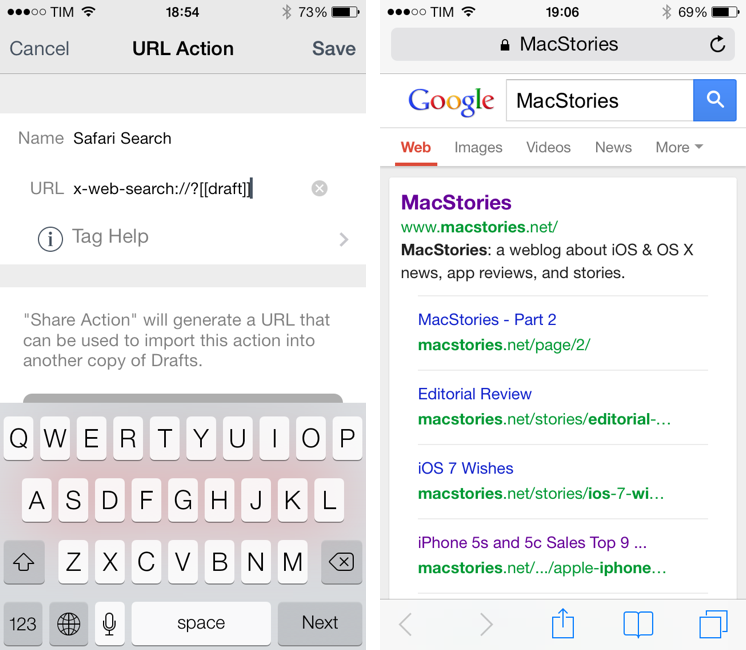
In moving back to Safari as my main browser on every Apple device I own, I thought I should mention a hidden feature of Safari for iOS that I discovered a few months ago and that I remembered today thanks to a Twitter exchange between readers Jordan and Jerry.
On iOS, you can launch Safari directly in a web search page using this URL scheme:
x-web-search://?[query]
Where [query] is the text of your search query. Essentially, instead of having to launch Safari, tap the address bar, type your search query, and then tap Go, you can use an app like Drafts or Launch Center Pro to quickly type out your search query and send it to Safari, which will open a new tab for your search.
In Drafts (or any other app that lets you create custom URL scheme-based services like Launch Center Pro, Editorial, or Mr. Reader), simply create an action that sends the text you’ve typed to Safari’s web search. Here’s my action if you want to install it in your Drafts app.
The benefit of this search URL scheme is that it doesn’t care about the web search you prefer: it’ll continue to work based on the search provider that you pick in Settings > Safari, and, overall, it’s just a nice shortcut that lets you save a couple of taps every day.
As usual, make sure to percent-encode your query. If you use Drafts, the action above will do it for you.
Skype Updated for iOS 7→
The Skype apps for iPhone and iPad have been updated this morning to support iOS 7. There aren’t notable new features in the updates, but at least the apps don’t have the iOS 6 keyboard anymore, and they blend better with the iOS 7 status bar (using Skype’s light blue color).
As usual, Skype for iPhone and Skype for iPad are available as two separate apps on the App Store.
Dr. Drang’s Scripts For Photo Management via the Finder→
Dr. Drang, following our photo management discussion on The Prompt #15:
As the podcast proceded, I soon learned that I wasn’t the only one with a photo mess on his hands. Myke Hurley has apparently never organized his photos. He has gigabytes and gigabytes of photos just sitting on his phone. Backed up to iCloud, yes, if you consider that a backup, but with no structure. Bradley began an intervention.
I agreed with much of what was suggested: bringing the photos onto Myke’s Mac through Image Capture and setting up the year/month folders. But Bradley then suggested Myke move his photos into the folder structure by hand, doing maybe fifty a day for the thousands of photos Myke has. This is madness. It’s using a human to serve the computer rather than the other way around. Like me, Myke needs an automated solution.
So I decided to use Myke’s plight as the kick in the pants to get me to finish the scripts I’d been planning to write. As I suspected, it didn’t take very long. Imagining poor little Myke dragging files for weeks on end was just the motivation I needed to sit down and do it.
Personally, I use Hazel for this, but if you don’t want to buy the app, check out Drang’s scripts.
By The End, He Was Drunk→
There was less they could do to make sure the phone calls Jobs planned to make from the stage went through. Grignon and his team could only ensure a good signal, and then pray. They had AT&T, the iPhone’s wireless carrier, bring in a portable cell tower, so they knew reception would be strong. Then, with Jobs’s approval, they preprogrammed the phone’s display to always show five bars of signal strength regardless of its true strength. The chances of the radio’s crashing during the few minutes that Jobs would use it to make a call were small, but the chances of its crashing at some point during the 90-minute presentation were high. “If the radio crashed and restarted, as we suspected it might, we didn’t want people in the audience to see that,” Grignon says. “So we just hard-coded it to always show five bars.”
There are many good stories about the creation of the iPhone, but Fred Vogelstein’s article for The New York Times is something else. Vogelstein, who is working on a book to be released in November, talked to various former Apple engineers such as Andy Grignon and Tony Fadell and assembled a fantastic collection of anecdotes, memories, and details of Steve Jobs’ legendary iPhone keynote at Macworld 2007.
If you read one thing today, make it this one. Personally, I found it more entertaining (and possibly accurate) than several sections of Walter Isaacson’s book. Make sure to read what happened to Forstall’s chief of staff.
The Original Voice of Siri→
Great story by CNN’s Jessica Ravitz, who found, almost by accident, the woman who says she’s “100% sure” she’s the voice of the original Siri (the one that debuted with iOS 5 exactly two years ago).
Behind this groundbreaking technology there is a real woman. While the ever-secretive Apple has never identified her, all signs indicate that the original voice of Siri in the United States is a voiceover actor who laid down recordings for a client eight years ago. She had no idea she’d someday be speaking to more than 100 million people through a not-yet-invented phone.
Her name is Susan Bennett and she lives in suburban Atlanta.
NSHipster Book Available for Pre-Order→
Mattt Thompson:
Combining articles from NSHipster.com with over a dozen new essays, this book is the essential guide for modern iOS and Mac OS X developers.
I am not a developer but I know that, for many, Mattt’s contributions to the developer community are invaluable. Support his work and pre-order his book here.