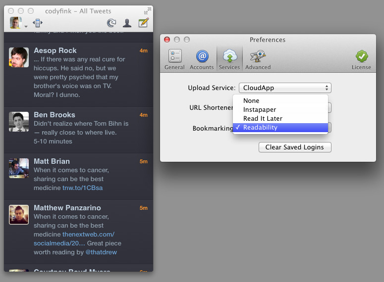
In light of the Twitter news yesterday, we missed a small but important update for Twitterrific! Fans of the Readability subscription service will find an update (4.4.4) waiting for them in the Mac and iTunes App Stores. Readability can be chosen as a read later services from the Services tab in Preferences on the Mac, and via Twitterrific in the Settings app on iOS. Readability, a bookmarking service that gives back to the authors you enjoy, also offers a customizable web and mobile reading experience, an easy to use article queue that can be shared with others, and bookmarklets to send articles directly to your Kindle.
The previous Twitterrific 4.4.3 update brought in a lot of extra refinements such as the addition of a load more button in profile pop-overs. In 4.4.4, the load more button has been added to timeline searches as well! In addition, 4.4.4 fixes some bugs with the Magic Mouse (no more missed clicks), and fixed a bug that would cause the timeline to jump to the top of the timeline when retweeting. Overall a small but noteworthy update!
Twitterrific is a free download on iOS, with a $4.99 in-app purchase removing ads and adding translations. Twitterrific for the desktop is $4.99 from the Mac App Store.
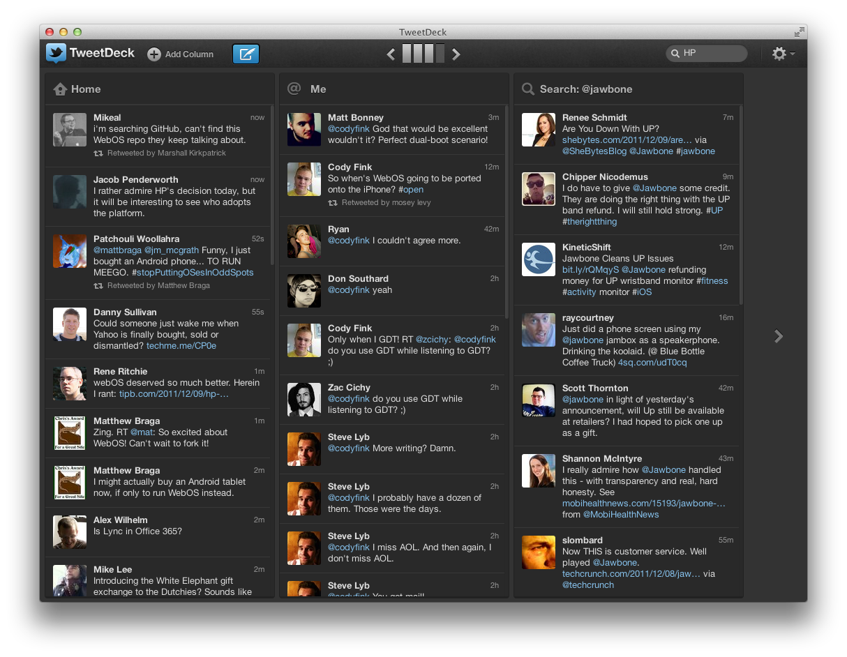
TweetDeck has always been looked up to as the power-user’s go-to Twitter app thanks to a huge feature set, its multi-column layout, quick filtering, and its availability across platforms thanks to Adobe Air. When Twitter acquired TweetDeck back in May, many questioned whether Twitter would continue to maintain the client, and whether Twitter would rebrand the app to better fit into their ecosystem. Yesterday, TweetDeck launched natively on Mac and Windows, bringing with it a brand new experience in-line with #NewNewTwitter’s focus. Like Twitter, it’s another big change many will have a hard time adjusting to.
That gorgeous app up above? That’s the next-generation Twitter app. Twitter 4.0 melds Twitter’s brand new web experience with your mobile phone, making it easier to discover and share information that matters most to you. Conversations, your activity feed, stories and trends have now been given focus in four new tabs that make Twitter more accessible than ever before.
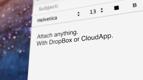
Sparrow, last updated with CloudApp integration (for large email attachments) and pull-to-refresh with version 1.4, has reached a milestone this morning with their 1.5 update now available on the Mac App Store. In this release, Sparrow continues to integrate Gmail natively with optional loading of remote images and token based searching for messages.
While I’ve taken a look at Flud before, its initial resemblance to Pulse left me uninterested. Flud, in their attempt to meld the news you were interested in with social media, never quite stood out enough from the competition or encouraged me to actively share articles with my friends. That was the case, but like Flipboard, Flud has a substantial update with a second version of their social news reader.
Flud 2.0 throws out its sharp-edged interface for an elegant carousel, containing the subscription’s headlines which scroll vertically to reveal more content. The interface, fluid and responsive when article images don’t need to be cached, differentiates itself from the likes of Flipboard and Pulse — sidestepping a magazine or traditional RSS-like experience — by presenting an open canvas (or in other words a very fancy grid) to discover content. There are some similarities with services like News.me in the updated Flud, with the main focus revolving around following your friends or idols who will curate interesting content.
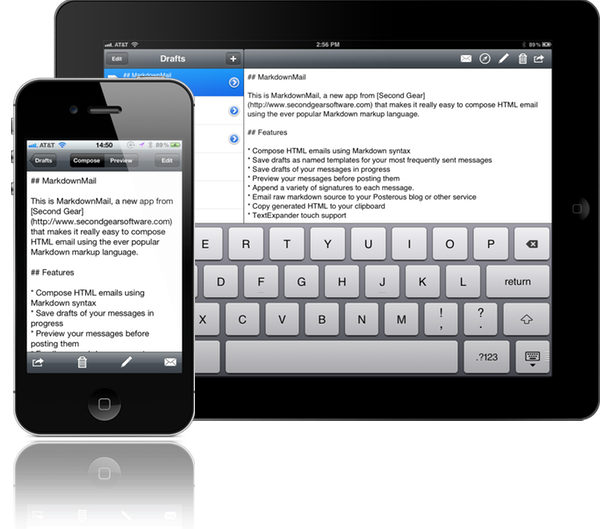
Formatting emails can be a chore if you’re using Mail’s standard RTF text selectors, but it doesn’t have to be. While MarkdownMail is niche tool of choice when it comes to composing messages — after all not many people write in Markdown as a second language — our audience of geeks will love having an outbox where they can quickly program their documents into to something presentable without going through three taps and a popover.
MarkdownMail allows you to draft and compose HTML emails on your iPhone or iPad using the Markdown markup syntax. New users unfamiliar to the formatting won’t be lost thanks to a syntax reference sheet available in the app. If you’re second guessing yourself, HTML output can be previewed before sending the message. Power users can take advantage of TextExpander integration for easily expanding snippets, addresses, and names into their emails. And for those emails that are often sent, MarkdownMail 3 adds a couple new features that make life even easier.
Email templates are great if you’re constantly sending announcements are messages from MarkdownMail to your coworkers or clients. Templates can be saved and used as a base for formatting your emails. Combined with TextExpander, shooting off important information will be done faster than ever. MarkdownMail 3 also introduces signatures support so you can maintain various business, personal, and family identities in the app. The iPhone interface gets an overhaul as well, enabling you to dynamically swap between preview and compose views. The updates address
MarkdownMail 3 is a universal application available on the App Store for only $2.99.
App Journal is a new series aimed at showcasing apps we have enjoyed using on our iPhones, iPads, and Macs, but decided not to feature in a standalone, lengthy review here on MacStories. App Journal is a mix of classic reviews, weekly app recommendations, and a diary of our experiences with apps that still deserve a proper mention.
This week’s App Journal doesn’t really have a central theme, except for the fact that all these apps were either released or updated in the past week. This journal is written by Cody, Don and myself (Graham) with Federico taking a break from the App Journal this week.
The Economist: The World in 2012
It feels like just yesterday that I was celebrating the start of 2011, and yet we have already entered the final month of the year. Being December also means the start of reflecting upon the year that was, and what next year will hold for us all. As part of that, The Economist is publishing a special ‘The World in 2012’ magazine this month and has also released a companion iPad app which includes some of those articles plus a number of videos and other interactive features.
There isn’t anything amazing about the app, it’s just a standard magazine app for the iPad (in other words mostly just static images that you swipe to and from) but its the content that matters. The Economist is a favourite publication of mine that deals with a whole range of economic, political, social and technological issues in an informed and intelligent manner - this special edition is no different. Some of the feature articles included cover the technological battlefields of 2012 (they believe it could be mobile payments, location and augmented reality), the continued rise of social (particularly for the US 2012 Presidential Election), the ‘Arab Spring’ heading further south and political change in China amongst a few other articles.
Interspersed between the feature articles are these panels which review some of the people to watch in 2012, events that are set to occur in 2012, economic figures for 2012 and what each month of 2012 will bring. Most articles also come accompanied with video as well as a few standalone pieces of video interviews with a range of people from different parts of the world - asking them what they think 2012 will bring.
Even if you’re not a fan of ‘magazines’ for the iPad, this free app from The Economist is well worth the download - it’s got great content that will give you something good to read and watch over breakfast for the next week.
It’s been a while since we’ve covered what Ollie’s been up to in his spare time. Twitterrific 4.4.3 — a combination polish & maintenance release — launched this afternoon on the Mac and iOS App Stores. There’s a couple of new improvements here, especially in the iOS edition that’ll delight some and confuse others. So what’s in the rundown? Lots of stuff.
I remember when I first reviewed Instacast for the iPhone back in March, declaring it the Twitter of Podcast apps. While possibly dramatized, what Instacast has done for mobile podcasts is what Loren Britcher did for Twitter apps. The interface, lightweight and smooth, capitalizing on common sense gestures and thoughtful design elements, quickly made Instacast one of my favorite iPhone apps. Instacast is the only non-Apple app that has a spot on my iPhone’s dock. An intelligent conversation, a good laugh, and Geek Friday are always just a tap away.
Instacast got smarter. Sure there were times when enhanced podcasts didn’t work or a wonky update caused weird crashes, but they were fixed and plenty of new features were added. Continuous playback always kept a friendly voice on the loudspeaker. Later, iCloud syncing was added in preparation for future updates. Future updates that of course would finally see Instacast taking on bigger endeavors.
There were lots of days on the couch when I thought about Instacast coming to the iPad. Until recently of course, I hadn’t known what to expect before I was invited to take a look at the first beta. I imagined that Instacast, containing a library of podcasts, would take on a form similar to iTunes. I imagined the interface as a grid, where you would easily scroll through podcast cover-art and see badges revealing the number of unplayed episodes. How silly!
Martin Hering first hinted at the design in September, and I later had the privilege of revealing more of the interface near the end of October. An excited Joshua Schnell and Myke Hurley have also been eager to share the new interface, giving it due praise on the App Orchard and at Macgasm. The hype around Instacast HD for the iPad has been astounding, and for good reason. Instacast HD is incredible.