29
Apr

Designing the Browser of the Future

Posted in stories by Federico Viticci.


[This is a total update & restyling of 7 months old post. Updated to December 2009]

I recently stumbled upon this post by Aza Raskin where he outlines the pros and cons of a brand new way of using Firefox: a vertical sidebar with multiple items in it. That post made me think a lot about this subject: how can we improve the browsers, what can designers and developers do to make browsers more usable and “modern”? I started searching for other similar resources and I found a couple of interesting mockups from GoSquared, IA and Cocoia. This post will showcase these mockups and provide some ideas about how can browsers evolve and get ready for “the future”.

Enjoy!

Tabs in the year 2009

One of the most used features of Firefox / Safari / Chrome / Opera is the ability to open multiple tabs in your session in order to keep more webpages open at the same time. Or at least, this is the use that I do. The real value of tabs, infact, lies in the possibility of being able to use them in multiple ways: some people use them as temporary boomarks, some to open more pages within the same site (for example, multiple articles in a blog)  and then there’s a large number of users who still use them as a simple “to-do list”.

The most obvious drawback, however, is that when you have more than 15 tabs your browser becomes a real mess. The top toolbar is cluttered by dozens of small tabs and you can’t even recognize which websites they belong to, as the tab’s name becomes unreadable. For this reason many developers tried to solve this problem by creating add-ons to display multi-row tabs.

I’d rather not talk about the “awesomeness” of such configuration.

Firefox Tabs

I wouldn’t call this the perfect workspace. Let’s move on.

Mockups, Mockups, Mockups

Aza Raskin (post) was talking about the possibility of placing tabs vertically rather than horizontally: a vertical display, indeed, would improve the process of managing tabs because humans are more used to “top to bottom” lists rather than “right to left” lists. But most of all, vertical tabs would allow us to create groups of tabs. Example: we have 10 open tabs, 3 tabs belong to ebay, 2 to facebook, 3 to twitter and 2 to Google. With a “hierarchical” group system we could first move the tabs belonging to  ebay in the first “father tab”, then we could combine those 3 tabs in a single tab with a dropdown menu that, if clicked,  shows the 2 remaining tabs. The same could be done for Twitter and Facebook tabs. This process will create 5 tabs instead of 10, allowing us to have a quick glimpse of everything we have in our browser. Even better, it’s intuitive and usable.

See the screenshot below for a quick example. It’s based on the Tree Style Tabs addon for Firefox, but the concept is the same.

Tree Style Tabs

I’m using this Tree Style thing since many months now and I just couldn’t live without. Still, it can be hardly improved.

Let’s now take look at the mockup posted over Aza Raskin’s blog.

As you can see ,there’s a sidebar on the left side of the screen containing Tabs, Applications and Workspaces.

Tabs are arranged vertically (no groups, anyway) as we have said before, but I’d focus on the other two “zones“. Applications is an excellent idea: since the Internet is now highly  based upon webapps, the possibility of having shortcuts just a click away is very good, especially if properly developed. Chrome is doing a similar thing with “pinned” tabs, though I’d like to see more from a modern browser: built-in custom userstyles, native gestures, system-wide integration?

Workspaces is another pretty good feature, but I’ll talk about it later. Overall the mockup is very rough, but some interesting discussions arose in the comments of this blog post, be sure to check it out.

Here’s an excerpt:

“Applications – Much of our time on the web is now spent in web apps. We use them in long-lived session, and when we close the tabs that house them we know we’ll be coming back. This design acknowledges that there are a handful of these applications that we always want around whether or not they are currently active by putting them in a consistent location.

Workspaces – We browse in tasklets: I’m researching a vacation, I’m working on Ubiquity development, I’m procrastination, etc. We should be able to easily take the sites we are interested in and drag-and-drop them into a workspace for safe keeping.”

Let’s now take a look at these mockups from Information Architects:

Firefox iTunes

Firefox iTunes

IA editors designed the browser of the future not as a simple browser. They took inspiration from iTunes libraries. Genius. In case you missed it, here’s the original post.

The real problem of browsers is that they just  browse the page without offering us any useful tool to organize and filter the content that we’re visiting. It’s like going to the museum everyday, without taking any notes or photos. And let’s not talk about bookmarks as they are now, please. This mockup shows a sidebar-powered Firefox that remembers everything, tags and organizes information in a cool way,with  integrated RSS management, ability to create surflist just like iTunes creates playlists and detailed statistics on surfing habits. Above all, it’s pure awesomeness.

Here’s an excerpt from IA’s blog post:

“Tabs worked well on slow machines on a thin Internet, where ten browser sessions were “many browser sessions”. Today, twenty+ parallel sessions is quite common; the browser is more of an operating system than a data display application; we use it to manage the web as a shared hard drive. If you have more than seven or eight tabs open they become pretty much useless. They’re a good solution to keep the screen tidy for the moment. And that’s just what they should continue doing. For the overall organization of your browsing, a cloud file system works much better.

To be clear: It’s not what Safari or Chrome do. The idea is not to show screen shots but to turn the browser into a media system organizer more than a media display application. Instead of structuring a browser to keep the screen tidy for the moment, we thought that it’d be awesome to structure the browser as a (multi media) file system. Like iTunes. With predefined folders. Like OSX. So whenever you open a new tab you see what you last saw in your iTunes, uhm, Firefox library.”

Comparing it to the first screenshot (the Aza Raskin one) is clear how the visions are very similar, but there are some important differences. Where surflists are similar to Raskin’s workspaces or “navigation flows” (in my case I could create a workspace called “Work” which would include Wordpress, Flickr and Google and another one called “Social” with all my social networks) tabs is the most obviuos difference. The IA mockup actually includes horizontal tabs too.

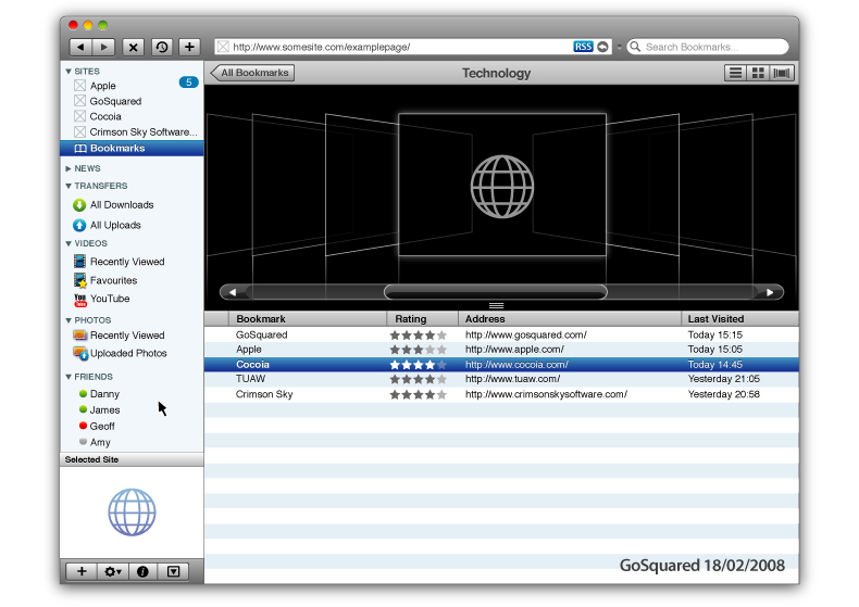
Again, another mockup. Cocoia got inspired by iTunes and designed a “dream browser” which makes easy for the user to keep everything under control, without the need of getting lost into dozens of sub menus. Here are two screenshots and an excerpt from this blog post.

“In my interface mockup, I got rid of the notion of tabs, and present websites in the ‘website’ group, the most important sidebar item. The items in the sidebar are relatively limited; your open pages, a control to open a new page, and your favorites, which invokes a list of your favorites in the main view. Again, there’s no way to get confused how you got to your favorites list and how you switch back to a website; it’s all in the place you know you have to look.

As you can notice, the sidebar contains groups for managing and using ‘features’ of everyday websites; news, photos, and videos. If this application were ever to become a reality, I’d suggest the sidebar to be extendible openly; imagine the same, unified interface to all your possible needs. An addition could be made to allow the easy tracking and viewing of classifieds and auction bids, or for working with online maps. The possibilities are virtually endless.”

While Cocoia’s mockup could be perfect for the average users who daily checks a few websites and a bunch of social networks, it could be hard for many people like me who usually keep 10-12 open tabs for work stuff. How does the Dream Browser work in a situation like this?

Last, I’d like to mention the GoSquared guys, who took inspiration from Sebastian de With of Cocoia and released their dream browser mockup too. They wrote two blog posts about it (here and here) and posted some screenshots which display a gorgeous way of keeping track of your online contacts and bookmarks.

The GoSquared guys took a very similar approach to that of Sebastian de With, designing a browser that streamlines the user experience dividing photos from videos and Friends. They wrote:

“The problem with current browsers is they are not designed for the new ways we are using the internet – RSS feeds are a late addition in the whole scheme of things, downloads are resigned to a small window in the background, and other media such as video and photos are still embedded into pages with no easy way of cutting through the clutter.

With this growing multitude of content flying around, perhaps a more organised approach would enable users to collect and share information online easily and efficiently.

Looking at iTunes, the most popular media software in the world, media is organised into groups of Music, Videos, TV Shows, Purchased Content, and then User Defined selection (Playlists). What if a similar approach was taken to the web? It would make sense – imagine being able to see all of the videos you have watched in the last week in a single list, with the ability to play any of them all from one page. Imagine you are downloading a 90 page PDF while also downloading a new app from your friend’s site, as well as downloading the latest movie trailer from the Quicktime site and being able to monitor all your downloads, and see what type of media each of them are, without even leaving the current window.

That’s our dream browser.”

My Idea

I thought a lot about these two mockups and I came out with my personal mockup of the “Dream Browser”. Well, it’s not a mockup (and I’m not so skilled with Photoshop) it’s just an addition to what these blogs above designed. I’m focusing on extending tabs and the workspaces feature, which many people above seem to forget about. Because it’s true that the average user doesn’t require many customization possibilities, but still we have to “imagine” a complete, professional browser. You can find additional info on my mockup in this post by Pascal Finette “Mozilla Labs Concept Series – Gem of the Week”.

- We’ll have the opportunity to choose whether to navigate with the sidebar or manage tabs vertically. The sidebar will be placed on the left;

- You’ll be able to add shortcuts to the most used webapps;

- Navigation experience will be organized in workspaces, or “content related pages”. Much like you organize your life in Work, Social and Stuff, you’ll be able to do the same in the browser. Workspaces will be displayed through small thumbnails in the sidebar. Clicking on a thumbnail will open a page with small live previews of all the sites inside that workspace; (like the IA mockup, applied to workspaces)

- Active workspace will be highlighted in sidebar;

- Workspaces won’t be organized in tabs: if you are in Workspace 1, visiting Twitter, and you’d like to switch to Facebook, in the same workspace, you’ll just have to click a button. A badge on the thumbnail will show you  how many open sites you  have in that workspace. Clicking that badge will open a popup (like the 4-finger swipe left gesture in MacOS) to see the available sites and change on the go;

- Ability to drag & drop  sites between workspaces ;

- Tab navigation outside the workspaces will be managed hierarchically, filtered by groups and “Tree Style”;

- The URL bar will integrate the search box. Alternatively you can run a search by typing in the url “goo bla bla bla” or just invoke Ubiquity. (as for the search keyword in URL bar, Glims already offers this feature and it’s amazing)

- Possibility of starting single-session so that you can log with more accounts in the same site (much like Stainless already does)

- Integration of services to back up your bookmarks / history / workspaces/ sites à la Xmarks;

- Improved multi-touch gestures;

- Built-in mail client;

- Built-in, full featured RSS reader or “News”;

- Simple and user-friendly browser theming, based on HTML and CSS;

- Possibility to navigate in Full-Screen (MegaZoomer for Mac already lets you do this)

And you? How do you imagine the browser of the future?


Subscribe to our RSS feeds. You can also follow our official Twitter account @macstoriesnet.


  1. #1

    That's what Tim said 1 year ago:

    very very curious. wonder how it will influence the future of the web experience

    [Reply]


  2. #2

    That's what Ticci said 1 year ago:

    Tim wrote:

    very very curious. wonder how it will influence the future of the web experience

    Thanks for the comment Tim!
    Well, I hope Firefox will get more “visual”. I mean, semantic web, human interfaces, I think these are the roads Mozilla should take for the future.

    [Reply]


  3. #3

    That's what Philip Finlay-Bryan said 1 year ago:

    Just love 3D foxtabs – well done. I leave all tabs open then 3D em!

    [Reply]

    Ticci Reply:

    absolutely. I’ve decided to cover Fox Tab in my next huge tutorial, be sure to check it out! ;)

    Thanks!

    [Reply]


  4. #4

    That's what Rene said 1 year ago:

    Very interesting and nice article.
    I definitely like the idea of grouping tabs, so the vertical / hierarchical mockup works for me.

    I don’t like as much the iTunes view, although maybe after using it you may get used to it.

    But I agree with you that it would be fun to see how the next version of FF takes more advantage of Ubiquity.

    [Reply]

    Ticci Reply:

    Thanks!
    Agree with you, grouping tabs is a great solution to organize workflows..especially if you keep many tabs open at a time.
    iTunes-view (well, not a carbone copy of iTunes, but something similar) I think would be very interesting, mainly because of webapps/bookmarks sorting. Just like iTunes does with songs.

    [Reply]


  5. #5

    That's what CrIS said 1 year ago:

    I never used iTunes but it’s always good if you have opensource and can download the source code so you can compile the browser how you like it by adding/removing/customizing features/Design,…. There so many Browsers build on Gecko such as K-Meleon and co. Not always the newest Versions are the best for everyone’s needs.

    [Reply]


  6. #6

    That's what Matt said 1 year ago:

    My current navigational style is that I’ll read a website, and Control+Click on interesting links (image reading techmeme) then read them later. Would we could do to help users, is a new type of control click (maybe Shift+Control+Click) which doesn’t open a tab, but stores the link on a “read later” list.

    As ever the question is finding the many different mechanisms which users use already and moving the navigational model to suit as many of those as possible.

    [Reply]


  7. #7

    That's what Don Schindler said 1 year ago:

    I like the idea here and using a somewhat iTunes like interface. I guess what I was referring to in my Tweet is why is search, twitter, facebook separated out by web pages. I don’t like Flock’s interface but these apps should not be pages anymore. They are tied to communication.

    I don’t want to tab, I want to be fed all the time like a stock-ticker of communication and browsing should be separated. Does this make sense?

    [Reply]


  8. #8

    That's what Trevor Tye said 1 year ago:

    Seems like the next logical evolution. Though I hope they improve on the “iTunes” look. There are things about the iTunes navigation I really don’t care for.

    [Reply]


  9. #9

    That's what disopedient said 1 year ago:

    i am no techie really so apologies if i seem to have misunderstood any of the above content.

    but nice idea on the group tabs, from a layman’s perspective.
    2nd mock-up’s (itunes) probably more aesthetically pleasing but if you are talking about some 20 over tabs, might not ease the switch from one to the other. still! ideal for those who are not that heavy on the super multiple tab browsing.

    if i apply this to my browsing habits, i just wonder if i am organised enuff to utilise this function to its best capability. :D i can have 20 over tabs opened and they are all about drastically different stuff. my sidebar group of tabs could potentially become another mess, just because i am not exactly an organised person really.

    and then perhaps! maybe someone would have to come up with.. another side bar to organise my hierarchical group of tabs? LOL! i wonder.

    but bottomline, brilliant ideas, though at the same time should be mindful that complexity be kept to the minimal when it comes to using the organisation interface.

    appreciate your tweet on forwarding this link again. it’s been insightful.
    cheers. :)

    [Reply]


  10. #10

    That's what Tom Kiley said 1 year ago:

    Looks really cool. I think the browser in general has been need a reworking for some time now.

    I’m one of the people who often have 15+ tabs open. A lot of them have pages that I want to read, but don’t have time for right now. Of course now, some of them get forced off the left of the screen and I seem to forget about them.

    Hopefully these design changes will make the UI more efficient.

    [Reply]


  11. #11

    That's what Sunil said 1 year ago:

    I’m really excited for the redesign of Mozilla Firefox!!!

    [Reply]


  12. #12

    That's what kukukuan said 1 year ago:

    Actually, I totally agree with the idea.

    When I trid to go further, I came to this conclusion – Browser will be a resource manager.

    I believe his change will happen, since applications moved from local OS to Web gradually.

    OS was once the connector that helps people manage softwares. Cloud computing era is coming, and it’s time for web browser.

    We need web browsers to manage online/offline resources. Apple has a lot of experience to deal with this job. Finder manages files and applications, iTunes manages music, iPhoto manages pictures, and the beta Safari 4 manages web resources. All of them has similar design. I’ll not discuss why Apple’s design is good, the fact is that many people like the design.

    BTW: the music player (or browser?) SongBird looks like your mockup, although a lot of details need to be polished. :D

    [Reply]


  13. #13

    That's what Ticci said 1 year ago:

    kukukuan wrote:

    Actually, I totally agree with the idea.
    When I trid to go further, I came to this conclusion – Browser will be a resource manager.
    I believe his change will happen, since applications moved from local OS to Web gradually.
    OS was once the connector that helps people manage softwares. Cloud computing era is coming, and it’s time for web browser.
    We need web browsers to manage online/offline resources. Apple has a lot of experience to deal with this job. Finder manages files and applications, iTunes manages music, iPhoto manages pictures, and the beta Safari 4 manages web resources. All of them has similar design. I’ll not discuss why Apple’s design is good, the fact is that many people like the design.
    BTW: the music player (or browser?) SongBird looks like your mockup, although a lot of details need to be polished.

    Agree.
    Imagine a browser that could store in background all of the pages you visited and sort them in a better way. I believe Mozilla could succeed in such an effort, Apple should try to be more ground-breaking with Safari 4.

    I tried Songbird for about 20 minutes, but I heard that was a big update so I think I’m gonna give it a try again.

    [Reply]


  14. #14

    That's what Adam said 1 year ago:

    Looks cool. Should make Firefox relevant to Mac users once again. May consider switching when a release like this comes out.

    [Reply]


  15. #15

    That's what Ticci said 1 year ago:

    Adam wrote:

    Looks cool. Should make Firefox relevant to Mac users once again. May consider switching when a release like this comes out.

    Well, I think Firefox is already relevant with all its addons..

    [Reply]


  16. #16

    That's what Karl AD. said 1 year ago:

    Excellent article! I’ve dreamed of a combined firefox/safari for a while. Now, if only firefox could get drag and drop attachments/uploads everything would be right with the world!

    [Reply]


  17. #17

    That's what paviles said 1 year ago:

    Ricci, genial Muy concreto. Da un excelente visión del producto!! Se ve muy bien, a tono con Mac OS. Esperemos que esas “extras” no hagan que el rendimiento de Firefox decaiga!!
    Saludos

    [Reply]


  18. #18

    That's what Javacikiz said 1 year ago:

    Hi, it was so long to read. Bu I know all of your writings are good. Thanks for sharing.

    [Reply]


  19. #19

    That's what Steve Hurst said 1 year ago:

    I am constantly having quite a few windows open with many tabs in each, so this whole concept looks great to me. Cant’s wait for this.

    Steve Hurst
    http://www.spnmarketing.com

    [Reply]


  20. #20

    That's what SeriousSamP said 1 year ago:

    Yeah great ideas! I think the way forward is definitely in customization. Maybe end up with changing the whole homepage idea as well. What about if people could integrate all their social networks and feeds and anything else they wanted into a dynamic homepage? A classic Dashboard idea.

    [Reply]


  21. #21

    That's what Ticci said 1 year ago:

    SeriousSamP wrote:

    Yeah great ideas! I think the way forward is definitely in customization. Maybe end up with changing the whole homepage idea as well. What about if people could integrate all their social networks and feeds and anything else they wanted into a dynamic homepage? A classic Dashboard idea.

    Sure, have you ever heard of Feedly addon? I’m gonna talk about it in my next huge Firefox tutorial!

    [Reply]


  22. #22

    That's what sucodestrela said 1 year ago:

    Thumbs up for this article!

    [Reply]


  23. #23

    That's what Casey Gotcher said 1 year ago:

    Good article. Looking forward to next FF for sure.

    [Reply]


  24. #24

    That's what Freddy said 1 year ago:

    Muy buen articulo.. te da una exelente visión de como podrían ser los navegadores en el futuro.. firefox sobre todo es un agente de cambio… y si.. por ahora manejo dos pefiles en firefox.. uno mínimo solo para navegar, y otro con mil addons para trabajar.

    Saludos

    [Reply]


  25. #25

    That's what Ganesh said 1 year ago:

    Let me some up… You guys gonna create Work Spaces like in linux , in your case pages from same site can be grouped together in workspace…Book marks toolbar now becomes vertical.!!.. Gr8 idea by ppl by at mozilla labs..!!! Thinking now, I I always wanted a group tabs from from same site (similar to group windows from same apps in windows)..!! May be u should include a feature such moving over workspace, the workspace splits to reveals the tabs inside it.!!!!!!1

    [Reply]


  26. #26

    That's what Ticci said 1 year ago:

    @ Ganesh:

    If I only had the means to create a FF extensions to enable these features in FF 3.0..

    [Reply]


  27. #27

    That's what Isaiah Copon said 1 year ago:

    I really like the idea of the iTunes like horizontal-tab feature!!
    But, I hope it doesn’t take up as much room as the iTunes toolbar does. Hopefully, it’ll be a slimmer version because we all know how important it is to have more screen available for the actual webpage.

    [Reply]


  28. #28

    That's what Ganesh said 1 year ago:

    @Ticci

    FF has the best add on platform out of all browsers.. Jus the other I went to fox tab add on.. They managed to bring famed vista flip in the FF browsers.. May be with FF 3.5 ur wish may come true.!!!!! :)

    [Reply]


  29. #29

    That's what Ticci said 1 year ago:

    @ Ganesh:

    Yeah I know Fox Tab, it’s pretty cool. Anyway, I’m writing the final part of my next article about Firefox, “Turn Firefox into Firefox.next now”. It’s gonna be huge ;)

    [Reply]


  30. #30

    That's what Ticci said 1 year ago:

    @ Isaiah Copon:

    Indeed, I HATE horizontal toolbars.

    [Reply]


  31. #31

    That's what superbnjmn said 1 year ago:

    i do like the itunes-like design! looks good

    [Reply]


  32. #32

    That's what Machin said 1 year ago:

    Im waiting to see this implemented, nice article.

    [Reply]


  33. #33

    That's what Digital Media Buzz said 1 year ago:

    Thanks for sharing the story with us via Twitter. Lots of great information!

    [Reply]


  34. #34

    That's what Sandy said 1 year ago:

    Honestly, I think I want both designs. Seems to me that the first example would be great for the actual browsing (or using web apps, etc) since the view is simplified. I wouldn’t want to have to load/view the images to “switch tabs” since that would just add extra overhead for me.

    The second example would be a great way to store “favorites.” I typically use delicious instead of the bookmarks feature, but even with the tags and descriptions, I often forget what the site was that saved and why I saved it. I think the visuals would help here.

    Great article, and I’m looking forward to the next installment – thanks for sharing via Twitter :)

    [Reply]


  35. #35

    That's what Ticci said 1 year ago:

    @ Sandy:

    have you ever heard of Webbla.app for visual bookmarks?

    [Reply]


  36. #36

    That's what Matt (technews.am) said 1 year ago:

    Great Article – thanks for the tweet informing me about it. So the web becomes an application and FF becomes an application browser. Very neat.

    [Reply]


  37. #37

    That's what ODGPUNCHER said 1 year ago:

    sounds like a fucking mess, if you felt the need to create such a convoluted solution to window management then I think you have too many windows (tabs) open

    [Reply]


  38. #40

    That's what James Gill said 8 months ago:

    The future of the browser is bright. Something tells me Apple may be in the best position to innovate here – I can imagine an integrated solution between Safari, OS X, and iTunes. My thoughts on the perfect browser have evolved since my rather basic concepts featured in the article – amazing what difference a year or two can make on one’s opinions and thoughts of internet browsing experience.

    [Reply]


  39. #44

    That's what Dave Sparks said 8 months ago:

    I must say I do like the idea and I am one for having a lot of tabs open.
    The only real issue is that this is only really suitable for widescreen browsers, a 1024×768 display would have to introduce horizontal scrolling on a lot of webpages to accommodate the side tabs.

    [Reply]


  40. #45

    That's what Kate said 1 month ago:

    Oh god, these are beautiful. They’re exactly what I’ve been looking for without knowing what I really wanted. I, too, am a multi-window/multi-tab/multi-browser person, and I usually have, for example, at least a dozen things open from LiveJournal. But there’s no way to tell, at a glance, which tab is which, and while I remember the order they’re in after a while (yes, I keep them open long enough for that), it’s still inefficient and clumsy. I love the idea of browsing with a more iTunes-like interface, but some of the other commenters are right; it would take up more screen real estate that some people don’t have much of to begin with. I have a MacBook Pro with a 13" screen, and does get awfully crowded at times. Still! I would jump on a browser designed like this in a heartbeat, no questions asked.

    [Reply]