Many applications try to take the minimal approach nowadays, and a very few manage to achieve it and combine it with an actual usability. Fortunately, these very few apps are indeed some of the best apps around, and if you take a look at the App Store you can see plenty of them in the top paid and top grossing charts. I’m talking about apps like Reeder, Simplenote, Taskpaper: applications that didn’t aim at empowering the user with tons of features and graphical goodness, whose developers just focused on elegance and usefulness. Sure there are applications like Pastebot that mix custom, rich graphical elements with a real purpose, but I thank God every day for apps like Reeder.
But what about the iPad? If you look at the apps out now, you’ll see that most of them try to follow the user interface guidelines suggested by Apple, just like with the first iPhone apps that came out in 2008. Then, after some months, designers and developers started to explore new ways of designing mobile apps, and I bet the same will happen with the iPad. But then again, there are some differences between the launch of the iPhone App Store and the iPad one: it turns out that some devs have already started experimenting with their apps, trying to break the rules established in Cupertino by introducing custom, different and non-native looking UI elements in their apps.
Now back to Reeder, there’s a reason why I mentioned it: today I’m going to take a look at Headline, a feeds reading app for the iPad which, in my opinion, might be the “new Reeder” for iPad.
Too soon to tell? Let’s take a look.
Reeder is sexy. I mean, it takes a minimal approach, but it’s a very appealing app that makes reading news looking good. For this reason, developing a new feeds reading app that takes a minimal approach and wants to indirectly compete with Reeder (which is already in the works for the iPad) must be a very difficult job. But somehow the Headline developers found the perfect mix between the “looking good” factor, usability and readability. Being a very first attempt on a new platform, Headline is a damn good result. Almost stunning, I’d say. But before I’ll dive into the app, let me say now that this app needs to be refined and tuned to fully compete with Reeder. And if this is not a competition, than it’s a goddamn race for who’s gonna be the first dev to release the first, perfect Google Reader app for the iPad.
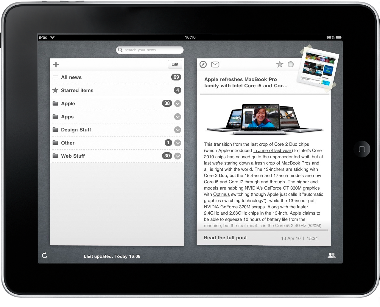
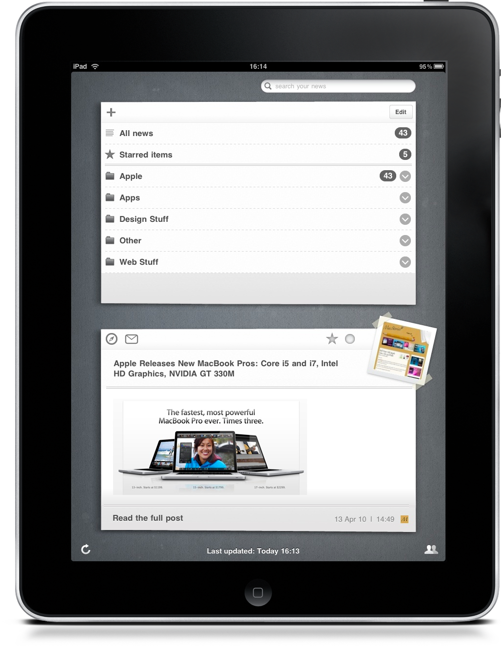
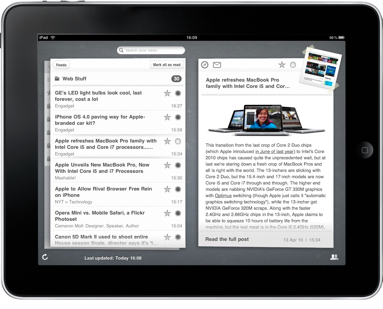
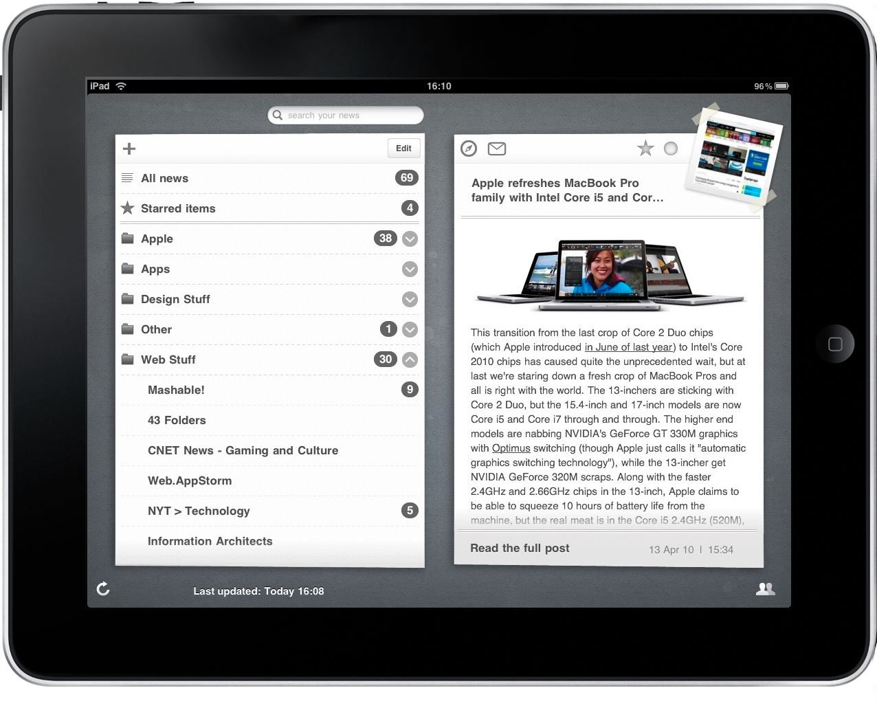
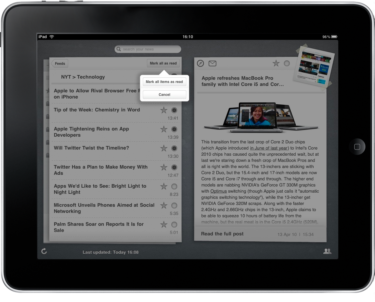
Headline goes minimal when laying out feeds but tries something new as well. Instead of presenting the already usual portrait:popover / landscape:split view scheme, Headline has these “panels” or “cards” (really, just take a look at the screenshots) that float both on screen and on each other, which contain your Google Reader folders, subscriptions and unread items. When you navigate through subscriptions, these cards open and slide to reveal the article, which is formatted to stay inside the panel. You can scroll through the panel to read, email and star an item, open it in the web view. The whole process feels smooth overall and it’s a very natural experience. It feels good to switch between cards, read, scroll, close.
The user interface design is custom and well done. Everything is kept simple, with subtle gray and black tones, good typography and menus that are easy to understand. In Headline portrait and landscape view don’t differ too much, except for the panels that get a different layout and spacing. You won’t see popovers and split vies like in many other apps. Another cool thing is that you can expand folders to reveal subscriptions directly from the main panel, and the animations are very nice. Of course you can open a folder in another window, and that will go over the main one. You can mark as read all the items using a popup menu, or just go through every single feed and mark as read. Sadly, there’s no implementation of the beloved swipe-to-do-something.
The only real problem of Headline is that being a new app it lacks a lot of extra stuff: there’s no support for Delicious, Instapaper and Read It Later, the settings are not in-app and offer just the home screen badge option, you can’t sort feeds in other orders than the default one. Here’s the good news though: the developers are working on it. The guys are based in the UK, so they haven’t been able to develop the app on a real device and were forced to cut some features for the first release. As you can read on the App Store page, support for Twitter, Instapaper, extended gestures and even smoother animations is coming very soon.
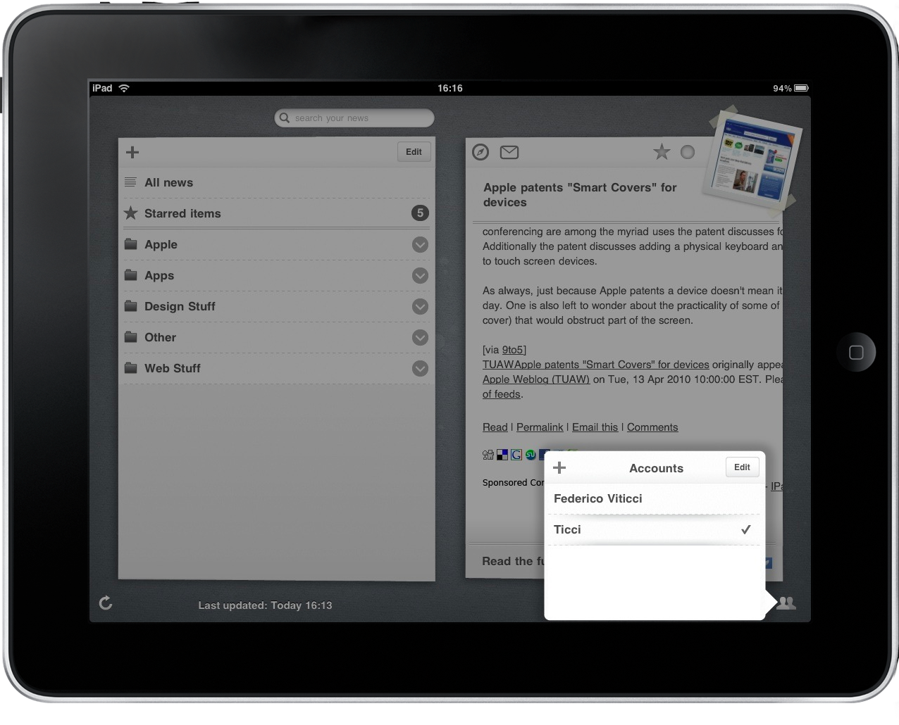
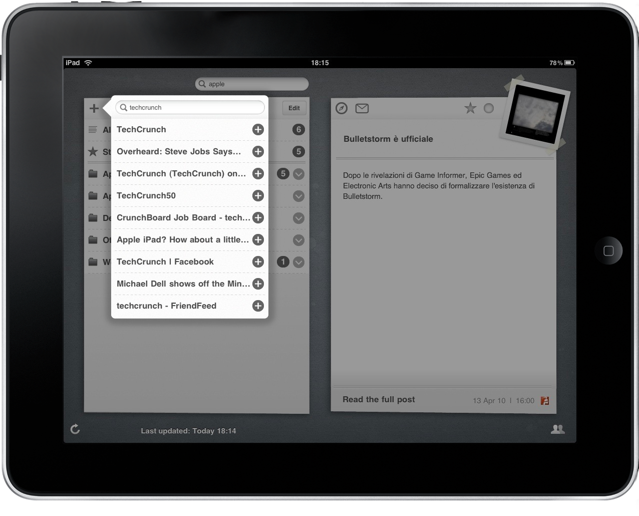
Headline has got two huge added values: support for multiple accounts and subscribe by search. Thanks to a button in the bottom right corner you can add as many Google accounts as you want and switch at any time between them. Very useful. Then, if you want to subscribe to a new blog you, say, have just seen mentioned in a post, you can search for it and subscribe right within Headline.
I’m believing in this application. I believe that the developers have big plans for it, they’re hard working on new features and improvements and they definitely want to make Headline the most beautiful and innovative RSS app for the iPad. Headline is available at $4.99 in the App Store, and you might argue that is a little bit pricey. But let me ask you this: what could have happened if we didn’t believe in Reeder when it first came out? Sure we wouldn’t have that great application on our iPhones now. Headline is very promising, and that’s the app I’ve decided to use on my iPad.
I highly recommend you to give it a try, because this one is gonna be huge.


