Lukas Hermann

69 posts on MacStories since April 2012

Former MacStories contributor.

This Week's Sponsor:

Listen Later

Listen to Articles as Podcasts


Weather HD 2 — Yet Another Weather Forecast App?

Hello and welcome to this MacStories review of another tremendous, beautiful, high-quality weather app for iOS. Seriously, I’m running out of ideas for how to start a new weather app post without it sounding like one of the many we’ve done before. Why are so many developers spending their time making forecast apps? Maybe because the iPad still has no native one. Maybe because making a good weather app is a fun challenge for developers, since you have to combine appropriate data visualization with intuitive UI. Personally, I tend to think that people developing weather apps for iOS know that they have awesome coding skills but don’t have any major projects to test them on. Whatever the reason, I’m truly thankful that the people at vimov decided to make a weather app because their newest release, Weather HD 2, is one of the finest approaches to data visualization and UI design I’ve ever seen.

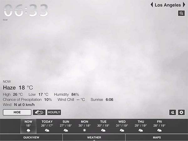
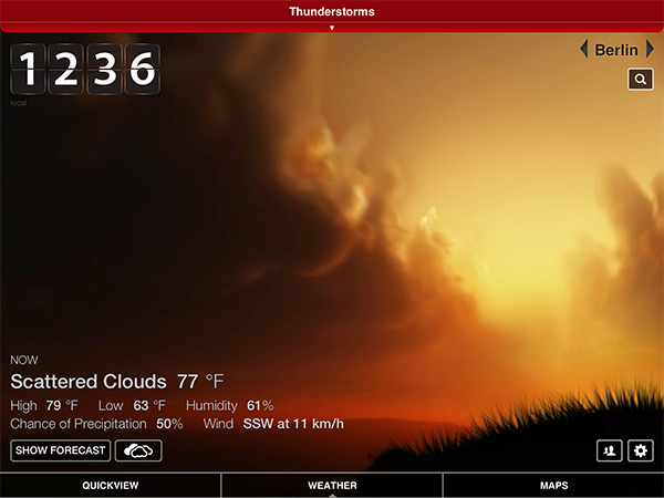
Weather HD 2 is the first major update to vimov’s original Weather HD. Fortunately for anyone who bought that version, the company decided to make 2.0 a free update instead of a new standalone app, so there will be no charge for existing customers. The original Weather HD attracted iPhone and iPad owners with its large, animated weather images, smooth UI, and large typography displaying all kinds of stats from temperature, humidity, and wind to more boring ones like sunrise time. Weather HD 2 incorporates new weather animations to enhance the variety of weather it can display, while the rest of the “old” features look the same. Additionally, the update includes three big new features: 3D weather maps, push notifications for severe weather alerts, and QuickView to view the weather at multiple locations side by side. While it is a universal app, I will only cover the iPad version here since it is much cooler to look at and use. Read more


Droplings Simplifies Public Sharing With Dropbox

Dropbox is a fantastic tool for everyone, from individuals to small businesses and teams. At MacStories, we use Dropbox every day. But while it is perfect for working or outsourcing important files you want to access anywhere, there is one feature in Dropbox which always bothered me: quickly creating download links to share files with friends or colleagues. Both in the Dropbox Finder window and web interface the process is just too intricate. I’ve always used other services like Droplr and CloudApp, although lately I’ve been growing tired with using multiple services for the same purpose.

Droplings, a lightweight menu bar app developed by fellow German freelance developer Carlo Zottman (developer of the Instapaper-to-Kindle sync tool Ephemera) could finally change that. Currently in beta, Droplings makes it easy to upload files to your “Public” Dropbox folder and share them afterwards.

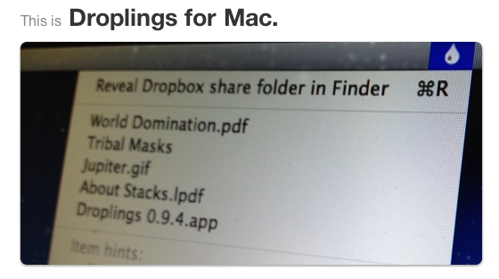
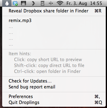
Firstly, enter your Dropbox ID in the app’s settings. Then, just drag and drop the respective file onto the menu bar icon, and within seconds the file will be uploaded and a Droplings preview link will be in your clipboard, ready for sharing. The default preview page looks pretty nice (as you can see from the screenshots below) and the embedded download link will be based on Dropbox. By clicking on the app’s menu bar icon, you have access to the last five uploaded files, as well as the app’s Preferences, which basically just activate your Dropbox ID and offer an option to activate custom HTML templates for the preview site. Droplings is simple and fast, and, in my opinion, way better than copying files into the Dropbox Finder window and right-clicking to generate a download link.

Droplings for Mac

Droplings for Mac

If you miss this simplicity of sharing with Dropbox as much as I do, go ahead and try Droplings. Since it is currently in beta (v. 0.9.x), you can download it for free on the app’s website.


Apple Ranks 55th in Fortune Global 500, Up From 111th in 2011

Apple Ranks 55th in Fortune Global 500, Up From 111 in 2011

As noted by @setteBIT, Apple has ranked 55th in the latest update of the Fortune Global 500, the annual ranking of the world’s largest corporations provided by American magazine Fortune. With a total revenue of $108.249 billion and total profit of $25.922 billion, Apple climbed 86 positions up from rank 111 in 2011. Fortune also reports $116.371 billion in assets and $76.615 billion in stockholder’s equity. Speaking in percentages, the profits marked 23.9% of total revenue.

These figures are data for the 2011 fiscal year, which ended on September 30, 2011. Compared to 2010, Apple reported a 66% increase in revenue, and 85% in profits in 2011. The new Fortune 500 list as well as Apple’s numbers for 2011 and all other members is already available online, and will be also included in the print version of the Fortune Magazine on July, 23.

Permalink

Guitar Pitch Pipe Lets You Quickly Tune Your Guitar

News from Hypercompact, the software company whose logo has inspired designer Evgeny Skidanov to create one of the most beautiful 3D animations I’ve ever seen. If they had published their app Guitar Pitch Pipe just one week earlier, I definitely would’ve integrated it in my story about the current state of music-making on the iPad — filed in the “small tools” sections. This guitar tuner is a perfect example for a small, reliable companion for guitarists on the road.

The App Store is flooded with guitar tuners. Apps like the UltimateGuitar tuner or Gibson’s effort are very prominent and elaborate apps — why considering this one then? Well, because it has one thing these other apps most of the time do not have: an innovative and simple UI. Guitar tuner apps are generally cluttered with features just a few percent of guitar players need like alternative tunings or the ability to change the tuning frequency; unfortunately, they are placed as prominently in the app as the standard tuning. This makes many tuner apps unnecessarily complex.

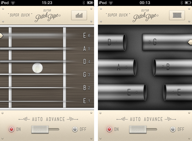
Guitar Pitch Pipe is different from that. Using a single main window, it plays back the six notes of the basic, 440Hz EADGBE guitar tuning with two different sounds: pipes (being the more unusual sound, and therefore integrated in the app name) and “classic” strings. The selected one is displayed in a visual interface, including tappable strings or pipes with the note characters on them. The currently playing pipes or strings are indicated by a closed pipe illustration or a cool 3D movement respectively. You can switch between these two layouts using the button in the top right corner.

You can either let Guitar Pitch Pipe play a note twice with a little pause in between for tuning, and then move on to the next one, or manually choose a string using the on/off switch at the bottom. The app then plays it until you move to the next one by tapping the respective string or pipe. The app constantly plays a note, there is no way, you could make it silent. Because of this you are more or less forced to only open it up when you really want to tune a guitar, otherwise it quickly becomes pretty annoying. This ensures a quick and focused use of the tuner, and makes it unobtrusive and functional.

The output sounds are very accurate, fitting to tuning both electric and acoustic guitars, and therefore make the app a very useful tool. The second reason for me using the Guitar Pitch Pipe guitar tuner from now on is its UI. We recently covered WTHR, a Dieter Rams inspired, minimalist weather forecast app for the iPhone. Guitar Pitch Pipe is quite similar to it. The app features no instructions or settings (because it doesn’t need any in its current state), it is colored beige, and uses skeuomorphed, plastic switches. The fretboard with strings and the pipes are crafted with love for detail; they are gloomy and very polished. It also features a cool icon but has a confusing description: “Super Quick”. The user could believe that the app is super quick, but without remembering which kind of app is behind the icon, it is very confusing.

However, while using the app for the first time, I immediately thought “Man, you could do much more with this design”. Retrospectively, this is still totally true: this app has potential to be enhanced with many new features while still maintaining its usability and simplicity. You could just add a second button, let’s say in the top left corner, make it trigger a pop down menu (which obviously needs to correspond with the rest of the app’s design), and let the user switch to alternate tunings like Drop D or C, or maybe even let them change the frequency. You wouldn’t need to change anything in the main screen design, just the sounds and the letters on the pipes or next to the strings to indicate different notes. This would make the app an even more complete and functional guitar tuner, suited for every type of guitarist — traditional (using standard tunings), metal and rock (dropped tunings) and progressive and experimental players (open and alternate).

But don’t get me wrong — Guitar Pitch Pipe already is a very good guitar tuner for the iPhone. Its output quality is outstanding, it’s fast and reliable, perfect for quick access, and does everything you need for tuning your guitar in standard tuning. There is just one thing that really annoyed me in its current version: sometimes, for instance when you use dropped tunings (which I personally use very often), you need some time to get back to standard tuning, especially on the lower E string. When you’re using Guitar Pitch Pipe’s automatic mode for that, the app plays each string just twice and then moves on to the next one, which is way too short in such situations. Users definitely must have the option to adjust how often single notes should be played back in auto mode. Otherwise, I absolutely recommend Guitar Pitch Pipe for any guitarist who is still searching for a good guitar tuner for his iPhone. Get Guitar Pitch Pipe for $0.99 on the App Store.


Grab Key Codes Directly From Your Dashboard With “KeyCodes”

Designer Tobas Ahlin (@tobiasahlin), working as a UI designer at Spotify, is known for his simple and useful OS X dashboard widgets for web developers. His widgets Loremify and Minicodes (both available for free) are well-known within the community. Loremify automatically generates “Lorem Ipsum…” placeholder text, with the option to specify the amount of characters and paragraphs — perfect for testing various text layouts on websites. And if you coded large CSS or JavaScript files, you can use Minicodes to “minify” them into smaller file sizes using the YUI compressing algorithm for faster upload and transfer. Both widgets feature minimalist, very polished UIs. And today, they are joined by a third one: KeyCodes.

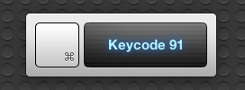
When you develop a web application, you sometimes want to bind functions to single or multiple keys (for example to quickly toggle actions). For that purpose, you need their so-called key code (a specific number each key has) to make sure you adress the right one. KeyCodes makes it easy to get this code. Just open your dashboard, click on KeyCodes, and press the key whose code you need, and both the key and its key code number are instantly displayed using a neon-styled, stainless steel UI (similar to Loremify’s look; see header image).

Simple, fast, intuitive, and free of charge. Go ahead and download KeyCodes for free from Ahlin’s website.


The Current State Of Music-Making and Discovery On The iPad

I have a confession to make: I’m a nerd. Yes, and I’m proud of it, because I think being a nerd means two things: I’m constantly curious about details, and I don’t hesitate to try out new stuff. To satisfy my curiosity, I’ve always dived into Apple’s ecosystem and the latest hardware related to it. Fortunately, my passion for Apple correlates with my love for discovering new music. I’ve been playing guitar since I was eight years old, and I love electronic music from the bottom of my heart as well. I’ve always found myself interested in both the traditional (perhaps organic) hardware side of music, and the more modern, digital software production process.

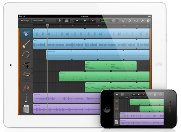
When the iPhone came out, many blogging colleagues and people around me predicted that its new software system, combined with the mobility of the device itself, would change the way people produce music and think about audible art as a whole. Three years later Apple unveiled the iPad. iPhone music software was indeed present at the time, but people soon recognized that the device’s screen was too small to create usable professional software for it — playing on-screen keyboards was nearly impossible and attempts to build high-end software synths like ReBirth or drum machines ended up in cluttered, untidy screens.

This problem seemed to get solved with the large screen of the iPad. Professional software retailers like KORG immediately started coding software versions of their most successful hardware. For instance, the iElectribe was one of the first apps available after the device’s launch. Over the years, I constantly tried out music apps for the iPad, tested hardware accessories (made possible with the release of iPhone OS 3), and never stopped investigating advantages, problems, and future possibilities of all those apps. Now, five years after the launch of iOS and the iPhone, I think it’s time to look back at how Apple’s mobile devices, with the focus clearly on the iPad, have changed the world of music and how they’ll continue to affect the future.

To do this, I recently went through my app archive and analyzed which kind of music apps remained installed on my devices, and which ones I liked when I tested them, but didn’t gain a place in my personal workflow. I discovered that I had to clearly divide music apps in several areas when discussing them. I distinguished between eight types of available music apps: promotion, discovery, entry level playing apps, handy/learning tools, sketching apps, recording, and professional software.

Throughout this post, I will cover each of those areas separately and point out their current state by discussing the most elaborate app(s) in their respective areas. I will point out the advantages and problems iOS brings to them, and predict — as far ahead as possible — what the future might hold.

Read more


Bob Mansfield, Apple SVP Of Hardware Engineering, To Retire

Bob Mansfield, Apple SVP Of Hardware Engineering, To Retire

In a short press release, Apple today announced the Bob Mansfield, Senior Vice President of Hardware Engineering, will retire. Mansfield joined the company in 1999 as Apple acquired Raycer Graphics. He led the Mac hardware engineering since 2005, the iPhone and iPod hardware engineering since 2010, and the iPad  hardware engineering since its inception.

“Bob has been an instrumental part of our executive team, leading the hardware engineering organization and overseeing the team that has delivered dozens of breakthrough products over the years,” said Tim Cook. … “We are very sad to have him leave and hope he enjoys every day of his retirement.”

Over the next several months, the role will be transitioned to Dan Riccio, currently vice president of iPad hardware engineering, who joined Apple in 1998 as vice president of Product Design. The entire hardware engineering team will continue to report to Mansfield until his departure.

We’ve embedded Apple’s statement past the break.

Read more


WeatherSnitch 2.1 Brings Full-Screen Weather, New Artworks

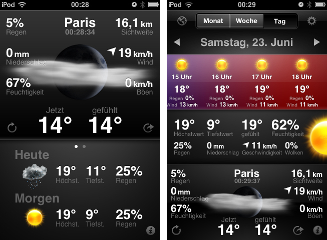
Today is the second time I don’t obey my “never cover stocks and weather apps” principle. I think I’ll have to abandon it completely, as there are way too many cool UIs in this app category. After I reviewed StockTouch some weeks ago, I recently discovered WeatherSnitch 2, a weather app by developer Snitchware (with a website certainly inspired by apple.com). The original WeatherSnitch v1 and this new update are designed as  “one view is all it takes” apps — just fire them up, get to the main screen displaying all relevant information, and continue with your workflow right away. Read more


Transit Beautifully Displays Public Transport Routes Around You

Google GTFS is an acronym some developers and bloggers might already be familiar with. The Google General Transit Feed Specification is a developer tool that public transport services can use to track their bus or train lines on Google Maps via GPS. Using GTFS, created using a bunch of zipped text files (you can get more information on the Google dev pages), public transport companies can voluntarily publish their routes for Google Maps users to incorporate them into route planning. Front-end developers can also benefit from this specification. One of the newest products for the iPhone which incorporates GTFS is Transit by Sam Vermette and Guillaume Campagna, which has been published today.

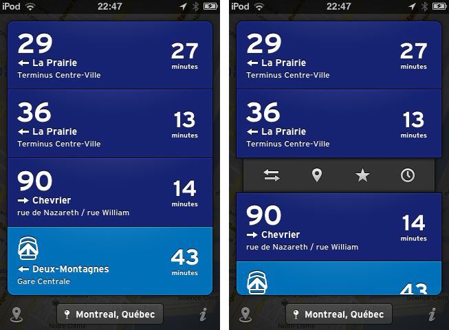
Transit locates you via GPS or Wi-Fi hotspots, and then displays the nearest public transport routes sorted chronologically after their departure. This way, you’re always up to date what traveling possibilities you have around you. If it’s in your home town, you only get what you need and what you’re familiar with, because the app displays only the nearest lines with the “real lines” colors and numbers. Your current location is then displayed in a small panel at the bottom of the screen with the route information in a custom list above it — tap it to change the saved location. Transit also works offline, so you can download foreign cities’ routes before traveling there to save 3G costs and still always be up to date. The bundle downloads can be reached via the location button in the bottom left corner of the screen (along with the amount of public transport agencies displayed).

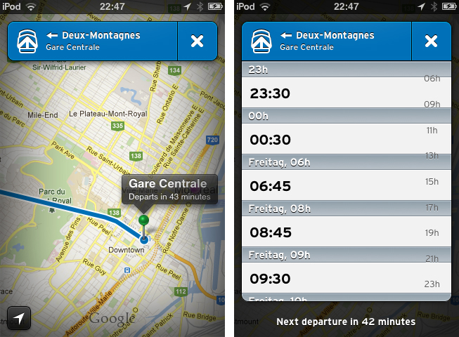
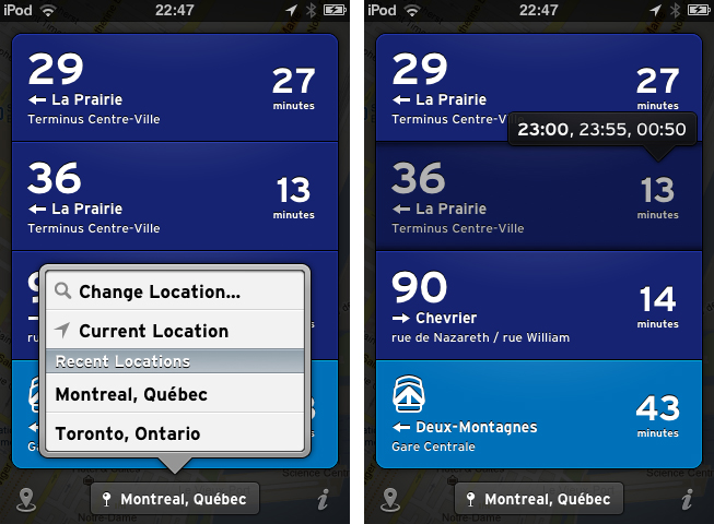
When looking at the list of your closest routes, route information elements inform you with big, readable typography about the next departures with location, time of departure, line information, bus/train stop location, and the route direction. Tap and hold one of them to get the direction and distance to the next stop, or to get the next departure times displayed in a cute popup panel above your finger. When you tap on one of the elements, there are four other actions to perform with it. You can switch the direction if the displayed destination is not the one you’re looking for,  then check the route with the Google Maps view to see other stations and their route distances. Furthermore, you can star routes to mark them as favorites so you can always pin them to the top of your list. You can also browse the whole line schedule for the day in a separate list if you need the information for a departure at a later time. This way you get the information you need quickly and efficiently.

Currently, Transit is only supported in three Canadian cities: Montreal, Toronto and Quebec. But the two developers promised to work hard and want to finish covering Canada by the end of July, with European and U.S. cities following in August. To keep the app clutter-free, Transit will always display the nearest routes and change displayed transport companies when the user is in a new location.

Transit can be freely downloaded on the App Store, however, certain features are restricted until they’re unlocked with a subscription. Using the free version, you cannot view routes offline and the app only displays the three closest routes. By paying $0.99 for one month, $2.99 for six months, or $4.99 for a year, you add the ability to view maps offline and see all routes within a 1.5km radius. This is a very good pricing plan: you can get free transit data in a pinch, or pay to receive the most comprehensive mapping data (which will probably be worth the subscription fee for constant travelers once more cities are added).

But what makes Transit really worth a try is its user interface. The trend of applying outer shadows and light textures to UI elements and buttons has been a common way to style an app in the last years, but not many designers manage to make it unique while still using this method. Sam Vermette did: Transit features a stunning amount of cool interface elements. Some of my favorites are the Tweetbot-like action menus when tapping a list element, the already mentioned small information popups, the black vignette design around the menus and the Google Maps view, and especially the popup list when changing the location. The latter shows a deep care for consistent design: within the list, the developers changed the text display font to the sans-serif font which is used throughout the app. Using Transit’s UI is pretty smooth — the performance only lacked a couple times when online data got fetched.

Another thing I really like about Transit is the icon. It’s unique, simple, and makes my fingers want to touch it.

So, as you could possibly tell from the review, I like Transit very much. I’m thrilled to see it coming to Europe over the next months (although not every public transport agency supports GTFS), because it’s plain, easy to use, but still has a great feature set which really solves the problem of combining multiple public transport agencies in one single, and still awesome user interface. Even if you’re not a resident of Toronto, Quebec or Montreal, I still urge you to download Transit for free on the App Store, take some time looking over its stunning UI, and wait for your city to be supported.

Be sure to keep an eye on Transit’s Twitter account to stay up to date on when new cities are added.