
For at least five years there have been three slots on my iPhone Home screen dedicated to apps for Twitter, RSS, and podcasts. For as long as I can remember, they have been taken up by Tweetbot, Reeder and Castro. Three weeks ago I got rid of all three, and replaced them with Twitteriffic, Unread, and Pocket Casts. I had come to the awkward realisation that although I frequently tried new apps (and occasionally reviewed them), I didn’t do the same thing when it came to Twitter, RSS, and podcast apps – at all. I had become too comfortable with the same apps.
So for three weeks I’ve been solely using those apps, and this “experiment” has lead to a few interesting revelations to me. Perhaps the most obvious one was that I discovered certain features I really liked, but had no idea I liked, until they were missing in the app I switched to (and vice versa). I won’t spoil the results, but suffice to say I have resolved to try new apps (whatever their purpose) more frequently, even if I’m really happy with the app I’m currently using.
Note: Just a heads up, this is not a review of Twitteriffic, Unread, and Pocket Casts. It is a reflection of what I personally liked and disliked about each of these apps, as compared to my use of Tweetbot, Reeder, and Castro. Just because I preferred one to the other, doesn’t mean they’re bad apps – in fact all six of them are great. Finally, there are some big features of each app that I will not mention, simply because I don’t use them.
Twitter: Twitteriffic
If there was anything that really precipitated this experiment, it was the shameful fact that I had not used Twitteriffic for many, many years. The main reason I didn’t choose the official Twitter app for this experiment was that I do actually use it a few times a week to view the Notifications tab, which provides much more info than Tweetbot. But I knew I wouldn’t permanently switch to the Twitter app because I’ve explored it a bit in the past and it just wouldn’t suit my use of Twitter, and I’m happy to use it as an occasional supplement to Tweetbot.
Anyway, three weeks ago I bought the latest version of Twitteriffic and removed Tweetbot from my iPhone home screen. The result…
I’m switching back to Tweetbot
What I Liked About Twitteriffic
Nothing (but that sounds worse than it is). What I mean by that is that there aren’t any features or design choices in Twitteriffic that I prefer, compared to Tweetbot. I seriously thought a lot about this, but I just cannot think of anything. Having said all that, and this may sound odd, the choice between Tweetbot and Twitteriffic was actually the closest of all three. Both are incredibly polished apps with a great amount of functionality and design excellence. There was nothing functionally wrong with Twitteriffic, and if Tweetbot disappeared tomorrow, I’d be perfectly happy with being “forced” to use Twitteriffic.
What I Disliked About Twitteriffic
Muting Functionality. I frequently mute hashtags which talk about TV shows because I live in Australia and have to wait hours, if not days/weeks before I see an episode. But I mute for a period of time, not indefinitely. Tweetbot makes this easy to do: simply tap and hold on a hastag, select “Mute”, and then choose for how long (1 Day, 1 Week, 1 Month or Forever). In Twitteriffic you don’t get to choose the period – it’s for an indefinite period. And as someone used to interacting with hashtags, it took me a long time to realise that to mute from a tweet, you need to press the “…” button.
Top-Heavy User Interface. I don’t know how people with an iPhone 6 Plus use Twitteriffic – it was difficult enough for me on an iPhone 5s to reach the top navigation buttons. The saving grace is that most of your time will be spent scrolling the main timeline, but if you do need to send a tweet, or view your DMs, get ready to stretch those fingers/thumbs. I’m also not much of a fan of the sidebar, which I accidentally triggered at least once a day whilst scrolling my timeline.
Missing Revamped Quote Tweet Functionality. Just before I started this experiment, Twitter revamped their quote tweet feature and Tweetbot was pretty quick at supporting it on their iPhone app. Three weeks later and my Twitter timeline is full of people using this new quote tweet feature. You can still read the quoted tweet in Twitteriffic by tapping the link, but it takes time and even though I had just a few days of the Tweetbot update, I quickly appreciated it enough to miss it in Twitteriffic. I’m sure this will come to Twitteriffic soon, so I didn’t mark Twitteriffic down too much for missing this, but it was still frustrating.
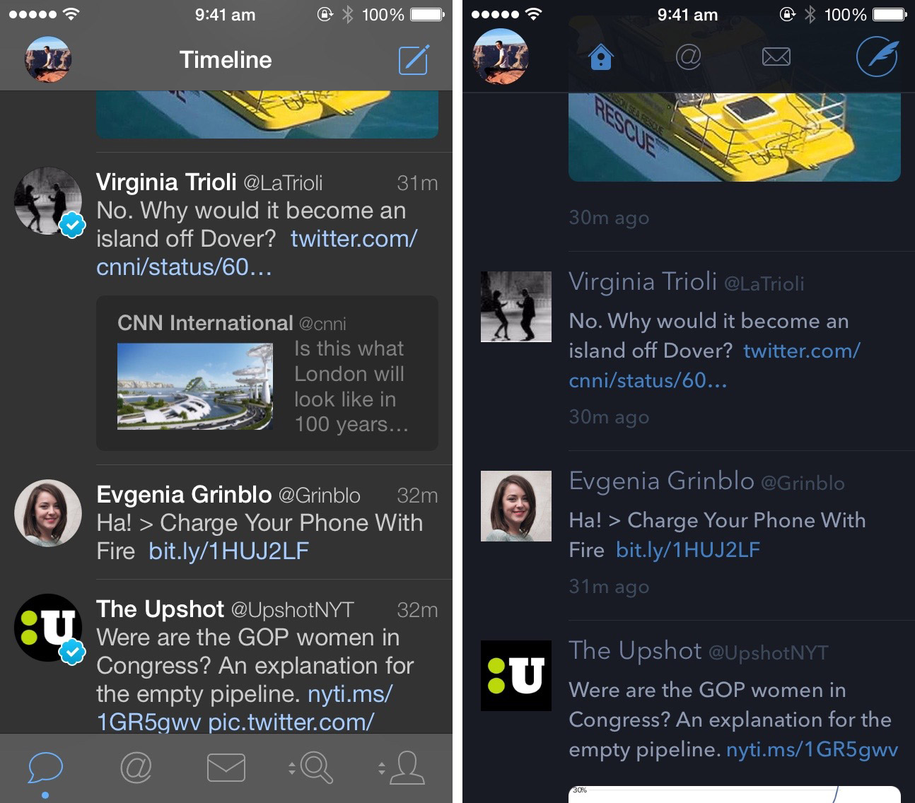
Miscellaneous Nitpicking. I had a few occasions (enough to warrant this comment) throughout the three weeks where Twitteriffic would just freeze up and become unresponsive. I think a few of those times where when I had 900+ unread tweets from overnight and I tapped the status bar (to scroll to the top), but then quickly stopped it scrolling, so that it stopped around ~200 unread tweets. It couldn’t seem to handle this a few times and, after a brief lag, completely ignored my intervention and went to the very top. Finally, the unified timeline was just confusing to me, particularly in respect to DMs – fortunately there’s an option to turn this off.
Podcasts: Pocket Casts
To preempt the inevitable question as to why I didn’t choose Overcast, Apple’s Podcast app, Instacast, or one of the many other clients, it was twofold. I wanted to choose an app I had never tried before, and wanted one that was well-regarded but also an underdog in some respects. Plus Shifty Jelly, the developer of Pocket Casts, also makes Pocket Weather Australia, which I really like. The result…
I’m switching back to Castro
What I Liked About Pocket Casts
Sharing. I don’t imagine I’d use this feature frequently (I used it once in the three weeks), but the ability to easily share a link to a podcast episode is just great to have – a glaring omission in Castro.
The Now Playing Screen. Castro’s innovative scrubber is great, but there’s something equally great about Pocket Cast’s simple but really well designed Now Playing screen. Coming from Castro, it is particularly great to have a large play/pause button!
Emoji Notifications. When I first got a Pocket Casts notification, I wasn’t very impressed with the inclusion of emoji. But as I got a few more notifications about new podcast episodes, I suddenly noticed that they were different emoji – Shifty Jelly has assigned custom emoji for many of the most popular podcasts (e.g. 🇺🇸 This American Life, 💰 Planet Money, 🍊 Freakonomics). It’s a little touch and I actually really like it – although I can imagine opinion might be divided on this issue.

What I Disliked About Pocket Casts
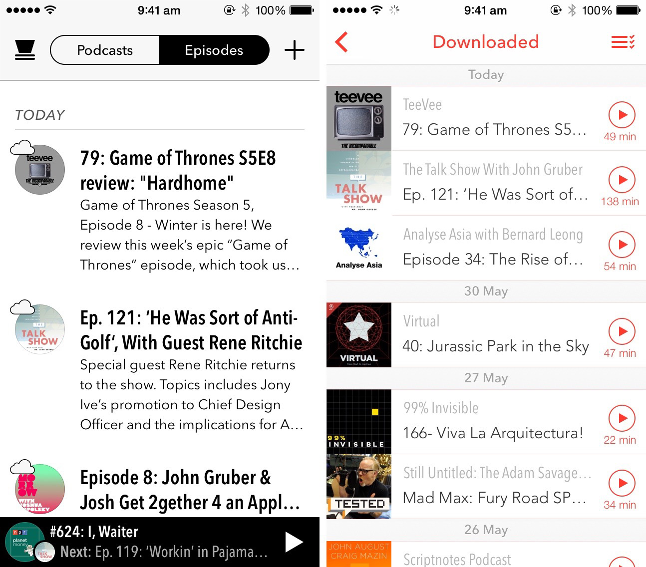
Navigational Structure. Coming from the simplicity of Castro, Pocket Cast’s navigational structure seemed overly complex to me. There were different “episode filters” for Unplayed, Downloaded, and Downloading – despite the fact that you could tell if an episode was downloaded/downloading in the unplayed filter (I ended up deleting the others). You could also create your own episode filters, which at first seemed like a great idea. So I created some episode filters but then never found the need to use them. There’s no doubt some people will love the flexibility of Pocket Casts, but I personally prefer the one list approach of Castro. And I subscribe to around 30 podcasts, so I’d say that I’m more than just a casual podcast listener.
Lack of Description Snippet. Pocket Casts will only show a single line of the title and doesn’t show any of the description in the episode filter lists. This can be frustrating when I’m trying to choose which episode to watch, as I don’t have a lot of information to go on at a glance. Castro, by contrast, tries to display the entire title (two lines) and includes up to four lines of description – making it a lot easier to skim my list of unplayed episodes and choose which one to watch.
Sleep Timer Functionality. When you set a sleep timer in Pocket Casts and the timer runs out, the podcast will simply stop playing as if you pressed the pause button. That can confuse me, wondering if I have accidentally pressed the pause button or if there was a problem with the podcast file. By contrast, when the sleep timer in Castro runs out it will fade the volume down to indicate that it is being paused due to the timer. Castro also literally tells you “Sleep timer extended” (via text to voice) when you resume playing the episode. That’s great because in my sleepy state I like the reassurance that the episode won’t continue playing forever if I do fall asleep.
User Triggered Autoplay. When you select a podcast episode to play in Pocket Casts it will play that episode and then stop. But if you tap and hold on a podcast episode you can choose to play that “Up Next” or make Pocket Casts autoplay episodes from there. That’s what I want, but I’d rather not have to manually do that every time. Once again, I prefer the way it works in Castro – always playing the next podcast episode available (which can be turned off).
RSS: Unread
I’ve just talked quite a bit about how much I like using Castro, an app made by Supertop. So when it came to choosing an RSS app to replace Reeder, Unread was an easy choice because it is also made by Supertop, and I’ve heard lots of great things about it. For those reasons, when I went into this experiment I thought that this would be the most likely switch to become permanent. I’ve used Reeder for many, many years and although it is a fantastic app, I presumed I’d enjoy a nice change of pace. The result…
I’m switching back to Reeder
Turns out I was pretty wrong. Unread was still a great app, but out of the three switches I made in this experiment, this was the hardest to adjust to.
What I Liked About Unread
Themes. Reeder also has themes, but I much preferred the selection of themes in Unread. Unlike the muted and beige-y themes of Reeder, there are a mix of themes in Unread, some of which incorporate vibrant colors.
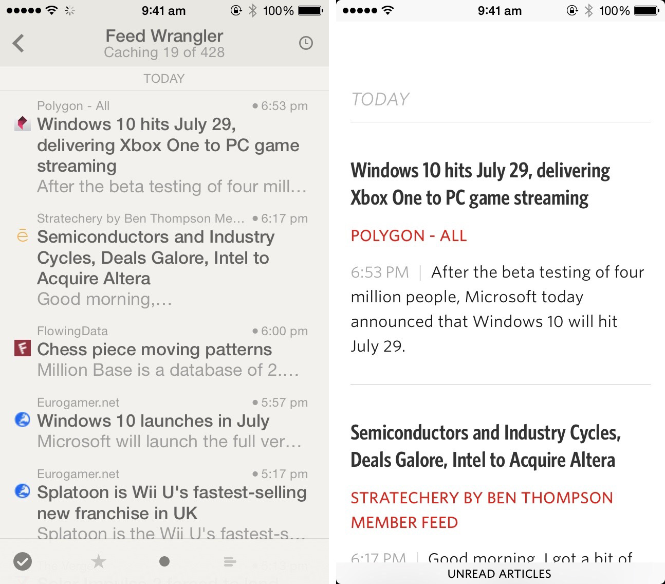
Twitter Timeline Feel. This was a double-edged sword. Unread will display the first sentence of articles, which when combined with the title, makes it easy to get a good idea of what is in an article. Reeder on the other hand only displays one line of the actual article, which on my iPhone 5s translates to about 4 or 5 words, which is almost always useless. So the upside of Unread’s design was that I found myself tapping in to view the entire article less frequently, and when I did tap into an article it was because I was interested in the full story, not because I wasn’t sure what it was about.
What I Disliked About Unread
So. Much. Scrolling. The downside to Unread’s design is that the way I read (mostly scrolling headlines) is made much more laborious. On my iPhone 5s, Unread usually only displays two articles in the list, whereas Reeder’s equivalent screen fits 4-5 articles plus UI elements on the top and bottom of the screen. If I didn’t use RSS as heavily as I do, I think I would actually prefer the information density of Unread. But because of the way I use RSS, Unread made reading it all feel like more work than it does in Reeder.
Sparse Interface. This is a little hypocritical of me, given I applauded Castro’s simple interface over Pocket Casts. But I’m going to try and justify myself by noting that I spend a lot of time using an RSS reader, whilst my objective with a podcast app is to quickly start a podcast and then exit the app. In any case, I found myself frequently overwhelmed and disorientated by Unread, which is hard to explain. I think it was caused by the really sparse UI with lots of white space and a lack of unique characteristics to individual articles (like publisher icons), but I’m not sure. All I know is that I didn’t enjoy using the app extensively and subconsciously over the three weeks I just started just scrolling through my shorter Smart Streams and delayed going through the larger Smart Streams until I was at my Mac (with Reeder).
So, Nothing Changed?
Yes and no. I have now switched back to my long-standing favorites of Tweetbot, Reeder, and Castro. But I don’t regret starting the experiment and encourage you to take the time and switch some of your longtime favorite apps. I feel more confident that I really am using the best Twitter client for me, I’ve discovered some features that I really appreciate (without previously knowing), and I’ve sent a few dollars to great indie developers. This certainly won’t be the last time I run an experiment like this.