In recent years Adobe has made a concerted effort to develop a collection of mobile apps that make it easy to accomplish various creative tasks. But rather than make one monolothic app that does everything (like Photoshop on PCs), they’ve been splitting up features into many apps that each focus on a different, and specific, creative aspect. For example, there is Adobe Brush CC, which enables you to create custom brushes for Photoshop and Illustrator based off photos you take on your iPhone or iPad, or Adobe Color CC, which will create a custom color palette from your photos. As Adobe has continued to release more and more of these apps every few months, their efforts have become more and more impressive. Adobe now has a sizeable collection of mobile apps that are some of the most technically impressive and well designed apps available on the iPhone and iPad.
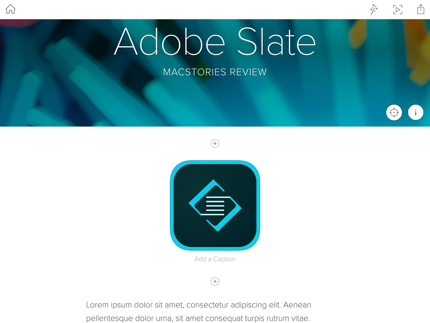
Which brings me to Adobe Slate, one of the most recent additions to Adobe’s mobile app stable. Unlike many of their other apps which directly integrate and complement Adobe’s desktop apps like Photoshop or Illustrator (such as Brush and Color, described above), Slate is its own distinct product. Adobe describes Slate as a tool to “turn any document into a beautiful visual story”, which is actually quite a good way to describe it. A more mechanical way of describing Slate would be that it is an iPad-only app for creating a webpage (not a website) for situations where the content you want to share or display is a mix of text and images.
I recently had an assignment at university that permitted a more creative format and layout than the typical essay or report. Because I had heard about Adobe Slate launching a few weeks earlier, I decided to test it out. I ended up submitting my assignment as a webpage created with Slate, and I really enjoyed using it and think the result was pretty great.[1]
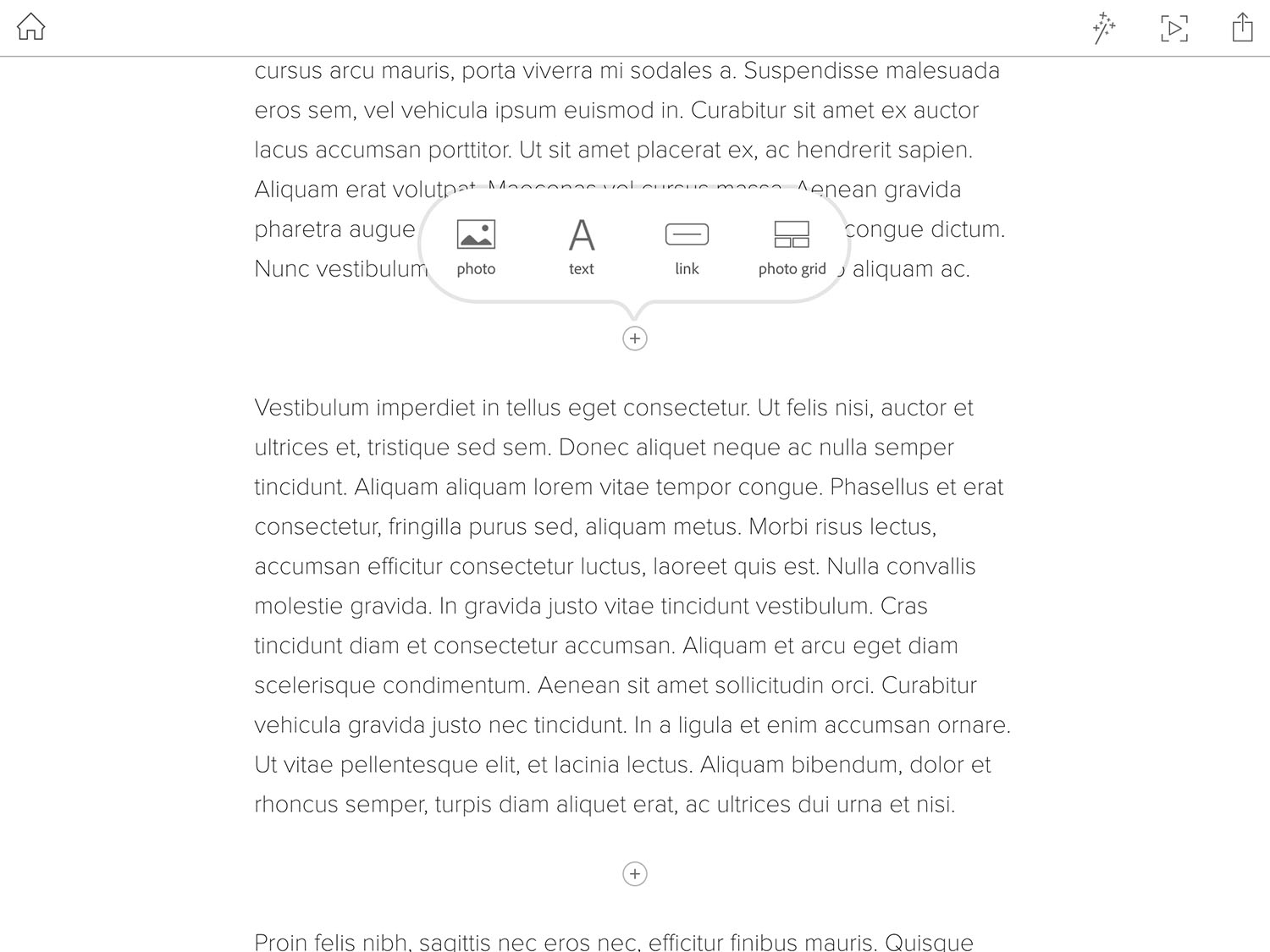
What makes Slate so impressive is that it is incredibly easy to get something created and published that looks truly fantastic, without much effort. A big part of why it’s so easy is because Slate comes with 11 great themes that range from the playful ‘Whimsy’ theme, the professional ‘Crisp’ theme and the bold ‘Wesley’ theme. Once you’ve chosen a theme (which you can change at any time), you just need to fill out the content. In order to do that, Slate comes with a handful of different content blocks that you’ll build your webpage with, and there’s one for photos, text, links and photo grids. Each block covers the width of the page, and you simply work your way down the page, adding blocks until you’re done.
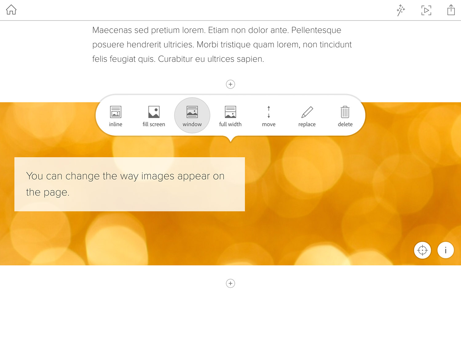
With the photo blocks, you are given some options as to how the image appears: it can be inline, fill the screen, appear in a window, or be the full width of the page. You’re also able to add images from a whole range of sources, not just your Photos library on the iPad. Slate can also do a search for Creative Commons-licensed photos, or pull photos from Lightroom or your Creative Cloud and Dropbox accounts.
The themes and blocks aren’t just simple to use, but they look great and come with subtle and delightful animations that you might find on a new Apple product webpage. Importantly, webpages created with Slate look great on a 27” display and great on an iPhone. You’re almost guaranteed to get a great result with very little effort. Slate is so simple to use that I honestly think I could fully teach a complete computer novice how to use it in about 10 minutes. Of course, that simplicity does come at a bit of a cost: flexibility.
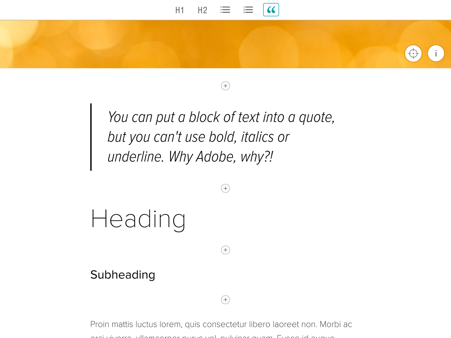
My biggest complaint with Slate is that the text formatting options are pretty woeful at the moment. The only options you are given is to make a block of text either a heading/sub-heading, bullet or number list or make it a quote (Slate will give the text some fancy animations and graphics). Bizarrely, Adobe has forgotten about the most basic text formatting options of bold, italics and underline. Additionally, as good as the themes are, they are not customizable at all – I would have liked to at least change the color palette of some of the themes.
The other glaring oversight with Slate is that besides text, the only kind of media you can embed are images. I think Slate would be even more impressive if you could embed YouTube videos, tweets, GIFs, and other external content. Finally, it should be noted that when you publish your Slate webpage, it is hosted by Adobe and there is a rather large advert for Adobe Slate at the bottom – which, as far as I can tell, cannot be removed at all.
All in all, Slate is an impressive iPad app and creative service from Adobe. If you’re looking to quickly build a standalone webpage for a school report, newsletter, holiday highlights journal, or almost anything else, Slate is a terrific option. There are some hard limits to what Slate can achieve today, but for many projects it’ll be the easiest and best tool to use, and the result you get with very little effort is truly impressive. If Adobe adds support for other forms of media like YouTube, and improves the customizability of text and themes, this app can become an even more compelling product. And given the pace at which Adobe is improving their collection of mobile apps, I have no doubts that Slate will get even better.
You can see a sample of Adobe Slate webpages here (just scroll down a bit).
Adobe Slate is available for free. It is free to publish your own Slate webpages, but note that you do need an Adobe Creative Cloud account, and there is a storage limit on the free tier.
- Unfortunately, I can’t share my Slate creation for a few reasons. And whilst I haven’t yet received a mark for the assignment, I did get a brief acknowledgement email from my lecturer after I sent the link, saying “looks impressive”, so I’m cautiously optimistic! ↩