Photos
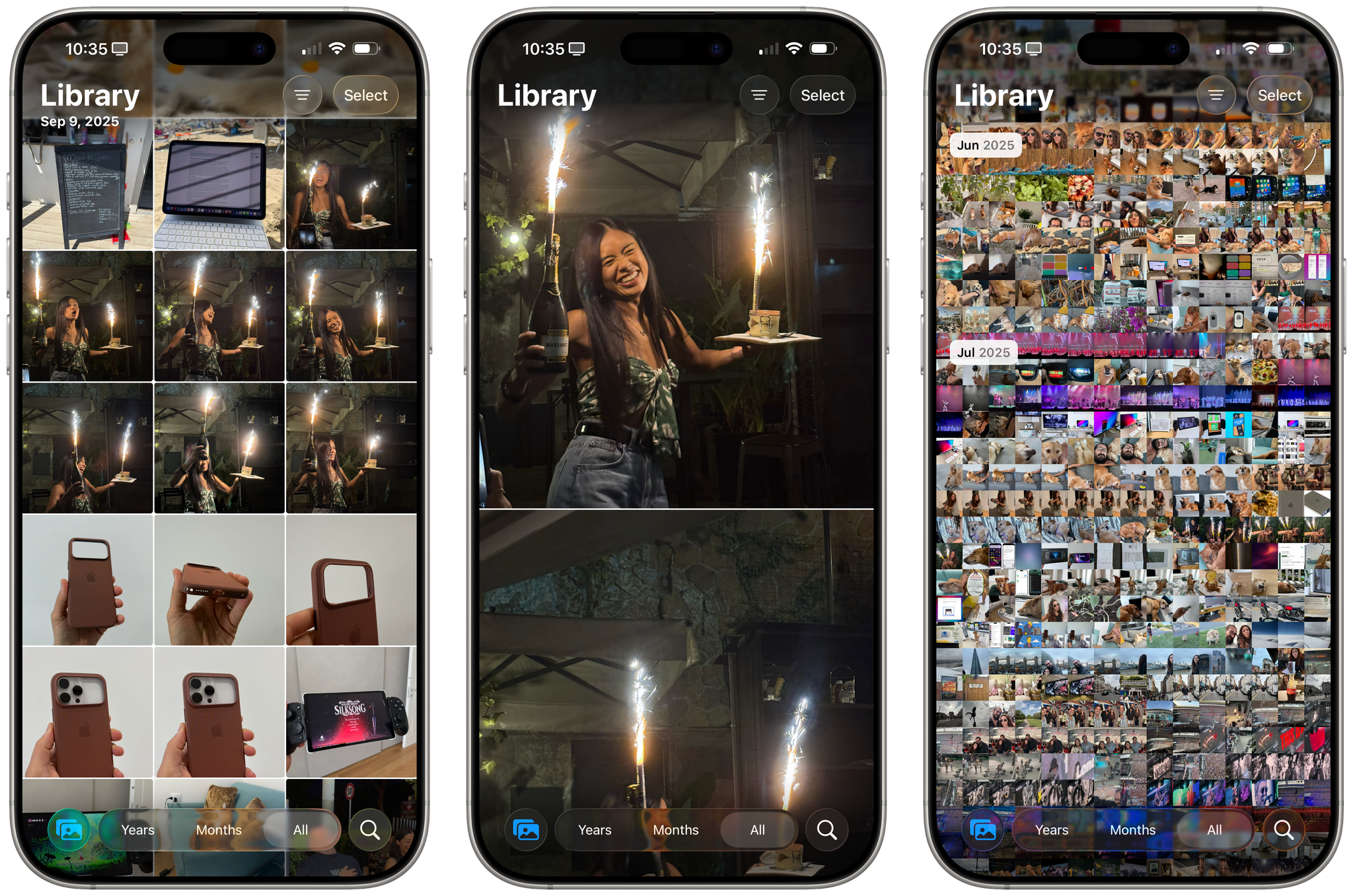
It’s fair to say that last year’s redesign of the Photos app didn’t go as planned. I liked it a lot – and still do – but the adoption of a unified layout has been heavily criticized on social media, Reddit, tech publications, and more. Anecdotally, all my IRL friends hated the look. So Apple listened to the majority of people and, in iOS 26, alongside introducing a Liquid Glass redesign, they went back to a tab bar that separates the Library from Collections.
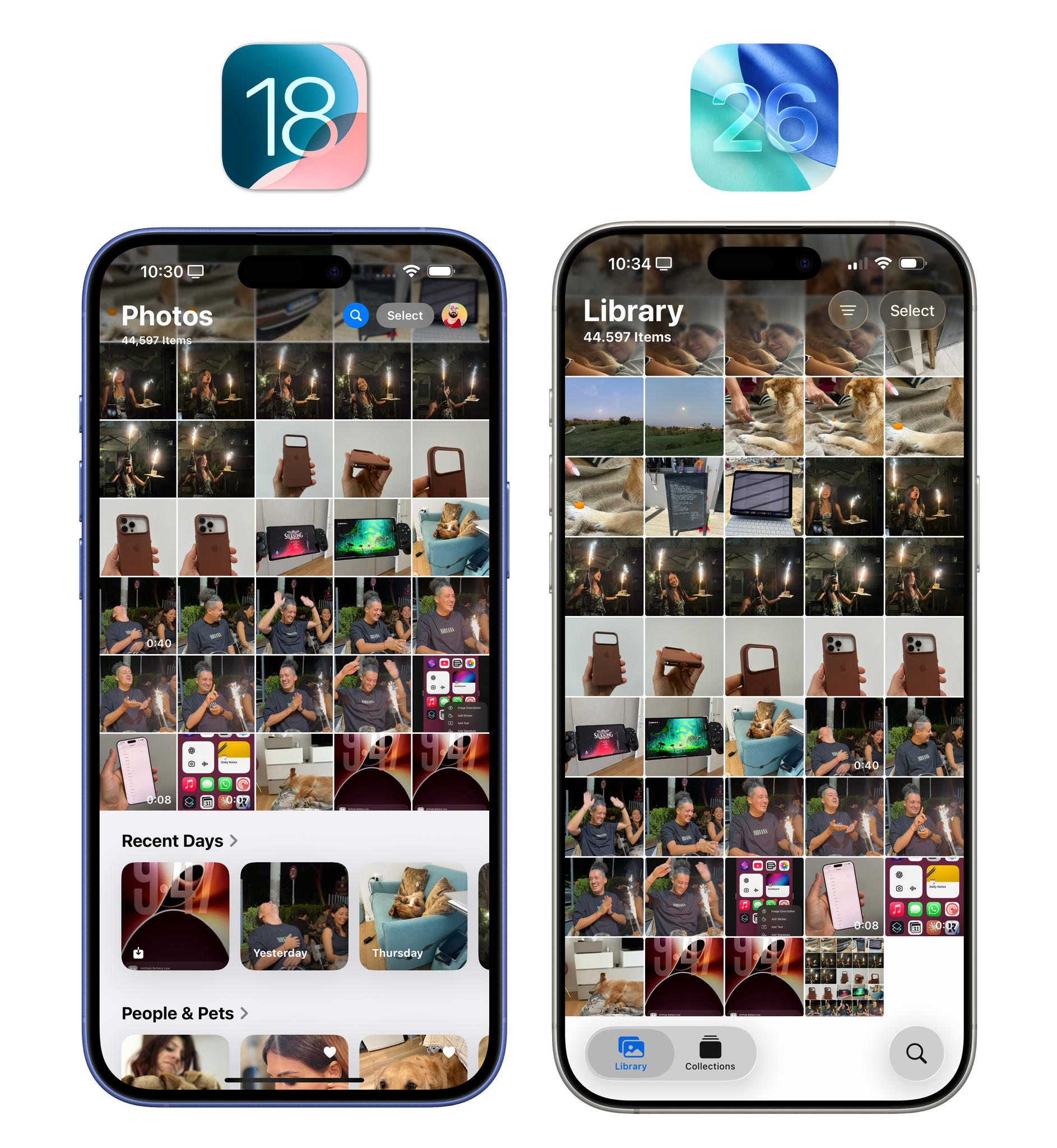
Photos is a great example of what I explained in the Design chapter: in previous years, an app with just two tabs at the bottom would have looked silly. With Liquid Glass and its compact, floating tab bars, it doesn’t. I’m not sure how I feel about the return of a pure grid view for my library with nothing else at the bottom; I miss the ability to see my Recent Days with highlights for each day under the grid. I’m sure that I’m in the minority here and most people will be happy to just have their grids back, but I wish Apple implemented the same approach as the Phone app here and offered a setting to choose between a classic and unified layout.
In any case, the Photos app has one of my favorite implementations of Liquid Glass’ visual effects because the content that scrolls underneath buttons and tab bars is so diverse. Scroll up in the grid, and the tab bar will morph into Liquid Glass segmented controls for the Years, Months, and All views, joined by a convenient search button in the bottom-right corner of the screen. If you like Liquid Glass, the Photos app is the best way to see how it interacts with colors and light.
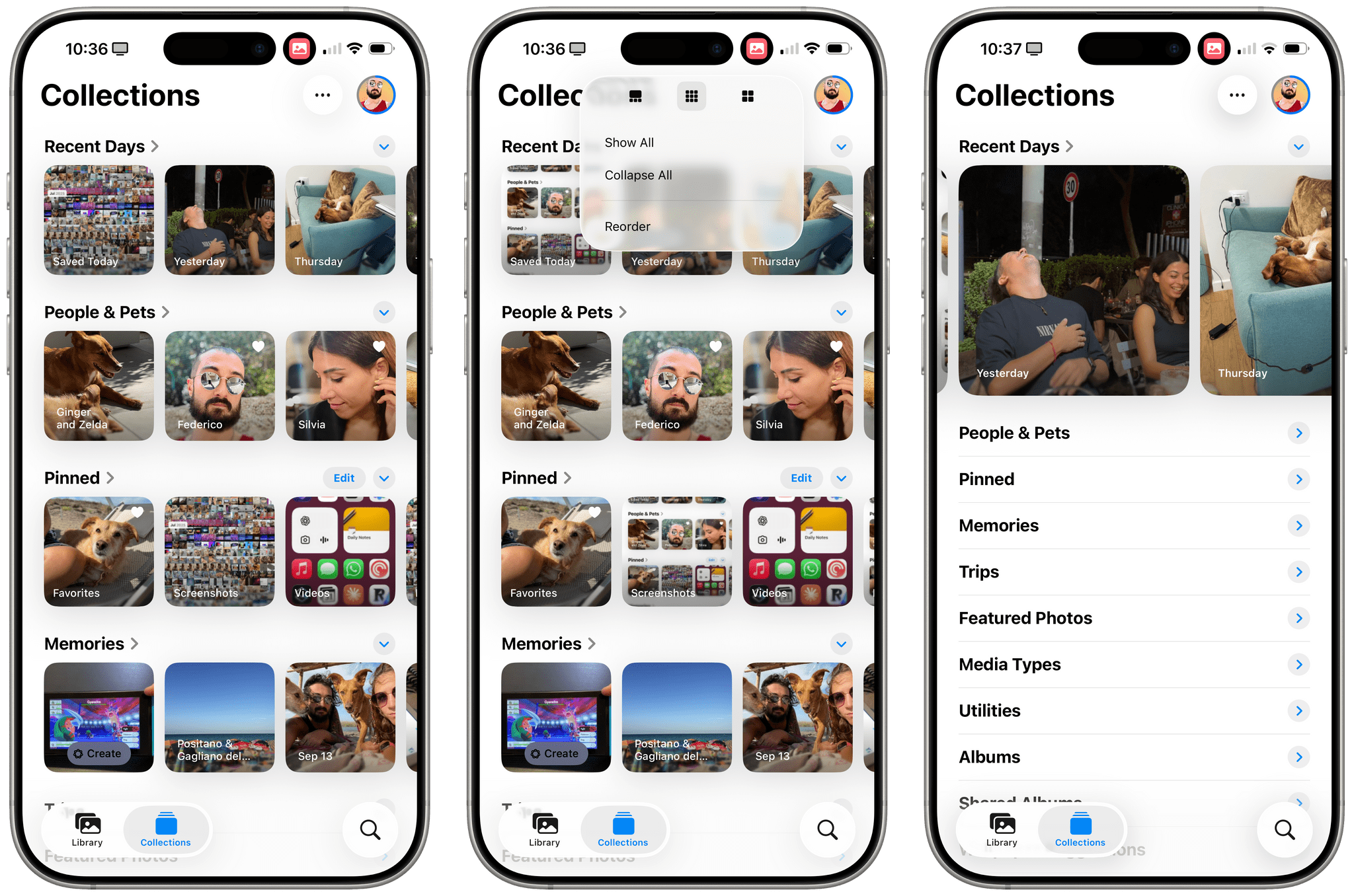
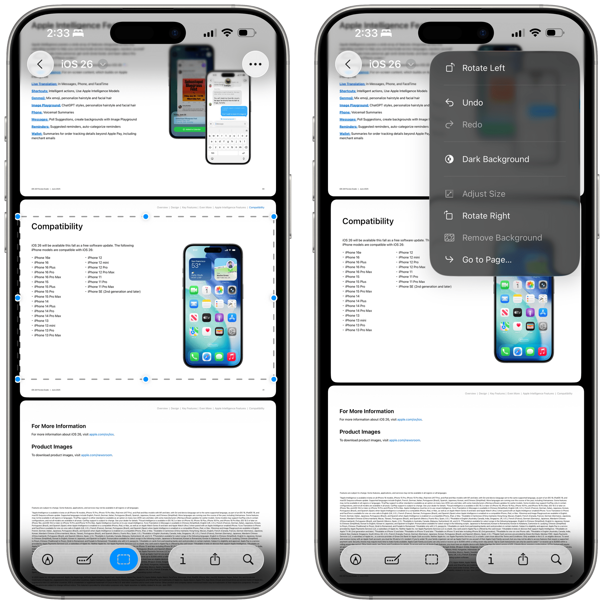
While splitting collections back into their own separate view, Apple took this as an opportunity to add more layout options to the page. Using an ellipsis button at the top, you can now open a menu that lets you adjust the size for collections, choosing between larger tiles, a denser layout, and another option that emphasizes whatever you put in the top row. You can now also expand and collapse collections to make the overall layout even denser.
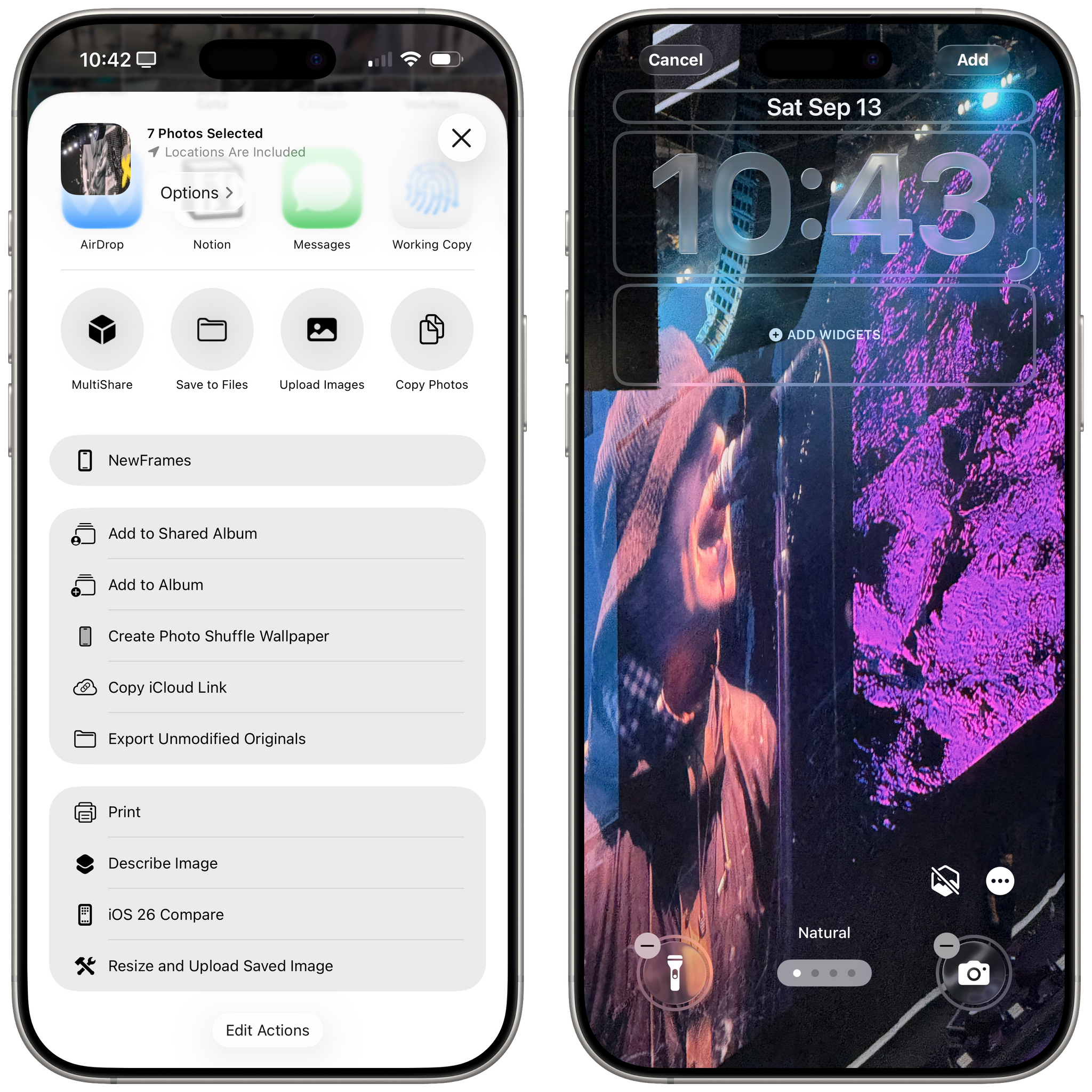
Also new in iOS 26, you can manually create photo shuffle wallpapers by selecting multiple items in the Photos app and choosing ‘Create Photo Shuffle Wallpaper’ from the share sheet. Doing so will bring up a Lock Screen creation UI inside Photos where you can see what the photo shuffle will look like before saving it.
My favorite addition to the Photos app this year isn’t really new. Apple advertises it as such, which is kind of odd, but there are objectively changes in this functionality that I appreciate. Let me explain.
Apple says that Photos in iOS 26 can now recognize events like concerts, sports, “and more” so that you can pull up details for the show or game right from the Info panel in Photos. Here’s what I wrote in September 2018 in my iOS 12 review:
There are two remarkable additions to Photos’ search and classification capabilities in iOS 12. The first one is a new built-in index of over 4 million public events that can automatically recognize photos taken at concerts, sporting events, and even festivals. Without having to do anything on my end, Photos recognized pictures taken at Justin Timberlake concerts in 2014 and 2018 (and suggested I share the most recent ones with my girlfriend, who was at the concert with me).
And in the associated footnote:
It’s unclear what database of events Apple is using, but it seems like only bigger events are understood by the app. More intimate concerts I went to in recent years, such as The Naked in Famous or The Shout Out Louds, which took place in smaller venues in Italy, couldn’t be searched for in Photos. On the other hand, the WWDC 2018 Bash was tagged as a “festival”, which seems fair given its location. If you go to concerts or other sporting events often, try to search for pictures taken there; you should be positively surprised.
The Photos app has long been able to tap into an unnamed database of public events. The feature is not debuting in iOS 26 – it’s evolving. Now, if Photos recognizes a public event (again, the database isn’t clear), it’ll put a ticket button in the bottom toolbar when viewing a photo. Tap it, and the Info panel will show you the event matched to that photo.
I’ve been able to test this feature with photos and videos I took at the Oasis concert in London on July 25. What’s really new in iOS 26 is the much nicer and more integrated experience Apple has built around a recognized event. In a dedicated page, you’ll find details for the date and venue, top songs and playlists for the artist on Apple Music, and even a calendar of upcoming events that you can browse and open inside Photos.
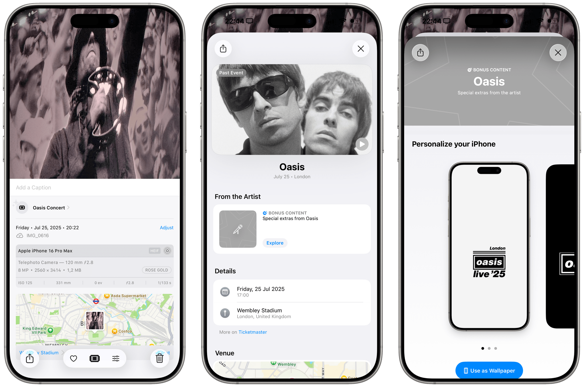
Notably, artists can embed special extras inside these pages in iOS 26. For Oasis, tapping an ‘Explore’ button reveals a page with bonus content that includes wallpapers and watch faces you can download to personalize your iPhone and Apple Watch.
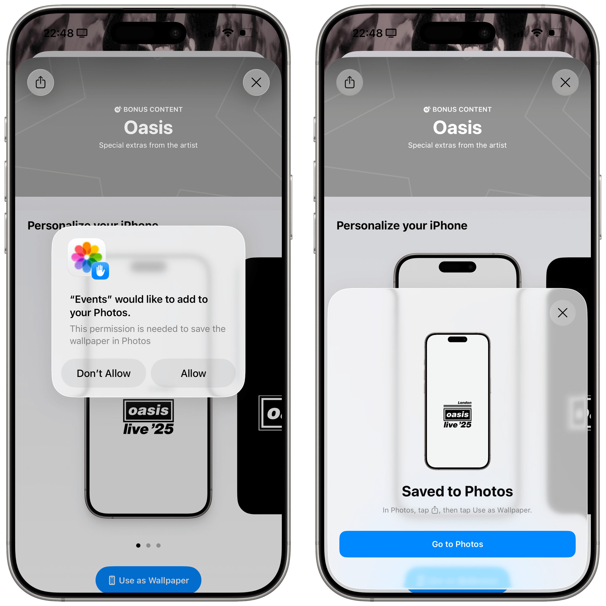
In an interesting limitation, this feature cannot set wallpapers directly; it just saves images to the Photos app.
I know what you’re thinking: why isn’t this concert schedule and bonus content experience baked right into Apple Music, too? I have no idea, but I hope that this “new” Photos feature eventually finds its way to the Music app as well. This cross-pollination of services (Photos, Maps, Music, and Calendar) reminds me of Stocks’ integration with Apple News in iOS 12 and iOS 18’s integration between Notes and Calculator, and it’s something I want to see the company continue doing.
Preview
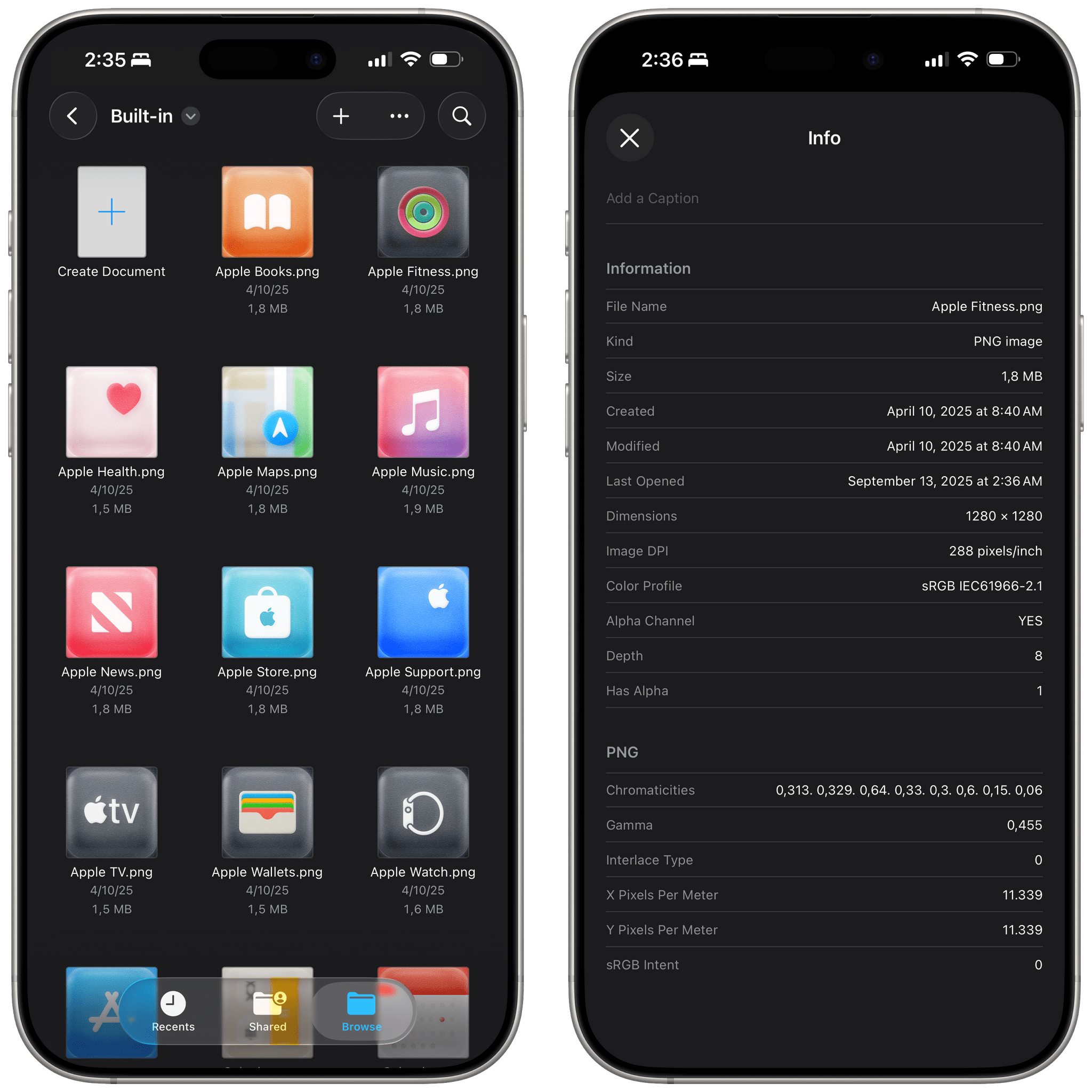
I covered Preview in the iPadOS chapter, but it deserves a second mention here, too, since it’s available on iPhone as well, and it’s a solid debut for a new system app that builds upon the long history of Preview for Mac and Quick Look’s integration in Files.
Preview is a document-based app on iOS, which means you can browse any location from the Files app to open images or PDFs in Preview. The app acts as an all-in-one collection of editing, auto-fill, and preview features that had been previously made available in Files and Quick Look. You can fill and rotate PDFs; you can rename and duplicate documents; and for the first time, you can also crop pages of PDFs.
There isn’t a lot to cover here because you’ve seen a lot of these features and tools elsewhere in iOS and iPadOS before, just not in the same place, all at once. I appreciate the addition of an inspector panel for PDFs and images. On iPad, as we’ve seen, it’s a sidebar; on iPhone, it opens with a delightful Liquid Glass morphing transition from the bottom of the screen.
The Preview app won’t win any awards for the most innovative experience. At the same time, it’s long overdue, works well, and finally gives some clarity on how, exactly, you’re supposed to work with PDFs on an iPhone without downloading a third-party app.
Reminders
I’ve already mentioned Reminders’ integration with Apple Intelligence, but there are a couple of smaller enhancements to the app I want to cover here as well.
The most important one is the new control for quickly creating reminders that you can use in Control Center, on the Lock Screen, or via the Action button.
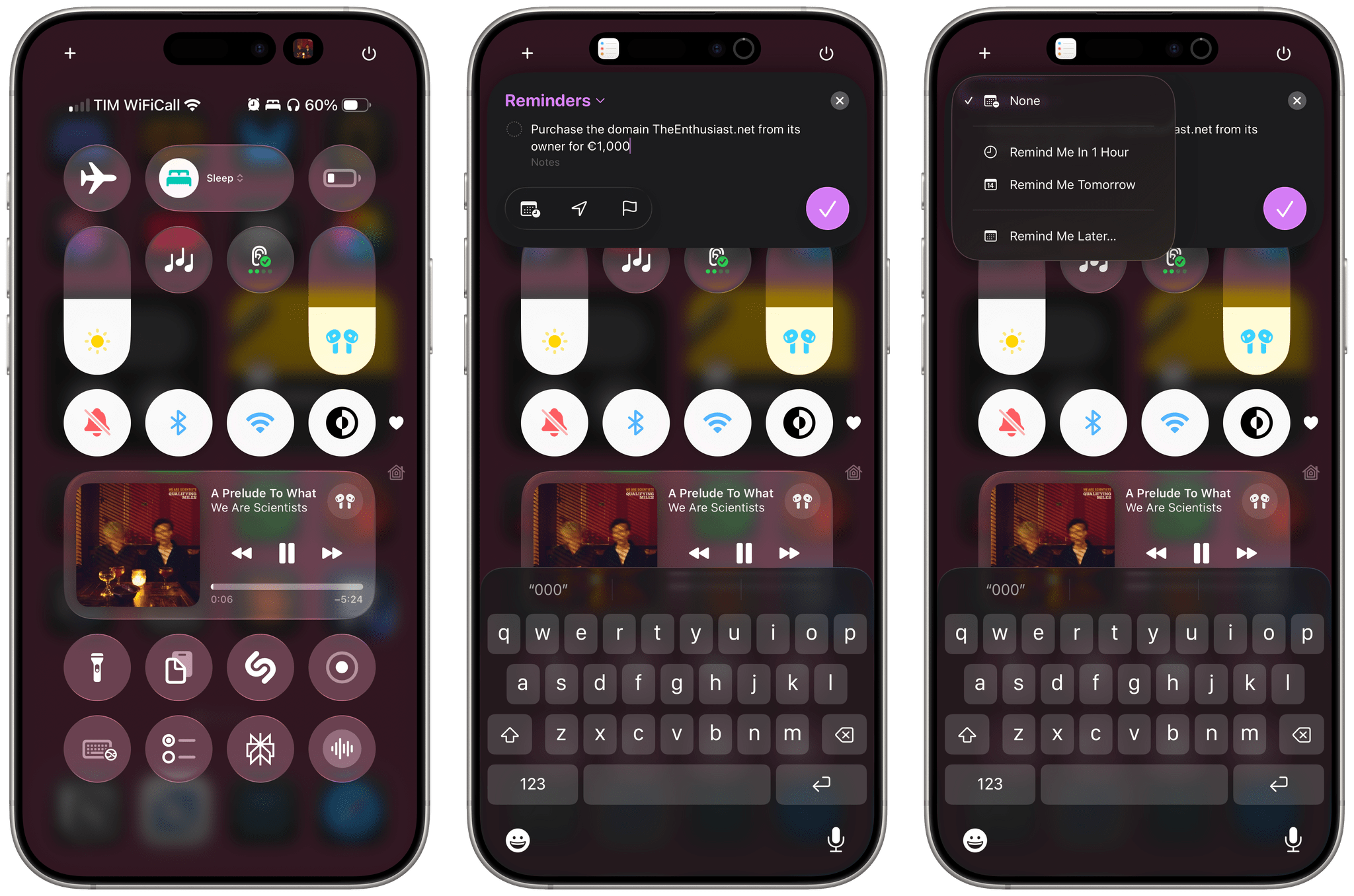
This control is an interactive snippet that supports keyboard input for task creation but also lets you interact with other elements of the window. You can change the list the task will be saved to, pick dates, select locations, and mark an item as flagged. This is a fantastic way to quickly create tasks from anywhere on iOS and iPadOS, and if you’re a Reminders user, I think you’ll be happy to have a method that is even faster than the Remind Me Faster app. Sadly, this control is based on private APIs, so apps like Things and Todoist won’t be able to offer a similar quick capture feature system-wide.
Reminders is also integrated with the Phone app now: swipe left on any recent call, and you’ll be able to set a callback reminder.
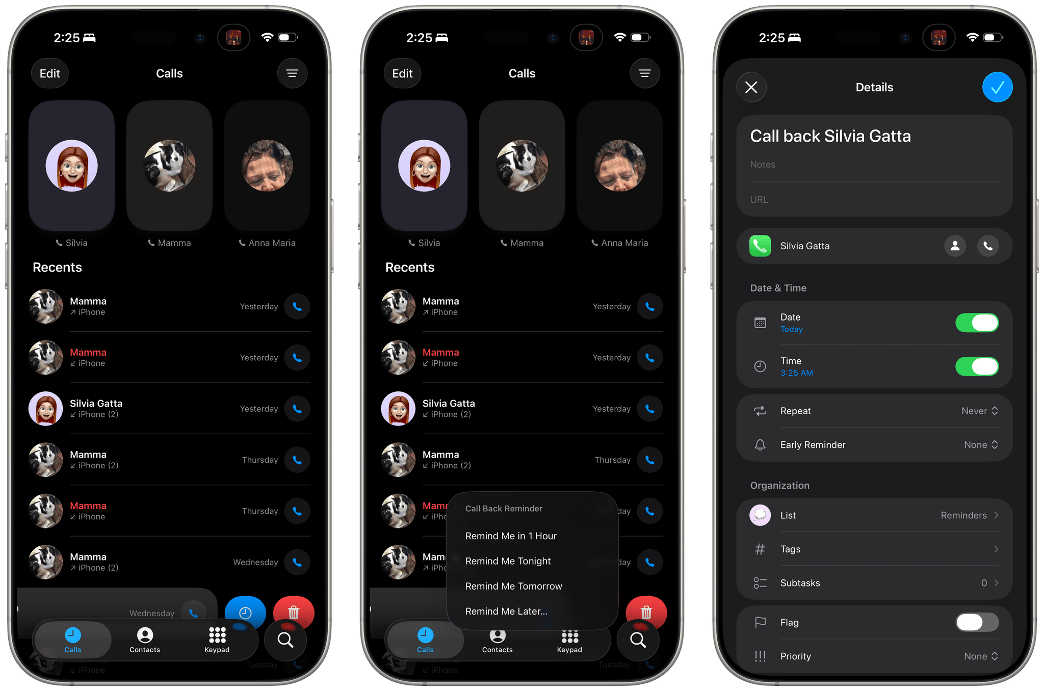
Individual reminders can now be set to a specific time zone. Add a reminder with a due time, and you’ll get access to a ‘Time Zone’ field to set the time according to a different location’s time zone.
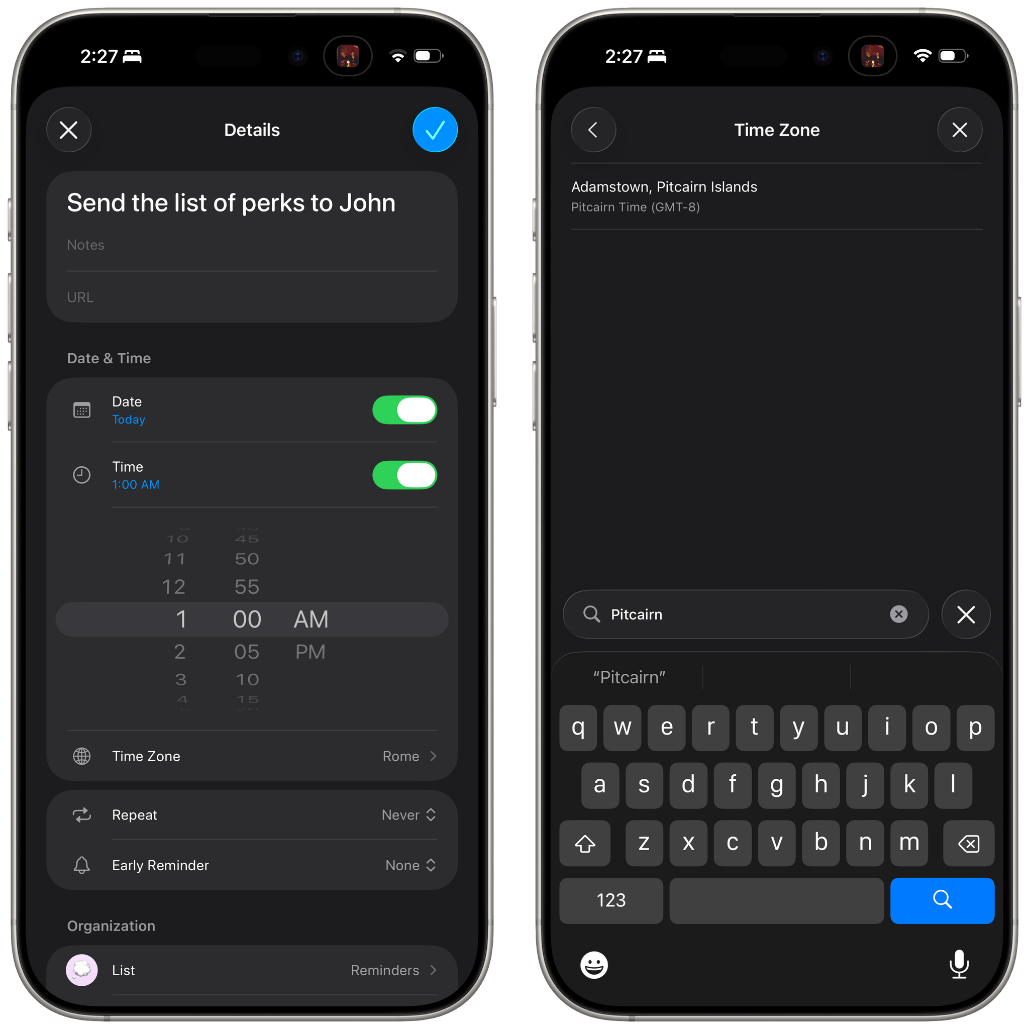
Reminders for iOS 26 also supports a manual time zone override in Settings ⇾ Apps ⇾ Reminders ⇾ Time Zone. By default, reminders automatically use the time zone of your location, but if you want to always set them to a different location, you can do so with the ‘Set Manually’ toggle.
Safari
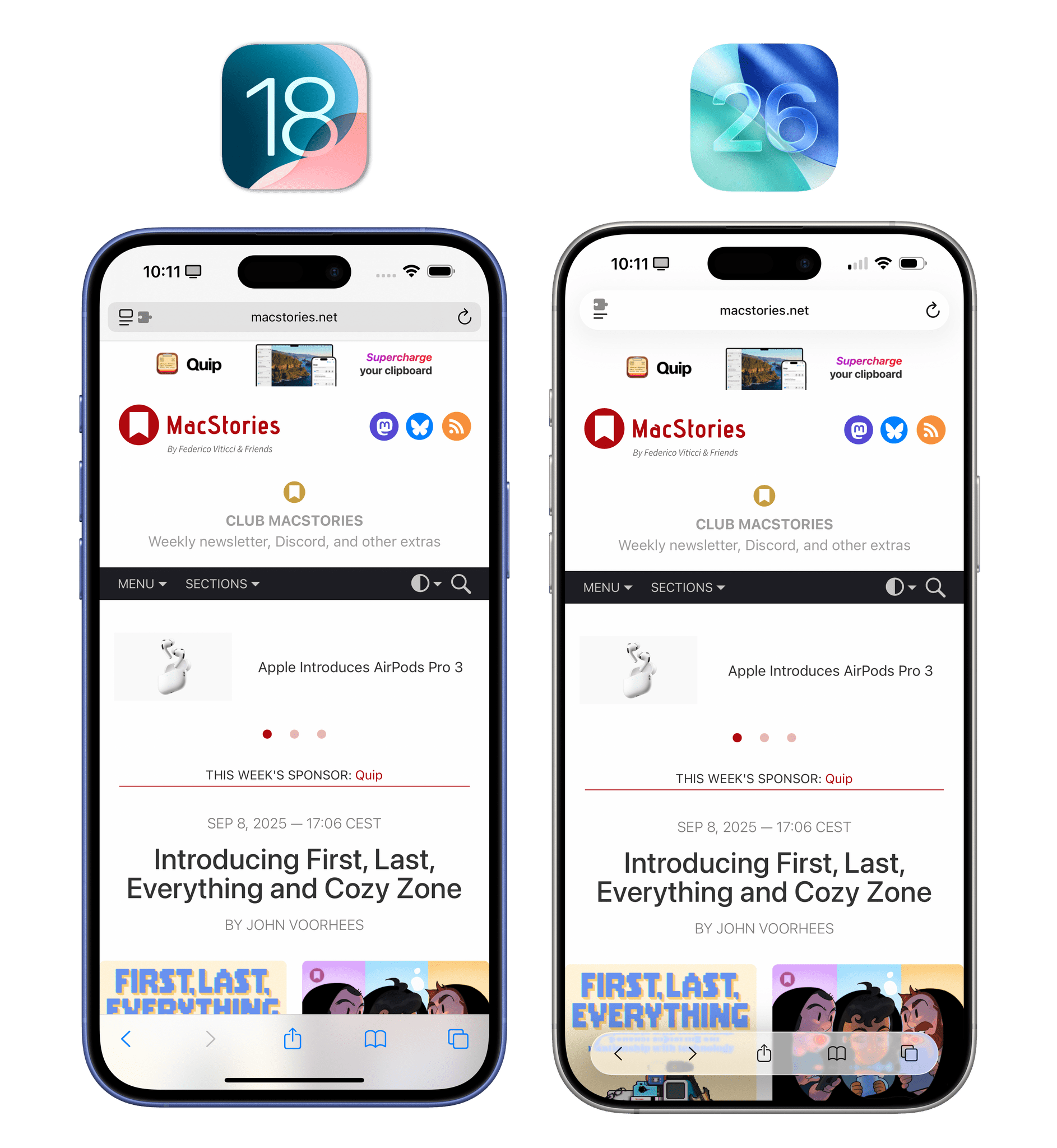
With iOS 26 and Liquid Glass, Apple is changing the default layout of Safari with an even more compact address bar floating at the bottom of the screen. After upgrading to iOS 26, Safari’s existing ‘Bottom’ layout will be replaced by a new ‘Compact’ mode that turns the toolbar and address bar into a row of Liquid Glass controls that take up less screen space and, in the process, hide the share, bookmark, and tab buttons in a menu.
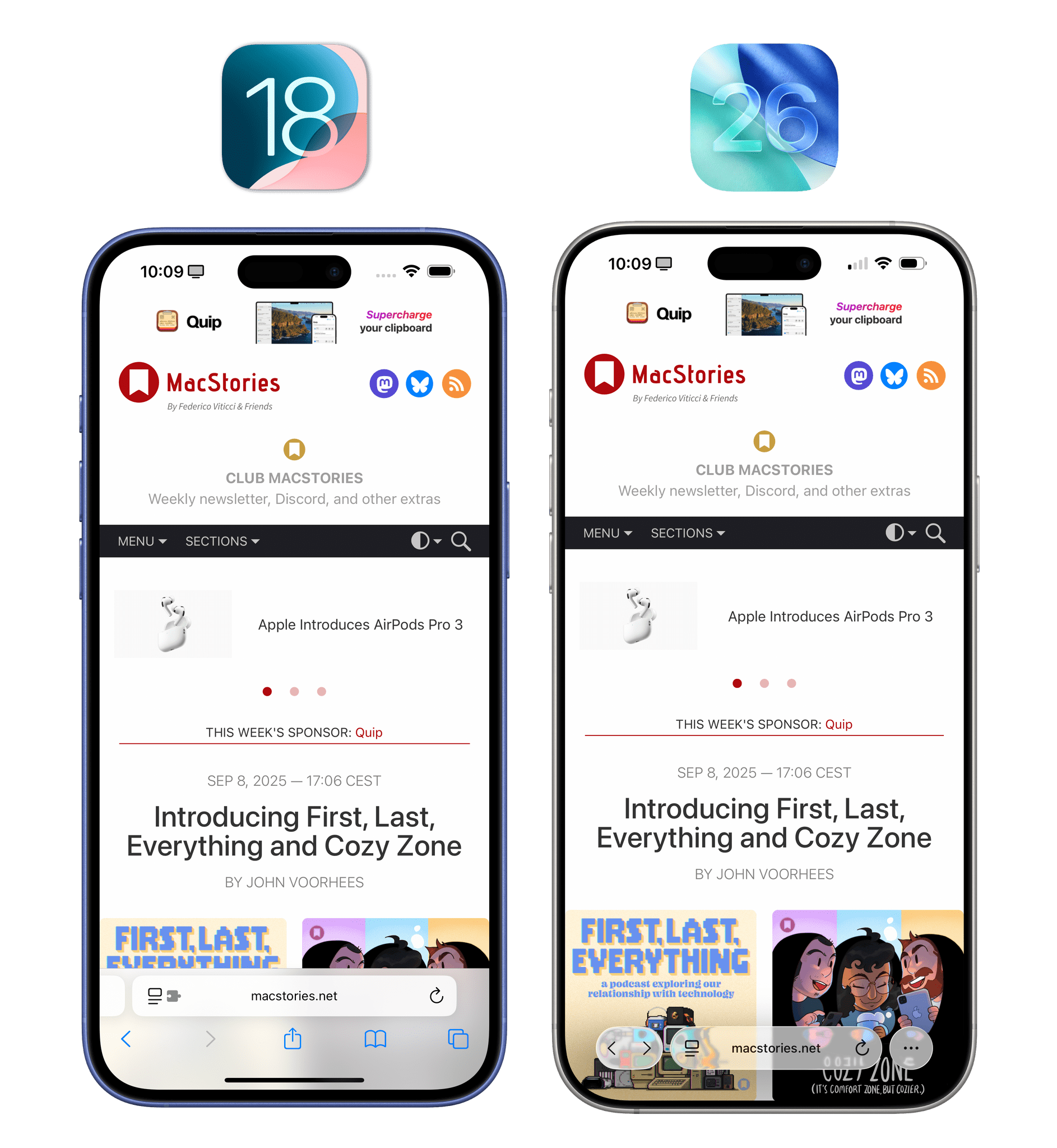
Fortunately, if you don’t want to use this layout, you can revert to the previous one in Settings. The ‘Bottom’ layout displays all existing controls but, rather than presenting them in an edge-to-edge toolbar at the bottom of the screen, they’re now contained in a floating “capsule” with a scroll edge effect at the bottom.
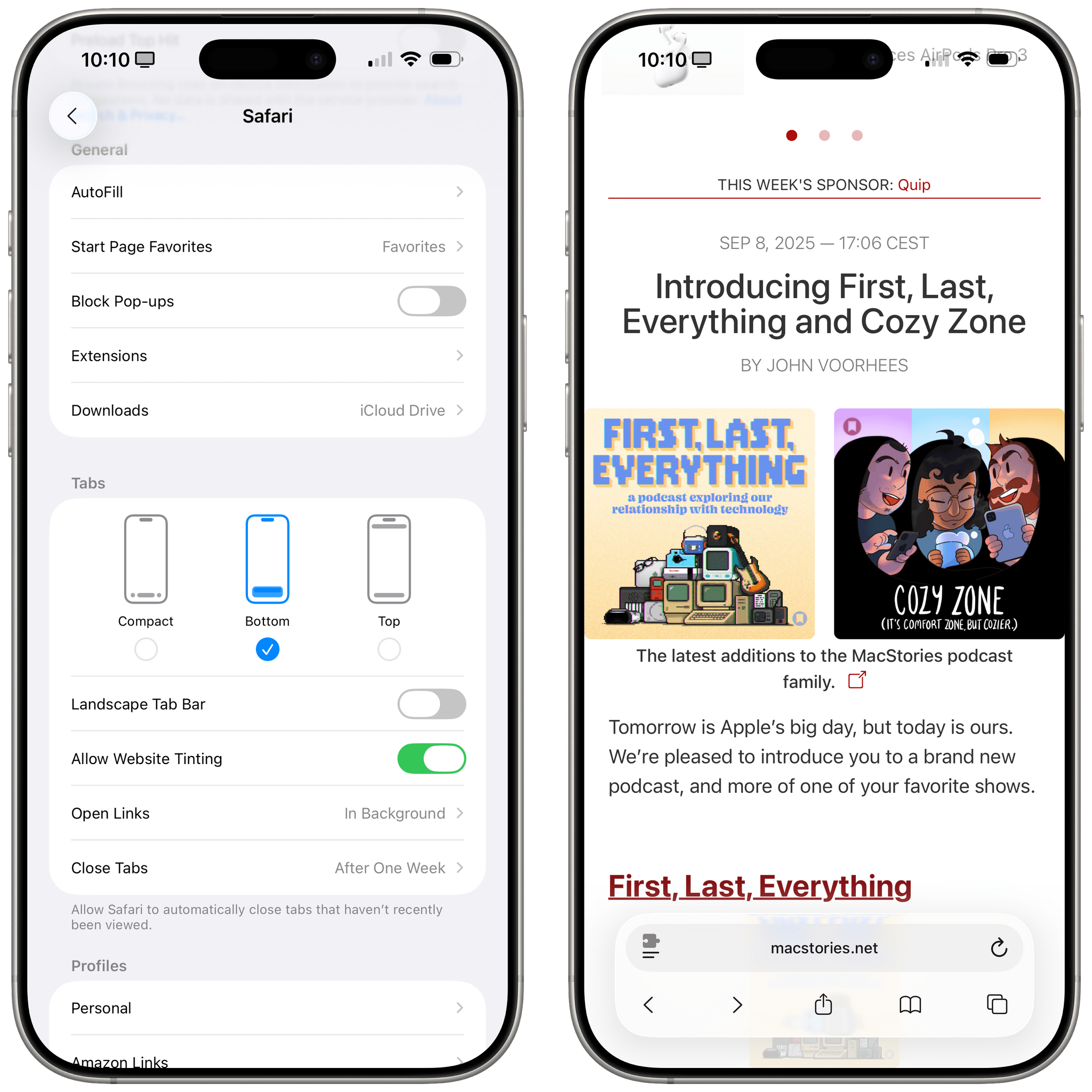
You can revert to the old Safari layout with the ‘Bottom’ option, which shows more controls at once.
The old ‘Single Tab’ top layout has been updated for Liquid Glass too and renamed ‘Top’:
No matter the layout you choose, when scrolling inside a webpage, Safari will always minimize the address bar into an element much smaller than before that is also made of Liquid Glass:
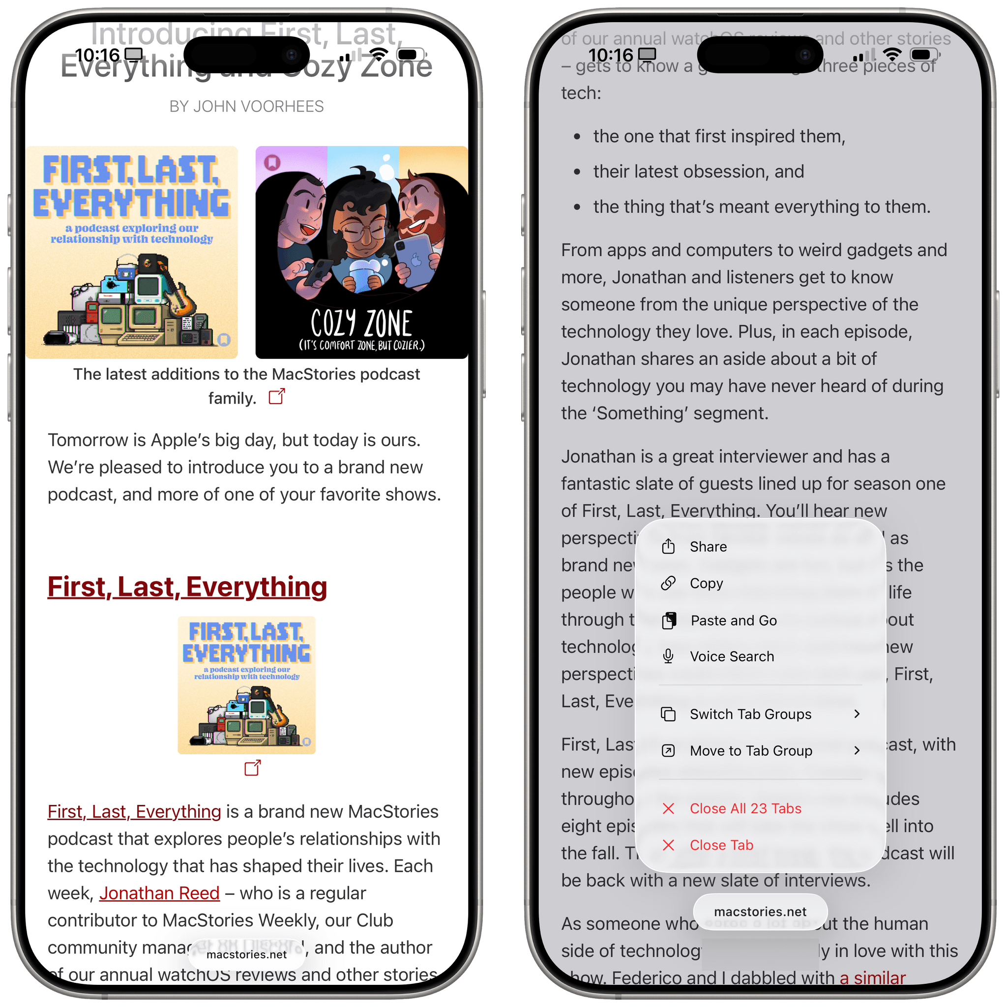
You can long-press the minimized address bar to access a context menu. (The visual glitch with the gray rectangle on the right is shipping in iOS 26 today.)
I’ve gone back and forth on this compact design over the summer. Initially, I deeply disliked how it hid the share and tabs buttons, which always required an extra tap. Over time, the more minimalistic look of the address bar has grown on me, and I like how webpages feel taller (and I can see more text at once) because of it. I’ve also gotten used to swiping up on the address bar to go back to the tabs view rather than always pressing the ‘All Tabs’ button. I recommend giving it a try, and if you don’t like it, Apple is keeping the older view mode around.
There are other nice quality-of-life improvements in Safari this year. With the compact layout enabled, you can press the ellipsis button and find a new option for quickly adding the current webpage to one of your bookmark folders. It’s not clear, however, how Safari picks the folder to surface at the top level here.
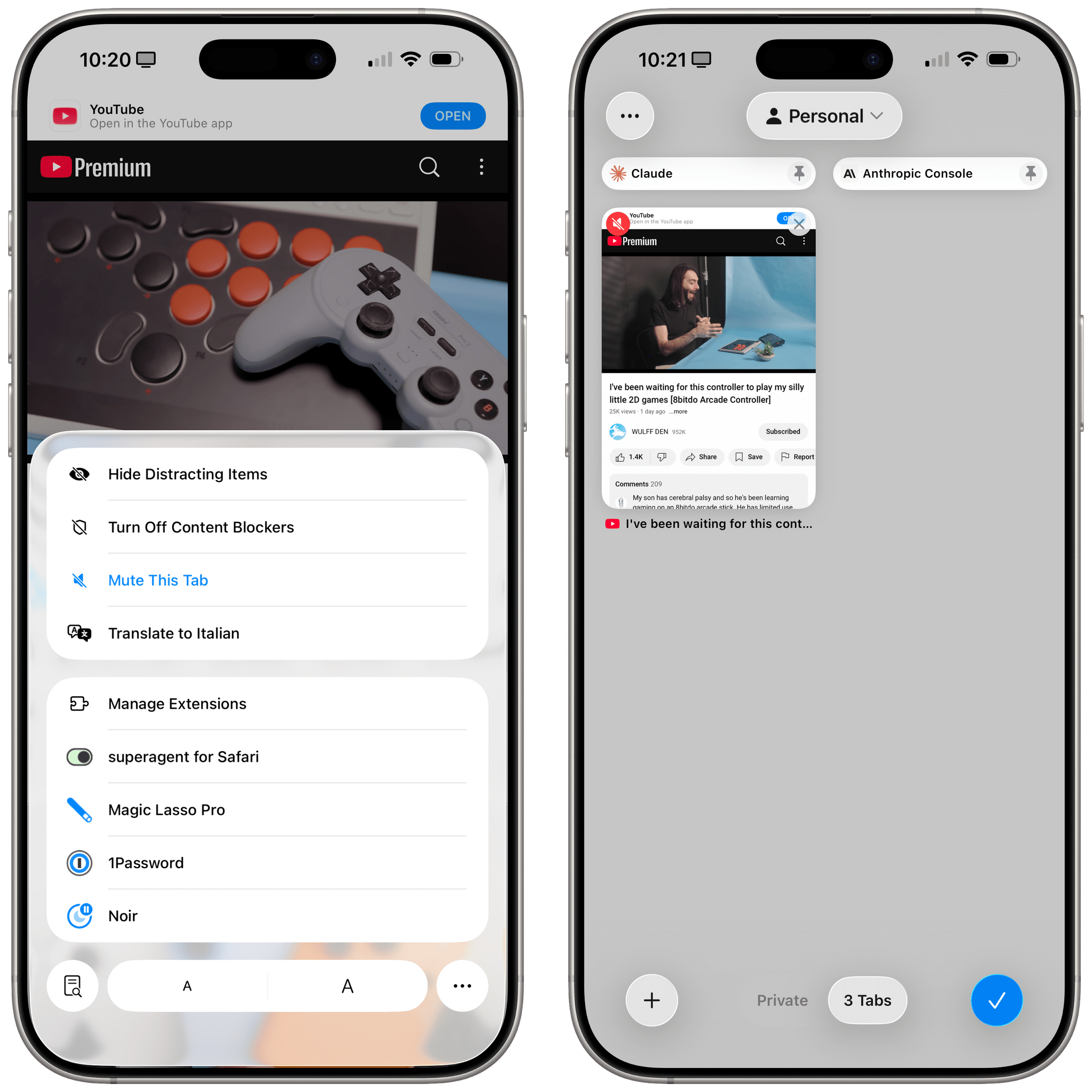
When a webpage is playing audio in a Safari tab, iOS and iPadOS 26 offer you the ability to mute and unmute the tab from the action menu:
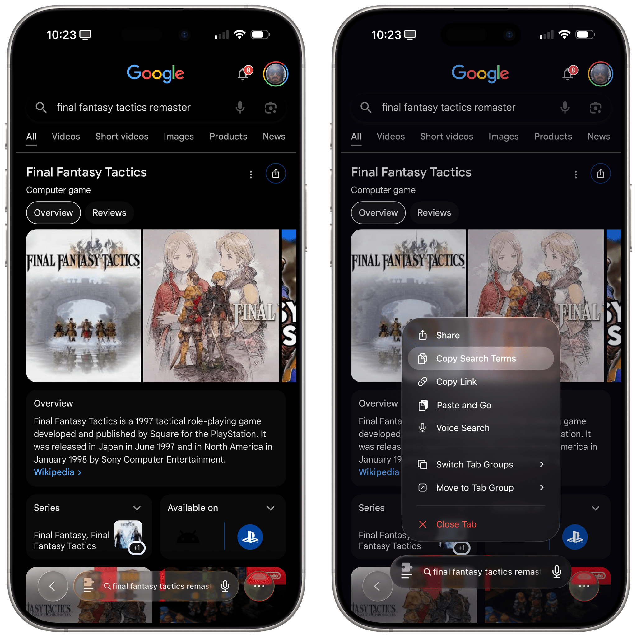
When you’re on a Google search results page and long-press the address bar, you’re now presented with separate buttons for copying the link of the page and copying the search terms you used:
Lastly, Safari has an updated flow for saving websites to the Home Screen. In iOS and iPadOS 26, you can choose to save any webpage as a bookmark on the Home Screen (which will reopen in your default browser) or as an app.
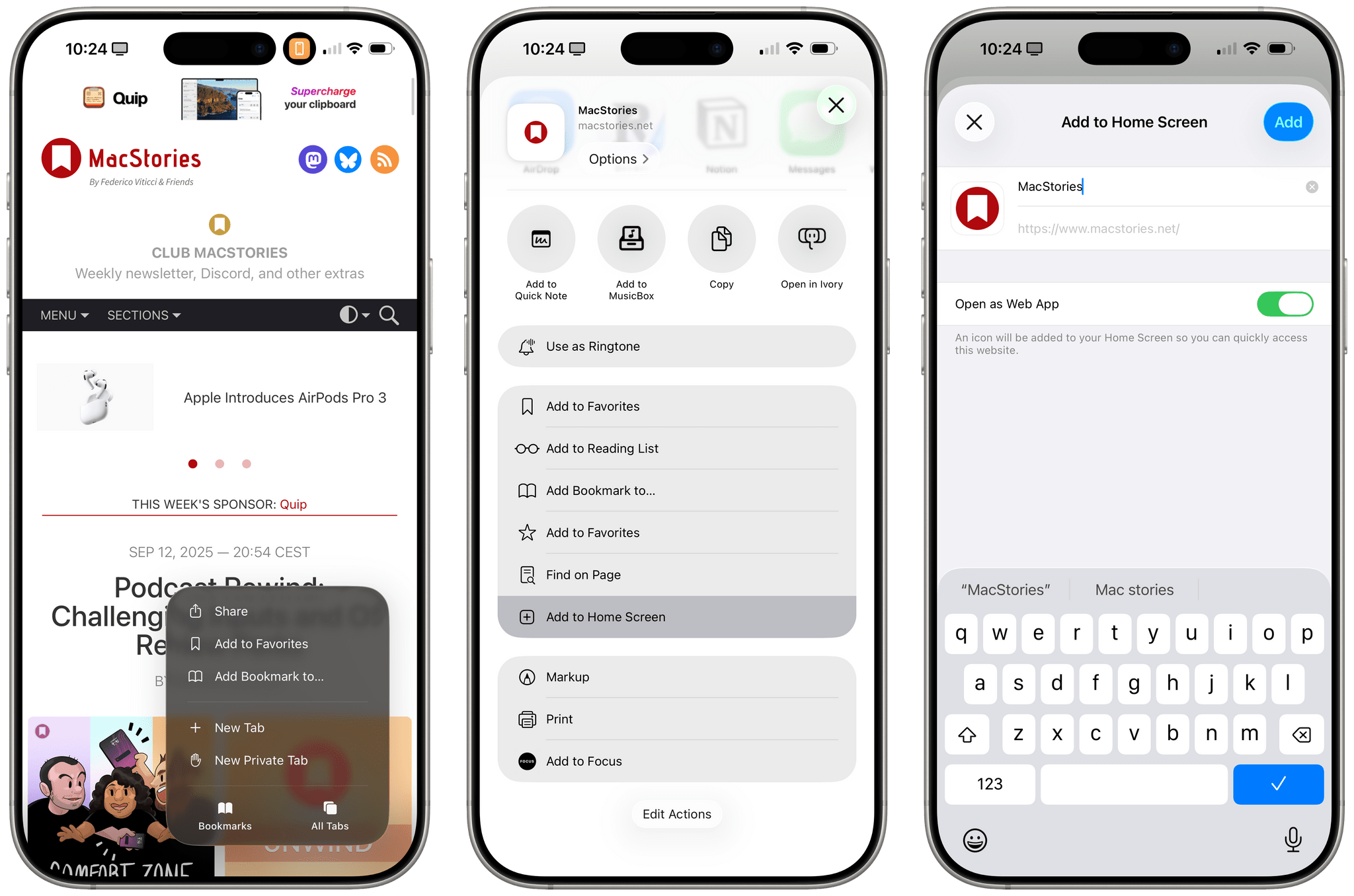
When saved as an app – regardless of whether the website supports PWAs or not – the selected website will open in full-screen, and you’ll see it in the app switcher. This is a nice feature, and clearly everyone should be saving MacStories as an app to their Home Screens now.
Shortcuts
There are two noteworthy changes to the Shortcuts app this year. One is the Use Model action, which I’ve covered in the Apple Intelligence chapter; the other is that I don’t know what Apple has done behind the scenes, but they’ve made the Shortcuts editor so much better.
I’m not sure if it’s Liquid Glass, or perhaps Shortcuts shedding some of its problematic SwiftUI in favor of UIKit, or a mix of both, but the reality is that editing long workflows in the Shortcuts editor no longer drives me insane in iOS 26. When I want to pick a Magic Variable and actions expand to reveal their outputs, the editor doesn’t jump around and lose my place anymore. The variable toolbar has been redesigned with Liquid Glass, and beyond looking nice, it feels much more stable and less glitchy than before.
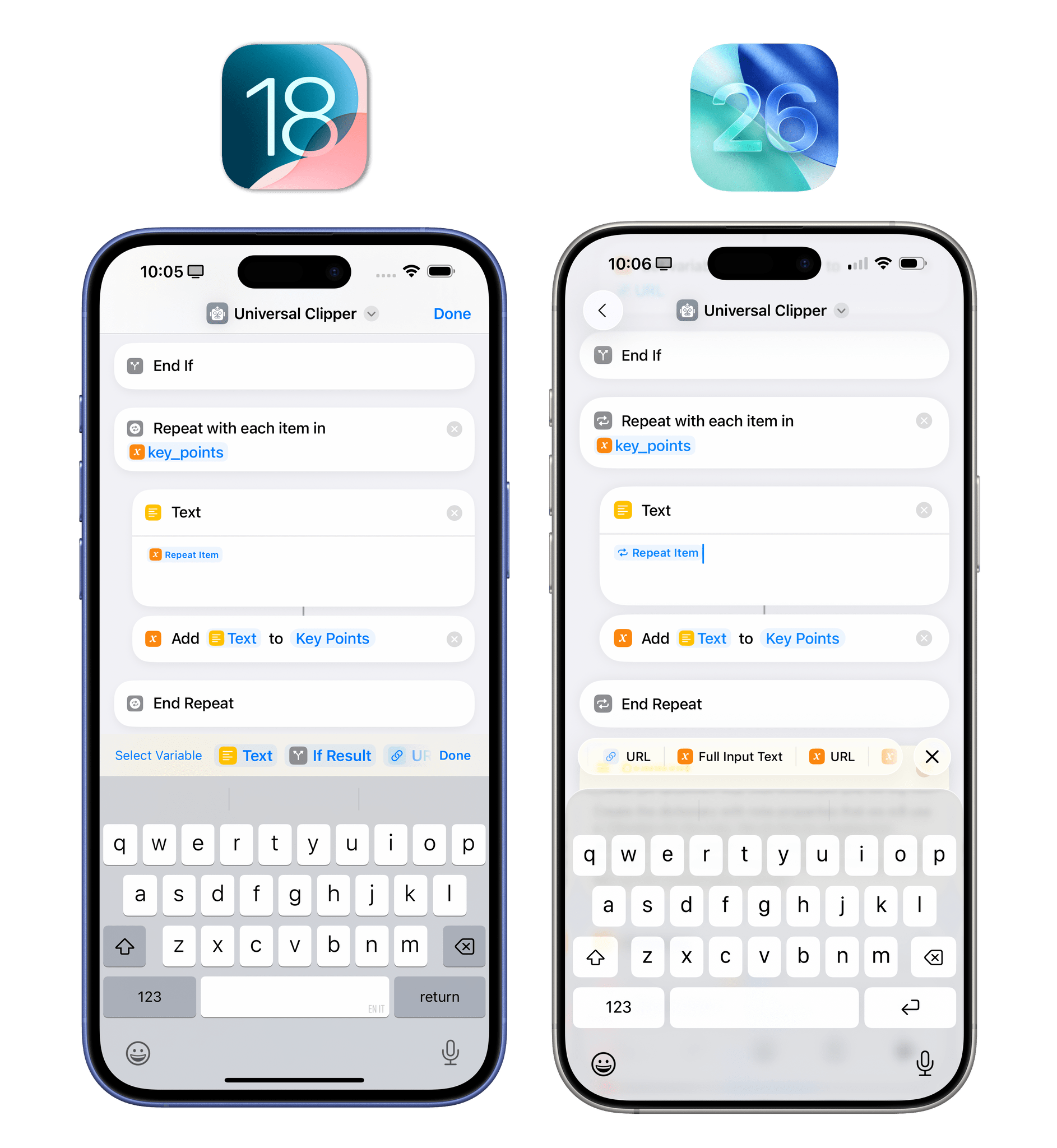
It may not look so different from iOS 18, but the updated Shortcuts editor feels so much better to use in iOS 26.
There’s an overall sense of speed, reliability, and, as a result, trustworthiness that just wasn’t there with the old version of Shortcuts. It’s the kind of change that won’t get a mention in any press release, which few people will notice, but those who do will be thankful that someone at Apple took charge of this project. I know I am.
I’m a little bummed that Shortcuts for iOS and iPadOS didn’t get support for file and folder automations like the Mac version, but such is the ebb and flow of the Shortcuts app over time. The Mac version didn’t have personal automations for several years, and now that it does, they’re actually more powerful than the ones on iOS and iPadOS. We know Apple at this point: they always have to keep us wishing for more.