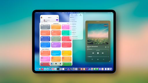
Apps
Given the growing number of built-in Apple apps, regional restrictions for certain features, the cross-platform nature of those apps, and the simultaneous release of iOS, iPadOS, and macOS 26, we think it’s only logical to split coverage of apps between my review and John’s review of macOS. We debuted this approach last year, and readers seemed to like it.
For the past few years, we’ve each felt like we were doing double the work to cover the same apps and features on two distinct platforms in two separate stories. This made sense years ago, when the Mac didn’t have the same apps as iOS and region-locked features weren’t as common, but it doesn’t apply to our current reality anymore.
This year, you’ll find the following apps covered in John’s upcoming review of macOS Tahoe:
- FaceTime
- Games
- Journal
- Maps
- Notes
- Passwords
- Podcasts
I’ll be covering the rest here. Let’s dive in.
Camera
While I may not be an “average user” of most iOS features because of my job, I absolutely think I’m the most average user of Apple’s Camera app. I use the Camera like most people do: I don’t fumble around with advanced settings; I never fully figured out the deal with Photographic Styles; I have no idea how to take advantage of RAW file formats; I just like to open the camera to take pictures, and the most tweaking you’ll see me do is tapping the lens buttons to switch zoom levels. Very frequently, I take silly videos of my dogs. I tried using an iPhone 16 Plus as my main iPhone for a while and eventually switched back to the 16 Pro Max – not because I’m a professional photographer; I just missed the 5× camera too much.
Because of all this, I’m very into the much-needed simplification of the Camera UI in iOS 26. With the redesign, Apple decided to streamline the Camera app and elevate the two capture modes people use the most: photo and video. Gone is the scrollable row of modes above the shutter button always shown by default; when you open the camera now, it defaults to showing you just two tabs for photo and video modes.
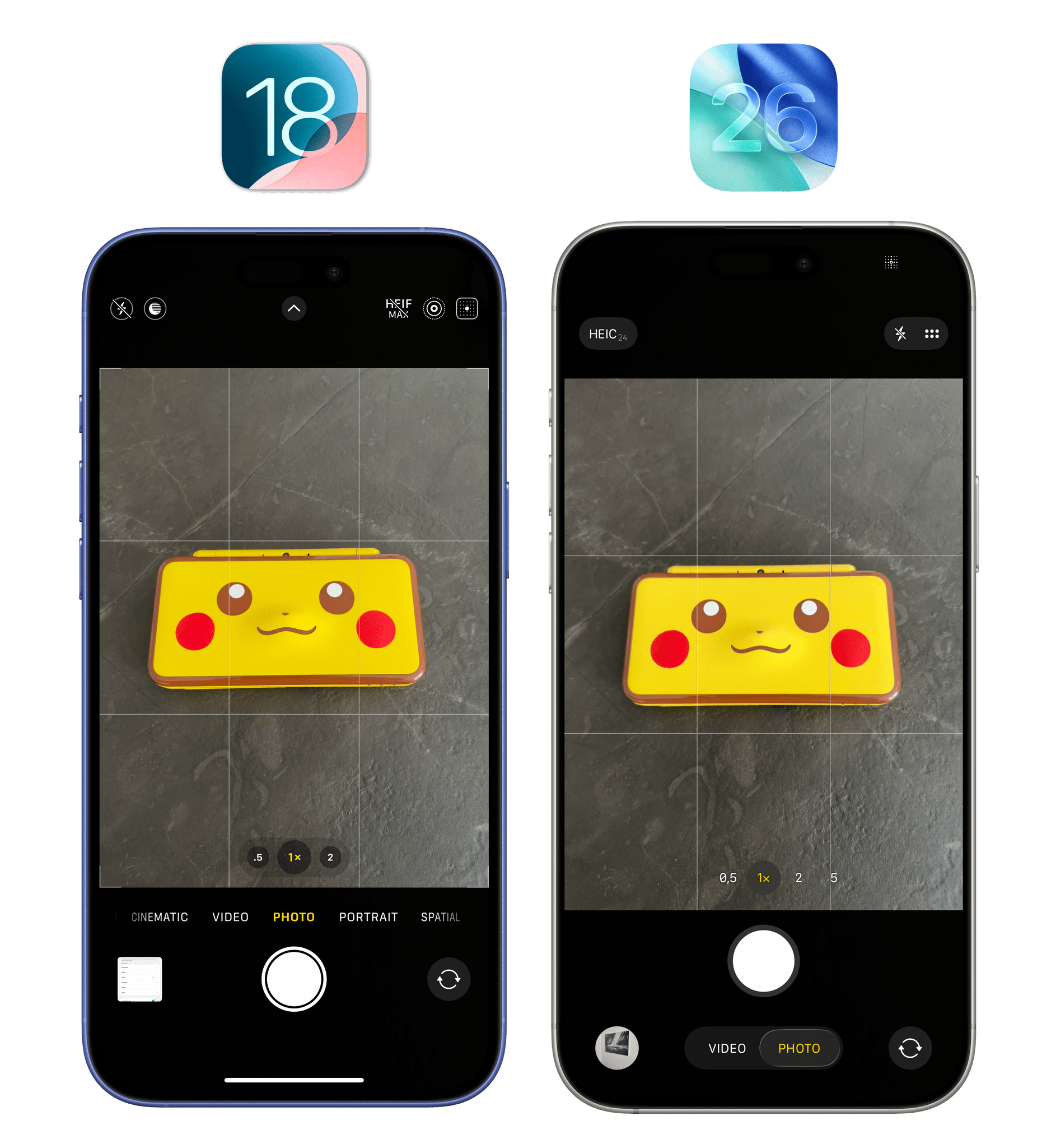
This is the right decision. The other modes are still there. The Liquid Glass segmented control hints at their presence by briefly expanding when switching modes, and you can always scroll the row of items to switch to other modes like portrait and slow-mo. The Camera app is also a good showcase of another subtle change Apple introduced with Liquid Glass: the Home indicator at the bottom of iPhone apps is hidden by default, allowing apps to feel more spacious than before. The Home bar still briefly appears on screen when you first launch an app, but then it disappears again.
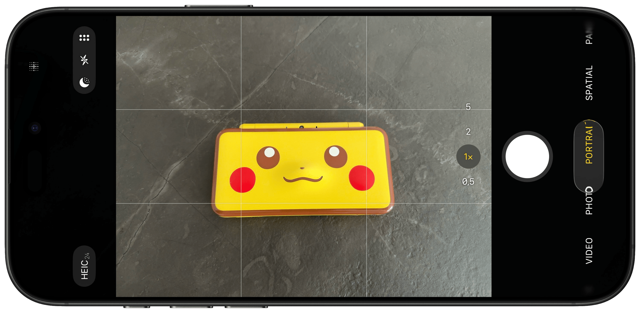
The simplification of the Camera app doesn’t stop at fewer tabs for shooting modes, though. Apple took advantage of Liquid Glass to condense other controls into sub-menus, leaving only the essentials always visible by default and making the secondary ones bigger and easier to use.
At the top of the screen, you’ll now only see two items: resolution on the left and a toolbar with night mode, flash, and more settings on the right. The most important change is in the “overflow” menu for all other settings, which is also mapped to a swipe up on the viewfinder. Tap the six dots in the upper-right corner or swipe up anywhere on the camera, and you’ll get a brand new Liquid Glass menu for all other camera options:
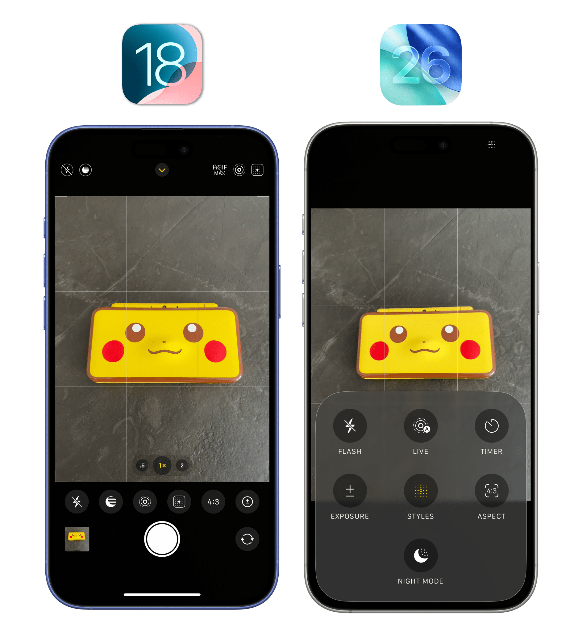
This is so much more intuitive than the old narrow strip of buttons! Each option is clearly labeled and easier to tap, and there are beautiful animations that playfully interact with the Liquid Glass material and content underneath in real time. Select any item from this menu, and it will elegantly morph into the related sub-menu with dedicated controls. If you’re looking for the perfect Liquid Glass demo to show off what Apple built in iOS 26, this is it.
Interacting with the Camera app in iOS 26.Replay
On balance, I think Apple has done a solid job simplifying the default UI state of the Camera app without removing any functionality for advanced users who need additional controls. From my perspective, the Camera app had gotten too complex for its own good; not everyone needs to be a professional photographer, including those who buy a ‘Pro’ iPhone model every year.
There are some other changes in the Camera app I want to highlight. First up is a new technology Apple is debuting this year that allows the system to detect if the iPhone’s lenses are smudged. If so, you’ll get a message in the Camera app telling you to clean them in order to get the clearest possible photo.
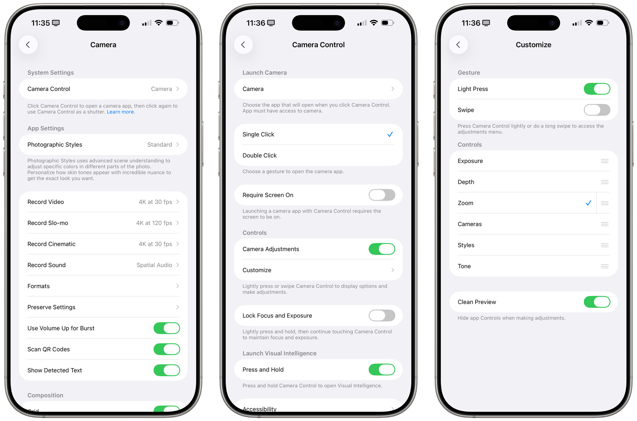
In Settings ⇾ Camera ⇾ Camera Control ⇾ Customize, you can now choose the controls that are available when navigating Camera Control’s list of items inside the Camera app. Personally, I only ever use Camera Control to open the app, but it’s nice to see Apple adding some personalization options here.
Lastly, I’ve already covered AirPods’ superior audio recording capabilities in iOS 26 in a separate article on MacStories earlier this year, but I want to mention another AirPods integration that is new in this update: you can now use AirPods as a remote shutter for the Camera app.
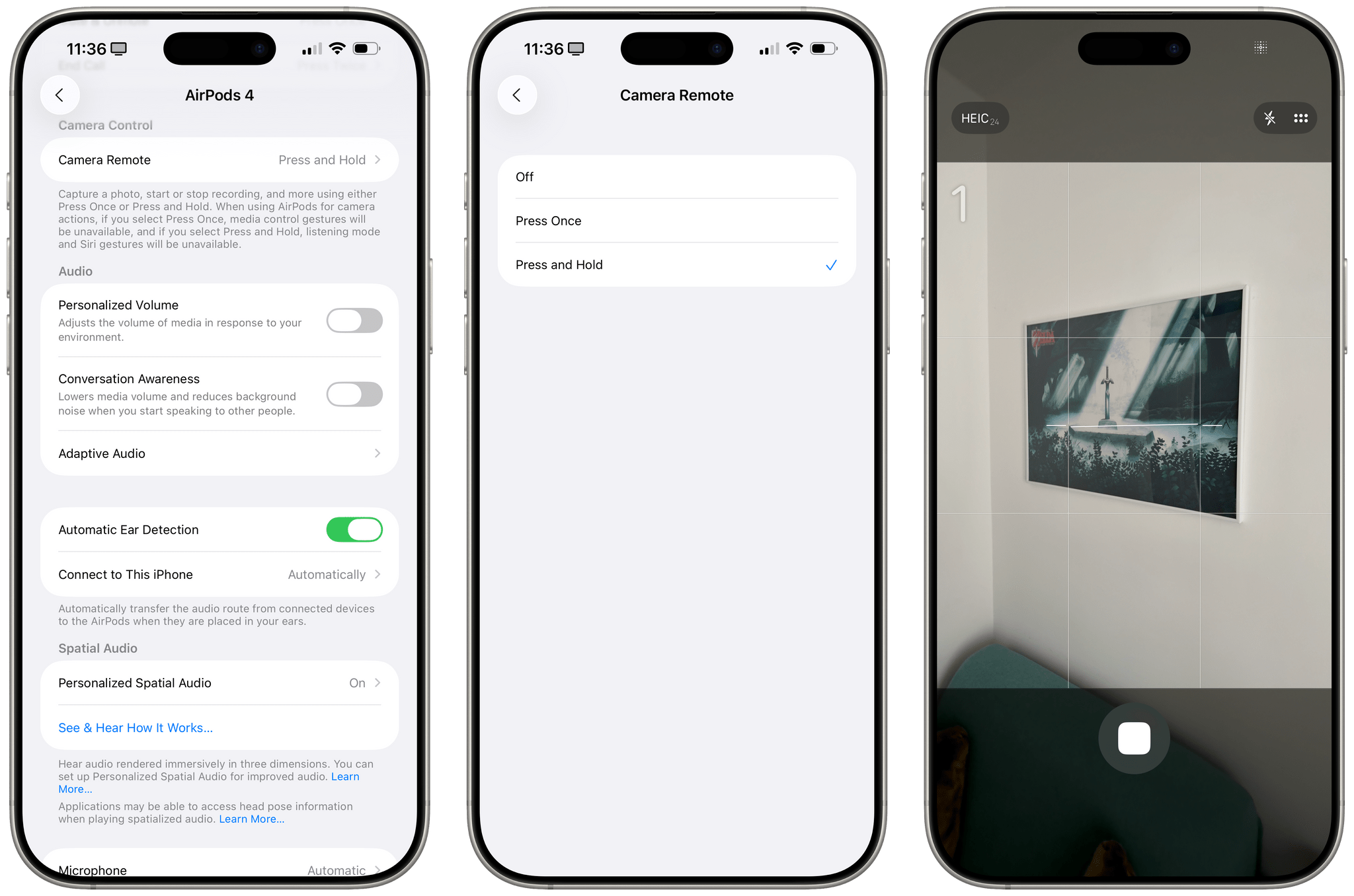
By default, you can press and hold the stem of an AirPod while inside the Camera app to take a picture or record a video, depending on which mode is selected. When you press and hold, you’ll see a three-second timer in the camera, then the selected action will be performed. This is particularly handy for group shots and self-portraits when the iPhone is far away or you don’t want to set a timer on the phone itself.
You can also adjust the behavior of this feature in Settings. Under the new Camera Remote page of the AirPods preferences in the Settings app, you can choose to only press once to control the camera. If you enable that, media playback controls won’t be available when wearing AirPods and using the Camera app, whereas with the press and hold mode, Siri gestures won’t be available.
Clock
There are two notable changes to the Clock app in addition to a Liquid Glass redesign (a common refrain throughout this chapter): an updated look for the alarm clock on the Lock Screen and the ability to set a custom snooze duration.
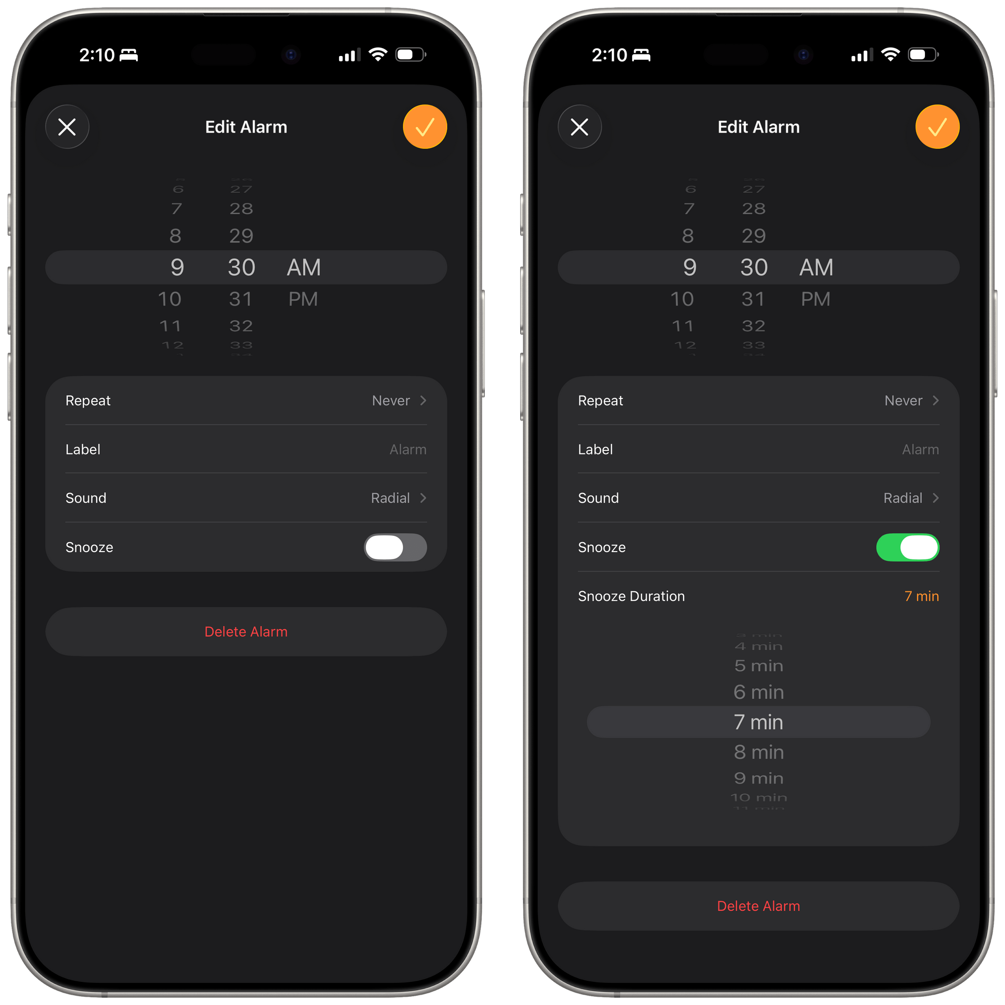
In the ‘Edit Alarm’ screen, there is a new ‘Snooze Duration’ field that lets you set a custom snooze in one-minute increments from 1 to 15 minutes. I don’t like snoozing my alarms, so this feature isn’t really for me, but I think a lot of people will like the addition.
When an alarm goes off on the Lock Screen, it also has a new look in iOS 26 with two extra-chunky ‘Stop’ and ‘Snooze’ buttons at the bottom of the screen.
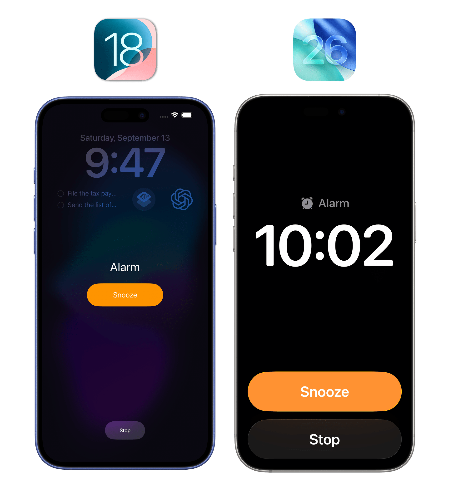
My understanding is that some folks don’t like the placement of two equally sized buttons at the bottom of the Lock Screen. I am not one of those folks. I always disliked the small ‘Stop’ button at the bottom of the screen when waking up in the morning; I’m glad the new one is larger and easier to tap.
Honestly, though, this doesn’t really matter for me. I’m lucky enough to have my dog Ginger wake me up – right on schedule – every morning with a kiss on my face because she wants to eat and nothing beats a dog’s internal clock. iOS 26’s Clock app ain’t got nothing on Ginger.
Files
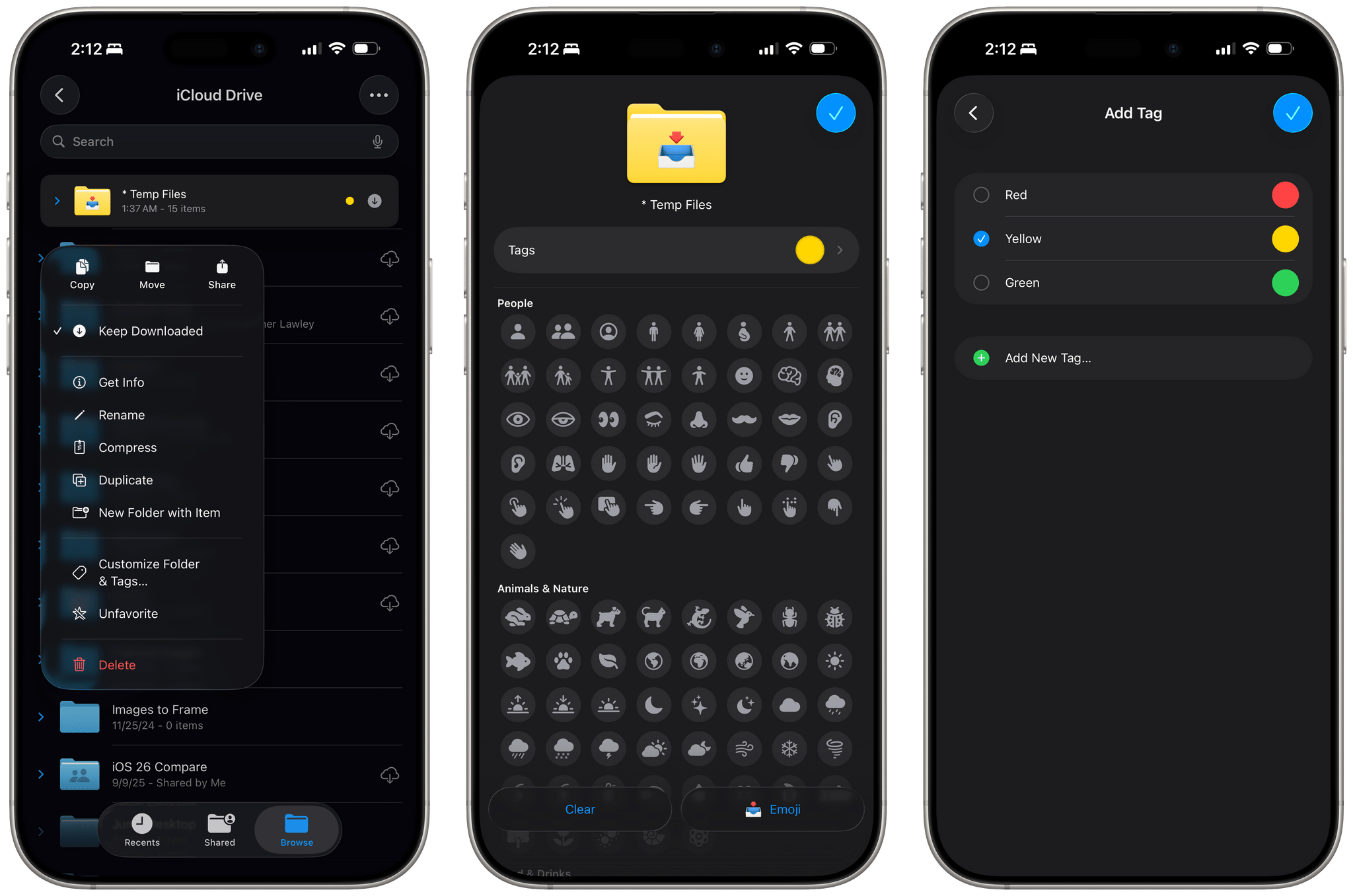
In addition to the features I mentioned for the Files app in the iPadOS chapter, I want to highlight the ability to set custom folder icons and colors, as well as Apple’s new ‘Open With’ menu.
Customizable folders are an interesting spin on Files’ and Finder’s longstanding support for file system tags, and they’re presented in the 26 line of OSes with a user-friendly interface that makes folders visually stand out. Long-press a folder in the Files app and select the new ‘Customize’ option, and you’ll be able to choose a tag and a symbol. The tag is the usual colored indicator that now gets applied to the entire folder and makes it look, say, yellow or green instead of the default blue. The symbol options appear to be a selection of SF Symbols that, unfortunately, cannot be searched, but you can also pick any emoji as well. Once you’ve customized a folder, your color and icon selections will sync with iCloud Drive and show up on iOS, iPadOS, macOS, and visionOS.
I like this change a lot. I’ve been able to make folders I frequently use appear more prominent in the Files app’s grid view, and the addition of custom symbols is a nice touch.
At long last, Apple is providing a solution for document defaults in iOS 26. I’ve complained about the Files app’s confusing system for picking which apps could open which file types many times over the years. In iOS 26, Apple is solving this problem with the most obvious solution: a user-configurable ‘Open With’ menu.
This menu works in two distinct ways. You can choose to open a specific file with a specific app by long-pressing it and picking a compatible app under the new ‘Open With’ option of the context menu. This action is temporary and specific to the selected file. You can still choose to preview a file with Quick Look, but if you know you want to open that particular item with a specific app that one time, you can now do that.
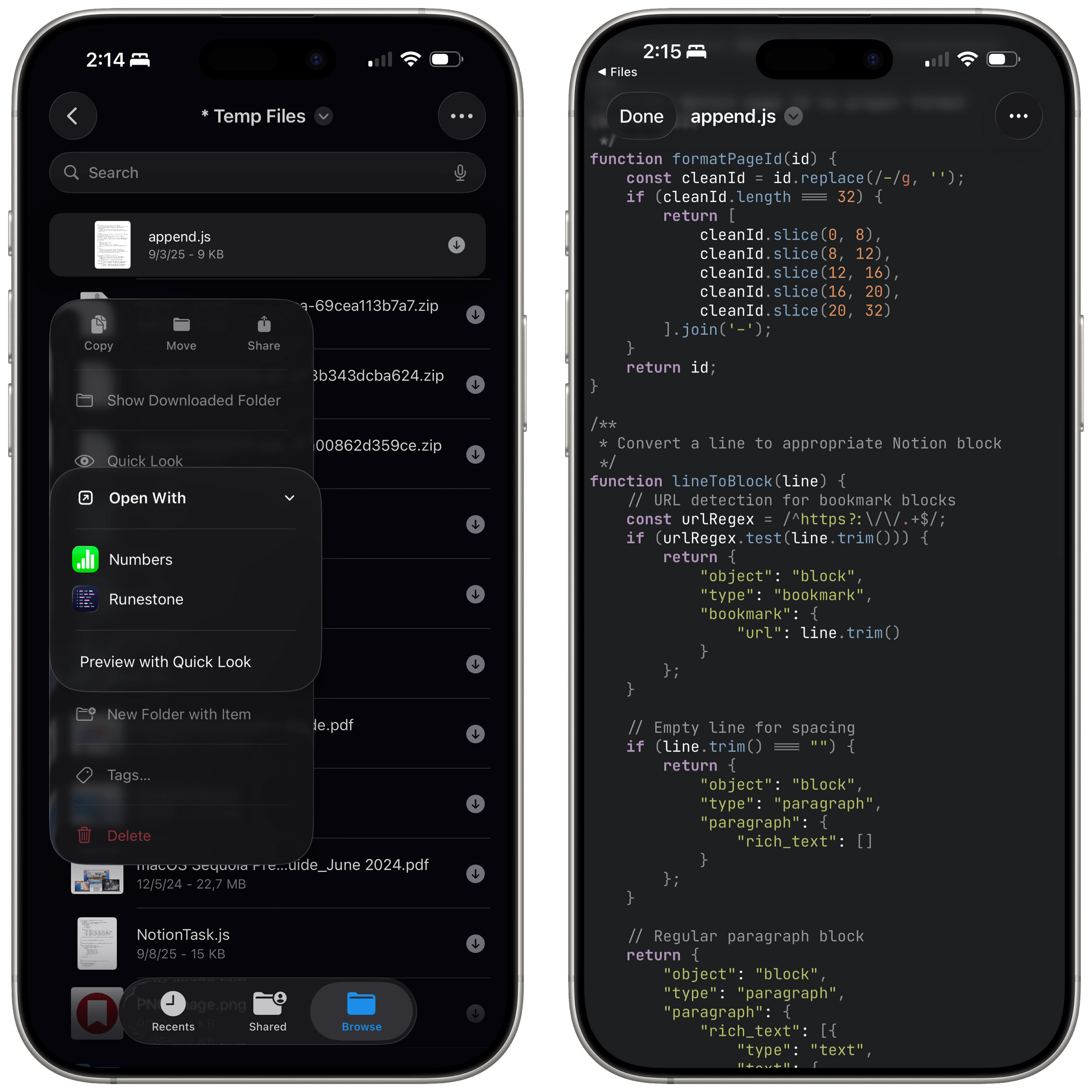
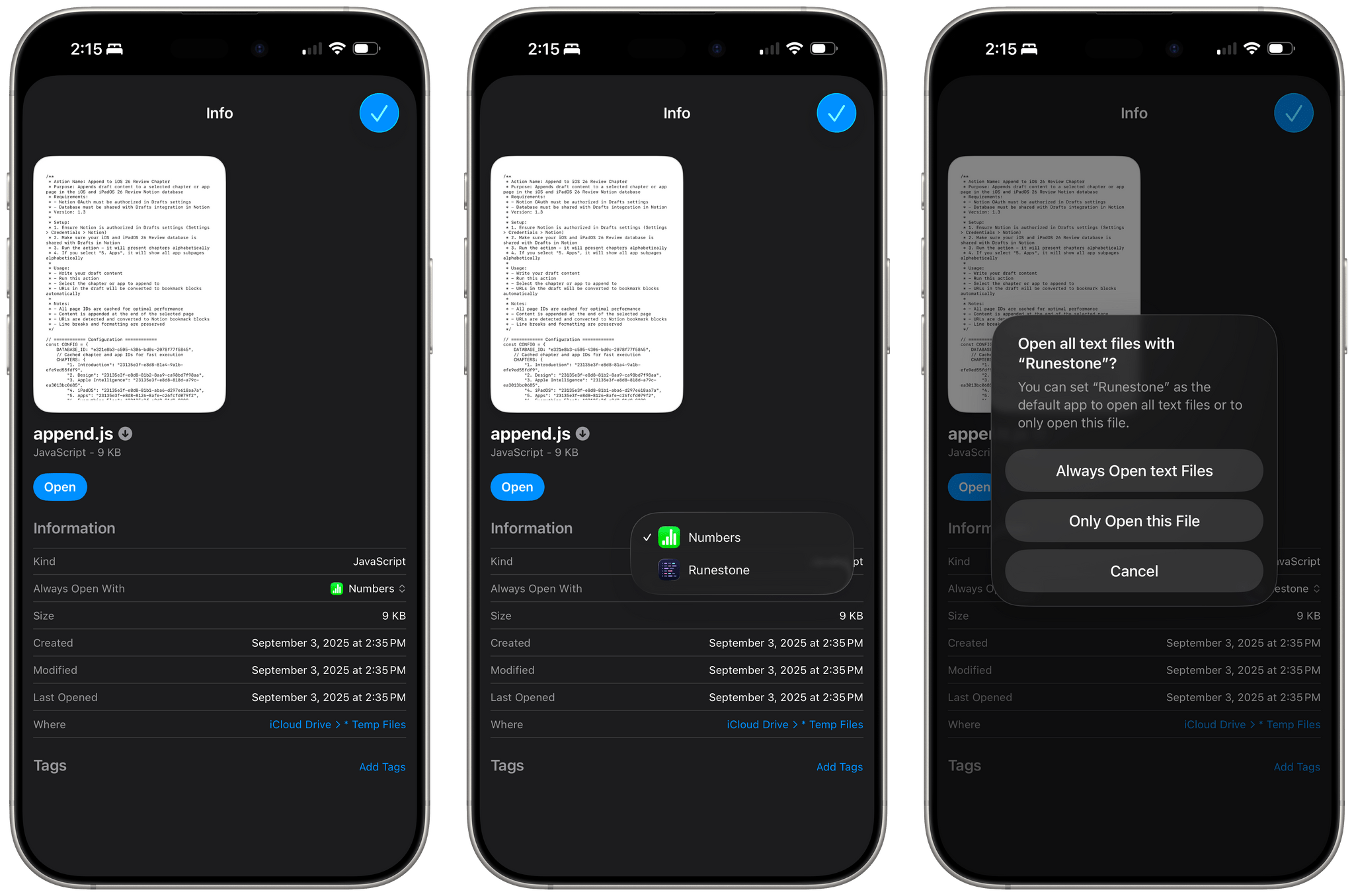
If you then decide that, going forward, you no longer want to play the document type lottery with the Files app, you can set a permanent default for specific files or specific file types. To do this, long-press a file and select the ‘Get Info’ option. In the inspector, you’ll see a new entry labeled ‘Always Open With’. Here, you can choose which app you want to use to always open either the selected file or all files with that document type. In my case, I wanted to set Runestone to always open .js files on my iPhone, and iOS 26 finally allowed me to do that.
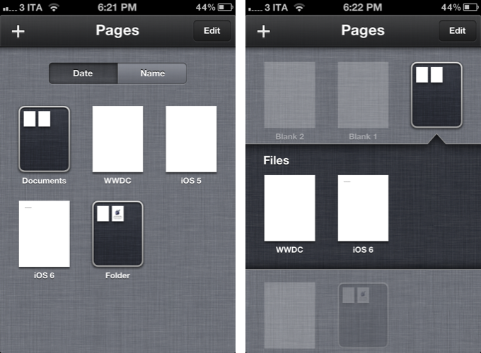
I’ve been complaining about this stuff since iOS 6. In case it’s not clear enough, this is what an iPhone file manager looked like at the time. We didn’t even have a Files app.
So forgive my enthusiasm when it took Apple 13 years – a third of my life – to realize they needed a menu to let users control which apps are supposed to open which documents.
Phew.
Messages
Apple’s steady re-implementation of popular WhatsApp and Telegram features, but with a nicer design, marches on as always in the Messages app. This year, there are better features for group chats we’ve already seen elsewhere, chat wallpapers that WhatsApp users should be familiar with, and other features that – due to Apple’s de facto texting monopoly in the U.S. – I believe most American users think never existed anywhere else before.
As always, Apple has more taste than those other companies, so even if they’re copying their features, they work and look better than the WhatsApp or Telegram counterparts ever did.
Conversation Updates
The entire Messages app has been redesigned for Liquid Glass: there’s a search bar at the bottom, floating buttons everywhere, and more compact UI elements that morph into buttons and toolbars depending on where you are in the app.
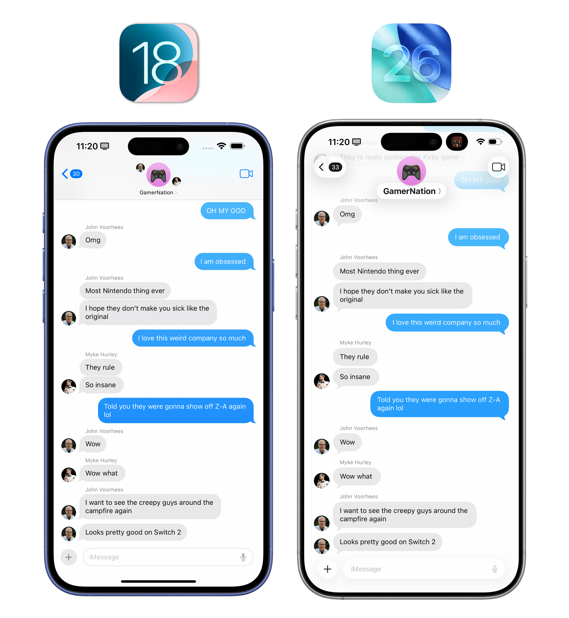
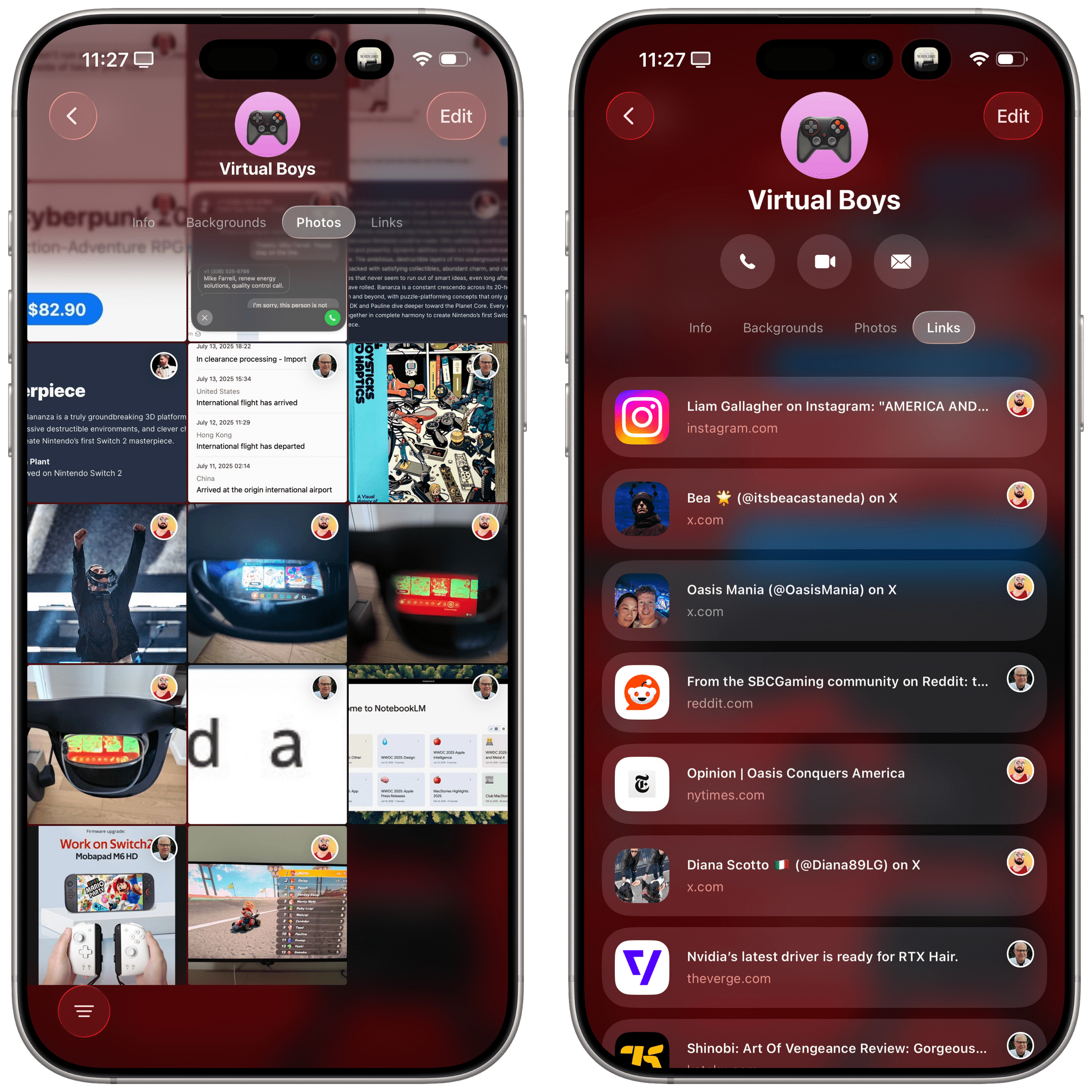
The most notable redesign is the conversation detail panel. In any conversation, tap on the person or group name at the top, and you’ll be taken to a redesigned page with new tabs for info, media, documents, links, and – new in iOS 26 – backgrounds.
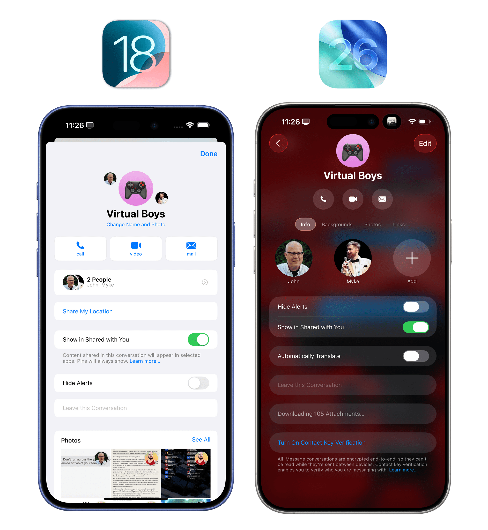
Aside from the fact that I prefer this tabbed view to access different conversation settings and shared items over iOS 18’s vertically stacked sections, we have to mention backgrounds because Apple seems very proud of this feature, and I think it’ll be popular with users. There is a selection of default “wallpaper styles” you can quickly apply as a background for your conversations, which will fundamentally alter the look of the Messages app’s transcript interface. The default backgrounds even support multiple modes. There are different types of “sky”, for instance, as well as light and dark versions of the “water” background that you can swipe through the same way you swipe through Lock Screens. I like how you can preview these before setting them, and I appreciate the way Liquid Glass elements in the transcript reflect and refract colors from the background.
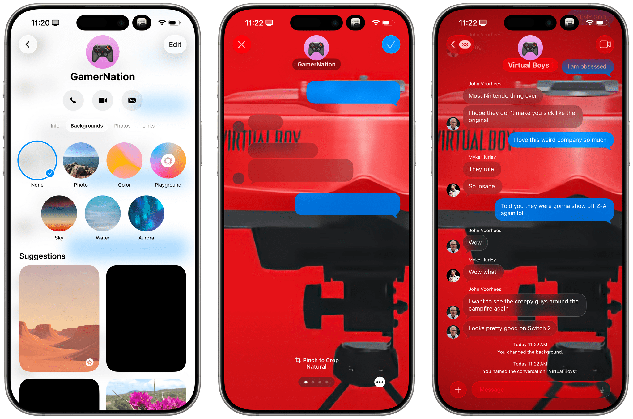
Setting a chat background in iOS 26. You can also long-press an image in the transcript to instantly set it as a background.
You can also set your own photos as chat backgrounds or, God forbid, use Apple Intelligence’s Image Playground to create some sloppy “illustration” to torture your family with. My recommendation: use AI-generated iMessage wallpapers only in conversations with your enemies.
I’m too boring to use custom chat backgrounds and never have in WhatsApp. I also think they’ll be very popular with a lot of people, and they’re admittedly fun to use and tinker with.
There are other, perhaps smaller, features of iMessage chats in iOS 26 worth mentioning. When sending a large attachment, a progress bar is now shown in the “bubble” for the contact or group at the top of the window.
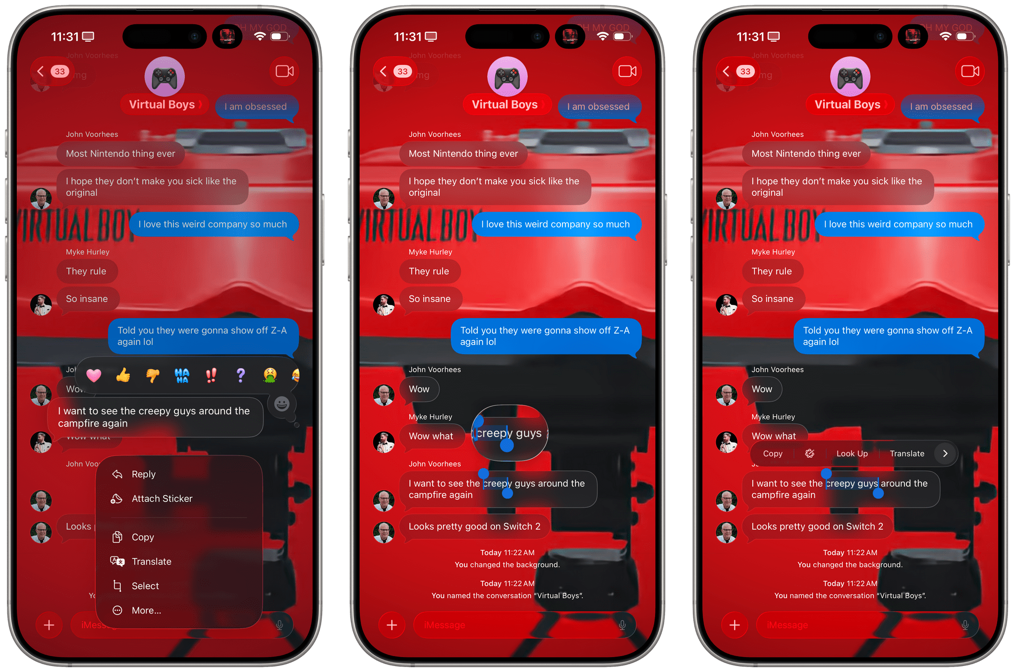
You can now select a portion of text within a message. Long-press any text in the transcript and choose ‘Select’, and you’ll be able to select text within it instead of copying the whole thing.
There are now typing indicators in group chats! WhatsApp has long offered this feature in groups, and I’m so happy this feature has been implemented in iMessage too. I need to see all those people who start typing a message and then change their minds.
Also coming straight from WhatsApp: polls. If you’re in a group thread and want to make a shared decision about something, or if you want to poke fun at someone with an amusing set of interactive questions, you can now create and share polls for other participants to vote on. You can create a poll with multiple choices and send it in a group; then, as everybody votes, you can see the results reflected in real time in the transcript. At any point, you can long-press on the poll and view more details about who voted and who didn’t.
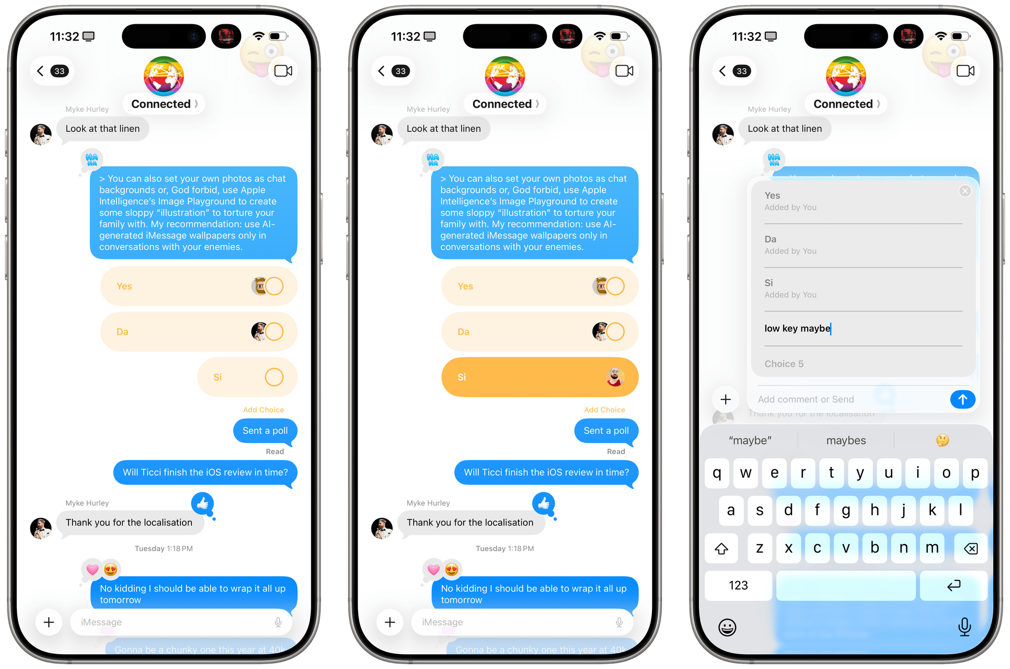
Anyone is able to add new options to the poll, so you can get into a fun little “war” with your friends about options that people can vote on. Apple Intelligence may also suggest polls when helpful, but I haven’t run into this feature myself. I don’t think I’m ever going to use polls in iMessage because most of my conversations with family and friends are happening in WhatsApp, but I suppose it’s good that Apple is reaching feature parity here as well.
And More…
Here’s everything else that’s changing in the Messages app this year:
Drafts filter. If you start writing a message but get interrupted by something else, Messages in iOS 26 lets you easily find it with a new drafts filter. In the main view of the app, tap the filter icon in the top-right corner, then select ‘Drafts’, and you’ll be able to see all the conversations where you began a message that wasn’t sent.
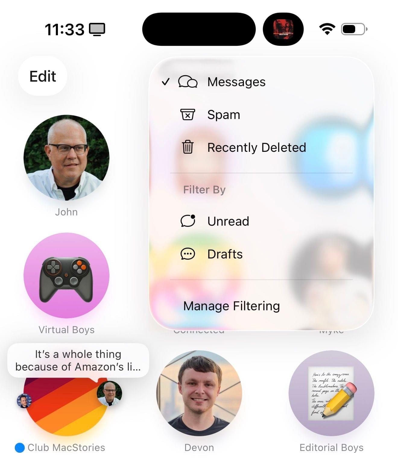
Screening and spam protection. The Messages app is joining the Phone app in adding screening and spam protection for unknown senders (which John will cover more extensively in his macOS review since it’s not available in Italy). With unknown sender screening in Messages, you can automatically move texts from people or businesses you don’t know into a separate section of the app and filter them out of the main view. This goes in tandem with on-device spam protection, which Apple says is powered by an updated model that should be more reliable than before.
With the unknown senders filter turned on, those texts will be hidden, and you won’t receive notifications for them. They’re placed in a dedicated area where you can manually approve specific unknown senders, and the approval will enable the contact across Phone, Messages, and FaceTime for future calls or texts. I have this feature turned off on my devices because I didn’t like the friction of going to a separate place and manually approving senders; since I don’t receive that much spam on a daily basis, I prefer to block the occasional spammer manually.
You can always enable or disable this feature by going to Settings ⇾ Apps ⇾ Messages and toggling the ‘Screen Unknown Senders’ switch. In a nice touch, you can choose to screen unknown senders but allow notifications for verification codes, and you can also apply additional third-party text message filters using apps like Truecaller.