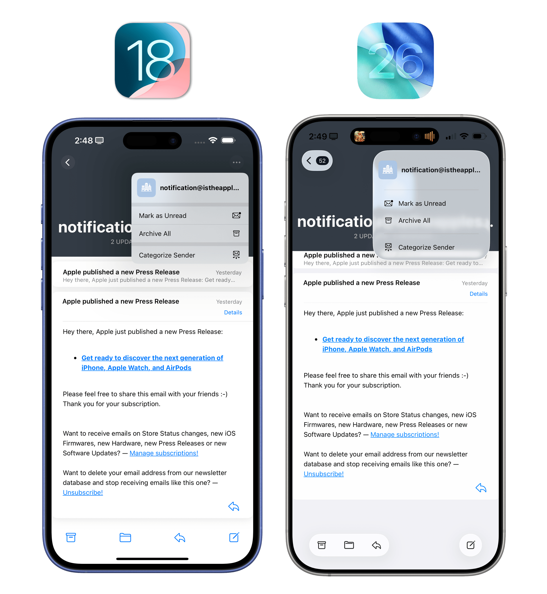
The Lock Screen
There are some pretty sweet-looking changes to the Lock Screen experience as well in iOS 26, which further reflect Apple’s commitment to Liquid Glass and the advancements they’ve made in computational photography and 3D rendering, also thanks to the Vision Pro.
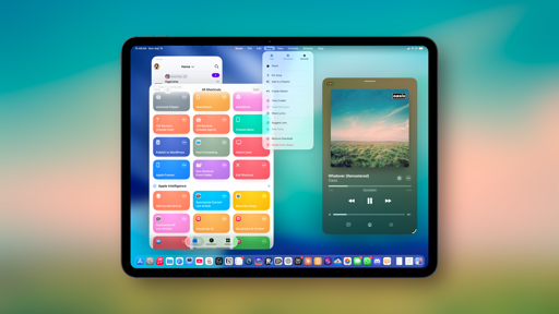
Aside from the fact that everything is rendered with Liquid Glass (including the ‘Customize’ button on the Lock Screen gallery that reflects the Lock Screen above it – seriously neat), the Lock Screen’s clock in the default font can now be extremely tall if you want it to be. Not all wallpapers support this option (like the Earth ones, for example), but on those that do, you can just grab the clock and resize it to take up almost half of the Lock Screen.
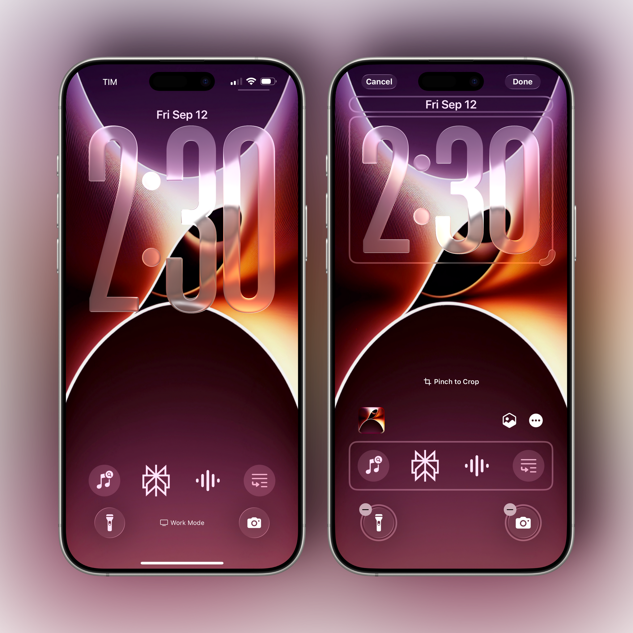
I love my giant Lock Screen clock, and I’ve been using it for months. It’s particularly nice if you have an iPhone with an always-on display and want to quickly check the time from a distance when you’re not wearing an Apple Watch. Even more impressive is the fact that the new font has been crafted for Liquid Glass, so it can dynamically adjust its weight, width, and height, as well as the reflections of each numeral, to nestle into whatever scene you’ve set as your Lock Screen wallpaper. When you enable the new clock mode, Lock Screen widgets will be placed at the bottom of the page, right above Lock Screen controls.
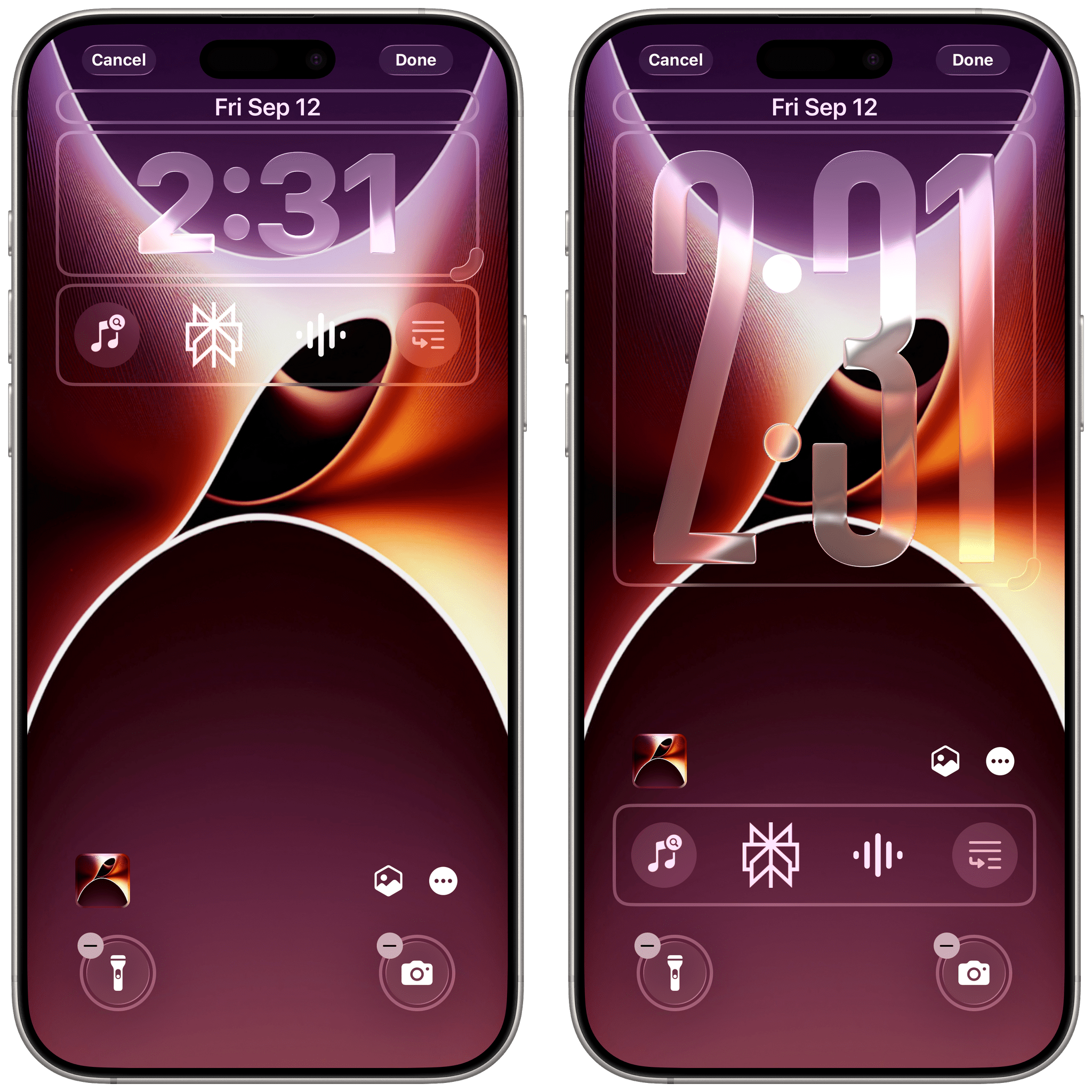
You can choose to keep Lock Screen widgets at the top (with the default clock) or put them at the bottom with the bigger clock.
The other visual trick Apple is really proud of this year – and, admittedly, it works well – is the ability to turn any photo, even ones that were taken years ago, into spatial scenes. Using vision techniques running on the Neural Engine on-device and per-pixel depth maps, a spatial scene adds a 3D effect to any 2D photo that you can experience by tilting your iPhone around. With six degrees of freedom, the effect responds to your device’s movement and will tilt the various layers of the photo differently. It’s essentially a fancy parallax effect, powered by AI, that can also be applied to photos you took decades ago as long as they have enough resolution and aren’t too grainy.
A spatial scene on the iOS 26 Lock Screen.Replay
I don’t like using photos as my Lock or Home Screen wallpapers (they’re too busy, and I take too many screenshots for work), but spatial scenes are a fun trick, and they work exceptionally well alongside Liquid Glass elements on the Lock Screen.
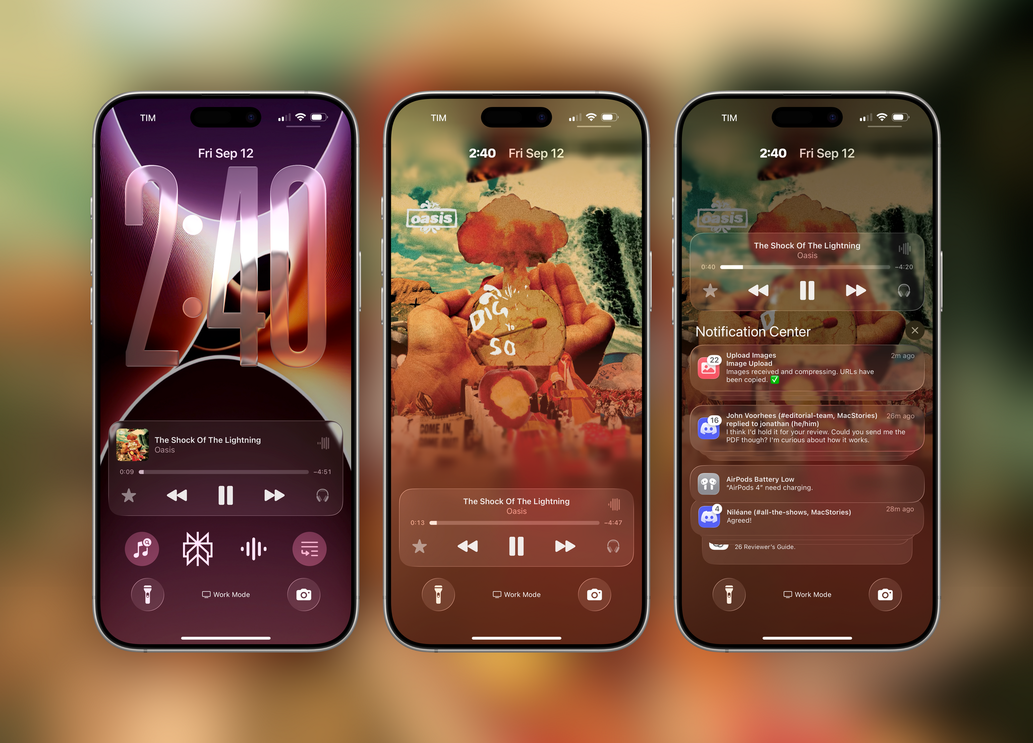
Lastly for the Lock Screen, there’s a new mode for Apple Music and third-party apps to display immersive, animated album artwork that interacts with Liquid Glass on the Lock Screen. Tap on the album art in the Now Playing widget, and the Lock Screen will transition to artwork mode like before. Now, however, if the app and the media item being played support it, artwork can extend edge to edge and animate inside the Lock Screen, complete with scroll edge effects and glass interactions.
Since Apple made this API open to third-party developers, not only should the likes of Spotify be able to support it if they want to, but I think we’re going to see some interesting spins on the idea by indie developers. Jordi Bruin, for instance, created Frames, a simple utility that plugs into this framework to play videos on the Lock Screen as full-screen “album artwork”.
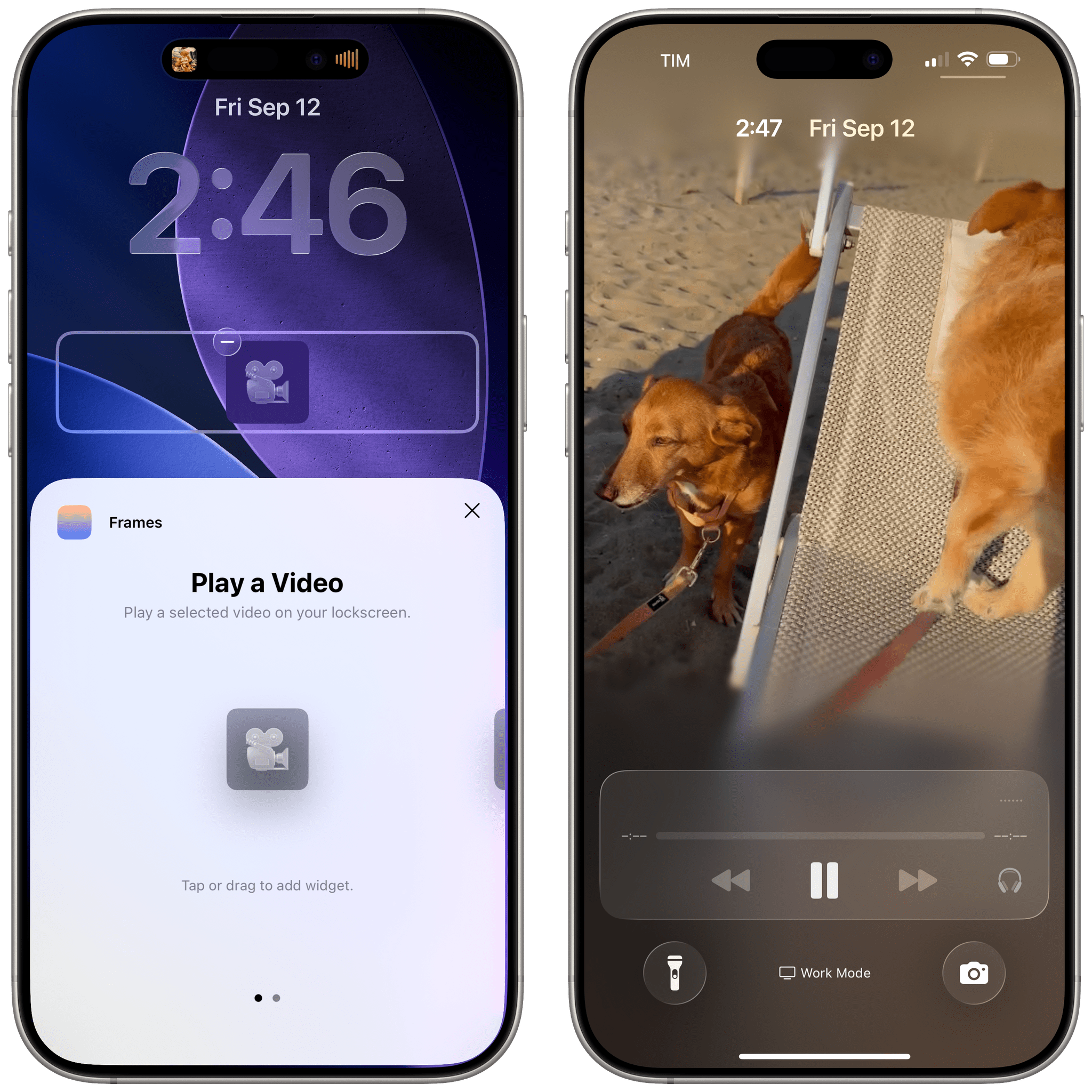
The app’s support for Shortcuts actions opens up some fascinating possibilities. You can, for example, automatically play a video of a person on the Lock Screen whenever they send you an iMessage thanks to personal automations and the Frames app. I guess that Apple never intended for this API to have this kind of use case, but it’s always great to see indie developers push the boundaries of the platform.
The Transforming Nature of Liquid Glass
So far, I’ve largely focused on how Liquid Glass looks and how its design structure has impacted the layout of apps, especially on iOS. But what I think deserves equal attention is understanding how Liquid Glass works and if there is anything more to it beyond its appearance.
Or let me put it this way: I’ve mostly focused on the glass aspect so far. But what about the “liquid”?
There are two qualities of Liquid Glass that I want to emphasize in this section: fluidity and its shape-shifting nature. Both will initially catch your attention because of their looks, but – as someone who’s been reviewing these OSes for over a decade – I think there’s something deeper going on.
Glass is rigid and brittle by nature; Liquid Glass is anything but. Liquid Glass is fluid and malleable, and you’ll notice this about the material everywhere in iOS 26’s animations when you start paying attention. Numbers on the Lock Screen passcode bounce up and down for a second when the screen comes up. Swipe between pages in Control Center, and tiles will swiftly stretch and bounce as they “land” on-screen. The force with which you unlock the Lock Screen itself affects how quickly or slowly icons fly in on the Home Screen. Even sidebars on iPad bounce around slightly when you scroll inside them.
An example of different Liquid Glass animations.Replay
These animations are ubiquitous in iOS 26, and while they’re nice to see, they’re not the most interesting aspect of Liquid Glass when it comes to motion design. The unique trait of Liquid Glass – what actually makes it “liquid” – is its fluid shape-morphing nature that mimics droplets of water and can transform UI elements based on the context of the screen.
Stay with me here as I run through a variety of examples. In Liquid Glass, for instance, toolbar items don’t open menus when clicked; they morph into menus. Tap a button in a toolbar, and rather than opening a menu below it, the button itself becomes the menu and transitions back to a button when the menu is dismissed.
Similarly, Liquid Glass can morph shapes of controls in real time based on proximity, mimicking the real-world behavior of water. When two elements get close to each other, Liquid Glass blends them into a single shape. To test this, open Notification Center and slowly swipe on a notification. You’ll notice the ‘Clear’ button appear first as part of the notification cell itself; keep swiping, and it’ll detach with fluid dynamics from the notification, becoming its own entity. Swipe in the other direction, and the two elements will be fluidly joined again as soon as they’re close to each other.
Feels like water, doesn’t it?Replay
This behavior is exactly what makes Liquid Glass liquid. And it’s used throughout iOS 26 not only to look cool (because it does), but to convey the state of the user interface and better express where certain items come from.
When you navigate across apps updated for iOS 26, you’ll notice that, unlike in iOS 18, controls like buttons and toolbar items don’t usually appear out of thin air, nor are they redrawn on-screen when you switch between views. Instead, most controls are always placed in the same position, but they fluidly shape-shift based on the context of the current screen to display controls that make sense for whatever you’re doing.
Let me show you with a video. In the main screen of the Notes app, you have a back button and ellipsis button at the top, with a search bar and compose button at the bottom. Watch what happens when you open a specific note:
The ellipsis button morphs into a toolbar and a button, while the search bar shape-shifts into a formatting toolbar since it makes more sense to have that when you’re editing a note. Go back, and the same happens in reverse.Replay
Once you notice this, you’ll see it everywhere in iOS 26. Reminders’ top toolbar morphs into an overflow menu; the ‘Select’ button in Mail disappears into another button when you open a specific message; Music’s profile picture turns into a toolbar when you open a playlist or album that you likely want to download or add to your library.
Liquid transitions are everywhere in iOS 26.Replay
Some folks may not like this dynamic nature of the user interface in Liquid Glass, and they may ascribe the transforming nature of the iOS 26 UI to Alan Dye’s proverbial tendency to get rid of UI chrome as much as possible. I don’t think that’s an accurate assessment. As long as the controls that you need are readily available, does it matter that certain UI elements morph into others based on the context of the app and what makes the most sense? I don’t think it does.
In fact, I’d argue that Liquid Glass’ dynamic morphing of controls is highly beneficial to UI discovery and learning patterns. With controls that morph and spring to life, Liquid Glass draws the user’s attention to an interface that had become overly flat, homogenous, and difficult to visually parse over the years. Liquid Glass’ transitions – beyond looking great and being a feat of engineering – make iOS and iPadOS easier to use, with more intuitive interactions and a more well-defined relationship between buttons and menus.
Most people this summer have focused on the glass part of Liquid Glass. I think that the liquid is going to carry this design system forward for the next few years.
I came back home from WWDC three months ago thinking that Liquid Glass was going to be a problematic distraction to draw the Apple community’s attention away from the fact that the company was lagging behind in AI. I spent weeks (rightfully) criticizing the state of Liquid Glass on iOS and iPadOS 26 at the time. In the meantime, Apple kept refining and iterating on Liquid Glass, ultimately landing on a visual balance that does carry some inherent legibility tradeoffs, but I do not consider them deal-breakers for the everyday experience at this point.
In the past three months, I’ve realized that Liquid Glass – beyond simply looking gorgeous on modern Apple hardware – is more than meets the eye. Sure, Liquid Glass takes to its logical conclusion an embrace of translucency and blur that started well over a decade ago with iOS 8 and iOS 9, and sure, it builds upon Apple’s recent penchant for fluid animations that started with the iPhone X and later, including the Dynamic Island. But beyond all that – beyond the spectacle of 120 Hz transitions and Gaussian blur and real-time lensing – I think Liquid Glass hints at a future where interfaces will be discrete, contextual to what you’re doing, and capable of naturally blending in with your physical environment.
It’s a fun thought exercise to try and rationalize the reason behind Liquid Glass. If there is a masterplan behind all this, I think it points to glasses – and it starts with fluid, glass-y interfaces on a phone because this is how Apple rolls. Or maybe it’s just supposed to feel new, and to create an itch.
Regardless of the reason, I genuinely believe that Liquid Glass looks great and makes modern iOS apps easier to use. And best of all: it’s fun.