The Home Screen and App Icons
Liquid Glass has also been an opportunity for Apple to rethink its icon system and build upon last year’s addition of dark and tinted icons. In iOS 26, Apple’s vision for modernized and customizable icons is more fleshed out, with new options that take advantage of the glass material and a much nicer-looking take on color-tinted options.
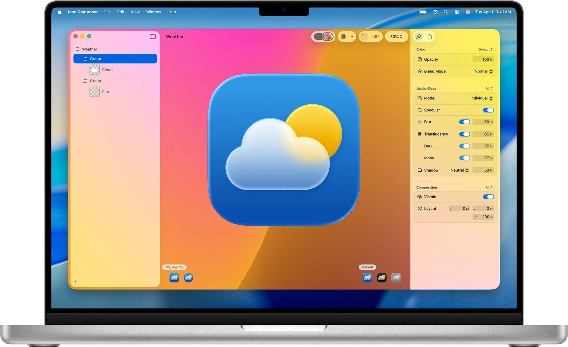
Without getting too much into the inner workings of icons since this is not a WWDC design session, Apple has a new system for designers and developers to create app icons. Icons are based on a layered look where multiple layers are rendered with the Liquid Glass material, taking on the properties of the material as seen elsewhere in iOS 26. That means specular highlights and light refraction are rendered within app icons on the Home Screen – even though you may not see them at small sizes. In fact, the best way to take in all the details of Liquid Glass is arguably the new Icon Composer developer tool, which allows app makers to preview how icons will be “glassified” by Apple’s design system.
As a user, you will be able to see other changes on the Home Screen, too. For starters, all of Apple’s system icons have been redesigned for the new age of Liquid Glass. Some of them aren’t that different from years past (looking at you, Music and Safari), while others (like Mail, Shortcuts, and Photos) are appreciably taking advantage of the Liquid Glass material and style.
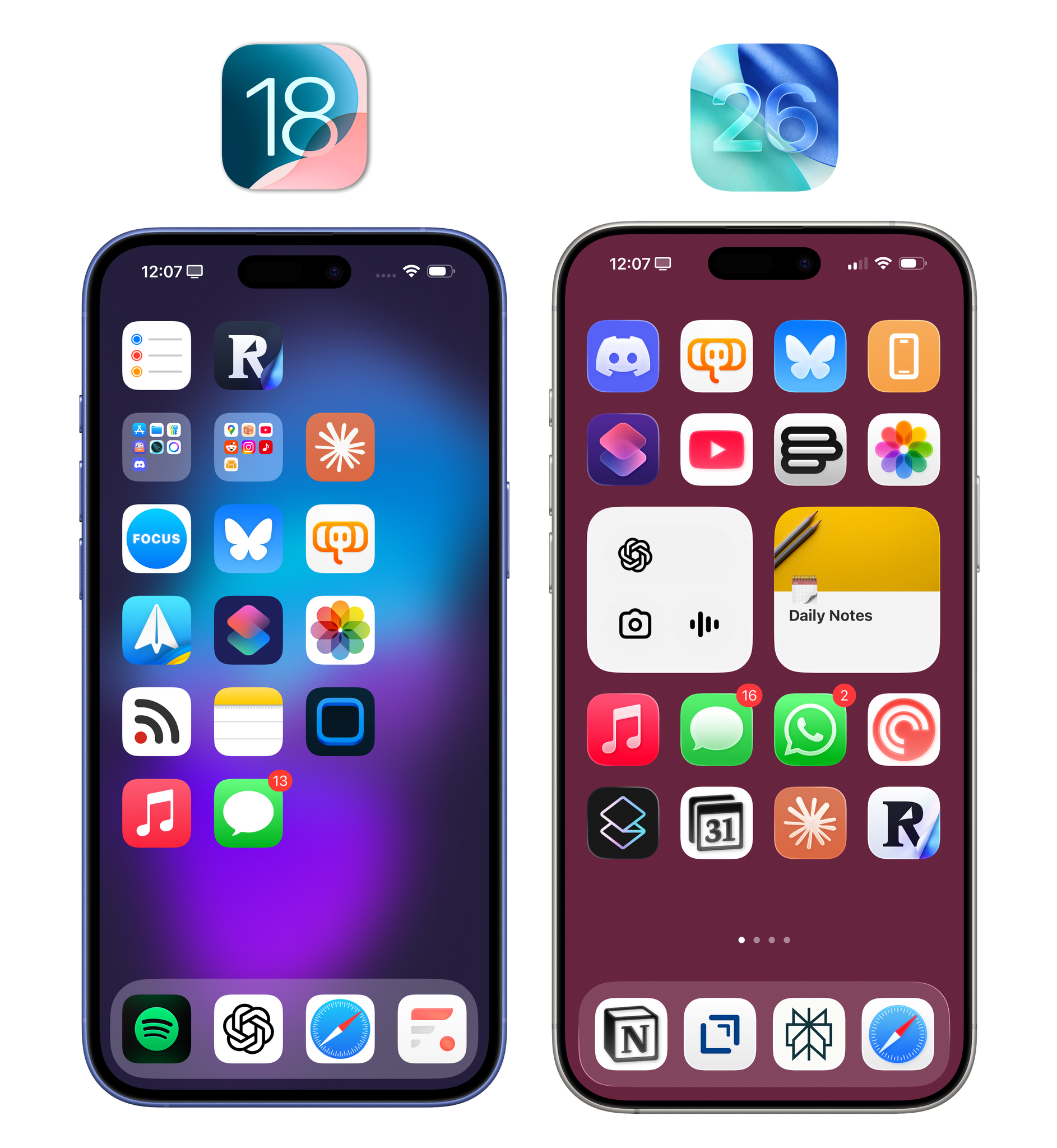
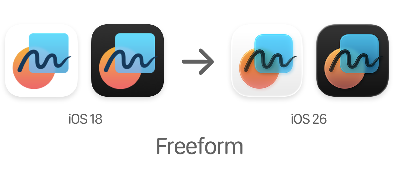
The underlying characteristic of all icons in iOS 26 is that they’re moving away from “flat” shapes and symbols; instead, all the layers of an icon appear as small slabs of tinted glass that can reflect what’s underneath. Personally, I love this look. A good example of this rendering engine is the Freeform icon. Despite its small size, there is an evident sense of depth to the icon with an ink scribble sitting on top of everything and the blue glass shape subtly reflecting the orange circle under it.
In addition to the material and colors, Apple is also tapping into the gyroscope and accelerometer to provide specular highlights and render reflections on Home Screen icons in real time. Slowly tilt your iPhone around while on the Home Screen and look closely around and inside the icons. You’ll see specular highlights with a shimmering border around each icon, and the layers inside them will adjust their reflections according to your movement. It’s a useless effect that is also very cool.
In looking back at my iOS 18 Home Screen on my old test iPhone, I do not miss the old, flat look of icons at all. While we aren’t going back to a pre-iOS 7 realistic style, I prefer this newfound balance of abstract shapes with some depth to them. I also appreciate how Apple considered other details of the icon experience on the Home Screen. Icons have rounder corners, and in jiggle mode, even the minus button to remove an app has been rendered with Liquid Glass and lets the top-left corner of an icon shine through the frosted glass panel. I may be an outlier these days, but it’s details like this that remind me there are people at Apple who still care.
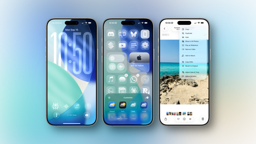
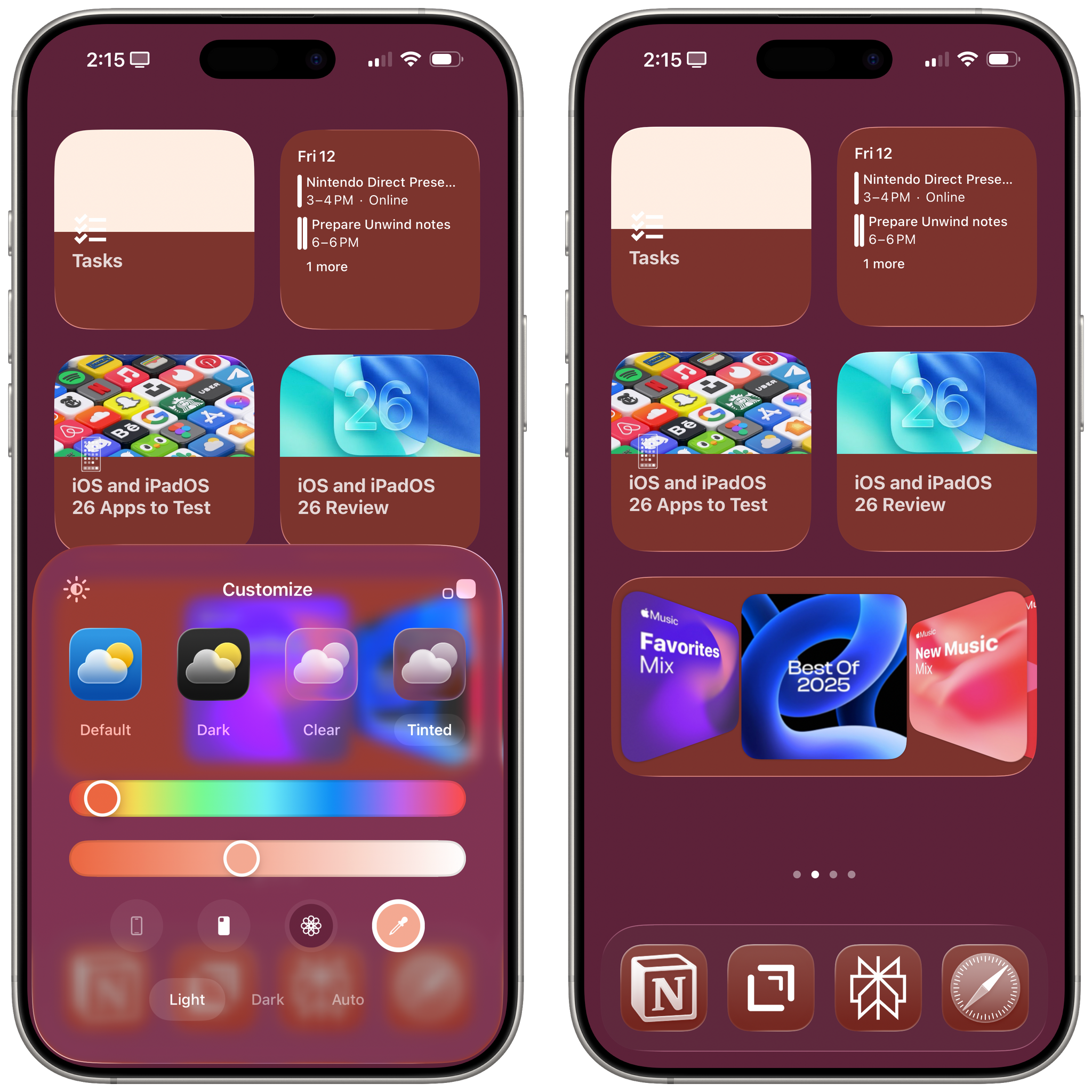
There are also new options for Home Screen icons that both extend last year’s tinting modes and bring the new Liquid Glass material into the fold.
Last year, I (and many others) lamented the fact that tinted icons looked terrible. I couldn’t understand why Apple decided to tint the glyphs inside each icon and keep the icon background always dark rather than the other way around. The company listened: in iOS 26, you can now choose between light and dark tinted modes. The dark mode carries over from last year, and it still looks awful; not even Liquid Glass can save it. The new light tinted mode, on the other hand, is hot. Icon glyphs stay in an off-white color while the rest of the icon changes hue based on the usual color and intensity sliders.
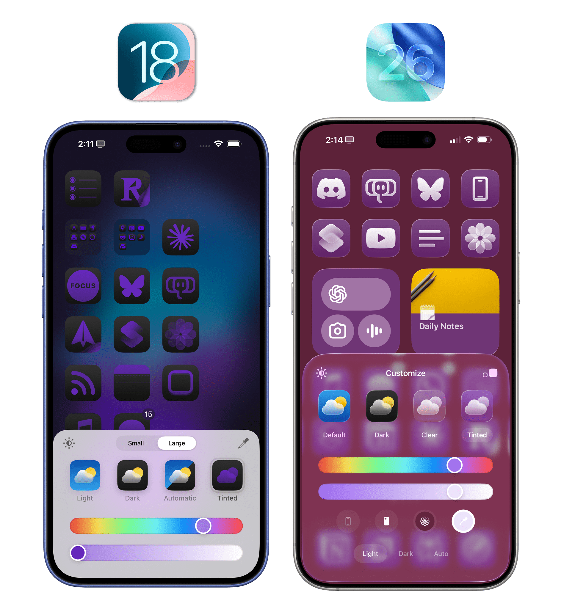
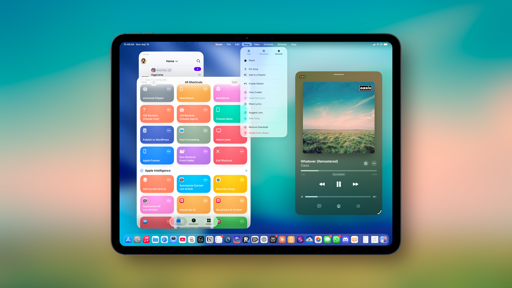
What’s so nice about this mode is that, thanks to the Liquid Glass material, you can make subtly colored icons that look like they’re made of frosted glass and are floating on top of your Home Screen wallpaper. And because the tinting mode applies to widgets as well, the same will be true for widget panels. Just look at the screenshots below, and you’ll see how much of an improvement this new tinted mode is over last year’s abomination. You’re still going to need a certain amount of good taste to design a great tinted Home Screen, but it’s much easier to create something that looks nice now.
Widgets look great with the new ‘Clear’ mode, too. I especially like how Widgetsmith’s widgets can feel like native components of the iOS 26 Home Screen thanks to the clear material.
But that’s not all. In addition to improved tinting, Apple is embracing the Liquid Glass material with a new ‘Clear’ mode for Home Screen icons. It’s fairly self-explanatory. When you enable this mode, icons will shed any colored layer and will be entirely rendered with a transparent glass material. As with tinted mode, there are two styles to choose from: light and dark clear icons, with an ‘auto’ toggle available as well if you want them to switch based on the system’s light and dark appearance.
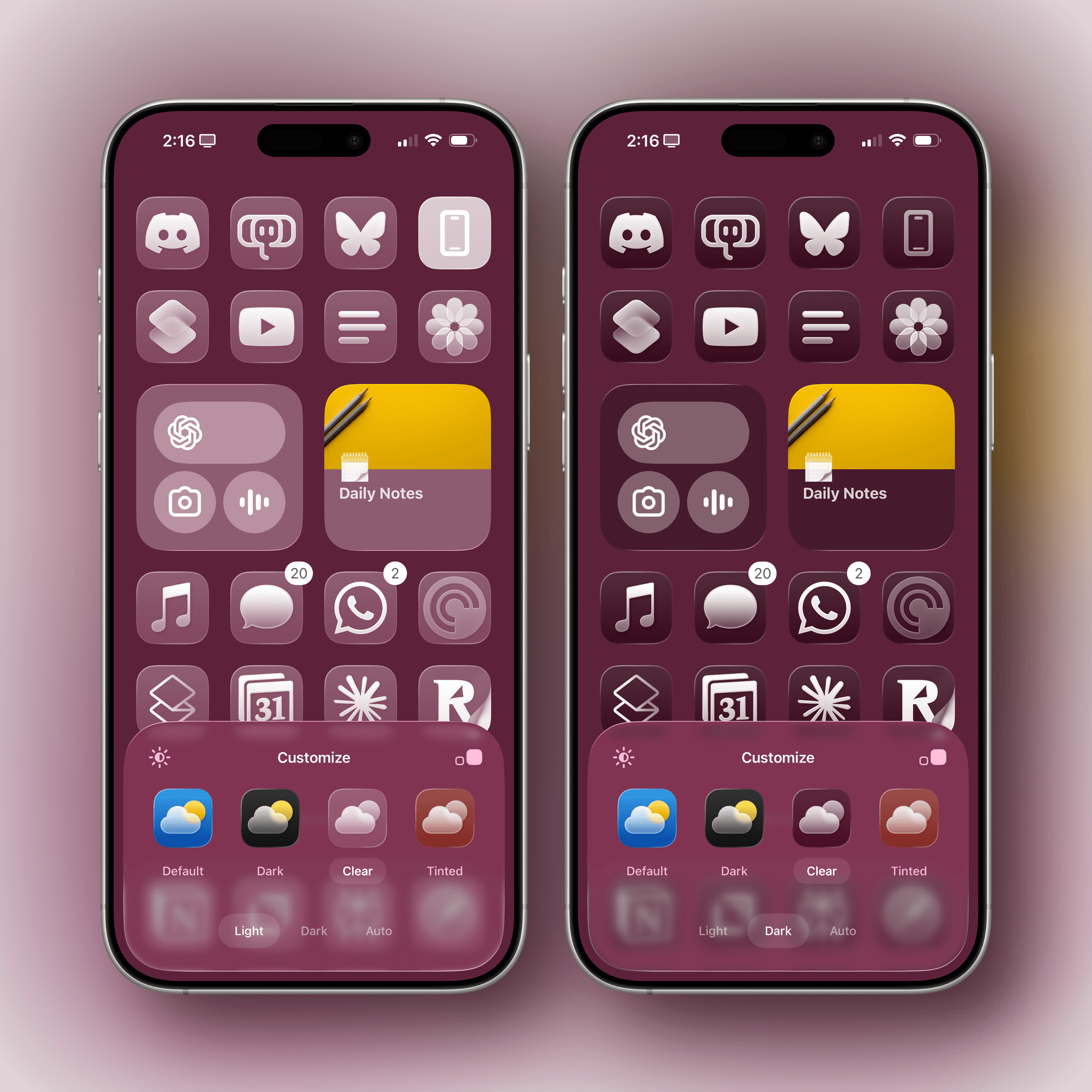
I’m a huge fan of this mode. It’s great for bringing a more minimalistic and distraction-free vibe to the Home Screen, and I’ve enjoyed using it late in the evening as a way to “unwind” from my apps and notifications. And again, since the clear material applies to widgets as well, I like how widgets almost look like components that are natively integrated with the Home Screen. This illusion has been especially effective for me with Widgetsmith, which I’ve been using to design all kinds of widgets for iOS 26 and this review. When rendered in clear mode, the app’s Apple Music Cover Flow-inspired widget and its time zone widgets feel like they’re part of the system rather than something you’ve tacked onto the Home Screen. It helps, of course, that when you’re in this mode, icons and widgets are rendered with the same material as the glass panel of the Customize menu.
Speaking of that menu, when customizing the Home Screen in iOS 26, you can now access a shortcut to quickly edit the Home Screen wallpaper. How was this not possible before?