Keyboard Shortcuts and Navigation
For power users, the most important change to iPadOS 15 isn’t the multitasking menu, the Shelf, or the addition of center windows: it’s the complete revamp of keyboard shortcuts and navigation.
With iPadOS 15’s stack of keyboard technologies, Apple is sending a clear signal: the company is now comfortable with the idea of an iPad as a modular machine; they want to make it easy for developers to make mature iPad apps that can evolve into Mac versions later, and for advanced users to be more efficient when working with an external keyboard. By and large, the effort is a resounding success that leaves very little else to be desired.
Keyboard Shortcuts
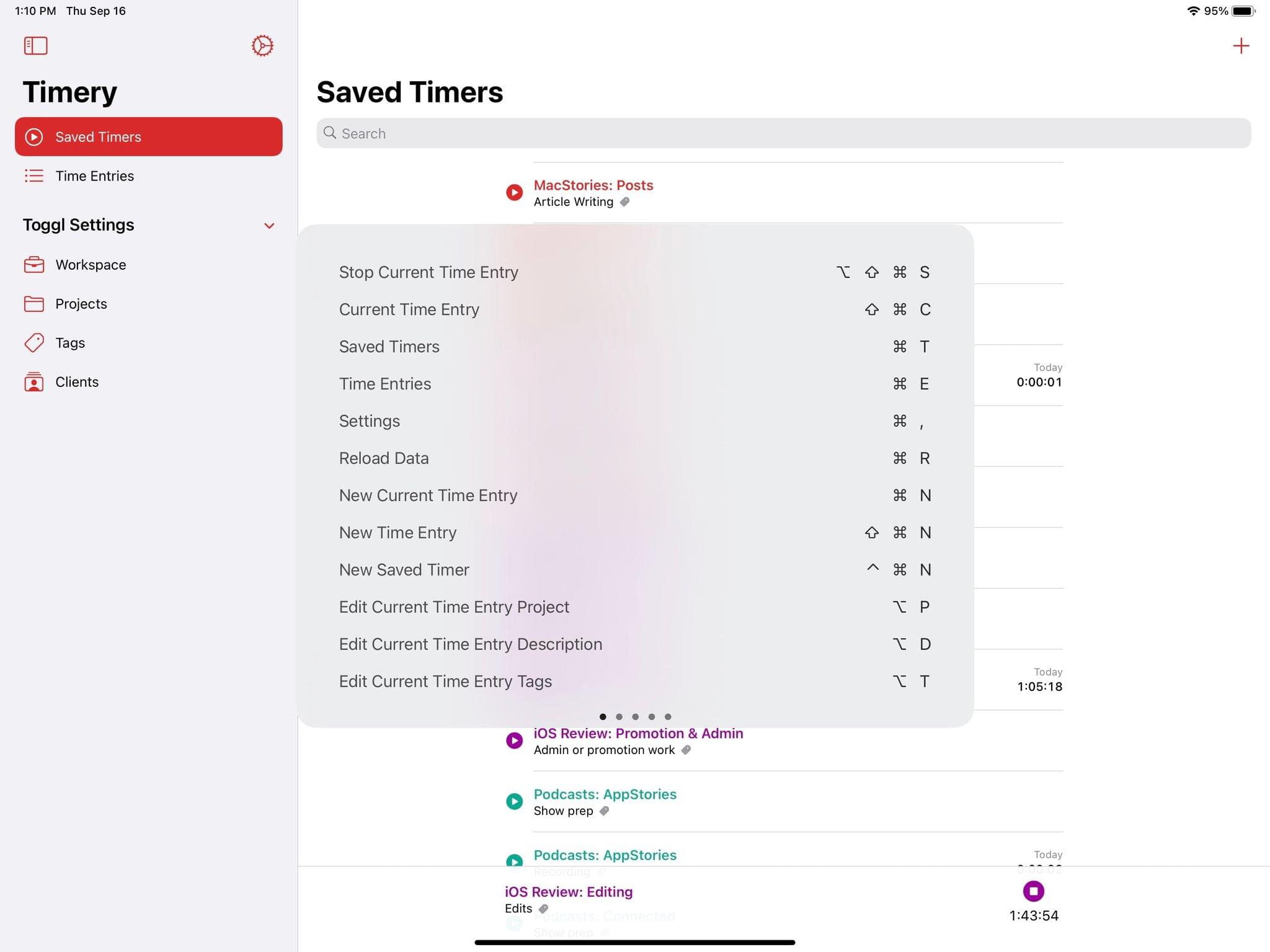
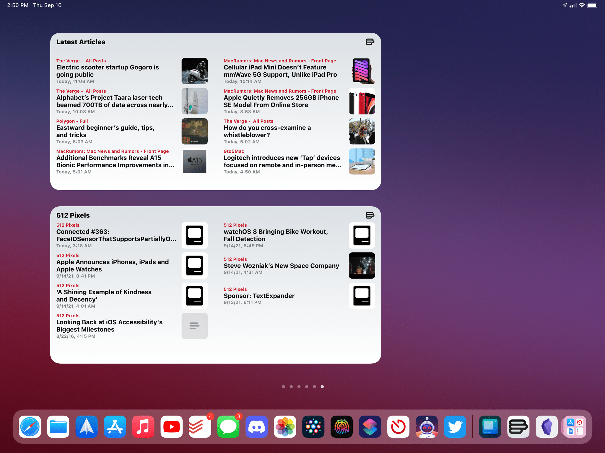
It all starts with iPadOS 15’s brand new look for the keyboard shortcuts menu: when you hold down the ⌘ key to view available keyboard shortcuts in an app, you’ll no longer see the paginated, translucent cheat sheet in the middle of the screen; instead, you’ll get a full-blown menu at the bottom of the screen that organizes different commands by category, allowing you to scroll through dozens of commands or click through specific sections. It’s fantastic, and it’s the kind of feature you’re going to learn to love in just a few days after updating to iPadOS 15.
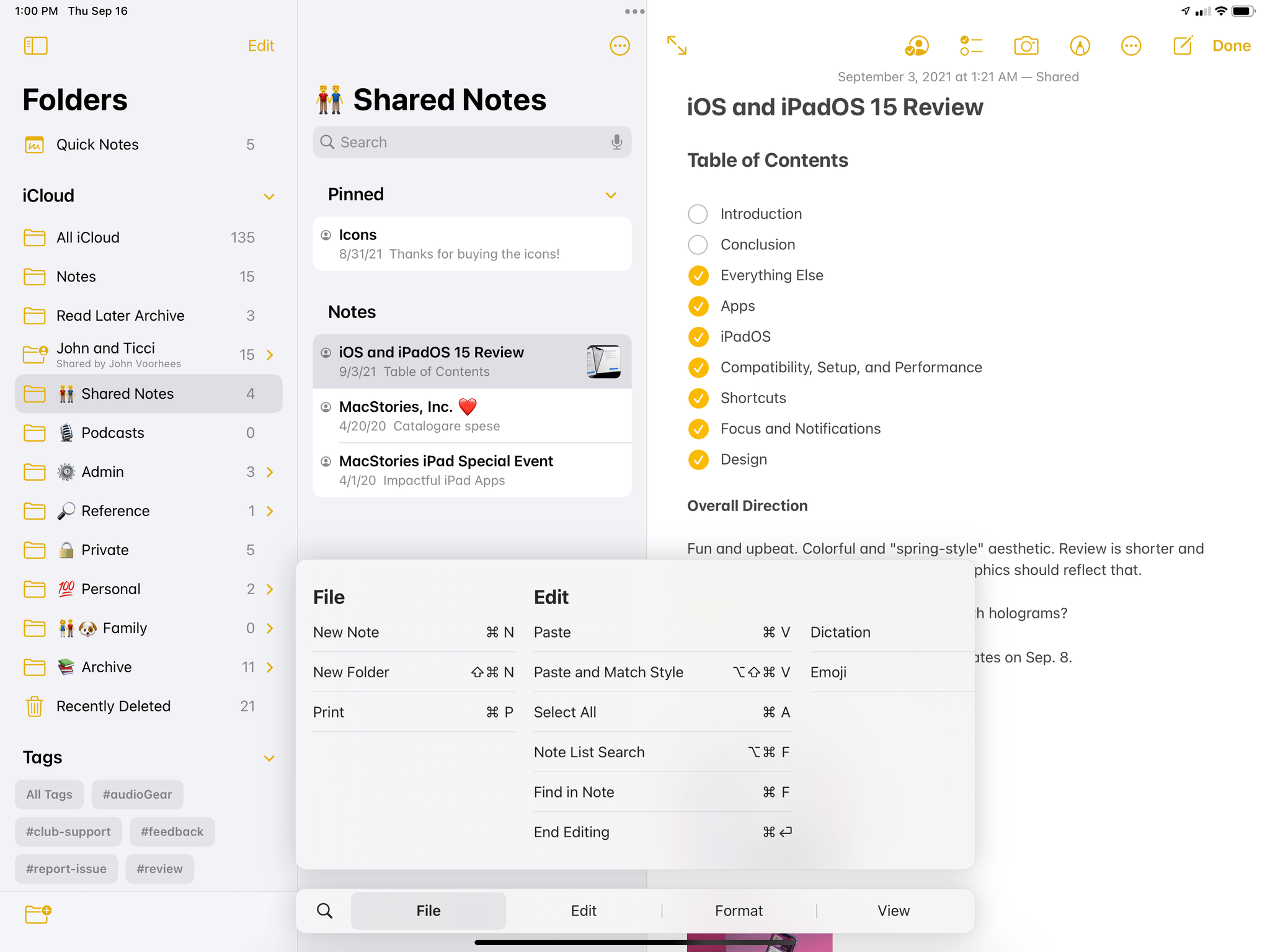
When I first saw the new keyboard shortcuts menu, it reminded me of another UI element with a similar shape that used to be displayed at the bottom on iPad: the much-maligned paginated Control Center in iOS 10. While the similarities are there, iPadOS 15’s shortcuts menu looks the way it does for another reason: it has to be consistent with the macOS menu bar, especially for developers looking to port their iPad apps to the Mac with Catalyst, which is one of the areas Apple is clearly prioritizing with their iPadOS updates this year. Allow me to explain.
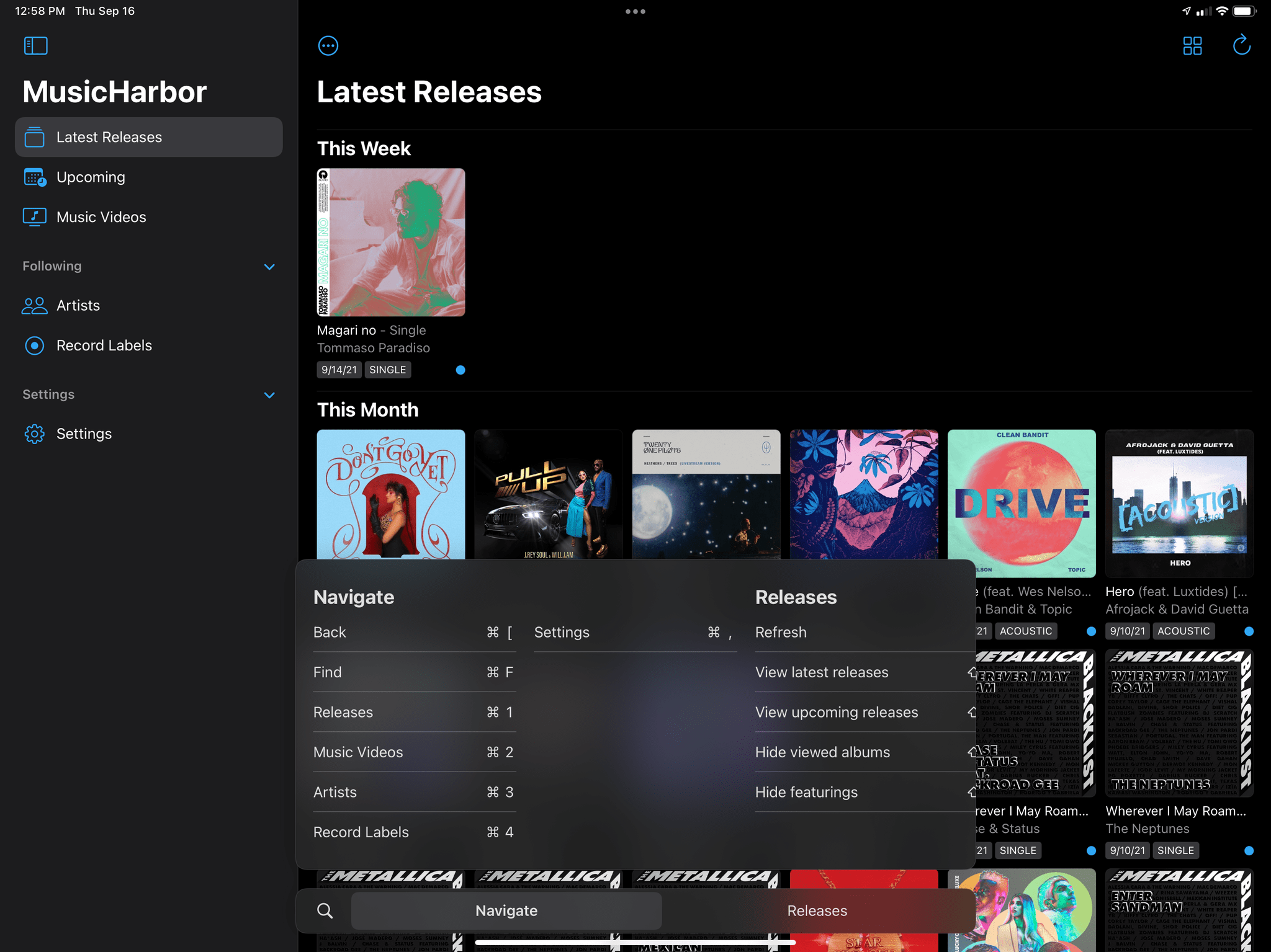
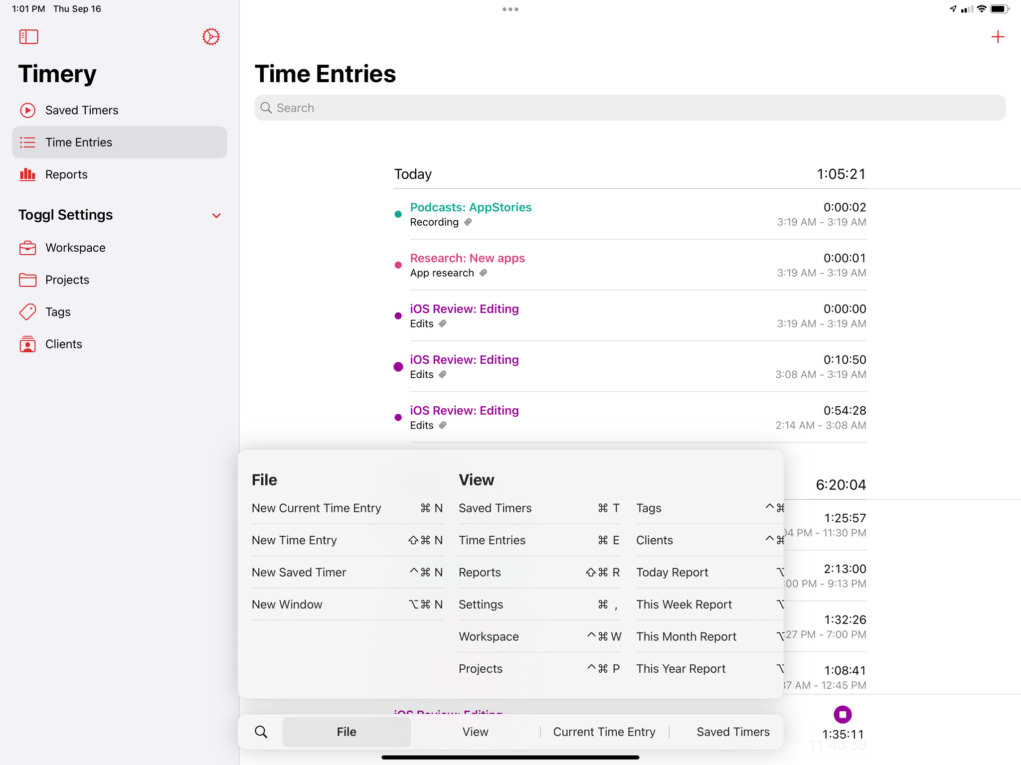
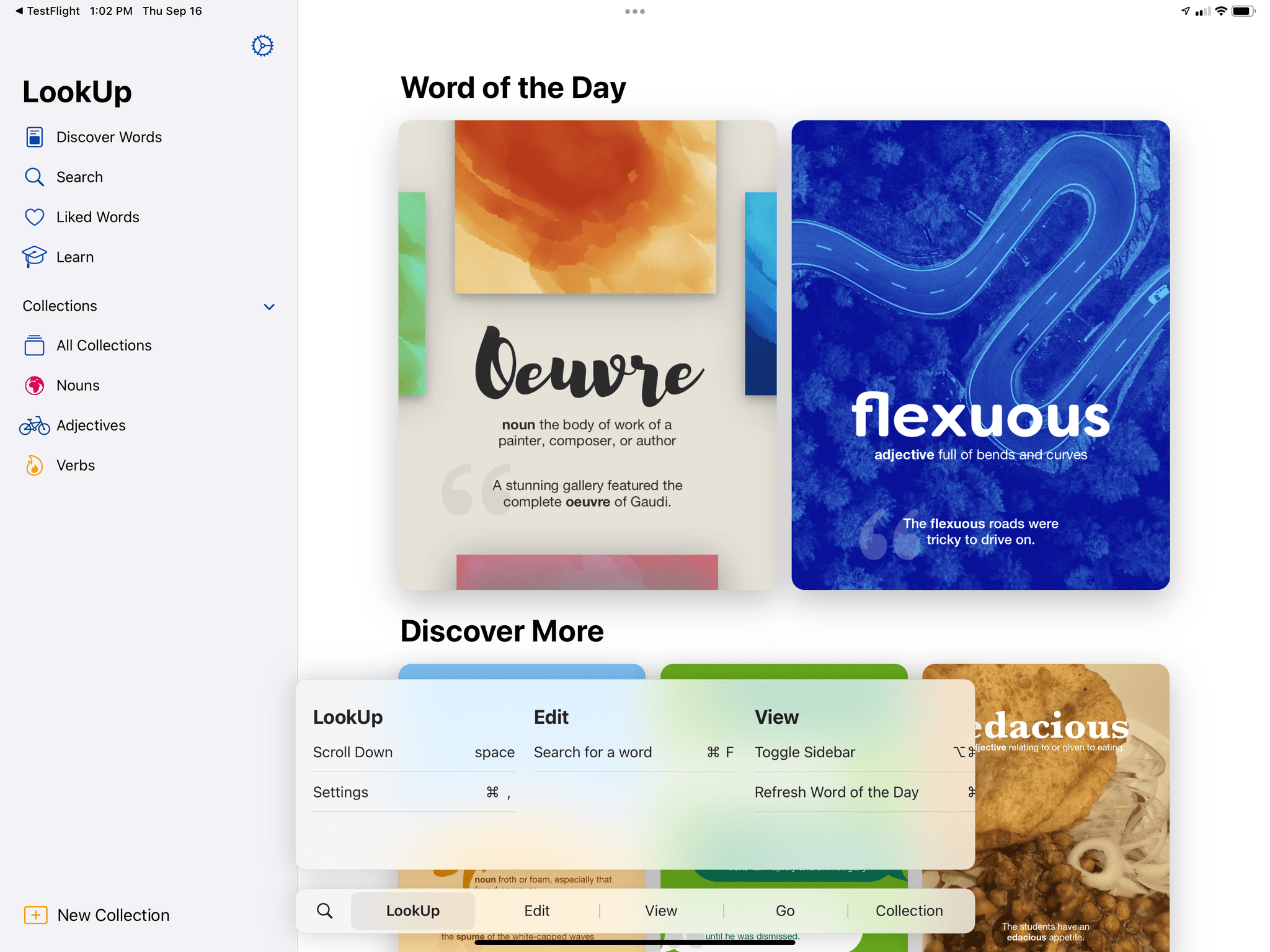
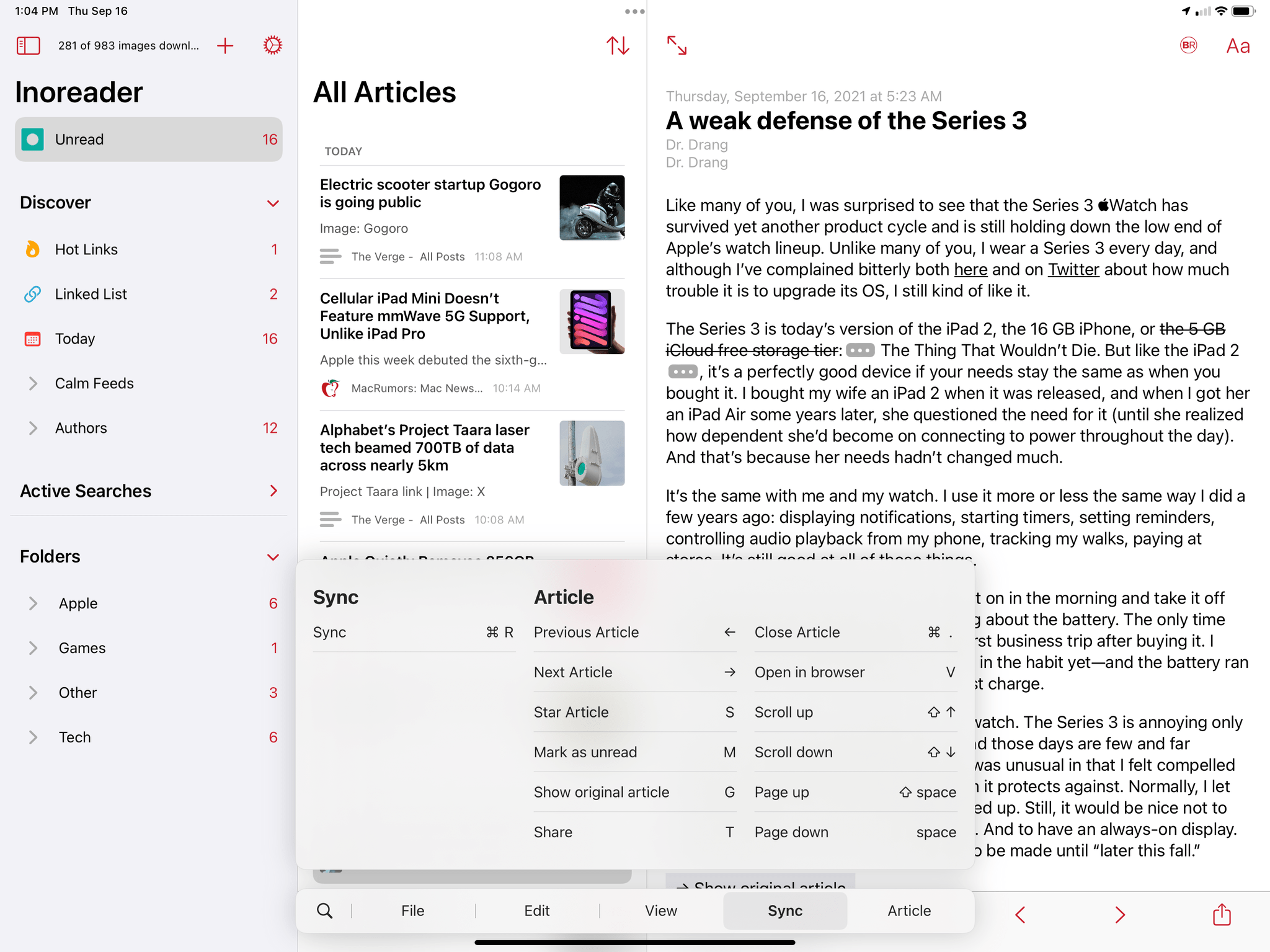
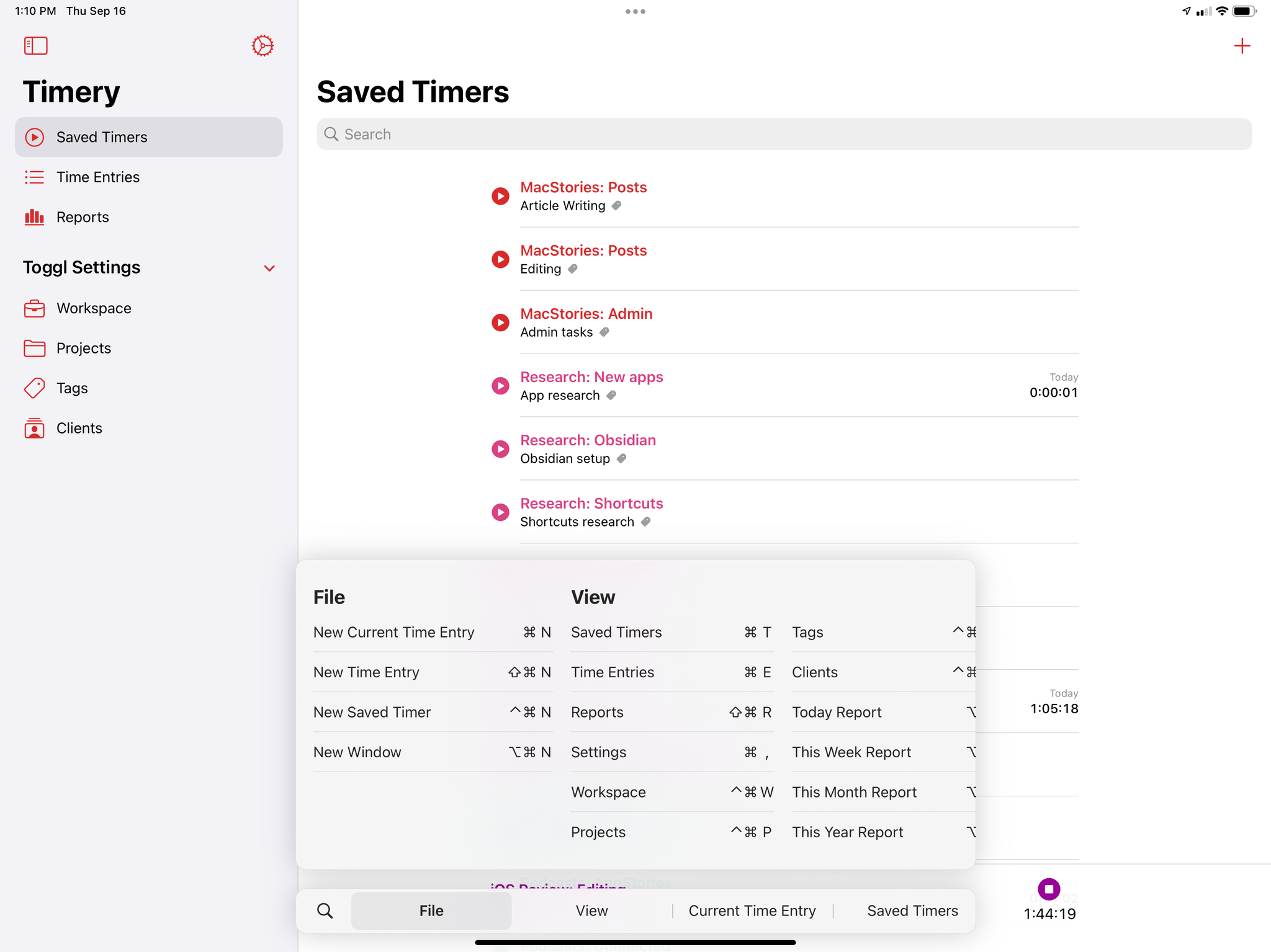
With iPadOS 15, Apple has restructured the ‘main menu’ system available for keyboard shortcuts in Mac Catalyst apps to use categories of commands on iPad too. This approach is consistent with the Mac, so in apps that ship dual iPad-Mac versions (such as Timery, MusicHarbor, or Craft), you’ll now see the familiar File-Edit-View menu on iPad as well, thanks to iPadOS 15.
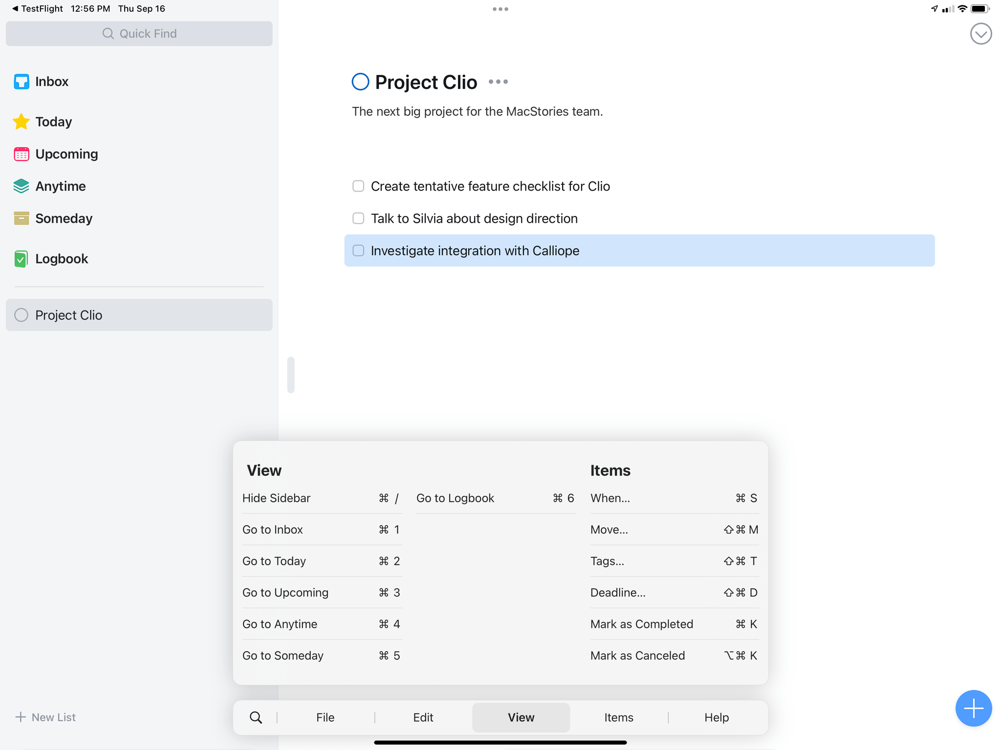
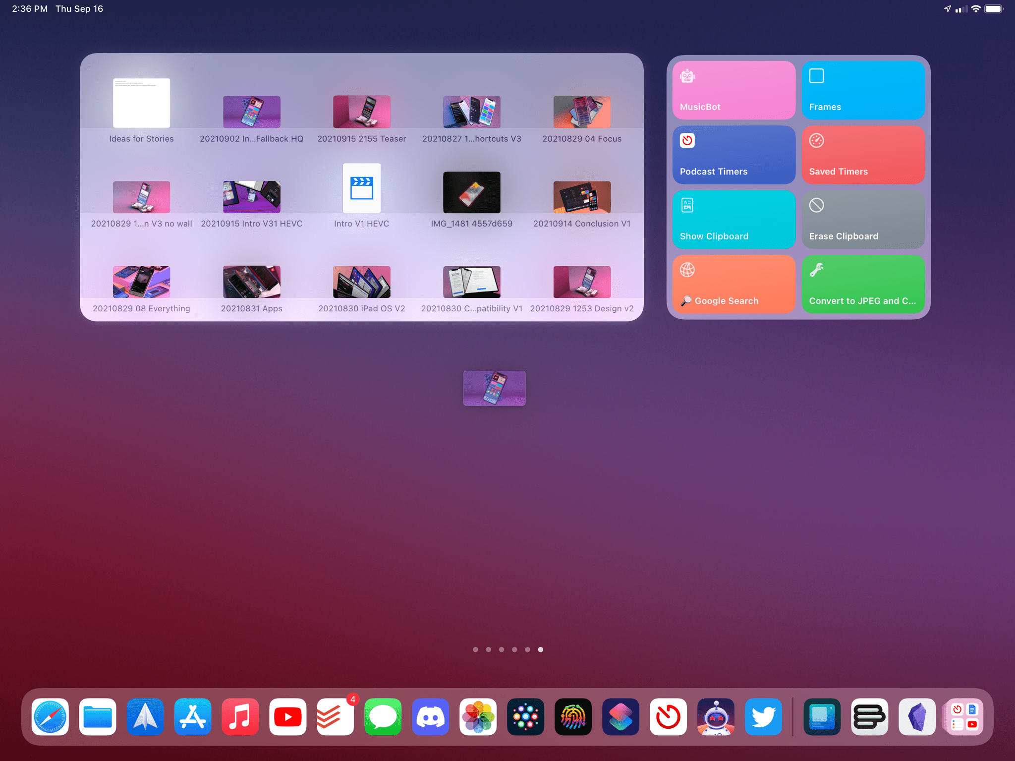
Things for iPadOS 15.
MusicHarbor for iPadOS 15.
Timery for iPadOS 15.
LookUp for iPadOS 15.
Lire for iPadOS 15.
There are some design and implementation differences between the menu bar on Mac and keyboard shortcuts menu on iPad, of course: on macOS, the menu bar supports nested menus and displays unavailable commands with a grayed-out color; in iPadOS 15, Apple has flattened navigation so that submenus aren’t shown in the menu, and everything is a top-level command. Additionally, unavailable commands are hidden by default on iPad. Besides these small differences, though, the keyboard shortcuts menu for iPadOS 15 is, effectively, Apple’s modern take on the menu bar.
And that, I think, is the key aspect to understand here. As we’ve seen over the past few years, whenever Apple brings a long-standing feature from the Mac to iPad, they like to rejuvenate and modernize it with design choices and interactions that make more sense for the modern era. The keyboard shortcuts menu is no different: while comparable in spirit and core concept, it adds its own flair to the classic menu bar.
For starters, the keyboard shortcuts menu is not a fixed element onscreen but can be contextually invoked by holding down ⌘ in any app; additionally, you can scroll sections of commands to see their associated keyboard shortcuts, and there’s a search button you can press to search for a command by name if you don’t remember whether it exists or how to trigger it. You can tap or click commands to execute them, and if you just start typing when the shortcuts menu comes up, you can instantly filter it by name to find any command in it. The latter is my favorite detail of the shortcuts menu since it lets me quickly find commands by guessing or partially remembering their name.
The net result of the refreshed keyboard shortcuts menu in iPadOS 15 is that it’s both more intuitive and powerful than before. And I think this is the case because Apple took the fundamentals of an idea from the Mac and reshaped it for iPad and its multiplicity of input methods.
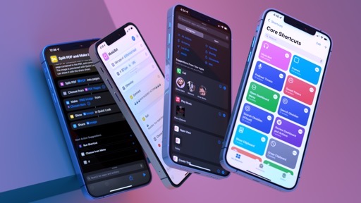
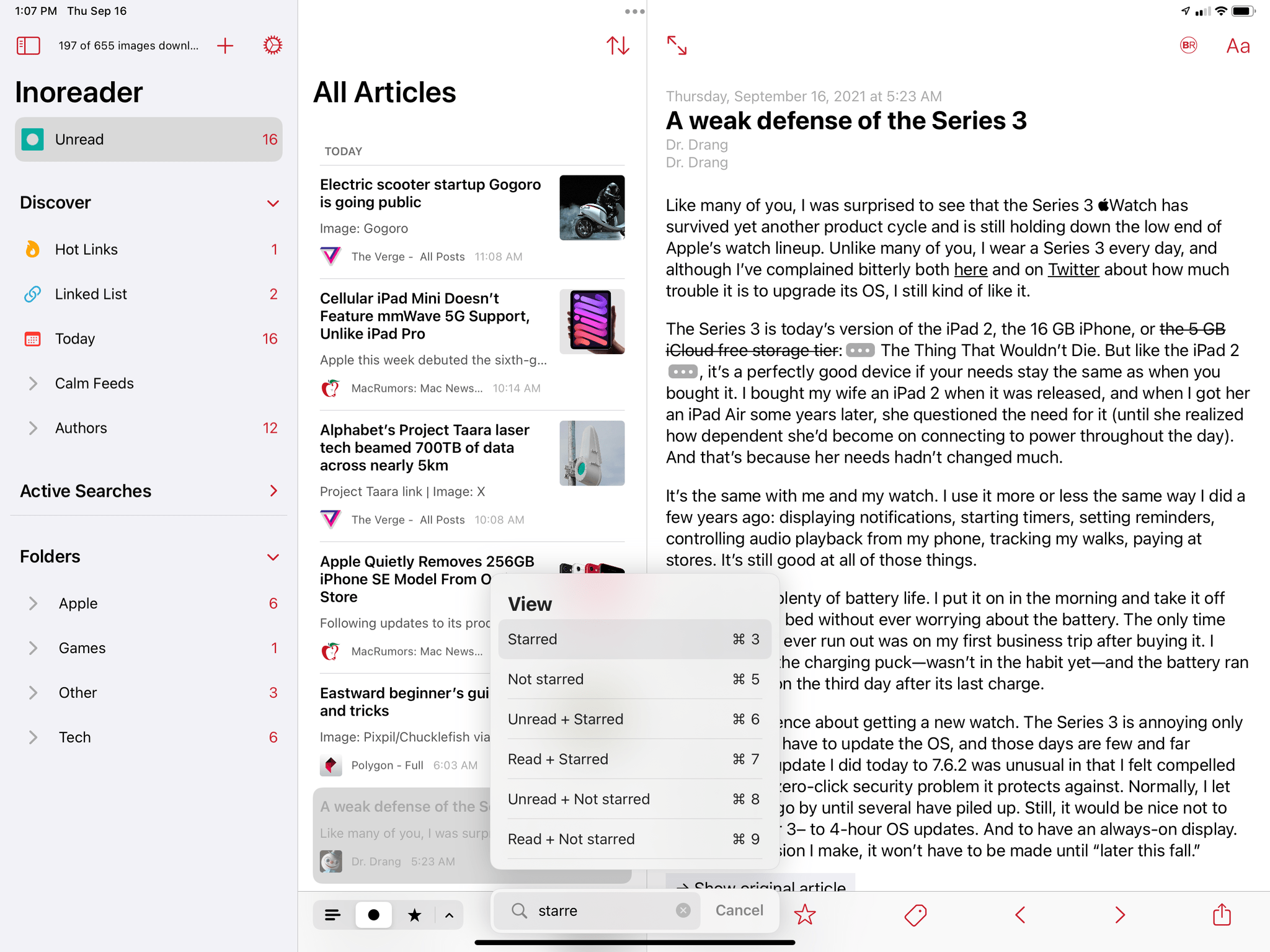
Developers can, of course, customize the keyboard shortcuts menu with their own categories and commands, which will carry over to Mac Catalyst apps as well. This is done using the UIMenuBuilder API, which lets developers design a single main menu system for keyboard shortcuts that seamlessly translates from iPad to Mac, and vice versa. Good third-party examples of this approach are MusicHarbor and Timery, which have reorganized their keyboard shortcuts in iPadOS 15 around categories. As a result, commands are easier to find, and developers are encouraged to add even richer support for keyboard shortcuts since the experience of learning them isn’t terrible anymore:
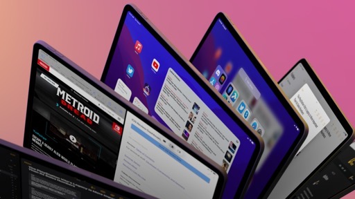
While I expect third-party developers – especially those who make Mac Catalyst apps – to fully embrace this new system, it’s nice to see Apple has done the work for their built-in apps too. My favorite examples are Safari and Mail, which now offer a slimmed-down version of their Mac versions’ menu bar with a selection of shortcuts organized by category in iPadOS 15:
The Globe Key and Global Commands
So far, I’ve only mentioned holding down the ⌘ key to discover keyboard shortcuts in apps using the new shortcuts menu of iPadOS 15. But the truth is, Apple has rolled out a second global modifier key in iPadOS 15 that can be held down to discover, well, global system shortcuts: the Globe key.
Unless you’re a bilingual iPad user, there’s a good chance you’ve often wondered what the Globe key on Apple’s Smart and Magic keyboards stood for. Sure, you could use the Globe key to toggle between the English and Emoji keyboards, but ever since Apple added the ⌘⌃Space shortcut to invoke the emoji popover, it’s likely you stopped using the Globe key trick altogether.
For international and bilingual users like myself, the Globe key has long been an essential complement to the iPhone and iPad keyboard experience, allowing us to quickly toggle between different keyboards. Over the past few years, however, Apple has been rolling out the ability to type in multiple languages using a single keyboard, progressively demoting the role once played by the Globe key. In the last two years, I’ve only manually cycled between international keyboards by mistake.
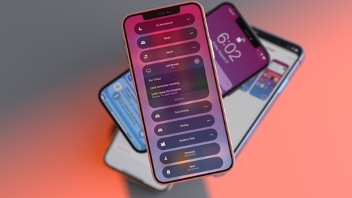
All of this to say: the Globe key isn’t nearly as important as it used to be, so Apple repurposed it in iPadOS 15 to show you global, system-wide commands for multitasking, the Home Screen, and more. Hold down the Globe key anywhere – even inside apps – and you’ll see a brand new list of system shortcuts for iPad:
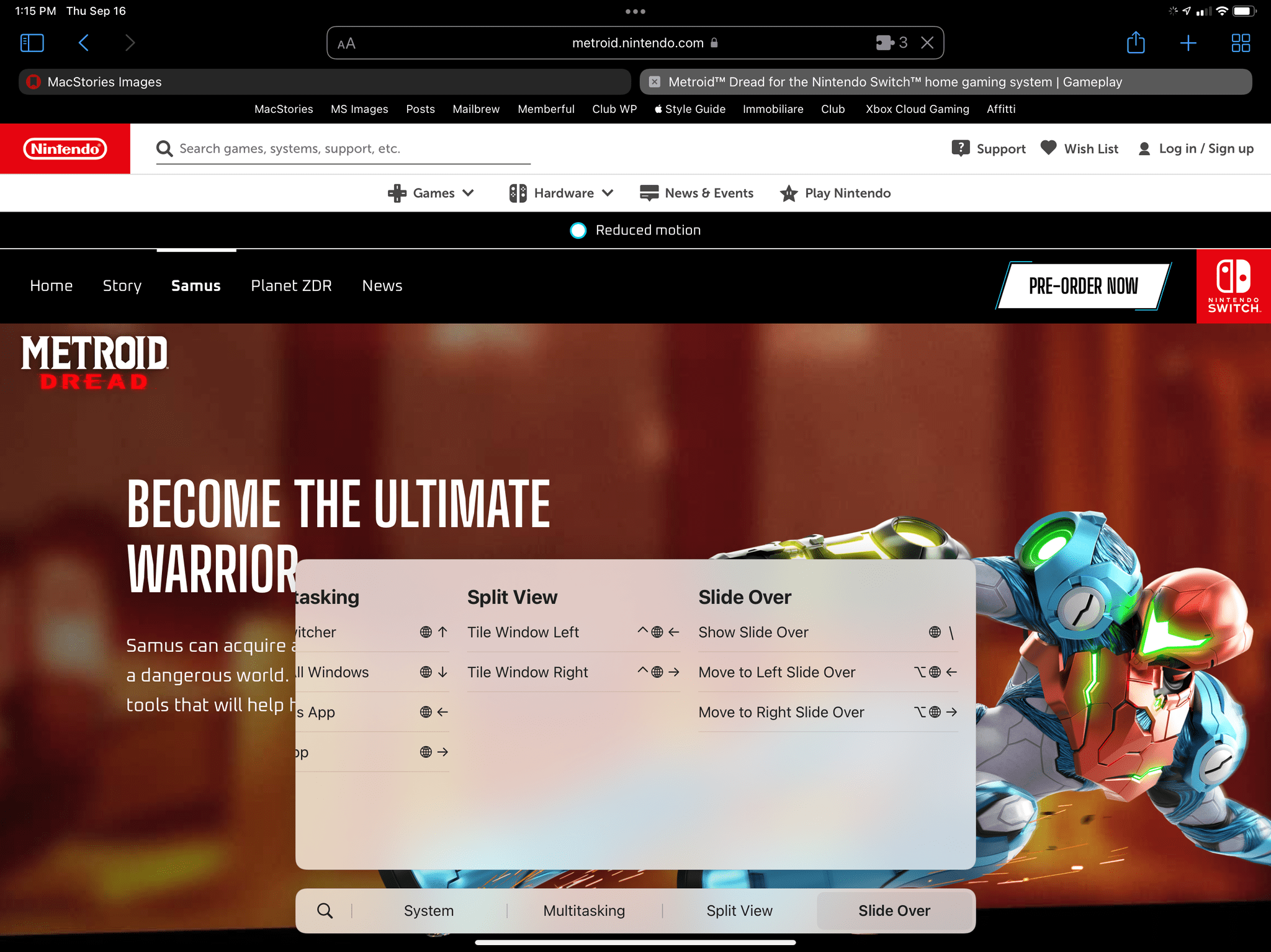
Of course, the significance of the Globe key is only one half of the story here: the juicy part is that Apple has added a selection of new keyboard shortcuts to operate Split View, Slide Over, and other areas of iPad multitasking from the keyboard.
This was one of my long-standing criticisms in all iPad and iPadOS reviews from the past few years: there was a disconnect between the iPad’s modular nature and the fact that multitasking was a touch-only affair that couldn’t be controlled from a keyboard at all. iPadOS 15 fixes this:
- Split View can now be entirely managed from the keyboard:
- You can cycle between apps in Split View with Globe + `;
- You can turn a Split View app into a full-screen window with Globe + F;
- Using Globe + ⌃ + ←/→, you can tile a full-screen window to the left or right side of the screen, pick a secondary app from Spotlight, and create a new Split View directly from the keyboard;
- If you have a Split View already open, the same command to tile windows to either side of the screen swaps their onscreen placement;
- If you want to replace one of the two apps in a Split View, you can use the Globe + ⌃ + ↓ command;
- You can show and hide Slide Over, as well as move it to either side of the screen, without using touch input at all:
- Globe + \ to toggle Slide Over;
- ⌥ Globe + ←/→ to move Slide Over;
- There are new shortcuts to show the app switcher and move between apps (previously, these actions required multitouch gestures);
- You can now invoke Siri, Control Center, and Notification Center with dedicated, Globe-based shortcuts.
It takes a while to learn all the potential permutations of global shortcuts and how to control iPad multitasking with it, but once you do, there’s no going back. iPadOS 15 gives us the deep, system-wide keyboard integration for multitasking we’ve been requesting for years now; while I still wish modifying Split Views via Spotlight was easier10, by and large, iPadOS 15’s global shortcuts feel like the culmination of Apple’s work on modularity. It’s nice to finally check these off my wish list.
Keyboard Navigation
Apple’s work on keyboard integration in iPadOS 15 extends beyond keyboard shortcuts to include another long-requested functionality: keyboard-based navigation across the iPadOS UI.
The idea is simple enough: in any app, you can now press the Tab key to select a specific part of the interface from the keyboard, select items in that region using the arrow keys, or continue to press Tab to select other parts of the interface that support keyboard navigation. You can then press Return to activate specific features from the keyboard, get access to keyboard shortcuts for selected items onscreen, and, generally speaking, navigate apps without ever lifting a finger off the keyboard.
The system is very intuitive: once you’ve tried it, it doesn’t require much of an explanation since the idea of keyboard navigation was explored by Apple on other platforms and implemented by some third-party developers in their apps years ago.
If the idea of highlighting parts of the iPadOS UI and selecting them without touch input sounds familiar, it’s because Apple has brought the Focus selection system, originally launched with tvOS in 2017, to iPadOS 15. Just like on tvOS, the Focus system lets you highlight onscreen UI elements using an indirect input method – the Siri Remote on Apple TV and, now, the keyboard on iPad. By default, Apple has enabled keyboard navigation in text fields, text views, and native sidebars; developers can choose to opt-in for other parts of their apps comprised of collection views, table views, and custom views.
I’ll be honest: I’m a trackpad and pointer user myself; I still prefer to select and click UI elements onscreen, so I haven’t used keyboard navigation much. It’s not for me. At the same time though, I think there are some cool demos for keyboard navigation in iPadOS 15, and I want to mention them.
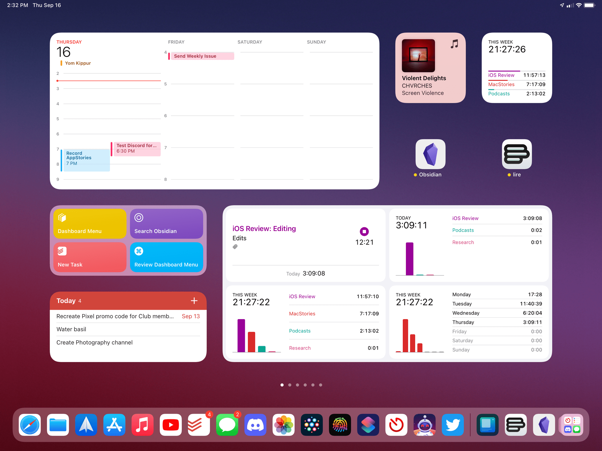
The first place you can test keyboard navigation in iPadOS 15 is the Home Screen. Hit the Tab key, and you’ll notice that the first icon or widget in the top left corner gets selected with the familiar Focus-style highlight around it. At this point, you can select different items on the Home Screen with the arrow keys, or you can press Return to open the selected app or widget.
You can now launch apps with the keyboard by selecting icons or widgets from the Home Screen.Replay
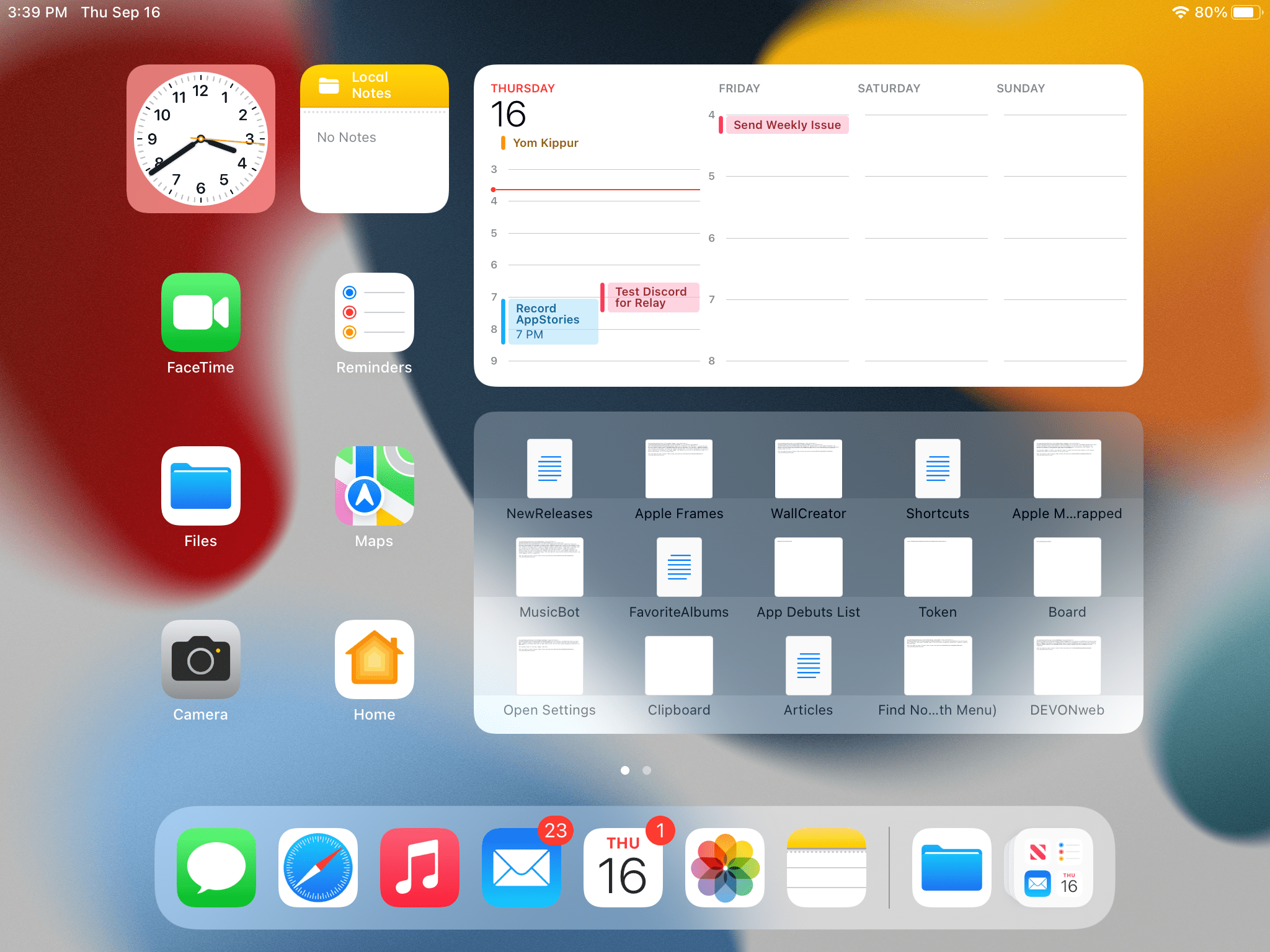
Then there’s the Shelf. In an app with multiple windows open, hit Globe + ↓ to view the Shelf, press Tab to highlight it, and you can then select windows with the arrow keys and click Return to open one:
The Shelf can also be controlled from the keyboard.Replay
Apple’s support for keyboard navigation is fairly extensive in built-in apps too. In Mail, you can navigate between mailboxes, switch to the search bar, or highlight messages in a mailbox just by switching between these Focus groups with the Tab key. In Photos, you can navigate sections in the sidebar, switch to selecting items in the grid, then hit ⌘C to instantly copy a selected item to the clipboard without ever using the share sheet:
I did all this from the keyboard.Replay
The list of examples goes on, and Apple has done a pretty good job at enabling keyboard navigation throughout several areas of the OS. It’ll be interesting to see how many third-party developers will take advantage of this new technology; my guess is that, as long as their apps use native components such as collection views and sidebars, developers of productivity apps will support navigation as a complement to their keyboard shortcuts experience. Like I said above, I don’t plan on using this often, but I’ve long believed the Focus engine would make sense on iPad too, so I’m glad Apple brought it to iPadOS 15.
Home Screen
The Home Screen upgrade in iPadOS 15 is simultaneously one of the biggest improvements to iPad this year and the most obvious change we were all expecting after iOS 14.
Let’s cut right to the chase here: you can now place widgets on the iPad Home Screen and intermix them with app icons. There are no technical improvements to widgets this year – they still do not support inline interactions, save for a few Apple widgets that use private APIs – and most iPad widgets you’ll see are the same ones you could put in the Today column before. The only things that are really changing this year are the Home Screen’s grid layout and the addition of a new XL widget size on iPad.
Let’s start with the latter. As we saw in the Home Screen and Widgets chapter, a selection of Apple apps, including Calendar, Contacts, and Files, now come with an extra-large widget option for iPad that lets you see a lot of content at once directly on the Home Screen. A good way to think about the XL widget is the following: it’s equivalent in size to two large widgets, four medium widgets, or eight small widgets. On a 12.9” iPad Pro, you can fit up to two XL widgets on the same page in landscape mode.
Home Screen widgets are supported on all iPad models, which means the diminutive iPad mini gets access to them as well. On Apple’s smallest tablet, I find small and medium widgets very hard to visually parse at a glance, and I think Large and XL widgets are better optimized for that kind of portable experience.
Some people may find them too big, but I’m a fan of XL widgets. I’ve been using the XL Calendar widget on my Home Screen since June; I find it a great way to keep an eye on my schedule for the week without opening the full Calendar app, and I appreciate how the widget supports different tap targets for events, which you can open in the app by clicking them. I also find the configurable XL Files widget an interesting idea to simulate having a “desktop” on your iPad Home Screen.
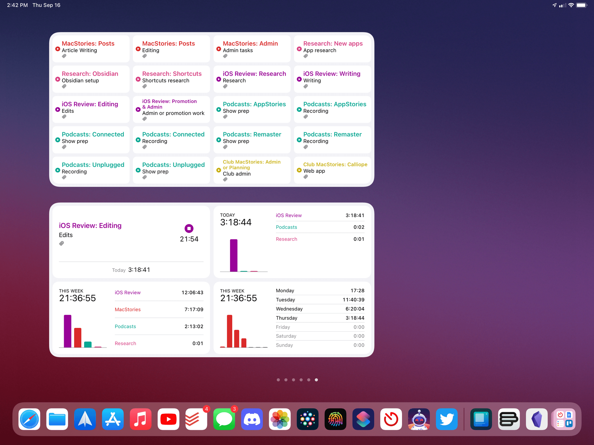
Of course, I’ve also seen some fascinating XL widget implementations by third-party developers. Timery, the excellent time-tracking app by Joe Hribar, is adding an XL widget for saved timers as well as another one that acts as a dashboard for your tracked time. I find the second one especially useful to get a bird’s eye view of my current timer plus how much time I’ve spent on specific projects over the past week.
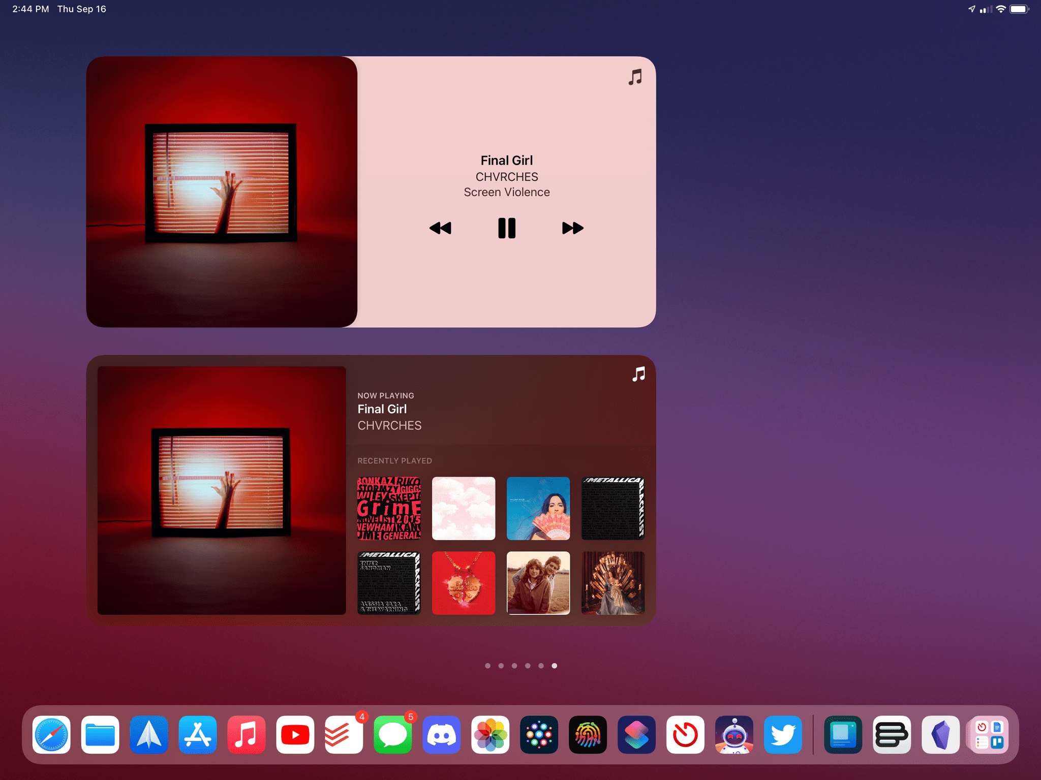
WidgetPod, a popular third-party Now Playing widget by Aditya Rajveer (the creator of Marvis Pro), has also added an XL widget for iPad that brings large playback controls to the Home Screen, something Apple itself didn’t do for Music:
Fantastical, the powerful calendar and reminder client by Flexibits, is adding a terrific XL widget that combines a monthly calendar with your list of events and tasks, which I’ve immediately put on my first Home Screen:
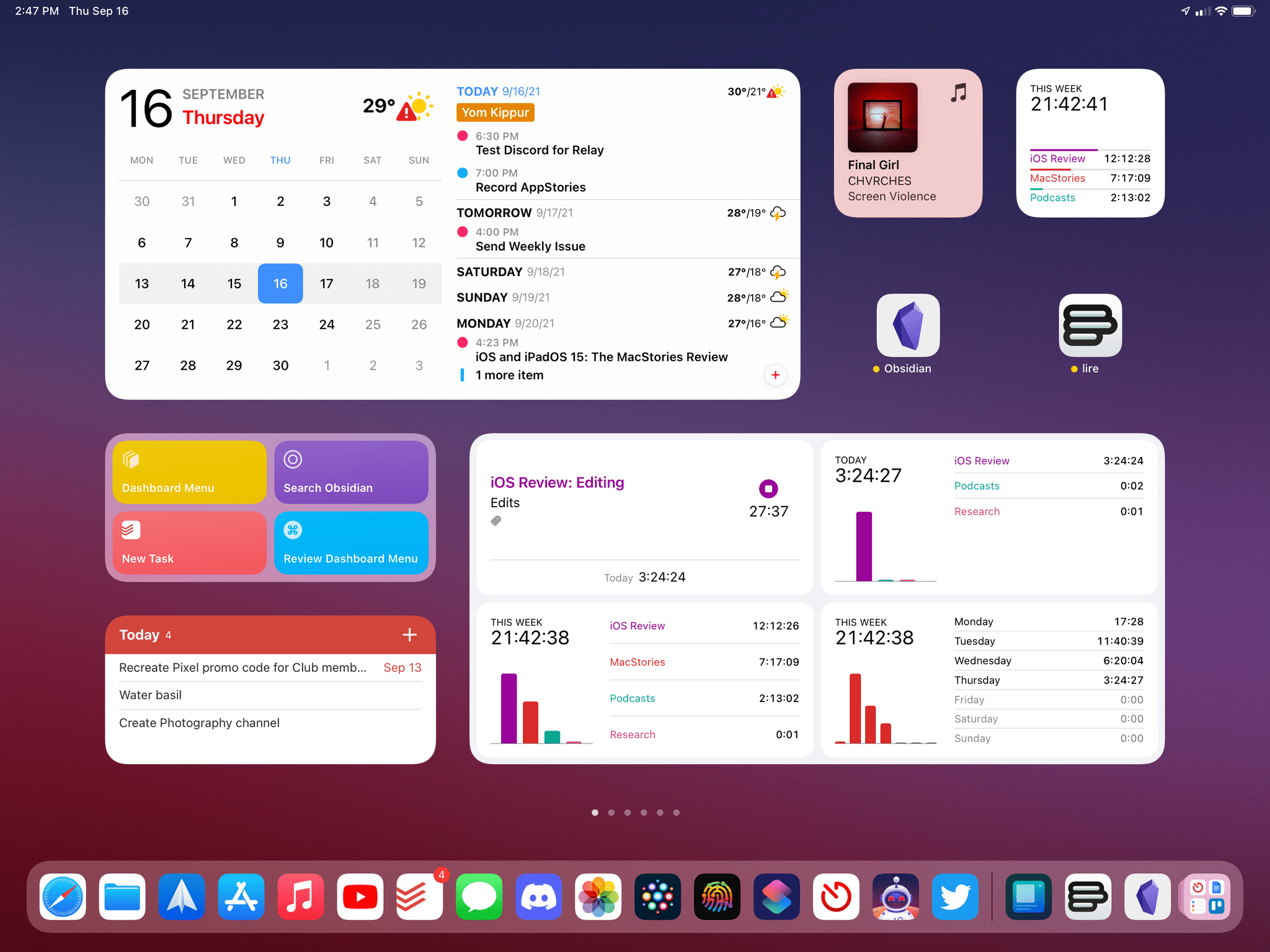
Lire, a highly customizable RSS reader we’ve covered on MacStories before, is also adding an XL widget you can personalize with a variety of filters to show different sets of articles:
Going forward, I expect to see even more interesting variations on the XL widget theme by third-party developers. Unfortunately, however, they’ll have to continue dealing with the limitations of Apple’s WidgetKit framework, which doesn’t support native interactions on the Home Screen still.
I thought that, in bringing widgets to the iPad Home Screen, Apple might consider supporting advanced hover effects for the pointer or perhaps keyboard input; instead, all we got are the same widgets from last year, plus a new size, with the same technical limitations of iOS 14. This is not to say that this feature is bad; it’s just…old at this point. I’m glad we have widgets on the iPad Home Screen; I just wish Apple had something more exciting in store for them by now.
If anything, to add widgets to the iPad Home Screen, Apple actually took something away this year: an entire row of icons. On a 12.9” iPad Pro running iPadOS 14, you could set up a 6x5 grid of icons for a total of 30 icons displayed in a dense grid that never reflowed with device orientation; even if you kept the widget column pinned to the left side of the Home Screen, the icon grid remained fixed at 6x5.
In iPadOS 15, the icon grid is set by default at 6x5 as well in either orientation:
As soon as you add a single widget to the Home Screen, though, the grid becomes 6x4 in landscape or 4x6 in portrait, for a total of 24 icons that reflow depending on how you rotate your iPad.
If you’re the kind of iPad user who cares about precise icon placement and fitting as many apps on a single screen as possible, I understand you’re feeling frustrated by the changes to the iPadOS 15 Home Screen.
Here’s my guess on why this happened: to maintain compatibility with iPadOS 14 widgets and avoid building a freeform Home Screen that doesn’t have a grid structure, Apple preferred to spread out app icons further and return to a non-dense grid that allows for both widgets and icons at the same time. Could Apple have come up with an alternative design for this? Probably, and it would have involved fitting more than four icons in the space taken up by a large widget.
If my theory is correct, I understand the trade-offs Apple had to accept for this design, and, on balance, I’d still take widgets on the Home Screen over the iPadOS 14 widget column. However, I also wish Apple gave power users an optional setting to make the Home Screen denser and fit even more icons and widgets onscreen. My hope is that, by this time next year, we’ll be talking about the great changes to widget interactivity and denser Home Screen grid of iPadOS 16. We can dream.
- Ideally, I would like to open Spotlight, search for an app, and hit a keyboard command to put the highlighted result on the left or right side of the screen immediately. Instead, you have to use drag and drop to grab the app icon from Spotlight and place it somewhere onscreen. This remaining touch-only interaction needs to go. ↩︎