I’ve made the case more than once that accessibility, conceptually, is not a domain exclusive to the disabled. Certainly, persons with disabilities will always be the target market for accessibility features, but I think many fully-abled people overlook the fact that accessibility features can help them too. To me, the canonical example is larger text. Yes, something like Large Dynamic Type is a boon to the visually impaired, but it can also benefit someone with aging or tired eyes.
In a similar vein, accessibility isn’t solely about discrete Accessibility features. While a big part of my writing involves reporting on iOS’ (and watchOS’) Accessibility features and how they affect users, I do make an effort to focus and write on the smaller aspects of accessibility. That is to say, I try to find accessibility in less obvious places – for instance, how technologies like Touch ID and Force Touch impact the disabled.
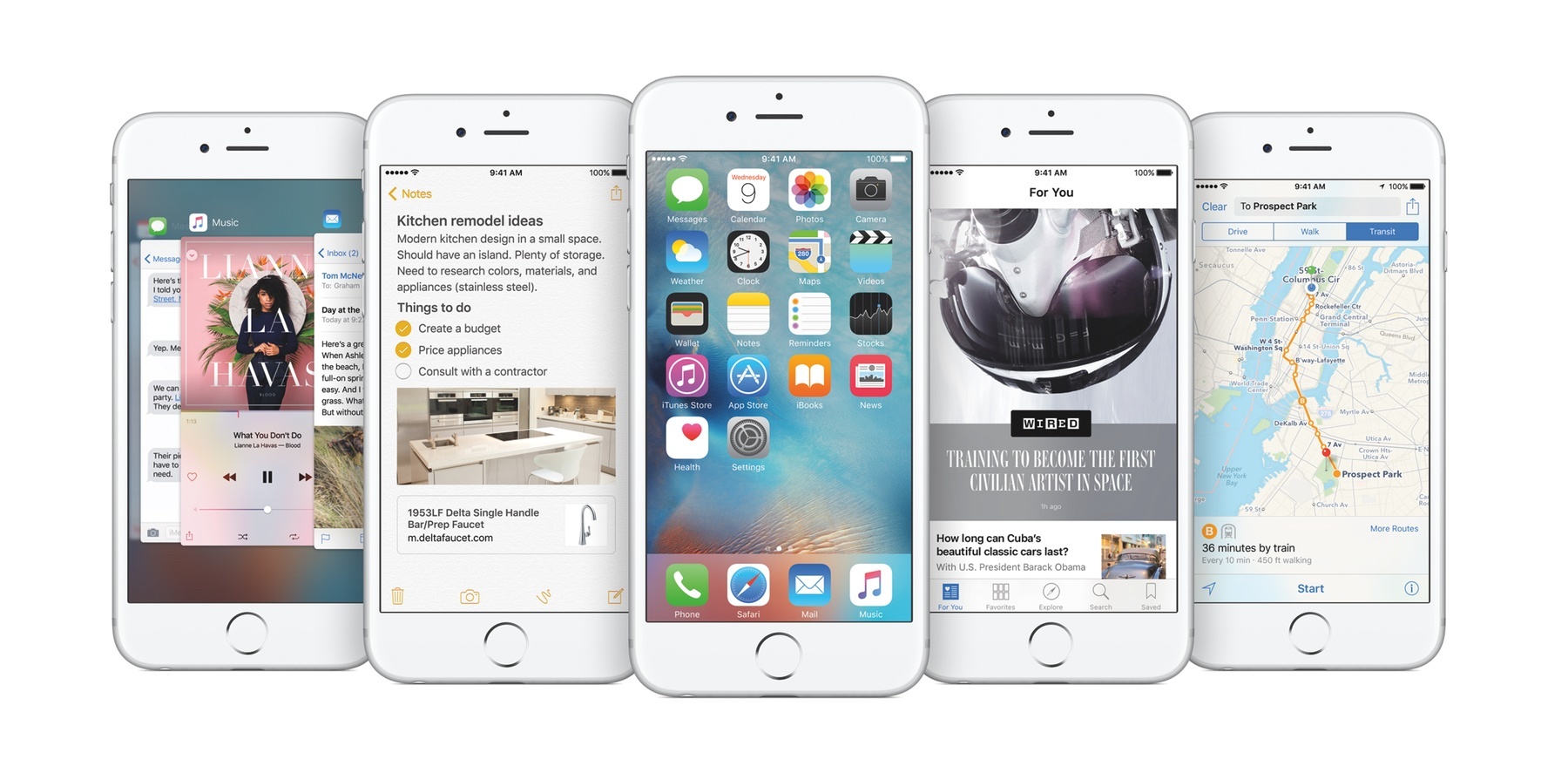
This concept has extended to my testing of the iOS 9 public beta throughout the summer. As I’ve gotten used to the new operating system on my iPhone 6 and iPad Air, I’ve come to notice several details that aren’t intentionally for accessibility, but nonetheless make the experience more accessible (and more enjoyable).
With that in mind, here are five “little things” in iOS 9 that stand out the most.
San Francisco
Of everything that’s new in iOS 9, Apple’s typeface is arguably my favorite “feature.” For as great as San Francisco looks and feels on Apple Watch, it’s equally great on my iPhone and iPad. Beyond San Francisco’s aesthetic appeal, iOS’ (and the Mac’s) new system font has appeal in terms of visual accessibility as well.
I’m no typographic expert, so all I can definitively say is that San Francisco feels more legible to me. I find that I don’t strain my eyes as much while reading, and even text at smaller sizes (such as that which describes a setting) is comfortable to read. Further, I find that distinguishing glyphs like 5 and S is easier due to how they’re rendered.
It isn’t that Helvetica Neue is worse or harder to see; rather, it’s just San Francisco looks and feels so much better. Looking at it for the first time on an iOS device, the sense is that you’re using a brand-new device. The reality is, though, that San Francisco is so good that it truly changes the experience.
Background & Font Choices in Safari Reader View
I use Reader View in Safari often, and have found it to be a terrific accessibility tool. It makes articles that I want to read “right away” on the Web more accessible. Instead of fighting a site’s ads and/or lack of support for the pinch-to-zoom gesture, I can open Reader View and start reading.
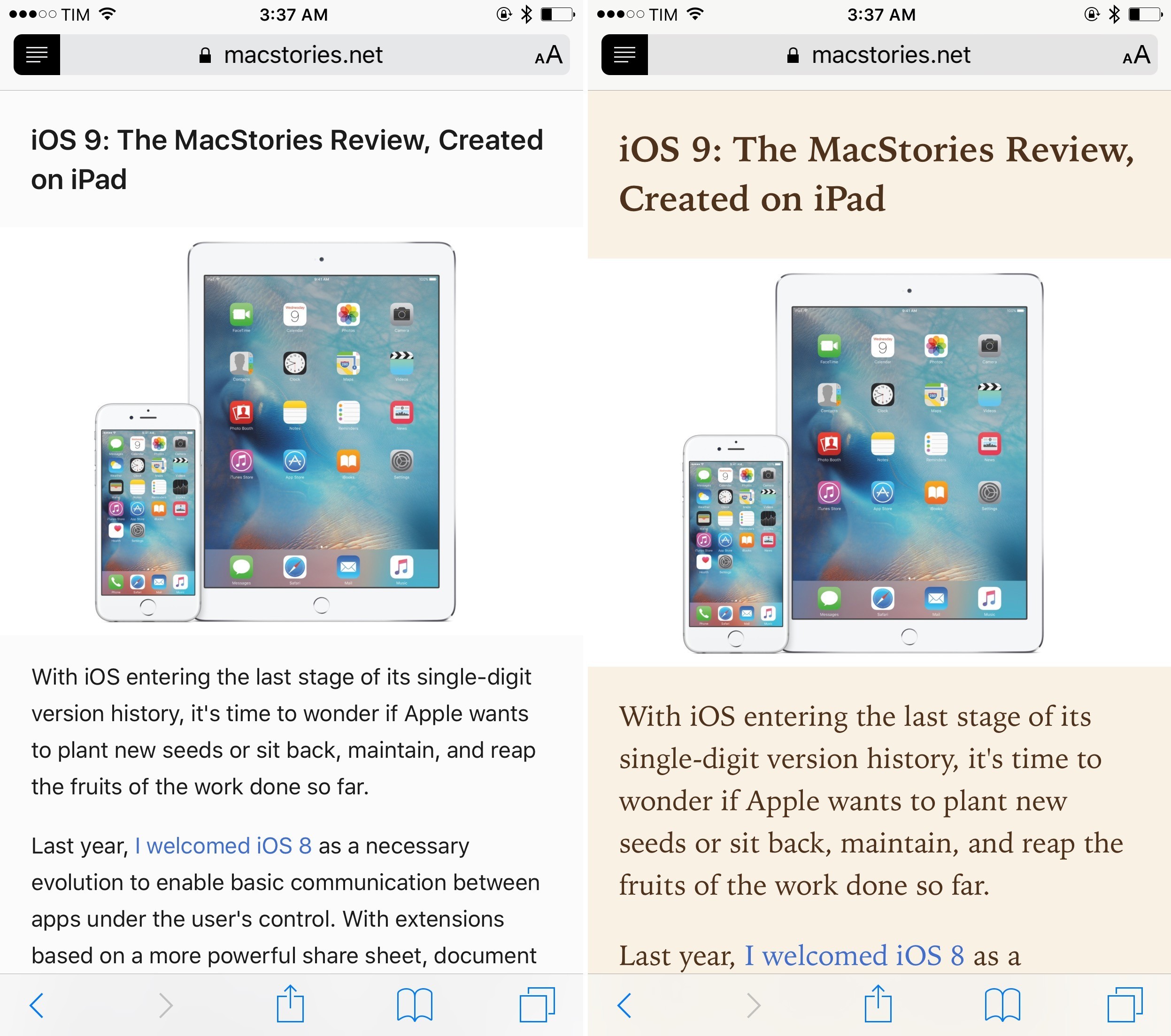
Apple has added a few features to Reader View in iOS 9 that enhance its accessibility. There are new options for changing the font and background of articles. This is notable because users can now use the font and background that is easiest to read, both in terms of legibility and contrast. In addition, you can now use pinch-to-zoom to resize text, which is a big improvement over the old method of repeatedly tapping the ‘aA’ button. In my usage, I leave the font set to San Francisco while alternating between the white and black backgrounds. (The latter is particularly good as a “dark mode.”)
The enhancements to Reader View are, in my opinion, one of the best things about iOS 9. As I stated previously, Reader View has become a go-to accessibility aid for me, so it makes me happy to see that Apple is investing time and resources to make it better.
Large Dynamic Type Practically Everywhere
I have professed my love for Large Dynamic Type several times. It is such a useful feature for the visually impaired (and the fully-sighted) because the setting sticks system-wide. Moreover, the fact that Large Dynamic Type has a public API means that third-party developers can hook their apps to it. And they should.
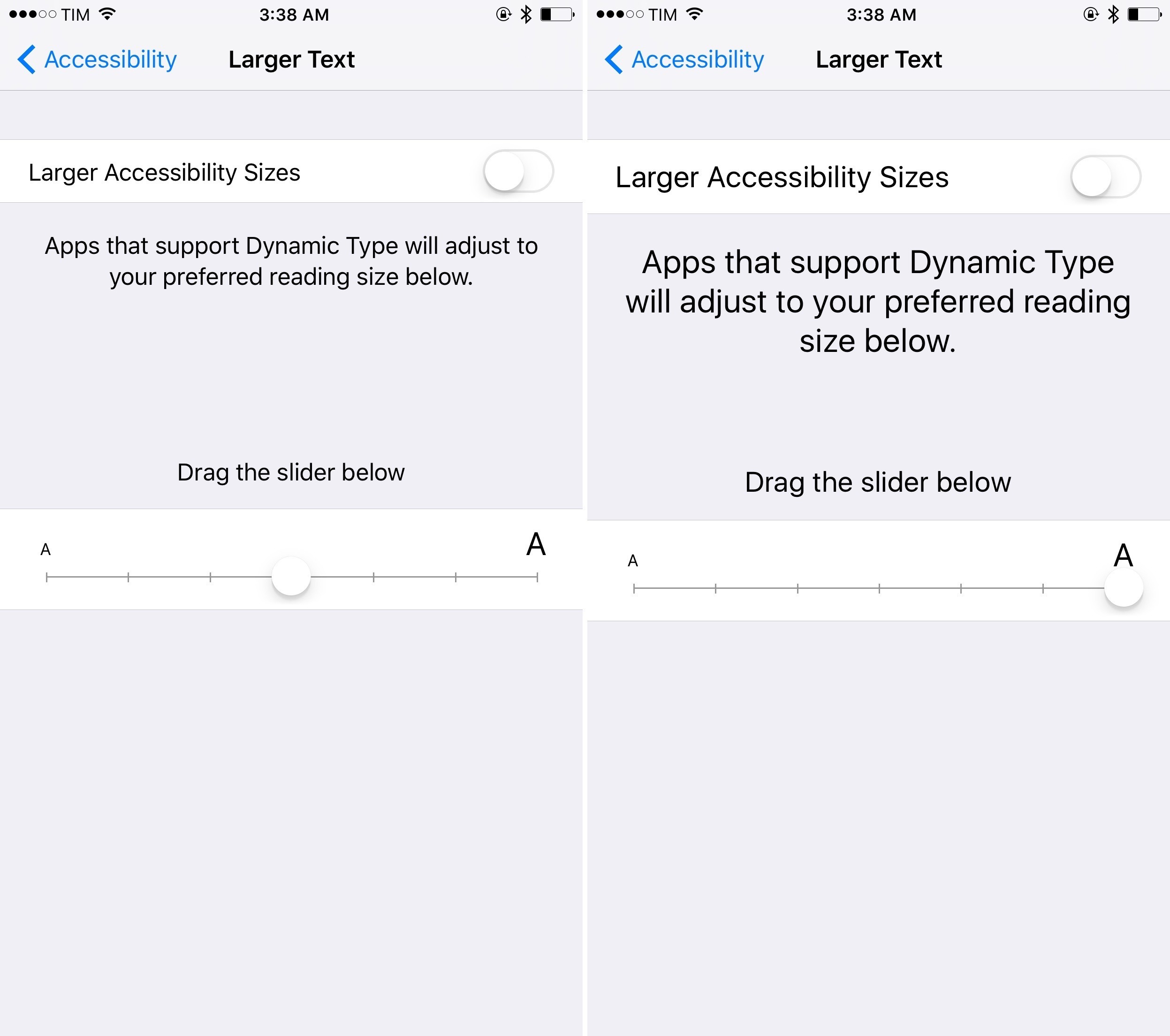
I’ve been using the iOS 9 public beta on my iPhone and iPad nearly all summer, and one thing that I’ve noticed is that Large Dynamic Type’s influence seems to have expanded across the system. For example, Notification Center and Siri respond to the size of text, big or small. I tested this with Siri by setting text size at its smallest and, sure enough, the UI adjusted accordingly. Furthermore, Large Dynamic Type also applies itself to notifications on the Lock screen, as well as the subject line in Mail messages.
Buttons Look More Like Buttons
This one is very subtle, but I noticed it quickly after putting iOS 9 on my devices.
Compared to iOS 8, it appears that Apple has tweaked buttons to look more like buttons. The corners are more rounded, which, to my eyes, makes them akin to the iOS 6-style buttons of yore. One instance where this change is noticeable is when iOS asks if you want to delete a photo. You can clearly see the rounded edges in that case.

From an accessibility standpoint, I find the rounded buttons to be significant because they provide (slightly) more definition. I’ve never been happy with the iOS 7-style buttons because they look too much like flat text on a flat background. By contrast, iOS 9’s tweaked design, however subtle, at least makes it more clear that what you’re looking at is a button (or series of buttons). As a person with low vision, I find that little bit of distinction very helpful in discriminating UI chrome from actual content.
Siri Understands Me Better
Since Siri debuted with the iPhone 4S in 2011, I’ve had a love-hate relationship with it. In terms of accessibility, Siri has proven to be a double-edged sword. It has so much potential as a voice-driven UI for those with motor delays, yet its inability to correctly parse non-standard speech patterns (read: stuttering) makes it virtually unusable by someone like me with a speech impediment. Both factors has made using Siri frustrating – to the point where, as a stutterer, I avoid Siri altogether.
Fortunately, change is happening. It feels like Apple has made huge strides recently in strengthening Siri’s backend, because I find it to be much better in iOS 9 and on my Apple Watch. Siri seems to be more adept at handling my stutter, sending back accurate (and quick) transcriptions of my commands. It even recognizes when it has cut me off mid-sentence, asking me to “say that again.” For my part, I’ve made concerted efforts to slow down and speak more deliberately to Siri. It seems to not only reduce anxiety in me, it also makes Siri’s job easier.
To be clear, Siri isn’t perfect and will have its moments where it can’t understand me. Still, the improvements I’ve noticed are a good sign that Apple is committed to making one of its tentpole features even better. I’m sure that I’m not the only one with a speech delay who feels this way, because it ultimately makes Siri more accessible and inclusive.
At a macro level, the things I’ve written about here offer a lesson in the fluidity of accessibility. To be accessible isn’t just about specialized software or people with disabilities. In iOS 9, being accessible is about Apple sweating the details, refining the little bits to ensure that the user experience is as polished and stable as possible.