In April, I settled an argument with myself. After years of assuming that a small and compact phone was what I wanted, I realized that the iPhone 6 Plus was the pocket computer for me. The size, harder one-handed operations, software slowdowns caused by memory constraints and resolution downsampling – ultimately, none of those potential 6 Plus issues pushed me to reconsider my decision. I had adjusted to the hybrid nature of the iPhone 6 Plus, and I couldn’t go back.
My physical traits and lifestyle habits meet the prerequisites necessary to use a 6 Plus on a daily basis. My hands are big enough for size not to be a deal breaker; I’m no longer constrained by obligatory one-handed operations; and generally, when I need to use my iPhone, I can use two hands for a better grip or faster interactions, and I don’t mind it.
I say “hybrid” as a callback to how many refer to the 6 Plus, but I don’t mean it in a pejorative light for the iPad. Since I switched to the 6 Plus in February, my use cases for the iPhone and iPad Air 2 have continued to be distinct and well-suited for the nature of each platform.
The iPad Air 2 is my primary computer, which I use to write and publish articles, manage MacStories, play games, read, and every other activity I used to perform on a Mac. The Air 2 has the unique advantage of being a truly portable computer, and it’s my most used iOS device to date.
The iPhone is the pocket computer for everyday life. It’s my camera. It’s my home remote. It’s Twitter and Slack. It’s my health companion. I value my iPad immensely (I wouldn’t be able to write this article without it), but the iPhone holds the key to my mobile lifestyle.
The iPhone is the hub around which everything revolves. Even the iPad – my computer – orbits the iPhone.
Based on lessons from the past few months, I knew getting an iPhone 6s Plus would be the best option for me. As I’ve witnessed, the Plus-sized iPhone and the iPad Air 2 don’t compete with each other in my life: they complement each other’s strengths. While I have sometimes traded one device for the capabilities of the other (such as reading on my iPhone instead of the iPad), I use each device for what it’s best at, and I’ve never once doubted the role of the iPad in my daily workflow. I’m fine with a big iPhone, and I’m doing well with a big iPad. I like big screens. They’re comfy.
As I outlined in my review, the most evident drawback of the iPhone 6 Plus was the inability to keep up with iOS 8. Whatever the reason – and no matter the performance improvements that Apple promised throughout the OS’ update cycle – the iPhone 6 Plus always felt behind iOS 8, exhibiting stuttering animations, constantly purging recent apps from memory, and, generally, being sluggish.
It was reasonable, then, to wait for an S-class upgrade that would iron out the kinks and offer a more complete vision of the 5.5-inch iPhone. More RAM, an updated processor, an improved camera; faster multitasking, faster apps, faster everything. That’s what I wanted. And knowing Apple – or, at least, knowing their penchant for a regular dose of small surprises – I assumed they’d throw in some seemingly minor but welcome new features for good measure as well.
The iPhone 6s Plus delivers on all these fronts, going beyond the “S stands for Speed” philosophy that is inexorably repeated every two years with changes I didn’t expect.
New Touch ID
The second-generation Touch ID sensor is fast, which makes for a fantastic unlocking experience. If you use the Lock screen to check the time and view notifications several times a day, though, the new Touch ID can be fast to a fault.
Apple doesn’t provide any specifics on the technical improvements behind this year’s Touch ID, but, in my experience, clicking the Home button with a finger configured with Touch ID unlocks the device immediately with no retry necessary. You can test this yourself by tapping the Home button quickly and releasing your finger in less than a second; the new Touch ID will unlock the iPhone, with more room for “wrong” finger placements than before. I tested this with my left and right thumb placed sideways and upside down on the sensor, and it worked every time. In most cases, Touch ID is also more adept at recognizing fingers that are slightly wet; Touch ID never worked for me on the iPhone 6 Plus after getting out of the shower and drying my hands for a couple of seconds, but it does now.
As far as unlocking an iPhone goes, this is great. When I pick up my iPhone – either from my desk or from my pocket – I instinctively reach out to the Home button and click it while I’m still bringing the device closer to my face. On the iPhone 6 Plus, that first click would usually result in Touch ID erroring out and asking me to try again. Not anymore. The first button click that occurs between picking up the iPhone and placing it in front of my eyes now unlocks the device – I’d say with 90% accuracy, no matter the orientation of my finger. And because grabbing my phone and clicking the Home button has become a second-nature kind of movement for me, the 6s Plus is always ready the moment my eyes are looking at its screen. After two years of seeing Touch ID as a “it’s nice when it works, but I need to be careful with my fingerprint” unlocking mechanism, the new Touch ID feels like magic.
The problem, at least for my habits, is that there is useful information to be lost by unlocking an iPhone too quickly. Since Apple’s move to a moderately bigger iPhone with the iPhone 5 and especially after the much taller iPhone 6 Plus, I tweaked my grip to click the Home button not only to unlock the device, but to view Lock screen notifications as well. While annoying, the aforementioned slowness of previous Touch ID sensors wasn’t a deal-breaker: a failed Touch ID scan meant I could at least view notifications. When I wanted to explicitly wake my locked iPhone’s screen to view notifications, I knew I could click the Home button because Touch ID wouldn’t be able to register a quick (and possibly oblique) click anyway.
That’s not the case with the iPhone 6s Plus, which posed a peculiar conundrum in the first days of usage. Do I prefer the ability to reliably unlock my iPhone with Touch ID in a fraction of a second, or am I bothered too much by the speed of the process as it now prevents me from viewing notifications on the Lock screen?
I’ve pondered that question, but there’s no contest. Of course I want to retain the benefits of a faster Touch ID. Whatever is going on behind the Home button is working, and I can’t imagine going back to an older iPhone with an even slightly worse Touch ID sensor that doesn’t perform as consistently as the one on the iPhone 6s Plus.
Still, I have to come up with a solution to read notifications on the Lock screen. I don’t like the idea of unlocking my phone, then manually opening Notification Center to view what I missed when the information is right there and I just need to wake my iPhone in a way that doesn’t unlock it. Using a different finger to view my Lock screen wouldn’t work either: it’d be unwieldy when I’m holding my phone with one hand, and muscle memory would still prevail when taking the device out of my pocket. So, for now, I’ve gone back to the simplest solution: using the Power button to view the Lock screen without engaging Touch ID at all. It’s a bit uncomfortable given its position along the upper side of the 6s Plus, but I’ve been learning to adjust my “initial grip” so that both the Home button and Power button are within reach.1
It’s interesting to observe how a hardware change affects software which in return is reflected in altered ergonomics. A faster Touch ID largely cuts the Lock screen middleman out of the unlocking experience, and that required me to rethink how I hold my phone when I do want to stay on the Lock screen.
I don’t know if Apple sees this as a “problem” that needs solving or as a curious byproduct of progress – like vinyl nostalgia after the move to CDs. Given our tendency to reach for the Home button, I wonder if Apple may be considering new ways to wake an iPhone just to glance at its screen that don’t involve potentially unlocking it. I’m reminded of this bit from The New Yorker’s profile of Jony Ive, from February 2015:
He picked up his iPhone 6 and pressed the home button. “The whole of the display comes on,” he said. “That, to me, feels very, very old.” (The iPhone 6 reached stores two weeks later.)
If we assume that Touch ID is staying in the Home button for the foreseeable future, I wouldn’t be surprised to know that Apple is exploring the idea of using the display itself to wake the device. Think about it: why rely on a sensor that is used to unlock the iPhone and why continue to press a button hundreds of times each day when you could turn on the screen just by pressing on it? I shared my theory before, and now that the iPhone’s display has a new layer to account for, it seems odd that it’s not being used to wake the device without unlocking it. I want to be able to wake the 6s Plus with 3D Touch: this way, I’d be able to press anywhere on screen to do it, and I’d only use the Home button when necessary.2
As it stands today, the iPhone 6s offers Apple’s best take on Touch ID yet. The sensor’s improved recognition can be appreciated in the Lock screen as well as in authentication prompts throughout the OS – such as the App Store’s purchase dialog or 1Password’s extension.
Speed comes at a cost, and if you’re used to looking at Lock screen notifications by clicking the Home button, you’ll have to rethink how you pick up and wake the device. Ultimately, a faster, accurate Touch ID can only benefit users and adoption of a more secure authentication system. I applaud Apple’s decision to revise each generation of the sensor for the past two years.
Faster, More Persistent Apps
As it was abundantly clear last year, the iPhone 6 Plus needed more RAM. I wasn’t the only one who pointed out a noticeable performance hit when moving from the iPhone 6 to the 6 Plus: by edging towards iPad territory with a Retina HD display and associated resolution downsampling, the 6 Plus’ 1 GB of RAM couldn’t match the snappiness and responsiveness of the iPhone 6. Safari tabs being constantly evicted from memory were the epitome of the 6 Plus’ aggressive RAM management. The problem was also evident in other common tasks such as opening widgets (Notification Center always took a couple of seconds to load) and moving between multiple apps.
The iPhone 6s Plus isn’t only faster on paper thanks to the A9 CPU and iOS 9 – it retains speed and quick interactions as you use it. Perceived speed is just as important as objective speed improvements: apps may launch quickly, but that doesn’t matter if the OS is always purging them from memory and slowing you down by having to relaunch them from a cold start.
The iPhone 6s Plus fixes the performance shortcomings of the previous generation by doubling the RAM available to the device. Apps still open as quickly as before when you first launch them, and now they’re also more persistent in remaining available to you across multiple launches.
Safari (perhaps the worst offender on the 6 Plus) can now keep multiple tabs stored in memory even after you move between a bunch of apps, so when you next open a tab, it’ll already be there waiting for you without having to reload. Other apps also maintain their state in the background more frequently: Twitter, Slack, Google Docs, and more lightweight games can be suspended by the system for prolonged periods of time, which results in a smoother experience with fewer stopgaps and hiccups.
Widgets benefit from the increased performance, too: where the Today view used to stutter every time on the 6 Plus when it tried to refresh widgets from their host apps, widgets on the 6s Plus take less than a second to update. I’ve noticed the same behavior for iOS 9’s new Search page: it used to be jittery on the 6 Plus, skipping a few animation frames when I opened it as (I assume) it was trying to load and prepare searchable content. On the 6s Plus, opening the Search page with a swipe down from the Home screen is fluid and goes straight to the keyboard to start typing.
Coming from an iPhone 6 Plus, the speed gains in the 6s Plus are striking. We’re still far away from the dream of a mobile OS that never reloads content before our eyes and always updates everything in the background. But, iOS 9’s optimizations and this year’s hardware changes make for a more pleasant iPhone experience in daily usage, with less time spent playing catch up. The iPhone 6s Plus feels as snappy as my iPad Air 2 now, which is what I wanted to see.
3D Touch: Peek and Pop
The best comparison I can make to describe peek and pop – two of the new gestures made possible by the 6s Plus’ pressure-sensitive display – is as if the Mac’s Quick Look preview system became physical and actionable. By applying different levels of pressure to select content on screen, you’re effectively saying “yes, I want to preview this and maybe do something with it”. By far, peek and pop have been the deepest changes to my day-to-day iPhone experience.
For the past eight years, our relationship with the iPhone’s display has been a binary one: you’re either touching the screen, or you’re not. 3D Touch alters the equation by introducing the concept of how you’re touching the screen, calculating your force and translating that value to multiple levels of input. The distinction between 3D Touch and Force Touch may have been conceived by an overly zealous marketing team, but they have been implemented differently: on Apple Watch, Force Touch always brings up the same contextual menu no matter how firmly you press; on the iPhone 6s, three possible outcomes are always offered to the user – tap, peek, and pop.3
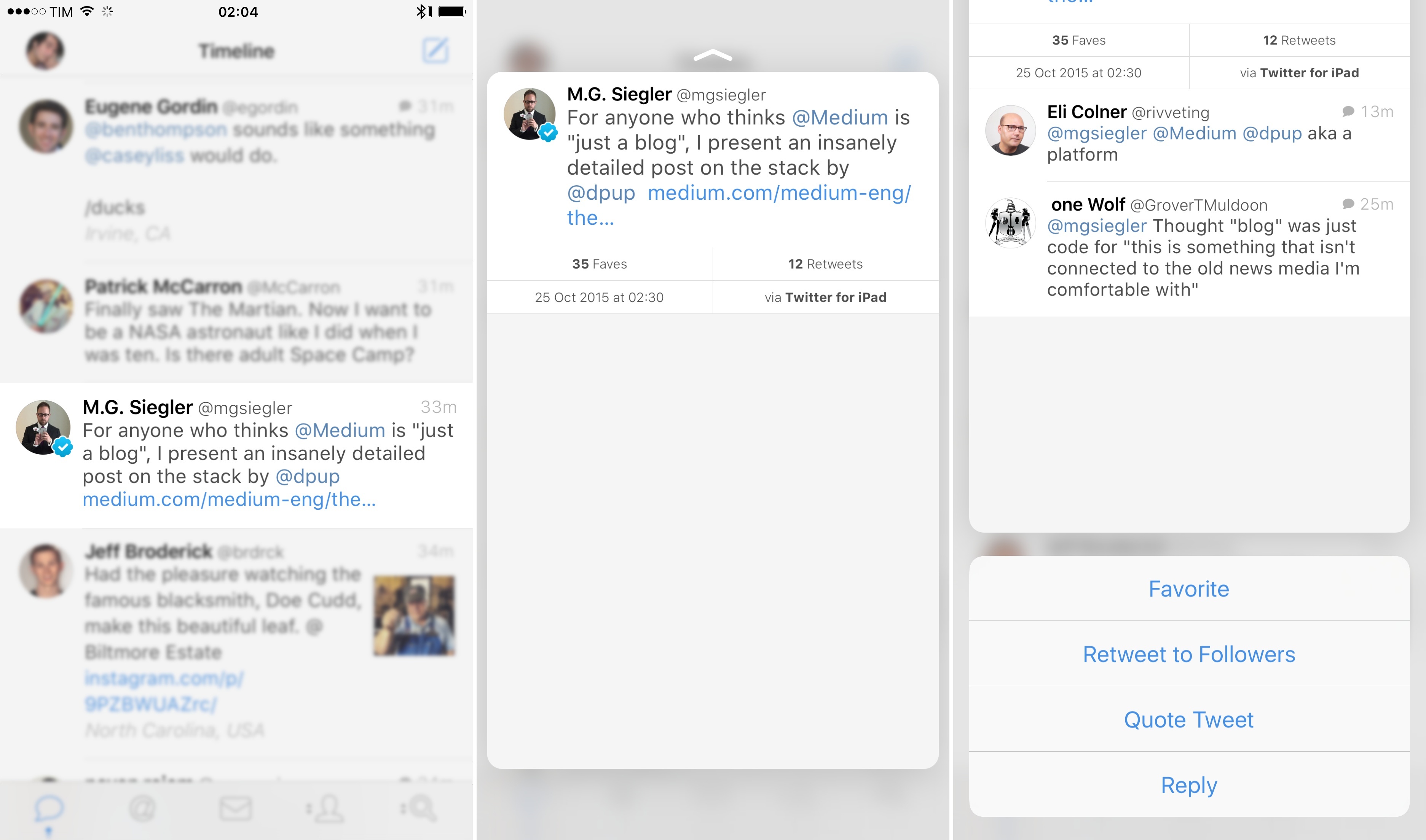
In my experience so far, peek and pop have been useful to preview app content and perform actions without having to reach small buttons or controls at the top of the screen. In Tweetbot, I’m scrolling my timeline differently: I swipe less to open tweet detail views because I can just press on a tweet, peek at the information I want to see, and release my finger when I’m done.
In a beta version of Newsify, an RSS reader for Feedly, I can peek at an article’s preview from the Unread list, which makes it easier for me to decide whether an article is worth reading or not. If I want, I can take action on that article immediately with peek quick actions.
Every link and detected data can be previewed in web views4 with a peek.
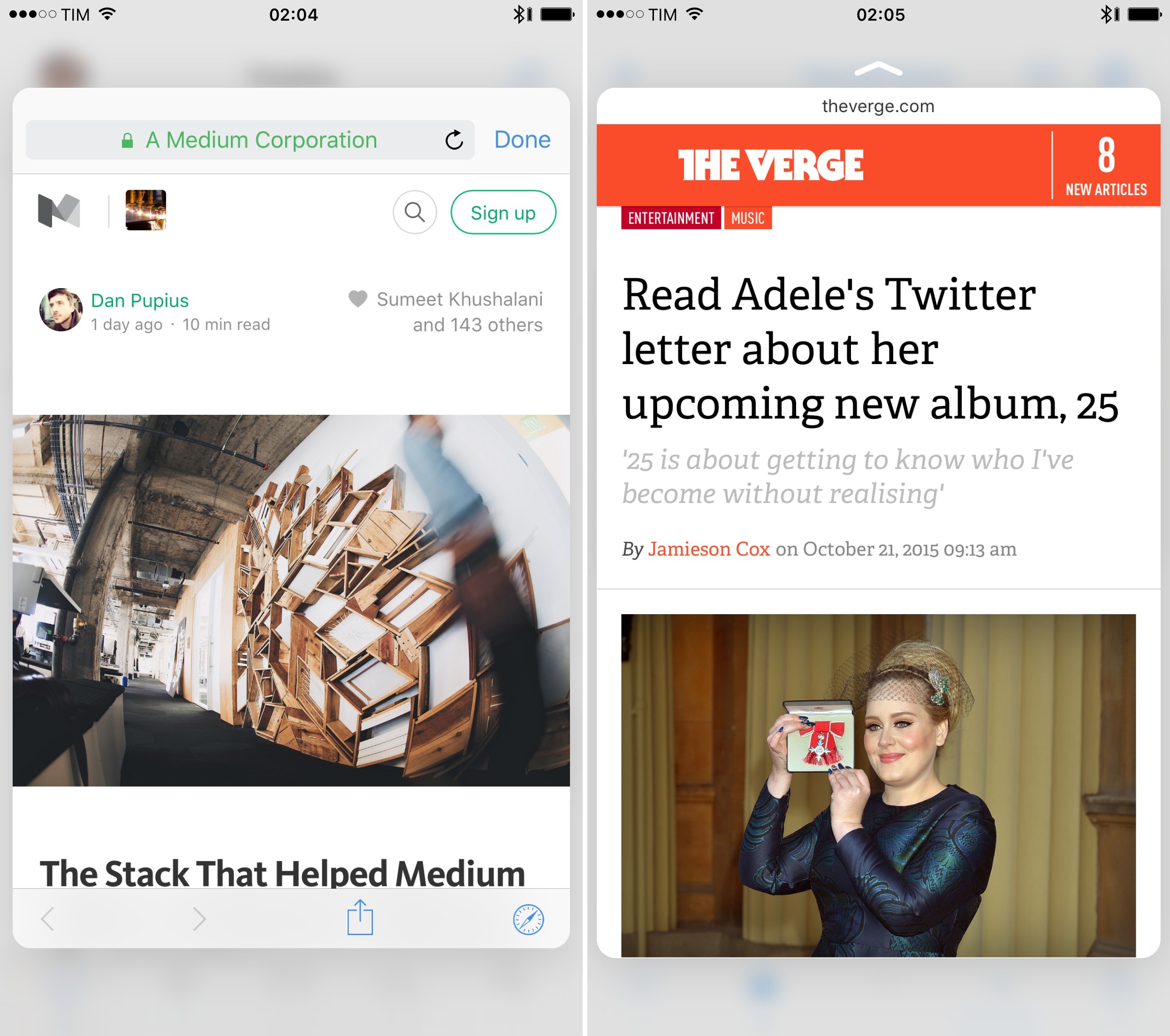
I read a lot of articles in Safari, and I like to be able to follow links to see what they are about. Before 3D Touch, the process wasn’t exactly comfortable on the iPhone, as it took too many taps to switch tabs in Safari. With 3D Touch, I can press any link to get a modal card that previews the webpage on top of what I’m seeing, so I can decide to open it in the background, pop it open, or dismiss it and go back to the article.
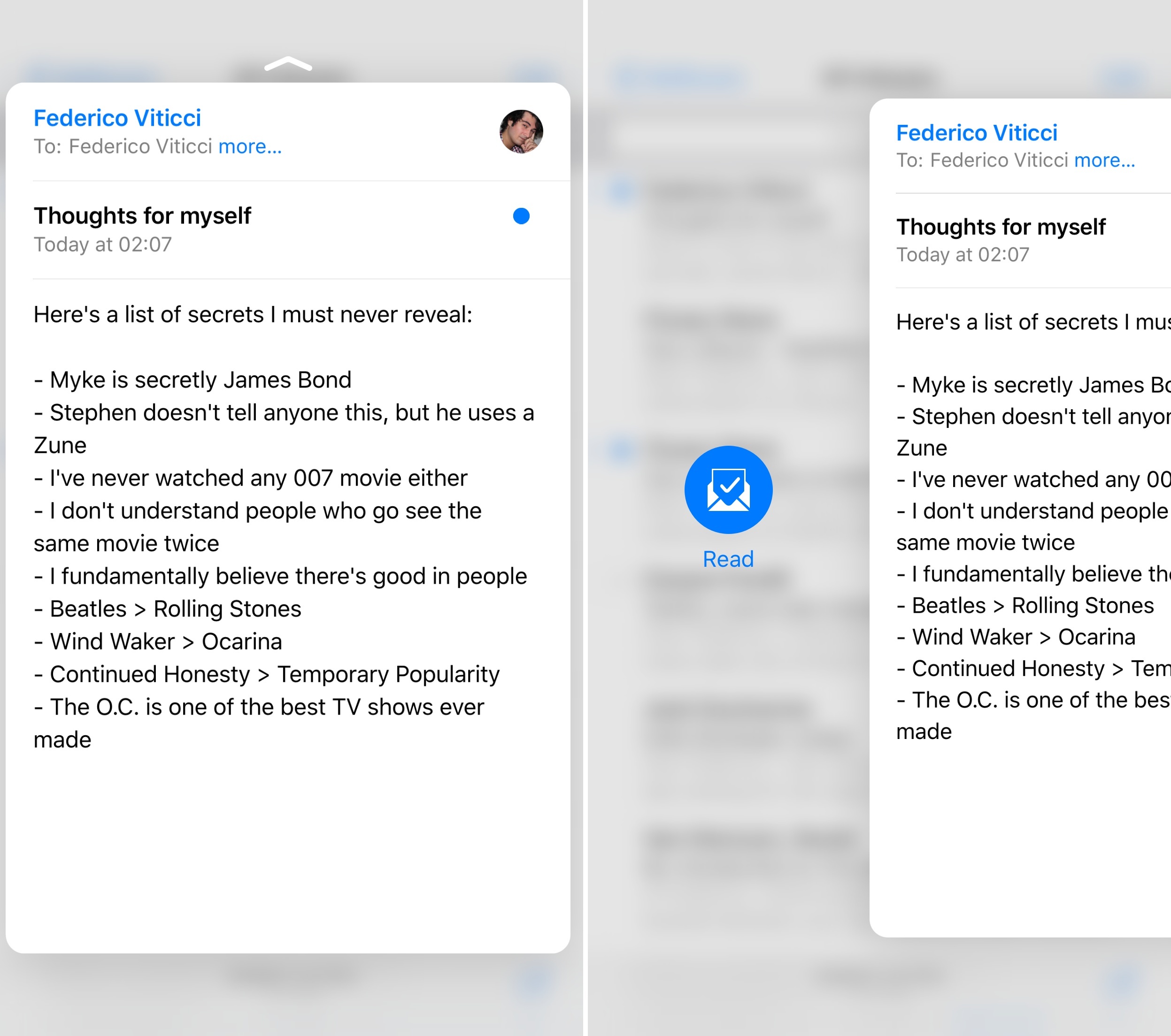
The same is true for links shared in Mail, Tweetbot, Messages, and dozens of other apps I use: whenever a web view is involved, following a link doesn’t disrupt my reading flow if I use 3D Touch to preview it. This has been useful in Mail, where I can unsubscribe from unwanted newsletters with a peek and preview pitches submitted to MacStories more easily.
The interaction of peek and pop is satisfying and informative. When I press on something that can be previewed, 3D Touch blurs the app in the background and brings the peek in the foreground with a quick transition and associated haptic feedback. If I press deeper, the peek pops open with an elastic animation and another subtle vibration. Visual and tactile feedback is consistent across iOS 9; once you get used to 3D Touch, its feel can’t be mistaken.
In addition to time saved with peeks, actions bundled with the peek have also come in handy in my usage. Tweetbot lets me favorite or quote a tweet by swiping the peek upward, so I don’t have to perform swipe gestures to view actions. I love peek and pop in the Photos app: in the Moments view, I can preview any item with one tap (including Live Photos and videos), but, even better, I can swipe up to copy an image or share it with extensions.
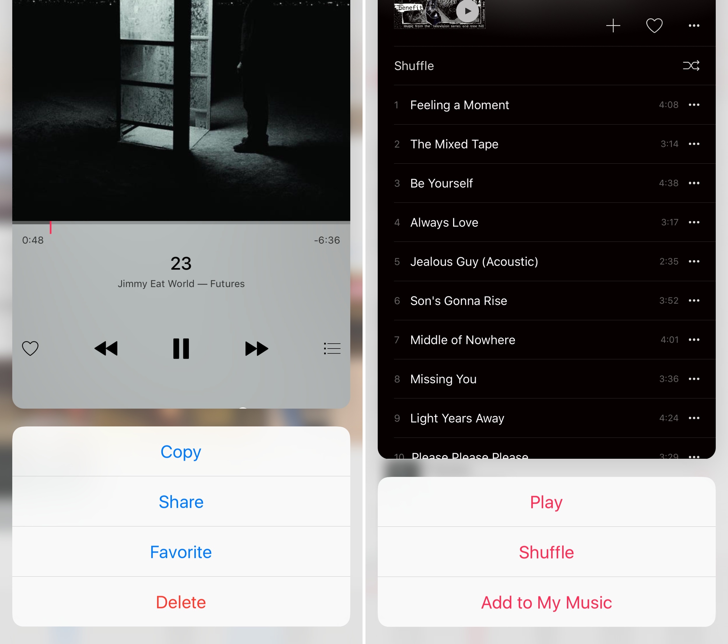
I’ve noticed the same pattern in Apple Music: 3D Touch enables me to preview albums and playlists (from any screen inside the app), which I can then play or shuffle with actions included at the bottom of the peek.
We’re in the early days of 3D Touch, and I’m still getting used to the physicality of new gestures and behaviors. From the get-go, I noticed that iOS 9 could easily get confused by a long-tap and a 3D Touch press on a selected piece of content. In apps like Tweetbot which support long-tap actions, I’ve often accidentally activated the share sheet instead of a peek preview because I wasn’t pressing deeply enough. It could be that I’m the problem and I’ll have to adjust my fingers to normal taps and 3D ones, but I think this is a potential issue developers should consider.5
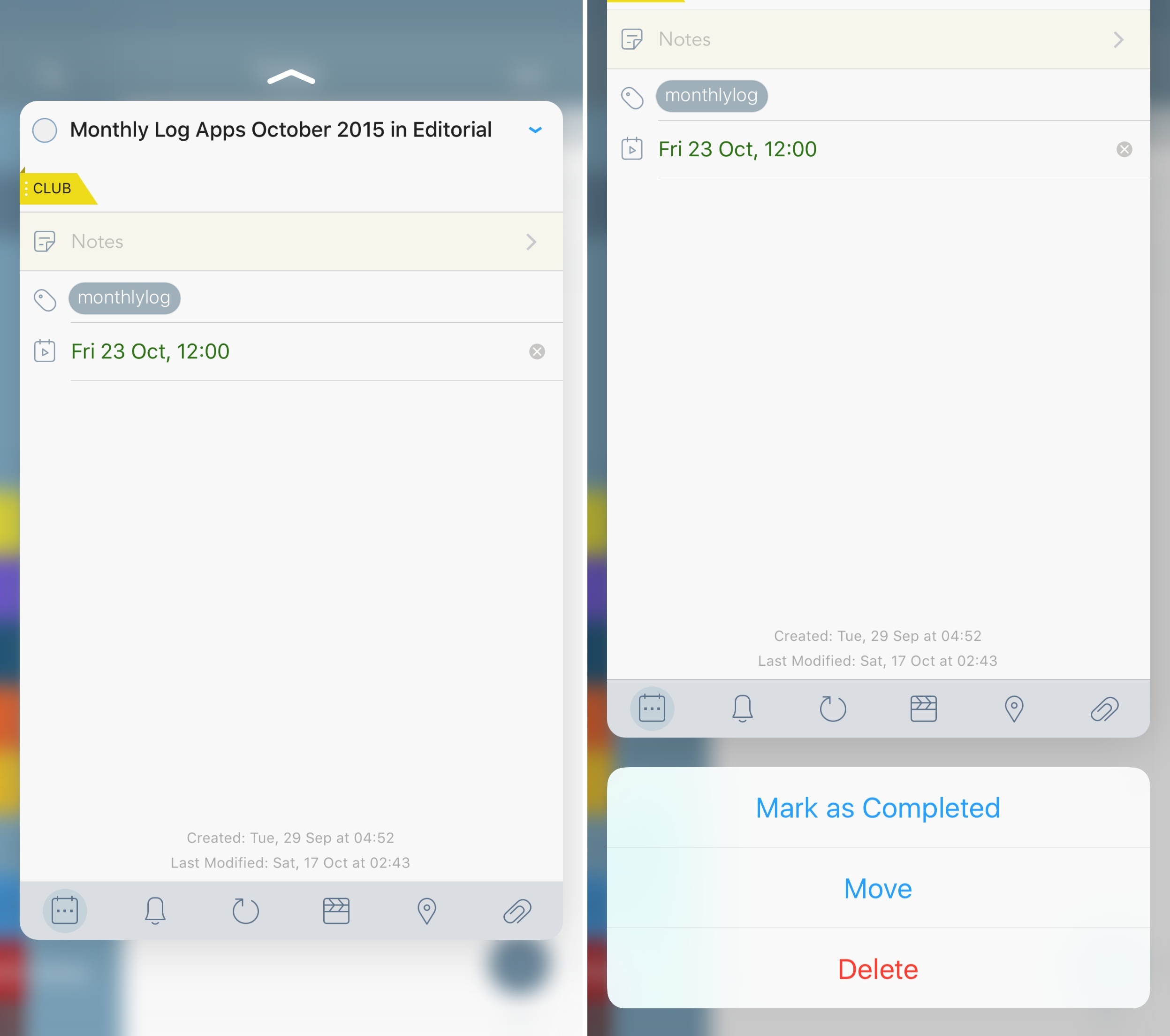
Secondly, third-party developers haven’t been given much freedom in the current peek and pop APIs. In Apple’s Mail, besides swiping up for quick actions, you can swipe a peek preview sideways to reveal buttons to archive a message or mark it as read. This additional peek interaction hasn’t been opened up to developers yet.6 I would love to see third-party apps being able to go beyond a simple preview with a list of actions underneath it.
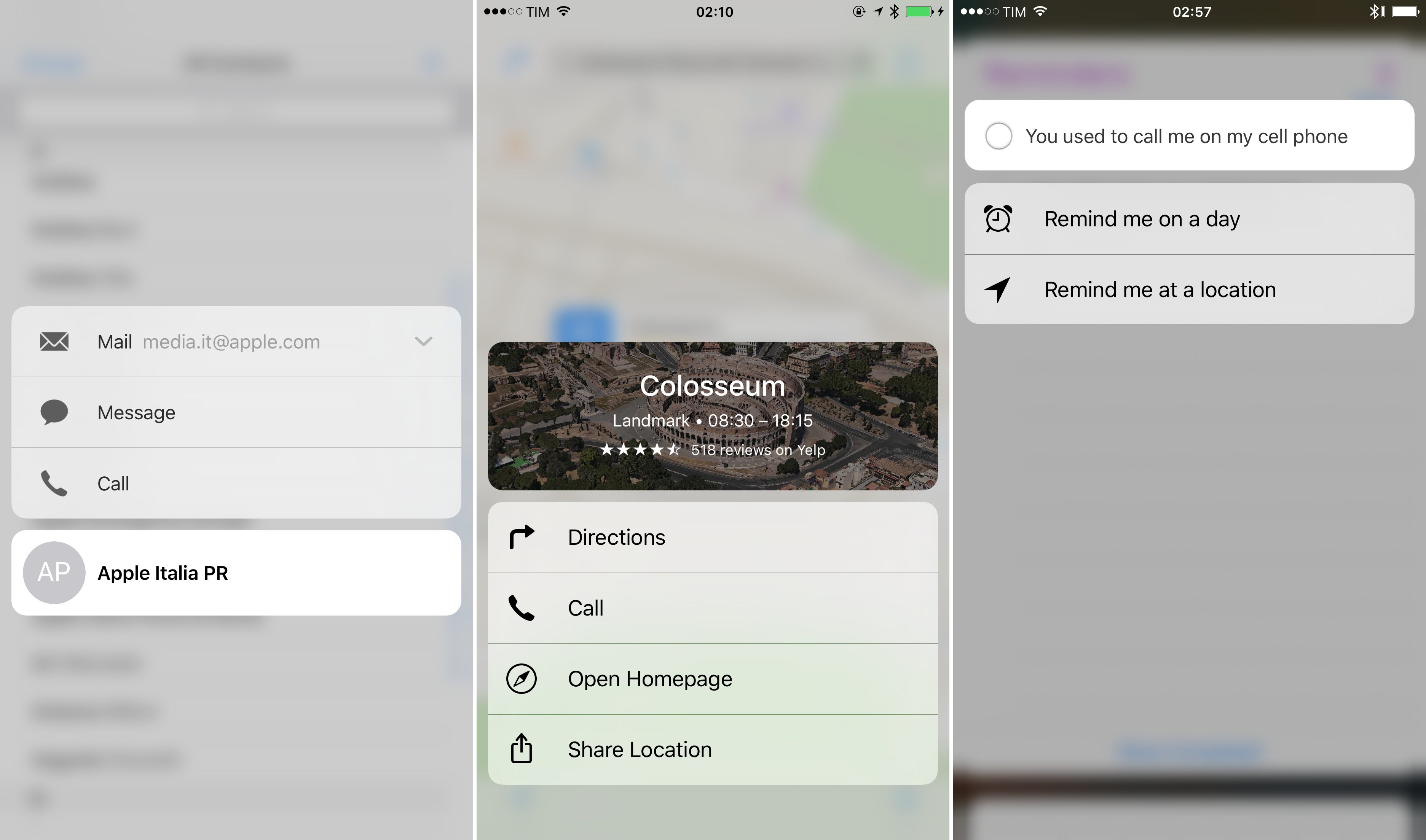
Similarly, I’m looking forward to seeing how developers will take advantage of views that are only available to devices with 3D Touch. In Apple’s Contacts, you can press an entry in your address book to bring up a list of actions, which have nested menus if that person has multiple phone numbers or email addresses. In Maps, 3D touching a location shows a custom menu that uses the location’s map view as backdrop. In Reminders, a deep press gives you the ability to check off a reminder or schedule it. I haven’t used any third-party app that offers this type of custom 3D Touch menu yet.
Peek and pop have turned out to be another argument in favor of the 6s Plus for me. With a bigger phone, peek previews are also bigger, allowing me to preview content at a larger size while avoiding the need for Reachability to navigate with ‘back’ buttons at the top of the screen. Before getting the 6s Plus, I used the 6s for a week, and the difference between peeks on the two is noticeable. Peeks on the 6s Plus are comparable in size to an iPhone 6 screen inside the device, which is a comfortable size for a preview; on the 6s, a peek feels like an iPhone 5s-like card – too tiny for my taste.
I want every app to support peek and pop with 3D Touch. In their current incarnation, peeks are a delightfully physical, useful preview framework that’s very pragmatic in saving time with fewer button taps. Peek and pop epitomize the thinking behind 3D Touch: expressing intention with a stronger tap, bringing interaction back into the content instead of diverting it to other UI elements. It’s a subtle distinction, but it makes sense in the context of an OS that has always prioritized direct manipulation over UI abstractions. A tap selects and opens; a stronger tap previews and interacts. Of course it’s supposed to be like this.
I can’t help but wonder what happens when app content becomes previewable with 3D Touch even if that app isn’t in the foreground. When you’re in Messages and you preview a link, an instance of Safari is called by 3D Touch to preview a webpage inside Messages. With iOS 9, Apple has introduced a new deep-linking framework to match web links with native app content, which is already supported by apps like Twitter and Dropbox. What if an app’s native view could be summoned with 3D Touch by peeking at a Universal Link? What if you could, say, peek at a tweet with the native Twitter app when in Safari, or peek and pop a Dropbox file from Slack? If you consider all the pieces that Apple has laid out over the years (the secure app sandbox, Universal Links, extensions, the back button), iOS’ deep-linking puzzle could come together quite nicely under 3D Touch.
I have a feeling that peek and pop predate a profound change in the iOS architecture and navigation experience. They’re a joy to use, and it’ll be interesting to see where Apple goes from here.
3D Touch: Home Screen Quick Actions
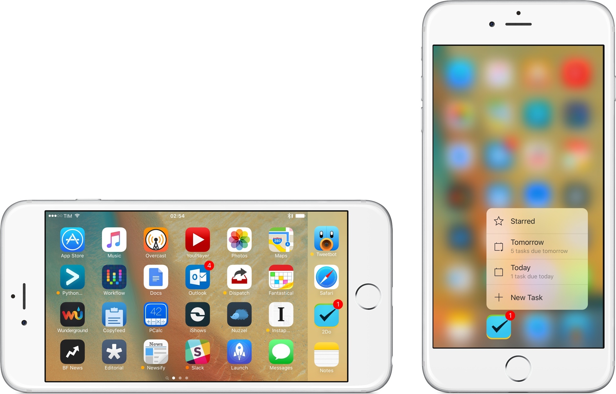
Another transformation caused by 3D Touch happens outside of the app, and into the app icon itself. With 3D Touch, apps can now define up to four Home screen quick actions that will be visible on the Home screen when pressing an app’s icon. These shortcuts are contextual to the selected app – everything else is blurred in the background when they’re shown – and they can initiate actions or take you into specific views with deep links. 3D Touch quick actions point to Apple’s continued investment in the Home screen structure, and they’re becoming an essential part of my workflow.
Quick actions build upon Apple’s focus on deep-linking and increased visibility for discrete app views in iOS 9. By unbundling features and points of interest from their apps, developers have been able to expose them directly in search and Universal Links; quick actions are the next logical step to bring these app units directly to users via the Home screen and 3D Touch.
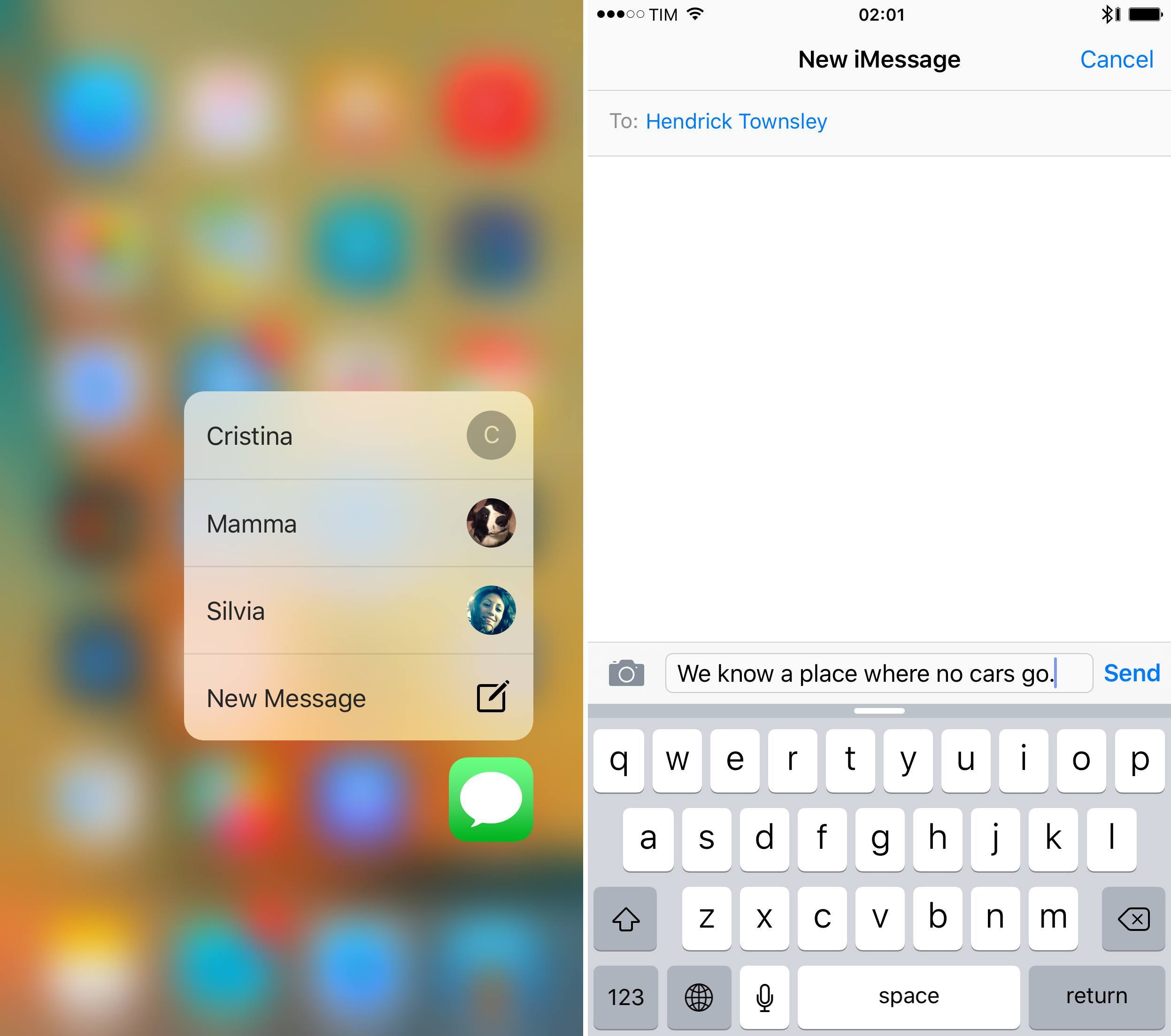
I’ve been rethinking my Home screen to put the apps I use the most toward the bottom, so it’s easier for my thumb to reach their icons and activate quick actions. Apple’s Messages is a good example: by pressing the icon, I’m presented with a button to create a new message as well as a list of most common conversations. I’m using conversation shortcuts constantly to jump straight into a message thread with my girlfriend or my mom.
When I go pick up my girlfriend at class every day, for instance, I no longer have to open the Messages app, reset whatever I’m doing (such as closing an existing thread), and find her; I can just unlock my iPhone to the Home screen, press on the Messages icon, and go directly to our conversation with the keyboard ready to type. Like peek and pop, this leads to less time spent navigating and decreased cognitive load as I don’t have to figure out how to get to what I want.
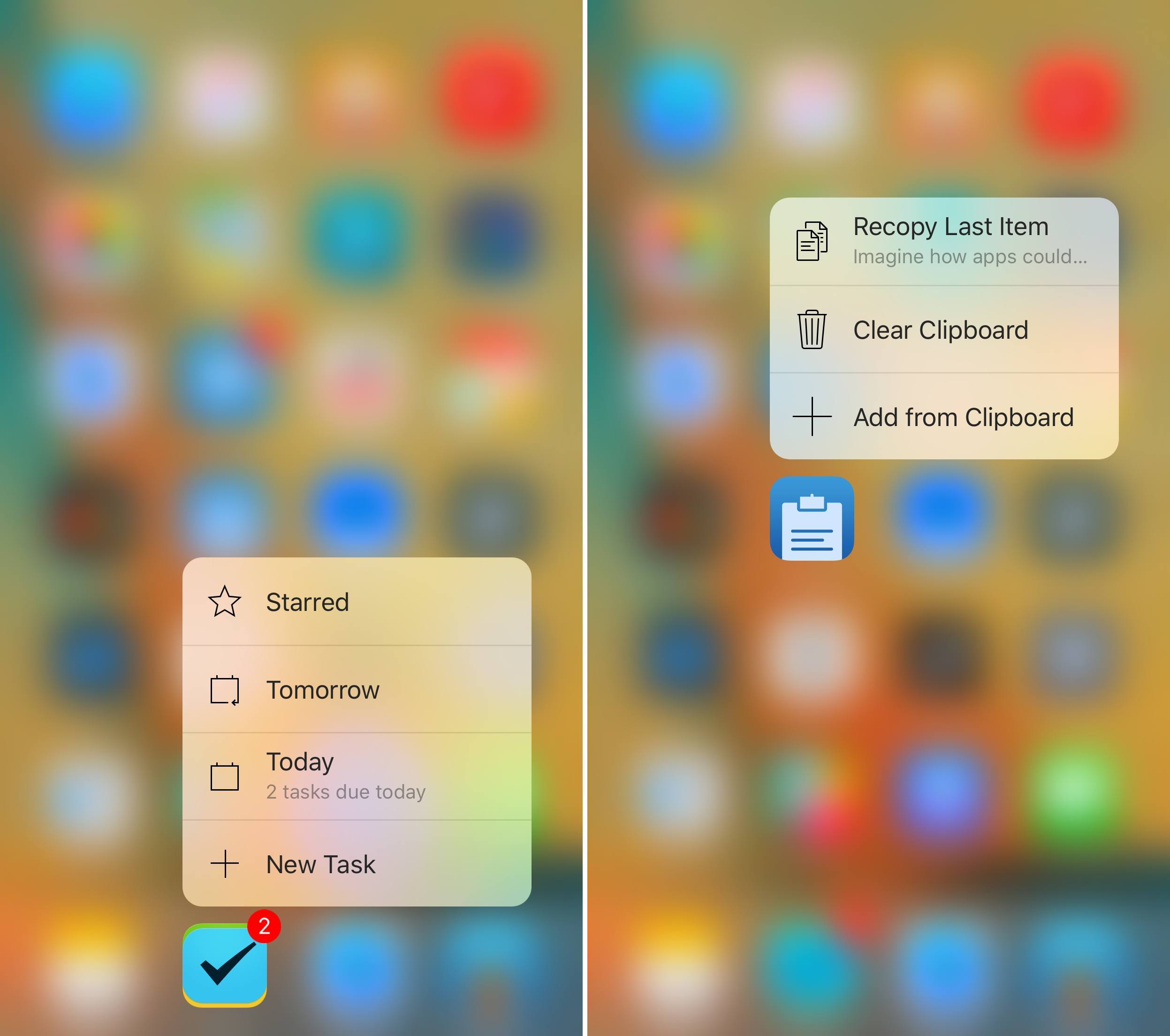
In addition to messaging – which I believe will greatly benefit from 3D Touch over time7 – Home screen actions are a boon to productivity. 2Do, the task manager I’ve been using after switching from Todoist, lets me create a new task from my dock or view what’s due today at a glance. The quick action menu can contain descriptions alongside labels for buttons (up to two lines of text): 2Do displays the number of tasks due on the current day or tomorrow, while Copyfeed shows me the first few words of the last bit of text stored in the app, which I can re-copy.
Apps like Launch Center Pro, PCalc, and Workflow are showing how 3D Touch combined with dynamic actions can be an efficient tool for those who get work done on iOS. All these apps have implemented a customizable quick action menu, which I believe is the right move to allow users to choose how they want to save time.
I’ve been enjoying this feature in Launch Center Pro: I’ve created shortcuts to jump to some favorite websites (which Safari doesn’t have), as well as custom buttons to use the share sheet for some text I’ve copied in the clipboard. Nothing that wasn’t possible before in the app, only now is surfaced in a natural way on the Home screen without compromising its simplicity.
Speaking of Apple’s web browser, while I’d gladly swap the ‘Show Reading List’ and ‘Show Bookmarks’ actions for specific bookmarks, I’ve been using Safari’s ‘New Tab’ quick action a lot. I use this to start a new Google search and, as I detailed in last week’s issue of MacStories Weekly, peek at my favorite websites with 3D Touch. When I open a new tab from the Home screen, Safari shows the Favorites grid immediately, and I can press on a website icon to open a peek.
Home screen quick actions are also beneficial to media apps. In Overcast, Marco Arment has added shortcuts to resume playing an episode and recommend it to other users; there’s an argument to be made about these options being better suited for Control Center, but I’m glad they’re also on the Home screen.
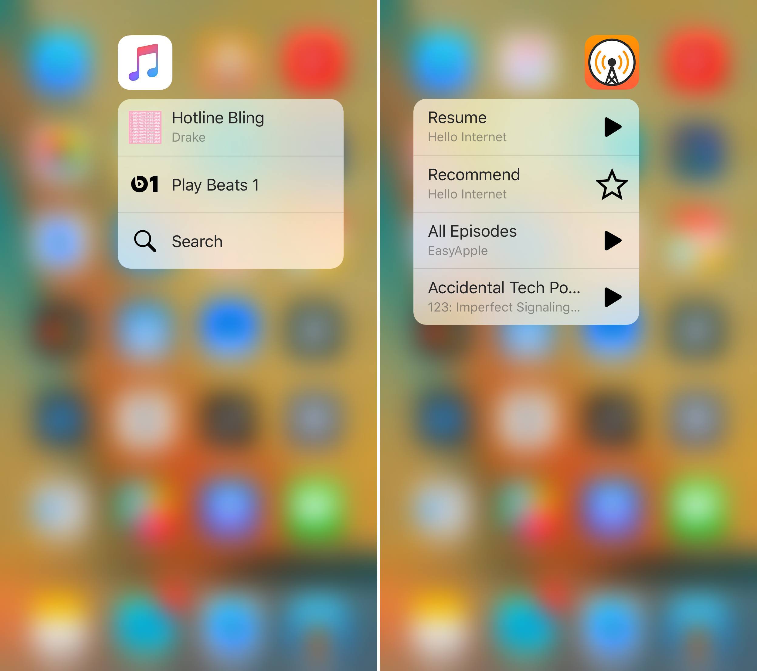
With 3D Touch, Apple had the chance to simplify navigation for its Music app, which now lets you jump to Beats 1 and Search from the Home screen – admittedly, two highly-accessed features that are too hidden without 3D Touch. Shazam deserves a mention as well: the app got so busy with social and recommendation features over the years, the ‘Shazam Now’ action on the Home screen is refreshing.
Apple’s Photos makes for an intriguing study of 3D Touch’s raison d’être. Like other apps, its quick action menu surfaces most recent items, favorites, and a shortcut to search. But, Photos’ menu also includes a ‘One Year Ago’ button that takes you to the search screen, showing photos and videos from the same day a year before in a stream of old memories which is reminiscent of Everpix and Timehop. This isn’t an app’s screen or visible feature, like Shazam’s button may be; ‘One Year Ago’ is a filter for search, which I bet most users don’t know about.
A couple of weeks into the iPhone 6s Plus, 3D Touch has me rethinking how I organize my apps on the Home screen and which features I expect to be able to access quickly. In many cases, I’m preferring 3D Touch shortcuts to traditional navigation in apps because it’s easier and faster. There are some aspects I would improve: some Apple apps don’t support 3D Touch quick actions at all, and I’d urge every developer (both Apple and third-party ones) to make actions customizable for users.
Live Photos
While not strictly related to speed improvements and changes to my workflow, Live Photos deserve a note as they’re something special.
Photos are the static representation of a moment. Our smartphones have gotten smarter at letting us take pictures quickly, and anyone can do it.
Videos are the moment, fully immersive with audio and motion. Our smartphones continue to shoot better video each year – the 6s Plus can record 4K video at 30 fps – but a good video requires patience and practice. Videos also take up a lot of storage on our devices.
Live Photos are something in between. They’re normal photos, but they come alive under your finger when you express your intention to remember. Live Photos are imbued with the immediacy of pictures and the fleeting nature of a moment.
Live Photos are the human metadata behind a static memory.
This is a smart move by Apple. There’s nothing inherently revolutionary about Live Photos from a technological standpoint: sure, the iPhone’s camera takes a video alongside the picture, but JPEG and MOV files hardly impress anyone these days. Rather, the appeal of Live Photos lies in what this new mode doesn’t do: there are no complicated settings to adjust – Live Photos just happen alongside regular pictures if you leave a yellow button enabled. The iPhone’s camera UI doesn’t overwhelm you with information about the video file inside a Live Photo. In fact, you never “manage” the video itself: the concept of a file inside the photo is completely abstracted from Live Photos, which are just that – photos that come alive. It’s a simple name that tells the whole story.
My heart is broken for all those times when I didn’t have the patience to take a video of my dog. I have pictures of her, and I have memories, but I can’t replicate those moments digitally anymore. They’re gone. I’m looking at Live Photos now, and as I browse my collection, I wish I had a live version of my mother and I hugging after doctors told me I was fine. We were laughing and crying and then we composed ourselves for a moment to send a selfie to my dad. I remember that moment, but its digital remnant is static. I wish all those smiles moved.
But here’s where I find some solace: from now on, I’m going to keep Live Photos always enabled for all my pictures. A live photo takes up double the storage of a regular picture, and I don’t care. I bought a 64 GB iPhone for this very possibility, and, with iOS 9.1, a lot of apps to “clean up” Live Photos and remove video from them (re-saving them as normal images) are about to hit the App Store. I’d rather worry about storage later than losing the precious, ephemeral moments captured by Live Photos forever.

Speaking of iOS 9.1, Apple’s latest software update brings an improved Live Photo experience that detects sudden camera movements and stops recording a live photo if you raise or lower your iPhone. The change is aimed at fixing the problem of Live Photos showing desks and floors as an iPhone is lowered after taking a picture while the camera is still recording video. So far, the new system seems to be working – the ‘Live’ label disappears from the camera view when I put the iPhone down, which keeps Live Photos from ending abruptly.
In the future, I’d like to see Live Photos maturing to include higher-quality videos, and perhaps new Photos features to automatically create mini videos and interactive collages from Moments and Live Photos. But already in this first version, Live Photos show a more human take on the traditional photo, which is something I don’t want to live without going forward.
A Reshaped Experience
The iPhone 6s Plus is a remarkable upgrade, yielding an experience reshaped around faster, more efficient interactions. For someone who gets work done on his iPhone and iPad, its practical speed gains are worth the price of admission.
As a former 6 Plus user, the 6s Plus fixes the missteps I mentioned earlier this year: the device no longer feels sluggish and struggling to catch up with the OS; the new Taptic engine is considerably better than the old iPhone vibrator; Touch ID is dramatically improved and even the mute switch seems harder to trigger accidentally.
There’s still room for refinement: rotation feels like it’s only becoming more stable now with iOS 9.18, and Plus-optimized apps continue to be inconsistent in their adoption of special landscape layouts. And, after spending a few months with iOS 9, I believe the 6s Plus should have access to a smaller version of Picture in Picture for watching videos anywhere. For the most part, all my other criticism regarding iOS 9 applies here as well.
Overall, however, I’m convinced that the 6 Plus was the right decision for me, and the 6s Plus solidifies it in every way. The new Touch ID sensor is a pleasure to use as I can get to my apps (and use 1Password) more quickly than ever. Apps, widgets, and extensions are snappier and I can run my workflows – which include Python scripts, too – without delays and random lock-ups. More RAM means apps I’m using stay active for longer and widgets can load information in a second without glitches. 3D Touch, in its various forms9, is rethinking iPhone navigation and the idea of previewing content and using shortcuts. Apps without 3D Touch actions are already feeling out of place – as if they lack an important new dimension.
The iPhone 6s Plus is more than faster chips: it brings a nimble, more productive iOS experience that makes everyday interactions better. I can’t wait to have some of this on my iPad as well.
- Using my index finger to click the Power button. ↩︎
- Of course, I think having separate Force Touch and 3D Touch monikers adds unnecessary confusion to Apple’s lineup. The implementation is different across iOS, OS X, and watchOS, but Force Touch is also capable of recognizing different levels of pressure, treating gestures like gradients. On OS X, QuickTime’s controls react differently depending on how deeply you press – it’s not a static, one-way shortcut. Similarly, you can press the watch face on Apple Watch and do it subtly to see the clock slightly recess in the background. There’s no good practical reason for letting both the Force Touch and 3D Touch names coexist. ↩︎
- This applies to WKWebView, UIWebView, and the Safari Services framework. ↩︎
- Supposedly, iOS has gotten smarter at separating long presses from 3D touches in iOS 9.1, which seems to be the case so far, though, again, it could be that I’m just getting used to the gesture every day. ↩︎
- Developers can only configure peek quick actions with the UIPreviewAction API. ↩︎
- Which is why I can’t wait for Slack to implement quick actions. I want to be able to define my own channels and DMs to pin to the Home screen. Please, Slack? ↩︎
- Although I can still get my Home screen stuck in a different orientation than the one I locked my iPhone into. ↩︎
- I’m even using it to switch between apps by invoking the app switcher. Initially, I thought this new gesture was kind of odd. It takes some time getting used to. The trick is to learn that you can press your thumb somewhere along the left edge of the screen (you don’t have to be precise) to peek and swipe to the latest app, or press harder to pop the app switcher open. It takes some practice, but it’s convenient. ↩︎