Apple’s Health app first debuted in 2014 as part of iOS 8. In the five years since its launch, Health has been one of the only iOS apps to receive redesigns every couple of years. The basic purpose of the app has remained the same through those changes, still serving as an aggregation tool for wellness data from sources like the Apple Watch to third-party apps and devices. However, Health’s regular reimagining serves as strong evidence that Apple has never quite felt content with how that original goal was being fulfilled.
It may be too early to cast judgment, but I have a strong suspicion that this year’s rebrand will stick. iOS 13’s Health app finally brings a design that feels intuitive and user-friendly, doing away with complication and creating a streamlined, inviting interface. Simultaneously, this year’s update adds compelling new features related to cycle tracking and hearing health that may hint at an evolving vision for the Health app’s future.
Design
The original Health app, besides suffering from a serious stumble out of the gate, felt overly complicated in its design. An assortment of different screens and graphs were available for viewing each data point, spread across separate Dashboard, Health Data, and Sources tabs and breakdowns by Day, Week, Month, and Year. It was a lot to navigate, and felt especially like overkill at the time because HealthKit-integrated sources were few and far between in the pre-Apple Watch days.

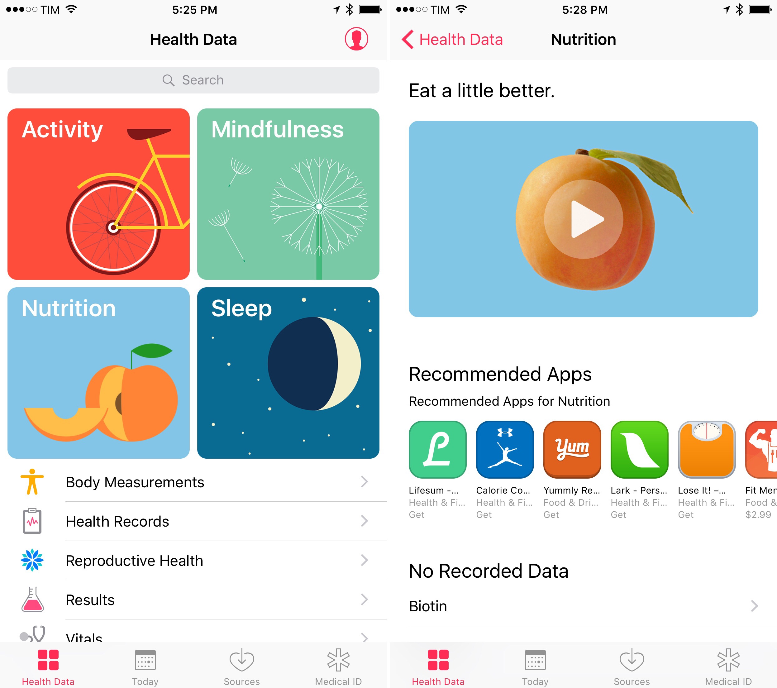
After two years of iterative improvements, Health received its first true redesign in iOS 10. Health Data became the new primary tab, headlined by four colorful featured sections laid out in a grid. Behind these featured Activity, Mindfulness, Nutrition, and Sleep banners you could find a video Apple created for each subject, highlighting its importance for personal wellness. Underneath these four highlighted areas, the Health Data tab also listed certain key categories like Body Measurements, Health Records, Reproductive Health, and more. Besides these changes, the Dashboard screen was renamed Today, and given a fresh look for displayed data. Sources and Medical ID tabs remained as-is without notable changes.
In iOS 13 Apple introduces the second redesign to Health, and it’s a good one. Everything has been simplified and streamlined, features like favorite data points work like they always should have, and the addition of App Store-style articles make education a more prominent function of Health than before. The app looks better than ever too, thanks to icon and typography tweaks that give Health a more fun, modern flavor.
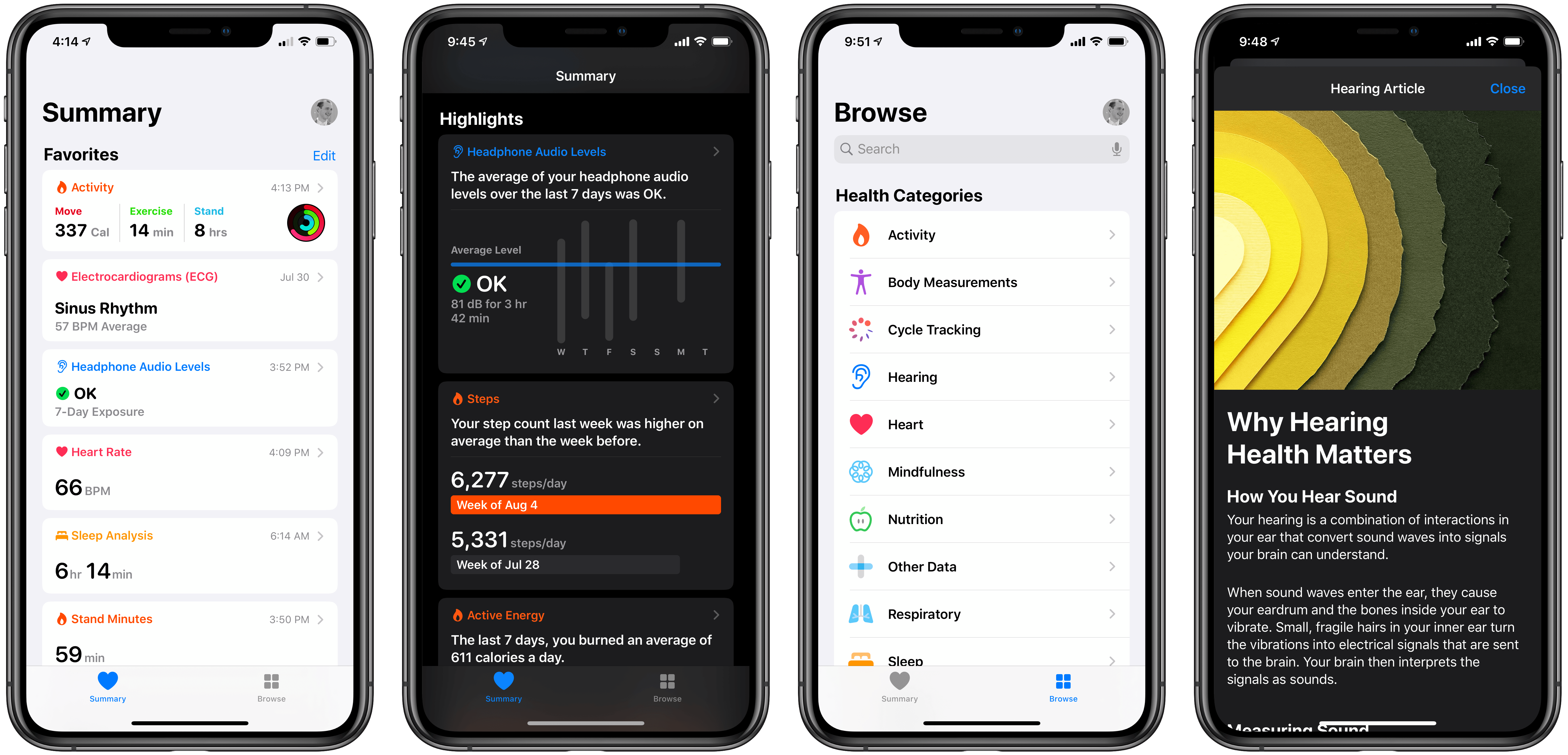
The new Health app contains only two navigation tabs: Summary and Browse. Summary hosts a variety of content sections, including a dashboard view of each data type you’ve labeled a favorite, a new Highlights area that displays interesting overviews of your recent data, a Get More From Health section featuring articles and suggested features to take advantage of, and lastly Summary includes a few recommended HealthKit apps to try.
The Summary screen reminds me of what Apple did last year with the Reading Now tab inside Apple Books. In Reading Now, Apple mixed together a variety of content sections such as the books you’re currently reading, your Want to Read collection, For You recommendations, and more. Reading Now was meant as a one-stop destination for your book-related needs, and Summary serves the same purpose in Health. While previous versions of Health were more fragmented, with the Summary screen Apple puts all the data you might want in one place, and sprinkles it with niceties like the new articles and feature suggestions. You can always tap through the different content that Summary surfaces to get more detail, but what’s available from the root page is a fantastic overview that eliminates much of the need to explore other parts of the app.
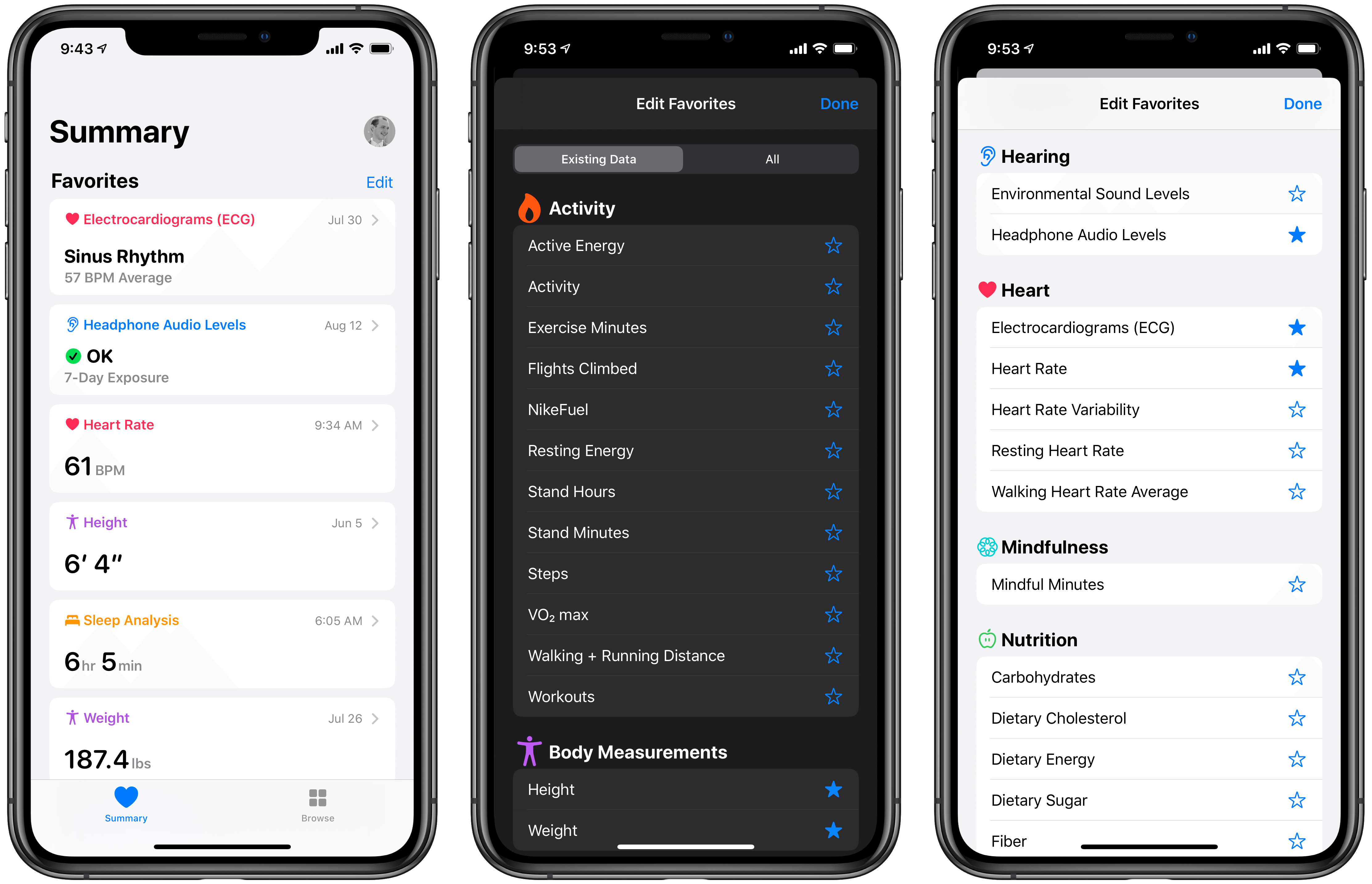
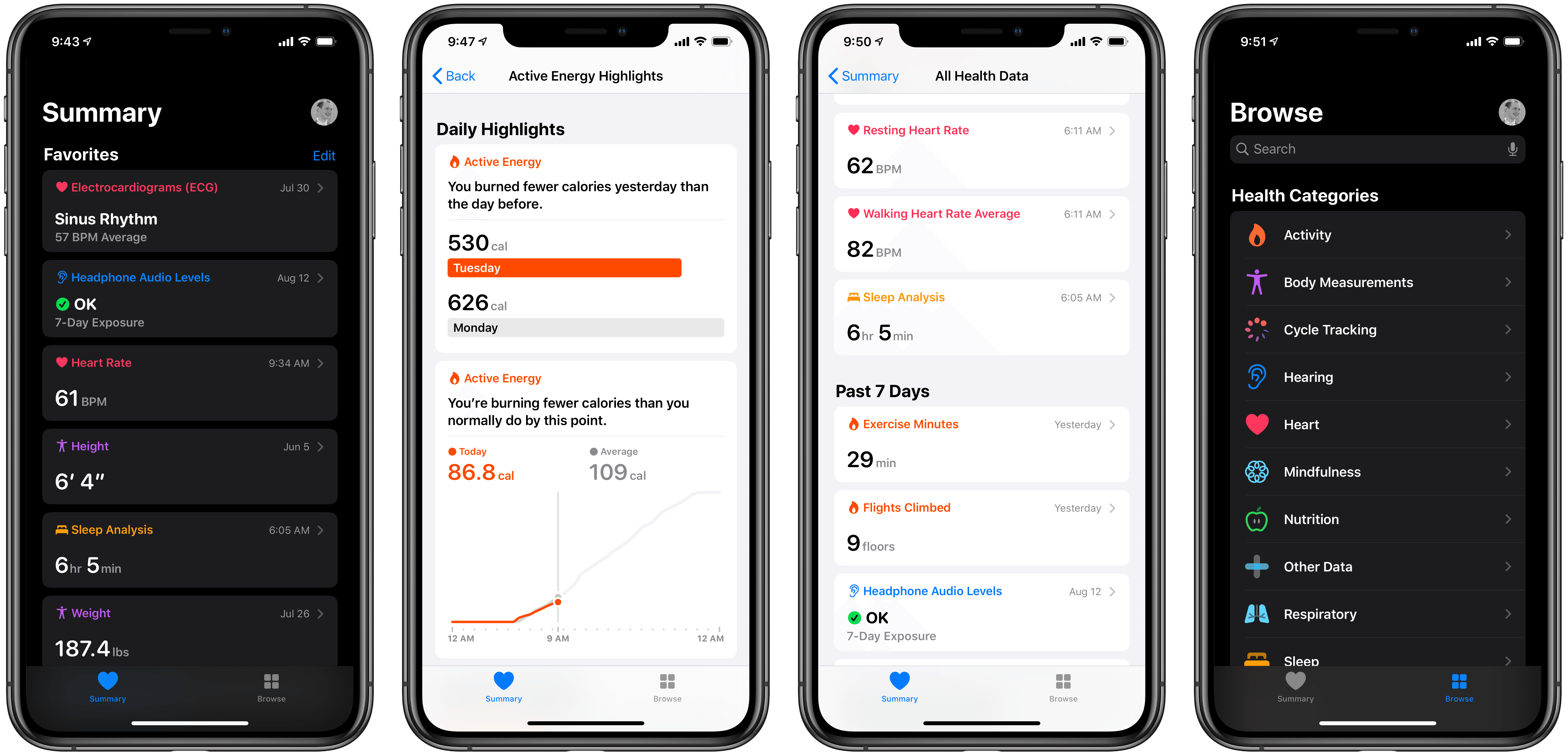
As I mentioned, favorites sit at the top of the Summary screen, finally receiving the place of prominence I’ve always thought they deserved. Each favorited data type shows the latest inputted data, and you can tap through to see the full page for that type with graphs, educational info, and more. Tapping the Edit button in the top-right of the Favorites section lets you view all data types and favorite them from one place. The one missing feature is the ability to reorder favorites so they display in the order you choose – currently that’s impossible.
The new Favorites section is far and away the change I appreciate most in this release, because it meets almost every need I have when opening Health. Apple’s previous attempts at a central Health screen always came up short. In the original Health app, data on the Dashboard was essentially the equivalent of Favorites, but the way that data was visualized wasn’t very user friendly. In iOS 10’s redesign, the current favorites system was introduced, but there was no way to view all favorite data in one place. The Health Data screen required tapping into each data type, where you’d see favorite selections at the top of their categories, but they were all isolated from each other. The Today screen in iOS 10 wasn’t a good substitute either, because it wouldn’t show data older than the current day. With the Favorites section in iOS 13’s Health update, all data points you care about can live in one place, showing their most recent data whether it’s a month old, a week old, or was just added.
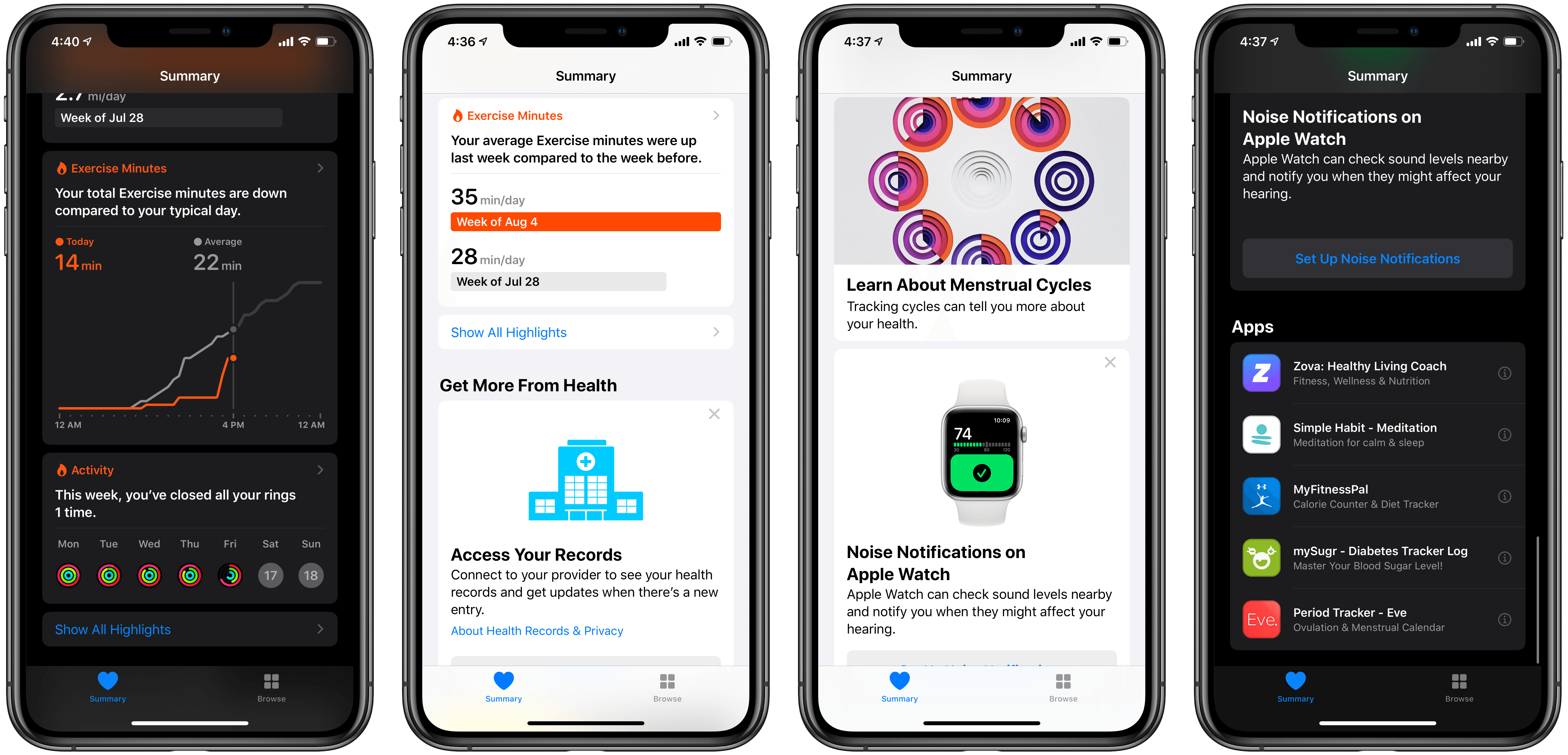
Below Favorites, the Highlights section surfaces graphs and charts that display relevant comparisons of recent health data. For example, you might see a highlight comparing the number of stair flights you climbed last week versus the week beforehand, or showing your average distance walked at certain points during the day. Summary only displays a few highlights at once, but you can tap the Show All Highlights option to dive deeper into the data at any time.
The remainder of Summary offers a grab bag of feature suggestions under the banner Get More From Health, like recommending you check out Health Records, along with articles by Apple’s Health team, and a few third-party apps worth checking out. Articles are the most significant addition because they’re entirely new in iOS 13.
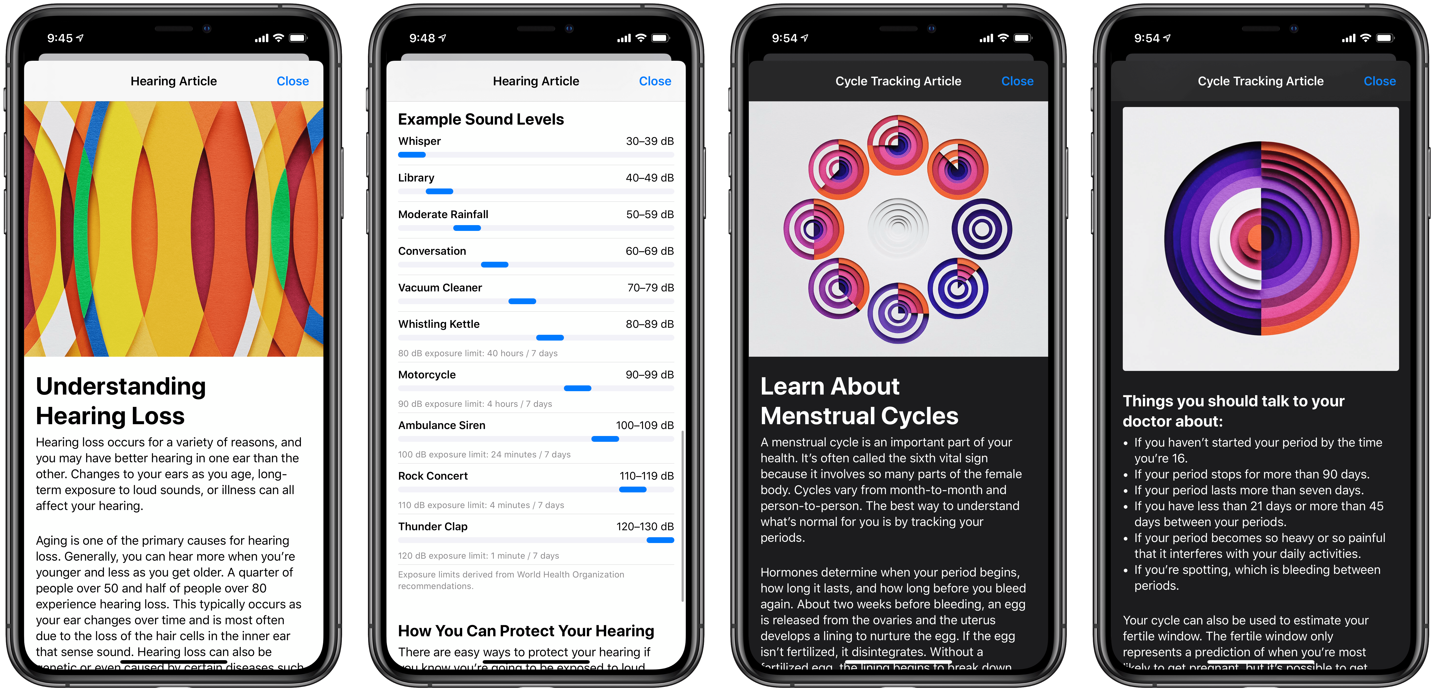
Health’s educational articles adopt a design similar to the Today stories in the App Store, making them feel very familiar. The current number of articles is extremely limited, with Apple focusing its efforts on articles for two of the new data categories in iOS 13, Cycle Tracking and Hearing Health. I expect we’ll see more articles added over time though, following the trend of these initial stories by providing accessible education on important subjects. You’ll see a couple articles featured on the Summary page, but you can also find stories on their respective data type pages.
Now that Apple carries a staff of doctors working on Health, Apple Watch, and related endeavors, the addition of education-related materials feels like a logical next step for the Health app. It’s one thing to have access to important data, and another thing entirely to understand how to interpret that data. I hope Apple eventually offers articles for every data category in Health.
The only other navigation tab in iOS 13’s Health is Browse, which is headed by a search bar but mostly consists of the various data categories you can explore, including a special section for Health Records. If there’s data you access infrequently and thus don’t want to favorite, you can find it in Browse, but most of the time you shouldn’t need to use this tab.
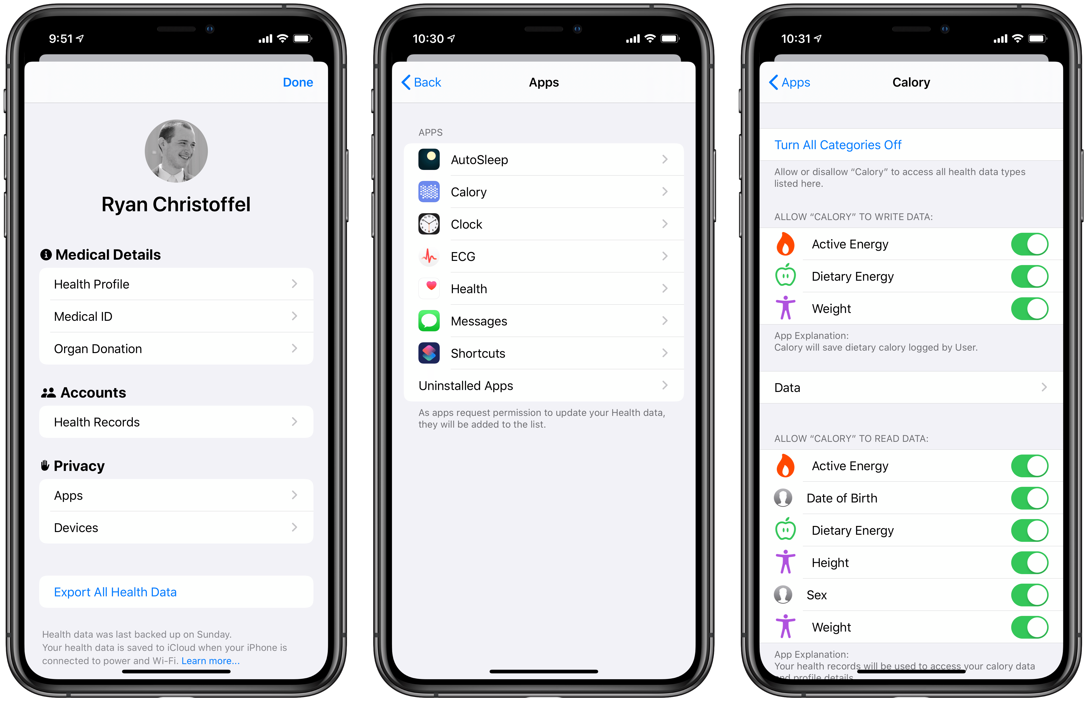
Everything not found in either the Summary or Browse tabs lives behind your profile picture, which now resides in the top-right of each main view like it does in the App Store and TV apps. Tapping this provides access to your Health Profile, Medical ID, HealthKit apps currently granted access to your data, and more. With the latter, you can easily see and manage specific permissions each app has without ever leaving Health.
Cycle Tracking
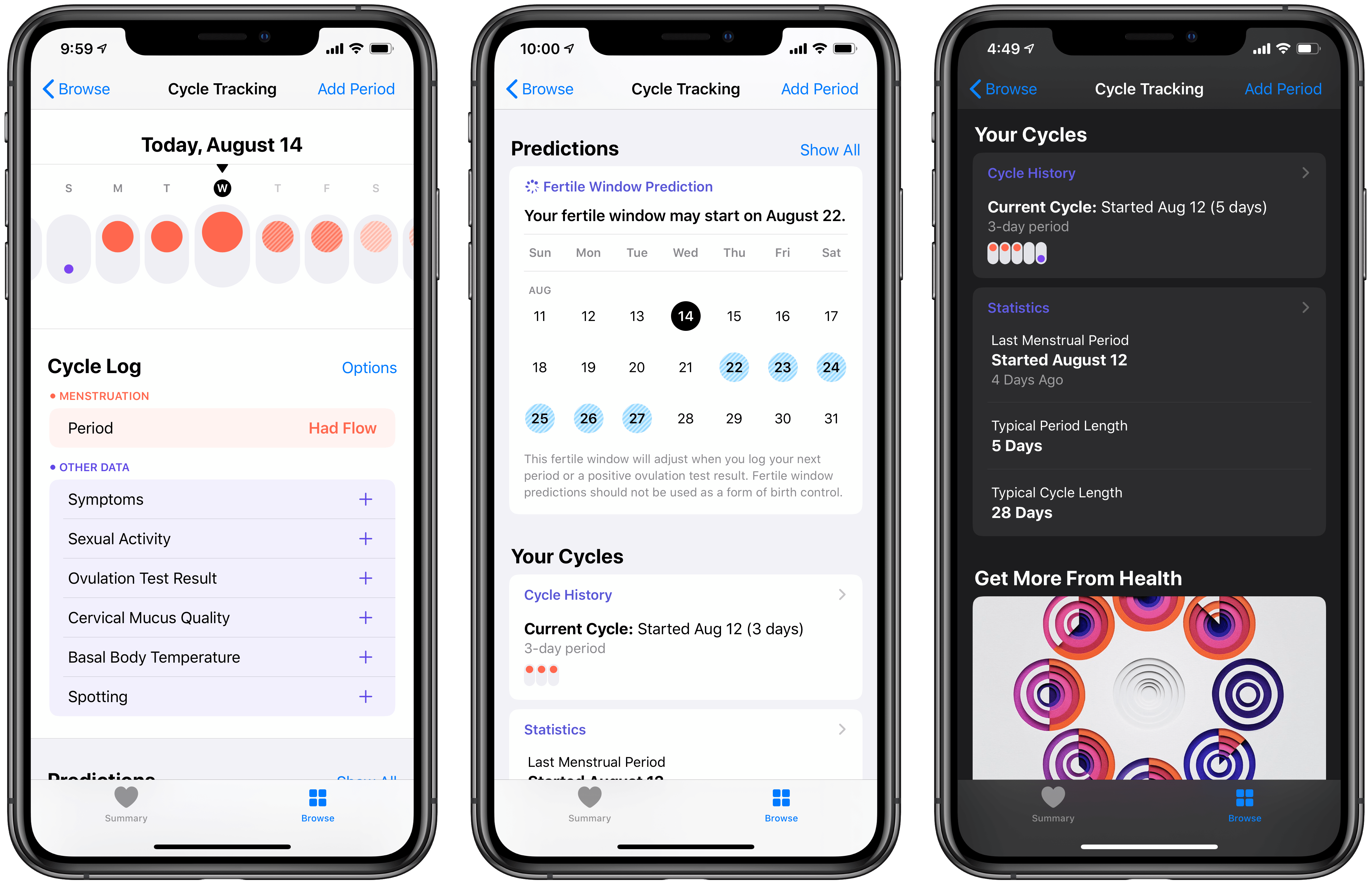
Long available through third-party apps, Apple has now built its own cycle tracking feature into iOS 13’s Health app. It enables logging various data points related to your period, such as flow level, basal body temperature, spotting, and symptoms like a headache or cramps.
When setting up cycle tracking for the first time, Health asks information about when your last period started, how long your period usually lasts, and the average length of your typical cycle. This information serves as a foundational reference point so Health can predict the start of your next period even before you begin regularly logging anything. After the setup process is complete, you’ll see a walkthrough of exactly how cycle tracking works in Health. The app explains its visual system, wherein a solid red dot on its cycle chart represents a day you logged your period, the addition of a purple dot means you logged a symptom or event too, lighter shaded red dots represent a prediction of flow, and finally, blue shading is used in Health to represent your likely fertile window.
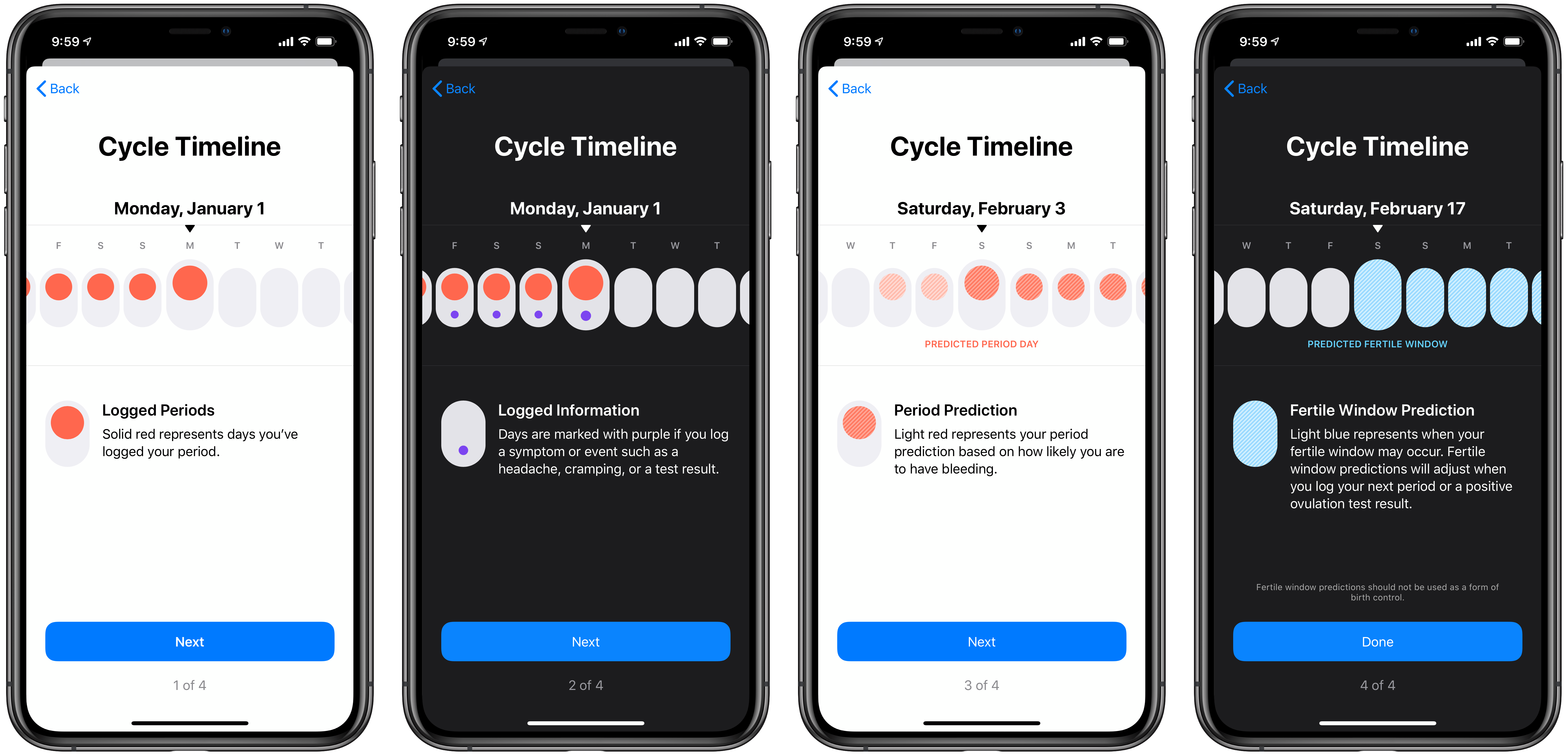
After the setup and tutorial process is complete, you’ll see the main Cycle Tracking screen, which starts with the visual timeline I just detailed, wherein a week’s worth of days are displayed with the appropriate colored dots to represent activity or predictions. Next are convenient buttons for logging aspects of your cycle, and as you scroll down you’ll see dedicated sections for predictions, your cycle history, and educational information.
When logging data about your cycle, there are seven different categories you can log: Flow, Symptoms, Sexual Activity, Ovulation Test Result, Cervical Mucus Quality, Basal Body Temperature, and Spotting. Tap any one of these from the main cycle tracking screen and you’ll be brought into a card-like interface where each of the seven categories can be swiped through for logging relevant data. The system keeps things simple and user-friendly, and the card-swiping navigation is unique among other first-party iOS apps.
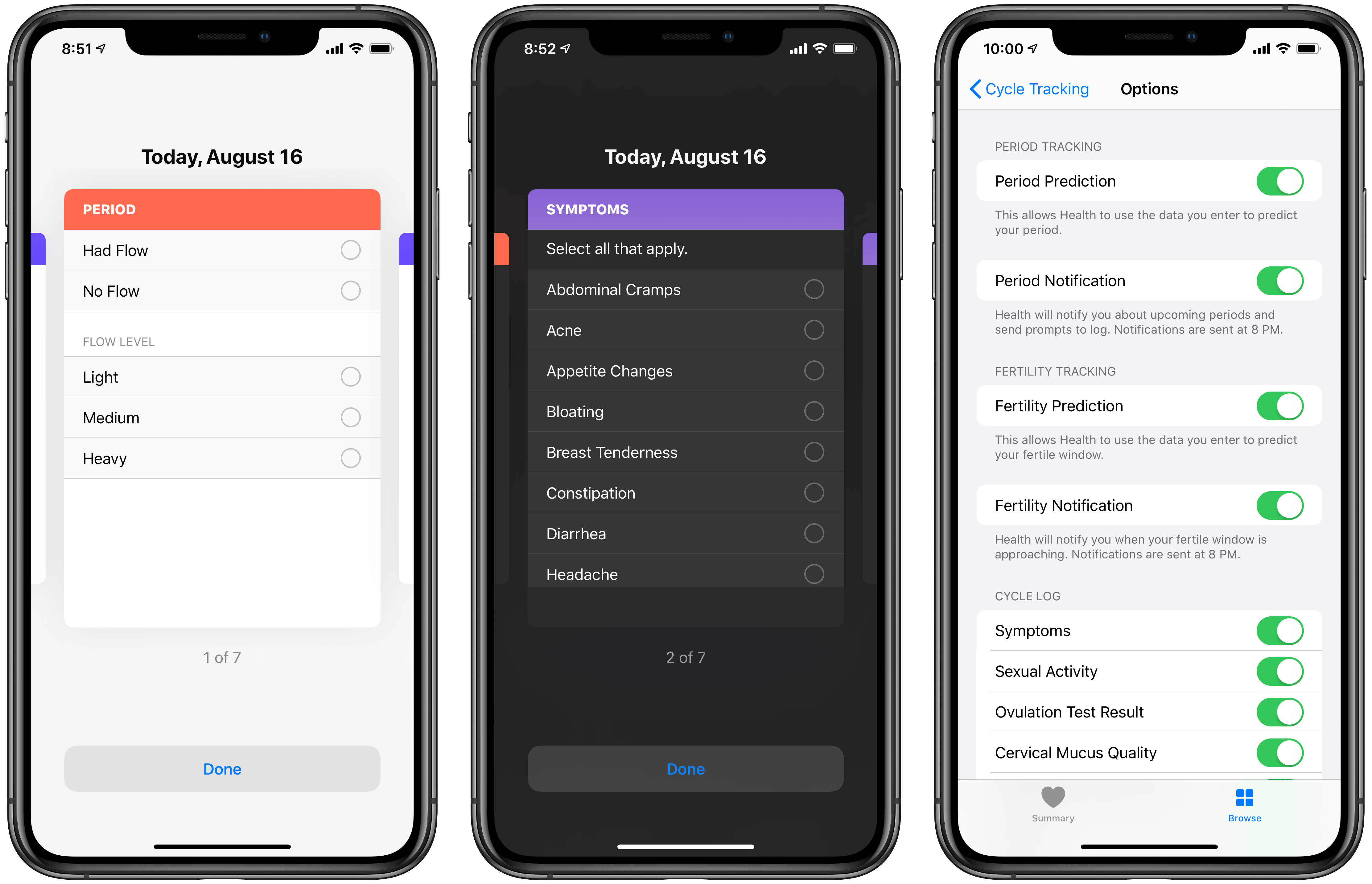
Health’s cycle tracking can offer predictions both for when your next period will start, and for your next fertile window. This information is visible throughout the cycle tracking screen, but it can also be delivered via push notifications if you’d like such proactive alerts. For your period, turning on notifications means you’ll not only be alerted to an upcoming period, but there will also be prompts to log data during your period. With fertility notifications, Health alerts you when it believes your fertile window is approaching. Each of these notifications is scheduled to deliver at 8 PM on the nights they’re needed.
What Apple has created with Health’s cycle tracking is more robust than the functionality offered for tracking any other kind of wellness data. Cycle tracking is a full-blown feature inside Health, with a variety of sub-features that enhance it – and it’s available not just on iPhone, but Apple Watch too. Though I’m guessing third-party cycle tracking apps may offer more functionality than what’s available in Health, Apple has nonetheless done something noteworthy here: cycle tracking shows how Apple’s vision for Health is expanding, moving the app from a mere data hub into a user-friendly, feature-driven tool for managing your health.
Hearing Health
Hearing health is another big new area of wellness tracking in the Health app. And like cycle tracking, hearing health encompasses not just a new data type that apps can record data for, but a suite of features that take advantage of existing hardware. With hearing health, Apple is shining a light on something that many of us never think about.
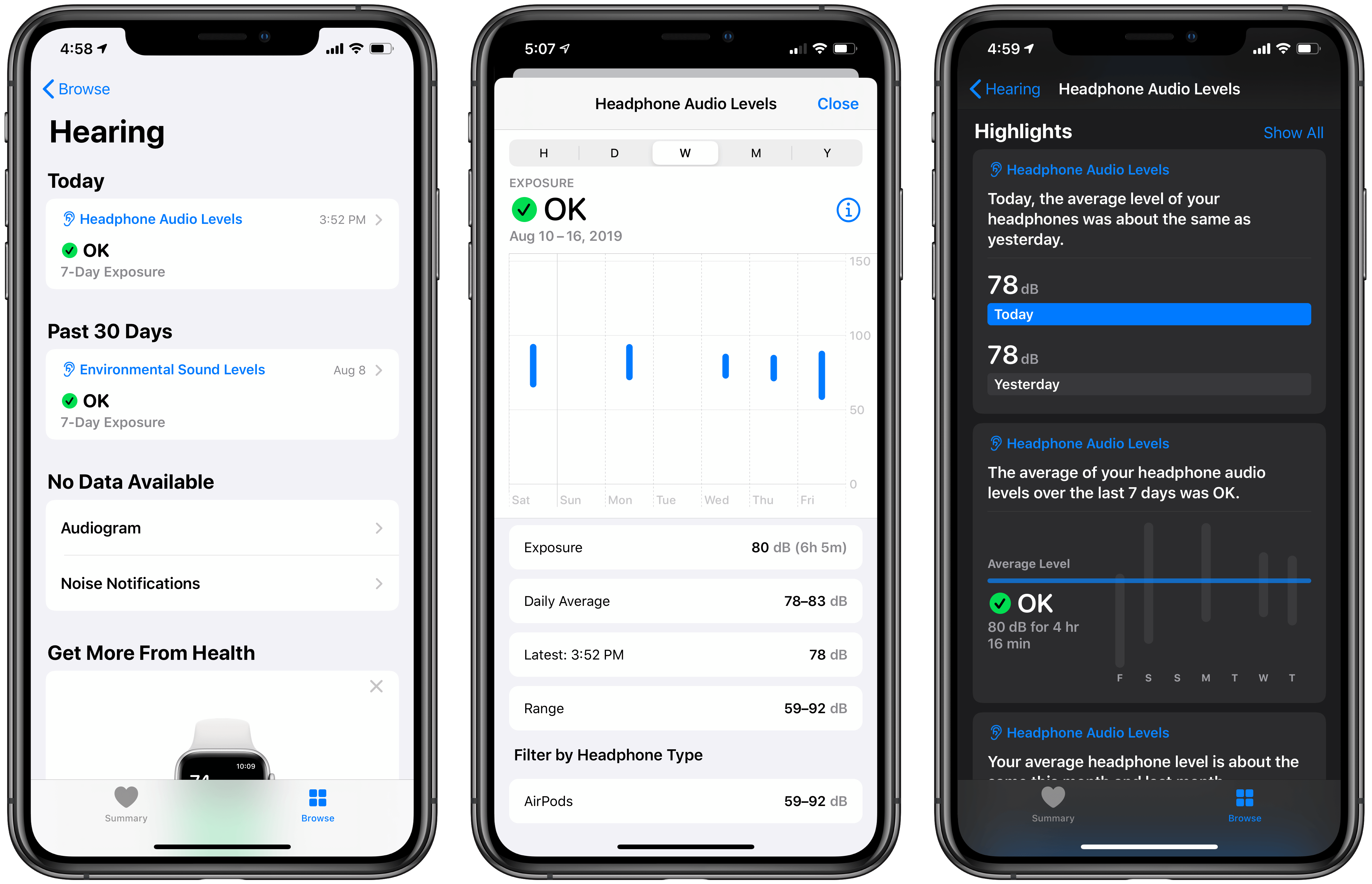
Under the banner of hearing health, the Health app can track a few different data points: Headphone Audio Levels, Environmental Sound Levels, Audiogram, and Noise Notifications. Of these, three out of four contain data that can be gathered without the need for a third-party app, using only the Apple hardware you own and the Health app; audiogram is the odd one out.
Headphone Audio Levels measures the A-weighted decibels of your headphone audio. This happens automatically, with no extra effort on the user’s part, but it works best when using Apple or Beats headphones. According to the explanatory text inside Health:
Audio played through other headphones or speakers connected via a wire can be estimated based on the volume of your device.
In other words, Apple and Beats devices can provide Health with more accurate, nuanced data, while measurements for all other headphone audio is simply based on your device’s volume setting. Still, in all cases you get data automatically saved without needing a third-party app or buying a new health accessory, which is great.
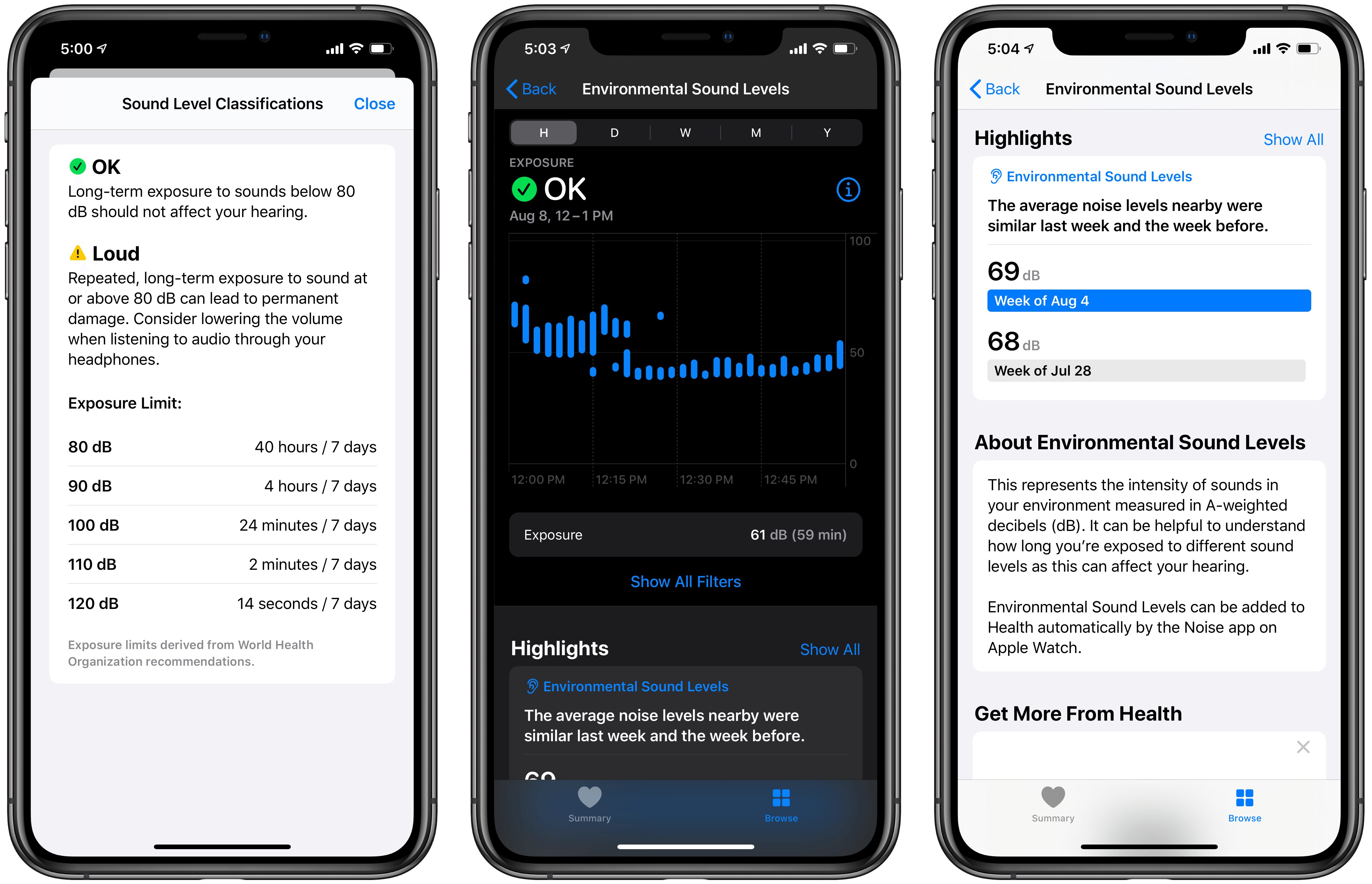
My audio level data reveals that I typically listen right at the border of what’s recommended for sustained periods of time, at around 80dB. The app assigns your levels a ranking (OK or Loud), and also gives guidance based on World Health Organization recommendations for what exposure limit you should try to maintain for different levels. According to Health’s WHO-inspired chart, 80dB is fine for 40 hours every 7 days, but if my average level rose to 90dB, that would only be safe for 4 hours every 7 days.
Health also tracks your environmental sound levels, which are collected in the background by a paired Apple Watch. At regular points throughout the day (typically every 30 minutes while in use) your Watch will quickly sample the current noise level of your environment and save that data to Health. At WWDC when Apple first announced these environmental noise detection features, it stated that the Watch will never record or save any audio from its samplings.
Environmental sound levels aren’t the only way that hearing health takes advantage of an Apple Watch, though. Like cycle tracking, there’s actually a full-on Apple Watch companion app too. In this case it’s the Noise app, which builds on the Watch’s audio sampling by sending you a notification whenever noise levels appear high enough to have a negative impact on your hearing health. Every time you receive one of these notifications, the occurrence will be saved to the Health app under, you guessed it, the Noise Notifications category. I’m not sure how much more useful this is than just seeing environmental readings inside its own category, but I suppose it doesn’t hurt to have these significant noise events in their own section.
The Health app is changing.
Unless you’ve hardly used the app before, you won’t be able to miss Health’s redesign in iOS 13. It’s a big transformation that finally, for my uses at least, completely rights all the wrongs of previous versions. It’s a brilliant example of the power of iteration: Health’s interface at launch, and after its iOS 10 revamp, wasn’t terrible, but it wasn’t the elegant, accessible UI present in iOS 13. Judged on design alone, Health has finally grown up.
But there’s more at play in this update than a redesign. Importantly, Apple is pushing further into education with iOS 13’s update. App Store-style articles help provide added clarity around key wellness topics. What’s the first thing many of us do when we have a question about our health? Do a web search, of course. But search results typically are a mixed bag of information overload, unhelpful anecdotes, and even misinformation. I see a lot of potential for Apple to build out Health and its editorials as trusted sources for basic wellness education.
Finally, iOS 13 introduces cycle tracking and hearing health, two domains that could have been added as mere data points for third-party apps to populate. Instead, Apple has built a suite of features unlike what’s available for any other wellness category in the Health app. There’s a full cycle tracking system available right inside Health, accessible both on the iPhone and Apple Watch, and hearing health offers similar built-in functionality thanks to the Noise app in watchOS and integration with connected headphones. In the first few years of its life Apple seemed content to let the majority of the Health app’s data come from third-party sources, but now it’s starting to flex its ecosystem strength to make the app more powerful and accessible.
At the start of 2019 Tim Cook told an interviewer, quite remarkably, that he believes Apple’s greatest contribution to mankind will “be about health.” While the company has long leaned hard into a health angle for Apple Watch, the immense significance of such a statement cannot be overstated. Clearly Apple has big long-term plans for personal health. And I think it’s telling that in the year Tim Cook made that claim, Apple is shipping its biggest update to the Health app ever.
There’s nothing in iOS 13’s Health revision that directly merits Cook’s grand prediction, but if you take a step back and consider Health’s new user-friendly nature, push toward education, and ecosystem integration to effortlessly track your health, it’s a telling sign of what’s to come.
Health in iOS 13 is just the beginning.