CarPlay fascinates me because it’s a relatively rare example of a successful Apple software product that isn’t tightly integrated with the company’s hardware. Of course, CarPlay runs from an iPhone, but it also relies on automaker media systems to deliver its experience to users in their cars. This lack of integration shows in cars with slower media systems; however, even when automakers’ hardware provides a subpar experience, CarPlay’s simplified but familiar interface and access to content already on users’ iPhones is superior. So much so in fact that Apple says CarPlay has managed to capture 90% of the new car market in the US and 75% worldwide.
I first tried CarPlay three years ago, when I leased a Honda Accord. As I wrote then, Honda’s entertainment system was slow, but the experience was nonetheless transformative. Easy access to the music and podcasts I love, multiple mapping options, and access to hands-free messaging all played a big part in winning me over.
When my lease was up earlier this year, CarPlay support was at the top of the list of must-have features when we began looking for a new car. We wound up leasing a Nissan Altima, which has a faster entertainment system, larger touchscreen, and better hardware button support for navigating CarPlay’s UI. The hardware differences took a system I already loved to a new level by reducing past friction and frustrations even though the underlying software hadn’t changed.
Just a few weeks after we brought the Altima home though, Apple announced that it would update CarPlay with the release of iOS 13 this fall. In a jam-packed keynote, CarPlay got very little stage time, but I was immediately intrigued by the scope of the announcement. CarPlay hasn’t changed much since it was introduced in 2014, but with iOS 13, iPhone users can look forward to not only significant improvements in its design, but a new app and other features that make this the biggest leap forward for CarPlay to date.
Setup and Settings
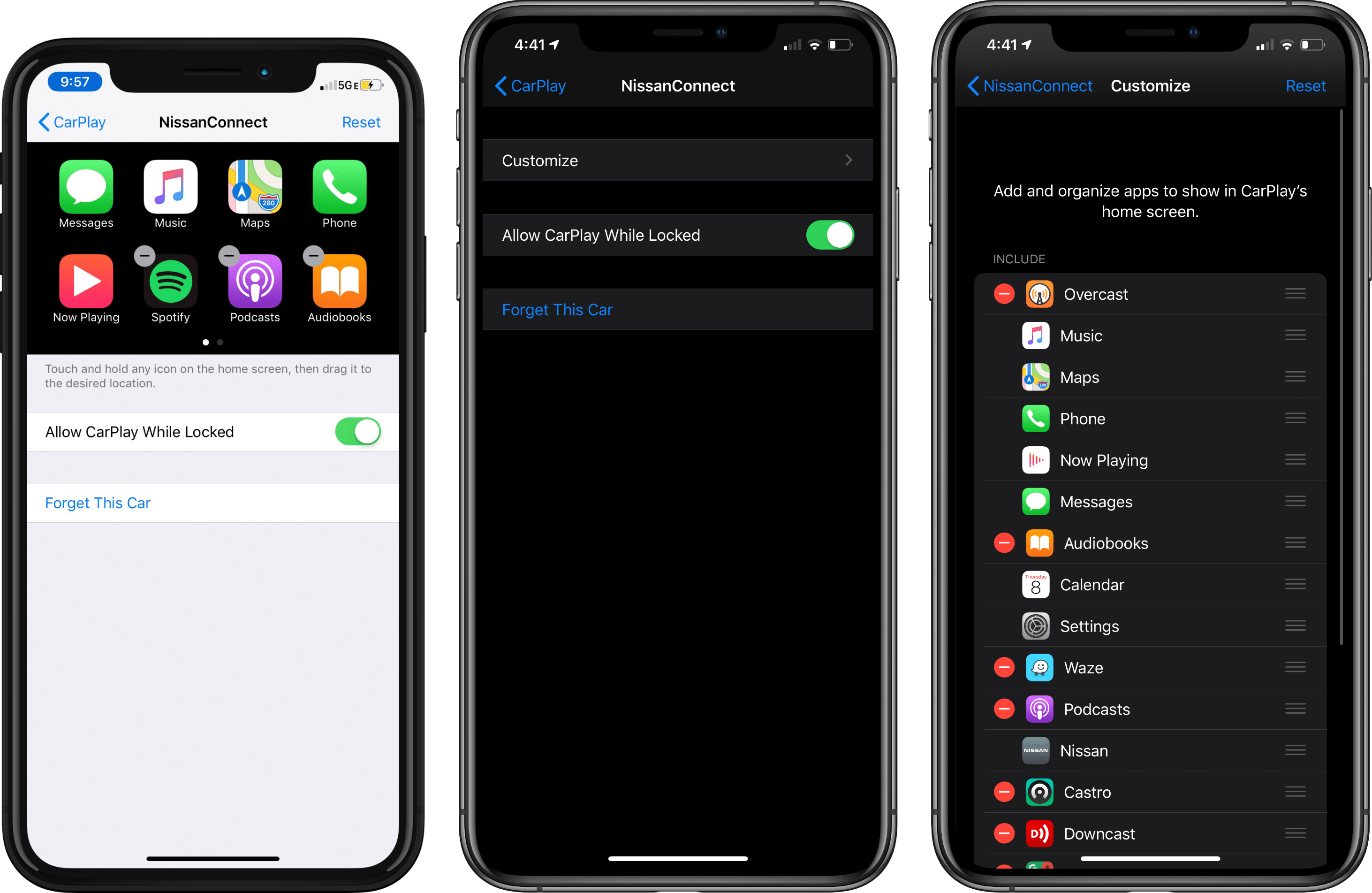
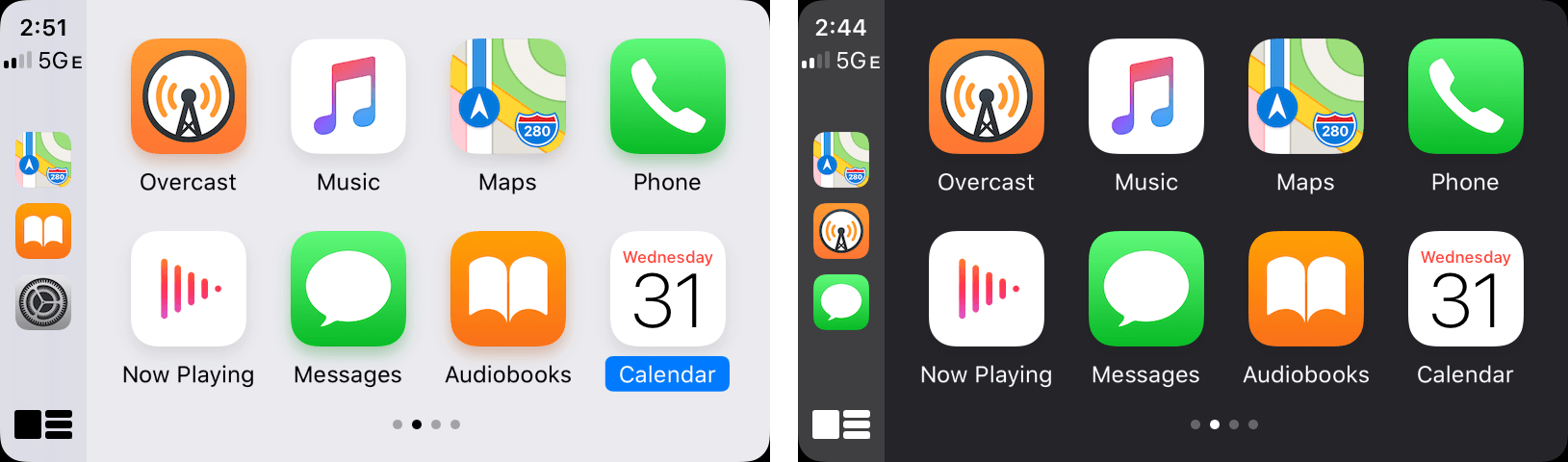
Activating CarPlay is accomplished in the iOS Settings app. Since Carplay’s introduction, after you connected your car to your iPhone in Settings → General → CarPlay, you could delete apps and rearrange them with drag and drop using a virtual CarPlay interface on your iPhone. The interface was intuitive and easy to use, but required swiping back and forth between CarPlay screens as more and more app developers added CarPlay support.
With iOS 13, instead of a virtual CarPlay UI, CarPlay’s settings include a ‘Customize’ buttonthat takes you to a screen that lets you delete and rearrange apps from a list reminiscent of what you see when editing your iPhone’s Today widgets. The new interface isn’t a one-to-one replication of CarPlay on your iPhone, but by using the iPhone’s screen space better, setting up CarPlay to your liking is faster now.
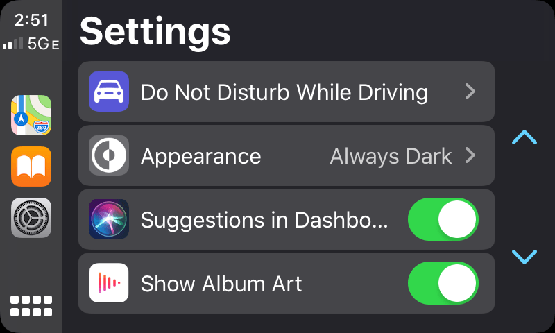
CarPlay has its own updated Settings app too. When you tap on Settings in CarPlay, you’ll find four ways to change how CarPlay behaves. The first is Do Not Disturb While Driving. Before iOS 13, Do Not Disturb could be activated when you connected to your car via Bluetooth or when driving was detected. With the new iOS 13 CarPlay setting turned on, Do Not Disturb is also activated as soon as your iPhone is connected to your car using CarPlay.
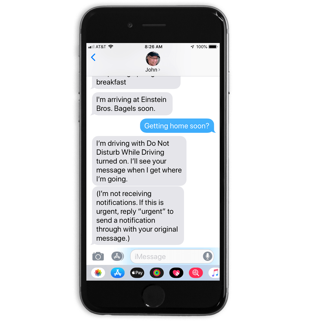
CarPlay sends an automatic response when Do Not Disturb is turned on that can be overridden in some circumstances.
Do Not Disturb’s behavior depends on how you have the feature set up in the Settings app on your iPhone. For instance, I have it set up to allow contacts marked as favorites to break through Do Not Disturb. With the setting turned on in CarPlay too, people labeled as favorites who text me while I’m driving will get a response that I’m unavailable until I stop, but they can bypass the feature if necessary by responding with ‘urgent.’
The next control governs light and dark mode. The two options are ‘Automatic’ and ‘Always Dark.’ Automatic changes between light and dark mode depending on the level of light detected in your car by your iPhone’s ambient light sensor. Light mode is new with iOS 13, and although I can see it being a good option in bright sunlight, I find it too bright for my tastes. I can also see why it’s not an option when it’s dark outside. Light mode is so bright that it would be a distraction to drivers. Instead, I’ve set CarPlay to Always Dark, which renders the entire interface in muted tones.
From Settings, you can also turn off Siri suggestions, which appear in the new Dashboard feature that I’ll cover further below. I’ve found Siri suggestions to be valuable and have left them on, but one benefit of turning them off is that it frees up space for CarPlay to show more ‘Now Playing’ information in the Dashboard. Instead of just artwork, play/pause, and skip forward, you gain track and album information, as well as a skip back button.
The final setting is another space-saving option called ‘Show Album Art.’ The setting is turned on by default and displays album art to the right of track information in CarPlay’s Now Playing app. However, because the layout reduces the available horizontal space, track information is sometimes truncated. This is an especially frequent issue with podcast titles, which are often longer than a song’s title. Add the fact that titles don’t scroll to reveal the full name of a song, podcast, or audiobook, and there’s an argument for turning off artwork, though, on balance, I prefer to see the artwork.1
Design
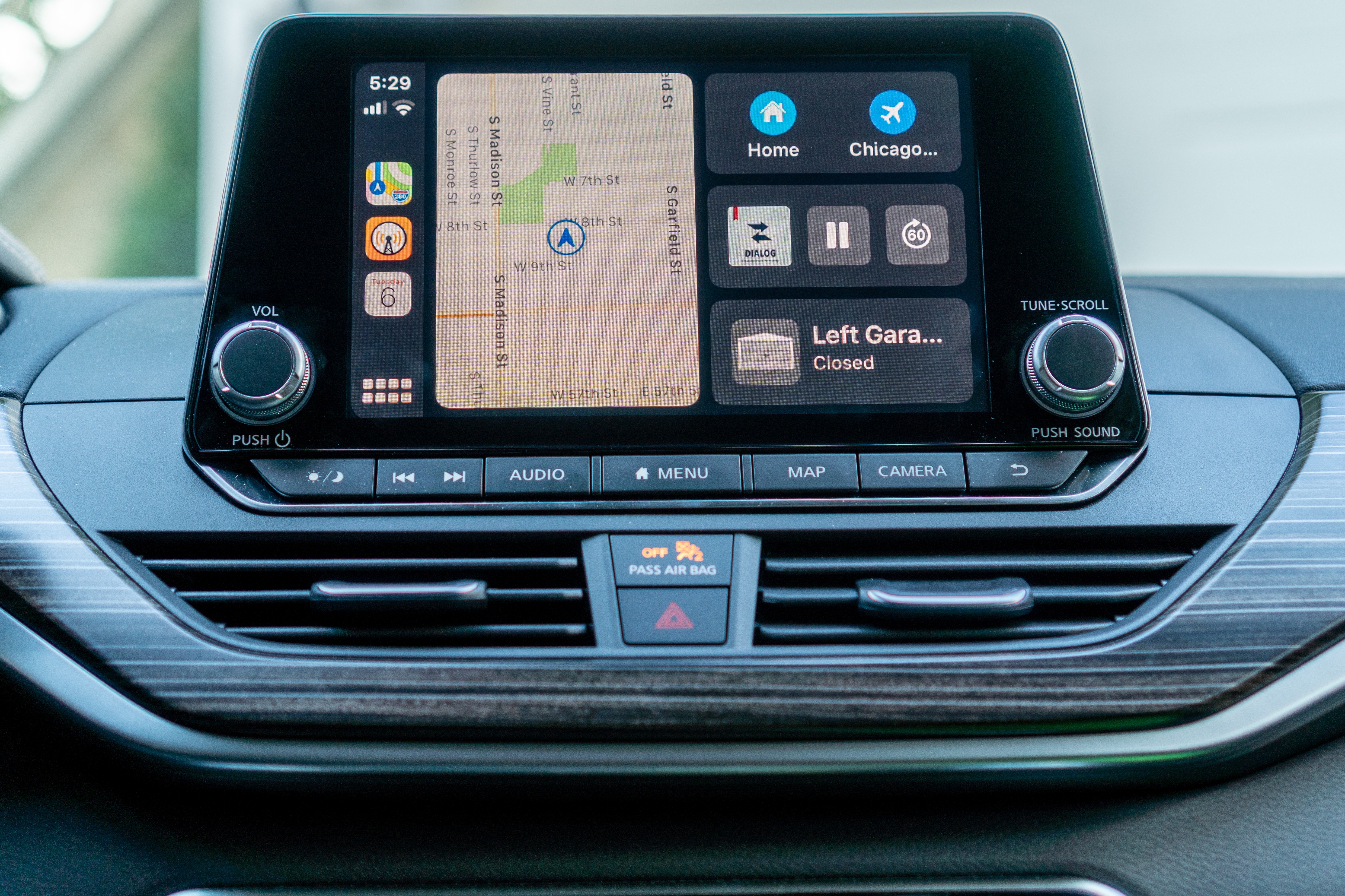
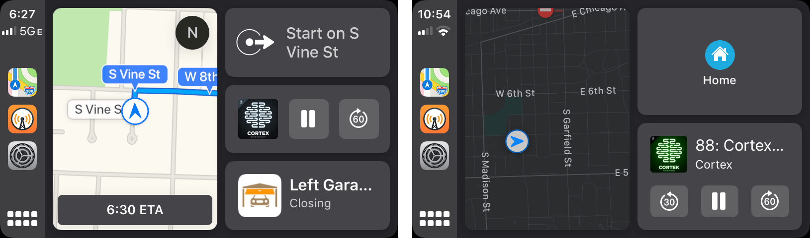
Apple’s CarPlay introduces a new view called the Dashboard. Previously in my car, CarPlay-compatible apps were arranged in a 2x4 grid of icons organized on multiple screens which I could swipe between just like on an iOS device. That view is still available, but I suspect many users will use the Dashboard more often because it offers ready access to more apps and information.
The best way to think of Dashboard is as a simplified Today widget view on an iPhone. Like widgets, the Dashboard is accessed by swiping right from the first page in icon view. Swiping back returns you to the icon view.
Alternatively, you can tap on the button in the lower-left corner of the screen toggle between the Dashboard and icon views. If you’re running an app full screen in CarPlay, the same button returns you to the Dashboard or icon view depending on which you were using last. In other words, if you navigate to Maps or Music from the Dashboard, the button returns you to the Dashboard, whereas when navigating to one of those apps from the icon view, the button returns you to the icon view. It’s a departure from how a Home button or Home indicator works, but I like it because it allows me to treat the Dashboard as my Home screen as long as I don’t need to use an app that it doesn’t support.
The Dashboard uses a two-column layout. The first column is an Apple Maps view of your current location, or if you’re navigating somewhere, your route. The second column is divided into three sections, except when Siri suggestions are turned off in Settings, in which case there are just two sections. On the top are suggested destinations like parking and gas stations. I’ve also seen ‘favorite’ destinations that I’ve saved in this section. If you’re already navigating, the top section displays turn-by-turn directions.
The middle section of the right-hand column is reserved for whatever is currently shown in the Now Playing app. The controls are limited to tappable artwork that opens the associated app, a play/pause button, and a skip forward button unless, as I mentioned, Siri suggestions are turned off, in which case track and album information are added as well as a back button.
The final section displays Siri suggestions, which are handy to have alongside the other Dashboard information. For example, since running the iOS 13 beta, I’ve seen suggestions for opening and closing my garage door with the Insignia HomeKit-enabled garage door opener that I installed at the beginning of the summer and upcoming calendar events from the new Calendar app that I cover below.
Each of the widgets in the Dashboard view is a mini version of the full CarPlay UI for each app. Except for the Siri suggestions widget, when you need more information or functionality from one of the widgets, tapping it takes you into the associated app’s fullscreen view.
In my use this summer, I’ve found the impact of the Dashboard is far greater than the sum of its parts. Each widget’s functionality is limited, but significantly reduces the time spent jumping back and forth between apps, especially from Maps. Previously, if I were navigating somewhere new, I’d keep Maps open but find myself moving to other apps to do things like skip a song and then return to Maps. Now, I can do that without leaving the Dashboard. It’s also nice to be able to open a calendar event or other app full-screen without first returning to the icon view to find it. It saves taps, which is faster and less distracting while driving.
Apple has updated a couple of other UI elements too. Siri is no longer modal, taking up the entire screen. Instead, the Siri animation is displayed at the bottom of the CarPlay screen, partially obscuring other content, but leaving most of it readable. Also, notifications for things like messages and reminders appear from the bottom of the screen instead of the top, putting them within easier reach than before.
Overall, I love the Dashboard. It has significantly reduced how often I switch between apps, which is a better user experience and safer. Still, the Dashboard leaves me wanting more. I’d love to treat the Dashboard like an Apple Watch face and set up multiple Dashboards for different occasions. For instance, I don’t need Maps if I’m running short errands near my home. For those occasions, I’d like to replace Maps with a more full-featured Music widget that lets me navigate through my favorite music. I’d also like to see Apple allow third-party apps to offer widgets like they do with Watch complications. That way, I could substitute in Google Maps or Waze for Maps or a weather widget for Siri suggestions, for example.
Screen Independence
Throughout Apple’s CarPlay update, the company has addressed the practicalities of how iPhones are used in cars, reducing friction and adding conveniences. When I’m on a long trip with my iPhone connected to the car’s entertainment system, I usually have a family member sitting in the passenger seat next to me. In the past, if they picked up my phone to use an app that isn’t available through CarPlay, it would dump CarPlay back to its icon view, disrupting navigation or whatever else I might have been using.
With iOS 13, CarPlay’s display is now independent of the iPhone running it. That means I can continue to follow the navigation instructions in CarPlay as I drive while a family member does a Google search, checks my email for me, or does anything else unsupported by CarPlay. It’s a small change, but one that acknowledges that a CarPlay-connected iPhone should be available to more than just the driver, which is a welcome change.
Apps
Calendar
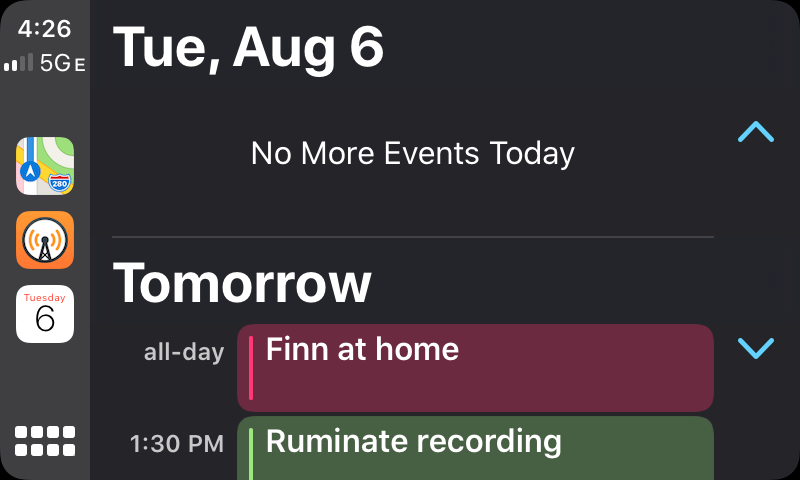
In discussing apps, I want to start with Calendar because it’s the sole entirely new app from Apple available as part of CarPlay. The app is a simplified version of its iOS counterpart that shows a handful of upcoming events only. There isn’t a way to create new events inside CarPlay. Instead, the Calendar app acts as an event viewer that’s condensed to show only the times you have blocked off. Tapping on an event opens its detail view showing the start and end time. If an event is associated with a location, that’s displayed too and can be tapped to open turn-by-turn directions in Maps.
The implementation of Calendar for CarPlay is simple but effective, providing the essential elements you need to know at a glance about upcoming appointments. Anyone who spends time driving to meetings will get a lot of value from the ability to keep up with upcoming events between this app and calendar-based Siri suggestions that are built into the Dashboard view.
Maps
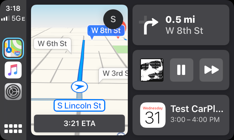
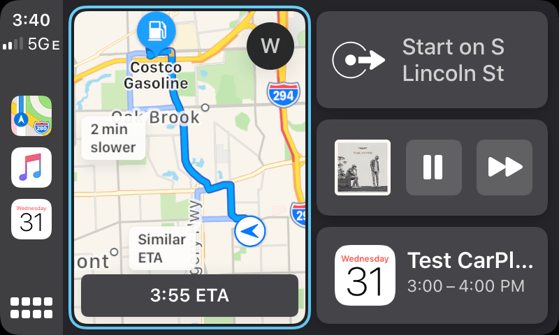
The core functionality of Maps hasn’t changed with CarPlay, but the UI has been substantially improved. With iOS 13, Apple has pulled off an impressive design achievement. Map controls are simultaneously more accessible than before and stay out of your way when not needed. That’s accomplished by a combination of UI elements that expand and collapse with a tap and others that serve multiple purposes depending on whether or not you’re navigating to a location as well as a UI that fades into the background when it’s not needed. At the same time, the app remains familiar to anyone who has used it before, making the transition to the update easy.
When you’re not navigating somewhere, Maps’ UI fades into the background after a little while, opening up use of your car’s full display. But with a tap the UI returns, re-centering your vehicle on the visible part of the map. In the top-right corner, a tap of the location icon centers the map on your current location, oriented with the direction your car is pointing to the top of the map. Tap it again, and the location icon adds a little line above the compass-like arrow that orients the map so north is always at the top of the map. Beneath the location button are buttons to toggle between 2D and 3D map views, pan the map beyond its current bounds, and zoom in and out.
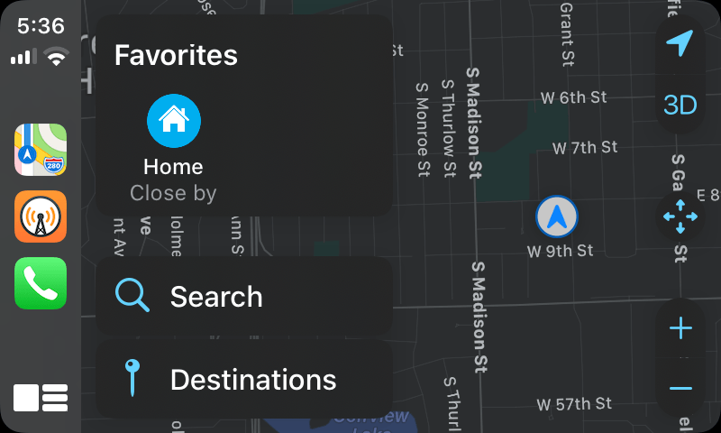
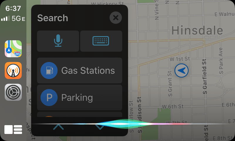
The left side of Maps’ UI is reserved for navigation. At the top are favorite destinations that you’ve saved, which get you on your way quickly. Below that are Search and Destinations.
Search has buttons to dictate a search term to Siri, a new keyboard UI for typing a search, and categories of destinations like gas stations, parking, and grocery stores. This is the first time a keyboard has made an appearance in CarPlay. While it’s not safe to type on a keyboard when you’re driving, I think it’s safe to assume this is a tacit admission by Apple that Siri just can’t handle the names of certain places well. When that happens, at least you now have the option to pull over and type your search. Destinations include a list of places you’ve recently navigated to as well as Collections, which are destinations you can save in groups.
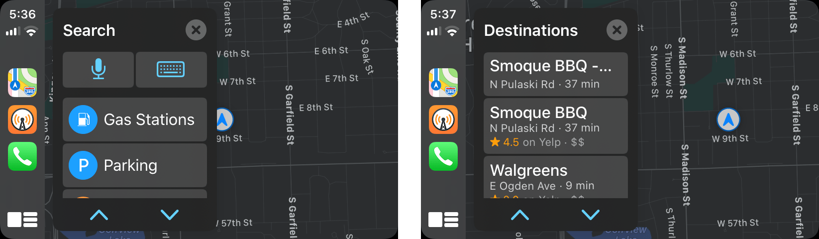
With Favorites, Search, and Destinations, Apple has moved functionality that was buried under layers of Maps’ toolbar UI and hard to reach to exactly where it’s needed. When you find the location you wish to navigate to, tap it and Maps provides a summary of the location if it’s available from Yelp, an estimated arrival time, whether tolls must be paid along your route, a phone button to call your destination, and a big green ‘Go’ button to start navigation.
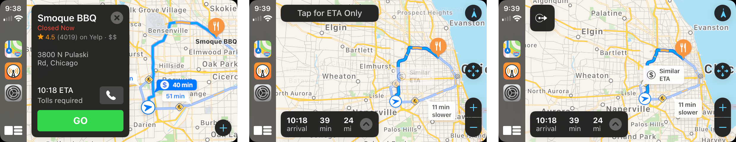
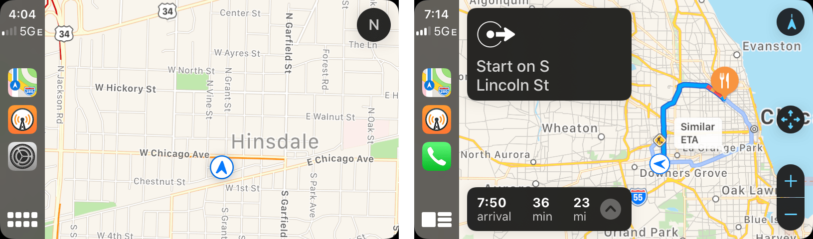
Tap ‘Go’ to start navigating and switch to ETA only mode by tapping the button that appears when you hit Go or tapping the turn-by-turn directions.
When you first tap ‘Go,’ the Maps interface briefly displays an ‘ETA Only’ button that mutes Siri and de-emphasizes turn-by-turn directions when tapped. The feature isn’t new, but it’s a great example of functionality that I expect will get more use in iOS 13 because it’s more prominent now.
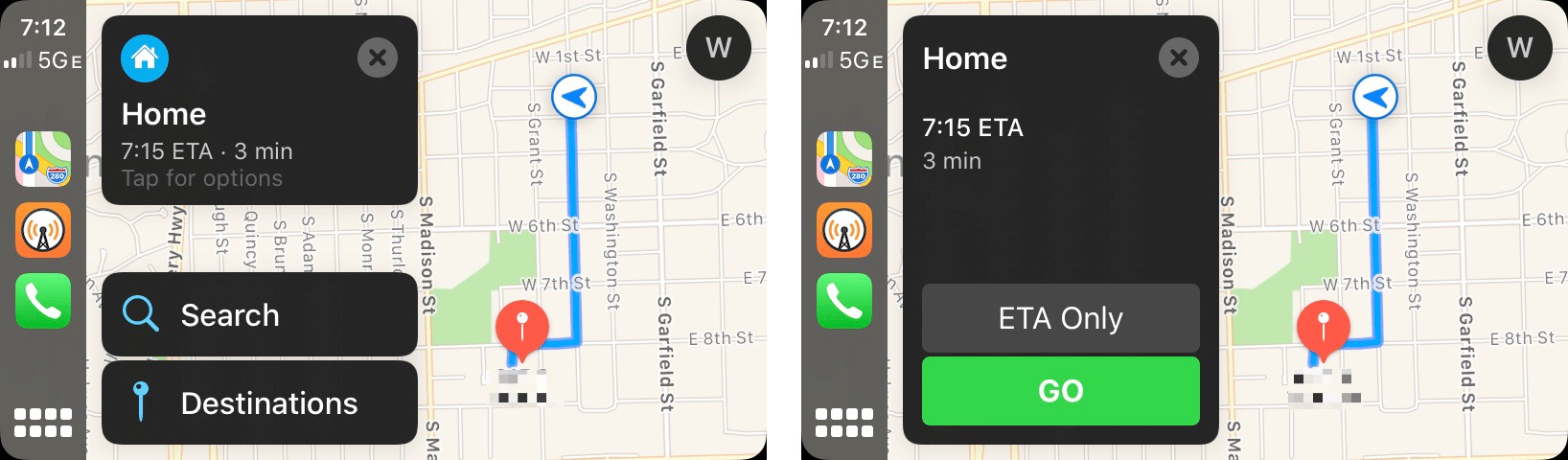
ETA Only mode is also surfaced from Favorites when Maps anticipates your destination. For example, when I’m out driving, and Maps expects I’m heading home next, the Home Favorites button’s size increases and displays an ETA for the trip. When I tap ‘Home,’ there’s a big ‘ETA Only’ button just above the green ‘Go’ button, making it simpler to pick that option. If you’re already navigating using turn-by-turn directions, you can also enter ETA Only mode by tapping the navigation directions in the top-left corner of the CarPlay screen.
I love ETA mode. When I’m driving somewhere I know how to get to, but there’s heavy traffic, it serves as a low-key version of turn-by-turn directions that doesn’t interrupt you with audio cues but still lets you know when you’ll get to your destination.
In the lower-left corner, Maps displays your arrival time and the time and distance to your destination. Tapping on the information opens a menu to search, mute navigation prompts, and share your arrival time with contacts – similar to the feature that’s also available on the iPhone and iPad in Maps.
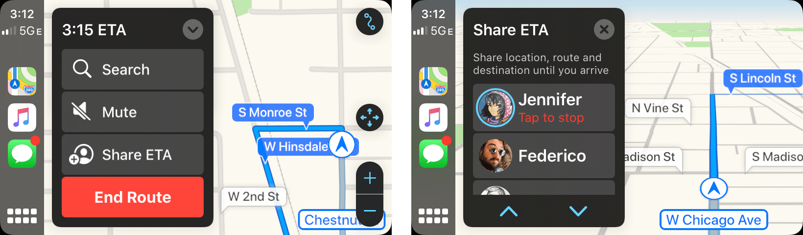
When you tap ‘Share Your ETA,’ Maps suggests people to share your arrival time with that appears to be based on machine learning. It’s not clear how the list is ranked, but it seems to be some combination of people to whom you’ve recently sent text or email messages that prioritizes text messages but excludes group threads.
In my testing, the suggestions have generally been solid, floating family and friends with whom I’m in regular contact to the top, but it doesn’t seem to account for their locations. Although there are scenarios where you’d want to let someone far away know when you arrive somewhere, I’d prefer that distant friends and family be pushed down to the bottom of the list. For instance, although I regularly use Messages with Federico, the fact that he’s in Rome significantly reduces the chances I’d want to share my arrival time at a local Chicago destination with him.
When you share your ETA, your arrival time, location, route, and destination are shared until you arrive. Along the way, the person you share your trip with will get an iMessage alert of the start of your trip, any delays, and when you are arriving.
The same menu’s search functionality drops you into the search UI available when you’re not navigating without interrupting your current trip, allowing you to set up intermediate stops along a route. Finally, the mute button turns off Siri turn-by-turn prompts as you’d expect.
Music and Now Playing
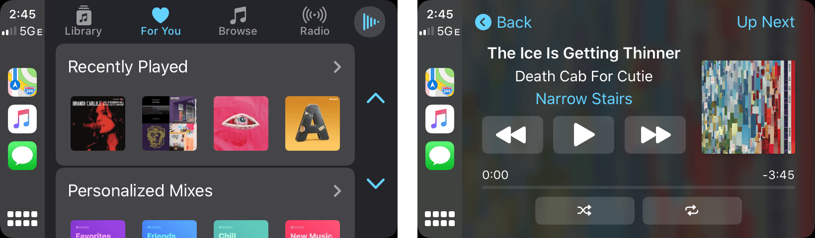
The most significant update to CarPlay’s Music app is a greater emphasis on album and playlist art. The Library, For You, and Browse tabs all include small album and playlist thumbnails at the top of each view, which makes it quick and easy to pick out recently added or suggested music and playlists. CarPlay’s use of thumbnail artwork isn’t new, but currently, the thumbnails are one level deeper in Music’s views. With iOS 13, your four most recently played tracks or albums and your four personalized playlists will all show up under For You, for example, which is not the case with iOS 12 and earlier. Artwork is also displayed to the right of track information in the Now Playing screen for music, podcasts, and audiobooks unless the Show Album Art toggle is turned off.
The Now Playing app also has a new icon that still resembles a play button, but it’s drawn using vertical red lines on a white background that looks as though it’s meant to suggest audio waveforms. When you’re in a list of content like the songs of an album or episodes of a podcast, the Now Playing icon in the upper right-hand corner of the screen has replaced the words ‘Now Playing’ that were used in earlier versions of CarPlay when audio isn’t playing. However, when audio is playing, the icon is replaced by a small waveform animation, which is an excellent visual cue that it’s what you tap to return to the Now Playing interface.
The functionality of Music and Now Playing hasn’t changed, but the new design of Music makes it feel more familiar because it more closely resembles the Music app on iOS and the upcoming macOS Catalina app. Add to that the small, but meaningful change of bringing thumbnails for things like recently played tracks, albums, and personalized playlists to the top level of For You and Browse, and finding something to play without a lot of tapping or scrolling feels a lot faster and easier.
Messages and Phone
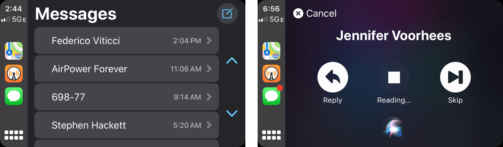
Messages no longer takes you into a Siri UI (left) and adds a new UI for interacting with messages (right).
The features of Messages and Phone haven’t changed much, but the way you get to them has. On iOS 12 and earlier, tapping the Messages or Phone icons took you directly into the modal Siri UI to read or send messages and make calls. Now, users are delivered into the Messages chronological list of recent conversations and the Favorites tab of the Phone app. If you have unread messages from multiple people, the new approach means you can tap directly on the ones you want to hear and skip others. While a message is being read, CarPlay displays buttons to play and stop the audio, reply, and skip. Those buttons change to ‘Review,’ ‘Change,’ and ‘Send’ after you’ve recorded a message to someone but haven’t sent it yet. Siri is available for calls and messages from a microphone icon in each app’s UI too.
Removing Siri as an intermediary in Messages has made a world of difference in sending messages on the go. Before, I had to open Messages, tell Siri who to send a message to, speak the message, confirm that Siri got it right, and after any changes, send it. Now I can simply tap a person’s name and begin speaking the message. The people I’m most likely to message are near the top of the list in most cases because I’ve recently messaged them, but if they aren’t there’s a new message button available to start fresh, telling Siri who I want to contact.
Siri
iOS 13 adds new ways to invoke Siri in CarPlay. In prior iterations, if you pressed on a dedicated steering wheel button, you needed to wait for the Siri tone to sound before speaking your command. With iOS 13, car manufacturers will be able to use always-on microphones to respond to Siri commands as soon as hardware buttons are pressed. That’s not a feature that’s available in my car, so I haven’t been able to test it.
CarPlay also supports ‘Hey Siri,’ which I’ve come to rely on. With my iPhone connected using a Lightning cable, invoking Siri by voice immediately triggers the Siri animation on my car’s screen, which is how I send messages with the Messages app and navigate using Maps most of the time.
I’ve already mentioned how much I enjoy the new Dashboard view, but the button used to invoke it hides another feature that I haven’t seen discussed elsewhere. Long pressing the Dashboard/icon view button invokes Siri as was possible with the Home button in previous versions of CarPlay. Since it’s in the lower left-hand corner of the screen, that means Siri is always within easy reach even if you don’t have a dedicated steering wheel button or always-on microphone that can respond to commands.
Finally, at WWDC, Apple announced that third-party navigation apps and audio apps like Pandora and Waze will be able to take advantage of Siri. Although I’m on the Waze beta, I haven’t seen the feature tested yet, nor have I seen the feature implemented by any other app.
More to Come from Manufacturers
At WWDC, Apple also announced CarPlay support for irregularly-sized in-car screens, second independent screens for spots like between a car’s instrument clusters, and dynamic screen resizing that can adjust to show CarPlay content alongside information from other sources like the car manufacturer’s entertainment system. Manufacturers are generally slow to adopt new technology, but for vehicles released in the future, these additions to CarPlay’s frameworks promise to give carmakers additional flexibility that will open up new ways to implement CarPlay.
When I first tried CarPlay in 2016, I knew I’d never want to go back to driving without it. Not only does CarPlay provide a familiar environment, but because the iPhone is where my music, podcasts, and contacts live and are updated continuously, it’s the perfect device to power navigation, entertainment, and communication when I’m driving.
With iOS 13, CarPlay will get an update far beyond any of the tweaks it’s received in the past five years. In apps like Maps, which got a big update, and Calendar, which is brand new, you can see CarPlay adopting a new design language that’s a lot like what is currently used on the iPhone and iPad. There is less reliance on navigation bars that reduce the size of the content area, and controls are better positioned for tapping while driving. Finally, with Dashboard and tweaks to other apps, Apple has reduced the number of taps necessary to perform many tasks. There are still remnants of the old design in apps like Music, Messages, and Phone that I hope receive more complete refreshes in the future, but between Dashboard, Maps, and Calendar, the update has already significantly improved my CarPlay experience.
The changes to CarPlay are the sort of evolution that feels so natural that it’s hardly noticeable unless you go back to the old version of CarPlay, which I spent a lot of time doing for this review. For example, with Dashboard, when I’m listening to a podcast and navigating with Maps, I no longer have to switch from Maps to Overcast to pause a podcast while talking to someone else in the car. Also, as I pull onto my street, Siri suggests opening my garage, which I do with a quick tap of the button on the Dashboard from a further distance than would work with the dedicated button in my car. I’ve also begun using ETA mode regularly because it’s surfaced better in iOS 13. Individually, each is a small change, but together they’ve added up to a much better experience for me, which I expect will be the case for many drivers when they update to iOS 13 this fall and connect their iPhones to their cars for the first time.
- Strangely, the switches for turning off Siri suggestions and album art in CarPlay set off haptic feedback on your iPhone. ↩︎