This Week's Sponsor:

FastMinder

A Simple, Lightweight, and Clutter-Free Intermittent Fasting Tracking Experience


Posts in iPad

How I Modded My iPad Pro with a Screen Protector, iPhone Holder, and Magnetic Stereo Speakers

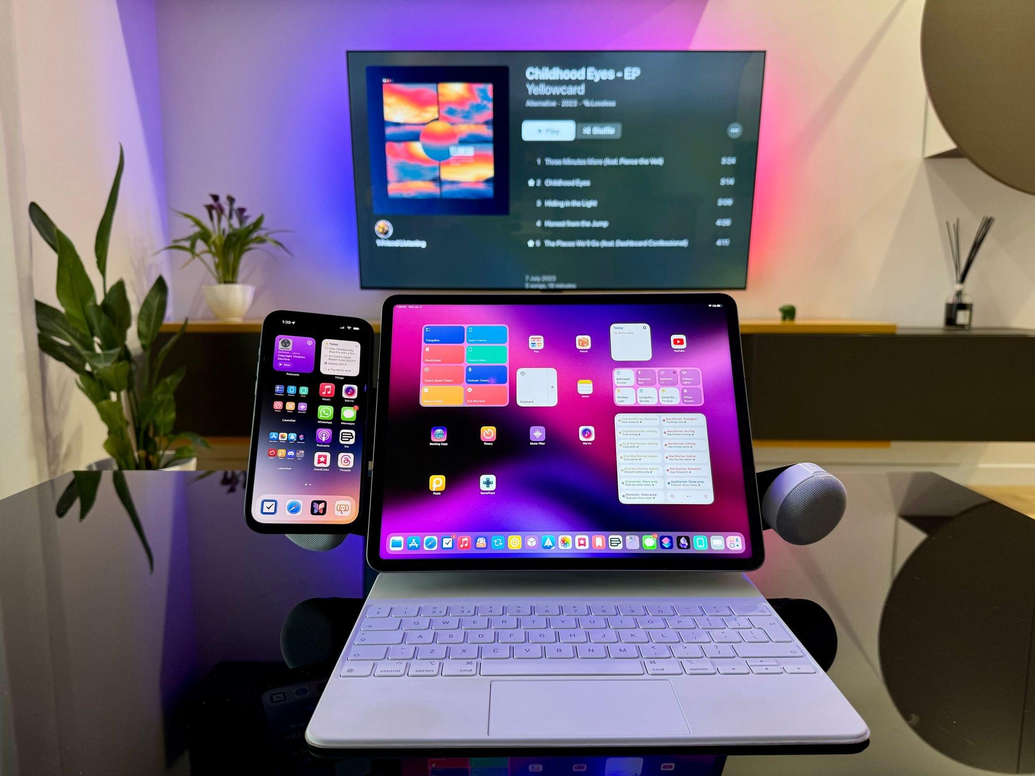
My new, modular iPad Pro 12.9" setup.

My new, modular iPad Pro 12.9” setup.

Those who have been reading MacStories for a few years should know something about me: I love modding things. Whether it’s customizing the silicone tips of AirPods Pro or adding kickstands to iPad covers (which I don’t do anymore), there’s something about the idea of taking an object and modding it specifically to my needs that my brain finds deeply satisfying. I’ve done it with videogame consoles; I’ve done it with IKEA furniture1; and I’ve done it – once again – with my 12.9” iPad Pro.

A new generation of iPad Pros and Airs is rumored to launch in the near future, and with the Vision Pro coming in a few weeks, what better way to wrap up my usage of the M2 iPad Pro than covering the mods I’ve been using?

Read more


Using the iPad Pro as a Portable Monitor for My Nintendo Switch with Orion, a Capture Card, and a Battery Pack

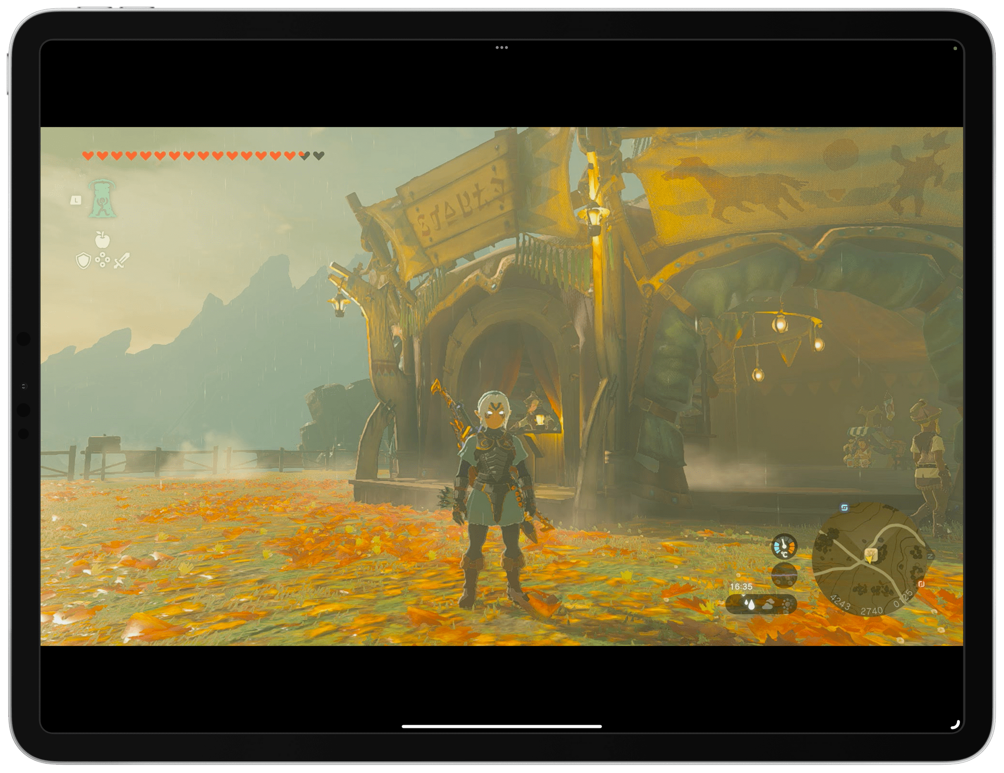
Tears of the Kingdom on my iPad Pro.

Tears of the Kingdom on my iPad Pro.

Those who have been reading MacStories for a while know that I have a peculiar obsession for portable setups free of the constraints typically involved with working at a desk or playing games in front of a TV.

It’s not that I don’t want to have a desk or dislike my 65” OLED TV: it’s that I don’t want those contexts to be my only options when it comes to getting work done or playing videogames. This is why I’ve spent the better part of my career fine-tuning my iPad-first lifestyle and why I’m so excited at the prospect of a giant screen that can always be with me. Modularity, portability, and freedom from a desk or TV are the driving factors in everything I use or buy these days.

For these reasons, it shouldn’t come as a surprise that I embraced the ability to use the iPad Pro as a portable monitor for videogame consoles thanks to UVC support. As I covered in my iPadOS 17 review, this feature was primarily conceived to let iPad users connect external webcams to their computers, but that hasn’t stopped developers from re-using the same underlying technology to create apps that allow you to display a video feed from any accessory connected via USB.

It’s a very intriguing proposition: the 12.9” iPad Pro has a gorgeous mini-LED display; what if you could use that to give yourself a little extra screen real estate when playing Super Mario Bros. Wonder or Tears of the Kingdom without having to pack a separate portable monitor with you?

In my review, I mentioned the Genki Studio app, which I used to play games with my Nintendo Switch and ROG Ally and output their video feeds to the iPad Pro’s display. Today, I want to explain how I took my setup a step further by enhancing the picture quality of the Nintendo Switch when viewed on the iPad Pro and, most importantly, how I created a fully-portable setup that allows me to play Switch games on the iPad Pro anywhere I am.

Read more


External Keyboards, iPadOS 14, and Obscuring Tab Bars

iPadOS 14 apps use sidebars, but only in certain size classes, so tab bars still get hidden behind the keyboard row.

iPadOS 14 apps use sidebars, but only in certain size classes, so tab bars still get hidden behind the keyboard row.

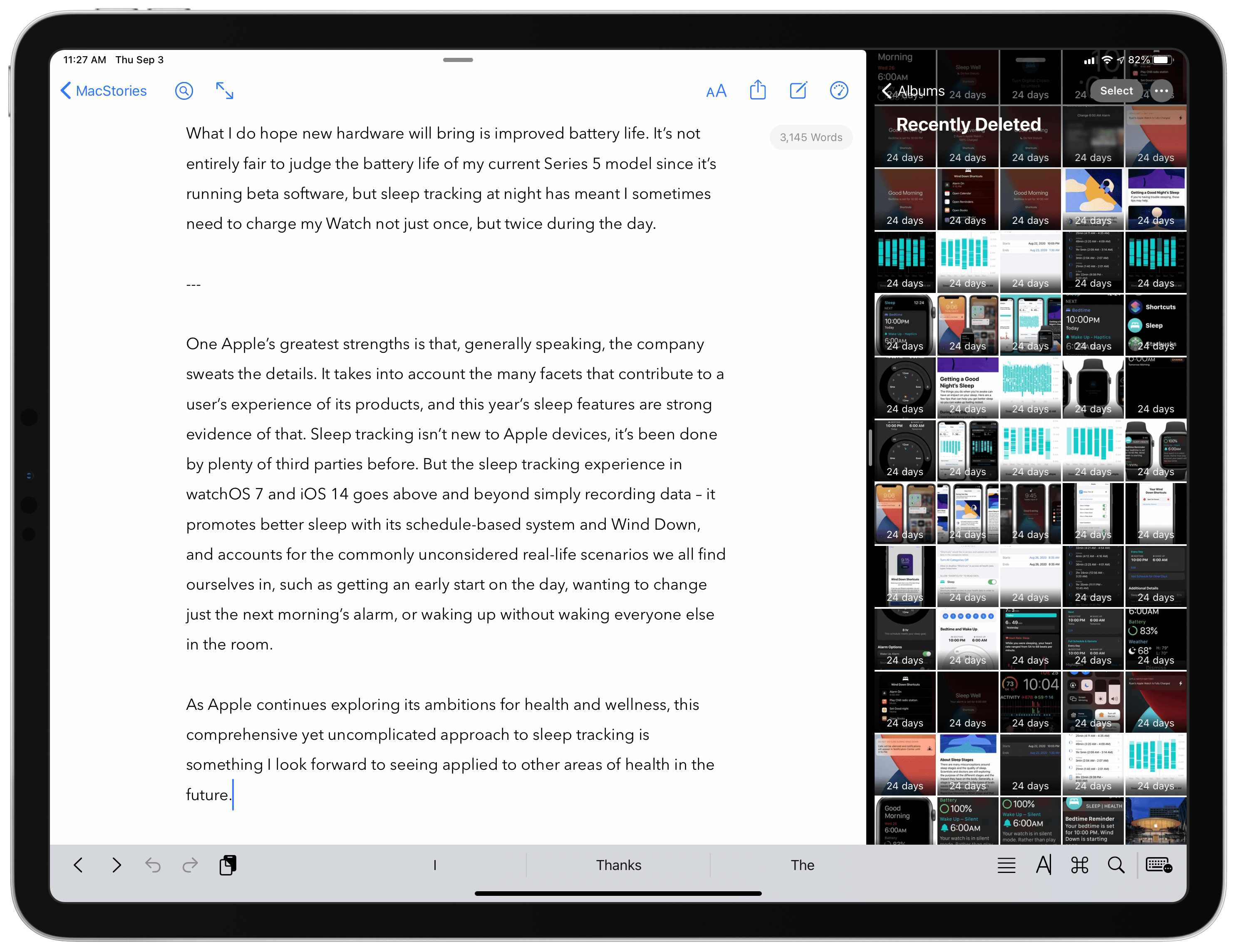
I love using the iPad as my primary computer, but a long-standing frustration I’ve had involves the keyboard row that lines the bottom of the screen when an external keyboard is attached. I like the row itself, as it usually offers valuable utility such as in Apple Notes, where a text formatting menu is available in the keyboard row. The problem is that iPadOS doesn’t adapt apps’ UI to account for the keyboard row, rather it simply hides the bottom portion of an app – which in many cases means hiding the app’s tab bar or other important controls.

This is mainly an issue when using Split View or Slide Over, not full-screen apps. But most of my iPad use does involve Split View and Slide Over, and I can’t count the number of times I’ve had to manually hide the keyboard row so I could access an app’s tab bar. This is a regular occurrence when writing articles, for example, as I’ll keep Ulysses and Photos in Split View, and the keyboard row that appears when working in Ulysses obscures Photos’ tab bar so I can’t switch tabs in Photos without manually hiding the keyboard row. The row also hides the share icon when viewing a photo, which is what I press many times when writing an article so I can run shortcuts via the share sheet. So as a workaround I have to manually hide the row, a short-lived fix because it then reappears after typing a single keystroke in Ulysses.

In iPadOS 14, Apple is halfway solving this problem. Because apps are being encouraged to switch from a tab bar-based design to one that involves a sidebar, there are fewer occasions when tab bars will be visible. In the iPadOS 14 beta, if I have Ulysses and Photos in a 50/50 Split View, there’s no longer a tab bar for the keyboard row to obscure, because Photos uses a sidebar instead where I can easily navigate to the view I need.

Unfortunately, this is only a partial solution because iPadOS 14 apps still revert to using a tab bar in a compact size class (i.e. when they’re an iPhone-like size). So all Slide Over apps retain tab bars for navigation as before, meaning those important tabs will be hidden any time you’re also working in an app that uses text and thus presents a keyboard row. The same is true for Split View when an app is the smaller app in your multitasking setup. If the app you’re writing in is the larger app in your Split View, the smaller app will have its tab bar obscured by a keyboard row. This is especially problematic for writers, who live in a text editor all day, but it also applies to anyone working in a note-taking app, messaging app, or anything else involving text. iPadOS 14 improves things via sidebars in certain situations, but in many multitasking contexts the years-old problem remains.

But there’s a happy ending of sorts, at least for me. My inspiration for writing about this issue was the discovery of a feature in Ulysses that fixes the problem for me. The app’s View Options inside its Settings panel contains a toggle that has been there for quite a while, I simply never thought to activate it: Hide Shortcut Bar. What this does is perpetually hide the keyboard row whenever a hardware keyboard is attached to your iPad. No keyboard row means no hiding tab bars in other apps while I write.

Ulysses does place some important shortcuts in the keyboard row, but most if not all of them can be triggered via keyboard shortcuts instead, making the keyboard row unnecessary (for my uses at least).

After making this discovery, I dug around in a few other apps’ settings to see how common this feature is. iA Writer offers it, as does Drafts, and possibly many other apps I haven’t tried. It seems more common in text editors than note-taking apps. It’s a shame that the whole keyboard row needs to be hidden just to account for an iPadOS design flaw, but I’m thankful that third-party developers have stepped in to address the issue themselves.

Ulysses is the app I multitask in most frequently, so the ability to keep its keyboard row hidden forever has truly made my day. I tried explaining to my wife why I got so happy all of a sudden, and she didn’t really get it. I don’t blame her.


Hands-On: Belkin’s USB-C to HDMI Adapter for the 2018 iPad Pro

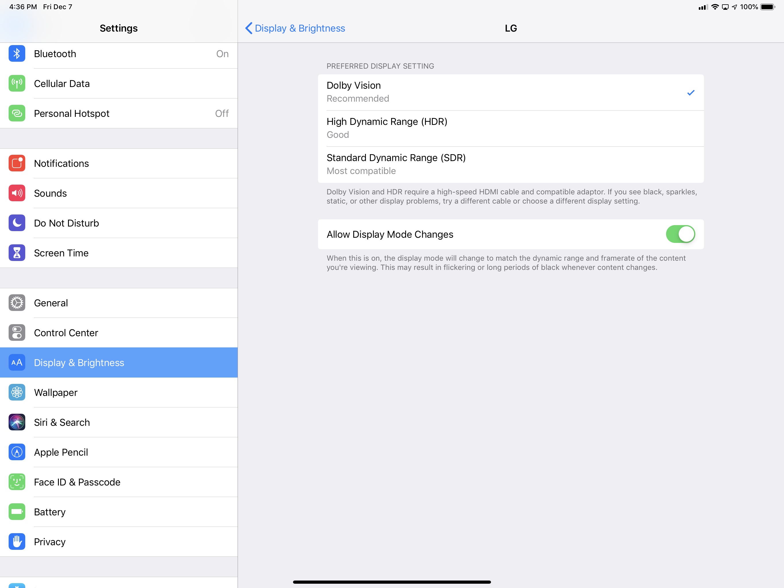
As I mentioned earlier this week, I have been looking forward to Belkin’s USB-C to HDMI adapter for the new iPad Pro since I discovered the accessory was announced on the same day of Apple’s Brooklyn event. The unique proposition of this adapter is support for 4K @ 60Hz video-out with HDR and HDCP 2.2, which, as I noted in yesterday’s iPad Diaries column as well, I haven’t been able to find in other USB-C adapters so far. I just spent 30 minutes playing with the iPad Pro connected to my 4K TV through this adapter, which arrived this morning, and I’m happy with the purchase, even though there is one significant drawback.

Read more


Field Trips Just Got Cooler: Waypoint EDU

With the ubiquity of the smartphone in increasingly younger classrooms, integrating them into education is fast becoming a requirement for teachers. What better way to tame smartphones in the classroom than to make them part of the learning process?

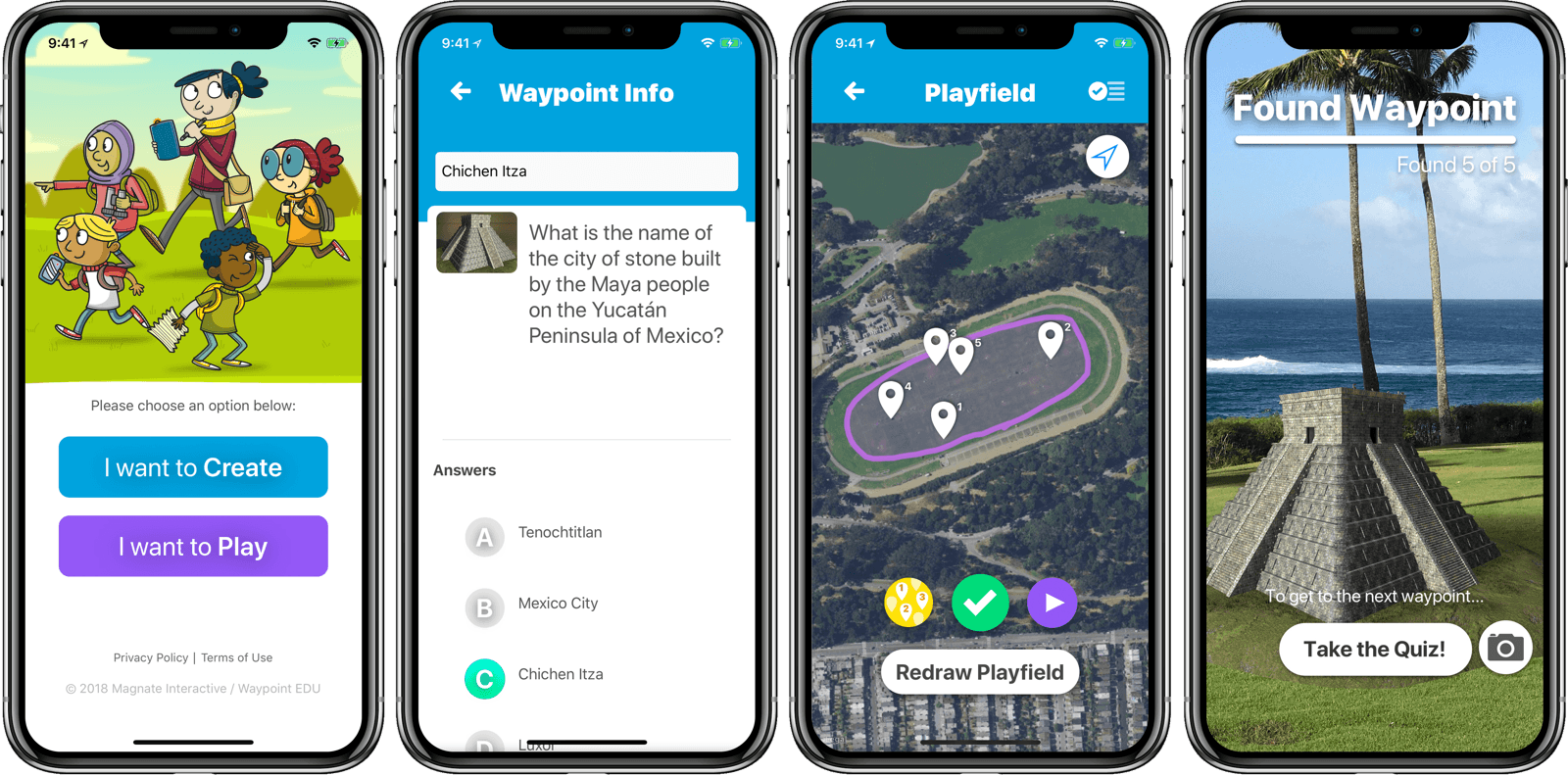
Matthew Braun, developer of SketchParty TV (one of my favorite Apple TV games), released a new app to do just that. Waypoint EDU uses AR to make the phone not only a learning tool, but a truly interactive experience that can take place outdoors. Or anywhere.

From the student perspective, it works like this: students see a waypoint on a map of their current location and move around to find it. A la Pokemon Go, they search by looking through their phones, scanning for an out-of-place object such as a (miniature) colosseum sitting in a park. Once they’ve found the waypoint, they answer a quiz question to reveal the next waypoint. Think augmented reality geocaching.

From the teacher (or parent) side, creating a curriculum is pretty easy. I didn’t get into creating a fully customized one while I was trying it out, but editing the waypoints and related questions is simple. Once you have your curriculum set up, you just pull up the map and draw the playfield with your finger. The waypoints are automatically placed within the playfield, ready for the Hunt to be shared with the students via AirDrop. You can currently add artwork from a library, and the ability to add your own artwork will be a paid feature in a future update.

Waypoint EDU is a free app. Obviously, it has the requirement that everyone in the group has access to an iPhone. In situations where that’s possible, Waypoint EDU seems to me like the future of field trips. Below is a video of Waypoint EDU in action. You can find it on the App Store, and get more info at waypointedu.com.


NotePlan Calendar + Markdown + Notes Comes to iOS

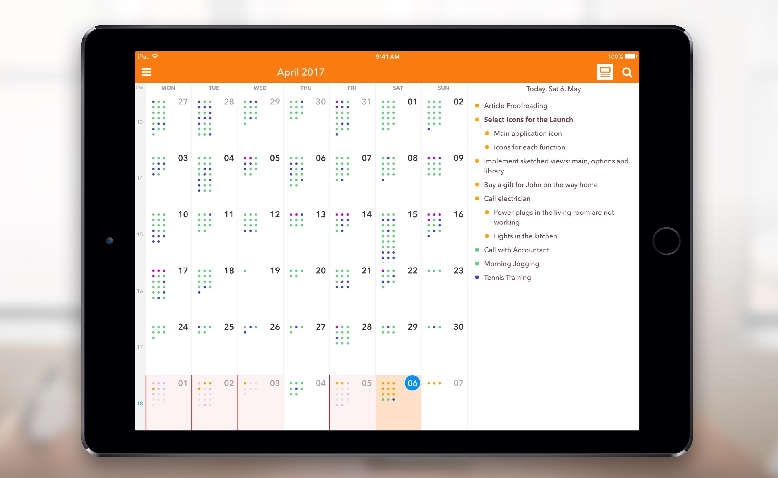
When I first heard about NotePlan, I was intrigued. It was a Mac app that used a text format (Markdown) as a calendar-based system, a note for each day, allowing you to easily create tasks and take notes, then see it all in an organized calendar. NotePlan for iOS was released today, and it’s enough to sell me on the idea.

I have a lot of side projects (I suppose my whole life is side projects these days), and organizing todo lists is vital. I love using the TaskPaper format, with TaskPaper on Mac and Taskmator on iOS, to track action items for individual projects. I also have a calendar, and a bucket of notes. Combining all of this in one place is appealing to me, and being able to use it on both Mac and iOS makes it truly useful.

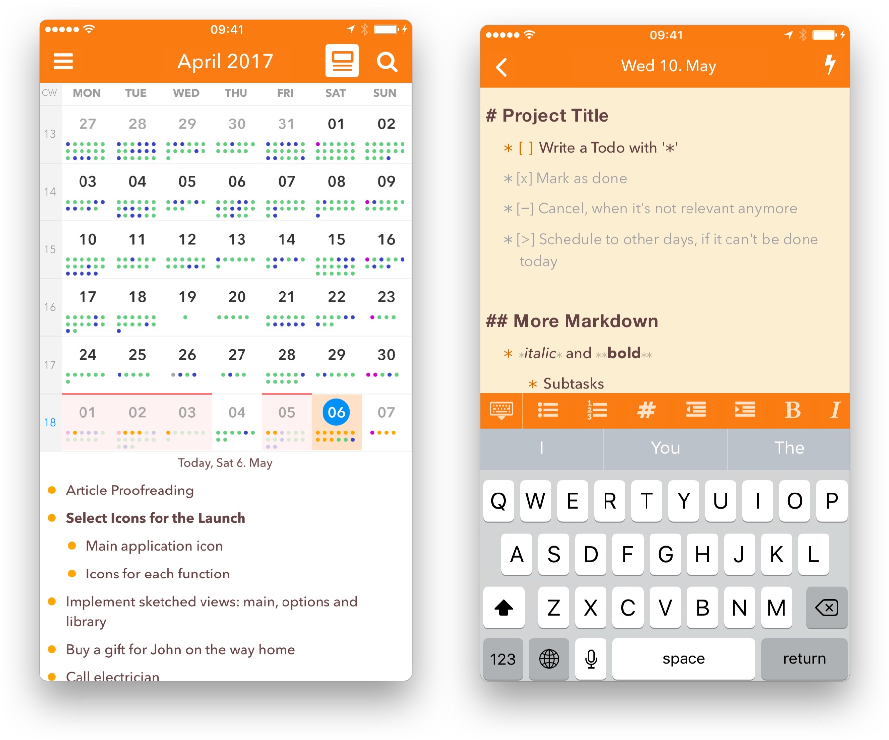
In NotePlan, tasks are created as Markdown lists. You can have it recognize any list item as a task, or tell it that only lines with a checkbox (- [ ] Thing to do) are action items. There’s an extra keyboard row available when editing that makes it easy to create items, complete or cancel them, or even schedule them for a future date.

Tasks can sync to Reminders lists as well, so it can incorporate into other workflows (and even shared lists). In the calendar view you can tap a day to see the note and associated task lists for that date.

Each day on the calendar gets a note, and you can add freeform notes in the All Notes area. A note can be bits of information, its own action list, or both. You can use #tags anywhere in the notes to organize, and wiki style links ([[title]] or [[YYYY-MM-DD]]) to reference other notes. Tasks added to freeform notes can be scheduled to the calendar with a tap, so you can use notes as a central project repository and schedule out the day’s (or week’s) tasks as you’re ready to tackle them.

NotePlan on iPhone

NotePlan on iPhone

On the new iOS version, you can drag and drop tasks around by pressing a text block until it turns blue and sliding it into place. You can also press and hold until it turns blue, then release and press another one to expand the selection between them, at which point NotePlan will offer you a toolbar to allow batch completion, rescheduling, etc.

I’d label NotePlan as a day planner, not a task manager like OmniFocus or Things. It’s ideal for planning out your day, Bullet Journal style. You won’t find extensive project management features or perspective overviews, but the combination of scheduling, tagging, and (plain text, portable) notes in one place makes it a true productivity tool.

If words like productivity, GTD, Markdown, TaskPaper and Bullet Journal cause a stirring within you, you’re probably the right audience for this one. Check out NotePlan for iOS, and then try out the Mac version for fully-synced productivity. Today and tomorrow, NotePlan for iOS is $11.99. After that, the price will be $14.99. NotePlan for Mac is $16.99.


Apple Updates iPad Pro Lineup with New 10.5” and 12.9” Models

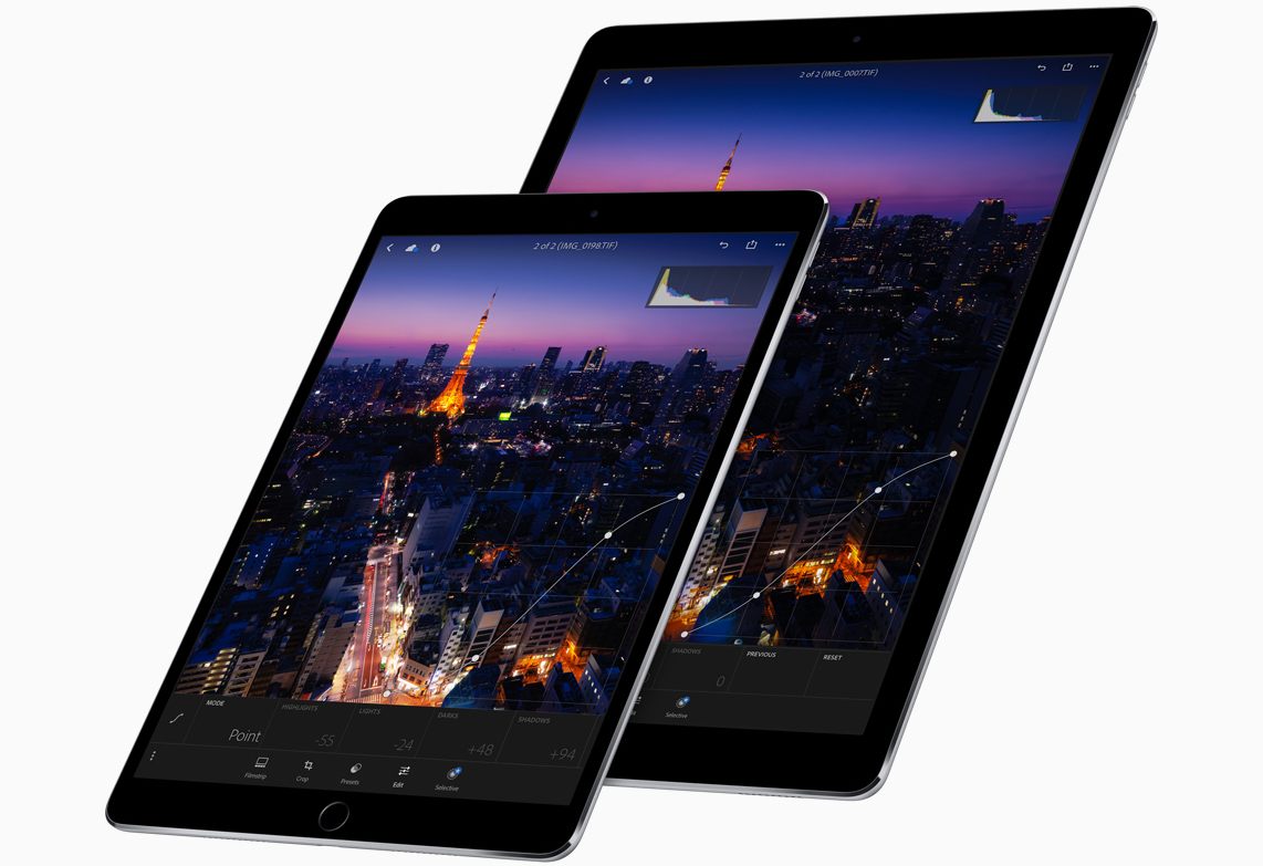
Today at its WWDC Keynote event in San Jose, California, Apple announced two refreshed models in their iPad Pro lineup. While both new iPads sport the same set of hardware and design improvements, the most significant change is unique to the smaller iPad Pro model. The original line included a 12.9-inch and a 9.7-inch model, but today the 9.7-inch has been replaced by a larger 10.5-inch iPad. This change could mark the beginning of the end for the 9.7-inch screen size — a size which has remained constant in the iPad line since the introduction of the original iPad back in 2010.

Read more


The Long-Lived iPad 2

Every once in a while, an Apple device comes along that sticks around for a while without an update.

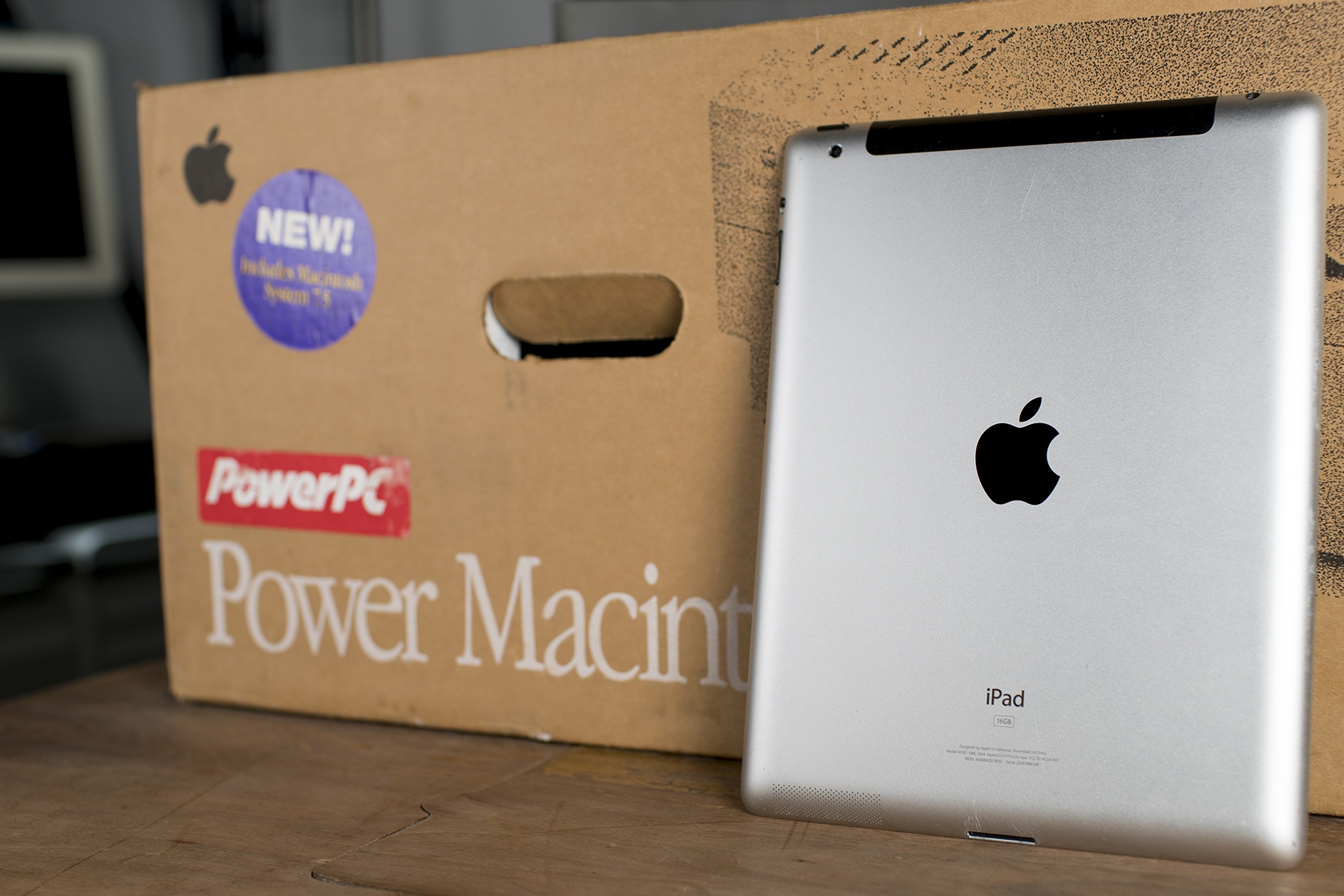
Jokes about the “current” Mac Pro aside, one such device that comes to mind for me pretty quickly is the iPad 2, introduced back in March 2011. It was finally taken off the market three years later.

While that doesn’t seem remarkable today, it was an eternity when it came to iOS devices at the time. The iPad 2 was one of the first devices Apple kept around to fill a lower price point on its product matrix.

But let’s not get ahead of ourselves quite yet.

Read more