This Week's Sponsor:

Kolide

Ensures that if a device isn’t secure it can’t access your apps.  It’s Device Trust for Okta.


Search results for "gboard"

iOS 11: The MacStories Review

For the second time in three years, the iPad isn’t following in the iPhone’s footsteps. With iOS 11, the iPad is going in its own direction – this time, with no cliffhanger.

iOS 9 marked a significant milestone for the iPad platform. In contrast with previous iPhone interface adaptations, iOS 9 did away with longstanding preconceptions and allowed the iPad to reach beyond the comfort of familiarity with the iPhone’s experience.

Shedding the vestiges of intrinsic iPhone OS notions – namely, single-tasking through one app at a time – the combination of more capable hardware with features such as Split View and Picture in Picture inaugurated a new beginning for the iPad’s post-PC endeavors. iOS 9 reset the iPad’s expectations and potential, providing millions of disenchanted users with the modern, powerful PC replacement they’d been envisioning since 2010.

But in many ways, iOS 9 wasn’t enough. The productivity enhancements that set the iPad on a new course felt, in hindsight, like first attempts at reviving its software and app ecosystem. Key aspects of iOS 9 were evidently unfinished, possibly hinting at future optimizations and fixes.

That future didn’t arrive with last year’s iOS 10, which only added to the sense of wondering when the iPad’s next shoe would drop. Amidst consistently declining unit sales and following another bland (at least iPad-wise) mid-cycle update to iOS, the legacy of iOS 9 gradually shifted from a first step packed with promise to a bittersweet one-off effort to infuse new life into the iPad.

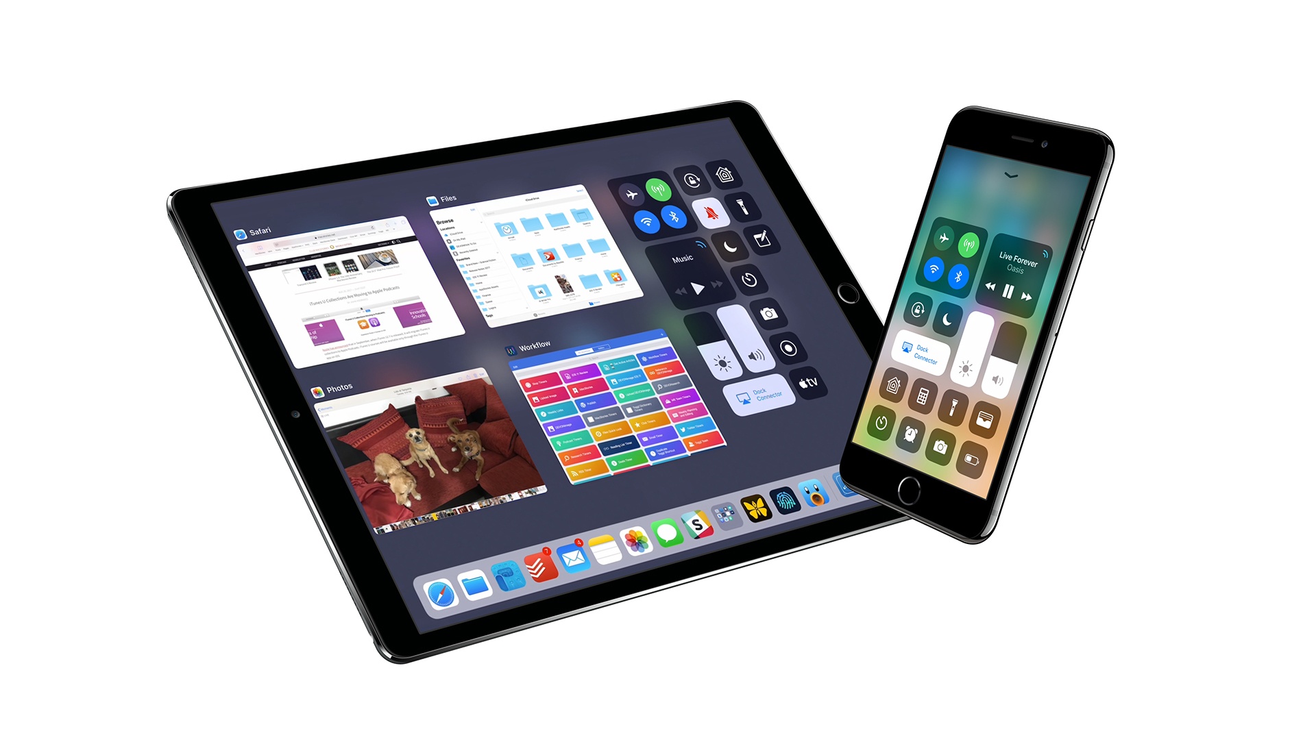
With iOS 11, Apple’s iPad vision feels resolute again. Multitasking is blending with multitouch, giving drag and drop a new purpose; the Mac’s best features – from file management to the dock – have been rethought, simplified, and extended specifically for iOS. The iPad’s mission is to reimagine the very concept of a portable computer by empowering a new generation of users to do their best work wherever they are, whenever they want.

If anything, iOS 9 was merely the iPad’s overture.

The iPad, however, is only one part of the broader iOS story, which has been – and most likely always will be – characterized by the iPhone’s evolution and impact on our society.

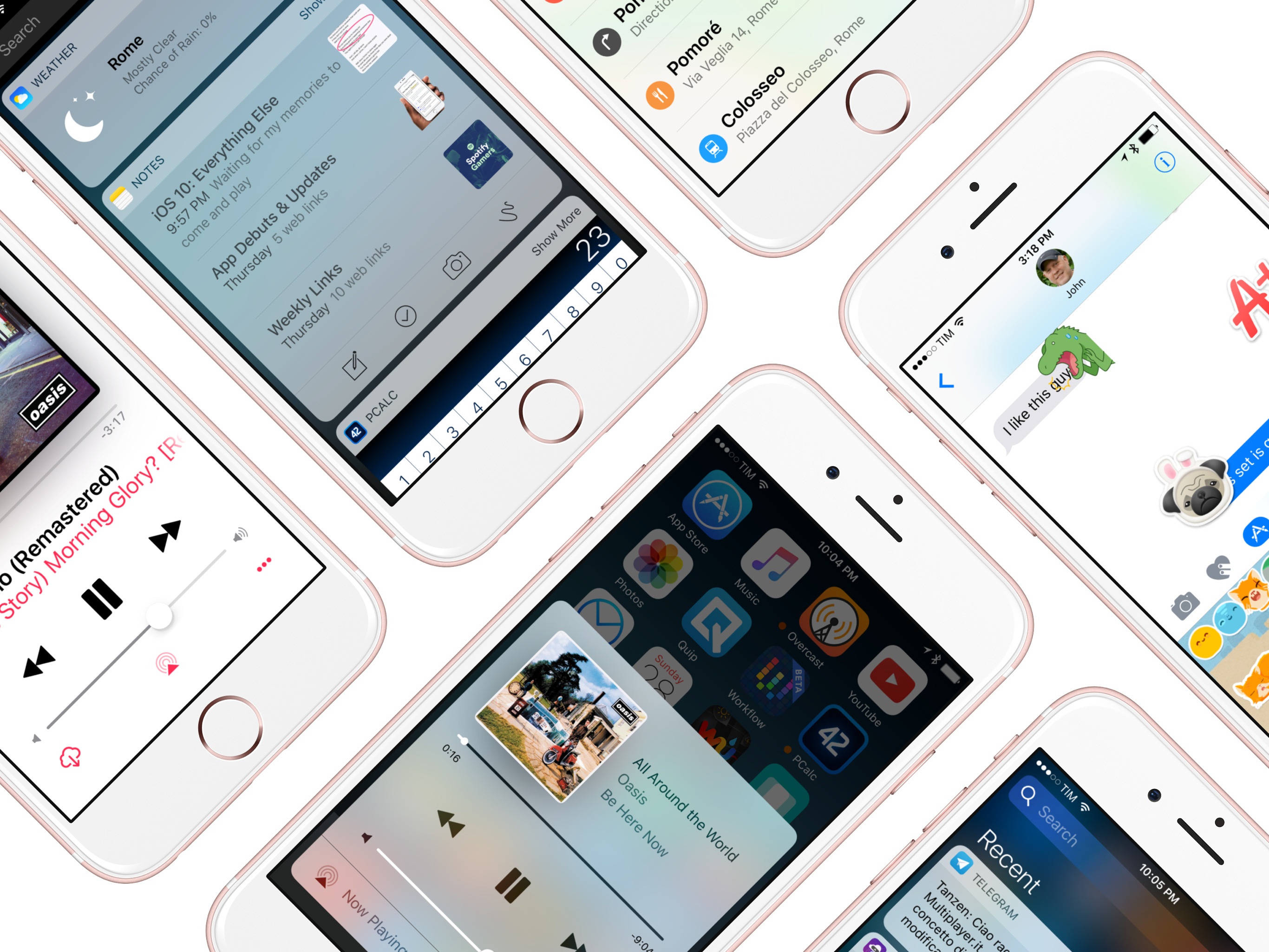
From that standpoint, not only did iOS 10 deliver with upgrades to core iPhone apps such as Photos, Messages, Music, and Maps – it showed how Apple was judiciously planting the seeds for technologies and human interface guidelines that are blossoming in iOS 11. The two-pronged approach of iOS 10 – updates to consumer apps along with the first signs of native iOS machine learning – resulted in an iPhone update that felt impactful without the need for a ground-up redesign.

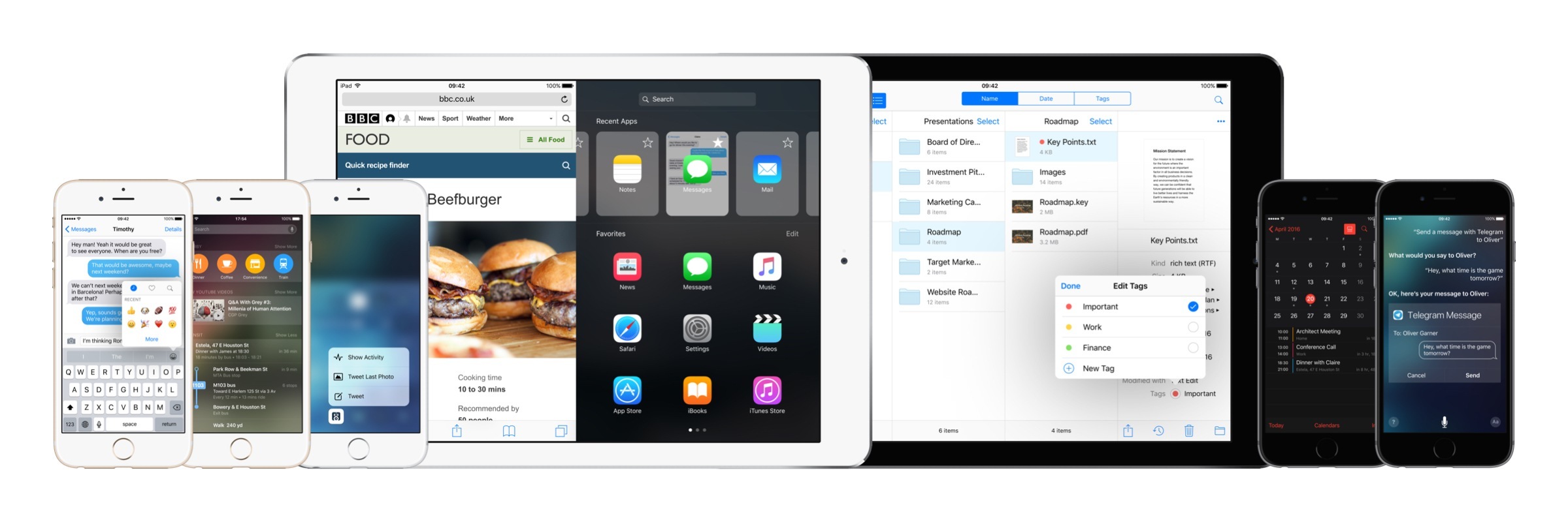
For the most part, iOS 11 follows the playbook of last year. The transition to a new design language is still in flux, with a progressive remodeling of iOS 7’s divisive aesthetic and the adoption of friendly UI elements that can guide users across the system. iOS 11’s most notable redesigns, including the App Store and Control Center, lay new foundations and fix what didn’t work before. Refinements – in some cases, reversals of ideas that didn’t pan out – are one of iOS 11’s overarching themes.

iOS 11 also reaps the rewards of investments Apple made in iOS 10 and 2016’s iPhone line. From the upcoming wave of augmented reality apps to deeper computational photography and new responsibilities for iCloud, iOS 11 epitomizes – with remarkable accomplishments and a few missteps along the way – the focus and priorities of the modern Apple.

But perhaps more importantly, unlike iOS 10, iOS 11 presents a cohesive narrative for both the iPad and iPhone. A story where, for the first time in years, the iPad is informing some of the design principles and features of the iPhone’s software. Even from different angles, and each with its own past struggles, both acts in iOS 11 end up asking the same question:

Where does the modern computer go next?

Read more


    The TV App as a Supporting Actor

    Joe Steel makes a good point in his look at this week’s Apple TV announcements:

    Why is TV the app an app and not the Home screen on the device? It’s obviously modeled after the same ideas that go into other streaming devices that expose content rather than app icons, so why is this a siloed launcher I have to navigate into and out of? Why is this bolted on to the bizarre springboard-like interface of tvOS when it reproduces so much of it?

    You could argue that people want to have access to apps that are not for movies or TV shows, but I would suggest that that probably occurs less often and would be satisfied by a button in the TV app that showed you the inane grid of application tiles if you wanted to get at something else.

    As I argued yesterday on Connected, I think the new TV app should be the main interface of tvOS – the first thing you see when you turn on the Apple TV. Not a grid of app icons (a vestige of the iPhone), but a collection of content you can watch next.

    It’s safe to assume that the majority of Apple TV owners turn on the device to watch something. But instead of being presented with a launch interface that highlights video content, tvOS focuses on icons. As someone who loves the simplicity of his Chromecast, and after having seen what Amazon is doing with the Fire TV’s Home screen, the tvOS Home screen looks genuinely dated and not built for a modern TV experience.

    I think Apple has almost figured this out – the TV app looks like the kind of simplification and content-first approach tvOS needs. But by keeping it a separate app, and by restricting it to US-only at launch, Apple is continuing to enforce the iPhone’s Home screen model on every device they make (except the Mac).

    That’s something the iPad, the Watch1, and the Apple TV all have in common – Home screen UIs lazily adapted from the iPhone. I wish Apple spent more time optimizing the Home screens of their devices for their different experiences.


    1. The Watch is doing slightly better than the other ones thanks to watchOS 3 and its Dock, but the odd honeycomb Home screen is still around, and it doesn’t make much sense on the device’s tiny screen. ↩︎

    Lessons Learned from the Demise of the Next Keyboard

    The Next Keyboard by Tiny Hearts made a big splash when it launched. Funded by a successful $65,000 Kickstarter campaign, it grabbed a lot of press, including from mainstream news outlets like CNBC. At it’s peak, the Next Keyboard made almost $20,000 in a single day, but like most apps, it rode a steep slope down after the initial spike.

    Tiny Hearts recently announced that it is discontinuing work on the Next Keyboard and pulling it from the App Store at the end of next week. Robleh Jama, the founder of Tiny Hearts, explores what went wrong:

    When we built Next Keyboard, we were amongst the first to experiment with Apple’s custom keyboard functionality. Unfortunately all third-party iOS keyboards — including Next Keyboard — were never truly stable because of Apple’s API. There’s a surprisingly poor user experience around using third-party keyboards (such as setting up a new keyboard). Even Google’s Keyboard, Gboard, has issues today, a full two years after third-party keyboards were announced.

    It’s hard to turn any app into a sustainable business, but the Next Keyboard faced greater challenges than most. Third-party keyboards are hard to build, limitations in the Apple APIs mean they cannot match the system keyboard feature-for-feature, and big companies like Google and Microsoft entered the market shortly after the Next Keyboard was launched.

    The experience was a costly and disappointing one for Tiny Hearts, but not without value. As Jama explains:

    Even though it was an expensive lesson, things worked out. There are things we wished would’ve turned out differently. We let our users down, and we don’t feel good about that. But we came out stronger and smarter for it, we’ve learned an unbelievable amount, and we will still bet on iOS, messaging and conversational interfaces. If you don’t play, you’ll never win. It’s been tough for us to swallow, but we paid for one of the most important lessons: making money with an app is risky.

    Permalink

    iOS 10: The MacStories Review

    Sometimes, change is unexpected. More often than not, change sneaks in until it feels grand and inevitable. Gradually, and then suddenly. iOS users have lived through numerous tides of such changes over the past three years.

    iOS 7, introduced in 2013 as a profound redesign, was a statement from a company ready to let go of its best-selling OS’ legacy. It was time to move on. With iOS 8 a year later, Apple proved that it could open up to developers and trust them to extend core parts of iOS. In the process, a new programming language was born. And with last year’s iOS 9, Apple put the capstone on iOS 7’s design ethos with a typeface crafted in-house, and gave the iPad the attention it deserved.

    You wouldn’t have expected it from a device that barely accounted for 10% of the company’s revenues, but iOS 9 was, first and foremost, an iPad update. After years of neglect, Apple stood by its belief in the iPad as the future of computing and revitalized it with a good dose of multitasking. Gone was the long-held dogma of the iPad as a one-app-at-a-time deal; Slide Over and Split View – products of the patient work that went into size classes – brought a higher level of efficiency. Video, too, ended its tenure as a full-screen-only feature. Even external keyboards, once first-party accessories and then seemingly forgotten in the attic of the iPad’s broken promises, made a comeback.

    iOS 9 melded foundational, anticipated improvements with breakthrough feature additions. The obvious advent of Apple’s own typeface in contrast to radical iPad updates; the next logical step for web views and the surprising embrace of content-blocking Safari extensions. The message was clear: iOS is in constant evolution. It’s a machine sustained by change – however that may happen.

    It would have been reasonable to expect the tenth iteration of iOS to bring a dramatic refresh to the interface or a full Home screen makeover. It happened with another version 10 beforetwice. And considering last year’s iPad reboot, it would have been fair to imagine a continuation of that work in iOS 10, taking the iPad further than Split View.

    There’s very little of either in iOS 10, which is an iPhone release focused on people – consumers and their iPhone lifestyles; developers and a deeper trust bestowed on their apps. Like its predecessors, iOS 10 treads the line of surprising new features – some of which may appear unforeseen and reactionary – and improvements to existing functionalities.

    Even without a clean slate, and with a release cycle that may begin to split across platforms, iOS 10 packs deep changes and hundreds of subtle refinements. The final product is a major leap forward from iOS 9 – at least for iPhone users.

    At the same time, iOS 10 is more than a collection of new features. It’s the epitome of Apple’s approach to web services and AI, messaging as a platform, virtual assistants, and the connected home. And as a cornucopia of big themes rather than trivial app updates, iOS 10 shows another side of Apple’s strategy:

    Sometimes, change is necessary.

    Read more


      Homescreen.me: Upload and Share Your iPhone Home Screen


      How different people arrange their iPhone Home screen is a natural curiosity for most of us with an interest in technology. We’ve featured Home screens in the vast majority of MacStories Weekly email newsletters, and it has easily been one of the most popular sections.

      The iPhone has become an integral part of our lives, and seeing the apps that different people elevate to their Home screen provides insights into how they work and live their lives. But it also gives us the opportunity to discover new apps, find a new wallpaper, or re-think the layout and structure of how we organize the apps on our own Home screens.

      If you find yourself curious about the iPhone Home screens of others, the relaunch of the Homescreen.me website might interest you. The basic pitch is that it allows anyone to upload and share their iPhone Home screen and Apple Watch watch face. The team behind Homescreen.me is also featuring the Home screens of different users, giving you the opportunity to get inspired and discover new apps.

      A particularly nice touch with Homescreen.me is that in your profile settings you can choose which iPhone (model and color) and Watch (model) you own. This selection has an impact because the screenshots you upload will be superimposed onto the correct device. When you upload your screenshot you’re also given the option to provide a description, and a wallpaper source.

      Read more


      On the Limitations of iOS Custom Keyboards

      Somewhat buried in a good Verge piece on iOS custom keyboards is a reiteration by Apple on why they don’t allow dictation for third-party keyboards:

      Apple has long been a stalwart for erring on the side of caution when it comes to keeping your data private and asking you to make sure you know you’re sharing something. The company’s policy is to not allow microphone access for extensions (like these keyboards) because iOS has no way to make it clear that the phone is listening. Giving third-party keyboards access to the microphone could allow nefarious apps to listen in on users without their knowledge, an Apple spokesperson says.

      As far as I know, it’s not just custom keyboards: no kind of app extension can access the microphone on iOS (plus other APIs). This has been the case since 2014 and it appears Apple still thinks the privacy trade-off would be too risky.

      The principle doesn’t surprise me; at a practical level, though, wouldn’t it be possible to enable dictation1 in third-party keyboards by coloring the status bar differently when the microphone is listening?

      I also have to wonder if, two years into custom keyboards, it would be time for Apple to lift some of their other keyboard restrictions. To recap, this is what custom keyboards on iOS can’t do:

      • Access the system settings of Auto-Capitalization, Enable Caps Lock, and dictionary reset feature
      • Type into secure text input objects (password fields)
      • Type into phone pad objects (phone dialer UIs)
      • Access selected text
      • Access the device microphone
      • Use the system keyboard switching popup

      Aside from microphone access, secure input fields, and phone pad objects, I’d like to see Apple add support for everything else in iOS 10. More importantly, I’d like to see their performance improve. Here’s an example: when you swipe down from the Home screen to open Spotlight, Apple’s keyboard comes up with a soft transition that’s pleasing on the eye; if you do the same with a custom keyboard, the transition is always jarring, and it often doesn’t work at all.2

      I struggle to understand the position of those who call custom keyboards “keyloggers” because, frankly, that’s a discussion we should have had two years ago, not as soon as Google launches a custom keyboard. Since 2014, hundreds of companies (including Microsoft and Giphy) have released custom keyboards, each theoretically capable of “logging” what you type. That ship has sailed. Apple has featured Microsoft’s Word Flow on the front page of the App Store and the entire Utilities category is essentially dominated by custom keyboards (and has been for a while). Every few weeks, a new type of “-moji” celebrity keyboard comes out and sits at the top of the Top Paid charts.

      I think it’s very unlikely Apple is going to backtrack on custom keyboards at this point. It’s not just Google – clearly, people find custom keyboards useful, and Apple is happy enough to promote them.3

      The way we communicate and work on iOS has grown beyond typing. Despite their limitations, custom keyboards have shown remarkable innovations over the past two years. With more privacy controls and some API improvements by Apple, they have the potential to work better and look nicer going forward.


      1. Not necessarily via Siri, so Google could use their own dictation engine in Gboard, for instance. ↩︎
      2. I’ve had multiple instances of iOS being “stuck”, unable to load a custom keyboard or switch back to the Apple one. ↩︎
      3. Unless, of course, it’s Gboard, which got no feature whatsoever this week, though it’s currently the #1 Free app in the US App Store. ↩︎

      iOS 10: Wishes and Concept Video

      iOS 10 concept.

      iOS 10 concept.


      (Full-res)

      I almost can’t believe there was a time when the iPad didn’t have Split View. Or that, for years, I thought Apple would never bring split-screen multitasking to iOS.

      More than any other iOS update before, iOS 9 has fundamentally reinvented the role of the iPad in my computing life. As I’ve written in my iOS 9 review and look at the iPad one year after my decision to stop using my Mac, iOS 9 and its multitasking improvements have catapulted the iPad away from the old limitations of iOS into a different league.

      With iOS 9 and the iPad Pro, the list of tasks I can’t perform on my iPad is down to a single item.

      I’ve never been happier with an iOS device and operating system than I am with the iPad Pro and iOS 9. Getting my work done is faster; using apps in Split View is a treat compared to iOS 8; and the software keyboard (despite some problems) continues to impress me with the addition of trackpad mode and the Shortcut Bar. The iPhone 6s, too, has been a pleasant surprise thanks to its superior performance and 3D Touch.1

      There’s never been a better time to be an iOS user. But that doesn’t mean that everything’s perfect. When it comes to iOS, happiness is often a fleeting moment – a temporary satisfaction with the current state of things before the inevitable longing for something deeper. Such is the constant pursuit of the future.

      Every year, I put together a list of the changes I’d like to see in the next version of iOS. I’ve been doing this for several years now. This year, I wanted to prepare something bigger. The tenth version of iOS due to be released later this year will be a major milestone for Apple and iOS users. It only felt appropriate to celebrate the occasion with a different take on my annual iOS wish list.

      For the past few months, I’ve been collaborating with Sam Beckett (author of a fantastic Control Center concept we linked to a while back) to visualize my iOS 10 wishes with a professional concept video and static mockups. Sam and I discussed my ideas for a couple of months, and he was able to visualize2 what I would like to have in iOS 10 – both for the iPhone and iPad – with a style and attention to detail I’m extremely happy with.

      Below, you’ll find a collection of my iOS 10 wishes, organized in tentpole features (the ones also shown in the video) plus additional sub-sections. Some of these wishes have been on my list for years; others are a consequence of the features Apple shipped with iOS 9.

      Let’s get started.

      Read more


      1. I use 3D Touch heavily every day. Peek previews for tweets and links in Tweetbot, Home screen actions, keyboard cursor control, and channel shortcuts in Slack are gestures I intuitively perform daily. ↩︎
      2. He was also very patient. As you can imagine, I sent him a lot of ideas and comments before signing off on the final version. I can't recommend working with Sam enough. ↩︎

      iPhone 6 Plus Review

      I was wrong about the iPhone 6 Plus.

      For years, I thought that big Android phones were meant to address a market segment made of people with abnormally voluminous hands. I had never tried one, but preconceptions are easier (and cheaper) to subscribe to than facts. When Apple released the iPhone 6 family in two sizes last year, I assumed that, among the People Who Have Big Hands And Like Big Smartphones, there could be a few millions who happened to want a 6 Plus.

      I also am one of those people.

      For the past two months, I’ve been carrying a 128 GB iPhone 6 Plus (white model) that Apple loaned to me for review purposes. I was curious to see if a larger iPhone could fit in my daily iOS usage, and, if so, how it would impact my iPad habits. The iPad is my primary computer; would an iPhone 6 Plus replace some of its advantages, or would the bigger size simply make some iPhone tasks better?

      I’ve used the iPhone 6 Plus intensively, and I’ll have to return it to Apple. But I really wish I didn’t have to go back to my iPhone 6.

      Read more


      Apple Releases iOS 7.1

      Apple today released iOS 7.1, the company’s first major update to iOS 7, which was released in September 2013. iOS 7.1 has been in testing with registered iOS developers since November, and it brings a variety of bug fixes, performance improvements, faster animations, CarPlay, user interface changes, and minor tweaks.

      Read more