This Week's Sponsor:

Listen Later

Listen to Articles as Podcasts


Search results for "LookUp"

My Must-Have Apps, 2019 Edition

My Home screens.

My Home screens.

Every year in late October, I start putting together a rough list of candidates for my annual ‘Must-Have Apps’ story, which I’ve historically published in late December, right before the holiday break. As you can tell by the date on this article, the 2019 edition of this story is different: not only did I spend the last months of the year testing a variety of new apps and betas, but I also kept tweaking my Home screen to accomodate MusicBot and new Home screen shortcuts. As a result, it took me a bit longer to finalize the 2019 collection of my must-have apps; in the process, however, I’ve come up with a slightly updated format that I believe will scale better over the next few years.

In terms of app usage, 2019 was a year of stabilization for me. Having settled on a specific writing workflow revolving around iA Writer and Working Copy, and having figured out a solution to record podcasts from my iPad Pro, I spent the year fine-tuning my usage of those apps, refining my file management habits thanks to iPadOS’ improved Files app, and cutting down on the number of apps I kept tucked away in folders on my iPhone and iPad.

Two themes emerged over the second half of 2019, though. First, thanks to various improvements in iOS and iPadOS 13, I increased my reliance on “first-party” Apple apps: I embraced the new Reminders app and its exclusive features, stopped using third-party note-taking apps and moved everything to Notes, and switched back to Apple Mail as my default email client. I’ve written about the idea of comfort in the Apple ecosystem before, and I’ve seen that concept work its way into my app preferences more and more over the course of 2019.

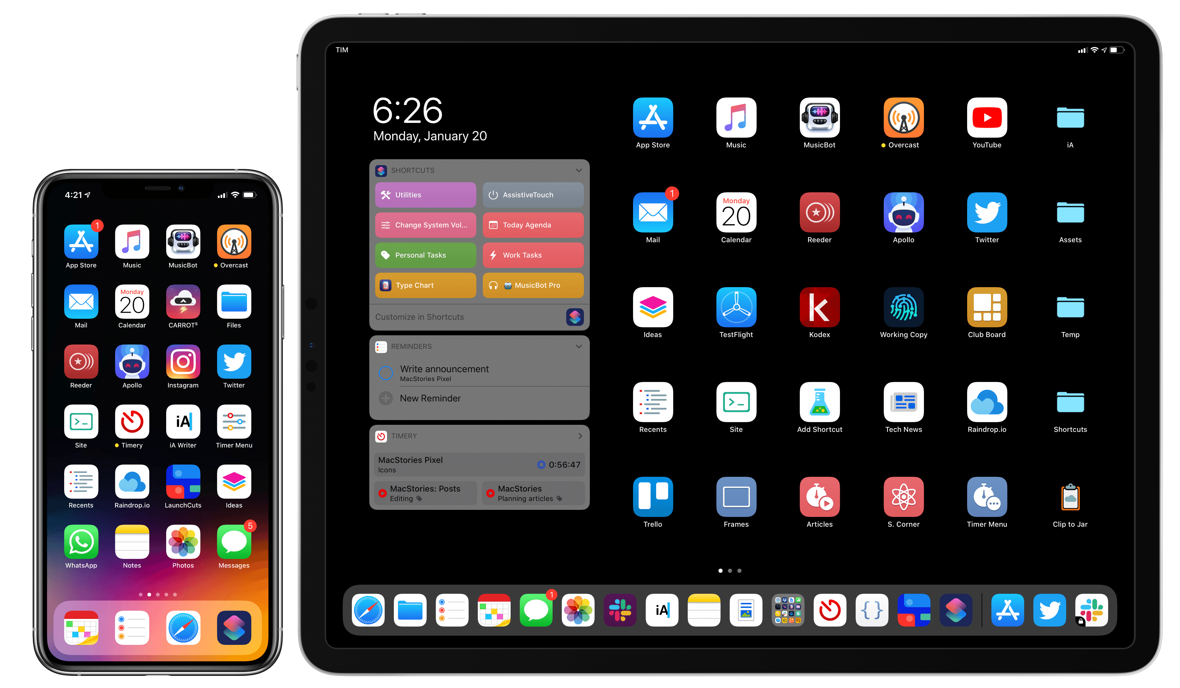
The second theme, unsurprisingly, is my adoption of a hybrid Home screen that combines apps and shortcuts powered by our custom MacStories Shortcuts Icons. Following changes to running shortcuts from the Home screen in iOS 13, I realized how much I was going to benefit from the ability to execute commands with the tap of an icon, so I decided to mix and match apps and shortcuts on my Home screens to maximize efficiency. Thanks to the different flavors of MacStories Shortcuts Icons (we just launched a Color set), I’ve been able to assemble a truly personalized Home screen layout that puts the best of both worlds – my favorite apps and custom shortcuts – right at my fingertips.

For this reason, starting this year you’ll find a new Home Screens section at the beginning of this roundup that covers the first tier of my must-have apps – the “ultimate favorites” I tend to keep on the Home screens of both devices. Because I like to keep my iPhone and iPad Home screens consistent, it made sense to start grouping these apps together in their own special section. These are the apps I use most on a daily basis; I’m pretty sure you’ll find at least a couple surprises this year.

This entire story features a collection of the 50 apps I consider my must-haves on the iPhone and iPad, organized in seven categories; whenever possible, I included links to original reviews and past coverage on MacStories. As for the traditional list of awards for best new app and best app update: those are now part of our annual MacStories Selects awards, which we published last December and you can find here.

Let’s dig in.

Read more


MacStories Selects 2019: Recognizing the Best Apps of the Year

John: The process of picking the MacStories Selects awards is simple. During the past year as we used and reviewed hundreds of apps, Federico, Ryan, and I kept a shared note in Apple Notes with a list of the apps that struck us as potential candidates for one of our 2019 awards. Not long ago, each of us revisited that list and refined it. Then, we convened in the MacStories Slack and hashed out the winners and runners up.

Today, we are pleased to announce the winners of the second annual MacStories Selects awards. As we explained when we introduced the inaugural Selects awards, we expected that we would expand and evolve them in 2019, which is precisely what we’ve done.

This year, the Selects Awards feature four new awards:

  • Best New Feature
  • Best Watch App
  • Best Mac App
  • Readers’ Choice Award

Best New Feature recognizes a new app feature that stands out for its impact. We also added an award for the Best New Watch app; in a year that saw Watch apps gain independence from the iPhone, this is an award that felt like an obvious and natural addition to Selects. With Apple’s renewed focus on Mac hardware and apps, we also wanted to recognize the 2019 Mac app that we feel represents the best that macOS has to offer.

Finally, for 2019 we are debuting a Readers’ Choice award selected by members of Club MacStories. All of our readers care about the apps they use, or they wouldn’t be reading MacStories in the first place. However, Club members’ interest and dedication to discovering and using the very best apps available rises to an entirely different level, so we felt it would be fitting to tap into their refined tastes with this special award.

When we looked back on our 2018 Selects picks, we couldn’t help but feel that something was missing. The awards were well-received by readers and developers alike, but they lacked a sense of permanence and concreteness found in other awards ceremonies. So, we’re very pleased and excited to announce that this year, we have commissioned custom, hand-made awards that we will be sending to each Selects award recipient later this week. From New Zealand to Texas and many points in between, each of the eight MacStories Selects awards will be in the hands of winners soon.

Congratulations from the entire MacStories team to the winners and runners up this year. Every one of these apps represents the best the App Stores have to offer. Thanks too to the developers of all the apps we use and love; your hard work doesn’t go unseen. 2019 has been a fantastic year for apps, and we can’t wait to see what you come up with in 2020. Also, thanks to the Club MacStories members who participated in the Readers’ Choice award voting. The Club is an important part of MacStories, so it was great to find a way to involve its members.

With that, let’s get on with the 2019 MacStories Selects awards.

Read more


The Important Role Design Plays in Building a Mac Catalyst App

There’s more to migrating an iPad app to the Mac than simply checking a box in Xcode. Although developers need to resort to AppKit APIs used to build Mac apps for some functionality, thoughtful design that respects the interaction model of the Mac is a significant part of the process too.

Vidit Bhargava is the designer behind the dictionary app LookUp and the cofounder of Squircle Apps. Bhargava, who we interviewed in the most recent issue of MacStories Weekly for Club MacStories, has written an in-depth look at how much of the process of bringing LookUp’s iPad app to the Mac was about design. As he explains:

I’m sharing this design document to highlight some of the design considerations I made for bringing LookUp’s iOS App to macOS. And while I did use fall backs to AppKit in certain situations (Even though I had no prior knowledge to AppKit, the APIs were relatively easy to get to), I still feel that a lot of apps can design a good experience without having to use them.

We’ve covered the iOS and iPadOS version of LookUp before and love it. On the Mac, there are dozens of little touches implemented throughout the app that make LookUp one of the best examples of an excellent Mac Catalyst app. What I find most fascinating is how familiar but also unmistakably Mac-like LookUp’s Mac design is, which is why it was one of a handful of apps that I spotlighted in my macOS Catalina review.

Bhargava’s full post is worth a read because it’s fully-illustrated with examples of the differences between the iPad and Mac designs, early prototypes, and the evolution of the app’s design.

Permalink

Despite Some Rough Edges, Twitter’s Mac Catalyst App Provides an iPad-like Experience That’s Better Than the Company’s Web App

Twitter is back on the Mac with an all-new Catalyst app. Twitter abandoned its Mac app early last year with a late Friday tweet:

Given the lack of support for the app leading up to that point, Twitter’s actions weren’t surprising. However, that left Mac users with only Twitter’s web app or third-party apps until yesterday, when the company released a Mac Catalyst version of their iPad app.

Twitter’s iPad app isn’t known for a strong design:

Four years have passed since Federico tweeted that and Twitter’s iPad client hasn’t gotten much better, which left me skeptical about what a Mac Catalyst version of Twitter’s app would look like. However, I’ve been pleasantly surprised by how well the port works on the Mac despite some rough edges.

Read more


macOS Catalina: The MacStories Review

Ironically, Apple chose to name this year’s update to macOS after an island. Since the iPhone and iOS took off, macOS has sometimes felt like an island isolated from the rest of the company’s OSes, but the goal articulated by the company at WWDC this year was quite the opposite. Apple clearly telegraphed that change is coming to the Mac and it’s designed to bridge the user experiences between each of its platforms.

To developers, that message came in the form of Catalyst and SwiftUI. Catalyst, which was previewed as an unnamed ‘Sneak Peek’ in 2018, is meant to make it easier for iPadOS developers to bring their apps to the Mac. SwiftUI has a similar longer-term goal of unifying and streamlining how developers build the interfaces for their apps across a range of devices, for everything from the Apple Watch to the Mac.

The efforts to draw macOS in closer with Apple’s other operating systems run deeper than just developer tools though. macOS may have been the foundation on which iOS was built, but in the years that followed iOS’s introduction, the two OSes grew apart. Identically-named apps were developed on different schedules, which meant they rarely included the same features. Also, system-level functionality like System Preferences, which serves the same purpose as iOS’s Settings app, was unfamiliar, making Mac adoption unnecessarily hard for newcomers. Catalina is an attempt to address those kinds of inconsistent user experiences.

With Catalina, Apple has taken clear, though not always successful, steps to bridge the divide between the Mac and iOS. App functionality has been realigned, System Preferences has been rearranged, and new features have been added to make it easier to move from one platform to the other.

As with other transitional periods in the Mac’s history, this one isn’t going to be easy. However, because the change is driven by a fundamental change in computing, it’s also necessary. We live in a new climate where computing is now dominated by mobile devices. For many people, a smartphone is all the computing power they need day-to-day. That doesn’t mean there’s no longer a place for the Mac, but it’s clearly what’s driving the changes in Catalina.

Apple could have chosen to ignore the shift of the ground beneath its feet and merely maintained macOS, making the kind of small incremental changes we’ve become accustomed to in recent years. However, not adapting is as deliberate a choice as change is, and it carries just as much or more uncertainty for the Mac as a platform because it risks irrelevance.

The Mac isn’t in crisis, but it isn’t healthy either. Waiting until the Mac is on life support isn’t viable. Instead, Apple has opted to reimagine the Mac in the context of today’s computing landscape before its survival is threatened. The solution is to tie macOS more closely to iOS and iPadOS, making it an integrated point on the continuum of Apple’s devices that respects the hardware differences of the platform but isn’t different simply for the sake of difference.

Transitions are inherently messy, and so is Catalina in places. It’s a work in process that represents the first steps down a new path, not the destination itself. The destination isn’t clear yet, but Catalina’s purpose is: it’s a bridge, not an island.

Read more


iOS and iPadOS 13: The MacStories Review

Following years of a judicious union between platforms, it’s time for iPad to embark on its own journey.

In looking back at major iOS releases from the recent past, it’s easy to see how building and positioning these annual updates has become a careful balancing act for Apple.

In last year’s iOS 12, we saw the company focus on improving performance, providing users with tools to understand their device usage habits, and adapting Workflow to the modern era of Siri and proactive suggestions. The strategy was largely successful: iOS 12 was regarded as Apple’s most reliable iOS release of late – a reputation that has resulted in a 90% adoption rate a year later; and the Shortcuts app – the highlight of last year from a user feature perspective – is becoming a built-in (and thus more powerful) app in iOS 13.

For all that Apple accomplished in iOS 12, however, some areas of the experience inevitably had to be put on the back-burner. Besides improvements to Reminders and Files, iOS 12 lacked a long-awaited dark mode (which was rolled out on macOS instead) as well as more substantial tweaks to the ever-evolving iOS 7 design language; chief among iOS 12’s absentee list, of course, was iPad. Even though Apple had trained users to expect major additions to the tablet platform on a biennial schedule (see iOS 9 and iOS 11), the lack of meaningful iPad features in iOS 12 spurred a contentious discussion when it became apparent that new iPad Pro hardware was so far ahead of its software, it legitimized asking whether investing in that hardware was even worth it.

The annual debate that surrounds which features make it into each major iOS release is symptomatic of a complicated truth: iOS isn’t just the operating system that runs on iPhones anymore, and these annual releases are more than a mere collection of updated apps. iOS is the platform for an ecosystem of devices – from our wrists and speakers to cars and TV sets – and its changes have repercussions that ripple far beyond an updated Reminders app or a new icon set.

This, of course, has been the case for a few years at this point, but the nature of iOS as an all-encompassing platform has never been as evident as it is today in iOS 13. For the first time since I started reviewing Apple’s annual iOS updates, it feels like the company is now keenly aware that a new iOS version has to cover an array of themes that can’t be pushed back for scheduling reasons. A single area of attention isn’t enough anymore – not for the Apple of 2019 as an economic, political, and social force, and not for iOS, the engine powering devices that aren’t just screens for apps, but bona fide lifestyle computers.

As a result, there’s something for everyone in iOS 13 and all the recurring themes of Tim Cook’s Apple are touched upon this time around. iOS 13 improves Face ID recognition and promises improvements to app download sizes and performance. Apple is sending strong signals on its commitment to privacy as a feature with a new sign-in framework for apps and enhancements to location tracking controls and HomeKit cameras. iOS’ design language is getting its biggest update in years with dark mode, new tools for developers to express colors and embed glyphs in their user interfaces, updated context menus, and redesigns aimed at facilitating one-handed interactions. We have notable improvements to built-in apps, including the rebuilt Reminders and Health, an overhauled Files app, and hundreds of quality-of-life tweaks that, in big and small ways, make iOS more capable and efficient.

No stone is left unturned in iOS 13 – and that includes iPad too.

The iPad experience has always been largely consistent with the iPhone – particularly since Apple unified core iOS interactions around a screen without a Home button – but also distinct from it. iOS 13 makes this distinction official by splitting itself in a second branch called iPadOS, which uses iOS as the foundation but is specifically optimized and designed for iPad.

It was clear when the new iPad Pro launched in late 2018 that it told only one part of a bigger story about the role of the tablet in Apple’s modern ecosystem. With iPadOS, Apple is ready to tell that full story: while the iPad has always been an extension of iOS, sharing key similarities with the iPhone hardware and software, it’s been evolving – arguably, a bit too slowly – into a different breed of computer that is fundamentally distinct from a phone.

We’ve been able to observe this divergence starting in iOS 9 with Split View multitasking and Apple Pencil, and the transition continued with iOS 11 and its drag and drop-infused environment. It was only natural (and well-deserved) for the iPad to begin advancing in a parallel direction to iOS – informed and inspired by it, but also capable of growing on its own and tackling problems that an iPhone doesn’t have to solve.

From this standpoint, there are two sides to iOS 13: on one hand, an underlying tide that raises all platforms, featuring a distillation of themes Apple comes back to on an annual basis; on the other, a fork in the road, opening a new path for the iPad’s next decade. And against this backdrop, a single question looms large:

Can Apple balance both?

Read more


    Catalyst Can Rescue the Mac and Grow the iPad

    At WWDC 2018, Craig Federighi provided a sneak peek at what everyone was calling Marzipan: an as-yet-unnamed way for iPad app developers to bring their apps to the Mac. So, it came as no surprise when Federighi retook the stage in 2019 and revealed more details about the project and its official name: Catalyst.

    What caught a lot of developers off guard though was SwiftUI, a declarative approach to building user interfaces that was also announced at WWDC this year. SwiftUI, known before the conference as Amber, its rumored project name, was on developers’ radar almost as long as Catalyst, but it’s fair to say that few anticipated the scope of the project. The purpose of SwiftUI is to allow developers to build native user interfaces across all of Apple’s hardware platforms – from the Apple Watch to the Mac – using highly-readable, declarative syntax and a single set of tools and APIs. If that weren’t enough to get developers’ attention, using SwiftUI carries the added advantage of providing features like dark mode, dynamic type, and localization automatically.

    The message from WWDC was clear: SwiftUI is the future, a unified approach to UI development designed to simplify the process of targeting multiple hardware platforms. It’s a bold, sprawling goal that will take years to refine, even if it’s eagerly adopted by developers.

    However, SwiftUI also raises an interesting question: what does it mean for Catalyst? If SwiftUI is the future and spans every hardware platform, why bother bringing iPad apps to the Mac with Catalyst in the first place? It’s a fair question, but the answer is readily apparent from the very different goals of the two technologies.

    SwiftUI serves the long-term goal of bringing UI development for all of Apple’s platforms under one roof and streamlining it. It won’t take over immediately though. There’s still work to be done on the framework itself, which Apple will surely expand in capability over time.

    By contrast, Catalyst is a shorter-term initiative designed to address two soft spots in Apple’s lineup: the stagnation of the Mac app ecosystem, and the slow growth of pro iPad apps. The unstated assumption underlying the realignment seems to be that the two app platforms are stronger tied together than they are apart, which ultimately will protect the viability of their hardware too.

    The impact of Catalyst on the Mac and iPad remains murky. It’s still too early in the process to understand what the long-term effect will be on either platform. There’s substantial execution risk that could harm the Mac or iPad, but despite some troubling signs, which I’ll get to in due course, I’m convinced that Catalyst has the potential for meaningful improvements to both platforms, especially the Mac. Let’s take a closer look at what those could be.

    Read more


    Designing a Dark Theme for OLED iPhones

    Vidit Bhargava, UI designer for the excellent LookUp dictionary app, details in a Medium post how implementing an OLED-friendly dark theme in an app is more complicated than one might think. For example:

    When an interface that uses a black theme for its background starts displaying content on the screen, the pixels needs to switch on before they can display the content. So, when you’re scrolling through the content in a black background, the pixels find it hard to keep pace with your scrolling, resulting in a smear on the screen.

    Bhargava uses the following tweet from Marc Edwards to illustrate this smearing issue.

    The solution utilized in LookUp was making its black theme not entirely black, but a dark enough grey that it appears black in use.

    The rest of the post outlines the impact of black, dark grey, and white themes on a device’s battery life, along with the readability challenges inherent to black themes. It’s a fascinating read, and goes to show that a quality OLED-optimized dark theme requires a lot of thought and care to achieve.

    Permalink

    Cardhop for iOS Review: A Powerful New Alternative to Apple’s Contacts

    Any time a new app launches in the same category as a first-party, pre-installed app, there’s always a lot to prove. It’s one thing to find new customers in a market limited to third-party options, where prospective users have to pay one way or another to access an app in that category. But when there’s a free, built-in option, third-party apps not only have to prove that they’re good apps, they also have to offer enough extra benefit above and beyond what the Apple-designed default provides. The bar for such apps is raised higher in many ways.

    Facing that challenge today is a new app from Flexibits, Cardhop for iOS, which serves as the iPhone and iPad companion to the contacts app launched for Mac in late 2017. Powered by a convenient natural language input system, Cardhop includes a host of features that differentiate it from Apple’s Contacts app and pose a strong threat to the iOS default.

    Read more