This Week's Sponsor:

Listen Later

Listen to Articles as Podcasts


Search results for "LookUp"

LookUp 7 Debuts Widgets on iPhone and iPad Alongside Powerful New watchOS 7 App

LookUp’s new widgets and watchOS app.

LookUp’s new widgets and watchOS app.

Widgets in iOS and iPadOS 14 are here and can be saved to your iPhone or iPad Home screen. A lot of third-party app updates will be trickling out in the days and weeks ahead with support for their own custom widgets, vying for your limited Home screen space.

If you’re interested in expanding your vocabulary, a word of the day widget seems like a perfect fit for the Home screen where you can glance at it throughout the day. That’s exactly what LookUp 7 provides, alongside widgets for running quizzes and opening your word collections. The dictionary app has also upgraded its watchOS component in a big way, offering new functionality that was previously limited to the full iOS version.

Read more


LookUp 6 Review: The Biggest Update Yet for the Best Dictionary App

The average life cycle of an app typically consists of two phases: the app’s early days often bring a host of significant updates as it strives toward feature maturity; however, once that level of maturity is achieved, the updates become more iterative and unsurprising, largely aimed at keeping pace with new OS technologies. LookUp 6 defies that normal pattern. The sixth major version of the excellent iOS dictionary app weds two important themes: adopting all the relevant functionality enabled by Apple’s latest OS releases, while simultaneously adding substantial features like quizzes, translation, full navigation via keyboard, and more. Despite how modern and feature-rich LookUp already was, version 6 sets the app on even stronger footing at the dawn of Apple’s latest software releases.

Read more


LookUp 5 Teaches Siri the Word of the Day and More via Shortcuts

We all know that it’s important to regularly learn new things, but often the busyness of life crowds out that learning and we settle into routines that make learning unnecessary. Fortunately, one of the things made possible by iOS 12 and the new Shortcuts app is that you can create your own custom “routines” of sorts with the help of Siri, and integrate daily learning into those routines.

In that vein, the excellent dictionary app LookUp was updated this week to version 5, which takes advantage of Siri shortcuts in iOS 12 to offer access to the word of the day via Siri. The update also brings a new Collections feature, additional shortcut options, and more.

Read more


LookUp 4.0 Adds Object Recognition via Vision Framework, Plus Drag and Drop

LookUp is a beautifully designed dictionary app that we first reviewed earlier this year. With its effective use of bold headings and colorful graphics atop a white background, Lookup visually looks like a sister app to Apple’s new App Store – and considering how much I love the new App Store, that’s high praise. I won’t spend any time on the basics of the app though, as you can check out Jake’s original review for that. Instead, I want to focus on how LookUp harnesses the power of new iOS 11 technologies.

Read more


LookUp Review: The Modern Dictionary

When considering a traditional dictionary, the words “fast” and “beautiful” don’t come to mind; even our digital dictionaries, sometimes coming in the form of iOS’ Look Up feature when highlighting a word, don’t do a great job of looking good, providing all the relevant information, and appearing in enough time to make it worth the process.

With LookUp, I’ve found things to be different – it’s a dictionary app built on convenience, design, and lots of information.

Read more


Vision Pro App Spotlight: Parchi Brings Voice-Created Sticky Notes into Your Environment

Parchi is a new visionOS sticky note app by Vidit Bhargava, the maker of the dictionary app LookUp. The app is a straightforward, but handy utility for jotting down a quick note using your voice.

When you start recording, Parchi's record button turns into a big stop button.

When you start recording, Parchi’s record button turns into a big stop button.

When you launch the app, you’re greeted by a bright yellow gradient window with a big record button in the middle. Tap it and start speaking to record a note. Tap again to stop, and your audio recording will transform into a yellow sticky note with your recording transcribed into text. Once created, you can drag notes around your environment, leaving them in places where they will serve as valuable reminders. In the bottom corners of the note are buttons to play back your audio and delete the note.

The All Parchi view.

The All Parchi view.

You can also access all of your notes from the app’s main UI by switching from the ‘Parchi Recorder’ view to ‘All Parchis,’ which displays each of your notes as a horizontally scrolling collection. The ‘All Parchis’ view also includes a search field for finding particular notes in a large collection.

Leave notes where they make the most sense within your environment.

Leave notes where they make the most sense within your environment.

I love Parchi’s simplicity and ease of use, but I’d like to see it expanded a little too. The smallest size note is still somewhat large. It would be great if I could shrink them even further with the text transforming into a play button when there isn’t enough room to display it. I’d also like to see Siri and Shortcuts support added to make it possible to create a note without first opening the app. Finally, a copy button would make Parchi a better complement to task managers and other apps by allowing text to be moved to other apps as needed.

Overall, though, I’ve really enjoyed using Parchi. It’s the kind of quick interaction I appreciate when I’ve got something on my mind that I want to jot down without interrupting the flow of whatever else I’m doing.

Parchi is available on the App Store for $2.99.


iOS and iPadOS 17: The MacStories Review

In the year when the vision is elsewhere, what do you get the OS that has everything?

Well, last year was weird.

For the first time since I started writing annual reviews of Apple’s two mobile operating systems – iOS and iPadOS – I published a review without the iPad part. Or rather: I had to publish it a month later given the mess Apple found itself in with Stage Manager for iPadOS 16 and its half-baked, embarrassing debut.

I don’t want to go over the specifics of that entire saga again and how we got to a shipping version of Stage Manager for iPadOS 16 that didn’t meet my expectations. Spoiler alert: as we’ll see later in this review, Apple listened to feedback and fixed the most glaring issues of Stage Manager in iPadOS 17, striking the balance between “guided multitasking” and freeform window placement that was missing from last year’s debut. Stage Manager for iPadOS 16 will remain another blip in the iPad’s long and storied history of ill-fated multitasking features. There’s no need to talk about it again.

I want to explain, however, why the past 12 months have been different than usual in iOS and iPadOS land beyond the fact that I couldn’t work on my iPad Pro for the first half of 2023.1

Following the launch of iOS 16 with its Lock Screen widgets and after Apple wrapped up work on the last big-ticket item on the iOS 16 roadmap (Live Activities for the Lock Screen and Dynamic Island, which launched in late October), it felt like the entire Apple community only started thinking about one product for the next six months: the headset. What would later be known as the Vision Pro and visionOS platform became the topic of conversation in Apple-related publications, podcasts, and YouTube channels. Leading up to WWDC 2023, anticipation surrounding the upcoming headset eclipsed anything related to other platforms.

And rightfully so. As I explained in the story that I wrote after I was able to try a Vision Pro at Apple Park, the excitement was justified. It’s always a rare occurrence for Apple to introduce a new hardware product with associated software platform; but to do so with a mind-blowing experience unlike anything I ever tried before in my life is truly something special. Apple had been working on visionOS and Vision Pro for years, and we were all thinking about it and waiting for it at WWDC. And the company delivered.

This context is necessary because the visionOS/Vision Pro development timeline explains what’s going on with iOS and iPadOS 17 this year. Both OSes are grab-bag style updates with a collection of welcome enhancements to different areas of experience. I quipped years ago that modern iOS updates need to have a little bit of everything for everyone; that has never been more true than with iOS 17, albeit for a different reason this time: most likely, because Apple didn’t have time to also deliver big, vision-altering upgrades on the iPhone this year.

iOS and iPadOS take a bit of a secondary role in 2023, happily conceding the spotlight to a new software platform that hasn’t launched yet, but which developers around the world are already testing in person.

To be clear, I am not complaining. iOS and iPadOS 17 may not have an industry-defining, obvious tentpole feature, but in their approach to offering miscellaneous improvements, they’re fun and interesting to cover. Of the two, iPadOS is the one that suffered from lack of development resources the most and whose strategy could be easily summed up as “it’s iPadOS 16, but we fixed Stage Manager”. Which, again, given the circumstances, is absolutely fine with me.

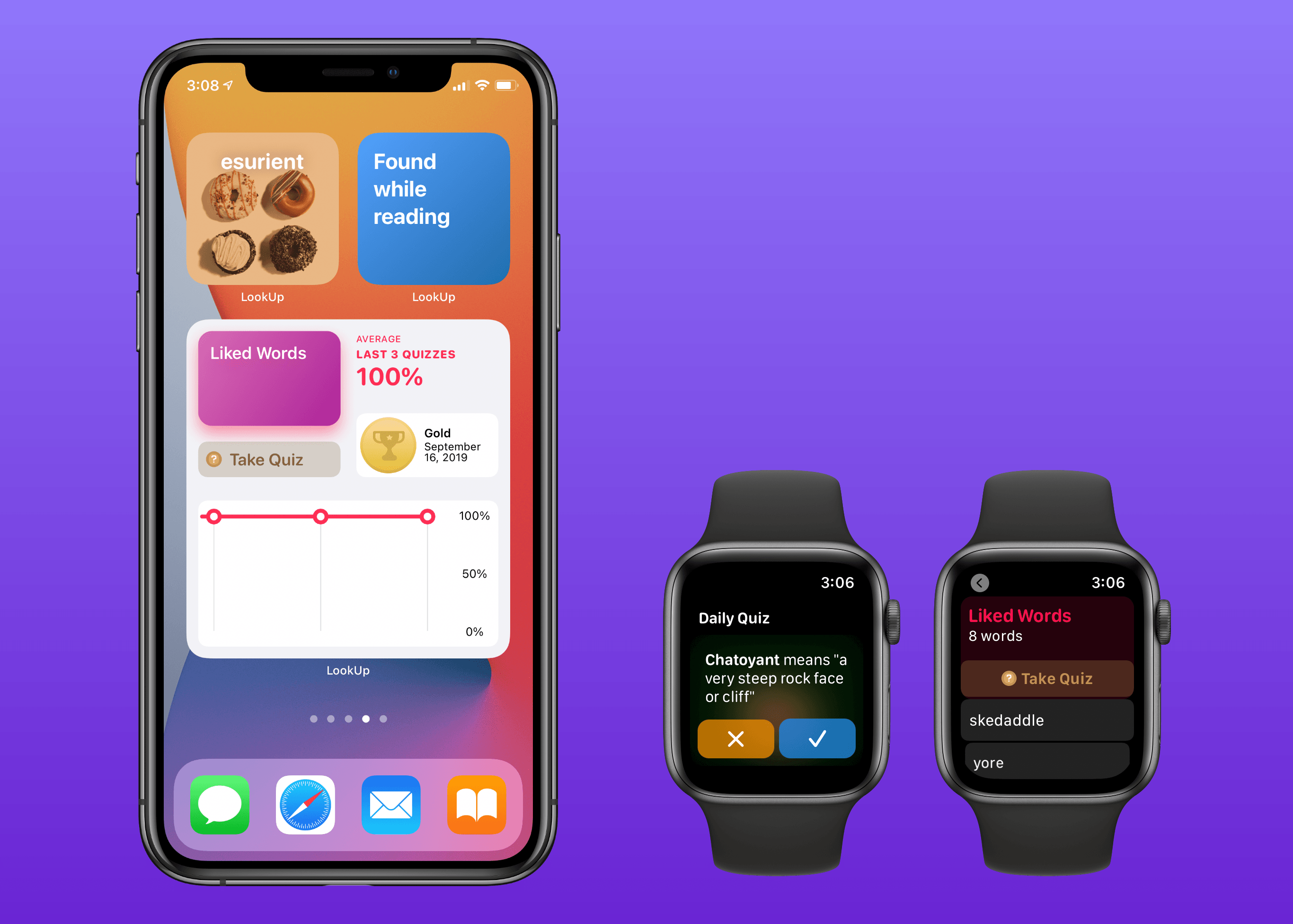
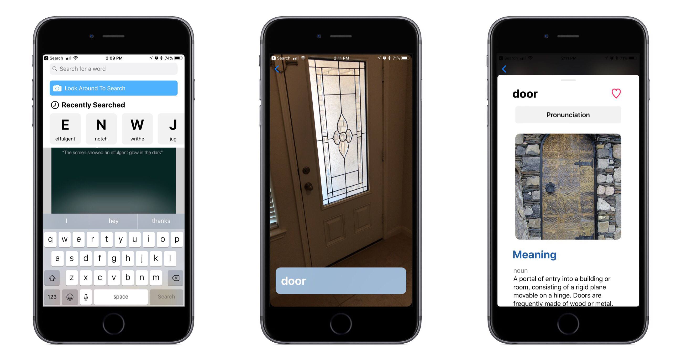
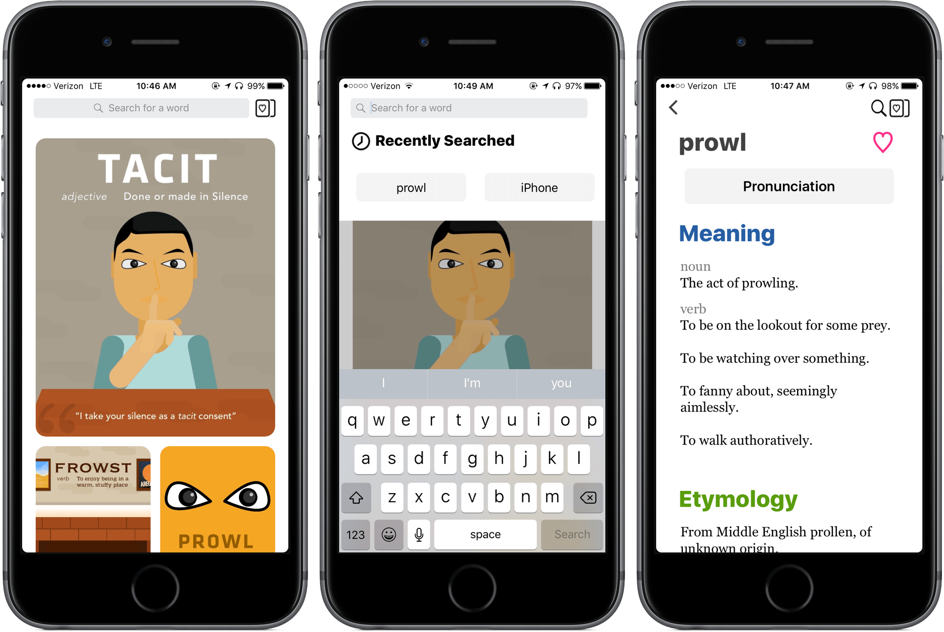
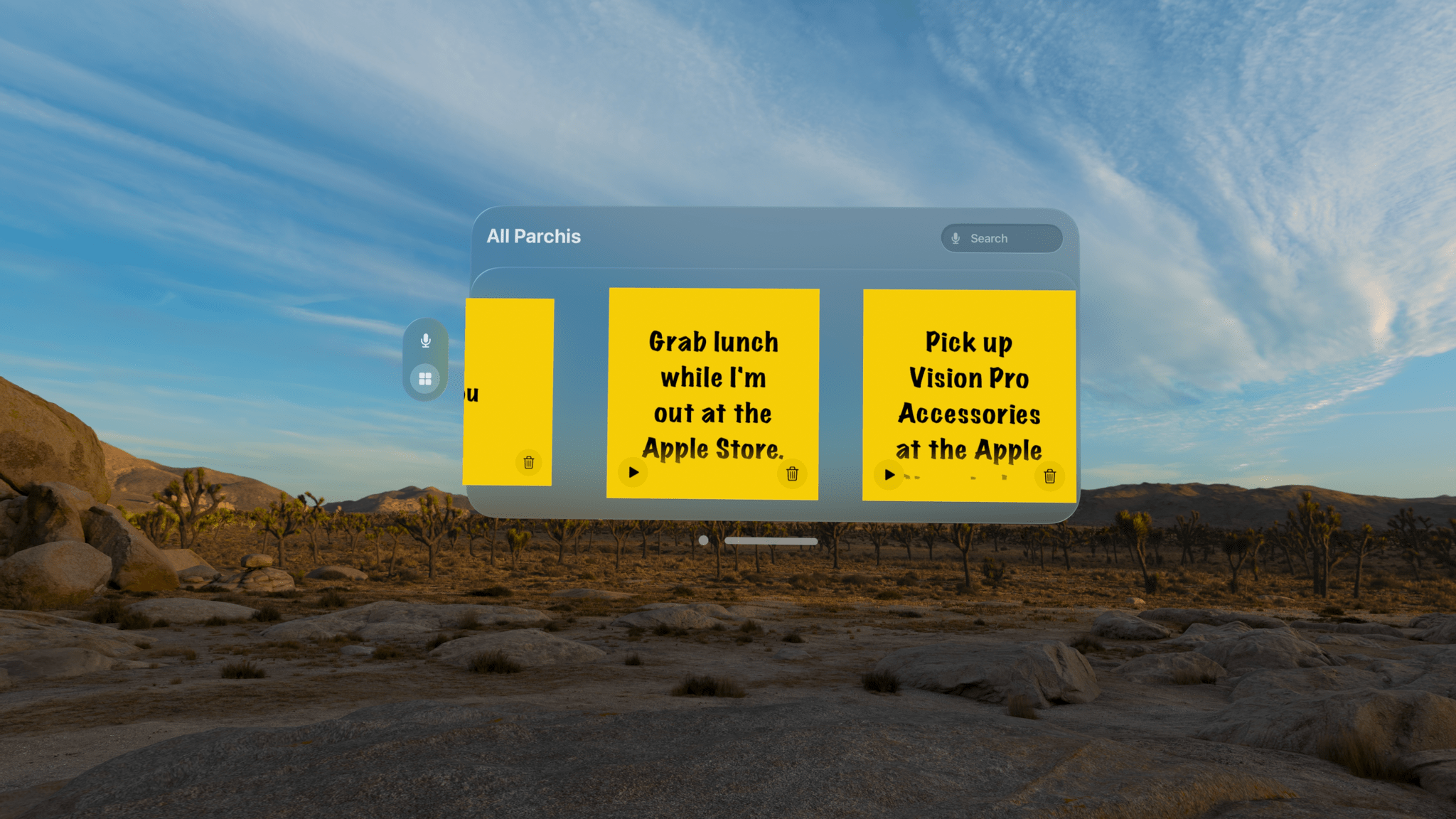
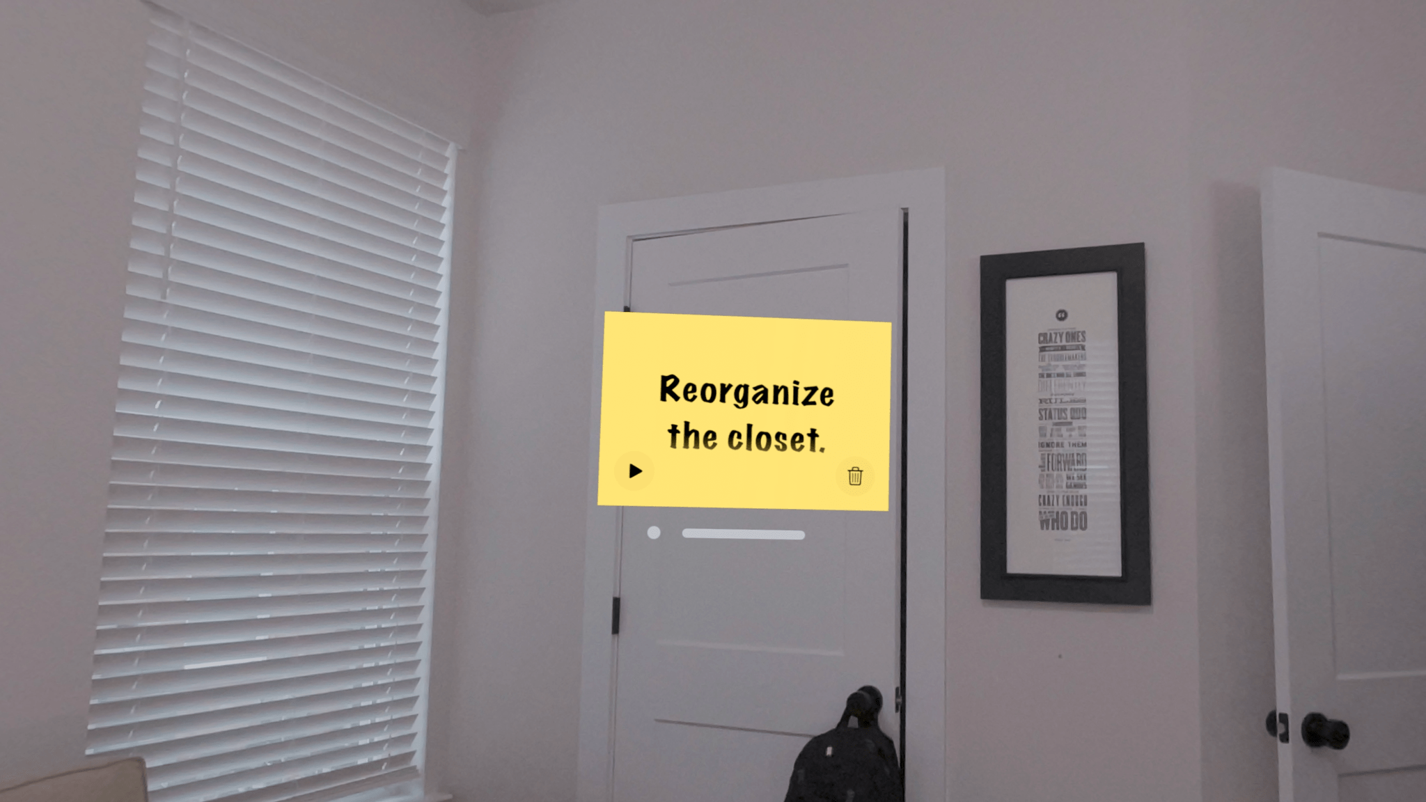
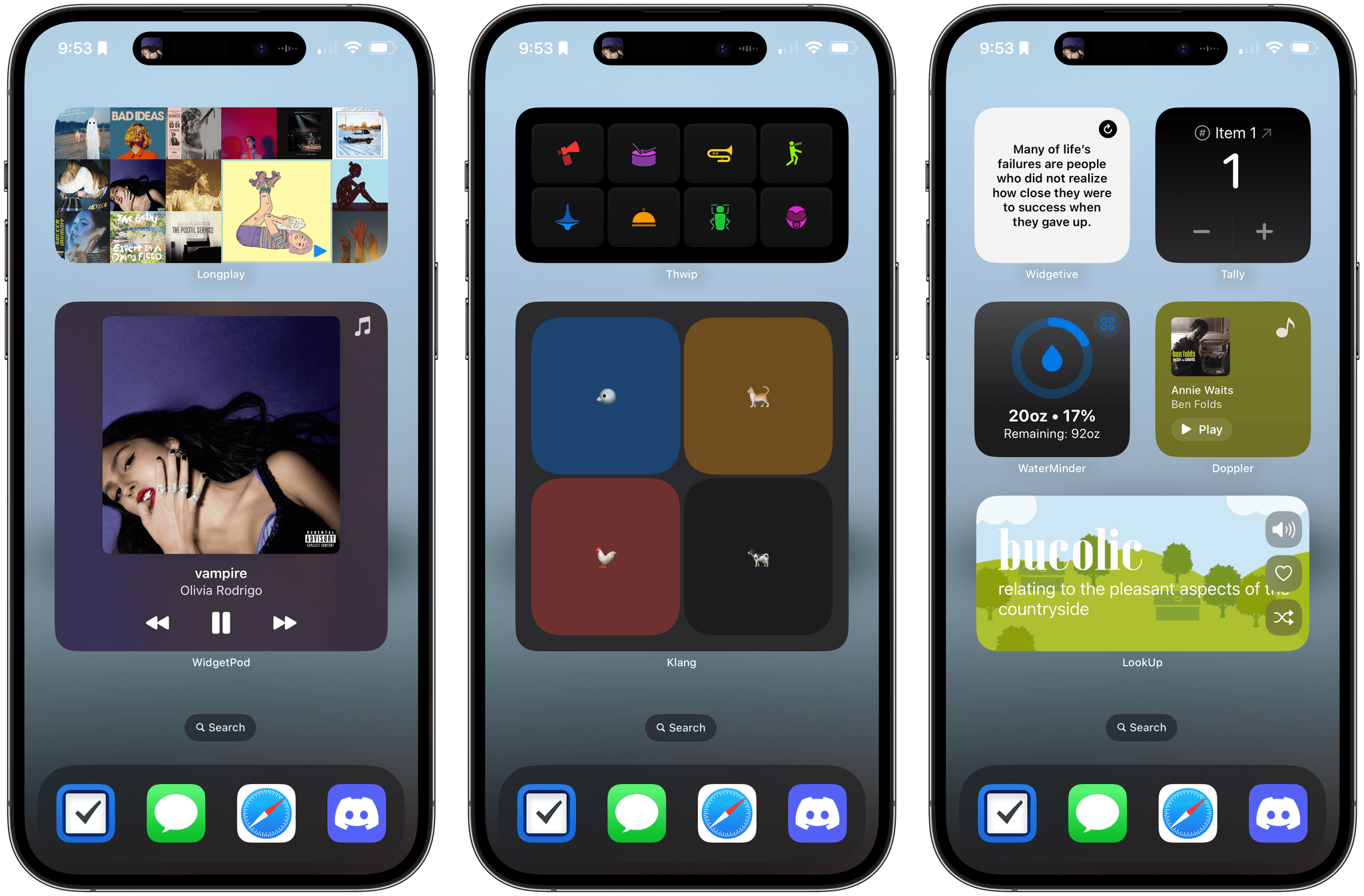
While Apple was busy with visionOS this summer, I was having fun exploring iOS 17’s collection of app updates and, as we’ll see in this review, extensive upgrades to one system feature: widgets.

As always every year: let’s dive in.

Read more


  1. Did I ever tell you the story of how I used a Microsoft Surface in secret as my main computer from January to June 2023 until Apple unveiled the new Stage Manager for iPadOS 17 and everything was good with the world again? How I spent six months in computing wilderness and questioned every single one of my tech decisions? And how I ultimately accepted that I prefer Apple platforms because, at the end of the day, they're made by people who care about great design and user experience? I did, and you can listen to the story here↩︎