This Week's Sponsor:

Listen Later

Listen to Articles as Podcasts


Search results for "Linky"

Create Better Text Shots for Twitter Using Linky

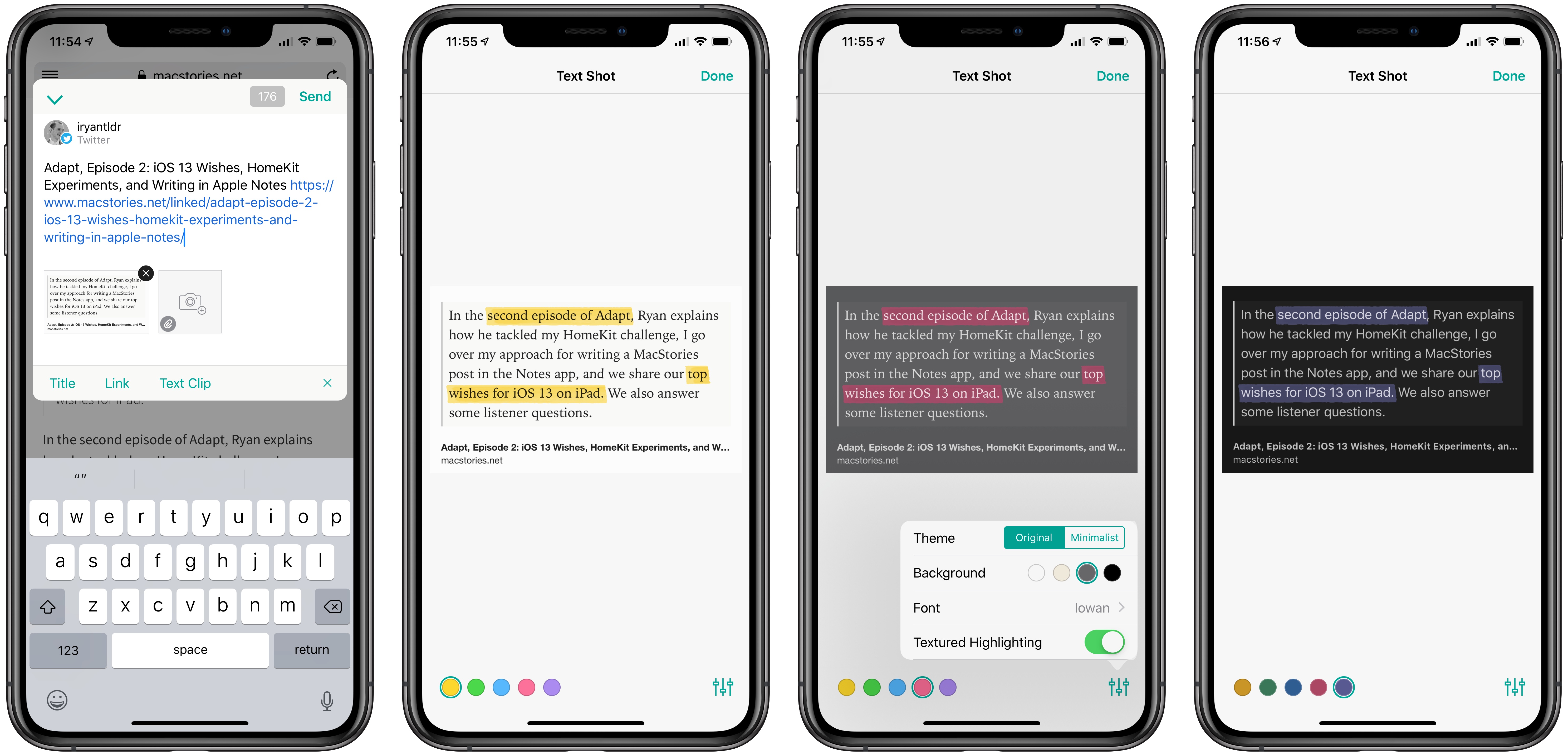
Linky is a tiny utility for iOS that I love. The app serves as an easy way to share to Twitter or Mastodon from the iOS share extension, and I use it every day to tweet MacStories articles or new episodes of Adapt. Used from Safari, the Linky share extension can automatically populate a tweet compose field with information from the site you’re viewing, such as its title, URL, and featured images. Linky’s ease of use makes it my favorite way to share content via tweets.

Earlier this week, Linky was updated with two new enhancements to its text shot feature. For years now the app has enabled easy creation of text shots for sharing portions of an article, or personal thoughts that exceed Twitter’s character limit. That text shot feature is now better than ever though thanks to the addition of highlighting and visual customization options.

After Linky has created a text shot – which happens upon activating the share extension when a portion of text is selected in Safari – you can tap that new image to enter editing mode. Inside editing mode, swiping over any portion of text in your text shot will cause it to highlight. This highlight can be one of five colors, and from the settings menu in the bottom-right corner you can choose whether the highlight is textured or solid. The feature is incredibly easy to use, and offers a great way to further call out certain words or phrases in a text shot.

Linky also offers an array of customization options for a text shot’s appearance. You can choose from one of six font options for the text, all of which look great; the background of the text shot can be white, sepia, gray, or black; you can also choose a minimalist theme or the default original. The added flexibility offered makes me far more likely to use text shots on a regular basis.

If you ever share clips of text you find online, Linky is hands-down the best way to do that. The app also includes support for multiple accounts, so you can tweet from several accounts at once, and offers annotation features for standard images. All told, I can’t recommend Linky highly enough.


Linky 5.3 Adds ‘Markup’ Feature for Image Annotations

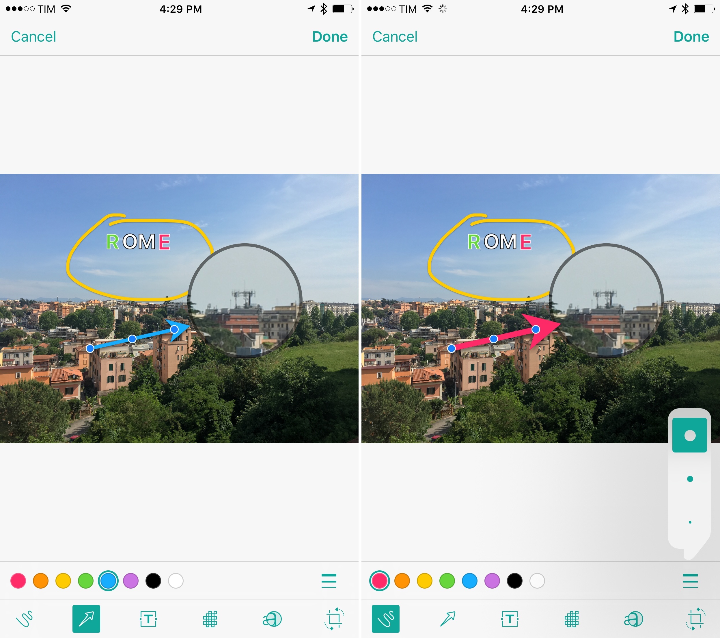
Linky's new Markup mode.

Linky’s new Markup mode.

I’ve been using Linky for a few years now to share images, links, and app deals to Twitter. The app has a powerful share sheet with support for multiple Twitter accounts, and its developer introduced clever additions such as textshots and suggested images when sharing from the web. It’s a solid app that comes in handy every day.

Today, Linky has reached version 5.3, which brings compatibility with Twitter’s accessible image captions (useful for textshots) and a new Markup option to edit and annotate images before sharing them.

Read more


Tweeting Multiple Pictures from iOS’ Photos App with Linky

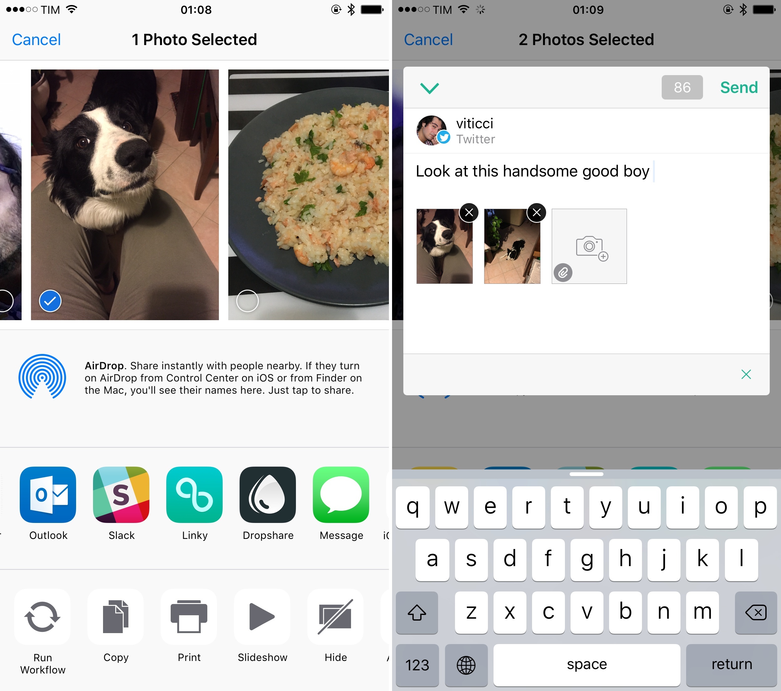
Ever since Twitter rolled out the ability to include multiple pictures in a tweet, I’ve been annoyed by the lack of such option in iOS’ tweet sheet. There are times when I’d rather not open my Twitter client to tweet some pictures or screenshots – maybe I don’t want to get distracted by news happening on Twitter, or maybe I just want to share from the Photos app without seeing mentions that I want to reply to.

Twitter’s (or Apple’s?) decision not to support the feature with the native iOS extension is baffling, but, thankfully, the latest update to Linky for iPhone and iPad offers an elegant (and obvious) solution to the problem.

Read more


Linky 5.0 Brings Better Sharing for Twitter on iOS with Images, Textshots, and More

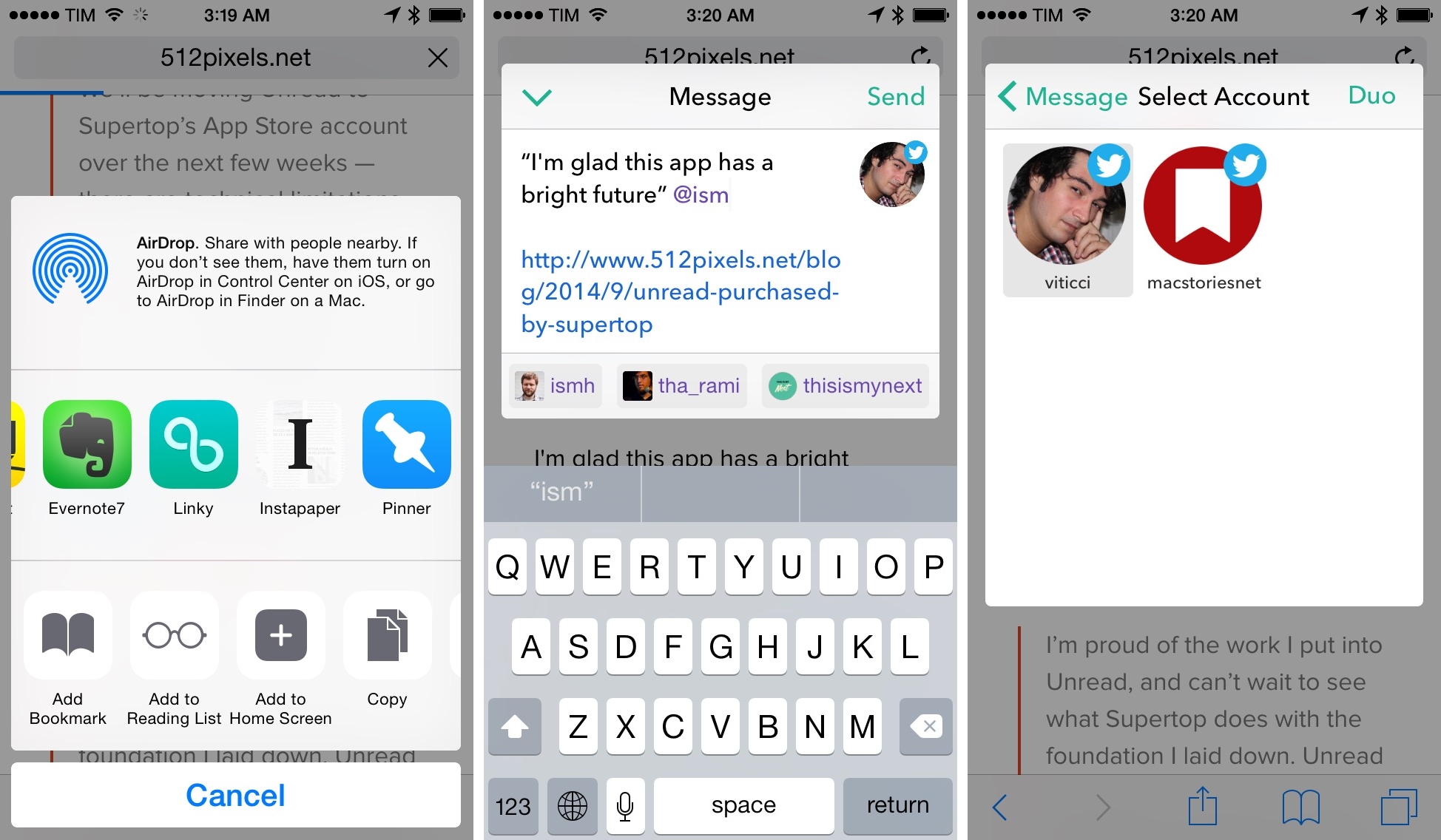
I covered Linky for iOS back in September, when the app’s iOS 8 update added a share extension that turned Linky into a supercharged share sheet for Twitter and Facebook thanks to excellent integration with any iOS app. I wrote:

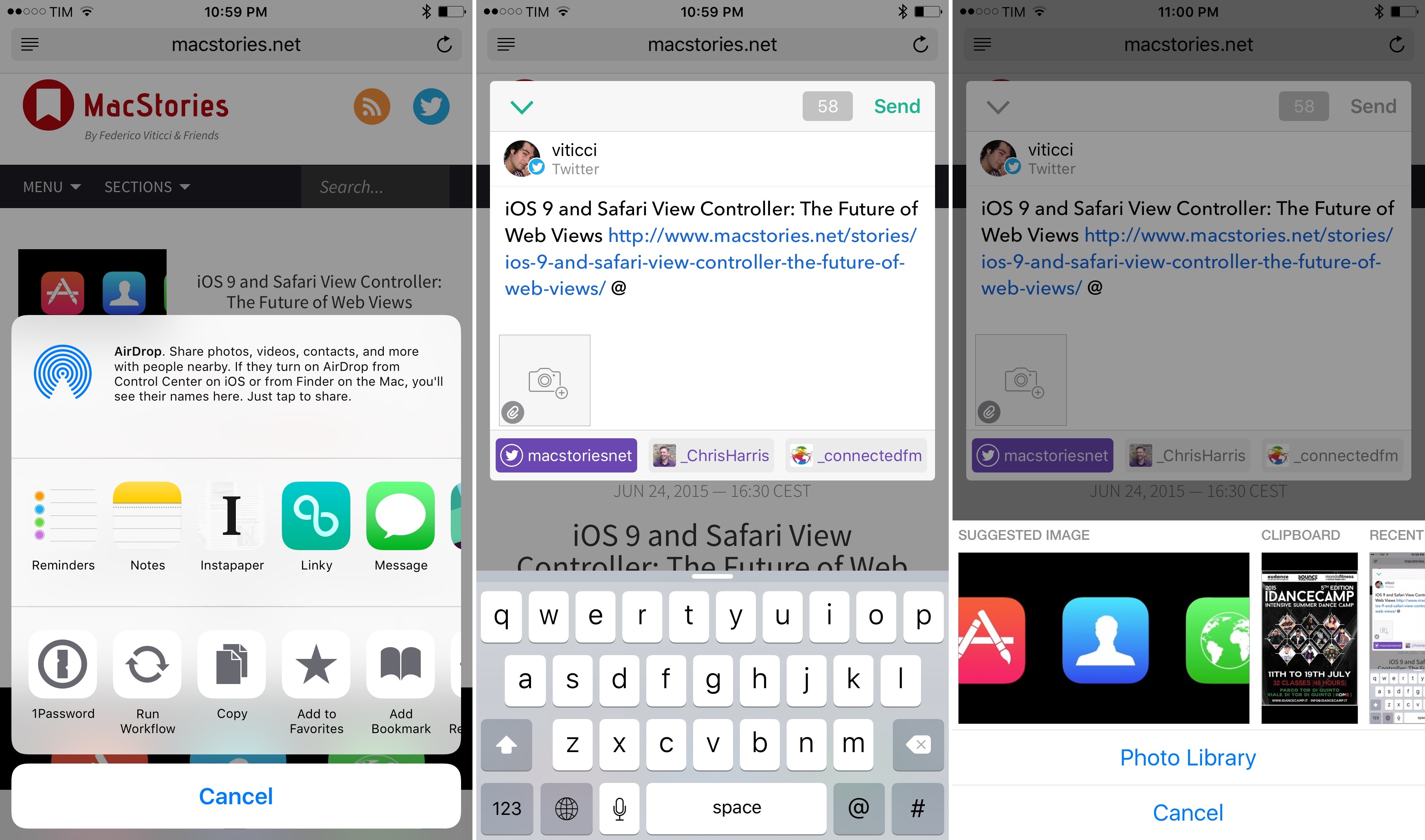
Linky the share extension is a great way to tweet links from Safari on iOS 8. Once enabled, Linky will appear as an extension of Safari and other apps that can share URLs such as Instapaper or a Pinboard client. The design of the app’s composer is minimal and easy to understand. You can switch between accounts by tapping the profile picture, tap buttons to insert the title or link of a webpage (if they’ve not been automatically inserted), and there’s a character counter in the bottom right.

For the past nine months, I’ve been using Linky every day to tweet links and quotes from Safari and other apps. Unlike the built-in Twitter share extension, Linky comes with thoughtful touches such as highlighting for links and text that exceeds the 140-character count – if you share dozens of links on a daily basis, the convenience of details adds up, and Pragmatic Code found a good niche for Linky to thrive.

The problem with Linky was that it worked well for text, but it didn’t have support for images. Tweeting screenshots from my camera roll or so-called textshots accompanying links to articles has become a common practice for me, but Linky couldn’t be part of my social sharing workflow whenever I needed to post something that wasn’t just text. Linky 5.0, released today on the App Store, wants to fill this gap with built-in support for images – but like prior releases, there are several hidden details that make the experience of sharing with Linky superior to alternatives on iOS.

Read more


ShortSwitch: A Shortcut to Quickly Import Screenshots and Videos from a Nintendo Switch on Your iPhone and iPad

ShortSwitch for iOS 14.

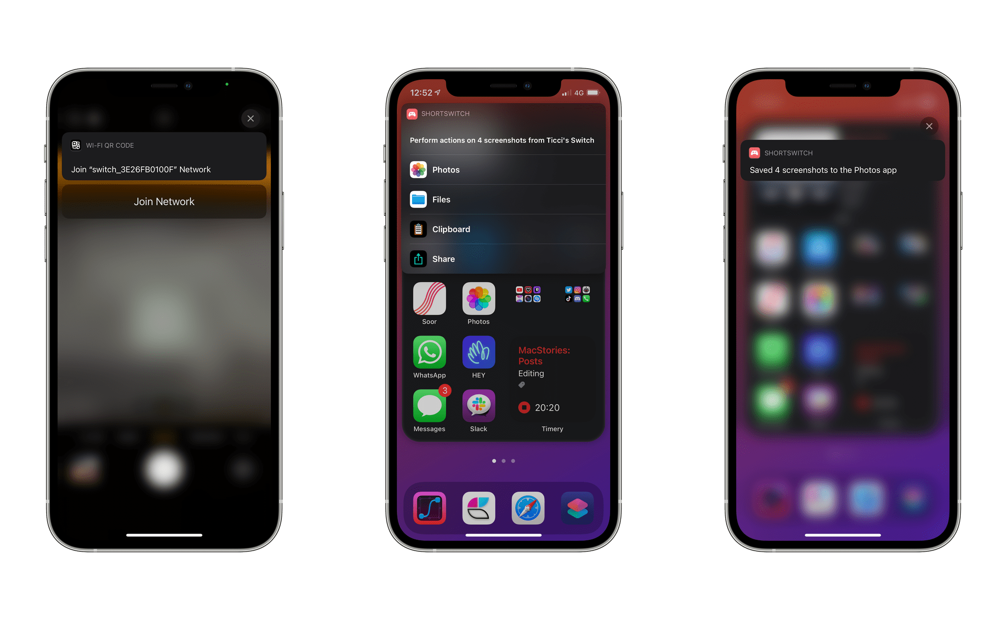
ShortSwitch for iOS 14.

Last week, Nintendo rolled out a new feature that simplifies importing screenshots and videos taken on a Nintendo Switch on any smart device. As part of the console’s 11.0 firmware, you can now share up to 10 screenshots or a single video capture from the Nintendo Switch media gallery and, by scanning a series of QR codes with your phone or tablet, wirelessly connect your device to the console and save them via a web browser. Although Nintendo’s approach may not be as intuitive or modern as, say, Microsoft automatically saving all screenshots you take on an Xbox console and uploading them to your Xbox account, it is a clever, platform-agnostic solution that will keep working with any device that can scan a QR code and connect to the console’s Wi-Fi network.1

As someone who plays a lot of Nintendo Switch games2 and has always disliked having to share screenshots via Nintendo’s Twitter integration on the Switch, I’ve long wanted an easier way to send images and videos from the console to my iPhone and iPad. As soon as I tested Nintendo’s new feature, I had a feeling I could further speed up the process with Shortcuts and remove the (little) friction left in Nintendo’s system for sharing media between the console and smart devices.

The result is ShortSwitch, a shortcut that automatically recognizes media being shared by a Nintendo Switch over Wi-Fi and which gives you the option to save all items at once in Photos or Files, share them via the share sheet, or copy them to the clipboard. ShortSwitch does this by directly accessing the local web server created by the Nintendo Switch to share media; because it doesn’t need to connect to the Internet or use third-party apps, ShortSwitch runs instantly and allows you to save multiple items at once in just a couple seconds. Even better, you can configure ShortSwitch to run as a Personal Automation on your iPhone and iPad, which means the shortcut will run automatically as soon as you connect your iPhone or iPad to a Nintendo Switch.

You can download ShortSwitch at the end of this article and find it (alongside 220+ other free shortcuts) in the MacStories Shortcuts Archive. Now, allow me to explain how ShortSwitch works and how I put it together.

Read more


My Must-Have Apps, 2019 Edition

My Home screens.

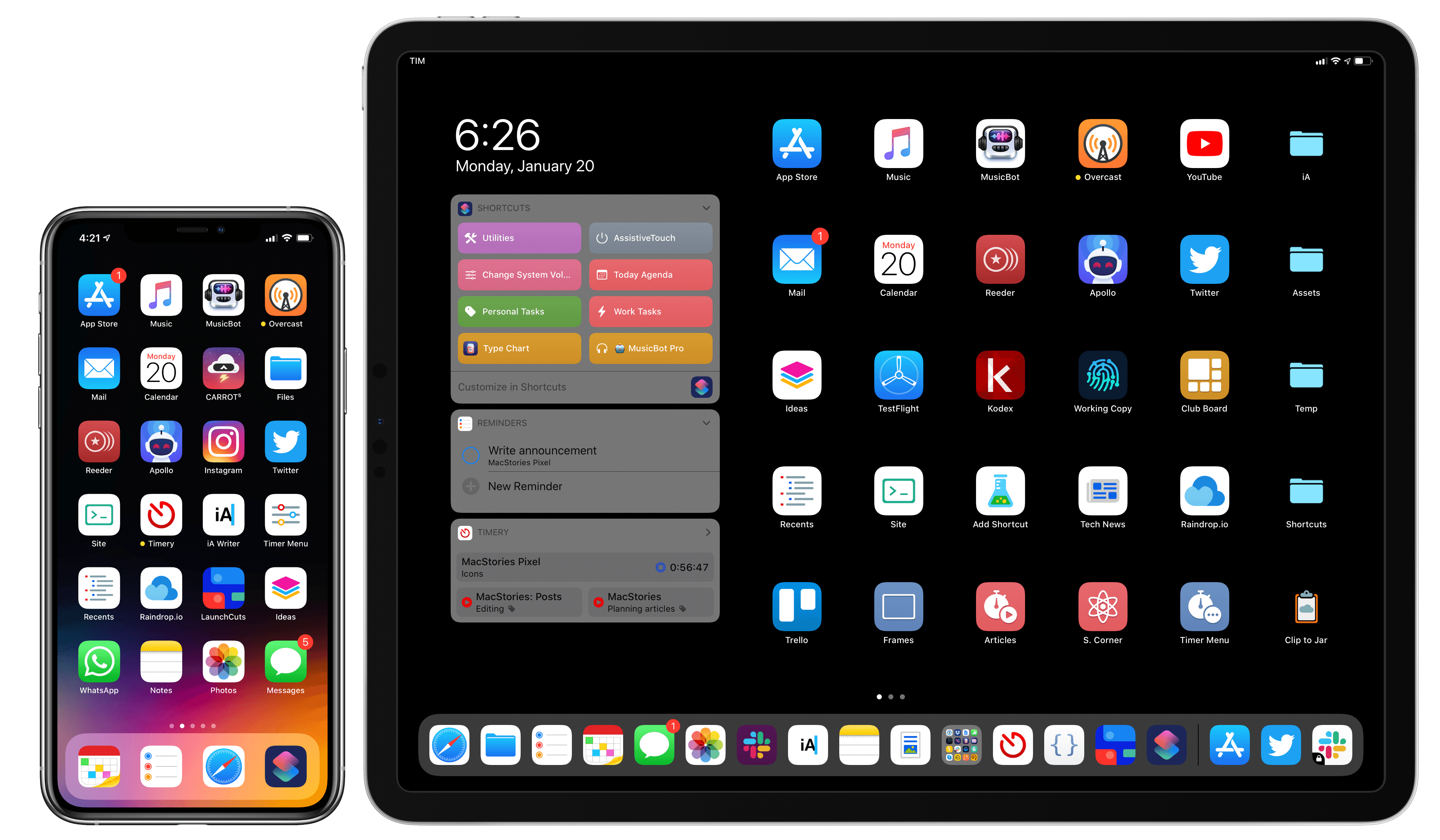
My Home screens.

Every year in late October, I start putting together a rough list of candidates for my annual ‘Must-Have Apps’ story, which I’ve historically published in late December, right before the holiday break. As you can tell by the date on this article, the 2019 edition of this story is different: not only did I spend the last months of the year testing a variety of new apps and betas, but I also kept tweaking my Home screen to accomodate MusicBot and new Home screen shortcuts. As a result, it took me a bit longer to finalize the 2019 collection of my must-have apps; in the process, however, I’ve come up with a slightly updated format that I believe will scale better over the next few years.

In terms of app usage, 2019 was a year of stabilization for me. Having settled on a specific writing workflow revolving around iA Writer and Working Copy, and having figured out a solution to record podcasts from my iPad Pro, I spent the year fine-tuning my usage of those apps, refining my file management habits thanks to iPadOS’ improved Files app, and cutting down on the number of apps I kept tucked away in folders on my iPhone and iPad.

Two themes emerged over the second half of 2019, though. First, thanks to various improvements in iOS and iPadOS 13, I increased my reliance on “first-party” Apple apps: I embraced the new Reminders app and its exclusive features, stopped using third-party note-taking apps and moved everything to Notes, and switched back to Apple Mail as my default email client. I’ve written about the idea of comfort in the Apple ecosystem before, and I’ve seen that concept work its way into my app preferences more and more over the course of 2019.

The second theme, unsurprisingly, is my adoption of a hybrid Home screen that combines apps and shortcuts powered by our custom MacStories Shortcuts Icons. Following changes to running shortcuts from the Home screen in iOS 13, I realized how much I was going to benefit from the ability to execute commands with the tap of an icon, so I decided to mix and match apps and shortcuts on my Home screens to maximize efficiency. Thanks to the different flavors of MacStories Shortcuts Icons (we just launched a Color set), I’ve been able to assemble a truly personalized Home screen layout that puts the best of both worlds – my favorite apps and custom shortcuts – right at my fingertips.

For this reason, starting this year you’ll find a new Home Screens section at the beginning of this roundup that covers the first tier of my must-have apps – the “ultimate favorites” I tend to keep on the Home screens of both devices. Because I like to keep my iPhone and iPad Home screens consistent, it made sense to start grouping these apps together in their own special section. These are the apps I use most on a daily basis; I’m pretty sure you’ll find at least a couple surprises this year.

This entire story features a collection of the 50 apps I consider my must-haves on the iPhone and iPad, organized in seven categories; whenever possible, I included links to original reviews and past coverage on MacStories. As for the traditional list of awards for best new app and best app update: those are now part of our annual MacStories Selects awards, which we published last December and you can find here.

Let’s dig in.

Read more


Catalyst Can Rescue the Mac and Grow the iPad

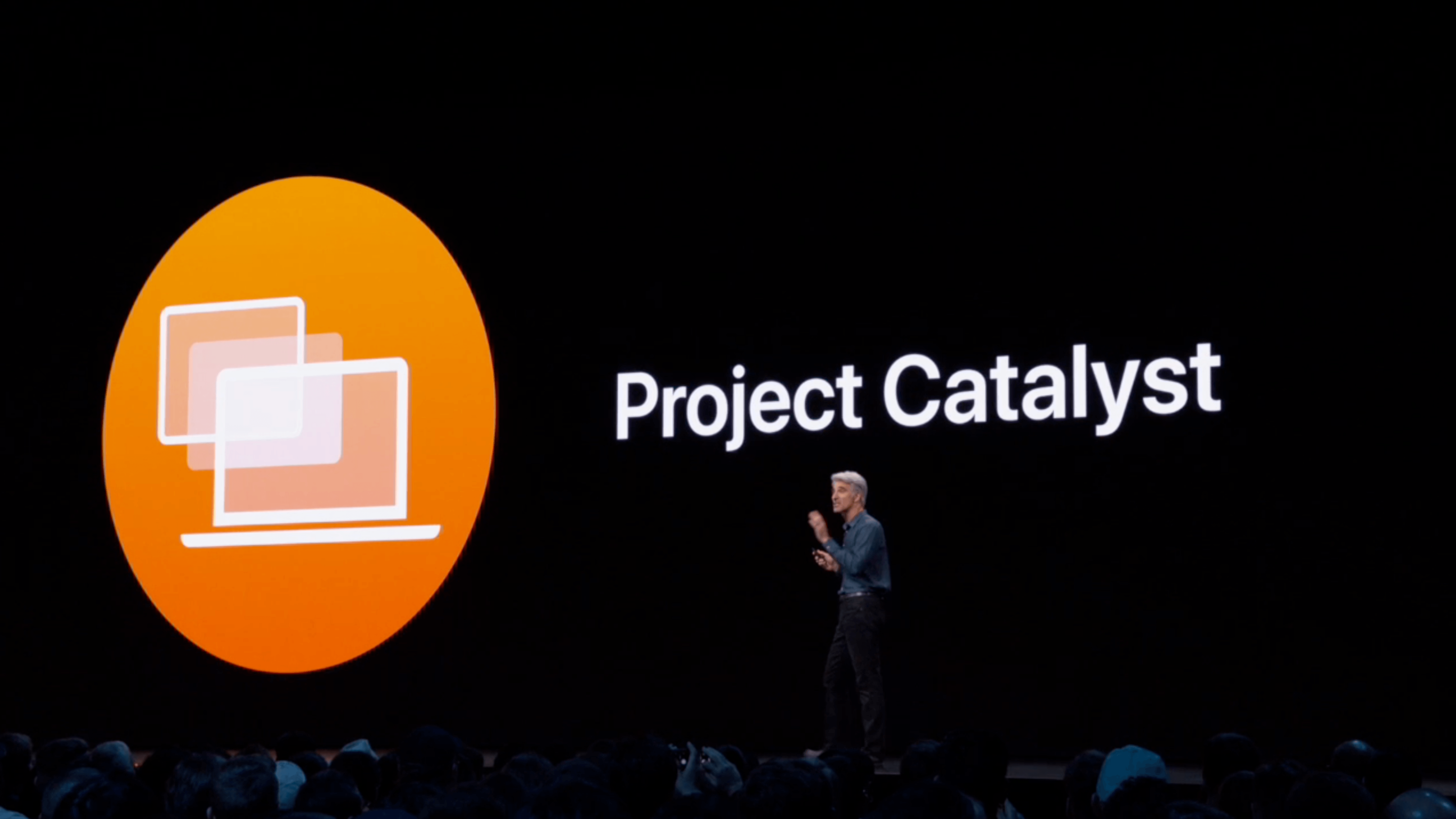
At WWDC 2018, Craig Federighi provided a sneak peek at what everyone was calling Marzipan: an as-yet-unnamed way for iPad app developers to bring their apps to the Mac. So, it came as no surprise when Federighi retook the stage in 2019 and revealed more details about the project and its official name: Catalyst.

What caught a lot of developers off guard though was SwiftUI, a declarative approach to building user interfaces that was also announced at WWDC this year. SwiftUI, known before the conference as Amber, its rumored project name, was on developers’ radar almost as long as Catalyst, but it’s fair to say that few anticipated the scope of the project. The purpose of SwiftUI is to allow developers to build native user interfaces across all of Apple’s hardware platforms – from the Apple Watch to the Mac – using highly-readable, declarative syntax and a single set of tools and APIs. If that weren’t enough to get developers’ attention, using SwiftUI carries the added advantage of providing features like dark mode, dynamic type, and localization automatically.

The message from WWDC was clear: SwiftUI is the future, a unified approach to UI development designed to simplify the process of targeting multiple hardware platforms. It’s a bold, sprawling goal that will take years to refine, even if it’s eagerly adopted by developers.

However, SwiftUI also raises an interesting question: what does it mean for Catalyst? If SwiftUI is the future and spans every hardware platform, why bother bringing iPad apps to the Mac with Catalyst in the first place? It’s a fair question, but the answer is readily apparent from the very different goals of the two technologies.

SwiftUI serves the long-term goal of bringing UI development for all of Apple’s platforms under one roof and streamlining it. It won’t take over immediately though. There’s still work to be done on the framework itself, which Apple will surely expand in capability over time.

By contrast, Catalyst is a shorter-term initiative designed to address two soft spots in Apple’s lineup: the stagnation of the Mac app ecosystem, and the slow growth of pro iPad apps. The unstated assumption underlying the realignment seems to be that the two app platforms are stronger tied together than they are apart, which ultimately will protect the viability of their hardware too.

The impact of Catalyst on the Mac and iPad remains murky. It’s still too early in the process to understand what the long-term effect will be on either platform. There’s substantial execution risk that could harm the Mac or iPad, but despite some troubling signs, which I’ll get to in due course, I’m convinced that Catalyst has the potential for meaningful improvements to both platforms, especially the Mac. Let’s take a closer look at what those could be.

Read more


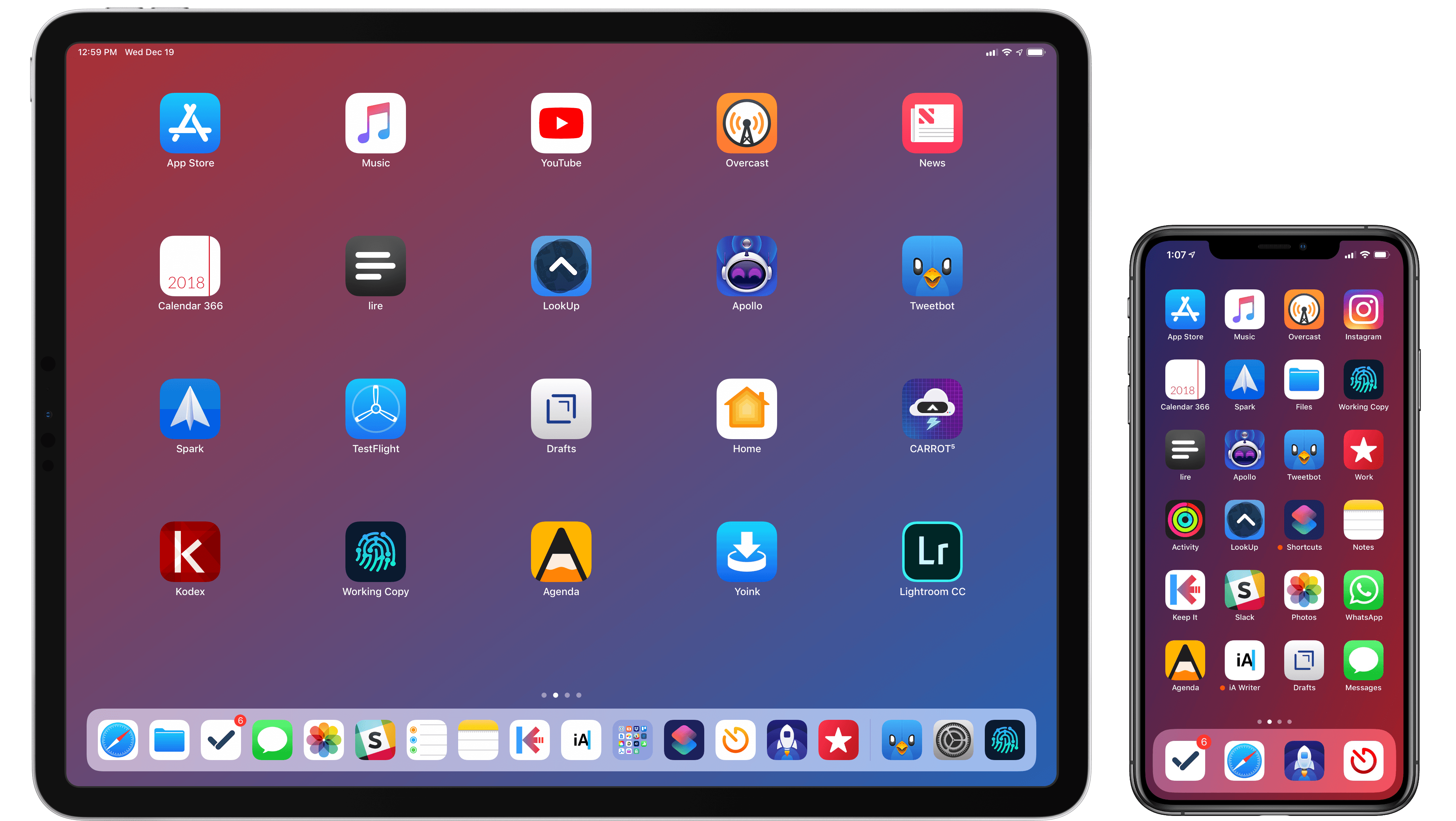
My Must-Have iOS Apps, 2018 Edition

Putting together my annual list of Must-Have iOS Apps is an exercise in analyzing the trends of the year and considering which ones had the biggest impact on how I use my iPhone and iPad. Two years ago, it was web services and open APIs; last year, I focused on collaboration with the MacStories team and making my workflow consistent across devices; this year, there isn’t a single overarching theme behind this list, but rather a collection of trends and changes that I’ve observed over the course of 2018.

First and foremost is the switch to a subscription-based business model by some of my favorite apps. As we noted in our look at the modern economics of the App Store earlier this year, it is becoming increasingly challenging for indie developers – the ones who make the apps we tend to use and cover most frequently on MacStories – to find a balance between reaching new customers with paid app updates and supporting an app over the span of multiple years for existing users who already paid once.

A subscription seems like an obvious solution: new customers can try an app for free and later decide to subscribe; longtime users of an app get to support their favorite app over a longer period of time; developers are more incentivized to keep making an app better thanks to the financial security provided by an ongoing revenue stream. Recurring subscriptions for all apps launched two years ago just before WWDC, and it feels like we’ve only now reached a point where more and more developers are willing to experiment with them. This major shift in app pricing wasn’t always met favorably by longtime users of existing apps, which has resulted in developers testing different approaches such as optional subscriptions, bundles containing subscriptions and In-App Purchases, or even multiple ways to unlock the same features. In looking at the apps included in this list, I was surprised by how many now include some form of recurring subscription; I think this transition will only become more prominent in 2019.

The second trend I noticed in my usage of third-party apps is a strong preference for those that fully embrace modern iOS technologies. From Siri shortcuts (by far, the most important iOS developer framework of 2018) to Files integration and support for external keyboards on iPad, I tend to prioritize apps that eschew proprietary functionalities and adopt native APIs such as iCloud, the Files document browser, or Reminders. With iOS growing more powerful and complex each year, I think it’s only natural that I’ve stuck with apps that shy away from Apple-provided solutions as little as possible; those frameworks are always going to be more integrated with the rest of the system than any alternative a developer can come up with, and I seek that level of integration because I enjoy the comfort of an ecosystem where all the pieces work well together.

Lastly, I’ve noticed some overall changes in the kinds of apps I consider my must-haves for iPhone and iPad. In the “pro” app department, the Photography and Development lists have grown to include apps such as Lightroom, Scriptable, Darkroom, and Halide – all new entries this year. One of my goals with the new iPad Pro is to use it as a workstation for editing photos and programming my own little additions to iOS; I felt like my increased usage of these apps warranted some changes in the annual picks. You will also find more apps designed to interact with macOS as a result of my purchase of a Mac mini (which I’m using as a home server for various tasks) and different utility apps as some of the old ones have been replaced by Shortcuts. An app that, by the way, I can no longer include in this roundup due to my self-imposed rule of not featuring Apple apps because they’re kind of obvious choices for an iOS user (this also applies to Shazam, officially acquired by Apple this year).

Below, you’ll find a collection of the 60 apps I consider my must-haves on the iPhone and iPad, organized in nine categories; whenever possible, I included links to original reviews and past coverage on MacStories. What you will not find is the usual list of awards for best new app and best app update, which we’ve relaunched as a team effort under the MacStories Selects name this year. Instead, at the end of the story you’ll find my App of the Year, which is also joining MacStories Selects as an award that recognizes an overall outstanding iOS app that had a profound impact on my workflow over the past year, regardless of its release date.

Let’s dig in.

Read more