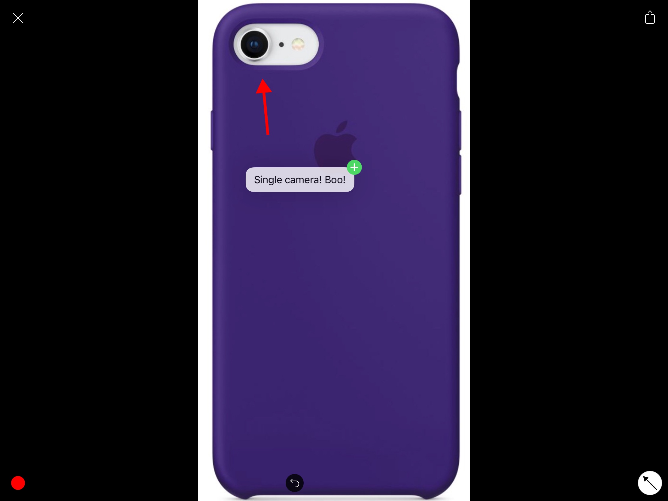
Earlier this year, John calledAnnotable “my hands-down favorite app for image annotations.” An all-in-one tool for marking up your images, Annotable serves as an interim stop for importing images and then exporting annotated versions to another app. With an iOS 11 update, images can now be dragged into and out of Annotable, making the annotation process simpler than ever before.
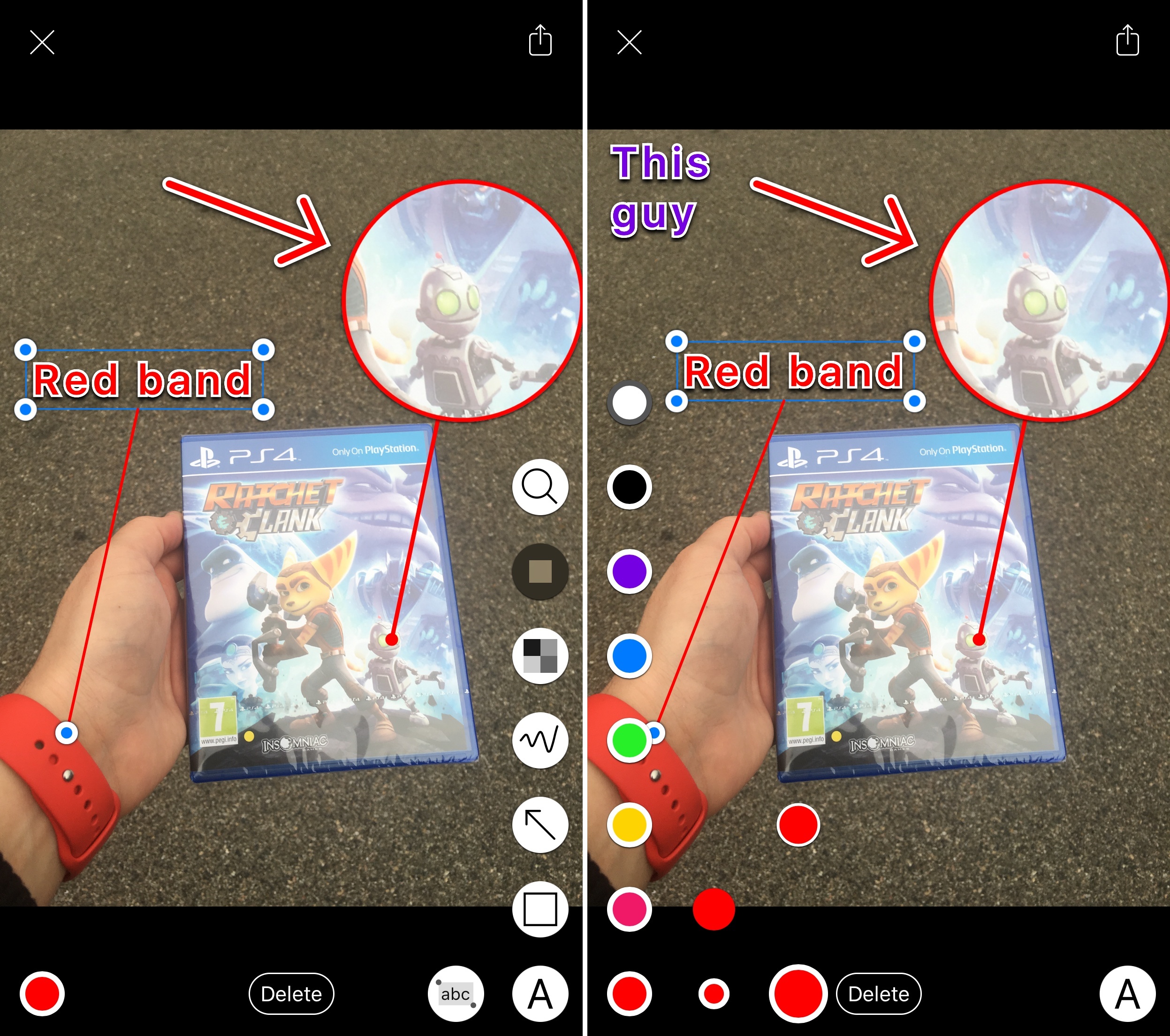
Let’s say you’re browsing the web on your iPad and you find an image online that you want to share with a friend, but you need to point out a detail. In Safari, you press and hold on the picture to pick it up, open Annotable, and drop it into the app when the green plus sign appears in the bottom right corner. The image will open in Annotable’s editor where you can apply any of the tools the app offers. You can even drag and drop text from another app onto an image in Annotable as an annotation. When you’re finished, tap save, and the image will be added to your camera roll, or drag the image into another app.
When you want to export photos, you can grab multiple from Annotable’s photo viewer and drag them to your app of choice. Of course, you could also head over to Photos to accomplish this, but I’ve found it convenient just to stay in the same app when I’m finished annotating my images.
Overall, the implementation of drag and drop into Annotable saves multiple steps, creating a more seamless way to get images into and out of this MacStories favorite.
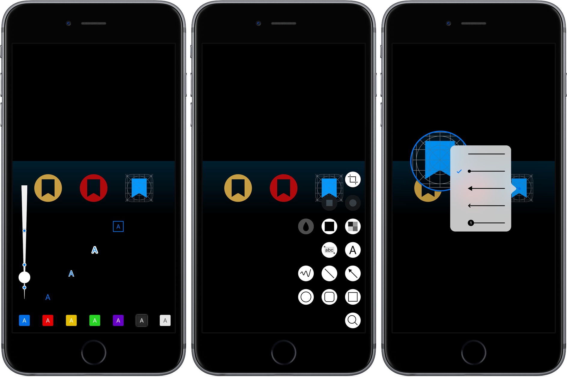
Annotable, an image annotation app from developer Ling Wang, received a major update yesterday. Version 2.0 of the app is all about customization. From the tools that appear when you open the app, to the formatting of text added to an image, Annotable gives you precise control over how you use the app and the look of marked up images, making it my hands-down favorite app for image annotations.
Nice update to Annotable, my favorite image annotation tool for iOS: the latest version has brought support for wide color (pictures you edit will be saved in wide color without changing their color profile back to sRGB) as well as haptic feedback on the iPhone 7.
The latter is one of the most interesting third-party implementations to date: both in the app and the Photos editing extension, Annotable will give you feedback when you snap to the edges of a picture, when an oval becomes perfectly circle or a line perfectly vertical/horizontal, or when you’ve zoomed an image to fit. That’s a clever way to augment the user experience without cluttering the interface with visual messages, and it’s line with Apple’s adoption of the Taptic Engine for system haptics as well.
Over the years of writing at MacStories, I’ve covered a fair share of image annotation apps. As reviewing apps is part of what I do for a living, I end up taking a lot of screenshots of software on a daily basis, and, often, those screenshots need to be annotated.
I’ve tried them all – Skitch (let’s pour one out), Pinpoint (née Bugshot), PointOut, image annotations in Workflow, and others. A problem persisted: I couldn’t find an image annotation tool that would pack the simplicity of Pinpoint and Skitch and the variety of tools I’d expect from a Mac app. Every app ended up missing one or two functionalities I needed, which resulted – and if you work on iOS, you’ve likely been in this situation, too – in having to keep a folder of multiple annotation apps, each serving a different purpose.
This changes today with Annotable, a new app for the iPhone and iPad created by developer Ling Wang. Annotable builds on the foundation of Skitch – with a layout heavily reminiscent of Evernote’s product – and adds annotation features seen in Pinpoint, PointOut, and various Mac apps to provide a powerful annotation environment with support for screenshots and photos.
Every year in late October, I start putting together a rough list of candidates for my annual ‘Must-Have Apps’ story, which I’ve historically published in late December, right before the holiday break. As you can tell by the date on this article, the 2019 edition of this story is different: not only did I spend the last months of the year testing a variety of new apps and betas, but I also kept tweaking my Home screen to accomodate MusicBot and new Home screen shortcuts. As a result, it took me a bit longer to finalize the 2019 collection of my must-have apps; in the process, however, I’ve come up with a slightly updated format that I believe will scale better over the next few years.
In terms of app usage, 2019 was a year of stabilization for me. Having settled on a specific writing workflow revolving around iA Writer and Working Copy, and having figured out a solution to record podcasts from my iPad Pro, I spent the year fine-tuning my usage of those apps, refining my file management habits thanks to iPadOS’ improved Files app, and cutting down on the number of apps I kept tucked away in folders on my iPhone and iPad.
Two themes emerged over the second half of 2019, though. First, thanks to various improvements in iOS and iPadOS 13, I increased my reliance on “first-party” Apple apps: I embraced the new Reminders app and its exclusive features, stopped using third-party note-taking apps and moved everything to Notes, and switched back to Apple Mail as my default email client. I’ve written about the idea of comfort in the Apple ecosystem before, and I’ve seen that concept work its way into my app preferences more and more over the course of 2019.
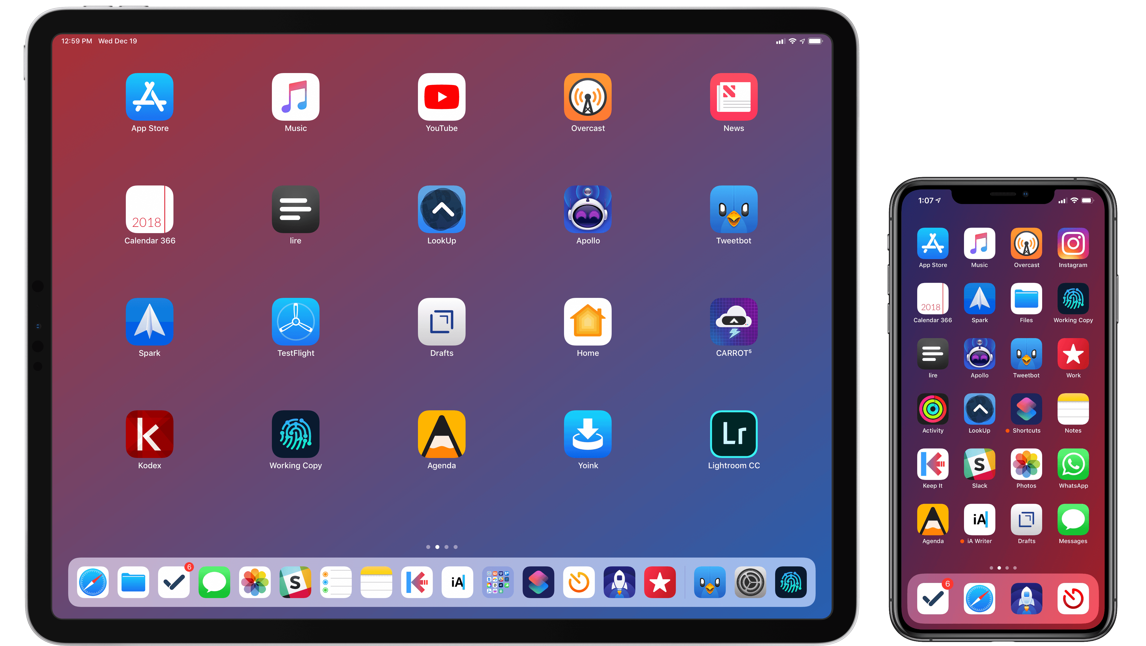
The second theme, unsurprisingly, is my adoption of a hybrid Home screen that combines apps and shortcuts powered by our custom MacStories Shortcuts Icons. Following changes to running shortcuts from the Home screen in iOS 13, I realized how much I was going to benefit from the ability to execute commands with the tap of an icon, so I decided to mix and match apps and shortcuts on my Home screens to maximize efficiency. Thanks to the different flavors of MacStories Shortcuts Icons (we just launched a Color set), I’ve been able to assemble a truly personalized Home screen layout that puts the best of both worlds – my favorite apps and custom shortcuts – right at my fingertips.
For this reason, starting this year you’ll find a new Home Screens section at the beginning of this roundup that covers the first tier of my must-have apps – the “ultimate favorites” I tend to keep on the Home screens of both devices. Because I like to keep my iPhone and iPad Home screens consistent, it made sense to start grouping these apps together in their own special section. These are the apps I use most on a daily basis; I’m pretty sure you’ll find at least a couple surprises this year.
This entire story features a collection of the 50 apps I consider my must-haves on the iPhone and iPad, organized in seven categories; whenever possible, I included links to original reviews and past coverage on MacStories. As for the traditional list of awards for best new app and best app update: those are now part of our annual MacStories Selects awards, which we published last December and you can find here.
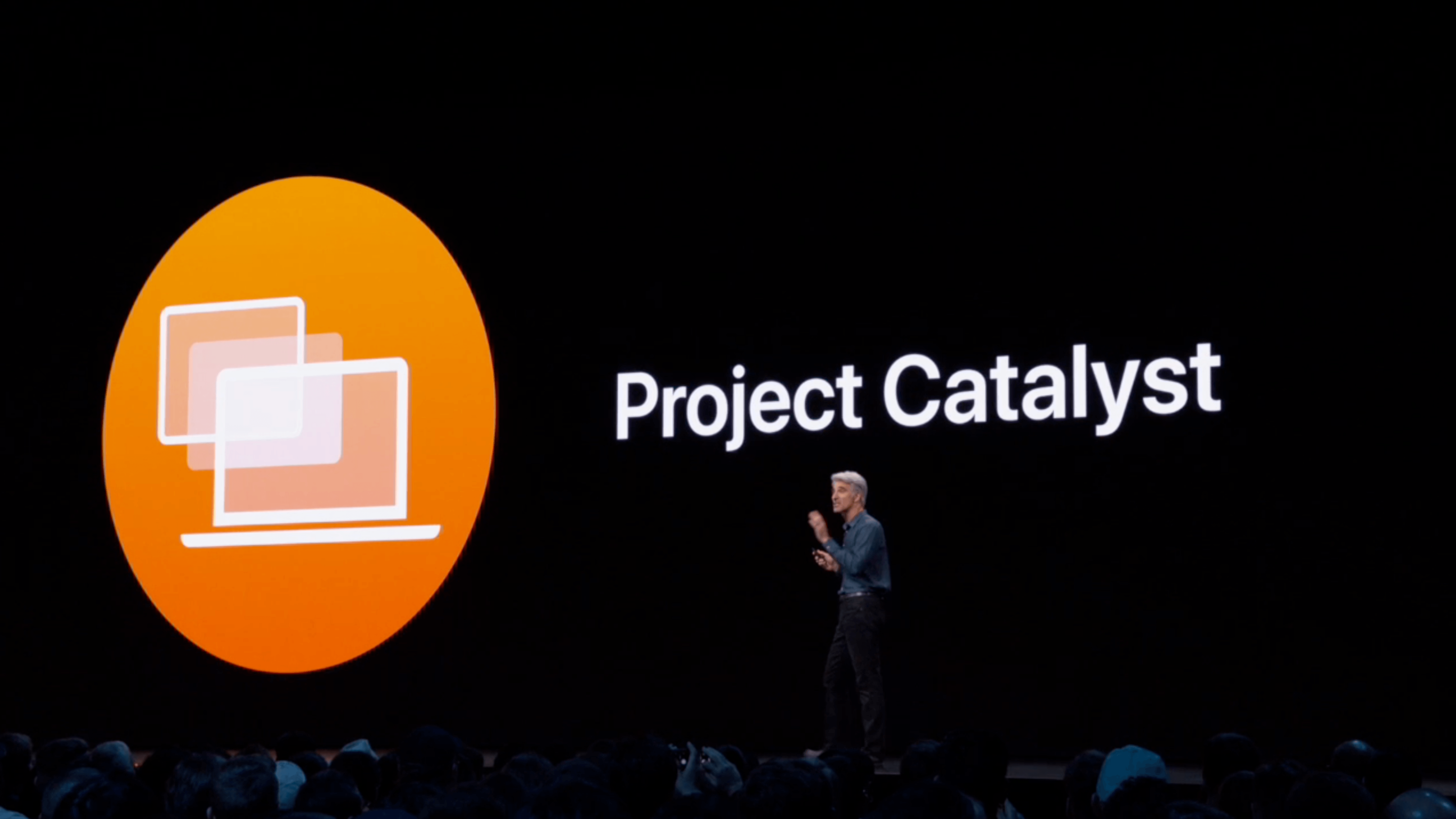
At WWDC 2018, Craig Federighi provided a sneak peek at what everyone was calling Marzipan: an as-yet-unnamed way for iPad app developers to bring their apps to the Mac. So, it came as no surprise when Federighi retook the stage in 2019 and revealed more details about the project and its official name: Catalyst.
What caught a lot of developers off guard though was SwiftUI, a declarative approach to building user interfaces that was also announced at WWDC this year. SwiftUI, known before the conference as Amber, its rumored project name, was on developers’ radar almost as long as Catalyst, but it’s fair to say that few anticipated the scope of the project. The purpose of SwiftUI is to allow developers to build native user interfaces across all of Apple’s hardware platforms – from the Apple Watch to the Mac – using highly-readable, declarative syntax and a single set of tools and APIs. If that weren’t enough to get developers’ attention, using SwiftUI carries the added advantage of providing features like dark mode, dynamic type, and localization automatically.
The message from WWDC was clear: SwiftUI is the future, a unified approach to UI development designed to simplify the process of targeting multiple hardware platforms. It’s a bold, sprawling goal that will take years to refine, even if it’s eagerly adopted by developers.
However, SwiftUI also raises an interesting question: what does it mean for Catalyst? If SwiftUI is the future and spans every hardware platform, why bother bringing iPad apps to the Mac with Catalyst in the first place? It’s a fair question, but the answer is readily apparent from the very different goals of the two technologies.
SwiftUI serves the long-term goal of bringing UI development for all of Apple’s platforms under one roof and streamlining it. It won’t take over immediately though. There’s still work to be done on the framework itself, which Apple will surely expand in capability over time.
By contrast, Catalyst is a shorter-term initiative designed to address two soft spots in Apple’s lineup: the stagnation of the Mac app ecosystem, and the slow growth of pro iPad apps. The unstated assumption underlying the realignment seems to be that the two app platforms are stronger tied together than they are apart, which ultimately will protect the viability of their hardware too.
The impact of Catalyst on the Mac and iPad remains murky. It’s still too early in the process to understand what the long-term effect will be on either platform. There’s substantial execution risk that could harm the Mac or iPad, but despite some troubling signs, which I’ll get to in due course, I’m convinced that Catalyst has the potential for meaningful improvements to both platforms, especially the Mac. Let’s take a closer look at what those could be.
Putting together my annual list of Must-Have iOS Apps is an exercise in analyzing the trends of the year and considering which ones had the biggest impact on how I use my iPhone and iPad. Two years ago, it was web services and open APIs; last year, I focused on collaboration with the MacStories team and making my workflow consistent across devices; this year, there isn’t a single overarching theme behind this list, but rather a collection of trends and changes that I’ve observed over the course of 2018.
First and foremost is the switch to a subscription-based business model by some of my favorite apps. As we noted in our look at the modern economics of the App Store earlier this year, it is becoming increasingly challenging for indie developers – the ones who make the apps we tend to use and cover most frequently on MacStories – to find a balance between reaching new customers with paid app updates and supporting an app over the span of multiple years for existing users who already paid once.
A subscription seems like an obvious solution: new customers can try an app for free and later decide to subscribe; longtime users of an app get to support their favorite app over a longer period of time; developers are more incentivized to keep making an app better thanks to the financial security provided by an ongoing revenue stream. Recurring subscriptions for all apps launched two years ago just before WWDC, and it feels like we’ve only now reached a point where more and more developers are willing to experiment with them. This major shift in app pricing wasn’t always met favorably by longtime users of existing apps, which has resulted in developers testing different approaches such as optional subscriptions, bundles containing subscriptions and In-App Purchases, or even multiple ways to unlock the same features. In looking at the apps included in this list, I was surprised by how many now include some form of recurring subscription; I think this transition will only become more prominent in 2019.
The second trend I noticed in my usage of third-party apps is a strong preference for those that fully embrace modern iOS technologies. From Siri shortcuts (by far, the most important iOS developer framework of 2018) to Files integration and support for external keyboards on iPad, I tend to prioritize apps that eschew proprietary functionalities and adopt native APIs such as iCloud, the Files document browser, or Reminders. With iOS growing more powerful and complex each year, I think it’s only natural that I’ve stuck with apps that shy away from Apple-provided solutions as little as possible; those frameworks are always going to be more integrated with the rest of the system than any alternative a developer can come up with, and I seek that level of integration because I enjoy the comfort of an ecosystem where all the pieces work well together.
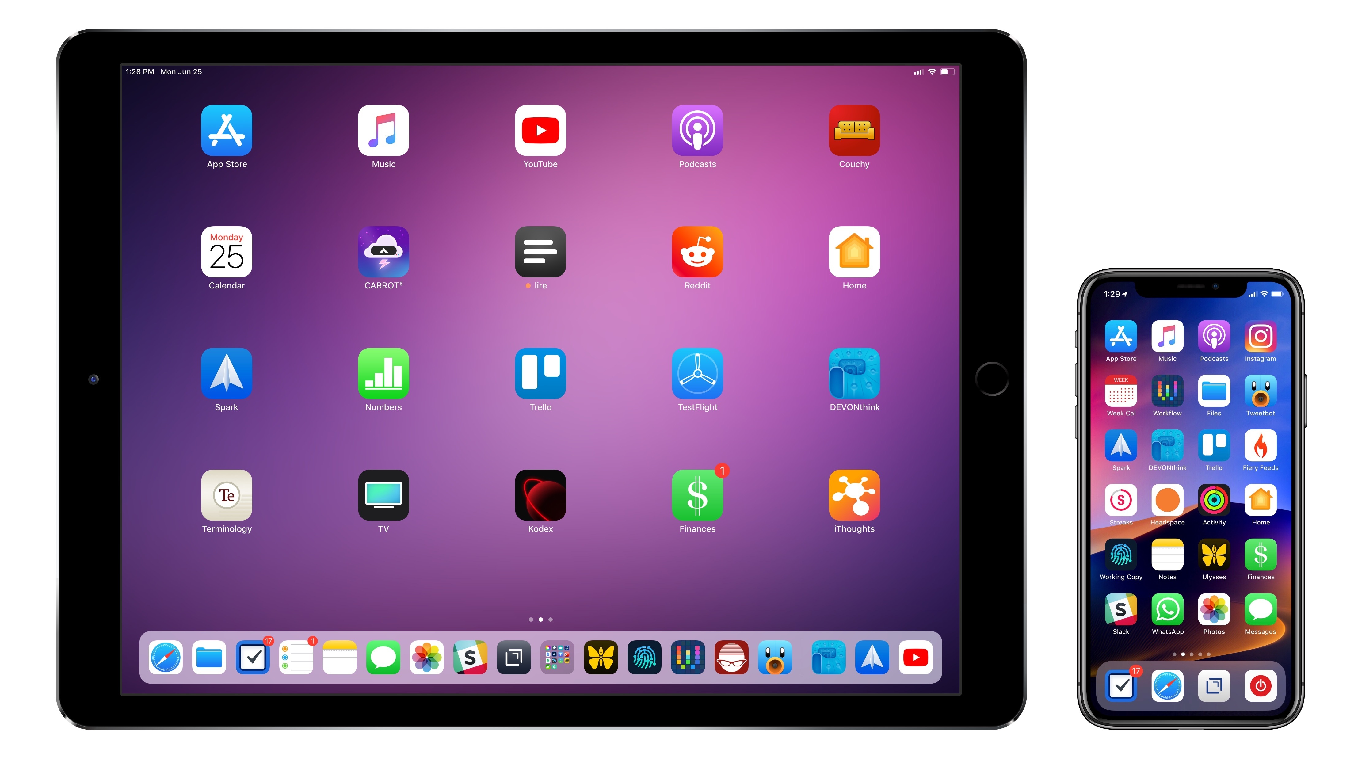
Lastly, I’ve noticed some overall changes in the kinds of apps I consider my must-haves for iPhone and iPad. In the “pro” app department, the Photography and Development lists have grown to include apps such as Lightroom, Scriptable, Darkroom, and Halide – all new entries this year. One of my goals with the new iPad Pro is to use it as a workstation for editing photos and programming my own little additions to iOS; I felt like my increased usage of these apps warranted some changes in the annual picks. You will also find more apps designed to interact with macOS as a result of my purchase of a Mac mini (which I’m using as a home server for various tasks) and different utility apps as some of the old ones have been replaced by Shortcuts. An app that, by the way, I can no longer include in this roundup due to my self-imposed rule of not featuring Apple apps because they’re kind of obvious choices for an iOS user (this also applies to Shazam, officially acquired by Apple this year).
Below, you’ll find a collection of the 60 apps I consider my must-haves on the iPhone and iPad, organized in nine categories; whenever possible, I included links to original reviews and past coverage on MacStories. What you will not find is the usual list of awards for best new app and best app update, which we’ve relaunched as a team effort under the MacStories Selects name this year. Instead, at the end of the story you’ll find my App of the Year, which is also joining MacStories Selects as an award that recognizes an overall outstanding iOS app that had a profound impact on my workflow over the past year, regardless of its release date.
After years of unabated visual and functional changes, iOS 12 is Apple’s opportunity to regroup and reassess the foundation before the next big step – with one notable exception.
We left last year’s iOS 11 update with a palpable tension between two platforms.
On one hand, following a year of minor changes to the iPad and a hardware refresh that came in later than some expected, Apple once again devoted plenty of attention to reimagining the tablet’s role in the world of modern computing. iPad updates in iOS 11, despite having their fair share of critics, largely did not disappoint. On the other hand, the iPhone – by and large still Apple’s crown jewel – had to play second fiddle to a platform that was more in need of a strong, coherent message. And so despite blessing the iPhone with the same features of its larger multitouch cousin (at least most of them), Apple seemed content ceding the smartphone’s spotlight to the iPad. There was a healthy array of new functionalities for both, but iOS 11’s “Monumental leap for iPad” tagline pretty much told the whole story.
iOS 12, available today for the same range of devices that supported iOS 11, feels like a reaction to changes that have occurred around Apple and consumer technology over the past year.
While iOS 11 may go down in Apple software history as the touchstone of the iPad’s maturity, it will also be remembered as one of the company’s most taxing releases for its users. You don’t have to look far into the iOS 11 cycle for headlines lamenting its poor stability on older hardware, plethora of design inconsistencies (which were noted time and time again), and general sense of sluggishness – issues that may have contributed to a slower adoption rate than 2016’s iOS 10.
There were debacles in Apple’s PR and marketing approach as well: performance problems with battery and power management were handled poorly during a key time of the year, culminating with a year-long discounted battery replacement program and a somewhat rushed battery-related addition to iOS’ Settings. Then, of course, there was the much derided iPhone X ad clearly showing one of the many reported iOS bugs on TV, which had to be fixed with an updated commercial before the actual software was fixed. No matter how you slice it, it’s been a rough few months for Apple in the realm of public perception of its software.
At the same time, toward the beginning of 2018, technology observers witnessed the rise of Time Well Spent – an organization and, perhaps more broadly, a public movement demanding that tech companies prioritize enabling healthier relationships with mobile devices. The principles underlying Time Well Spent, from battling smartphone addiction and notification overload to including superior parental controls in mobile OSes, may have originated as a natural consequence of breakneck technological progress; as some argue, they may also be a byproduct of global socioeconomic and political events. Time Well Spent’s ideas found fertile soil in Silicon Valley: earlier this year, Facebook made key changes to its news feed to improve how users spend time on the social network; Apple made a rare commitment to better parental features in a future version of iOS; Google went all out and turned digital well-being into a suite of system features for Android.
It’s important to understand the context in which iOS 12 is launching today, for events of the past year may have directly shaped Apple’s vision for this update.
With iOS 12, Apple wants to rectify iOS’ performance woes, proving to their customers that iOS updates should never induce digital regret. Perhaps more notably though, iOS 12 doesn’t have a single consumer feature that encapsulates this release – like Messages might have been for iOS 10 or the iPad for iOS 11. Instead, iOS 12 is a constellation of enhancements revolving around the overarching theme of time. Apple in 2018 needs more time for whatever the next big step of iOS may be; they want iOS users to understand how much time they’re spending on their devices; and they want to help users spend less time managing certain system features. Also, funnily enough, saving time is at the core (and in the very name) of iOS 12’s most exciting new feature: Shortcuts.
iOS 12 isn’t Apple’s Snow Leopard release: its system changes and updated apps wouldn’t justify a “No New Features” slide. However, for the first time in years, it feels as if the company is happy to let its foot off the gas a little and listen to users more.
Apple released the first public beta of iOS 12 today, allowing non-developer testers to check out the new features and improvements in the next major version of iOS, set to be released sometime in the fall. While it’s always good practice to avoid installing a beta OS on your primary devices, the public beta seed typically ensures a minimum level of stability and functionality that isn’t always guaranteed with the first developer builds seeded at WWDC. If you’re interested in installing the public beta of iOS 12, you can find more details here.
We covered the big themes of iOS 12 and its most important functionalities in our original overview earlier this month. In this article, I want to focus on something different: showcasing my favorite small features and tidbits that I’ve come across in iOS 12 since installing the beta on both my iPhone X and iPad Pro a few weeks ago. While these features may change (or be removed altogether) between today and iOS 12’s final public release, they should give you an idea of the nice and hidden details you can expect from the latest iOS 12 beta. Let’s take a look.