John: It’s hard to understate the importance of the iPad’s large screen. Early critics dismissed the device as a big iPhone, but that criticism revealed a fundamental misunderstanding of the product.
By jumping from the iPhone’s small 3.5-inch display to one that approached 10 inches, the iPad delivered a canvas that allowed Apple and third-party developers to rethink not just the concept of mobile apps, but of apps altogether. The additional screen real estate allowed developers to flatten and spread UIs in a way that made new uses possible. That, in turn, led to richer, deeper experiences for everything from reading a comic book to managing complex projects and automating repetitive tasks, allowing users to interact directly with the software beneath their fingers.
After years of using the very best apps developers have to offer on the iPad, it was remarkably easy for Federico, Ryan, and I to come up with a list of the iPad apps that have been the most impactful for us during the past decade. There’s a lot of factors at play in arriving at these apps. Some forged a path by adopting the latest Apple technologies in a unique way that set an example for apps that followed. Others are apps that define a category that takes unique advantage of the iPad’s hardware. These are also apps that work on the iPhone or Mac too, but are most at home on the iPad’s unique platform.
Although there is no single formula for which iPad apps have been the most impactful, one thing each app in this collection shares is a rich, personal experience. These are apps inspired by and reflected in the image of Steve Jobs sitting onstage in a comfortable black leather chair swiping through photos. The iPad and the apps that run on it have come a long way since then, but the intimacy of directly manipulating apps that transform a slab of glass into anything a developer can imagine hasn’t changed, and remains what makes the iPad so special.
Pythonista
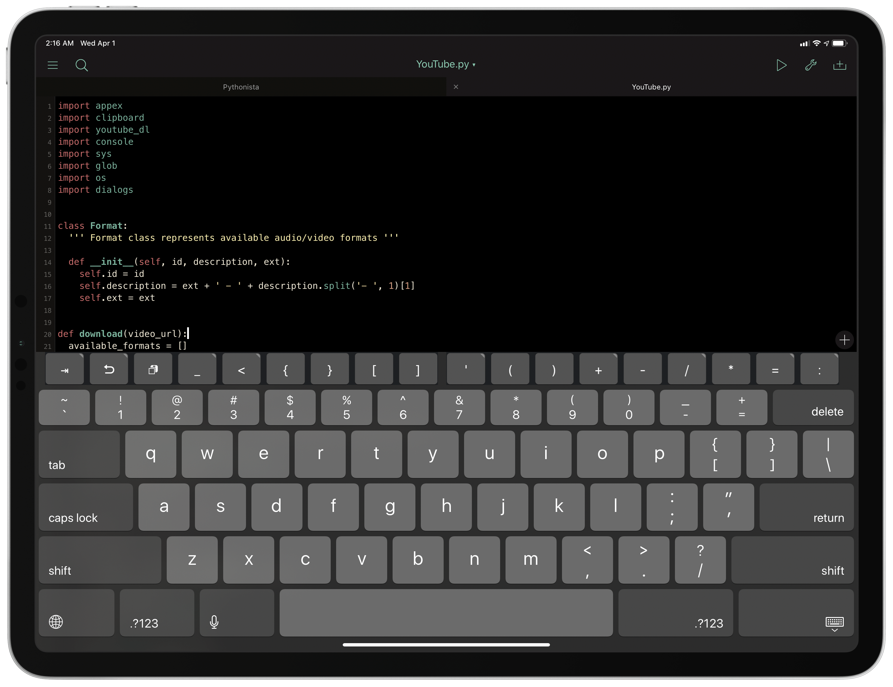
Federico: Before Workflow revolutionized automation on iOS and developer tools were an official category on the App Store, there was Pythonista. Created by indie developer Ole Moritz, Pythonista is a Python IDE that lets you write and run traditional Python scripts on your iPad, with a twist: in addition to the Python standard library, Pythonista offers custom modules that bridge native iOS APIs (such as the clipboard, Safari, UIKit, EventKit, etc.) with Python, allowing you to create scripts that control system functionalities in an automated fashion.
This may not sound so groundbreaking today since apps like Shortcuts and Scriptable are based on the same principle. It’s important to note, however, that Pythonista did all of this in 2012, when the App Store was young and the idea of writing code on an iOS device was consistently frowned upon. Ole Moritz’s idea was bold and revolutionary in the iOS app community at the time; I’d go as far as to say Pythonista pioneered the concept of iOS automation, which was later perfected by Workflow and remixed by a slew of other apps.
Pythonista was the app that convinced me that trying to get all my work done from an iPad wasn’t necessarily going to be a failed experiment. Sure, I had to learn the basics of Python scripting, but in return for a small investment of my time, I was able to create all sorts of scripts that could provide functionalities that were missing from iOS – a crucial factor as I was just beginning my transition from the Mac to iPad in late 2012. I used Pythonista to create a variety of enhancements to my iPad experience, from converting Markdown to HTML to uploading images to our CDN and manipulating plain text in ways that no iPad text editor allowed at the time.
Pythonista is still available today, and it recently received a major update with support for the latest features of iOS and iPadOS 13, plus a custom keyboard that lets you run Python scripts from any text field on your device. These days, all my automation happens in Shortcuts, but I have fond memories of Pythonista, and I believe it created a market that didn’t exist at the time, paving the way for Workflow and other iOS automation apps to follow.
Editorial
Federico: Following the launch of Pythonista, Ole Moritz had an idea: what if the underlying Python engine of Pythonista was used for a Markdown text editor? And thus Editorial was born.
Editorial is very close to my heart. I started beta testing the app alongside a small group of other people in late 2012, when I was undergoing my last rounds of radiotherapy treatments; in my mind, Editorial will forever be tied to those happy memories. Editorial was also in beta for a long time: I started testing the app in November 2012, and it eventually launched in August 2013. During those 10 months, I had the privilege of submitting feedback and, in a way, nudging Moritz toward adopting or tweaking certain features. By the time Editorial launched to the public, my iPad workflow had been rebuilt around it, and I knew so much about the app, I wrote my first really long review about it, which I eventually turned into an eBook.
Besides my personal memories of it, however, Editorial stands out in the iPad app ecosystem on its merits alone. In hindsight, Ole Moritz did two things absolutely right with Editorial: first, he built the app atop the same Python foundation of Pythonista, but he complemented that with a visual workflow editor that can be considered a precursor to Workflow and its variable-based system; second, Moritz realized the potential of a Sublime Text-inspired editor for iOS, and for this reason allowed users to script and control fundamental aspects of Editorial such as its text editor and text selection engine.
The combination of these aspects resulted in the most powerful Markdown text editor the iPad has ever seen, which, sadly, is no longer receiving new features. For a couple years, however, I was able to do some wild things in Editorial: I created hundreds of workflows to insert and edit Markdown, control the built-in web browser, fetch data from remote services, and even publish my articles to WordPress without leaving the app.
Before Workflow would show how to build an entire app around a visual automation editor, and before the iPad Pro even existed, Editorial showed that it was possible to create a professional app for iPad while playing by Apple’s rules. These days, iA Writer is my go-to text editor, but Editorial will always have a special place in my heart because it was the app that carried me through the transition from OS X to iOS.
Fantastical
Federico: When we first started planning our iPad at 10 special series with the rest of the MacStories team months ago, I thought long and hard about whether I wanted to propose Fantastical, Flexibits’ popular calendar app, as one of the outstanding iPad apps to feature in this collection. After all, the original iPad version, which came out in 2014, left much to be desired in terms of achieving feature parity with its desktop counterpart, and it never quite took advantage of the screen real estate of the 12.9” iPad Pro when it launched the following year. Ultimately, I decided it was worth highlighting Fantastical – the new version of the app – in this roundup because it symbolizes a new generation of iPad apps and encapsulates what modern iPad app development should be like in 2020.
The new Fantastical for iPad takes what worked in the Mac version of the app and translates it to a modern iPad experience that is deeply integrated with iPadOS. Gone is the simplified calendar view of the original iPad app, replaced by a suite of views, which include a full monthly calendar reminiscent of the Mac app’s layout; the sidebar, customizable in size, takes advantage of the iPad’s large display to embed a mini calendar, and each item in the list can be tapped to open detail views as popovers. The difference between the old Fantastical for iPad and the new app is striking; the older version of the app was the product of a different era in iPad app design, when the notion of a “pro iPad app”, before the iPad Pro, was often derided and quickly dismissed.
The new Fantastical for iPad represents a fresh trend in iPad app development – an effort from developers to bring powerful functionality from macOS to the nascent iPadOS platform while adapting it to the iPad’s different interactions and frameworks. Fantastical for iPad supports Split View, context menus, customizable icons, and advanced shortcuts based on parameters; the app can be used via touch, obviously, but it also integrates with keyboard shortcuts; in an upcoming update, which is coming out very soon, the app will also feature deep pointer support to let you navigate its UI and interact with the calendar using a mouse or trackpad.
For all these reasons, Fantastical deserves to be included in this collection: besides being an excellent calendar client, it is a shining example of what to expect from the future of iPad app development – apps that can blend desktop-class functionality with multiple input systems, extensive support for native APIs, and the ability to scale across different screen sizes.
Yoink
Federico: Back in May 2017, before Apple’s announcement of iOS 11 at WWDC, I shared a wish list and concept video where, among other things, I imagined a system-wide “shelf” for storing bits of data via drag and drop.
Here’s how I described the idea:
The idea behind the Shelf is to make it as effortless as possible to hold something for later without the cognitive load of deciding which app or extension should receive it right away. The Shelf would be heavily tied to the new drag & drop framework and it’d be inspired by previous implementations (such as the NeXTSTEP shelf) and older desktop apps (examples: DragThing and Yoink). Think of it as a transient dock for temporary clippings, or, even better, as a multi-slot clipboard that can hold a variety of items and be consistently available across apps.
The Shelf would be local to each iPad, and it could hold an infinite number of items; the Shelf would be paginated and users could scroll between multiple pages to find the item they’re looking for. Anything could be dropped in the Shelf: from text selections and images to phone numbers and even songs; as long as an item supports drag & drop on iOS 11, the Shelf could hold it for later.
While my vision for a deeply integrated shelf might have been overly ambitious, that didn’t stop indie developer Matthias Gansrigler from launching an iOS version of Yoink – an app that has allowed me to perform nearly all the tasks I envisioned in that story from 2017.
Yoink stands out in the iPad app ecosystem for two reasons: it is perhaps the only so-called shelf app that is still updated on a regular basis two years after its original release; and it is the most powerful expression of iPad drag and drop, quite possibly the most advanced and underrated developer framework on iPadOS.
In Yoink, you can drop anything that can be dragged from any iPad app, whether it’s a link, an image, an email message from Mail, or a block of plain or rich text. If you can drag it, you can drop it in Yoink; later, when you need that piece of data again, you can drag it out of Yoink again and drop it in another app, where it’ll be inserted in the original format. But there’s more: by taking advantage of the more advanced aspects of the drag and drop APIs for developers, Yoink stores multiple “flavors” of each item, and each version can be individually dragged out of the app. For example, a block of text can be exported as plain or formatted text; an email message can be dropped elsewhere either as a Mail link, an attachment, or the plain text of the original message’s subject line.
It is this richness of formats and integration with drag and drop that has turned Yoink into a must-have companion utility for all those power users who use their iPads primarily in touch mode. In the years I’ve covered iOS for iPad, now called iPadOS, I’ve never seen any other app offer such deep integration with the drag and drop framework. Aside from this technical achievement, however, Yoink provides essential functionality that has been sadly ignored by Apple: the peace of mind of knowing you can drop something – anything – in a safe place, and take it back with you at a later stage. Yoink lets me enjoy drag and drop on my iPad more, and it’s unique in its category.
Workflow
Federico: Few apps have had such a profound impact on the entire iOS app ecosystem as Workflow. Originally showcased in 2014 by a young, independent development team and released later that year after a long review period, Workflow seemingly achieved the impossible: in an era where most “productivity hacks” on iOS revolved around the aforementioned Pythonista and URL schemes, Workflow managed to blend the power and visual scripting of Apple’s Automator with native integration with modern iOS technologies. Rather than forcing users to learn a scripting language or deal with the complexities of encoding URL schemes, Workflow turned automation on its head with a drag and drop-based programming environment that empowered everyone to connect multiple apps and actions together, creating automated workflows that could save them time or make them more productive each day.
Workflow started making waves in the iPhone and iPad community, and it soon became a must-have for all those users who were seeking to live the post-PC life and only work from an iPad. Apple noticed, and in early 2017 they acquired Workflow, later relaunching it as Shortcuts – an app that is now pre-installed on millions of devices and sports deep Siri integration and an even more powerful app automation framework.
Today’s Shortcuts app is both similar to and drastically different from the original Workflow app. Shortcuts no longer relies on URL schemes to let apps communicate with each other and features an all-new editor based on parameters and natural language. At the same time, however, the original vision behind Workflow is still very much alive within Shortcuts, and that is why Workflow deserves to be in this list.
Six years ago, Ari Weinstein, Conrad Kramer, and the rest of the Workflow team came up with ideas and features that are still at the foundation of Shortcuts today, from variables and conditional blocks to the Content Graph engine and the ability to share workflows with other users. The visual automation model and interaction paradigm behind Shortcuts was conceived for the original Workflow app in 2014; today, the mix of automation and native system frameworks is still unmatched on other platforms. At least for me, Workflow was the most important iPad app of the decade – a utility that singlehandedly changed how I was able to get work done on my iPad.
Ulysses
Ryan: My favorite writing app, Ulysses, got very serious about the iPad following the iPad Pro’s 2015 debut. The Markdown editor has a long history on the Mac, and existed on the iPad too before 2015, but by the time the iPad Pro launched the app started to fall behind on advancements like Split View and Slide Over multitasking and working with a 12.9-inch display. When Ulysses’ next big update arrived, it represented not only the adoption of those modern features, and the launch of an iPhone version, but also a fresh foundation that would see the iPad version become just as powerful as its Mac companion.
Ulysses offers a unique twist on Markdown editing, offering full Markdown support but opting to hide certain syntax – most notably URLs – behind visual content blocks. This approach isn’t for everyone, but I absolutely love it. I have a hard time using traditional Markdown editors now because I’ve grown so spoiled by the way Ulysses hides links, displays image previews automatically, and by some of its other design choices. The editing interface is clean, minimal, and enables customization of key details like font, font size, and text spacing. When you write for a living, the last thing you want to do is stare at a displeasing editor design, so this is very important.
Another strength of Ulysses is its top-notch export features, several of which I use all the time. Exporting to PDF provides an array of beautiful style options, more of which can be downloaded online or even customized yourself on the Mac. I also export to plain text Markdown regularly so I can save my drafts in Working Copy when collaborating with Federico and John. The most crucial export option for me, however, is WordPress publishing. This feature works flawlessly, offering access to all the tools you’d want such as tags and categories, and it’s something you just won’t find in practically any other Markdown editor.
MindNode
Ryan: Mind mapping never felt like a natural fit for me on computers until the iPad. I’m not a big mind mapper in the first place, but I have historically used pen and paper to create free-form mind maps when I need to get my thoughts down in an unfiltered, unstructured way. This practice never translated well to the Mac, but when MindNode released version 5 a few years ago on iOS, redesigning its UI and adopting system drag and drop, something finally changed.
For me, the appeal of mind mapping is its flexibility, and MindNode beautifully retains that. If you think in outlines, Quick Entry mode lets you type an outline and have it instantly converted to a new mind map. If your thought process needs a little less structure, you can add assorted ideas to your map as separate nodes, then form the connections and structure later. Drag and drop is a key aid in this, as you can easily dump ideas or content from other apps into MindNode with a simple gesture, and also connect nodes to each other via touch interactions.
MindNode offers a rich feature set that not only make it a great mind mapping tool, but a fantastic iPadOS citizen as well. Visual Tags are an elegant way to group related information, the delightful sticker set can beautify your map, Focus mode highlights what’s most important in a given moment, and export and theme options are extensive. In the realm of OS support, MindNode uses Files’ document browser, supports Split View, Slide Over, and multiwindowing, and offers some of the best external display integration on iPad.
Agenda
Ryan: The date-based notes app Agenda got its start on the Mac, which perhaps explains why its iPad app launched in such great shape. Many new apps begin on the iPhone, then when an iPad version debuts it’s a slightly adapted version that draws inspiration primarily from iOS’ simplicity, often not taking good advantage of the iPad’s large display or offering power user features like external keyboard control. Agenda, by contrast, nailed those things from the start.
Agenda’s iPad layout is one of the best examples I can point to of an app scaling well from the 7.9-inch iPad mini’s display all the way up to the 12.9-inch iPad Pro’s. The app is organized into three different panes: all your projects are on the left, your notes are in the center, and the right contains a calendar agenda view, plus recently edited and related notes. On my iPad Pro, keeping all three panes on-screen at once is a fantastic way to fill out the display; it makes all the information I need visible at a glance. But the nice thing is that on smaller devices, or when using Split View, you can choose to keep just one or two panes visible at a time. More productivity apps could stand to learn from Agenda’s scalability, as too many simply ignore large-screened devices and build for the lowest common denominator.
As I mentioned, Agenda’s external keyboard control is another strength. You can control almost everything in the app without taking your hands off the keyboard, giving Agenda easily one of the best keyboard implementations available on iPad. This is only one of the many pro features Agenda offers on both iPad and Mac – saved searches are another great one.
Notability
Ryan: Notability is a digital notebook app that has long been among the best of the App Store. Even prior to the days of the Apple Pencil, Notability excelled at merging the strengths of digital and analog notebooks in a single app. You can handwrite and insert typed text; do free-form highlighting of anything in your document; insert photos, GIFs, and document scans; audio recordings can be initiated and saved in your notes; and more. The app lets you create documents containing a healthy mix of all of these different elements, or edit an existing PDF with the same toolset. And while it’s become more common these days for note apps to have a diverse set of tools, Notability is one of the first apps to popularize this trend on iPad, and it’s continued being a strength of the app through years of the device’s transformation.
Aside from its versatility, Notability’s primary strength is in how easy to use it is. The app has a clean, approachable design that’s a triumph in simplicity, particularly considering how much power lies under the hood. The main interface consists of standard column views of your notes and their folders (dubbed ‘Subjects’ in the app), and when you’ve opened a note, the various tool options are just as easy to navigate. Unlike many other digital notebooks, from my first use Notability has never confused me, I’ve never wondered how to access a given tool, or what a button would do when I pressed it. Because of its elegant, intuitive design, Notability’s a fantastic choice for people new to the iPad, yet somehow it’s just as excellent a choice for pro users.
Pixelmator
Ryan: I have a long history with Pixelmator, as the Mac version of the app was the first image editing software that really clicked with me. I dabbled in Photoshop a little in my teen years, but never cared for it largely because I didn’t want to invest the time into learning its full capabilities. Then Pixelmator came along and it was just what I needed: an intuitive and accessible, yet powerful layer-based editor. Over a decade later, Pixelmator’s still my go-to app, with the only change being that for most of that decade I’ve used it on iPad instead of Mac.
Pixelmator took a few years to make its way to the iPad, first arriving in late 2014, but it’s always been a perfect fit for the device. Direct manipulation when working with image layers is far better than using a pointing device. Though my need for it has decreased in recent years thanks to the advent of automation tools in Shortcuts, there are still certain image editing tasks I always turn to Pixelmator for. My most common needs involve cutting backgrounds out of images, resizing images to better fit an article, using the retouch tool to erase unwanted objects from a photo, and bringing multiple images next to each other in a custom layout. Much of this functionality simply isn’t available in other apps, or if it is, it comes with a lot more complexity. Out of all the iPad apps I depend on, Pixelmator might be one I’d have the hardest time replacing.
Kindle
Ryan: In the early days of the iPad, one of Apple’s ambitions for the device was that it would be a great e-reader, hence the launch of iBooks (now Apple Books). As time has shown, however, the iPad’s success as an e-reader may owe more to the Kindle app than Apple Books. Amazon’s dominance in the books market is a story for another day, but that aside, the rising popularity of Kindle devices when the iPad launched, combined with Amazon’s growing role in shopping overall, has resulted in the Kindle app having a significant impact on the iPad’s last decade.
While some users aren’t comfortable reading on an iPad, preferring either the e-ink technology of Kindle devices or an analog paperback, many others are perfectly happy using a multipurpose device like the iPad to read books. I’m one of those people, having shifted the entirety of my reading to the iPad. I prefer Apple Books over Kindle, but Amazon’s app and ecosystem have clearly had a bigger impact in the space of digital reading. More books are available on Kindle, and they’re available on both Apple and non-Apple devices alike. Though digital books haven’t killed paper ones, as some analysts originally predicted, they still represent a healthy chunk of the publishing market, and that’s largely thanks to the Kindle app and iPad.
Things
Ryan: Popular task manager Things has been an iPad mainstay since the beginning. The iPad launched with Things support, and 10 years later, the task manager is doing quite well thanks to a major makeover with Things 3 and regular updates ever since.
Among a crowded task management market, Things stands out for its beautiful design, approachability, and healthy straddling of the spectrum between overly complex task managers and overly simple ones. It doesn’t provide as many options as task management heavyweights, but it’s also much more robust than basic task or list apps.
One of Things’ greatest achievements on iPad is helping popularize the recent trend of offering full app navigation via a connected keyboard. In May 2018 Things 3.6 launched with a remarkable new approach for an iPad app: enabling nearly everything that can be done via touch to also be possible from the keyboard. Until that point, while many productivity apps offered keyboard shortcut support, it was practically never on the scale of what can be done in productivity tools on the Mac, which have long offered deep keyboard integration. Things showed that even on a touch-first device, iPad users found great value in having the option of going keyboard-first instead.
Luna Display
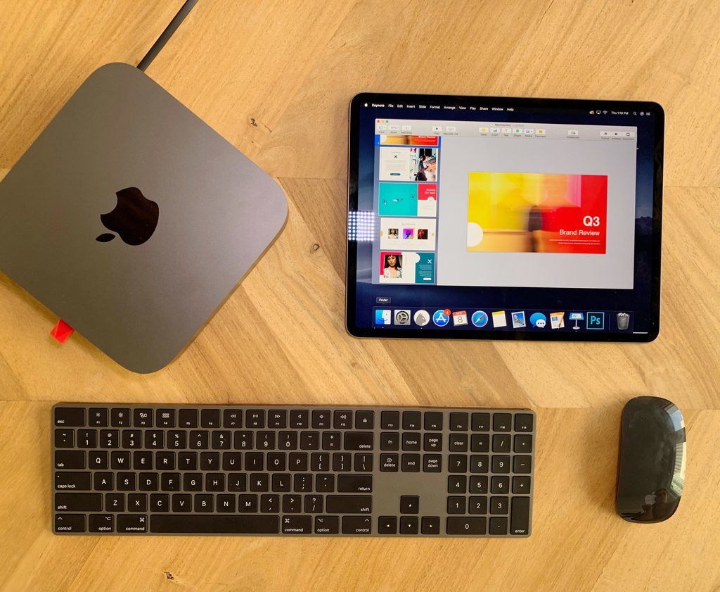
Ryan: Imagine if your iPad Home screen had an app on it that opened macOS in its entirety. That’s what Luna Display made possible, and in a way that was significantly more reliable and better optimized for touch input than any remote desktop tools that had come before it.
Luna Display’s app pairs with the Luna Display hardware that plugs into your Mac. This enables a level of connection stability and responsiveness that you simply can’t get with app-only solutions such as Team Viewer. Once everything’s set up, your iPad can become a secondary display for your Mac, either hosting an extra screen’s worth of content or else mirroring your primary display, in which case you can gain easy access to macOS from wherever you are via an iPad. You can also, with a little extra work, use Luna Display to make an iPad your only display for a headless Mac mini. I did this for several months last year, since my Mac mini was used only for podcast recording. Whichever setup you choose, one thing is clear: it’s pretty remarkable getting to turn macOS into simply another app on your iPad.
Ferrite Recording Studio
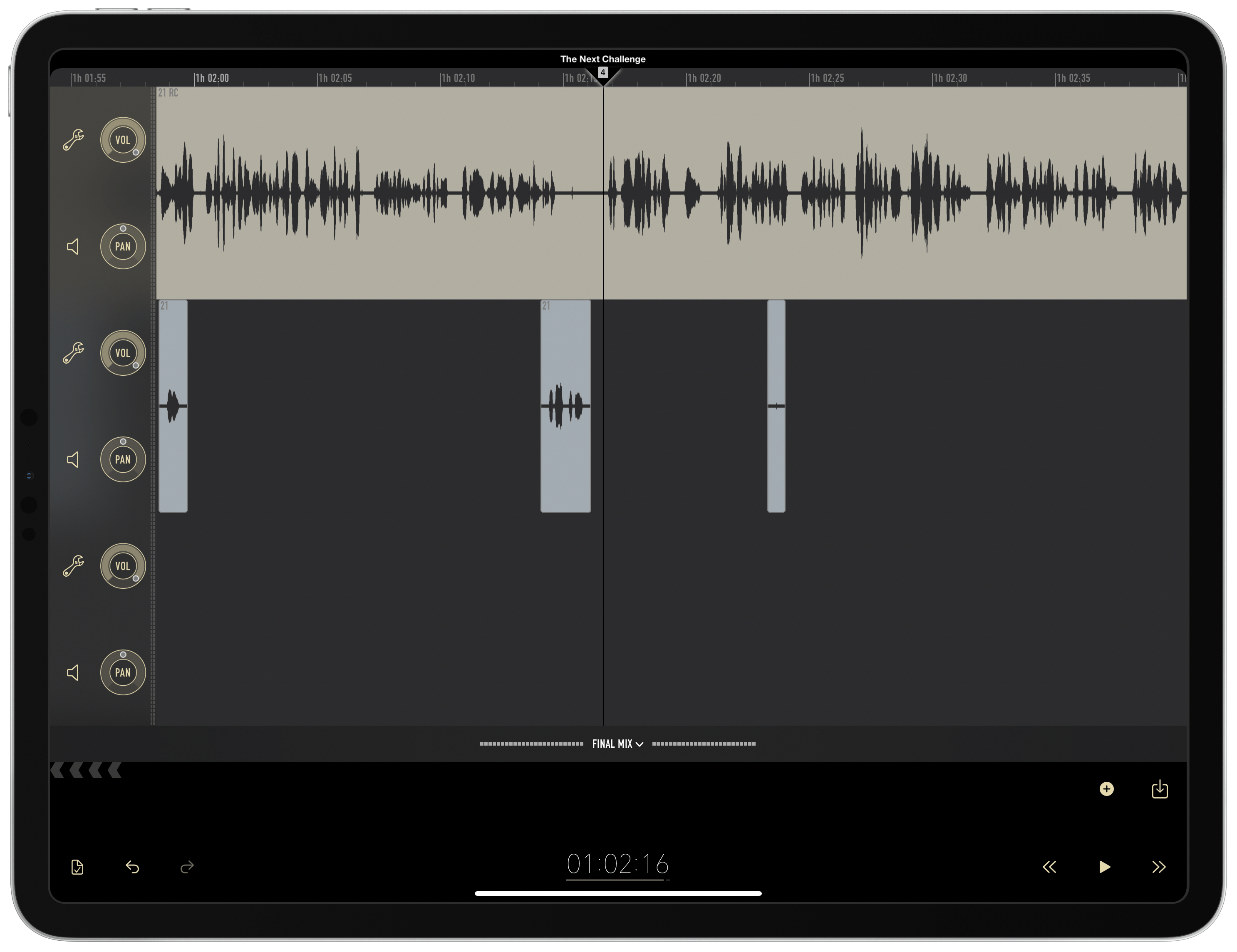
Ryan: If you do any podcast-related work on an iPad, Ferrite Recording Studio is a must-have app. Designed both for podcast recording and editing, Ferrite puts all kinds of advanced tools at your disposal to provide a first-class podcasting experience on iPad. It’s truly a unique product on the App Store: Ferrite isn’t a watered-down iPad port of a Mac app, rather it started on the iPad and offers the kind of pro features you would expect from an equivalent Mac experience.
One of Ferrite’s strengths is how versatile it is. Jason Snell edits podcasts in Ferrite using the Apple Pencil and touch input, taking advantage of the gesture customization options the app lets you configure. You can watch a video of him in action, and it’s truly impressive. Ferrite is flexible enough, however, that if you prefer a different mode of editing, that’s just as thoroughly supported. For example, I edit in Ferrite primarily from a connected keyboard. Last year I outlined my process, which has changed a little since then but still relies heavily on keyboard shortcuts. Ferrite’s one of the few iPad apps that lets you fully customize all shortcuts to your exact preferences.
Audio recording and editing is a very specific professional niche, but it’s in such creative niches that the iPad has historically been lacking in quality tools. Apple created versions of Garage Band and iMovie to accompany the original iPad, and they were great in their time, but few developers took up the mantle from there; Apple, similarly, has kept its pro app efforts Mac-first. Five years after the iPad Pro debuted, however, Ferrite is a strong example of things beginning to change.
OmniFocus
Ryan: For all 10 years of the iPad’s life, OmniFocus has been a power user solution for getting things done on the platform. Though the app has undergone major changes over the years, it’s always retained a reputation for letting you manage tasks with as much power and precision as you need. Where some apps limit options so they can appeal to the widest set of users, OmniFocus knows its users want all the control they can get.
The latest iteration of OmniFocus, version 3, does a remarkable job offering that rich feature set while nonetheless being more accessible than ever before. The customizable task inspector, replacement of contexts with tags, and even the more playful color scheme were all changes that went a long way toward helping those new to the app get comfortable with it. It’s good to offer a lot of options to users, but when those options clutter up the interface and make it harder to find the tools you actually care about, that’s a problem. In OmniFocus 3, the app took customization to a new level and, in the process, empowered users to essentially build their own personalized task manager using only the tools they cared about.
I can’t talk about OmniFocus 3 without also mentioning the iPad specifically. In landscape, the app’s three panels – perspective view, project view, and inspector – can all stay visible at once for quicker access to the information you need. You can use drag and drop to easily create new tasks in the exact place you want, including in the Forecast to automatically assign a due date; dropping on the Forecast works with existing tasks too for assigning due dates. OmniFocus also supports multiwindowing, so you can keep separate lists and views open in different windows, and it offers plenty of keyboard shortcuts too. The Omni Group has shown by their work that they count the iPad as a first-class citizen in their development.
Comixology
John: When the iPad debuted, big-screen iPhones were still more than four years away. It’s hard to recall now, but without bigger iPhones and smaller iPads in the lineup, the jump from 3.5 inches to a 9.7-inch display felt absolutely enormous.
With that increase in screen size came apps uniquely suited to take advantage of its expansive real estate. One of the earliest and most natural extensions of the new screen size was comic book readers, and none has proved as popular over the long haul as Comixology.
The first iPad’s dimensions were not a perfect mapping to the size of a comic book’s page, but it was close enough and certainly much better than an iPhone. Its size was only part of the equation that made the iPad a perfect match for comics, though. The bright, colorful display brings the artwork of comic books to life. The iPad has also meant comic fans can carry enormous libraries of their favorite titles with them wherever they go and read them in new ways, like with Comixology’s Guided View feature.
Not everyone is a fan of Guided View, which takes readers through cells on a page one-by-one, animating the transitions between each. Still, the feature improves the reading experience on smaller iPads, and I like it personally. For those who don’t, though, I’m glad there’s a full-screen option too.
These days, the 11-inch iPad Pro is probably the closest in size to a physical comic book and one that I know comic fans often recommend. I’ve never owned the smaller iPad Pro and only dip into comics occasionally, but when I do, they look gorgeous on my 12.9-inch iPad Pro. Just as often, though, I read on my iPad mini using Guided View, because it’s just so comfortable to hold the mini in one hand, tapping from cell to cell.
Regardless of the iPad you use, if you are a lapsed comic book fan or want to dip your toe in for the first time, give Comixology a try. The convenience and experience of reading comic books digitally on an iPad are truly delightful.
GoodNotes
John: I’ve written about GoodNotes often on MacStories and with good reason: it’s been one of my favorite iPad apps for a long time. GoodNotes is not alone in the note-taking category by any stretch of the imagination, but there’s a reason why it’s been featured in Apple ads and onstage at keynotes over and over again. What sets the app apart from the competition is its focus on providing users with the absolute best handwriting experience that feels incredibly natural.
Note-taking apps were around from the earliest days of the iPad, but it was the Apple Pencil that put them in the spotlight. Before then, third-party styluses were available, but they weren’t nearly as good as the Apple Pencil was when it was introduced. In the years since then, the Apple Pencil has trickled down to even the iPad mini. That’s opened the note-taking experience up to more and more people, which has been good to see since you don’t need the most expensive, largest screen to get a lot out of a note-taking app like GoodNotes.
What’s unique about an app like GoodNotes is that it’s very clearly an iPad app first and an iPhone and Mac app second. That’s because if you’re taking handwritten notes, an accessory like the Apple Pencil, and a big touch screen like the iPad’s, are so important. The iOS and Mac versions of GoodNotes are both excellent apps, too, but given a choice, I’ll grab any iPad to use it before I’ll pick up my iPhone or open the app on my Mac. Those apps serve as readers for the notes I take on my iPad and are used sparingly for note-taking themselves.
Personally, I’ve found GoodNotes transformative in the way I take notes. For a long while, I’d carry a small notebook and pen with me. However, the reality is that I rarely am without an iPad nearby when I want to jot something down, and the benefit of having my notes synced almost instantly across all my devices far outweighs those times I don’t have an iPad available. With the expansion of the Apple Pencil across the iPad lineup and the introduction of GoodNotes’ fantastic Mac Catalyst app last fall, I expect we’ll continue to see GoodNotes pushing at the forefront of Apple’s technologies, with the iPad app sitting squarely in the center.
Linea Sketch
John: One of the things that some observers get wrong when they look at iPad apps is assuming that simple-to-use apps are also unsophisticated. Linea Sketch by The Iconfactory is a perfect example of what I mean. It’s the kind of app that anyone can pick up and use. You don’t need a deep understanding of drawing app conventions built up over the years or an online class to get started. Instead, the app’s incredibly natural-feeling UI guides users, abstracting away complexity and making the way the app works obviously from the get-go.
Linea Sketch isn’t the most feature-rich drawing app on the App Store, but self-imposed constraints, like how its one screen equals one page of content, are a big part of what makes getting started with the app so easy. For many people interested in sketching, drawing quick diagrams, brainstorming, or mocking up UIs, Linea is all they’ll ever need. Over time, The Iconfactory has continued to add new features, like fill, blend, shape snapping, and versioning, which have extended the app’s power and flexibility without making it hard to use.
One of the things I love about many of the art-creation apps on the iPad is their approachability. Part of that comes from the direct manipulation of the art you are creating. Everyone has picked up a pencil or pen and begun doodling at some point, and apps like Linea Sketch tap into that natural sort of activity with tools that aren’t intimidating to novices but are flexible enough to work for pros too.
In December, The Iconfactory announced that Linea Sketch 3.0, which hasn’t been released yet, will be switching to a subscription business model. That’s a hard switch to make for an app that has been paid up front for the past three years, but The Iconfactory is doing it right by communicating early about their plans and why they are making the change. Not every user is likely to subscribe, but an app of Linea’s caliber requires regular maintenance and support, so I’m hopeful that it works out and Linea Sketch is developed long into the future.
Concepts
##
John: I want to note up front that Concepts is the sponsor of our entire iPad at 10 series this week. I normally wouldn’t include a sponsor’s app in a story like this, except not only was Concepts on my list of influential apps before we ever approached them about sponsoring, but it’s also an app that I’ve used since late 2018, long before they were ever a sponsor.
I also wanted to cover Concepts immediately following Linea Sketch because the two apps show off the range of the iPad so well. Both are drawing apps, but unlike Linea, which feels like sitting down in front of a single sheet of paper with a set of art tools, Concepts is something different altogether.
Concepts is the sort of tool that doesn’t have a good physical-world analog. It’s an infinite canvas app that accommodates an incredibly broad spectrum of creative uses. I’ve used it to mind map big projects, doodle while editing a podcast, and outline upcoming stories, but it can be used to storyboard video, design buildings, create art for art’s sake, and a whole lot more.
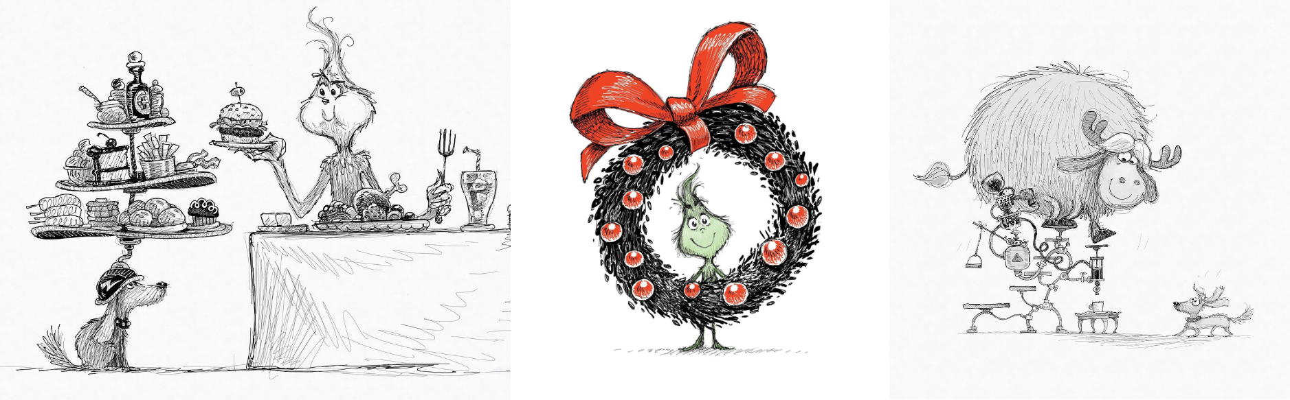
At its core, Concepts is about drawing, but as the name suggests, that’s a means to an end, which is exploring ideas visually. Those ideas may never be more than rough sketches and handwritten notes as they typically are for me or they may lead to polished artwork like the concept sketches of Yarrow Cheney, the director of the animated version of The Grinch, whom Federico and I interviewed on AppStories.
Cheney explained during our interview that he uses Concepts because it reduces the distance between the idea in his head and recording it for use in a project. That comment has stuck with me because it perfectly captures what the best iPad apps get right. Through direct manipulation and intuitive controls, they reduce friction and get out of the way of ideas, allowing the user to execute on them almost effortlessly.
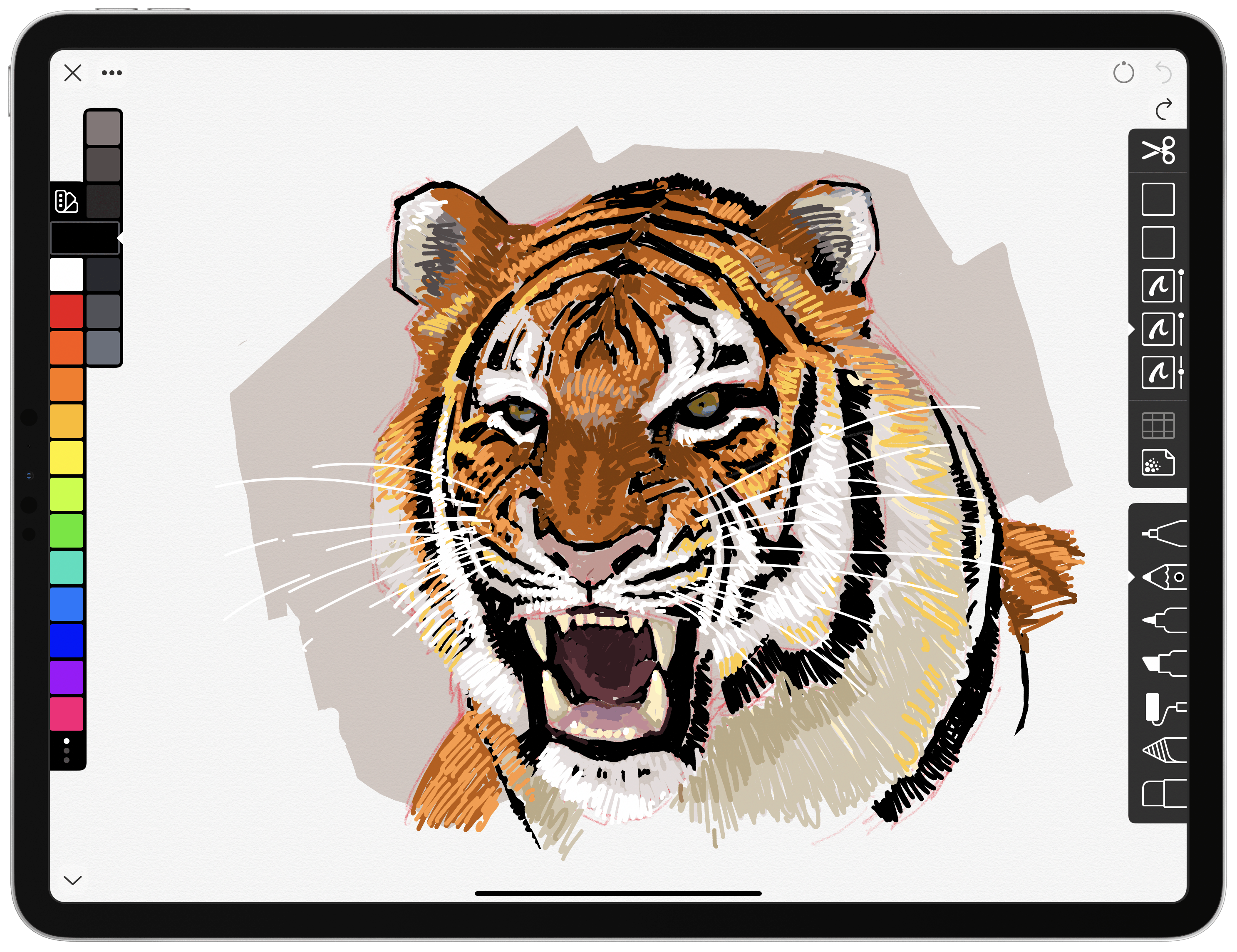
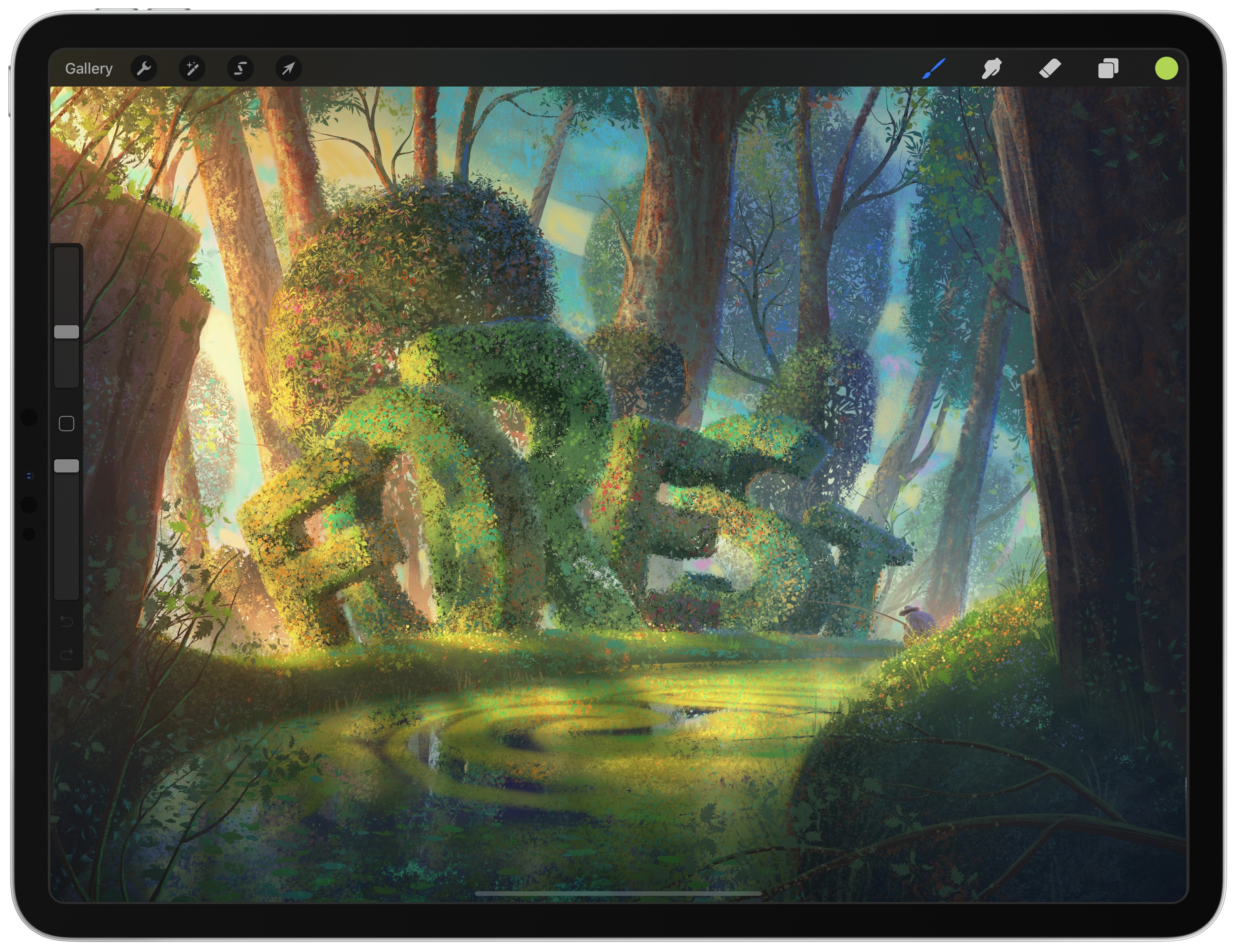
Procreate
John: Procreate has a long history on the iPad. It, too, is a drawing app that rethinks what that means in the context of the iPad. The app has benefitted greatly from Apple’s emphasis on the Pencil and its extension to an ever-increasing number of iPad models.
For a long time, big companies ignored the iPad or built simplified versions of their app that omitted substantial portions of their apps’ functionality. That has begun to change with the introduction of the iPad Pro, but it gave companies like Savage Interactive, that make Procreate, room to reimagine what it means to be a drawing app unburdened by the legacy of a desktop app.
My favorite aspect of Procreate is how elegantly it hides a deep catalog of brushes and other tools behind a minimalistic UI. The app can be used as a free-hand drawing or painting tool with its myriad of brushes, or in conjunction with photos that you import onto its canvas. The latest update to the app also features a straightforward way to transform your drawings into animations that takes no time at all to learn.
Despite its large number of available brushes, Procreate also allows users to design and share their own. The app’s Brush Studio could easily be an app of its own, but it is neatly tucked away where it doesn’t get in the way when you don’t need it, which is a common theme among the best iPad apps.
I don’t consider myself much of an artist, but I enjoy doodling in Procreate. It’s a creative outlet that I find relaxing and an app that I don’t find frustrating. Simply starting to sketch and poking around the UI as needs arise gets you very far in Procreate. Plus, with an excellent series of ‘Learn to Procreate’ videos from Savage, and an online Handbook with all the nitty-gritty details, Procreate is a shining example of what pro apps can be on the iPad.
Pixelmator Photo
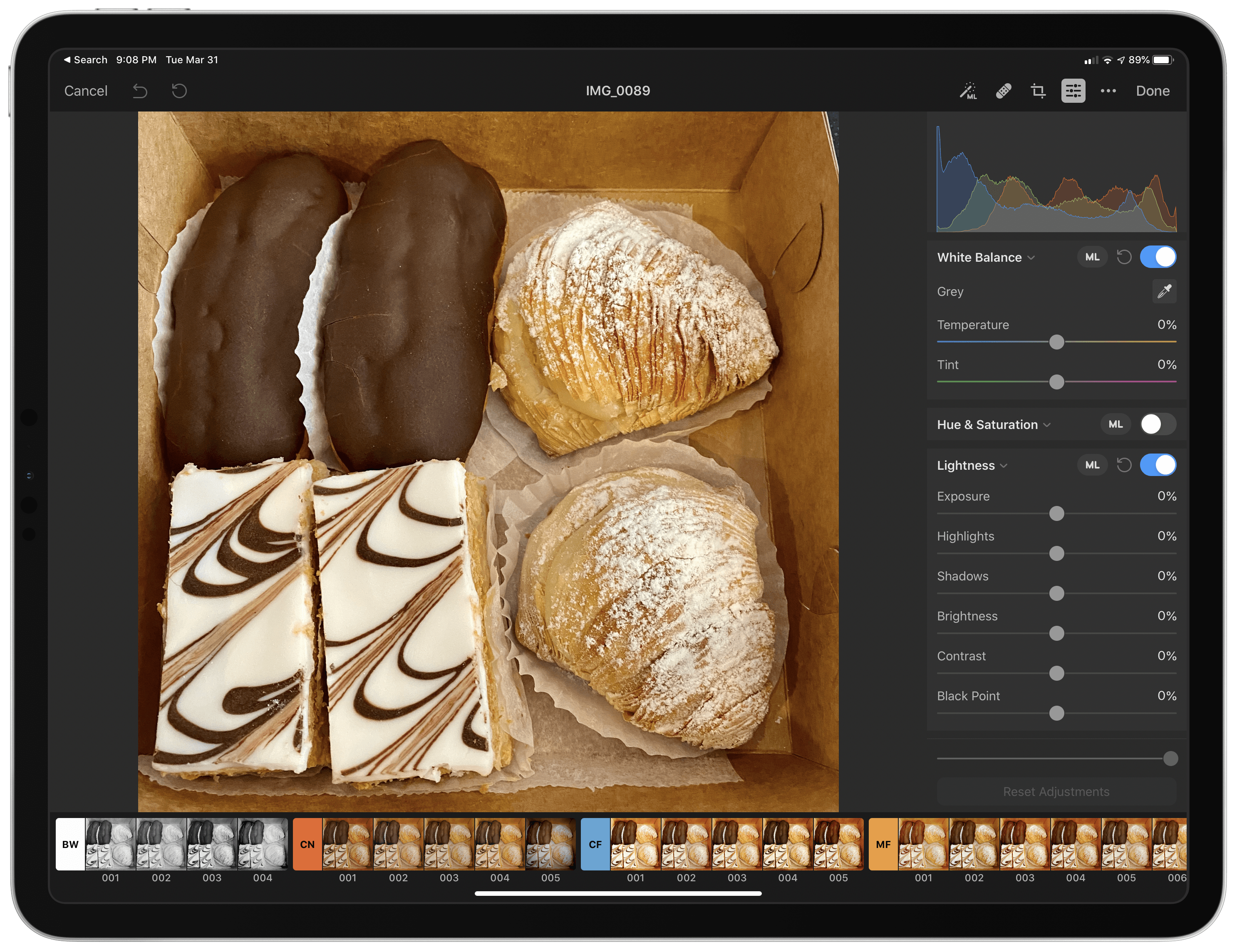
John: I’ve used Pixelmator’s apps since the original Pixelmator was released long ago. Pixelmator Photo is one of the newer apps in this collection, but no less important. Photo editing apps, like drawing apps, have a long history on the desktop that comes with a lot of baggage. The iPad provided the Pixelmator team an opportunity to rethink the approach to photo editors and bring the latest technologies like machine learning along to assist users.
The app can access photos from either your iCloud Photo Library or the system document browser, which provides access to any photo in iCloud Drive and the other file providers available in the Files app. The app features an extensive selection of parameters that can be tweaked for each photo. What I usually do, though, is start with the magic wand tool, which is powered by machine learning. I usually wind up tweaking an image more by hand, but the magic wand tool usually gets me most of what I want. There are similar machine learning-based adjustments that can be applied to individual categories of tools too.
In addition to the many manual and automatic edits that can be made to pictures, Pixelmator Photo includes an excellent set of high-quality filters that can be applied to obtain a specific look. If you create a group of adjustments to an image that you like a lot, you can even save them as a custom, sharable filter.
I use Pixelmator Photo to edit photos all the time. It’s not the only photo editor I use, but what I appreciate about it is that the app produces much better results than the Photos app’s built-in tools with only a little more effort. That makes it perfect for cleaning up a group of photos quickly when you want to share them right away. The machine learning isn’t always perfect, but by giving me a head start on edits, Pixelmator Photo saves time, allowing me to dial in the last 10% of whatever look I want.
Affinity Photo and Designer
John: Affinity’s apps are another excellent example of apps built without the burden of a long desktop history. Affinity makes desktop versions of its apps, but the fact that its iPad apps are developed in tandem with the desktop versions is part of what makes them special, ensuring that they work in concert, allowing users who use one version to move easily to the other.
Affinity’s apps feature UIs with a unique design of their own that works well when moving between the company’s apps. Each app relies on narrow toolbars along the top and sides of the screen with additional tool settings appearing along the bottom of the screen as needed.
For many users, Affinity Photo can serve as a replacement for desktop apps like Adobe Photoshop. The app supports Adobe PSD files, unlimited layers, customizable brushes, and a wide array of tools for manipulating your images. Affinity Designer provides a similarly sophisticated set of tools for working with vector graphics. With tight integration between the apps and their desktop counterparts, the apps’ maker, Serif, has created an end-to-end workflow that serves a wide variety of needs.
One of my favorite touches in both apps is the ability to customize keyboard shortcuts. This isn’t something you see very often on the iPad, and I hope it becomes more prevalent as pro apps multiply.
Affinity’s suite of apps on the iPad and their tight integration with their Mac versions is where I hope a lot of pro Mac and iPad apps wind up. Today, that sort integration is rare, but with Mac Catalyst and SwiftUI, this is the direction Apple seems to be heading and one I expect will benefit the users of pro creative apps more and more over time.
Adobe Photoshop
John: Ever since I started writing about apps, I’ve heard about this or that app that would be the next Photoshop. No doubt, Adobe heard that too and decided Photoshop should be the next Photoshop instead.
I give Adobe a lot of credit. Photoshop is thirty years old on the Mac, and instead of trying to graft its complex Mac UI onto the iPad, Adobe started from scratch, rebuilding its core engine to work on both platforms then implementing Photoshop’s tools in a manner that makes sense given the iPad’s hardware and input methods.
Today, there’s a lot of desktop Photoshop that still isn’t available in Photoshop on the iPad, but Adobe’s update history and past announcements suggest that the company is fully committed to building out functionality rapidly. Replicating Photoshop in an iPad-centric way is a tall order, but the features Adobe has implemented so far and the system-level features supported like Split View, Slide Over, dark mode, keyboard shortcuts, and the system document browser are excellent.
Photoshop also represents a unique opportunity for users to learn Photoshop. The Mac version of the app, with its 30 years of features, is intimidating. The iPad version, however, is very approachable. I use Photoshop on the iPad for lightweight compositing work on MacStories projects all the time. I would never have thought to make those same edits in Photoshop on the Mac because it just seemed unapproachable and like too much tool for the task. With some basic Photoshop experience under my belt on the iPad, though, I’ve found myself experimenting with the desktop version too. It’s a virtuous cycle where the iPad and Mac versions of pro apps support each other and extend each other’s user base by working as a tight-knit unit, which I expect will be central to the next chapter of the iPad’s story.
You can also follow all of our iPad at 10 coverage through our iPad at 10 hub, or subscribe to the dedicated iPad at 10 RSS feed.
