Kaleidoscope 2, an advanced file comparison app by Black Pixel, is out today. It is a powerful piece of software to spot differences between text, images, or folders, and merge changes in seconds. If you’ve been looking for a file comparison tool that is equally gorgeous and powerful, I wouldn’t hesitate to go buy Kaleidoscope right now.
I’m not the best person to write an in-depth review of Kaleidoscope. The only images I deal with on a daily basis are screenshots, because the photos I take go straight to Dropbox and I never edit them; my backup consists of a full copy of my MacBook Air mirrored to a couple of external drives with SuperDuper; and, I primarily work with text, but I don’t have an editor that sends me revisions of my writing on a daily basis. If anything, I just read my articles over and over until I’m happy with them. Kaleidoscope is perfectly suited for people who don’t work like me: people who take photographs and edit them, who organize files and backups carefully with a precise folder structure, and who send bits of the same text back and forth with another person.
However, there have been a couple of occasions in which I’ve appreciated the features offered by Kaleidoscope, and I thought it’d be worth to mention them.
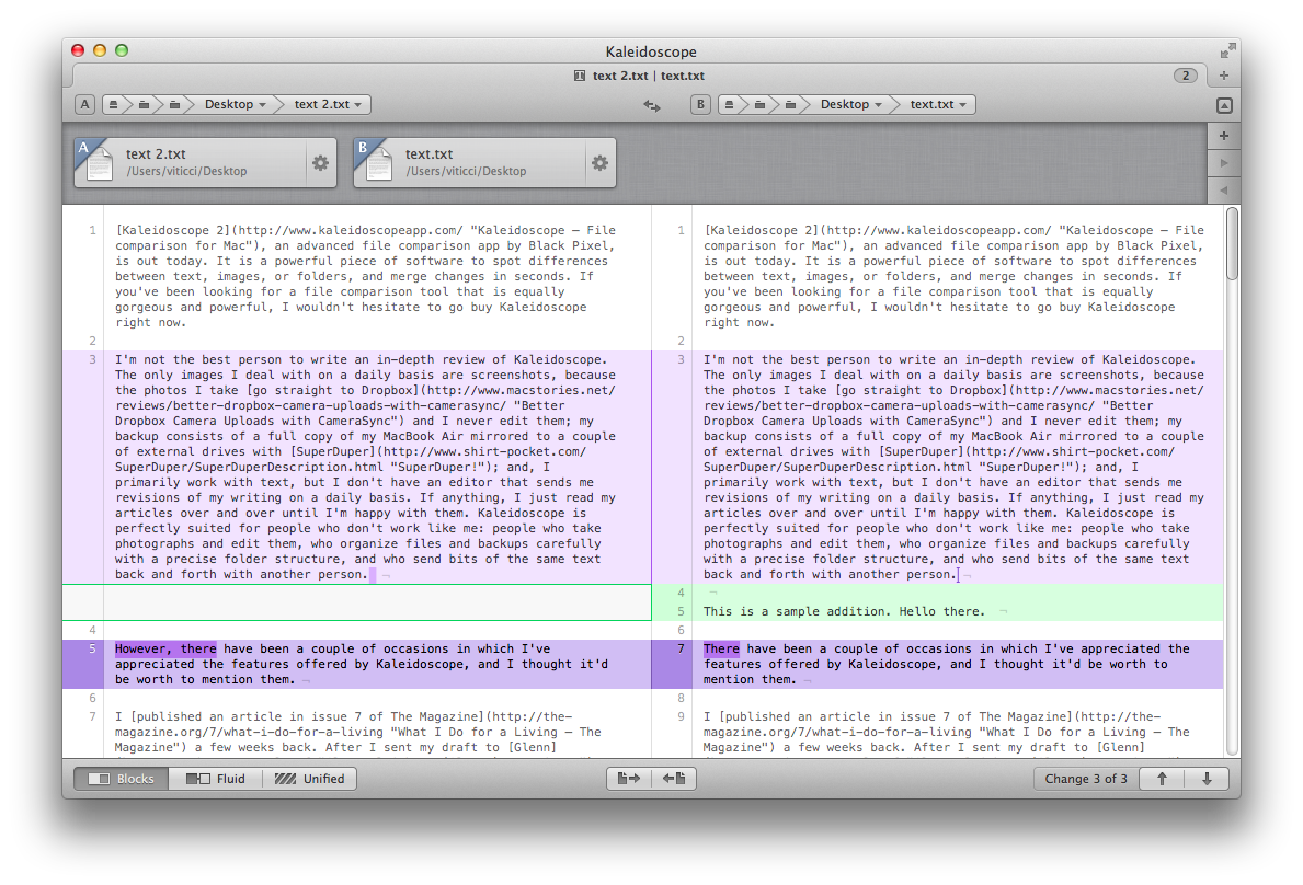
I published an article in issue 7 of The Magazine a few weeks back. After I sent my draft to Glenn and Marco, Glenn got back to me with an edited copy that had a couple of fixes that substantially improved my piece; it looked great, but still – I wanted to compare those changes. Normally, I would have gone with opening the text files in two separate TextEdit windows, reading them side by side. With Kaleidoscope, I found the process of comparing text visually more appealing and simplified.
Kaleidoscope calculates what is known as a diff between file A (the older one) and file B (the newer one). In addition to finding text added in file B (colored in green) and deleted from file A (colored in red), Kaleidoscope’s tracking algorithm also finds parts of text that have been changed between two files, coloring them in purple.[1] Kaleidoscope presents two files in a single window that shows file A on the right and file B on the left. In spite of the many options available either from the menu bar or as keyboard shortcuts, I find Kaleidoscope’s interface surprisisngly clean and focused on what really matters: content.
Black Pixel wanted to ensure people would be able to easily send files to Kaleidoscope, because, admittedly, the whole concept of “comparing and merging differences” can sound fairly extraneous to the less geek among Mac users. Upon first run, the app will show a beautiful, interactive walkthrough with “zoomable sections” for buttons and other UI elements, accompained by text to better explain the functionalities of the app. Some may argue that UI walkthroughs aren’t the way to go these days, but I liked Kaleidoscope’s.
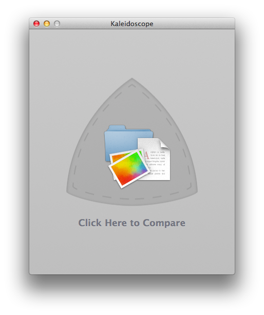
Once dismissed, Kaleidoscope will offer the easiest way to drop two files into the app: drag them onto the main window. There are two subtle touches at play here: firstly, the graphics of the “Drag Files Here” window include a folder, a text file, and an image, suggesting to the user the kind of comparisons that are possible with Kaleidoscope. Second, clicking on the area will open a standard Open dialog to manually pick files from the Finder. You can also drop files onto Kaleidoscope’s Dock icon, send them via Services from the Finder, or, again via Services, from a right-click on text in any OS X application. When Glenn sent me revisions of my article, I preferred dragging them from Mail to the Desktop, and from the Desktop to Kaleidoscope.
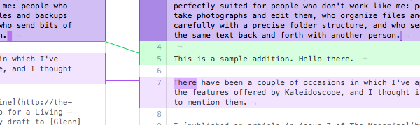
With two text files ready for comparison in the main window, Kaleidoscope gives you a bunch of options and views to fine-tune the presentation of content. At the bottom, there are three views: Blocks, Fluid, and Unified. I like Fluid because it connects changes from file A to file B with colored lines. One of Kaleidoscope’s biggest features is immediately revealed: you can select differences and copy them to the right (old to new) or to the left (new to old).[2] There’s a wide selection of keyboard shortcuts to navigate between changes.
One thing I noticed about Kaleidoscope’s split window is that, while a single gesture scrolls both documents, the “rubber-banding” effect only works with the file currently under the cursor.
For comparing edits in my article for The Magazine, I didn’t have much use for the advanced merging features; however, the tracking algorithm combined with coloring provided an invaluable aid in spotting differences quickly and allowing me to jump back to Mail.app and send my thoughts to Glenn in a new message. When my team helped me edit my Mountain Lion review last year – one of the few times we used a “standard” writer > editor workflow for MacStories – Kaleidoscope would have saved us hours of reading. I can’t imagine doing that kind of editing work without Kaleidoscope ever again.
MacStories readers know I’m a fan of the subtle details in software, and Kaleidoscope has many of them. For instance, take the File Shelf: with a button in the top right corner (or a keyboard shortcut), you can show an additional “bar” with icons for your currently open files. Like the iOS multitasking tray, the File Shelf has a linen background and appears beneath the main content. Unlike Apple’s app switcher, it is full of options and I actually like using it.
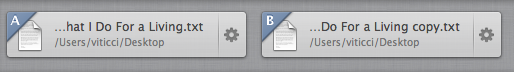
Files are marked as “A” or “B” with a blue ribbon. If a file’s name is too long, it gets truncated with an ellipsis at the beginning of the name, rather than the end. This is a smart choice: considering the majority of users are going to compare copies of the same file in Kaleidoscope, and considering the default behavior of OS X for duplicating files is appending “copy” to the file name, showing the end of the file name is the right way to always make it clear which file a user is selecting. A file’s path is also shown below the name.
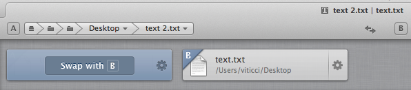
Files in the Shelf can be dragged and rearranged, but doing so won’t switch their “A” and “B” status. To do so, you can click on one and choose “Swap with A/B” or click the “Swap A and B” icon in the top toolbar. The same option is also available from the Edit menu and, if you’re a fan of shortcuts, you’ll notice how Toggle File Shelf uses CMD+/, whilst Swap relies on the opposite, CMD+.
There’s another way to get files in the Shelf and swap comparisons. Obviously, you can drop files from the Finder onto the Shelf to deposit them there; you can also click a “+” button on the right to fire up the standard OS X Open dialog. But let’s say you have three files already in the Shelf, and the first two are marked as “A” and “B”. To make the last two files “A” and “B”, you can click the arrow button in the Shelf to “advance” the comparison to the next file.[3]
The files in the Shelf are right-clickable. With a right-click on a file[4] you’ll bring up a contextual menu to open a file with other apps, reveal it in Finder, remove it, or copy its path to the clipboard.
The top area of Kaleidoscope has more of the aforementioned attention to details. Kaleidoscope uses “top tabs”, reminiscent of the Safari 4 that never was. A tab’s title is made of an icon for the file type (a “T” for text, a photo for images, a folder icon for folders), the names of “A” and “B”, and a numeric badge for the number of all files in the current tab. You can click the badge to open or close the File Shelf. Tabs can be dragged and rearranged, and you can right-click on one to show other options for adding files and closing tabs.
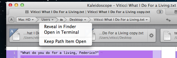
Below a tab’s title, there’s an interactive path bar; by default, this bar shows the file and last folder as expanded. You can click on a folder in the path bar to reveal it in Finder, open it in Terminal, or collapsing the path bar item. For the same reason, if you want to keep previous items in the path closed and, say, only the first one (usually the hard drive’s name) open, you can click it and choose “Keep Path Item Open”. I like how the bar’s items expand and close as you hover over them, and I wish more Mac apps had a path bar that was this intuitive yet feature-rich.
Like I said above, I’m no photographer and I have a very simple backup solution. Still, I wanted to try Kaleidoscope’s support for images and folders to see what Black Pixel had implemented.
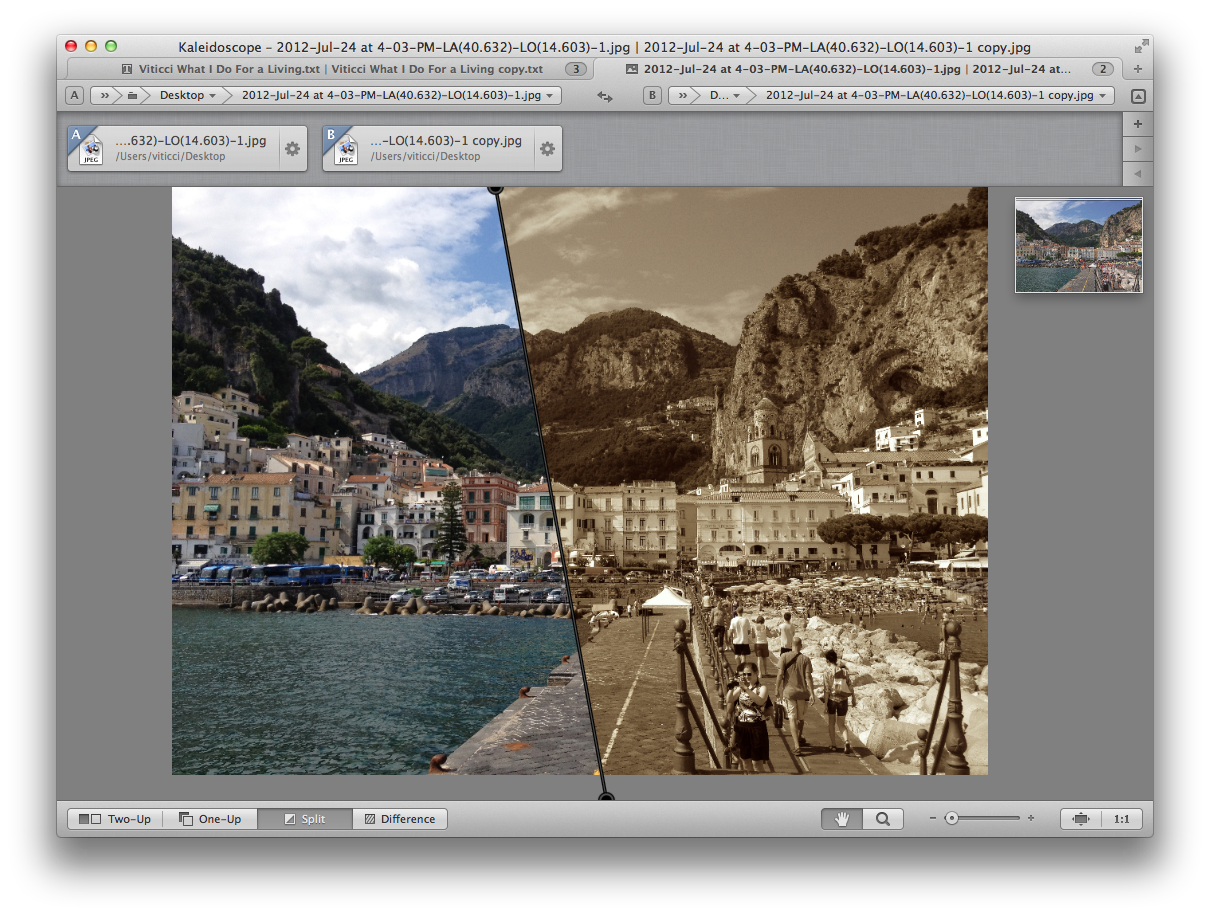
Comparing images in Kaleidoscope is fun. There are four views (Two-Up, One-Up, Split, Difference) and the same “A” and “B” mechanism applies. If you right-click on an image, Kaleidoscope recognizes whether you’ve clicked on the “A” or “B” file, offering a contextual menu for each. You can zoom images to fit, zoom to actual pixels, pan around, use multi-touch gestures – Kaleidoscope supports basically any modern interaction method you can think of. My favorite view is Split: this will put two images in a single area, placing a “draggable line” in the middle. You can drag this line – even pick it from the corners and re-adjust its position – and move it over an image to see the difference between “A” and “B” in real-time, on the same canvas, as you move the cursor. It’s insanely cool and addicting.[5]
I also like the One-Up view: showing one file at the time, One-Up offers a Play button that will switch between files automatically according to a time interval that you can specify (from 0.25 to 1 second). I don’t have a particular “photo editing workflow” (aside from playing around with effects in the occasional Instagram photo), but I have no doubts designers and photographers will appreciate the tools offered by Kaleidoscope.[6]
Support for folders is streamlined and easy to use. You can drop some folders into Kaleidoscope and the app will highlight with the usual color scheme files that have been added or deleted. You can merge the contents of folders, and you can click on sub-folders to open them in a new tab. I don’t have a particular use for it, but I’m sure this will come in handy for developers who keep branches of code inside multiple folders and people who, for instance, keep their music library on an external drive and copy only specific albums to their computers.
I’ve only scratched the surface of what’s possible with Kaleidoscope 2. The app comes with a lot of features, and I recommend visiting the official website and reading the (beautifully formatted) in-app documentation to know more about every option and menu. Just to name a few examples, there’s a command line tool that can be integrated with Alfred, integration with third-party apps and services, a three-up interface to resolve merge conflicts, and commands to create new files directly from the clipboard (it works with images, too).
Ultimately, what I like about Kaleidoscope is that it’s an app for everyone. Users who, like me, just need a good-looking, fast, and powerful comparison tool every once in a while will appreciate the app’s reliability and richness in terms of features and details; advanced users, designers, and developers will be able to integrate Kaleidoscope in their existing workflows with the apps they already use.
Kaleidoscope epitomizes the concept of “versatile software”: anyone can pick it up and use it, and the app will “scale” according to a user’s needs.
You can buy Kaleidoscope 2 at $34.99 for a limited time. The app is available both on the App Store and on Black Pixel’s website. If you want the best of both worlds, App Store customers will be able to unlock the Direct Sale version automatically simply by running the Direct Sale version on a machine that has run the App Store copy at least once.
- Difference Coloring can be set to Multicolored or Single Color in Preferences > Text. Here, you will also find a toggle for dark mode (I like how iOS-inspired the switch is) and a menu to change the default font (Menlo Regular). ↩︎
- You can also “keep both” changes. ↩︎
- You can also go back. ↩︎
- Or using the gear icon. ↩︎
- Tip: you can click on the thumbnail preview in the top right corner. ↩︎
- I’d mention the reliability and speed as well. Kaleidoscope opened photos of 4 MB each and switched between them with no issues or hiccups. ↩︎