Evomail, a new Gmail client for iPad released today at $2.99, wants to fill the void left by the announced-but-never-released Sparrow for iPad, providing an alternative to the largely web-based official Gmail app and the upcoming (?) Mailbox for iPad. To differentiate itself from iOS’ native email client, Apple’s Mail app, Evomail focuses on three main areas: a new, modern design; push notifications; and tight integration with Gmail. The first version of Evomail is good, but rough around (many) edges.
I previously shared my experience with email clients on iOS in my reviews of Sparrow for iPhone and, just last month, Triage. In short: I’ve used Apple’s Mail for years, but as I was growing tired of lackluster Gmail integration and issues introduced with iOS 6, I’ve been looking for other solutions. Sparrow was a fantastic mail app, but, alas, Google’s acquisition halted its development; Triage is meant for quickly processing messages; Apple Mail still has that ridiculously-wrong notification sound for sent messages; Gmail is my email client for search and writing medium/long emails now, but I don’t like its web-based views and awkward scrolling mechanics. I still have to find the perfect email app for iPad.
Developed by David McGraw, Jared Erondu, and Jonathan George (former CEO of Boxcar), Evomail is, unlike other third-party debuts, iPad-only for now. And it only works with Gmail accounts (both standard and Google Apps), so if you’re looking for a full-featured email client for your IMAP mail, you should look elsewhere.
To access your Gmail account, Evomail uses Google’s web login tool, so you’ll be able to avoid the creation of an app-specific password if you have 2-step verification on your account (and instead just enter the confirmation code Google will send to your phone). Evomail’s login screen is clean and elegant, with a spinning logo that appears when the app is requesting a login page to Google. The subsequent permission dialog confirms that Evomail’s servers will receive, but never store, information from your email accounts; according to co-founder Jonathan George, this will enable them to “do things never before done in an email client”. Like Mailbox, Evomail also needs to store your authorization token to use push notifications.
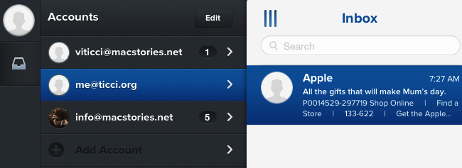
Evomail’s interface is clean and polished, and it’s divided in four main sections. On the left, you’ll find a dark sidebar (reminiscent of Sparrow and Tweetie) containing a profile picture, an Inbox shortcut, and a compose button at the bottom. Tapping the circle avatar brings up a drawer with the account switcher – a list of all your configured accounts that also has two “Add Account” and “Edit” buttons to bring up a new Google login page or edit an existing account. Evomail lets you set up account-specific signatures (with HTML support), but, alas, there is no Unified Inbox – an issue that is exacerbated by the tediousness of constantly switching between accounts. The animation to reveal the account drawer isn’t always super-fast on my iPad mini – a problem shared by other animations in Evomail – and I would like to see a way to add account shortcuts in the main sidebar as a way to quickly move across them.[1]
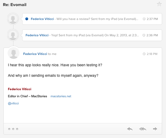
The way Evomail works with composing new messages is one of the app’s best features. Instead of bringing up a modal window that takes over your entire Inbox, Evomail will “slide in” an additional panel that you can swipe away while writing to reference another message. Because panels are independent from each other, you can move between messages in your Inbox and you won’t lose the compose panel, which is a great way of working on the iPad, where there are no multiple windows.
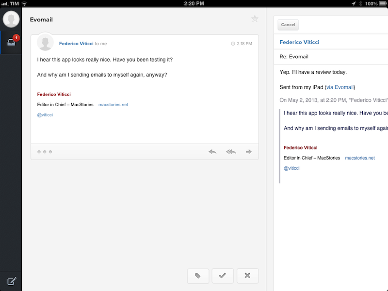
The compose screen is delightfully designed: the writing area is clutter-free and supports iOS’ native rich text controls; the To/Cc/Bcc fields come with a folder-like animation for revealing contacts matching what you’re typing[2]; you can attach photos from your library or take new ones directly in Evomail.
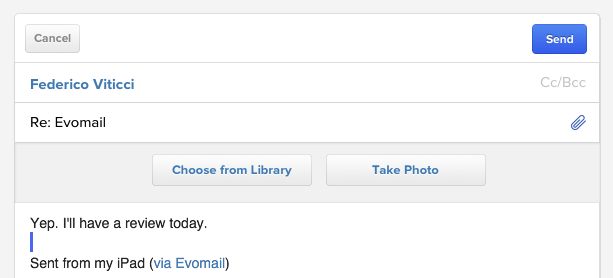
Overall, I like the functionality and design choices of the compose screen; it also supports saving drafts, which you can access by tapping & holding the compose button (like Tweetbot).
The drawer – the area between the sidebar and the Inbox – doesn’t only host the account switcher, but it also doubles as navigation for an email account. By swiping to the right or tapping the list button in the top left, in fact, you’ll gain access to your account’s sent mail, starred items, spam, trash, drafts, archive, and all available labels (which are colored). I like the way the list button becomes blue and vertical when labels and mailboxes are revealed, but I don’t think this is the best possible implementation for this feature. It seems confusing to have both accounts and mailboxes in the same area – something that becomes clear when you try to view your accounts when mailboxes/labels are already shown (spoiler: the sidebar will “flash” instead of having an animated transition).
The more I think about it, the more I believe email accounts should have been in the sidebar on the left, leaving the drawer exclusively for navigation inside an account.
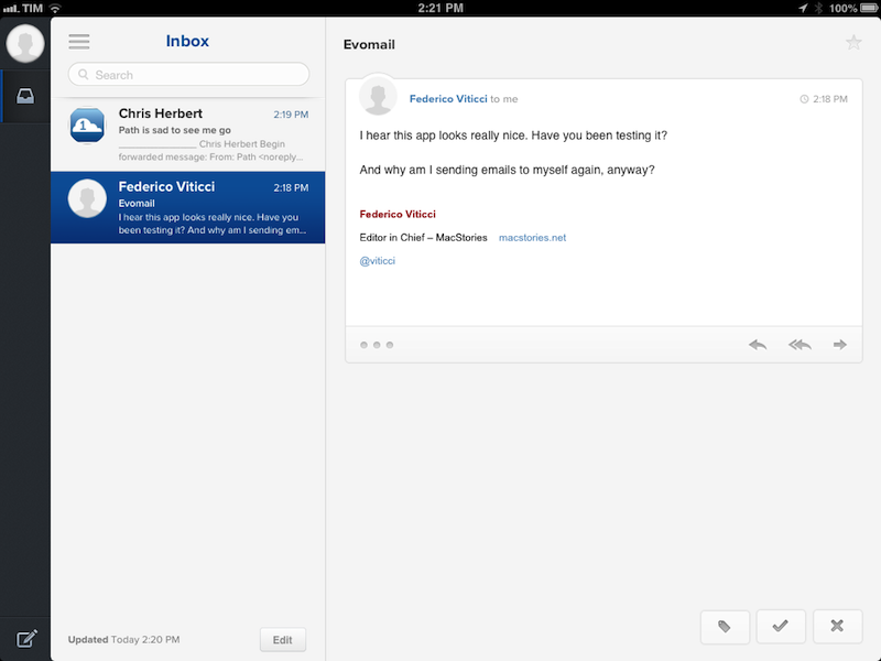
The Inbox is fairly straightforward. There are rounded avatars, icons for attachments or messages you’ve already replied to or forwarded to someone else, a badge for threaded conversations, a search bar and a custom pull to refresh animation. The message view is well executed: previous messages inside a conversation are shown as smaller previews, and you can tap on one to expand it and reveal the full original message. I have found Evomail’s threading to be reliable and easy to use in the way it also lets you see quoted text inline.
In a message, you can tap on a person’s avatar to show email addresses, and you can tap on the timestamp to mark messages as read/unread. At the bottom of a message’s box, there are buttons to reply, reply all, and forward, plus a button to share a message.
If you want to quickly reply or reply all without having to tap any buttons, you can swipe to the left to bring up a panel that, when released, will open a standard reply; if you keep pulling the reply panel will become a “reply all” (an interaction reminiscent of Mailbox for iPhone).
I’m not sure about the utility of Evomail’s sharing feature: using iOS’ native share sheet, it lets you send a public link to an email message to your friends on Twitter, Facebook, or iMessage. Essentially, Evomail is using a service called EvoCloud to generate short links to let anyone view a message in a web browser; the Evomail developers say this feature was created to share emails “you can’t stop laughing about”. Personally, I don’t like the idea of sharing private information received via email with the world, but I guess this is part of the “things never done before” that George mentioned. I just don’t have a use for it.
Another nice touch that I liked in the message viewer is support for iOS’ data detectors (for, say, dates) and web links. Tapping on a URL won’t yank you out of Evomail, but it’ll open a built-in, full-screen web view with options to share a link and even send it to Google Chrome (with callbacks). This is how Apple’s Mail should also treat URLs.
There’s an additional set of three floating buttons at the very bottom of each message: label, archive, and delete. They’re not revolutionary, but they’re always there and they’re easy to reach.[3]
My main problem with Evomail is that I can’t use it as my main iPad email client (yet) because of bugs in this initial release. It’s not just about the graphical glitches[4] – it’s about full Gmail search (which doesn’t return all results as Gmail and Apple Mail do) and bugs with read messages being marked as unread again; archived messages re-appearing in my inbox; pull to refresh getting stuck on “getting messages” or not getting the latest messages in my inbox; or, generally speaking, with the app taking considerably longer than Apple Mail to update and load messages from the server.
I want to like Evomail: it doesn’t reinvent email on the iPad, but its push notifications for new messages have been very reliable for me, the design of the app is fresh and uncluttered, and I’m a fan of the implementation of the compose window, conversations, and the built-in web browser. It comes with Send & Archive, which is a must-have for me.
The issues I’ve run into (with a final build of the app) interfere with essential aspects of mail on the iPad – where I want to make sure my Inbox is up to date so I can start typing and referencing old messages – and I need to make sure that the system I’m trusting is solid and free of major bugs.
I’m looking forward to future updates to Evomail for improvements to search and Gmail sync. The fact that Evomail’s developers can make optimizations on their servers gives me hope that fixes will come sooner, rather than later.
Evomail is $2.99 on the App Store.
- As for account avatars, right now they are primarily fetched through Gravatar. According to the developers, a server-side enhancement (with no app update required) will be deployed soon to let you use your own Google photo. ↩︎
- Again, the speed of the animation could be improved, and sometimes the app doesn’t return suggested contacts at all. ↩︎
- If I had to nitpick, I’d say that the label popup disappears a bit too much against the white background. Also, the way the label was drawn and rendered in code causes the top line to disappear when you scroll the list of labels. And now you cannot unsee it. ↩︎
- And I found plenty of them, with disappearing archive/delete/label buttons, unresponsive sharing buttons, stuck pull to refresh animation, and more. ↩︎