iPhone Tab Bar Lessons
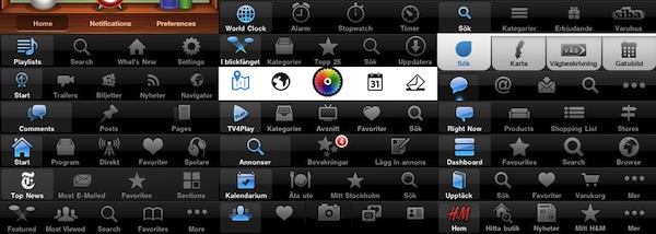
Over the last couple of years, the iPhone has greatly popularized the tab bar navigational model for mobile handsets. Apple has put together a design rationale for the tab bar in their Human Interface Guidelines (HIG) along with lots and lots of other information — they do however leave some question unanswered. Having worked with interaction and graphical design for iPhone applications during the last couple of years I’ve managed to pick up some lessons the hard way, and in this post I would like to share my thoughts on a couple of do’s and don’ts.
Petter Silfver compares different tab bar designs from popular iPhone apps and gives some insight into Apple’s subtle design decisions that most of us won’t even notice, but are important to build a consistent and natural experience on iOS. Such as colors and hues in the tab bar, the ideal number of tabs, or the problems with a “More” tab that distracts users and hides important functionalities of an app that should be discovered naturally.
If you’re an iOS geek like me, a designer, or simply interested in knowing more about this particular aspect of Apple’s Human Interface Guidelines, check out the post here. It’s full of details, and it’ll make you re-consider the implementation of Instagram’s Camera button.


