iOS 6 Concepts: Multitasking and App Store
The past couple of days has seen a fresh round of new iOS 6 concepts surface online. Specifically, Rene Ritchie at iMore posted a series of mockups showing possible improvements for the current (poor) state of App Store search on the iPhone, while The Verge featured a forum post by member Sentry about multitasking on iOS.
For the App Store, I’ve already largely discussed why I think the new interface represents a step backwards in several areas. Especially on the iPhone, discovery is hampered by a new card-based layout for search results that’s slow and makes terrible use of information desnsity on our device’s screens. Rene offers some interesting solutions:
Taking it one step further, Apple could implement the portrait interface they use for app categories and present a few horizontal list views. The first could present search results filtered by keyword relevance, the second by rating, the third by how many “friends” have the app, the fourth by recency of release, etc. So, for example, a search for “Twitter” could result in the official Twitter for iPhone app showing up first for relevancy, Tweetbot first for friends who have the app, and Flurry for most recent.
Filters are interesting. With iOS 6, not only does Apple have data from Genius and Game Center, they also have direct integration with Facebook and Twitter. I’m not sure this is a path Apple could go down with for such a core feature of the system, but it’d be curious to see, say, how a Facebook-enabled App Store could recommend apps that my friends are liking and using. I’m not sure about the privacy implications, but the appeal of such a functionality could be big for the average user who just wants good app recommendations.
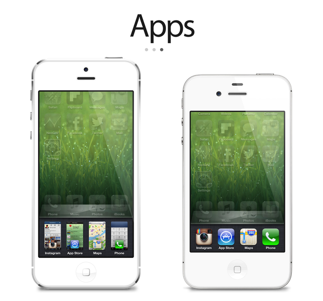
On The Verge, forum member Sentry has an elegant and very Apple-like take on how the multitasking tray could be improved. Practically unchanged since iOS 4, Sentry argues that iOS 6 should make better use of the extra screen space of the iPhone 5 for multitasking. Instead of proposing the usual Mission Control-like UI we’ve seen in dozens of mockups, he says that users are very entrenched into the simplicity of the multitasking tray: it shouldn’t change too much.
In an attempt to offer more functionality and features, they lose the core simplicity of the switcher which made it particularly usable to begin with. Some concepts use the entire screen space to display a grid of app previews, others only double the switcher height to include an extra row of icons. While both offer additional functionality, they actually hinder the flow and ease of app-switching. Whether it’s a full screen grid solution or displaying two rows in the switcher instead of one, both require more from your thumb than Apple’s original solute while tending to be overly brash in appearance as well.
I agree about the app switcher: it’s very easy to use, and, while geeks like us would like to have more options for “real” multitasking, typical iPhone users don’t have any problems with switching apps. I’m still not completely sold on the concept of live app previews for the switcher, but I know (at least I very much hope so) that Apple won’t change this part of the experience unless they come up with something better. An improvement that’s useful, not just different for change’s sake.
Check out the concepts by clicking on the source links above. Also recently: a great concept on how to enhance Spotlight by giving it Siri-like features based on text input.


